Filtering customization in Blazor DataGrid
The appearance of filtering elements in the Blazor DataGrid can be customized using CSS. Styling options are available for different parts of the filtering interface:
- Filter bar cell and input elements: Used to enter filter values directly in the header row.
- Input focus styles: Visual highlight applied when the filter input field is focused.
- Clear and filter icons: Icons for clearing filter values and indicating active filters in column headers.
- Filter dialog content and footer: Sections of the filter popup used for entering filter criteria and confirming actions.
- Input fields and buttons within the filter dialog: Controls used to specify filter values and apply or cancel filtering.
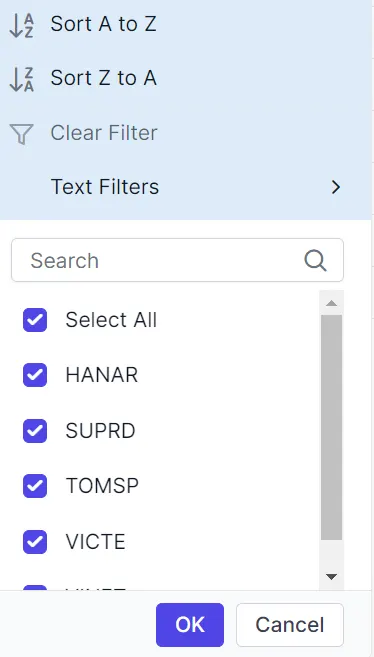
- Excel-style number filter visuals: Menu-style interface for selecting numeric filter conditions in Excel-like filtering mode.
Customize the filter bar cell element
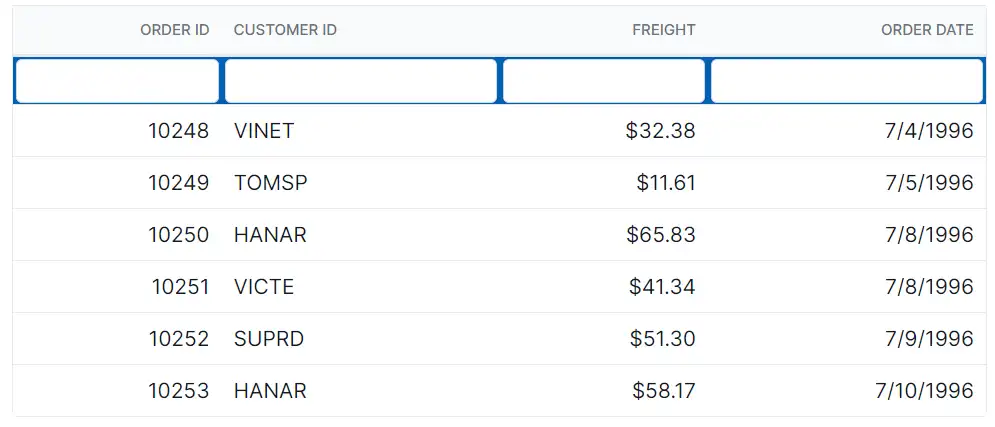
The .e-filterbarcell class styles the filter bar cells in the header row. Use CSS to adjust its appearance:
.e-grid .e-filterbarcell {
    background-color: #045fb4;
}
Properties like background-color, padding, and border can be changed to visually distinguish the filter row from header cells.
Customize the filter bar input element
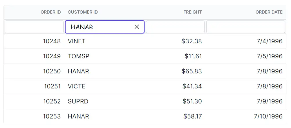
The .e-input class inside .e-filterbarcell styles the input field in the filter bar. Apply CSS to modify its look:
.e-grid .e-filterbarcell .e-input-group input.e-input {
    font-family: cursive;
}
Adjust properties such as font-family, font-size, and border can be adjusted to improve readability and match the grid design.
Customize the input focus
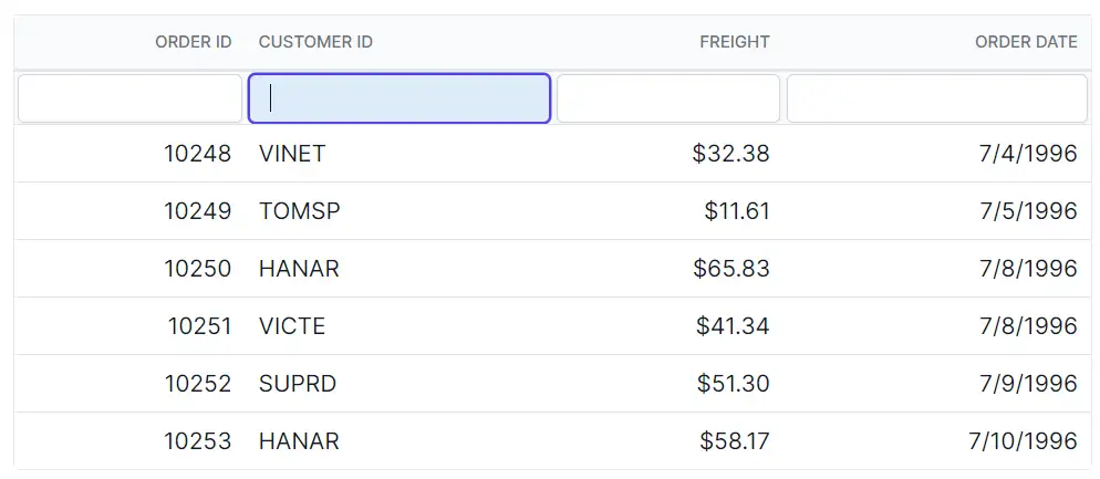
The .e-input-focus class styles the filter bar input group when focused. Apply CSS to change its appearance:
.e-grid .e-filterbarcell .e-input-group.e-input-focus {
    background-color: #deecf9;
}
Change properties like background-color and border to enhance focus visibility and support keyboard navigation.
Customize the filter bar input clear icon
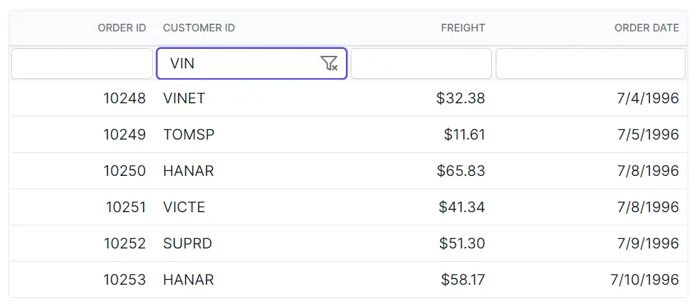
The .e-clear-icon::before class defines the clear icon in the filter bar input. Apply CSS to change its appearance:
.e-grid .e-filterbarcell .e-input-group .e-clear-icon::before {
    content: '\e72c';
}
The content property can be updated to use a different glyph from the icon set.
@using Syncfusion.Blazor.Grids

<SfGrid DataSource="@Orders"
        Height="315"
        AllowFiltering="true"
        AllowPaging="true">
    <GridPageSettings PageSize="8"></GridPageSettings>
    <GridColumns>
        <GridColumn Field=@nameof(OrderData.OrderID) HeaderText="Order ID" TextAlign="TextAlign.Right" Width="140"></GridColumn>
        <GridColumn Field=@nameof(OrderData.CustomerID) HeaderText="Customer ID" Width="120"></GridColumn>
        <GridColumn Field=@nameof(OrderData.Freight) HeaderText="Freight" TextAlign="TextAlign.Right" Width="120"></GridColumn>
        <GridColumn Field=@nameof(OrderData.OrderDate) HeaderText="Order Date" Format="d" Width="100" TextAlign="TextAlign.Right"></GridColumn>
    </GridColumns>
</SfGrid>

<style>
    .e-grid .e-filterbarcell {
        background-color: #045fb4;
        color: #ffffff;
    }

    .e-grid .e-filterbarcell .e-input-group input.e-input {
        font-family: cursive;
    }

    .e-grid .e-filterbarcell .e-input-group.e-input-focus {
        background-color: #deecf9;
    }

    .e-grid .e-filterbarcell .e-input-group .e-clear-icon::before {
        font-family: 'e-icons' !important;
        font-weight: normal;
        content: '\e72c';
    }

    /* Optional: highlight the focused filter cell for keyboard users */
    .e-grid .e-filterbarcell:focus-visible {
        outline: 2px solid #005a9e;
        outline-offset: -2px;
    }
</style>

@code {

    private List<OrderData> Orders { get; set; }
    protected override void OnInitialized()
    {
        Orders = OrderData.GetAllRecords();
    }
}
internal sealed class OrderData
{
private static readonly List<OrderData> Data = new();
public OrderData(int orderID, string customerID, double freight, DateTime orderDate)
{
OrderID = orderID;
CustomerID = customerID;
Freight = freight;
OrderDate = orderDate;
}
internal static List<OrderData> GetAllRecords()
{
if (Data.Count == 0)
{
Data.Add(new OrderData(10248, "VINET", 32.38, new DateTime(2024, 1, 10)));
Data.Add(new OrderData(10249, "TOMSP", 11.61, new DateTime(2024, 1, 11)));
Data.Add(new OrderData(10250, "HANAR", 65.83, new DateTime(2024, 1, 12)));
Data.Add(new OrderData(10251, "VICTE", 41.34, new DateTime(2024, 1, 13)));
Data.Add(new OrderData(10252, "SUPRD", 51.3, new DateTime(2024, 1, 14)));
Data.Add(new OrderData(10253, "HANAR", 58.17, new DateTime(2024, 1, 15)));
Data.Add(new OrderData(10254, "CHOPS", 22.98, new DateTime(2024, 1, 16)));
Data.Add(new OrderData(10255, "RICSU", 148.33, new DateTime(2024, 1, 17)));
Data.Add(new OrderData(10256, "WELLI", 13.97, new DateTime(2024, 1, 18)));
Data.Add(new OrderData(10257, "HILAA", 81.91, new DateTime(2024, 1, 19)));
}
return Data;
}
public int OrderID { get; set; }
public string CustomerID { get; set; }
public double Freight { get; set; }
public DateTime OrderDate { get; set; }
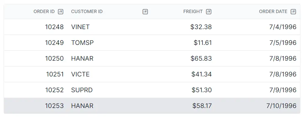
}Customize the filtering icon in the header
The .e-icon-filter::before class styles the filter icon in column headers. Apply CSS to modify its look:
.e-grid .e-icon-filter::before {
    content: '\e81e';
}
Update the content value to match the desired icon glyph.
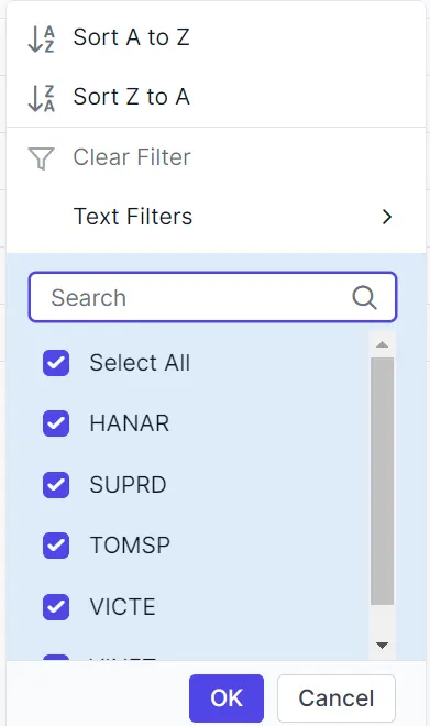
Customize the filter dialog content
The .e-filter-popup .e-dlg-content class styles the content area of the filter dialog. Apply CSS to change its appearance:
.e-grid .e-filter-popup .e-dlg-content {
    background-color: #deecf9;
}
Modify properties such as background-color, padding, and border to match the application theme.
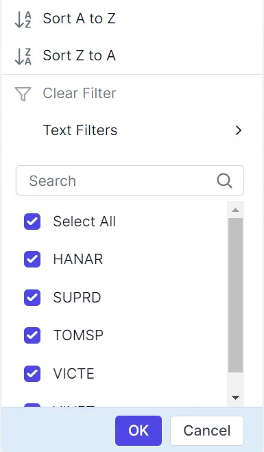
Customize the filter dialog footer
The .e-filter-popup .e-footer-content class styles the footer section of the filter dialog. Apply CSS to adjust its appearance:
.e-grid .e-filter-popup .e-footer-content {
    background-color: #deecf9;
}
Properties like background-color, text-align, and border can be changed to align with the layout design.
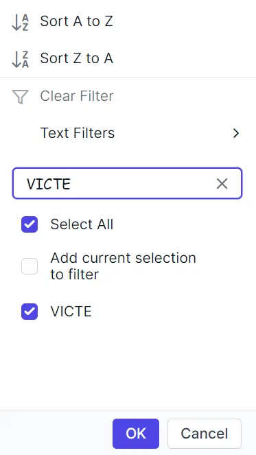
Customize the filter dialog input field
The .e-input class inside .e-filter-popup targets input fields in the filter dialog. Use CSS to adjust its appearance:
.e-grid .e-filter-popup .e-input-group input.e-input {
    font-family: cursive;
}
Adjust properties such as font-family, color, and border to improve clarity and consistency.
Customize the filter dialog button element
The .e-filter-popup .e-btn class styles buttons inside the filter dialog. Apply CSS to modify their appearance:
.e-grid .e-filter-popup .e-btn {
    font-family: cursive;
}
Change properties like font-family, background-color, and border to match the design.
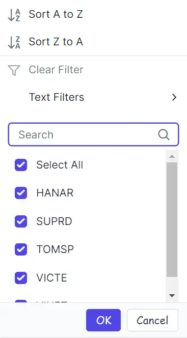
Customize the Excel-style number filter menu
The .e-contextmenu-container ul class inside .e-filter-popup styles the number filter list in the Excel-style filter dialog. Apply CSS to change its appearance:
.e-grid .e-filter-popup .e-contextmenu-container ul {
    background-color: #deecf9;
}
Properties such as background-color, color, and text-align can be adjusted to match the required design.
@using Syncfusion.Blazor.Grids

<SfGrid DataSource="@Orders"
        Height="315"
        AllowFiltering="true"
        AllowPaging="true">
    <GridPageSettings PageSize="8"></GridPageSettings>
    <GridFilterSettings Type="FilterType.Menu"></GridFilterSettings>
    <GridColumns>
        <GridColumn Field=@nameof(OrderData.OrderID) HeaderText="Order ID" TextAlign="TextAlign.Right" Width="140"></GridColumn>
        <GridColumn Field=@nameof(OrderData.CustomerID) HeaderText="Customer ID" Width="120"></GridColumn>
        <GridColumn Field=@nameof(OrderData.Freight) HeaderText="Freight" TextAlign="TextAlign.Right" Width="120"></GridColumn>
        <GridColumn Field=@nameof(OrderData.OrderDate) HeaderText="Order Date" Format="d" Width="100" TextAlign="TextAlign.Right"></GridColumn>
    </GridColumns>
</SfGrid>

<style>
    .e-grid .e-icon-filter::before {
        font-family: 'e-icons' !important;
        font-weight: normal;
        content: '\e81e';
    }

    .e-grid .e-filter-popup .e-dlg-content,
    .e-grid .e-filter-popup .e-footer-content,
    .e-grid .e-filter-popup .e-contextmenu-container ul {
        background-color: #deecf9;
    }

    .e-grid .e-filter-popup .e-input-group input.e-input,
    .e-grid .e-filter-popup .e-btn {
        font-family: cursive;
    }

    /* Optional: focus outline inside the filter dialog for keyboard users */
    .e-grid .e-filter-popup .e-input-group input.e-input:focus-visible,
    .e-grid .e-filter-popup .e-btn:focus-visible {
        outline: 2px solid #005a9e;
        outline-offset: 2px;
    }
</style>

@code {
    private List<OrderData> Orders { get; set; }

    protected override void OnInitialized()
    {
        Orders = OrderData.GetAllRecords();
    }
}
internal sealed class OrderData
{
private static readonly List<OrderData> Data = new();
public OrderData(int orderID, string customerID, double freight, DateTime orderDate)
{
OrderID = orderID;
CustomerID = customerID;
Freight = freight;
OrderDate = orderDate;
}
internal static List<OrderData> GetAllRecords()
{
if (Data.Count == 0)
{
Data.Add(new OrderData(10248, "VINET", 32.38, new DateTime(2024, 1, 10)));
Data.Add(new OrderData(10249, "TOMSP", 11.61, new DateTime(2024, 1, 11)));
Data.Add(new OrderData(10250, "HANAR", 65.83, new DateTime(2024, 1, 12)));
Data.Add(new OrderData(10251, "VICTE", 41.34, new DateTime(2024, 1, 13)));
Data.Add(new OrderData(10252, "SUPRD", 51.3, new DateTime(2024, 1, 14)));
Data.Add(new OrderData(10253, "HANAR", 58.17, new DateTime(2024, 1, 15)));
Data.Add(new OrderData(10254, "CHOPS", 22.98, new DateTime(2024, 1, 16)));
Data.Add(new OrderData(10255, "RICSU", 148.33, new DateTime(2024, 1, 17)));
Data.Add(new OrderData(10256, "WELLI", 13.97, new DateTime(2024, 1, 18)));
Data.Add(new OrderData(10257, "HILAA", 81.91, new DateTime(2024, 1, 19)));
}
return Data;
}
public int OrderID { get; set; }
public string CustomerID { get; set; }
public double Freight { get; set; }
public DateTime OrderDate { get; set; }
}