Customize the Primary Toolbar in Blazor PDF Viewer
17 Jul 202623 minutes to read
This guide explains how to show or hide the primary toolbar, remove default items, reorder toolbar items, and add custom toolbar items.
Show or hide primary toolbar at initialization
Set EnableToolbar to false to hide the built-in toolbar.
@using Syncfusion.Blazor.SfPdfViewer

<SfPdfViewer2 EnableToolbar="false"
              Height="100%"
              Width="100%"
              DocumentPath="wwwroot/Data/PDF_Succinctly.pdf">
</SfPdfViewer2>
Show or hide primary toolbar at runtime
Use the ShowToolbarAsync method to show or hide the toolbar dynamically.
@using Syncfusion.Blazor.SfPdfViewer
@using Syncfusion.Blazor.Buttons

<SfButton @onclick="OnClick">Hide Toolbar</SfButton>

<SfPdfViewer2 @ref="PdfViewer"
              Height="100%"
              Width="100%"
              DocumentPath="wwwroot/Data/PDF_Succinctly.pdf">
</SfPdfViewer2>

@code {
    private SfPdfViewer2 PdfViewer;

    private async Task OnClick()
    {
        await PdfViewer.ShowToolbarAsync(false);
    }
}Customize the default toolbar items in the primary toolbar
Show only the required default actions and control their order in the primary toolbar.
Use PdfViewerToolbarSettings to specify which toolbar items are shown and their order. The toolbar renders only the items listed in the ToolbarItems collection. For a full list of available values, see the ToolbarItem enum.
@using Syncfusion.Blazor.SfPdfViewer

<SfPdfViewer2 Height="100%"
              Width="100%"
              DocumentPath="wwwroot/Data/PDF_Succinctly.pdf">
    <PdfViewerToolbarSettings ToolbarItems="ToolbarItems"></PdfViewerToolbarSettings>
</SfPdfViewer2>

@code {
    List<ToolbarItem> ToolbarItems = new List<ToolbarItem>()
    {
        ToolbarItem.OpenOption,
        ToolbarItem.PageNavigationTool,
        ToolbarItem.MagnificationTool,
        ToolbarItem.PrintOption,
        ToolbarItem.DownloadOption
    };
}
Rearrange the default toolbar items in the primary toolbar
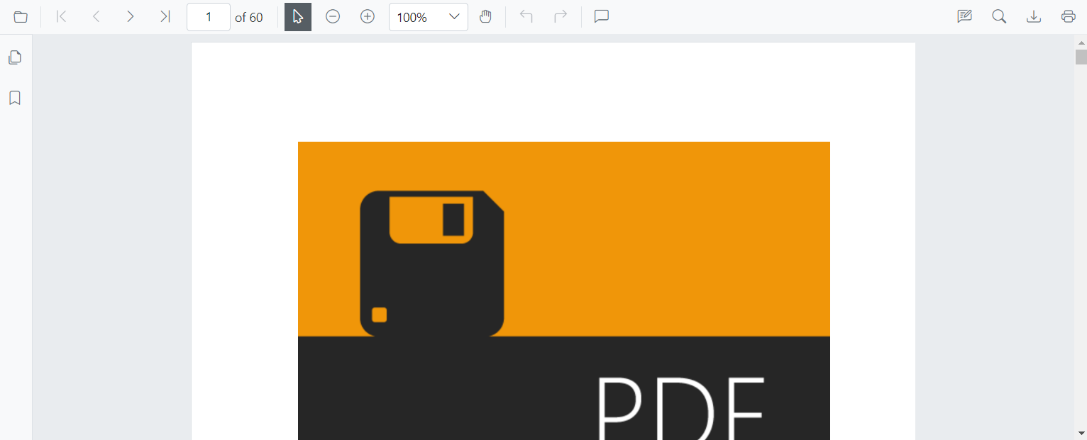
Change the visual order of default items in the primary toolbar by reordering the ToolbarItems collection.
@using Syncfusion.Blazor.SfPdfViewer

<SfPdfViewer2 Height="100%"
              Width="100%"
              DocumentPath="wwwroot/Data/PDF_Succinctly.pdf">
    <PdfViewerToolbarSettings ToolbarItems="ToolbarItems"></PdfViewerToolbarSettings>
</SfPdfViewer2>

@code {
    List<ToolbarItem> ToolbarItems = new List<ToolbarItem>()
    {
        ToolbarItem.OpenOption,
        ToolbarItem.PrintOption,
        ToolbarItem.DownloadOption,
        ToolbarItem.PageNavigationTool,
        ToolbarItem.MagnificationTool,
        ToolbarItem.SelectionTool,
        ToolbarItem.PanTool,
        ToolbarItem.AnnotationEditTool,
        ToolbarItem.SearchOption
    };
}
Remove default items and add custom items to the primary toolbar
Render custom buttons in place of the default items by using templates positioned at specific indexes.
Set ToolbarItems to null and provide a list of PdfToolbarItem objects with custom templates. Each item defines a Template and Index for positioning.
@using Syncfusion.Blazor.SfPdfViewer
@using Syncfusion.Blazor.Navigations

<SfPdfViewer2 @ref="Viewer"
              DocumentPath="wwwroot/Data/PDF_Succinctly.pdf"
              Height="100%"
              Width="100%">
    <PdfViewerToolbarSettings CustomToolbarItems="CustomToolbarItems" ToolbarItems="null"></PdfViewerToolbarSettings>
    <PdfViewerEvents ToolbarClicked="ClickAction"></PdfViewerEvents>
</SfPdfViewer2>

@code {
    private SfPdfViewer2 Viewer;

    private List<PdfToolbarItem> CustomToolbarItems = new List<PdfToolbarItem>()
    {
        new PdfToolbarItem() { Index = 0, Template = GetTemplate("PreviousPage") },
        new PdfToolbarItem() { Index = 1, Template = GetTemplate("NextPage") },
        new PdfToolbarItem() { Index = 2, Template = GetTemplate("Print") },
        new PdfToolbarItem() { Index = 3, Template = GetTemplate("Download") }
    };

    private static RenderFragment GetTemplate(string name)
    {
        return __builder =>
        {
            if (name == "PreviousPage")
            {
                <ToolbarItem PrefixIcon="e-icons e-chevron-left"
                            Text="Previous Page"
                            TooltipText="Previous Page"
                            Id="previousPage"
                            Align="ItemAlign.Left">
                </ToolbarItem>
            }
            else if (name == "NextPage")
            {
                <ToolbarItem PrefixIcon="e-icons e-chevron-right"
                            Text="Next Page"
                            TooltipText="Next Page"
                            Id="nextPage"
                            Align="ItemAlign.Left">
                </ToolbarItem>
            }
            else if (name == "Print")
            {
                <ToolbarItem PrefixIcon="e-icons e-print"
                            Text="Print"
                            TooltipText="Print"
                            Id="print"
                            Align="ItemAlign.Right">
                </ToolbarItem>
            }
            else if (name == "Download")
            {
                <ToolbarItem PrefixIcon="e-icons e-download"
                            Text="Download"
                            TooltipText="Download"
                            Id="download"
                            Align="ItemAlign.Right">
                </ToolbarItem>
            }
        };
    }

    private async void ClickAction(ClickEventArgs Item)
    {
        if (Item.Item.Id == "previousPage")
        {
            await Viewer.GoToPreviousPageAsync();
        }
        else if (Item.Item.Id == "nextPage")
        {
            await Viewer.GoToNextPageAsync();
        }
        else if (Item.Item.Id == "print")
        {
            await Viewer.PrintAsync();
        }
        else if (Item.Item.Id == "download")
        {
            await Viewer.DownloadAsync();
        }
    }
}
Customize the primary toolbar with default options
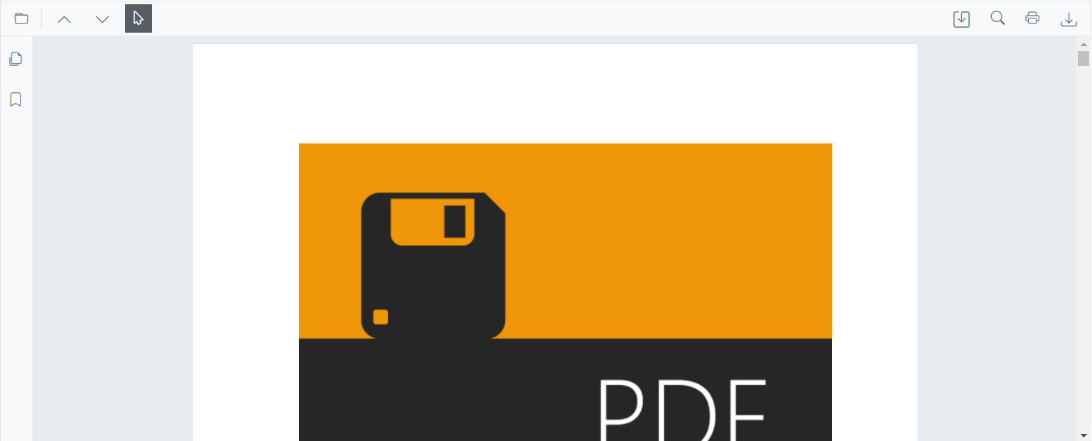
Combine default and custom items by using both ToolbarItems and CustomToolbarItems. Custom items are inserted at specified index positions among the default items.
@using Syncfusion.Blazor.SfPdfViewer
@using Syncfusion.Blazor.Navigations

<SfPdfViewer2 @ref="Viewer"
              DocumentPath="wwwroot/Data/PDF_Succinctly.pdf"
              Height="100%"
              Width="100%">
    <PdfViewerToolbarSettings ToolbarItems="ToolbarItems" CustomToolbarItems="CustomToolbarItems"></PdfViewerToolbarSettings>
    <PdfViewerEvents ToolbarClicked="ClickAction"></PdfViewerEvents>
</SfPdfViewer2>

@code {
    private SfPdfViewer2 Viewer;
    MemoryStream stream;

    private List<ToolbarItem> ToolbarItems = new List<ToolbarItem>()
    {
        ToolbarItem.OpenOption,
        ToolbarItem.SelectionTool,
        ToolbarItem.SearchOption,
        ToolbarItem.PrintOption
    };

    private List<PdfToolbarItem> CustomToolbarItems = new List<PdfToolbarItem>()
    {
        new PdfToolbarItem() { Index = 1, Template = GetTemplate("Save") },
        new PdfToolbarItem() { Index = 3, Template = GetTemplate("Download") }
    };

    private static RenderFragment GetTemplate(string name)
    {
        return __builder =>
        {
            if (name == "Save")
            {
                <ToolbarItem PrefixIcon="e-icons e-save"
                            Text="Save"
                            TooltipText="Save Document"
                            Id="save"
                            Align="ItemAlign.Right">
                </ToolbarItem>
            }
            else if (name == "Download")
            {
                <ToolbarItem PrefixIcon="e-icons e-download"
                            Text="Download"
                            TooltipText="Download"
                            Id="download"
                            Align="ItemAlign.Right">
                </ToolbarItem>
            }
        };
    }

    private async void ClickAction(ClickEventArgs Item)
    {
        if (Item.Item.Id == "save")
        {
            byte[] data = await Viewer.GetDocumentAsync();
            stream = new MemoryStream(data);
            await Viewer.LoadAsync(stream);
        }
        else if (Item.Item.Id == "download")
        {
            await Viewer.DownloadAsync();
        }
    }
}
Modify the toolbar icons in the primary toolbar
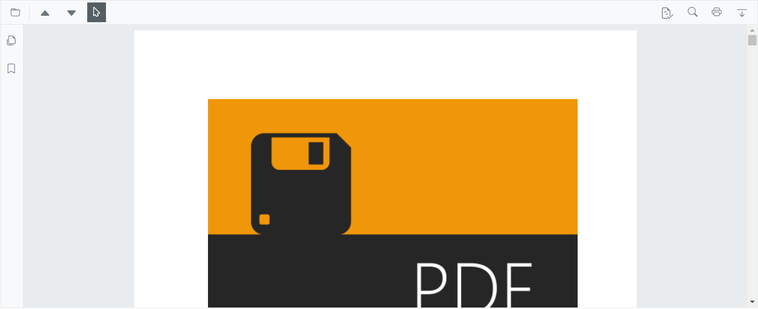
Adjust icon glyphs and styles for custom toolbar items using CSS.
Customize the appearance of toolbar icons for custom toolbar items. The following example demonstrates a custom toolbar with custom icon styles.
@using Syncfusion.Blazor.SfPdfViewer
@using Syncfusion.Blazor.Navigations

<SfPdfViewer2 @ref="Viewer"
              DocumentPath="wwwroot/Data/PDF_Succinctly.pdf"
              Height="100%"
              Width="100%">
    <PdfViewerToolbarSettings ToolbarItems="ToolbarItems" CustomToolbarItems="CustomToolbarItems"></PdfViewerToolbarSettings>
    <PdfViewerEvents ToolbarClicked="ClickAction"></PdfViewerEvents>
</SfPdfViewer2>

@code {
    private SfPdfViewer2 Viewer;
    MemoryStream stream;

    private List<PdfToolbarItem> CustomToolbarItems = new List<PdfToolbarItem>()
    {
        new PdfToolbarItem() { Index = 1, Template = GetTemplate("PreviousPage") },
        new PdfToolbarItem() { Index = 2, Template = GetTemplate("NextPage") },
        new PdfToolbarItem() { Index = 4, Template = GetTemplate("Save") },
        new PdfToolbarItem() { Index = 7, Template = GetTemplate("Download") }
    };

    private static RenderFragment GetTemplate(string name)
    {
        return __builder =>
        {
            if (name == "PreviousPage")
            {
                <ToolbarItem PrefixIcon="e-icons e-chevron-left"
                            Text="Previous Page"
                            TooltipText="Previous Page"
                            Id="previousPage"
                            Align="ItemAlign.Left">
                </ToolbarItem>
            }
            else if (name == "NextPage")
            {
                <ToolbarItem PrefixIcon="e-icons e-chevron-right"
                            Text="Next Page"
                            TooltipText="Next Page"
                            Id="nextPage"
                            Align="ItemAlign.Left">
                </ToolbarItem>
            }
            else if (name == "Save")
            {
                <ToolbarItem PrefixIcon="e-icons e-save"
                            Text="Save"
                            TooltipText="Save Document"
                            Id="save"
                            Align="ItemAlign.Right">
                </ToolbarItem>
            }
            else if (name == "Download")
            {
                <ToolbarItem PrefixIcon="e-icons e-download"
                            Text="Download"
                            TooltipText="Download"
                            Id="download"
                            Align="ItemAlign.Right">
                </ToolbarItem>
            }
        };
    }

    private async void ClickAction(ClickEventArgs Item)
    {
        if (Item.Item.Id == "previousPage")
        {
            await Viewer.GoToPreviousPageAsync();
        }
        else if (Item.Item.Id == "nextPage")
        {
            await Viewer.GoToNextPageAsync();
        }
        else if (Item.Item.Id == "save")
        {
            byte[] data = await Viewer.GetDocumentAsync();
            stream = new MemoryStream(data);
            await Viewer.LoadAsync(stream);
        }
        else if (Item.Item.Id == "download")
        {
            await Viewer.DownloadAsync();
        }
    }
}
This applies only to custom toolbar items.
Add the redaction tool to the primary toolbar on desktop
Show the redaction tool in the primary toolbar on desktop by including ToolbarItem.Redaction in the ToolbarItems collection.
@using Syncfusion.Blazor.SfPdfViewer

<SfPdfViewer2 Height="100%"
              Width="100%"
              DocumentPath="wwwroot/Data/PDF_Succinctly.pdf">
    <PdfViewerToolbarSettings ToolbarItems="ToolbarItems"></PdfViewerToolbarSettings>
</SfPdfViewer2>

@code {
    private List<ToolbarItem> ToolbarItems = new List<ToolbarItem>();

    protected override void OnInitialized()
    {
        ToolbarItems = new List<ToolbarItem>()
        {
            ToolbarItem.OpenOption,
            ToolbarItem.PageNavigationTool,
            ToolbarItem.MagnificationTool,
            ToolbarItem.SelectionTool,
            ToolbarItem.PanTool,
            ToolbarItem.UndoRedoTool,
            ToolbarItem.CommentTool,
            ToolbarItem.AnnotationEditTool,
            ToolbarItem.Redaction,
            ToolbarItem.FormDesigner,
            ToolbarItem.SearchOption,
            ToolbarItem.PrintOption,
            ToolbarItem.DownloadOption
        };
    }
}
Show or hide the navigation toolbar
Control the sidebar that displays thumbnails using the EnableNavigationToolbar property.
@using Syncfusion.Blazor.SfPdfViewer

<SfPdfViewer2 EnableNavigationToolbar="false"
              Height="100%"
              Width="100%"
              DocumentPath="wwwroot/Data/PDF_Succinctly.pdf">
</SfPdfViewer2>