How can I help you?
Getting Started with Aurelia TreeGrid
This section helps to understand the getting started of the Aurelia TreeGrid with the step-by-step instructions.
Create your first TreeGrid in Aurelia
To get started Syncfusion Aurelia application refer this page for basic control integration and script references.
The Essential Aurelia TreeGrid has been designed to represent and edit the hierarchical data.
This section explains how to create a TreeGrid widget in your application with hierarchical data source and enable sorting and editing. The following screenshot displays the output.
- Create TreeGrid folder inside src/samples/ location.
- Create TreeGrid.html file inside src/samples/TreeGrid folder and use the below code example to render the TreeGrid component.
1.Create HTML file and add the following necessary script and css files to the HTML file.
<!DOCTYPE html>
    <html xmlns="http://www.w3.org/1999/xhtml">
        <head>
            <meta name="viewport"content="width=device-width, initial-scale=1.0"/>
            <meta charset="utf-8" />
            <link href=" http://cdn.syncfusion.com/33.1.44/js/web/flat-azure/ej.web.all.min.css" rel="stylesheet"/>
            <script src="http://cdn.syncfusion.com/js/assets/external/jquery-1.10.2.min.js"></script>
            <script src="http://cdn.syncfusion.com/js/assets/external/jsrender.min.js"></script>
            <script src="http://cdn.syncfusion.com/js/assets/external/jquery.globalize.min.js"></script>
            <script src="http://cdn.syncfusion.com/js/assets/external/jquery.easing.1.3.min.js"></script>
            <script src="http://cdn.syncfusion.com/33.1.44/js/web/ej.web.all.min.js" type="text/javascript"></script>
        </head>
        <body>
        <!--Add TreeGrid control here -->
        </body>
    </html>
2.Create the TreeGrid with the empty data source.
<template>
    <div>
        <ej-tree-grid id="TreeGrid"
            e-child-mapping="subtasks"
            e-tree-column-index="1"
            e-columns.bind="columns"
            e-size-settings.bind="sizeSettings">
        </ej-tree-grid>
    </div>
</template>
To render the Aurelia TreeGrid using below code.
export class DefaultSample {
    constructor() {
        this.sizeSettings = {width:"700px", height:"100px"};
        this.columns =  [
            { field: 'taskID', headerText: 'Id', width: 70},
            { field: 'taskName', headerText: 'Task Name' },
            { field: 'startDate', headerText: 'Start Date' },
            { field: 'duration', headerText: 'Duration' }
        ];
    }
}
TreeGrid with empty datasource
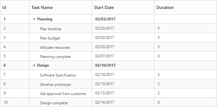
3.Create data source for TreeGrid.
export class DefaultSample {
    constructor() {
        this.sizeSettings = {width:"700px", height:"350px"};
        this.columns =  [
                        { field: 'taskID', headerText: 'Id', width: 70},
                        { field: 'taskName', headerText: 'Task Name' },
                        { field: 'startDate', headerText: 'Start Date' },
                        { field: 'duration', headerText: 'Duration' }
        ];
        this.ProjectData = [
          {
              taskID: 1,
              taskName: 'Planning',
              startDate: '02/03/2017',
              subtasks: [
                    { taskID: 2, taskName: 'Plan timeline', startDate: '02/03/2017', duration: 5, },
                    { taskID: 3, taskName: 'Plan budget', startDate: '02/03/2017', duration: 5, },
                    { taskID: 4, taskName: 'Allocate resources', startDate: '02/03/2017',  duration: 5},
                    { taskID: 5, taskName: 'Planning complete', startDate: '02/07/2017', duration: 0}
              ]
          },
          {
              taskID: 6,
              taskName: 'Design',
              startDate: '02/10/2017',
              subtasks: [
                     { taskID: 7, taskName: 'Software Specification', startDate: '02/10/2017',  duration: 3, },
                     { taskID: 8, taskName: 'Develop prototype', startDate: '02/10/2017',  duration: 3 },
                     { taskID: 9, taskName: 'Get approval from customer', startDate: '02/13/2017', duration: 2 },
                     { taskID: 10, taskName: 'Design complete', startDate: '02/14/2017', duration: 0}
              ]
          }
        ];
    }
}
4.Initialize the TreeGrid with data source created in last step.
<template>
    <div>
        <ej-tree-grid id="TreeGrid"
            e-data-source.bind="ProjectData"
            e-child-mapping="subtasks"
            e-tree-column-index="1"
            e-columns.bind="columns"
            e-size-settings.bind="sizeSettings">
        </ej-tree-grid>
    </div>
</template>
TreeGrid widget is displayed as the output in the following screenshot.
Enable Toolbar
TreeGrid control contains the toolbar options to Add, Edit, Delete, Cancel, Update, Search, ExpandAll and CollapseAll operations, you can enable the toolbar by using e-toolbar-settings property.
<template>
    <div>
        <ej-tree-grid id="TreeGrid"
            e-toolbar-settings.bind="toolbarSettings">
        </ej-tree-grid>
    </div>
</template>export class DefaultSample {
constructor() {
this.toolbarSettings = {
showToolbar: true,
toolbarItems: [
ej.TreeGrid.ToolbarItems.Add,
ej.TreeGrid.ToolbarItems.Edit,
ej.TreeGrid.ToolbarItems.Delete,
ej.TreeGrid.ToolbarItems.Update,
ej.TreeGrid.ToolbarItems.Cancel,
ej.TreeGrid.ToolbarItems.ExpandAll,
ej.TreeGrid.ToolbarItems.CollapseAll,
ej.TreeGrid.ToolbarItems.Search
]
};
}
}The following screen shot displays a Toolbar in TreeGrid.
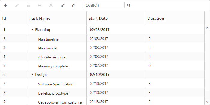
NOTE
Add, Edit, Delete options are enabled by
allowEditing,allowAdding,allowDeletingin theeditSettingsproperty.
Enable Sorting
The TreeGrid control contains sorting functionality to arrange the data in ascending or descending order based on a particular column. Sorting can be enabled by using e-allow-sorting property.
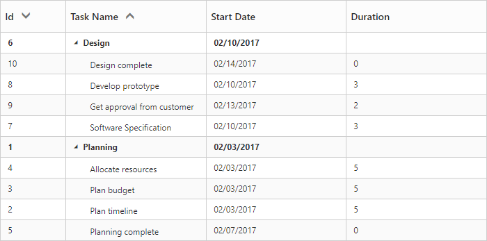
Multicolumn Sorting
You can enable the multicolumn sorting in TreeGrid by setting e-allow-multi-sorting as true .You can sort multiple columns in TreeGrid by selecting the desired column header when holding the Ctrl key.
<template>
    <div>
        <ej-tree-grid id="TreeGrid"
            e-allow-sorting="true"
            e-allow-multi-sorting="true">
        </ej-tree-grid>
    </div>
</template>
The following screen shot displays a multiple column sorting in TreeGrid.
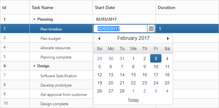
Enable Editing
You can enable editing in TreeGrid by using e-edit-settings property and it is illustrated in the following code example.
<template>
    <div>
        <ej-tree-grid id="TreeGrid"
            e-edit-settings.bind="editSettings">
        </ej-tree-grid>
    </div>
</template>export class DefaultSample {
constructor() {
this.editSettings= {
allowEditing: true,
allowAdding: true,
rowPosition: ej.TreeGrid.RowPosition.Below,
allowDeleting: true,
editMode: "cellEditing"
};
}
}
Click here to refer more details for TreeGrid Editing.
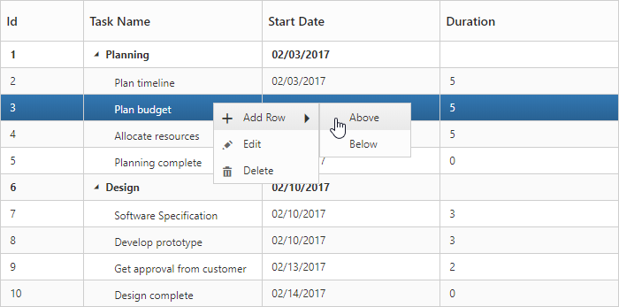
Enable Context Menu
The context menu in TreeGrid control is used to manipulate (add, edit and delete) the TreeGrid rows.
In TreeGrid, context menu can be enabled by e-context-menu-settings property. The e-context-menu-settings property contains two inner properties showContextMenu and contextMenuItems.
<template>
    <div>
        <ej-tree-grid id="TreeGrid"
            e-context-menu-settings.bind="contextMenuSettings">
        </ej-tree-grid>
    </div>
</template>export class DefaultSample {
constructor() {
this.contextMenuSettings = {
showContextMenu: true,
contextMenuItems: [
ej.TreeGrid.ContextMenuItems.Add,
ej.TreeGrid.ContextMenuItems.Edit,
ej.TreeGrid.ContextMenuItems.Delete
]
};
}
}The following screenshot displays the context menu in TreeGrid control.
Click here to refer more details for TreeGrid context menu.
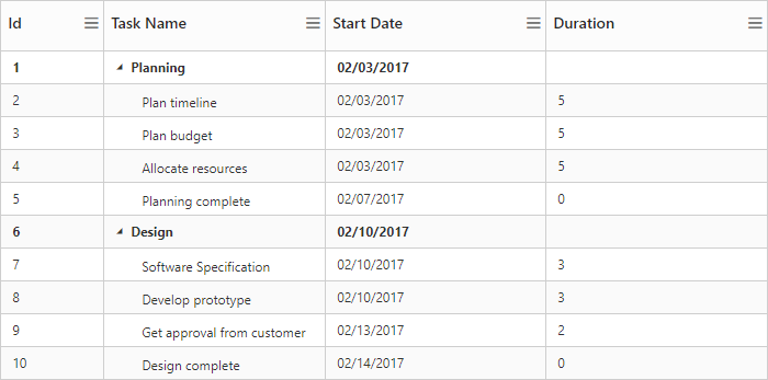
Enable Column Chooser
You can enable the column menu in TreeGrid, by setting the e-show-column-chooser as true.
<template>
    <div>
        <ej-tree-grid id="TreeGrid"
            e-show-column-chooser="true">
        </ej-tree-grid>
    </div>
</template>
The following screenshot displays the column chooser in TreeGrid control.
Define dimension of TreeGrid
By default TreeGrid control was rendered with 100% width and 450px height, we can define the dimension of TreeGrid control by using e-size-settings property. TreeGrid control width and height can be defined by either height and width properties or by defining inline style in TreeGrid container element. The below code example shows how to define width and height for TreeGrid control.
<template>
    <div>
        <ej-tree-grid id="TreeGrid"
            e-size-settings.bind="sizeSettings">
        </ej-tree-grid>
    </div>
</template>export class DefaultSample {
constructor() {
this.sizeSettings = {width:"700px", height:"350px"};
}
}NOTE
1.TreeGrid control will automatically update the width and height value based on container element on window resize action, this can be enabled by setting
isResponsiveproperty astruefor thisheightandwidthvalue will be defined in percentage.
2.We can also render TreeGrid with auto height by settingsizeSettings.heightasauto.