How can I help you?
Tooltip in ASP.NET WebForms Sparkline
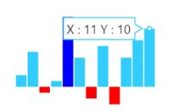
The Tooltip follows the pointer movement and is used to indicate the value of a point. This feature is applicable for line, column, pie, and area Sparkline. You can enable the tooltip by setting it’s Visible property as true. You can customize the tooltip Fill, Border and Font.
@(Html.EJ().Sparkline("container")

.Tooltip(tooltip => tooltip.Visible(true))

 )
Tooltip Customization
You can customize the tooltip Fill, Border Color, Width and Font properties Color, FontFamily, FontStyle, FontWeight, Opacity and Size
<ej:Sparkline ClientIDMode="Static" ID="Sparkline1" runat="server">
    <Tooltip Visible="true" Fill="#ff14ae" Width="4">
        <Border Color="Green" Width="3"></Border>
        <Font Size="12px" FontFamily="Algerian" FontStyle="Italic" FontWeight="Lighter" Opacity="0.5"></Font>
    </Tooltip>
</ej:Sparkline>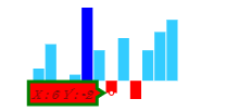
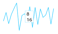
Tooltip Template
HTML elements can be displayed in the tooltip by using the Template option of the tooltip. The template option takes the value of the id attribute of the HTML element. You can use the #point.x# and #point.y# as place holders in the HTML element to display the x and y values of the corresponding point.
<div id="item" style="display: none;">
    <div>
        <div>#point.x#</div>
        <div>#point.y#</div>
    </div>
</div>

<ej:Sparkline ClientIDMode="Static" ID="Sparkline1" runat="server">
    <Tooltip Visible="true" Template="item"></Tooltip>
</ej:Sparkline>