How can I help you?
Templates
The ComboBox has been provided with several options to customize each list item, group title, selected value, header, and footer elements.
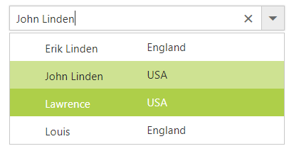
Item template
The content of each list item within the ComboBox can be customized with the help of ItemTemplate property.
In the following sample, each list item is split into two columns to display relevant data’s.
<ej:ComboBox ID="empList" runat="server" Width="100%" DataTextField="text"
                    ItemTemplate="<span><span class='name'>${text}</span><span class ='city'>${country}</span></span>"
Placeholder="Select a country"></ej:ComboBox><style>
#loader {
color: #008cff;
height: 40px;
width: 30%;
position: absolute;
top: 45%;
left: 45%;
}
.city{
right: 15px;
position: absolute;
}
</style>public partial class Template : System.Web.UI.Page
{
protected void Page_Load(object sender, EventArgs e)
{
this.empList.DataSource = empList.GetEmpList();
}
}
public class empList
{
public string text { get; set; }
public string eimg { get; set; }
public string status { get; set; }
public string country { get; set; }
public static List<empList> GetEmpList()
{
List<empList> emp = new List<empList>();
emp.Add(new empList { text = "John Linden", eimg = "1", status = "Available", country = "USA" });
emp.Add(new empList { text = "Lawrence", eimg = "2", status = "Available", country = "USA" });
emp.Add(new empList { text = "Erik Linden", eimg = "3", status = "Available", country = "England" });
emp.Add(new empList { text = "Tam", eimg = "4", status = "Available", country = "England" });
emp.Add(new empList { text = "Louis", eimg = "5", status = "Available", country = "USA" });
return emp;
}
}
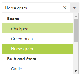
Group template
The group header title under which appropriate sub-items are categorized can also be customize with the help of GroupTemplate property.
This template is common for both inline and floating group header template.
In the following sample, Countries are grouped according to the category.
<div class="control">
    <ej:ComboBox ID="groupingCountry" runat="server" DataTextField="text" DataGroupByField="category"  GroupTemplate="<ul>${category}</ul>" Placeholder="Select a country" Width="100%"></ej:ComboBox>
</div>
protected void Page_Load(object sender, EventArgs e)
{
this.groupingCountry.DataSource = Countries.GetCountries();
}
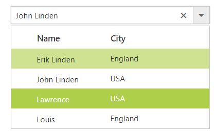
Header template
The header element is shown statically at the top of the popup list items within the ComboBox, and any custom element can be placed as a header element using the
HeaderTemplate property.
In the following sample, the list items and its headers are designed and displayed as two columns similar to multiple columns of the grid.
<ej:ComboBox ID="empList" runat="server" Width="100%" DataTextField="text"
                    HeaderTemplate="<span class='head'><span class='name'>Name</span><span class='city'>City</span></span>"
Placeholder="Select a country"></ej:ComboBox><style>
#loader {
color: #008cff;
height: 40px;
width: 30%;
position: absolute;
top: 45%;
left: 45%;
}
.head, .item{
display: table;
width:100%;
margin:auto;
}
.head{
height: 40px;
font-size:15px;
font-weight:600;
}
.name, .city{
display: table-cell;
vertical-align: middle;
width: 50%;
}
.head .name {
text-indent: 16px;
}
.head .city {
text-indent: 10px;
}
.city{
right: 15px;
position: absolute;
}
</style>public partial class Template : System.Web.UI.Page
{
protected void Page_Load(object sender, EventArgs e)
{
this.empList.DataSource = empList.GetEmpList();
}
}
public class empList
{
public string text { get; set; }
public string eimg { get; set; }
public string status { get; set; }
public string country { get; set; }
public static List<empList> GetEmpList()
{
List<empList> emp = new List<empList>();
emp.Add(new empList { text = "John Linden", eimg = "1", status = "Available", country = "USA" });
emp.Add(new empList { text = "Louis", eimg = "2", status = "Available", country = "USA" });
emp.Add(new empList { text = "Erik Linden", eimg = "3", status = "Available", country = "England" });
emp.Add(new empList { text = "Tam", eimg = "4", status = "Available", country = "England" });
emp.Add(new empList { text = "Lawrence", eimg = "5", status = "Available", country = "USA" });
return emp;
}
}
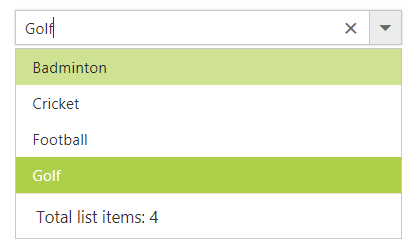
Footer template
The ComboBox has options to show a footer element at the bottom of the list items in the popup list. Here, you can place any custom element as a footer element using the FooterTemplate property.
In the following sample, footer element displays the total number of list items present in the ComboBox.
<ej:ComboBox ID="selectCountry" runat="server" Width="100%" DataTextField="text"
                    FooterTemplate="<span class='foot'> Total list items: 5 </span>"
Placeholder="Select a country"></ej:ComboBox><style>
#container {
visibility: hidden;
}
#loader {
color: #008cff;
height: 40px;
width: 30%;
position: absolute;
top: 45%;
left: 45%;
}
.foot{
text-indent: 1.2em;
display: block;
font-size: 15px;
line-height: 40px;
border-top: 1px solid #e0e0e0;
}
</style>public partial class Template : System.Web.UI.Page
{
protected void Page_Load(object sender, EventArgs e)
{
this.selectCountry.DataSource = empList.GetEmpList();
}
}
public class empList
{
public string text { get; set; }
public string eimg { get; set; }
public string status { get; set; }
public string country { get; set; }
public static List<empList> GetEmpList()
{
List<empList> emp = new List<empList>();
emp.Add(new empList { text = "John Linden", eimg = "1", status = "Available", country = "USA" });
emp.Add(new empList { text = "Louis", eimg = "2", status = "Available", country = "USA" });
emp.Add(new empList { text = "Erik Linden", eimg = "3", status = "Available", country = "England" });
emp.Add(new empList { text = "Tam", eimg = "4", status = "Available", country = "England" });
emp.Add(new empList { text = "Lawrence", eimg = "5", status = "Available", country = "USA" });
return emp;
}
}
No records template
The ComboBox is provided with support to custom design the popup list content when no data is found and no matches found on search with the help of NoRecordsTemplate property.
In the following sample, popup list content displays the notification of no data available.
<ej:ComboBox ID="searchCustomer" AutoFill="true" runat="server" Width="100%" DataTextField="ContactName" NoRecordsTemplate="<span class='norecord'> NO DATA AVAILABLE</span>" Placeholder="Search a customer">
    <DataManager URL="http://js.syncfusion.com/ejServices/wcf/NorthWind.svc/"  CrossDomain="true"></DataManager>
</ej:ComboBox>
protected void Page_Load(object sender, EventArgs e)
{
this.searchCustomer.Query = "ej.Query().from('Suppliers').select('SupplierID', 'ContactName').take(0)";
}<style>
.record:before{
content: '\e7c3';
font-family: 'e-icons';
font-size: 18px;
margin-left: -25px;
margin-top: -3px;
position: absolute;
}
</style>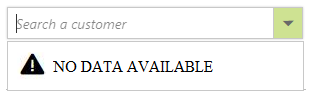
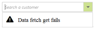
Action failure template
There is also an option to custom design the popup list content when the data fetch request fails at the remote server. This can be achieved using the
ActionFailureTemplate property.
In the following sample, when the data fetch request fails, the ComboBox displays the notification.
<ej:ComboBox ID="searchCustomer" AutoFill="true" runat="server" Width="100%" DataTextField="ContactName" ActionFailureTemplate="<span class='action-failure'> Data fetch get fails</span>" Placeholder="Search a customer">
    <DataManager URL="http://js.syncfusion.com/ejServices/wcf/NorthWind.svcs/"  CrossDomain="true"></DataManager>
</ej:ComboBox>
protected void Page_Load(object sender, EventArgs e)
{
this.searchCustomer.Query = "ej.Query().from('Suppliers').select('SupplierID', 'ContactName').take(0)";
}<style>
.action-failure:before{
content: '\e7c4';
font-family: 'e-icons';
font-size: 18px;
margin-top: -4px;
position: absolute;
margin-left: -25px;
}
</style>