How can I help you?
Axis in ASP.NET Webforms Chart
Charts typically have two axes that are used to measure and categorize data: a vertical (y) axis, and a horizontal (x) axis.
Vertical axis always uses numerical or logarithmic scale. Horizontal(x) axis supports the following types of scale:
- Category
- Numeric
- DateTime
- DateTime Category
- Logarithmic
Category Axis
Category axis displays the text labels instead of numbers. To use the categorical axis, you can set the ValueType property of the axis to the Category. Default value of ValueType is Double.
@(Html.EJ().Chart("chartContainer")

      // ...

     .PrimaryXAxis(
          //Use categorical scale in primary X axis
          px=>px.ValueType(AxisValueType.Category)
     )
        // ...
    )
Click here to view our online demo sample that uses Category axis.
Place labels on ticks
Labels in the category axis can be placed on the ticks by setting the LabelPlacement property of axis to the onTicks. The default value of the LabelPlacement property is betweenTicks i.e. labels are placed between the ticks, by default.
@(Html.EJ().Chart("chartContainer")

      // ...

     .PrimaryXAxis(
          //Placing X-axis labels on the ticks
          px=>px.LabelPlacement("onTicks")
     )
        // ...
    )
Display labels after a fixed interval
To display the labels after a fixed interval n, you can set the Interval property of the axis range as n. The default value of the interval is 1 i.e. all the labels are displayed.
@(Html.EJ().Chart("chartContainer")

      // ...

     .PrimaryXAxis(
          //Displaying labels after 2 intervals
          axis=>axis.Range(range=>range.Interval(2))
     )
        // ...
    )
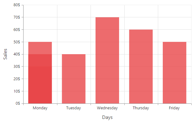
Indexed Category Axis
Category axis can also plot points based on index value of data points. Index based plotting can be enabled by setting IsIndexed property to true in the axis.
<ej:Chart ID="Chart1" runat="server">
         <PrimaryXAxis IsIndexed="true"></PrimaryXAxis>
       <Series>
          <ej:Series>
              <Points>
                  <ej:Points X="Monday" Y="50"></ej:Points>
                  <ej:Points X="Tuesday" Y="40"></ej:Points>
                  <ej:Points X="Wednesday" Y="70"></ej:Points>
                  <ej:Points X="Thursday" Y="60"></ej:Points>
                  <ej:Points X="Friday" Y="50"></ej:Points>
                  <ej:Points X="Monday" Y="40"></ej:Points>
                  <ej:Points X="Monday" Y="30"></ej:Points>
              </Points>
          </ej:Series>
       </Series>
    </ej:Chart>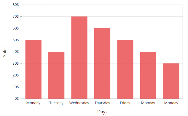
While Category axis isIndexed value false
Numeric Axis
Numeric axis uses numerical scale and displays numbers as labels. To use numeric axis, you can set the ValueType property of the axis to Double.
<ej:Chart ID="Chart1" runat="server">
            <%--Use numerical scale in primary Y axis--%>
            <PrimaryYAxis ValueType="Double"></PrimaryYAxis>
        </ej:Chart>
Customize numeric range
To customize the range of an axis, you can use the Range property of the axis to set the Minimum, Maximum and Interval values. Nice range is calculated automatically based on the provided data, by default.
<ej:Chart ID="Chart1" runat="server">
    <PrimaryYAxis>
        <%--Customizing Y-axis range--%>
        <Range Min="0" Max="50" />
    </PrimaryYAxis>
</ej:Chart>
Customizing numeric interval
Axis interval can be customized by using the Interval property of the axis range. Nice interval is calculated based on the minimum and maximum value of the provided data, by default.
<ej:Chart ID="Chart1" runat="server">
    <PrimaryYAxis>
        <%--Set interval to PrimaryYAxis--%>
        <Range Interval="5"/>
    </PrimaryYAxis>
</ej:Chart>
Apply padding to the range
Padding can be applied to the minimum and maximum extremes of the axis range by using the RangePadding property. Numeric axis supports the following types of padding
- None
- Round
- Additional
- Normal
None
When the value of the RangePadding property is None, padding can not be applied to the axis. This is also the default value of the rangePadding.
<ej:Chart ID="Chart1" runat="server">
    <%--Applying none as range padding--%>
    <PrimaryYAxis RangePadding="None">
    </PrimaryYAxis>
</ej:Chart>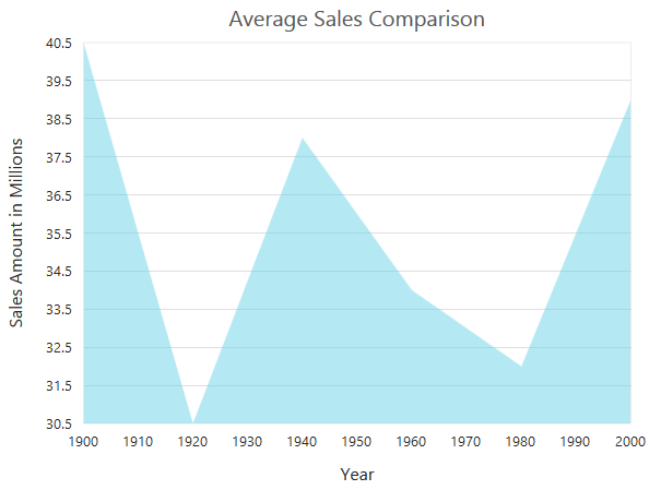
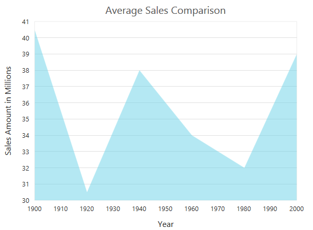
Round
When the value of RangePadding property is Round, the axis range is rounded to the nearest possible value divided by the interval.
<ej:Chart ID="Chart1" runat="server">
<%--Applying round as range padding--%>
<PrimaryYAxis RangePadding="Round">
</PrimaryYAxis>
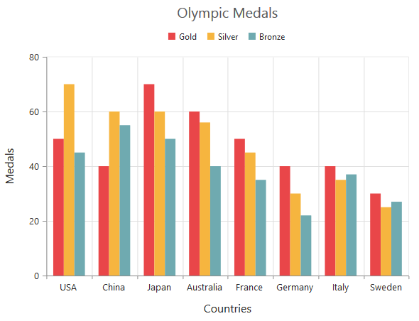
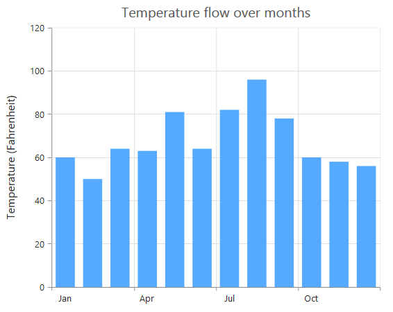
</ej:Chart>Chart before rounding axis range

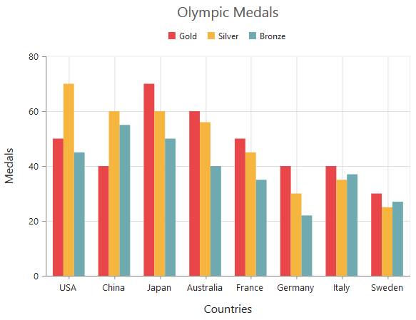
Chart after rounding axis range
Additional
When the value of the RangePadding property is Additional, the axis range is rounded and an interval of the axis is added as padding to the minimum and maximum values of the range.
<ej:Chart ID="Chart1" runat="server">
    <%--Applying additional as range padding--%>
    <PrimaryYAxis RangePadding="Additional">
    </PrimaryYAxis>
</ej:Chart>
Normal
When the value of the RangePadding property is Normal, the padding is applied to the axis based on the range calculation.
<ej:Chart ID="Chart1" runat="server">
    <%--Applying normal as range padding--%>
    <PrimaryYAxis RangePadding="Normal">
    </PrimaryYAxis>
</ej:Chart>
Customizing the starting range of the axis
By default the Y axis will be always calculated from the value 0 for column, bar, stacking column and stacking bar series types. You can modify this behavior by setting false to the property startFromZero in the axis. On setting this the axis minimum value will be calculated based on the value for the data points.
<ej:Chart ID="chartcontainer" runat="server">
         <PrimaryYAxis RangePadding="None" StartFromZero="false" />
      </ej:Chart>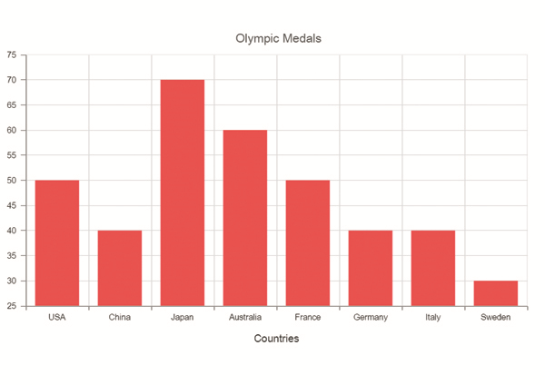
DateTime Axis
Date time axis uses date time scale and displays the date time values as axis labels in the specified format. To use date time axis, set the ValueType property of the axis to Datetime.
<ej:Chart ID="Chart1" runat="server">
    <%--Use date time scale in primary X axis--%>
    <PrimaryXAxis ValueType="Datetime">
    </PrimaryXAxis>
</ej:Chart>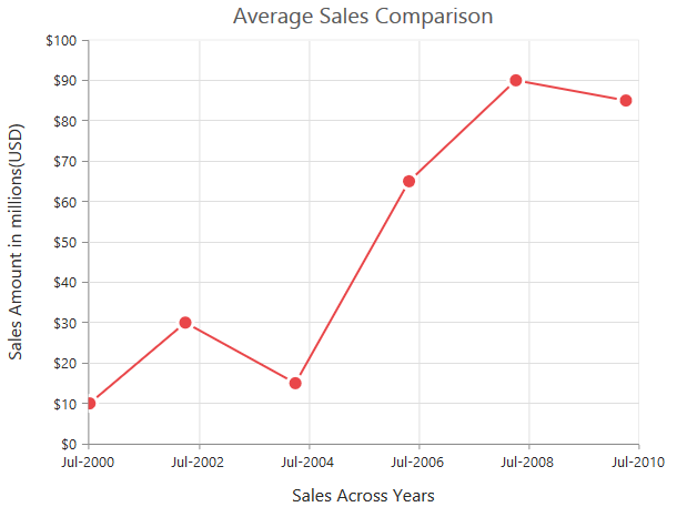
Click here to view our online demo sample for date time axis.
Customizing date time range
Axis range can be customized by using the Range property to set the Minimum, Maximum and Interval values. Nice range is calculated automatically based on the provided data, by default.
<ej:Chart ID="Chart1" runat="server">
    <%--Customizing X-axis date time range--%>
    <PrimaryXAxis>
        <Range Min="2000/6/1" Max="2010/6/1" />
    </PrimaryXAxis>
</ej:Chart>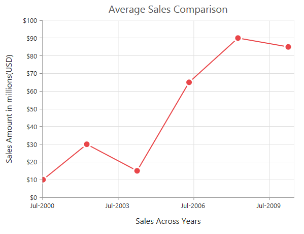
Date time intervals
Date time intervals can be customized by using the Interval and IntervalType properties of the axis. For example, when you set Interval as 2 and IntervalType as Years, it considers the 2 years as interval.
Essential Chart supports the following types of interval for date time axis.
- Days
- Hours
- Milliseconds
- Minutes
- Months
- Seconds
- Years
<ej:Chart ID="Chart1" runat="server">
    <%--Customizing X-axis date time interval--%>
    <PrimaryXAxis IntervalType="Years">
        <Range Interval="2" />
    </PrimaryXAxis>
</ej:Chart>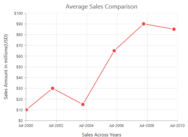
Apply padding to the range
Padding can be applied to the minimum and maximum extremes of the range by using the RangePadding property. Date time axis supports the following types of padding
- None
- Round
- Additional
None
When the value of the RangePadding property is None, padding is applied to the axis. This is also the default value of the rangePadding.
<ej:Chart ID="Chart1" runat="server">
    <%--Applying none as range padding--%>
    <PrimaryXAxis RangePadding="None">
    </PrimaryXAxis>
</ej:Chart>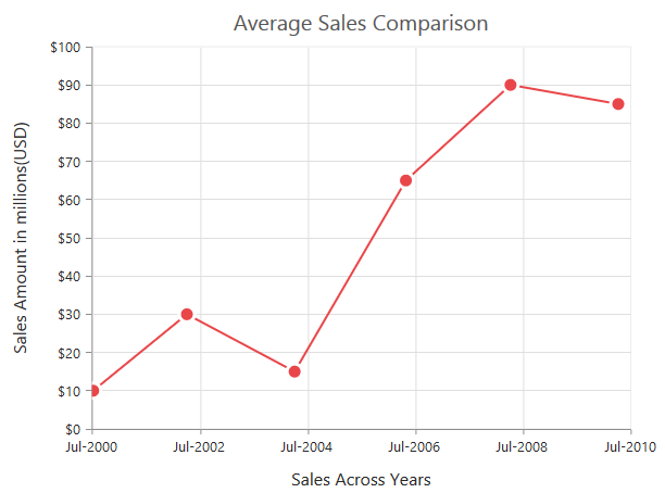
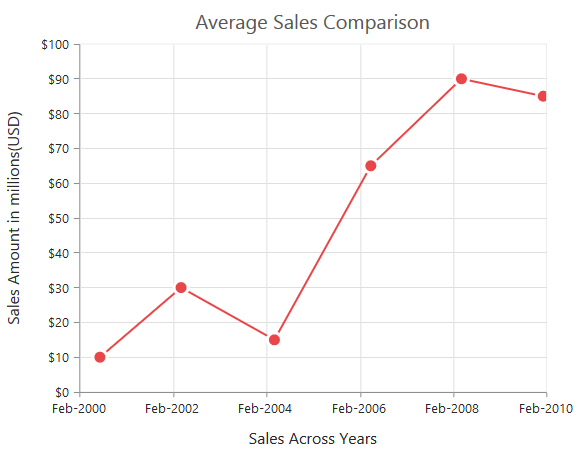
Round
When the value of the RangePadding property is Round, the axis range is rounded to the nearest possible date time value.
<ej:Chart ID="Chart1" runat="server">
    <%--Applying round as range padding--%>
    <PrimaryXAxis RangePadding="Round">
    </PrimaryXAxis>
</ej:Chart>
Chart before rounding axis range
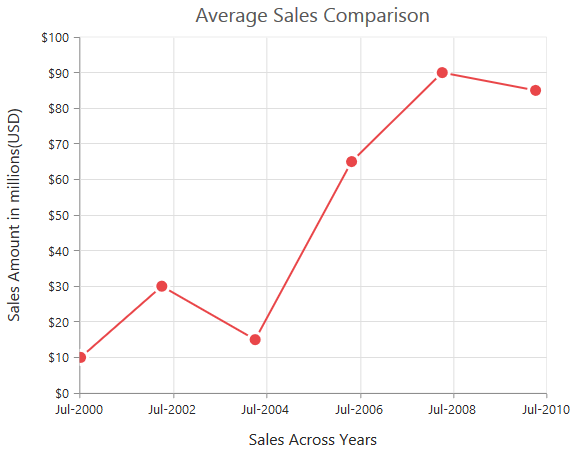
Chart after rounding axis range
Additional
When the value of the RangePadding property is Additional, the range is rounded and date time interval of the axis are added as padding to the minimum and maximum extremes of the range.
<ej:Chart ID="Chart1" runat="server">
    <%--Applying additional as range padding--%>
    <PrimaryXAxis RangePadding="Additional">
    </PrimaryXAxis>
</ej:Chart>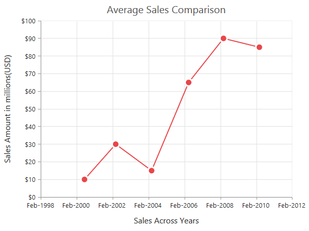
DateTime Category Axis
DateTime category axis takes date time value as input but behaves like category axis. This is used to display the date time values with nonlinear intervals (used to depict the business days by skipping holidays). To use date time axis, set the ValueType property of the axis to DateTimeCategory.
<ej:Chart ID="chartcontainer" runat="server">
         <PrimaryXAxis ValueType="DateTimeCategory"/>
</ej:Chart>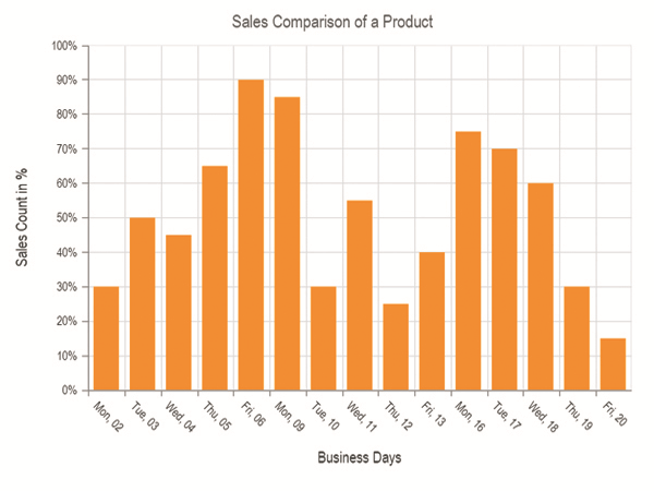
Click here to view our online demo sample for date time axis.
Customizing DateTime Category range
Axis range can be customized by using the Range property to set the Minimum, Maximum and Interval values. Datetime category axis takes numeric input for minimum and maximum property.
<ej:Chart ID="chartcontainer" runat="server">
       <%--Customizing X-axis date time category range--%>
         <PrimaryXAxis>
            <Range Min=0 Max=4/>
         </PrimaryXAxis>
      </ej:Chart>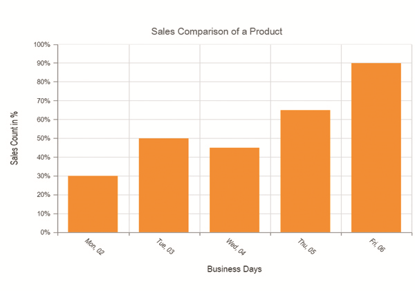
DateTime Category intervals
Date time category intervals can be customized by using the Interval and IntervalType properties of the axis. For example, when you set the intervalType as months, it displays only the first label of all the months from the data.
Essential Chart supports the following types of interval for date time category axis.
- Days
- Hours
- Milliseconds
- Minutes
- Months
- Seconds
- Years
- Auto
<ej:Chart ID="chartcontainer" runat="server">
         <PrimaryXAxis IntervalType="Months"/>
      </ej:Chart>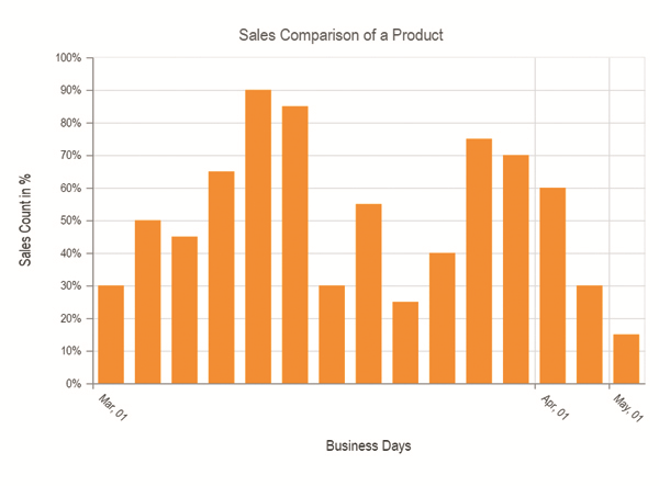
Logarithmic Axis
Logarithmic axis uses logarithmic scale and it is very useful in visualizing when the data has values with both lower order of magnitude (eg: 10-6) and higher order of magnitude (eg: 106). To use logarithmic axis, set the ValueType property of the axis to Logarithmic.
<ej:Chart ID="Chart1" runat="server">
    <%--Use logarithmic scale in primary X axis--%>
    <PrimaryXAxis ValueType="Logarithmic">
    </PrimaryXAxis>
</ej:Chart>
Click here to view our online demo sample link for logarithmic axis.
Customize Logarithmic range
Logarithmic range can be customized by using the Range property of the axis to change the Minimum, Maximum and Interval values. Nice range is calculated automatically based on the provided data, by default.
<ej:Chart ID="Chart1" runat="server">
    <%--Customizing logarithmic range--%>
    <PrimaryYAxis>
        <Range Min="1" Max="5" />
    </PrimaryYAxis>
</ej:Chart>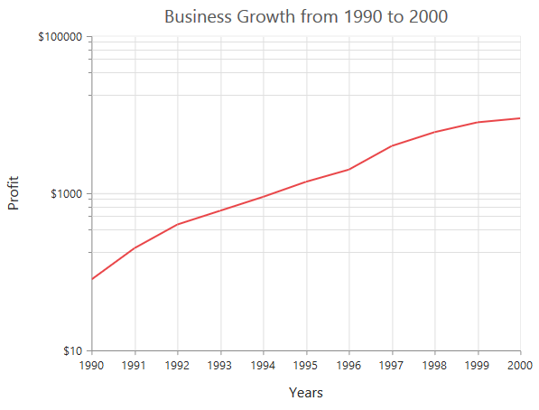
Logarithmic base
Logarithmic base can be customized by using the LogBase property of the axis. The default value of the LogBase is 10.
<ej:Chart ID="Chart1" runat="server">
    <%--Customizing logarithmic base--%>
    <PrimaryYAxis LogBase="2">
    </PrimaryYAxis>
</ej:Chart>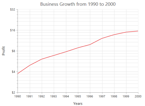
Logarithmic interval
Logarithmic axis interval can be customized by using the Interval property of the axis. When the logarithmic base is 10 and logarithmic interval is 2, then the axis labels are placed at an interval of 102. The default value of the interval is 1.
<ej:Chart ID="Chart1" runat="server">
    <%--Customizing logarithmic interval--%>
    <PrimaryYAxis>
        <Range Interval="2" />
    </PrimaryYAxis>
</ej:Chart>
Label Format
Format numeric labels
Numeric labels can be formatted by using the LabelFormat property. Numeric values can be formatted with n (number with decimal points), c (currency) and p (percentage) commands.
<ej:Chart ID="Chart1" runat="server">
    <%--Applying currency format to axis labels--%>
    <PrimaryXAxis LabelFormat="c">
    </PrimaryXAxis>
</ej:Chart>
The following table describes the result of applying some commonly used label formats on numeric values.
| Label Value | Label Format property value | Result | Description |
| 1000 | n1 | 1000.0 | The Number is rounded to 1 decimal place |
| 1000 | n2 | 1000.00 | The Number is rounded to 2 decimal place |
| 1000 | n3 | 1000.000 | The Number is rounded to 3 decimal place |
| 0.01 | p1 | 1.0% | The Number is converted to percentage with 1 decimal place |
| 0.01 | p2 | 1.00% | The Number is converted to percentage with 2 decimal place |
| 0.01 | p3 | 1.000% | The Number is converted to percentage with 3 decimal place |
| 1000 | c1 | $1,000.0 | The Currency symbol is appended to number and number is rounded to 1 decimal place |
| 1000 | c2 | $1,000.00 | The Currency symbol is appended to number and number is rounded to 2 decimal place |
Format date time values
Date time labels can be formatted by using the LabelFormat property of the axis.
<ej:Chart ID="Chart1" runat="server">
    <%--Formatting date time labels in date/Month name/Year format--%>
    <PrimaryXAxis LabelFormat="dd/MMMM/yyyy">
    </PrimaryXAxis>
</ej:Chart>
The following table describes the result of applying some common date time formats to the labelFormat property
| Label Value | Label Format Property Value | Result | Description |
| new Date(2000, 03, 10) | dddd | Monday | The Date is displayed in day format |
| new Date(2000, 03, 10) | MM/dd/yyyy | 04/10/2000 | The Date is displayed in month/date/year format |
| new Date(2000, 03, 10) | n3 | 1000.000 | The Number is rounded to 3 decimal place |
| new Date(2000, 03, 10) | MMM | Apr | The Shorthand month for the date is displayed |
| new Date(2000, 03, 10) | t | 12:00 AM | Time of the date value is displayed as label |
| new Date(2000, 03, 10) | hh:mm:ss | 12:00:00 | The Label is displayed in hours:minutes:seconds format |
Custom label format
Prefix and suffix can be added to the category labels by using the LabelFormat property. You can use the {value} as placeholder text in your custom text, it is replaced with the corresponding axis label at the runtime.
<ej:Chart ID="Chart1" runat="server">
    <%--Adding prefix and suffix to axis labels--%>
    <PrimaryXAxis LabelFormat="${value} K">
    </PrimaryXAxis>
</ej:Chart>
Common axis features
Customization of features such as axis title, labels, grid lines and tick lines are common to all the axis. Each of these features are explained in this section.
Axis Crossing
Axis can be positioned anywhere in chart area using the CrossesAt property of axis. This property specifies where the horizontal axis should intersect or cross the vertical axis and vice versa. Default value of CrossesAt property is null.
<ej:Chart ID="Chart1" runat="server">

		<%--Cross primary Y axis at 0--%>
		<PrimaryXAxis CrossesAt="0">
		</PrimaryXAxis>

	</ej:Chart>
Crossing a specific Axis
The CrossesInAxis property takes axis name as input and determines the axis used for crossing. By default all the horizontal axes crosses in primary Y axis and all the vertical axes crosses in primary X axis.
<ej:Chart ID="Chart1" runat="server">

		<%--Crosses secondary vertical axis at -0.2 --%>
		<PrimaryXAxis CrossesAt="-0.2" CrossesInAxis="SecondaryYAxis">
		</PrimaryXAxis>

	</ej:Chart>
Axis will be placed in the opposite side if value of CrossesAt property is greater than the maximum value of crossing axis (axis name provided through CrossesInAxis property or primary Y axis for horizontal axis).
<ej:Chart ID="Chart1" runat="server">

		<%--Crosses primary Y axis at a value greater than its maximum --%>
		<PrimaryXAxis CrossesAt="200">
		</PrimaryXAxis>

	</ej:Chart>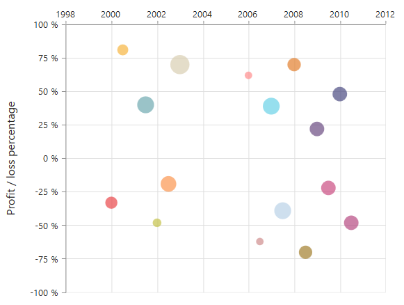
Positioning the axis elements while crossing
The ShowNextToAxisLine property is used for controlling the axis elements movement along with the axis line while axis crossing is performed. When the showNextToAxisLine is set as false only the axis line and the tick lines are placed at the crossing Value and the axis elements will be placed outside the chart area. The default value of ShowNextToAxisLine is true.
<ej:Chart ID="Chart1" runat="server">

		<%--Crosses primary Y axis at the value 0 --%>
		<PrimaryXAxis CrossesAt="0" ShowNextToAxisLine="false" >
		</PrimaryXAxis>

	</ej:Chart>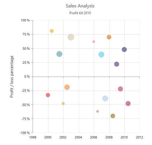
Axis Visibility
Axis visibility can be controlled by using the Visible property of the axis. The default value of the Visible property is true.
<ej:Chart ID="Chart1" runat="server">
    <%--Disabling visibility of Y-axis--%>
    <PrimaryYAxis Visible="false">
    </PrimaryYAxis>
</ej:Chart>
Axis title
The Title property in the axis provides options to customize the text and font of the axis title. Axis does not display the title, by default. Title text can also be trimmed based on the title text length or specified length.
<ej:Chart ID="Chart1" runat="server">
    <%--Customizing axis title--%>
    <PrimaryXAxis EnableTrim="true">
        <Title Text="Month" MaximumTitleWidth="80">
            <Font Color="grey" FontWeight="Bold" FontFamily="Segoe UI" FontSize="16px">
            </Font>
        </Title>
    </PrimaryXAxis>
</ej:Chart>
You can modify the position of the axis title either inside or outside the chart area using the property Position. By default, it will be placed outside the chart area. In addition, you can also change the alignment of the title to near, far and center by Alignment property, using Offset property you can change the position with respect to pixels.
<ej:Chart  ID="Chart1" runat="server">
        <PrimaryXAxis Title-Position="Inside" Title-Alignment="Near" Title-Offset="10"/>
    </ej:Chart>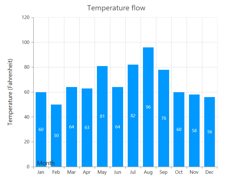
Label customization
The Font property of the axis provides options to customize the FontFamily, Color, Opacity, Size and FontWeight of the axis labels.
<ej:Chart ID="Chart1" runat="server">
    <%--Customizing label appearance--%>
    <PrimaryXAxis EnableTrim="true">
            <Font Color="blue" FontWeight="Bold" FontFamily="Segoe UI" FontSize="14px">
            </Font>
    </PrimaryXAxis>
</ej:Chart>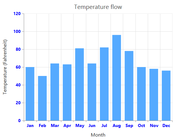
Axis Labels Line Break
Axis Labels can be placed in multiple lines by specifying
for data points x value and in label format.
For category value type,
can be specified in x value of data points.
<ej:Chart ID="Chart1" runat="server">
    <Series>
       <ej:Series>
           <Points>
               <ej:Points X="India" Y="61.3"></ej:Points>
               <ej:Points X="United<br>States<br>of<br>America" Y="31"></ej:Points>
               <ej:Points X="South<br>Korea" Y="39.4"></ej:Points>
               <ej:Points X="United<br>Arab<br>Emirates" Y="65.1"></ej:Points>
               <ej:Points X="United<br>Kingdom" Y="75.9"></ej:Points>
           </Points>
       </ej:Series>
    </Series>
</ej:Chart>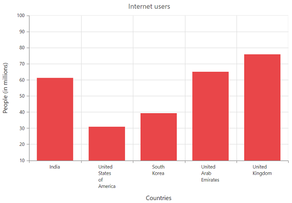
For numeric, datetime and datetimeCategory value type,
can be specified in labelFormat.
<ej:Chart ID="Chart1" runat="server">
    <PrimaryXAxis LabelFormat="MMM<br>dd<br>yyyy" ValueType="Datetime">
    </PrimaryXAxis>
</ej:Chart>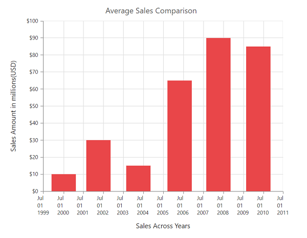
Label and tick positioning
Axis labels and ticks can be positioned inside or outside the chart area by using the LabelPosition and TickPosition properties. The labels and ticks are positioned outside the chart area, by default.
<ej:Chart ID="Chart1" runat="server">
    <%--Customizing label and tick positions--%>
    <PrimaryXAxis AxislabelPosition="Inside" TickLinesPosition="Inside">
    </PrimaryXAxis>
</ej:Chart>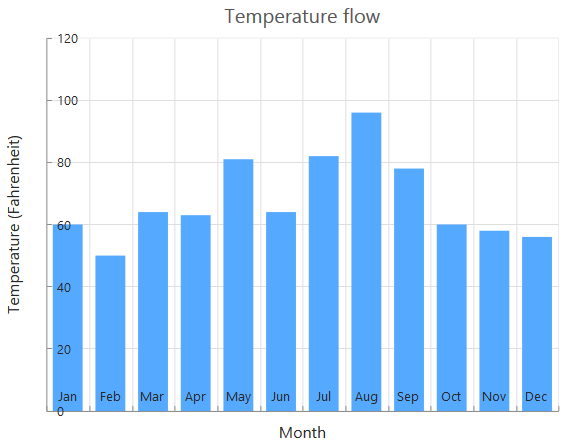
Edge labels placement
Labels with long text at the edges of an axis may appear partially outside the chart. The EdgeLabelPlacement property can be used to avoid the partial appearance of the labels at the corners.
<ej:Chart ID="Chart1" runat="server">
<%--Customizing edge label placement--%>
<PrimaryXAxis EdgeLabelPlacement="Shift">
</PrimaryXAxis>
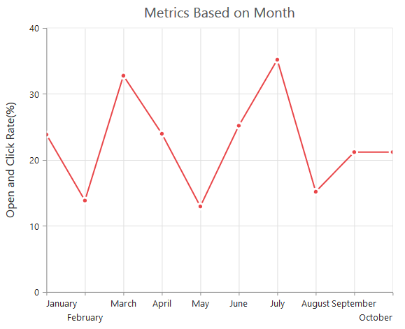
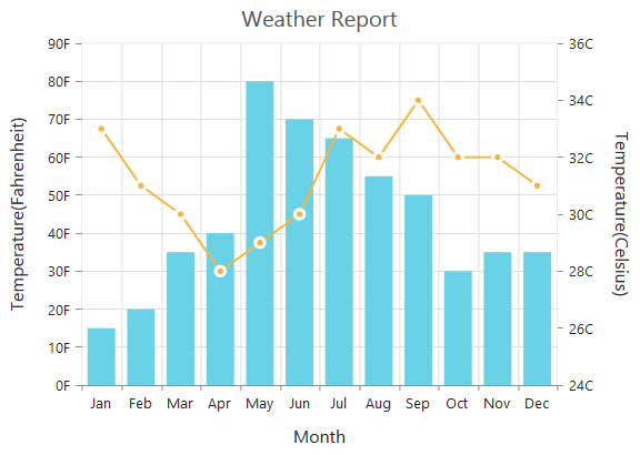
</ej:Chart>Chart before setting edge label placement to X-axis
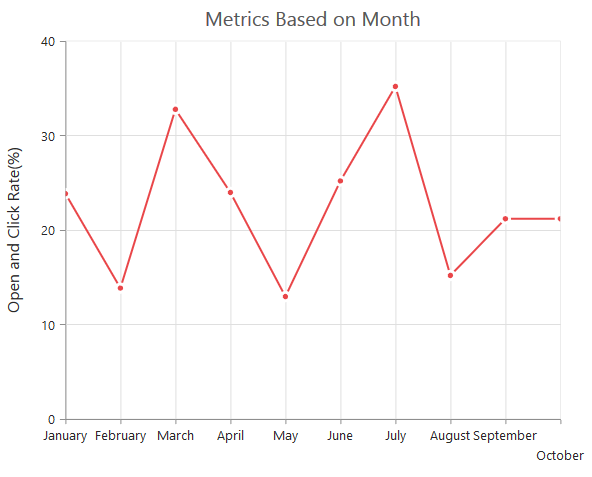
Chart after setting edge label placement to X-axis
Grid lines customization
The MajorGridLines and MinorGridLines properties in the axis are used to customize the major grid lines and minor grid lines of an axis. They provide options to change the Width, Color, Visibility and Opacity of the grid lines. The minor grid lines are not visible, by default.
<ej:Chart ID="Chart1" runat="server">
    <%--Customizing grid lines--%>
    <PrimaryXAxis MinorTicksPerInterval="0">
        <MajorGridLines Color="blue" Visible="true" Width="1" />
        <MinorGridLines Color="red" Visible="false" Width="1" />
    </PrimaryXAxis>
</ej:Chart>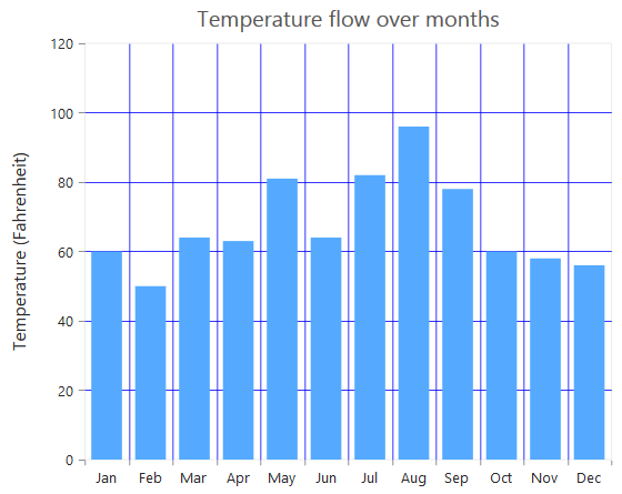
Tick lines customization
The MajorTickLines and MinorTickLines properties in the axis are used to customize the major tick lines of an axis and minor tick lines of an axis. They provide options to change the Width, Size, Color and Visibility of the grid lines. The minor tick lines are not visible, by default.
<ej:Chart ID="Chart1" runat="server">
    <%--Customizing grid lines--%>
    <PrimaryXAxis MinorTicksPerInterval="0">
        <MajorTickLines Color="blue" Visible="true" Width="1" Size="5" />
        <MinorTickLines Color="red" Visible="false" Width="1" Size="5" />
    </PrimaryXAxis>
</ej:Chart>
Inversing axis
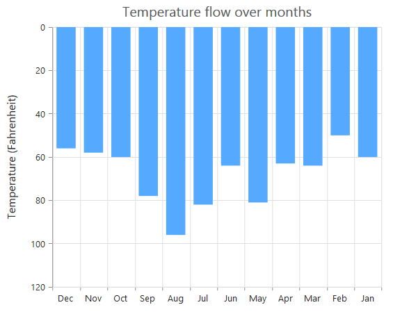
Axis can be inversed by using the IsInversed property of the axis. The default value of the IsInversed property is false.
<ej:Chart ID="Chart1" runat="server">
    <%--Inversing the X-axis--%>
    <PrimaryXAxis IsInversed="false">
    </PrimaryXAxis>
</ej:Chart>
Chart before inversing the axes

Chart after inversing the axes
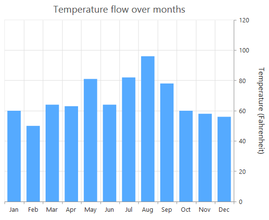
Place axes at the opposite side
The OpposedPosition property of axis can be used to place the axis at the opposite side of its default position. The default value of the OpposedPosition property is false.
<ej:Chart ID="Chart1" runat="server">
    <%--Placing axis at the opposite side of its normal position--%>
    <PrimaryXAxis OpposedPosition="true">
    </PrimaryXAxis>
</ej:Chart>
Chart with X and Y axes at normal position
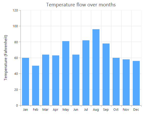
Chart with Y-axis at opposed position
Maximum number of labels per 100 pixels
A maximum of 3 labels are displayed for each 100 pixels in the axis, by default. The maximum number of labels that is present within the 100 pixels length can be customized by using the MaximumLabels property of the axis. This property is applicable only for an automatic range calculation and it does not work when you set the value for Interval property in the axis range.
<ej:Chart ID="Chart1" runat="server">
    <%--Maximum number of labels per 100 pixels--%>
    <PrimaryXAxis MaximumLabels="1">
    </PrimaryXAxis>
</ej:Chart>
Chart before setting maximum labels per 100 pixels
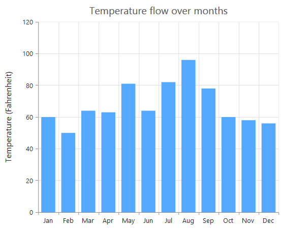
Chart after setting maximum labels one per 100 pixels
Multiple Axis
Multiple axes can be used in the Chart and chart area can be split into multiple panes to draw multiple series with multiple axes.
An additional horizontal or vertical axis can be added to the chart by adding an axis instance to the Axes collection and then you can associate it to a series by specifying the name of the axis to the XAxisName or YAxisName property of the series.
<ej:Chart ID="Chart1" runat="server">
    <Axes>
        <%--Creating a secondary horizontal axis--%>
        <ej:Axis Name="SecondaryX">
        </ej:Axis>
        <ej:Axis Name="SecondaryY"></ej:Axis>
    </Axes>
    <Series>
        <ej:Series XAxisName="SecondaryX" YAxisName="SecondaryY">
        </ej:Series>
    </Series>
</ej:Chart>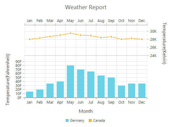
Click here to view the multiple axis online demo sample.
Smart Axis Labels
When the Axis labels overlap with each other based on the chart dimensions and label size, you can use the LabelIntersectAction property of the axis to avoid overlapping. The default value of the LabelIntersectAction is None. The other available values of the Label Intersect Actions are Rotate45, Rotate90, Trim, MultipleRows, Wrap and Hide.
<ej:Chart ID="Chart1" runat="server">
   <%--Avoid overlapping of x-axis labels--%>
    <PrimaryXAxis LabelIntersectAction="MultipleRows"></PrimaryXAxis>
</ej:Chart>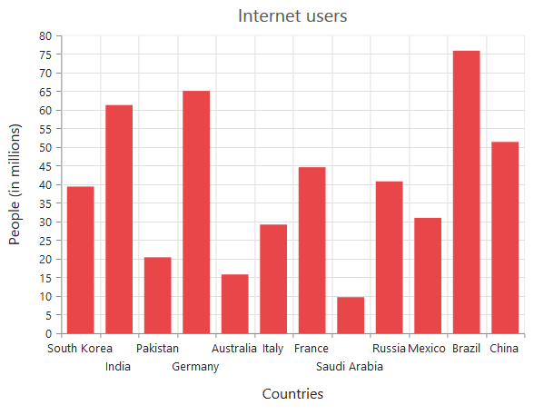
Click here to view our online demo sample for smart axis labels.
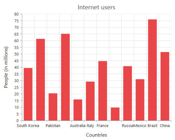
The following screenshot displays the result, when the LabelIntersectAction property is set as Rotate45.
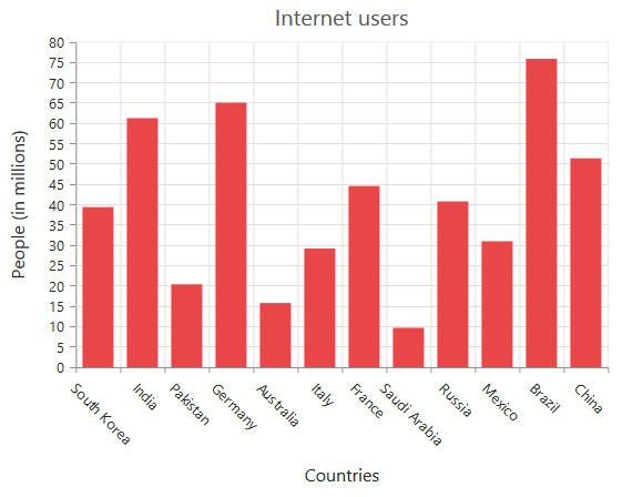
The following screenshot displays the result, when the LabelIntersectAction property is set as Rotate90.
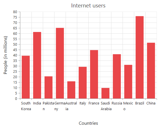
The following screenshot displays the result, when the LabelIntersectAction property is set as Wrap.
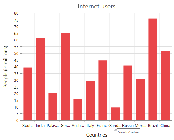
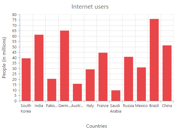
The following screenshot displays the result, when of setting the trim as value to the LabelIntersectAction property.
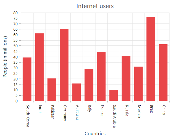
The following screenshot displays the result, when the LabelIntersectAction property is set as Hide.
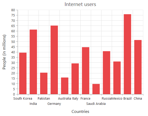
The following screenshot displays the result, when the LabelIntersectAction property is set as **MultipleRows **.
The following screenshot displays the result, when the LabelIntersectAction property is set as WrapByWord.
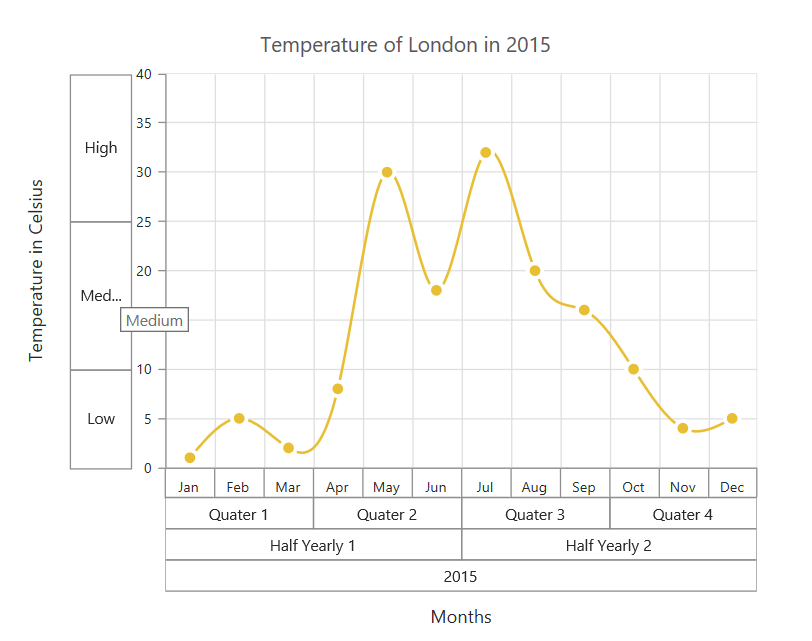
Multi-level Labels
Axis can be customized with multiple levels of labels using the MultiLevelLabels property. These labels are placed based on the start and end range values and we can add any number of labels to an axis.
<ej:Chart ID="Chart1" runat="server">
     <PrimaryXAxis>
        <MultiLevelLabels>
            <ej:MultiLevelLabels Visible="true" Text="Quarter1" Start ="-0.5" End="2.5">
            </ej:MultiLevelLabels>
        </MultiLevelLabels>
      </PrimaryXAxis>
      </ej:Chart>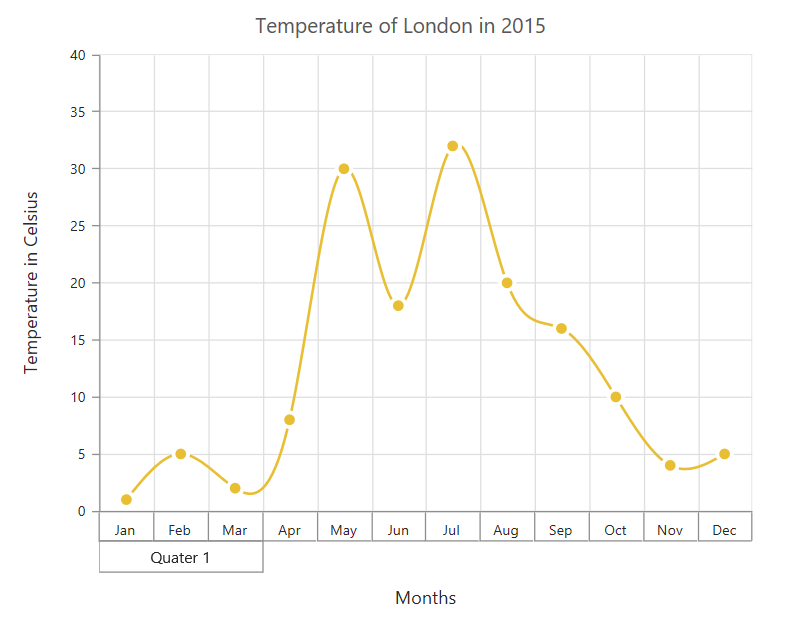
Customizing the multi-Level labels
The color, width and type of the border can be customized. The default border type is Rectangle. And the other supported border types are namely brace, curly brace, without top/bottom border and none.
<ej:Chart ID="Chart1" runat="server">
        <PrimaryXAxis>
         <MultiLevelLabels>
            <ej:MultiLevelLabels Border-Type="Brace" Border-Color="Black" Border-Width="2">
            </ej:MultiLevelLabels>
         </MultiLevelLabels>
        </PrimaryXAxis>
     </ej:Chart>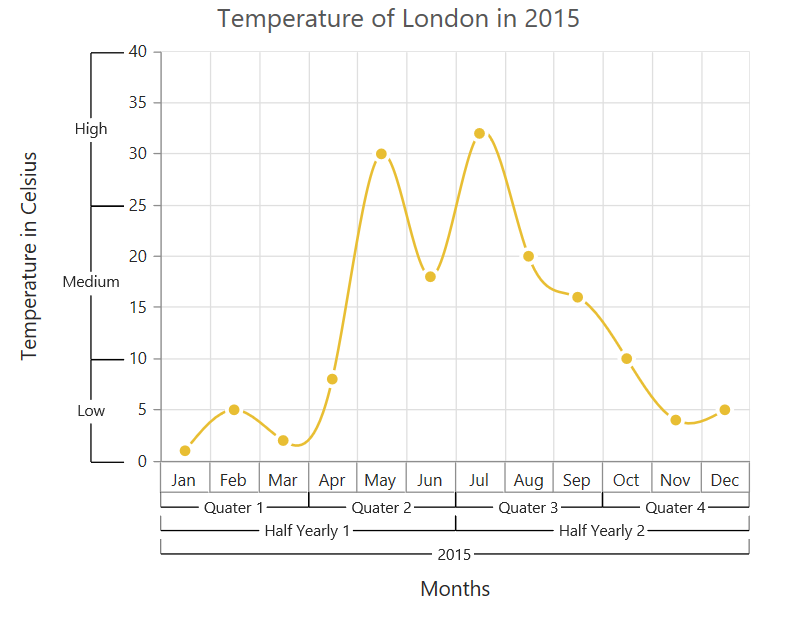
The text of the labels can be customized using the Text and Font properties
<ej:Chart ID="Chart1" runat="server">
        <PrimaryXAxis>
          <MultiLevelLabels>
            <ej:MultiLevelLabels Text="Year - 2015" Font-FontFamily="Algerian"  Font-Size="12px" Font-Color="Black" >
            </ej:MultiLevelLabels>
         </MultiLevelLabels>
         </PrimaryXAxis>
     </ej:Chart>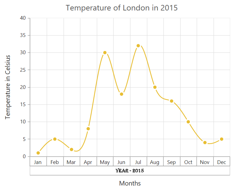
You can change the alignment of the text to far, near and center position using the TextAlignment property. By default, the text will be center aligned.
<ej:Chart ID="Chart1" runat="server">
     <PrimaryXAxis>
      <MultiLevelLabels>
        <ej:MultiLevelLabels TextAlignment="Far">
        </ej:MultiLevelLabels>
      </MultiLevelLabels>
     </PrimaryXAxis>
    </ej:Chart>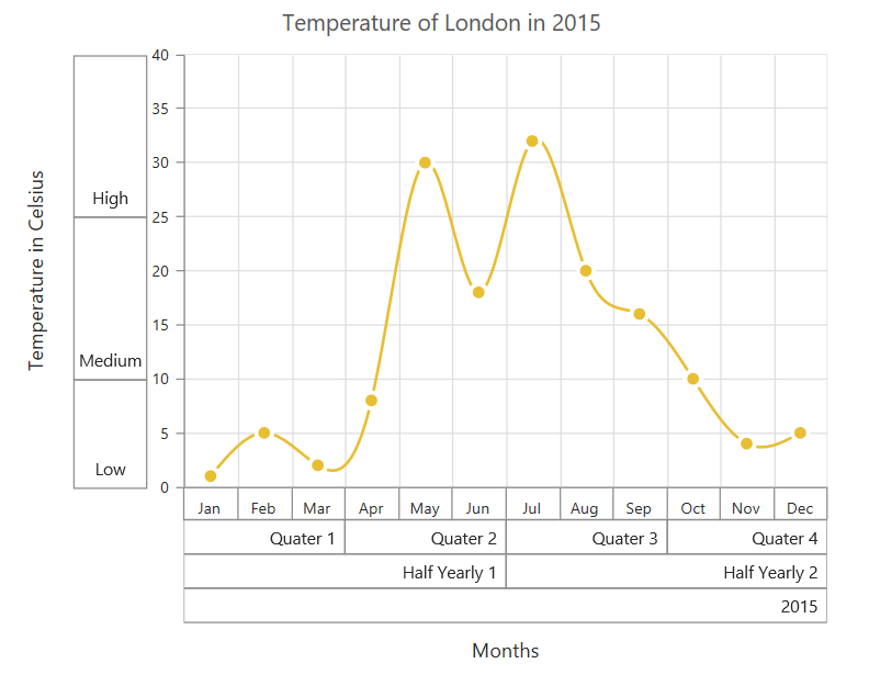
You can trim, wrap or wrapAndTrim the text if it exceeds the maximum text width value using the property TextOverflow
<ej:Chart ID="Chart1" runat="server">
     <PrimaryXAxis>
      <MultiLevelLabels>
        <ej:MultiLevelLabels  TextOverFlow="trim"   MaximumTextWidth="40" >
        </ej:MultiLevelLabels>
      </MultiLevelLabels>
     </PrimaryXAxis>
    </ej:Chart>
The below screenshot shows the trimmed multi-level labels
And these labels can be placed in various rows using the Level property.
Click here to view the multi-level labels online demo sample.