How can I help you?
Custom Buttons in Angular Button
Essential Angular Button control has an option of using normal ejButton as Custom Button to give visual weight to ejButton which helps user interface to notify and differentiate the priority action button with the other normal buttons.
Custom Buttons includes six predefined button styles and each button indicates unique sign of action to the user.
List of Custom Buttons
| Button Types | Class | Description |
|---|---|---|
| Primary Button | e-primary | Provides extra visual weight and identifies the primary action in a set of buttons |
| Link Button | e-link | Deemphasize a button by making it look like a link while maintaining button behavior. |
| Success Button | e-success | Indicates a successful or positive action. |
| Information Button | e-info | Indicates a informative sign action to user |
| Warning Button | e-warning | Indicates the warning action. |
| Danger Button | e-danger | Indicates the danger sign action to user. |
To customize ejButton as anyone type of custom Buttons ,assign CSS class name of the custom button (For Ex:e-success) to cssClass property of ejButton.
The following steps explains you the details about customizing normal ejButton with above mentioned button types.
<table width="500px">
    <tr>
        <td>
            <input id="PrimaryBtn" cssClass='e-primary' size="medium" [showRoundedCorner]="true" contentType="textandimage"  type="button" text="Primary" ej-button/>
			 <td>
            <input id="DangerBtn" cssClass='e-danger' size="medium" [showRoundedCorner]="true" contentType="textandimage"  type="button" text="Danger" ej-button/>
			 <td>
            <input id="InfoBtn" cssClass='e-info' size="medium" [showRoundedCorner]="true" contentType="textandimage" type="button" text="Information" ej-button/>
			 <td>
            <input id="WarningBtn" cssClass='e-warning' size="medium" [showRoundedCorner]="true" contentType="textandimage"  type="button" text="Warning" ej-button/>
			 <td>
            <input id="SuccessBtn" cssClass='e-success' size="medium" [showRoundedCorner]="true" contentType="textandimage"  type="button" text="Success" ej-button/>
			 <td>
            <input id="LinkBtn" cssClass='e-link' size="medium" [showRoundedCorner]="true" contentType="textandimage"  type="button" text="Link" ej-button/>
    </tr>
    </table>

    <style>
    .frame {
            margin: auto;
            width: 400px;
        }

        .control .btnsht {
            width: 125px;
            display: inline-block;
        }
        .e-btn.e-select.e-btn-medium{
            width:115px;
        }

</style>import {Component} from '@angular/core';
@Component({
selector: 'ej-app',
templateUrl: './default.component.html',
})
export class DefaultComponent {
constructor() {
}
}Execute the above code to render the following output.
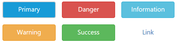
Image in Button
The Essential Studio for Angular has an option of using custom image in a button by assigning a CSS class with background-image to prefixIcon or suffixIcon property of ejButton.Please,refer the following below steps.
Create a custom CSS class with background-image property. Use the following syntax to apply class names.
Syntax: .e-icon .e-[icon name]
<table width="500px">
    <tr>
        <td>
            <button id="button" size="large" [showRoundedCorner]="true" contentType="textandimage"  prefixIcon="e-icon e-profile" type="button" text="Profile" ej-button></button>
    </tr>
    </table>

    <style>
    .e-icon .e-profile{
        background-image: url('profile.png');
    }
</style>import {Component} from '@angular/core';
@Component({
selector: 'ej-app',
templateUrl: './default.component.html',
})
export class DefaultComponent {
constructor() {
}
}Now,assign this custom CSS class name to prefixIcon or suffixIcon property of the ejButton.
Execute the above code to render the following output.