Populating data source in Xamarin Segmented Control
8 Jan 20258 minutes to read
The segmented control can be populated from a collection of strings, views, or a collection of objects in a built-in class.
String collection
The segmented control provides the collection of strings as a data source.
Namespace:

xmlns:sys="clr-namespace:System.Collections.Generic;assembly=netstandard"
...
<ContentPage.Content>
    <buttons:SfSegmentedControl
        VisibleSegmentsCount="3"
        SelectedIndex="2"
        BorderColor="#3F3F3F"
        FontColor="Black"
        Color="Transparent"
        SelectionTextColor="#02A0AE">
        <sys:List x:TypeArguments="x:String">
            <x:String>Formals</x:String>
            <x:String>Casuals</x:String>
            <x:String>Trendy</x:String>
        </sys:List>
    </buttons:SfSegmentedControl>
</ContentPage.Content>
SfSegmentedControl segmentedControl = new SfSegmentedControl();
List<string> clothList = new List<string>
{
"Formals","Casuals","Trendy"
};
segmentedControl.ItemsSource = clothList;
segmentedControl.Color = Color.Transparent;
segmentedControl.VisibleSegmentsCount = 3;
segmentedControl.SelectedIndex = 2;
segmentedControl.BorderColor = Color.FromHex("#3F3F3F");
segmentedControl.FontColor = Color.Black;
segmentedControl.SelectionTextColor = Color.FromHex("#02A0AE");
this.Content = segmentedControl;
Segment items
The segmented control customize the text or icons, or use other built-in customization options available for the segments. Segment item collections can also be used.
The items inside the ItemsSource can be added in the code behind as below.
public class ViewModel
{
    public ObservableCollection<SfSegmentItem> SegmentItems { get; set; }

    public ViewModel()
    {
        SegmentItems = new ObservableCollection<SfSegmentItem>
        {
            new SfSegmentItem(){Text="XS",FontColor=Color.FromHex("#3F3F3F")},
            new SfSegmentItem(){Text="S",FontColor=Color.FromHex("#3F3F3F")},
            new SfSegmentItem(){Text="M",FontColor=Color.FromHex("#3F3F3F")},
            new SfSegmentItem(){Text="L",FontColor=Color.FromHex("#3F3F3F")},
            new SfSegmentItem(){Text="XL",FontColor=Color.FromHex("#3F3F3F")},
        };
    }
}<ContentPage.Content>
<buttons:SfSegmentedControl
CornerRadius="20"
BorderColor="#2C7BBC"
SelectionTextColor="White"
Color="White"
FontColor="#3F3F3F"
VisibleSegmentsCount="5"
ItemsSource="{Binding SegmentItems}">
<buttons:SfSegmentedControl.BindingContext>
<local:ViewModel/>
</buttons:SfSegmentedControl.BindingContext>
</buttons:SfSegmentedControl>
</ContentPage.Content>SfSegmentedControl segmentedControl = new SfSegmentedControl();
segmentedControl.BindingContext = new ViewModel();
segmentedControl.SetBinding(SfSegmentedControl.ItemsSourceProperty, "SegmentItems");
segmentedControl.CornerRadius = 20;
segmentedControl.Color = Color.White;
segmentedControl.VisibleSegmentsCount = 5;
segmentedControl.BorderColor = Color.FromHex("#2C7BBC");
segmentedControl.FontColor = Color.FromHex("#3F3F3F");
segmentedControl.SelectionTextColor = Color.White;
this.Content = segmentedControl;
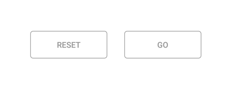
Custom views
Custom views or images can be added as segments in the segmented control.
The items inside the ItemsSource can be added in the code behind as below.
public class ViewModel
{
    public ObservableCollection<View> ViewItems { get; set; }

    private Button ResetViewButton = new Button
    {
        Text = "Reset",
        TextColor = Color.FromHex("#979797"),
        BackgroundColor = Color.White,
        BorderColor = Color.FromHex("#979797"),
        BorderWidth = 1,
        HeightRequest = 50,
        VerticalOptions = LayoutOptions.Center
    };
    private Button GoViewButton = new Button
    {
        Text = "Go",
        TextColor = Color.FromHex("#979797"),
        BackgroundColor = Color.White,
        BorderColor = Color.FromHex("#979797"),
        BorderWidth = 1,
        HeightRequest = 50,
        VerticalOptions = LayoutOptions.Center
    };

    public ViewModel()
    {
        ViewItems = new ObservableCollection<View>
        {
            ResetViewButton,
            GoViewButton
        };
    }
}<buttons:SfSegmentedControl
BorderColor="Transparent"
HeightRequest="80"
HorizontalOptions="Center"
x:Name="segmentedControl"
VisibleSegmentsCount="2"
Color="Transparent"
ItemsSource="{Binding ViewItems}"
SegmentPadding="30">
<buttons:SfSegmentedControl.BindingContext>
<local:ViewModel/>
</buttons:SfSegmentedControl.BindingContext>
<buttons:SfSegmentedControl.SelectionIndicatorSettings>
<buttons:SelectionIndicatorSettings Color="Transparent"/>
</buttons:SfSegmentedControl.SelectionIndicatorSettings>
</buttons:SfSegmentedControl>SfSegmentedControl segmentedControl = new SfSegmentedControl();
segmentedControl.BindingContext = new ViewModel();
segmentedControl.SetBinding(SfSegmentedControl.ItemsSourceProperty, "ViewItems");
segmentedControl.BorderColor = Color.Transparent;
segmentedControl.HeightRequest = 80;
segmentedControl.HorizontalOptions = LayoutOptions.Center;
segmentedControl.VisibleSegmentsCount = 2;
segmentedControl.Color = Color.Transparent;
segmentedControl.SegmentPadding = 30;
segmentedControl.SelectionIndicatorSettings = new SelectionIndicatorSettings()
{
Color = Color.Transparent,
Position = SelectionIndicatorPosition.Fill,
StrokeThickness = 10
};