How can I help you?
Handling multiple segments in Xamarin Segmented Control
8 Jan 20252 minutes to read
The segmented control handles segmented items with space distributed for the items in two ways. When the available space in the segmented control is not equally distributed, the items beyond the edges of the control can be viewed by scrolling the panel.
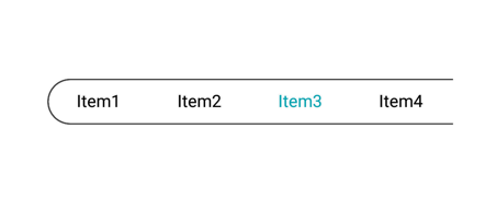
Visible segment counts
The segmented control displays items for view based on the count that is given for VisibleSegmentCount.
<buttons:SfSegmentedControl
    SegmentHeight="20"
    VisibleSegmentsCount="4"
    SelectedIndex="2"
    FontColor="Black"
    Color="Transparent"
    DisplayMode = "Text"
    SelectionTextColor="#02A0AE">
<segmentCollection:List x:TypeArguments="x:String">
<x:String>Item1</x:String>
<x:String>Item2</x:String>
<x:String>Item3</x:String>
<x:String>Item4</x:String>
<x:String>Item5</x:String>
<x:String>Item6</x:String>
<x:String>Item7</x:String>
<x:String>Item8</x:String>
<x:String>Item9</x:String>
</segmentCollection:List>
</buttons:SfSegmentedControl>
public partial class SegmentedControlSample : ContentPage
{
SfSegmentedControl segmentedControl;
public SegmentedControlSample()
{
InitializeComponent();
segmentedControl = new SfSegmentedControl();
List<String> itemsList = new List<String>
{
"Item1","Item2","Item3","Item4","Item5","Item6","Item7","Item8","Item9"
};
segmentedControl.ItemsSource = itemsList;
segmentedControl.Color = Color.Transparent;
segmentedControl.VisibleSegmentsCount = 4;
segmentedControl.SelectedIndex = 2;
segmentedControl.FontColor = Color.Black;
segmentedControl.SelectionTextColor = Color.FromHex("#02A0AE");
this.Content = segmentedControl;
}
}
Segment width
Users can use the SegmentWidth property to display the segmented items within the given width instead VisibleSegmentCount.
<buttons:SfSegmentedControl SegmentWidth = "80"/>segmentedControl.SegmentWidth = 80;