Spin Button Customization in Xamarin NumericUpDown (SfNumericUpDown)
6 Jul 202318 minutes to read
Spin button position in the SfNumericUpDown control can be changed relative to the TextBox based on SpinButtonAlignment property.
There are three built-in modes:
Align the spin button in right side
Spin buttons will get aligned to the right side of the control.
<numeric:SfNumericUpDown SpinButtonAlignment="Right"/>SfNumericUpDown NumericUpDown = new SfNumericUpDown();
NumericUpDown.SpinButtonAlignment = SpinButtonAlignment.Right;
this.Content = NumericUpDown;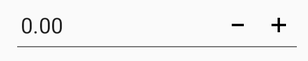
Align the spin button in left side
Spin buttons will get aligned to the left side of the control.
<numeric:SfNumericUpDown SpinButtonAlignment="Left"/>SfNumericUpDown NumericUpDown = new SfNumericUpDown();
NumericUpDown.SpinButtonAlignment = SpinButtonAlignment.Left;
this.Content = NumericUpDown;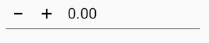
Align the spin button in both side
Spin buttons will get aligned to the both side of the control.
<numeric:SfNumericUpDown SpinButtonAlignment="Both"/>SfNumericUpDown NumericUpDown = new SfNumericUpDown();
NumericUpDown.SpinButtonAlignment = SpinButtonAlignment.Both;
this.Content = NumericUpDown;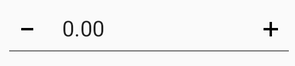
NOTE
By default the property value is Right.
UpDown button color customization
You can customize the SfNumericUpDown control button color by using the UpDownButtonColor property.
<syncfusion:SfNumericUpDown UpDownButtonColor="Aqua" Value="123" />SfNumericUpDown NumericUpDown = new SfNumericUpDown();
NumericUpDown.Value = 123;
NumericUpDown.UpDownButtonColor = Color.Aqua;
this.Content = NumericUpDown;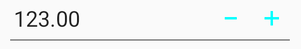
UpDown button view customization
You can set the UpDownButton of SfNumericUpDown control by using any of the following ways:
-
ButtonView- Sets the expected view to theSfNumericUpDownbuttons. -
ButtonImage- Sets the image to theSfNumericUpDownbuttons. -
ButtonFontIcon- Sets the icon to theSfNumericUpDownbuttons.
NOTE
For image and Font icon, you need to add the respective image and TTF file.
For Android: Add the image at Resource/Drawable/{Image} and .ttf file at Assets/{.ttf}.
For iOS: Add the image and .ttf file to Resource/{Image/.ttf} and to use FontIcons, add respective FontFamily name in info.plist file under Fonts provided by application category.
For UWP: Add the image and .ttf file directly to the project.
Set the view to the Updown buttons
<updown:SfNumericUpDown x:Name="upDown" SpinButtonAlignment="Both" TextAlignment="Center">
<updown:SfNumericUpDown.IncrementButtonSettings>
<updown:UpDownButtonSettings ButtonHeight="45" ButtonWidth="45">
<updown:UpDownButtonSettings.ButtonView>
<Grid HeightRequest="40" WidthRequest="40">
<Image Source="up.png" Aspect="AspectFit" />
</Grid>
</updown:UpDownButtonSettings.ButtonView>
</updown:UpDownButtonSettings>
</updown:SfNumericUpDown.IncrementButtonSettings>
<updown:SfNumericUpDown.DecrementButtonSettings>
<updown:UpDownButtonSettings ButtonHeight="45" ButtonWidth="45">
<updown:UpDownButtonSettings.ButtonView>
<Grid HeightRequest="40" WidthRequest="40">
<Image Source="down.png" Aspect="AspectFit" />
</Grid>
</updown:UpDownButtonSettings.ButtonView>
</updown:UpDownButtonSettings>
</updown:SfNumericUpDown.DecrementButtonSettings>
</updown:SfNumericUpDown>
public partial class MainPage : ContentPage
{
SfNumericUpDown upDown;
Grid incrementGrid, decrementGrid;
UpDownButtonSettings incSettings, decrementSettings;
Image incrementImage, decrementImage;
public MainPage()
{
InitializeComponent();
incrementGrid = new Grid
{
HeightRequest = 40,
WidthRequest = 40,
BackgroundColor = Color.Blue
};
incSettings = new UpDownButtonSettings
{
ButtonView = incrementGrid,
ButtonHeight = 45,
ButtonWidth = 45
};
incrementImage = new Image
{
HorizontalOptions = LayoutOptions.Center,
VerticalOptions = LayoutOptions.Center,
Source = (FileImageSource)ImageSource.FromFile("up.png"),
Aspect = Aspect.AspectFit
};
decrementSettings = new UpDownButtonSettings
{
ButtonView = decrementGrid,
ButtonHeight = 45,
ButtonWidth = 45
};
decrementGrid = new Grid
{
HeightRequest = 40,
WidthRequest = 40,
BackgroundColor = Color.Red
};
decrementImage = new Image
{
Source = (FileImageSource)ImageSource.FromFile("down.png"),
Aspect = Aspect.AspectFit,
HorizontalOptions = LayoutOptions.Center,
VerticalOptions = LayoutOptions.Center
};
upDown = new SfNumericUpDown
{
SpinButtonAlignment = SpinButtonAlignment.Left,
IncrementButtonSettings = incSettings,
DecrementButtonSettings = decrementSettings
};
incrementGrid.Children.Add(incrementImage);
decrementGrid.Children.Add(decrementImage);
this.Content = upDown;
}
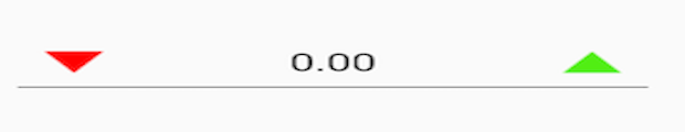
}Set the image to the Updown buttons
<updown:SfNumericUpDown x:Name="upDown" SpinButtonAlignment="Both" TextAlignment="Center">
<updown:SfNumericUpDown.IncrementButtonSettings>
<updown:UpDownButtonSettings ButtonImage="up" ButtonHeight="35" ButtonWidth="35" />
</updown:SfNumericUpDown.IncrementButtonSettings>
<updown:SfNumericUpDown.DecrementButtonSettings>
<updown:UpDownButtonSettings ButtonImage="down" ButtonHeight="35" ButtonWidth="35" />
</updown:SfNumericUpDown.DecrementButtonSettings>
</updown:SfNumericUpDown>
public partial class MainPage : ContentPage
{
SfNumericUpDown upDown;
Grid incrementGrid, decrementGrid;
UpDownButtonSettings incSettings, decrementSettings;
Image incrementImage, decrementImage;
public MainPage()
{
InitializeComponent();
incSettings = new UpDownButtonSettings
{
ButtonImage = "up",
ButtonHeight = 45,
ButtonWidth = 45
};
decrementSettings = new UpDownButtonSettings
{
ButtonImage = "down",
ButtonHeight = 45,
ButtonWidth = 45
};
upDown = new SfNumericUpDown
{
SpinButtonAlignment = SpinButtonAlignment.Both,
IncrementButtonSettings = incSettings,
DecrementButtonSettings = decrementSettings
};
this.Content = upDown;
}
}
Set the font icon to the Updown buttons
<updown:SfNumericUpDown x:Name="upDown" SpinButtonAlignment="Both" TextAlignment="Center">
<updown:SfNumericUpDown.IncrementButtonSettings>
<updown:UpDownButtonSettings ButtonFontIcon="" ButtonHeight="35" ButtonWidth="35">
<updown:UpDownButtonSettings.ButtonFontFamily>
<OnPlatform
x:TypeArguments="x:String">
<On
Platform="Android"
Value="numeric.ttf">
</On>
<On
Platform="iOS"
Value="numeric">
</On>
</OnPlatform>
</updown:UpDownButtonSettings.ButtonFontFamily>
</updown:UpDownButtonSettings>
</updown:SfNumericUpDown.IncrementButtonSettings>
<updown:SfNumericUpDown.DecrementButtonSettings>
<updown:UpDownButtonSettings ButtonFontIcon="" ButtonHeight="35" ButtonWidth="35" >
<updown:UpDownButtonSettings.ButtonFontFamily>
<OnPlatform
x:TypeArguments="x:String">
<On
Platform="Android"
Value="numeric.ttf">
</On>
<On
Platform="iOS"
Value="numeric">
</On>
</OnPlatform>
</updown:UpDownButtonSettings.ButtonFontFamily>
</updown:UpDownButtonSettings>
</updown:SfNumericUpDown.DecrementButtonSettings>
</updown:SfNumericUpDown>SfNumericUpDown upDown = new SfNumericUpDown();
upDown.SpinButtonAlignment = SpinButtonAlignment.Both;
UpDownButtonSettings incSettings = new UpDownButtonSettings();
incSettings.ButtonFontIcon = "\xe701";
if (Device.OS == TargetPlatform.Android)
{
incSettings.ButtonFontFamily = "numeric.ttf";
decrementSettings.ButtonFontFamily = "numeric.ttf";
}
else
{
incSettings.ButtonFontFamily = "numeric";
decrementSettings.ButtonFontFamily = "numeric";
}
upDown.IncrementButtonSettings = incSettings;
UpDownButtonSettings decrementSettings = new UpDownButtonSettings();
decrementSettings.ButtonFontIcon = "\xe700";
decrementSettings.ButtonWidth = 45;
upDown.DecrementButtonSettings = decrementSettings;
this.Content = upDown;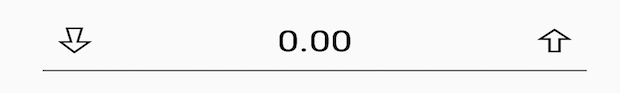
Additional customization properties of Updown buttons
Customize the Updown buttons background color
This property is used to change the background color of the increment and decrement buttons.
<updown:SfNumericUpDown >
    <updown:SfNumericUpDown.IncrementButtonSettings>
    <updown:UpDownButtonSettings BackgroundColor="Red"/>
    </updown:SfNumericUpDown.IncrementButtonSettings>
    <updown:SfNumericUpDown.DecrementButtonSettings>
    <updown:UpDownButtonSettings BackgroundColor="Green"/>
    </updown:SfNumericUpDown.DecrementButtonSettings>
</updown:SfNumericUpDown>
SfNumericUpDown numericUpDown = new SfNumericUpDown();
UpDownButtonSettings incrementButtonSettings = new UpDownButtonSettings();
UpDownButtonSettings decrementButtonSettings = new UpDownButtonSettings();
numericUpDown.IncrementButtonSettings = incrementButtonSettings;
numericUpDown.DecrementButtonSettings = decrementButtonSettings;
incrementButtonSettings.BackgroundColor = Color.Red;
decrementButtonSettings.BackgroundColor = Color.Green;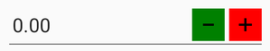
Highlight the Updown buttons background color
This property is used to change the background color of the increment or decrement button.
<updown:SfNumericUpDown >
  <updown:SfNumericUpDown.IncrementButtonSettings>
  <updown:UpDownButtonSettings HighlightedBackgroundColor="Red"/>
  </updown:SfNumericUpDown.IncrementButtonSettings>
  <updown:SfNumericUpDown.DecrementButtonSettings>
  <updown:UpDownButtonSettings HighlightedBackgroundColor="Green"/>
  </updown:SfNumericUpDown.DecrementButtonSettings>
 </updown:SfNumericUpDown>
SfNumericUpDown numericUpDown = new SfNumericUpDown();
UpDownButtonSettings incrementButtonSettings = new UpDownButtonSettings();
UpDownButtonSettings decrementButtonSettings = new UpDownButtonSettings();
numericUpDown.IncrementButtonSettings = incrementButtonSettings;
numericUpDown.DecrementButtonSettings = decrementButtonSettings;
incrementButtonSettings.HighlightedBackgroundColor = Color.Red;
decrementButtonSettings.HighlightedBackgroundColor = Color.Green;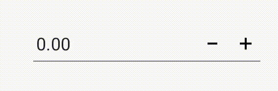
Customize the Updown buttons font color
This property is used to change the text color of the increment and decrement buttons.
<updown:SfNumericUpDown >
    <updown:SfNumericUpDown.IncrementButtonSettings>
    <updown:UpDownButtonSettings ButtonFontColor="Red"/>
    </updown:SfNumericUpDown.IncrementButtonSettings>
    <updown:SfNumericUpDown.DecrementButtonSettings>
    <updown:UpDownButtonSettings ButtonFontColor="Green"/>
    </updown:SfNumericUpDown.DecrementButtonSettings>
</updown:SfNumericUpDown>
SfNumericUpDown numericUpDown = new SfNumericUpDown();
UpDownButtonSettings incrementButtonSettings = new UpDownButtonSettings();
UpDownButtonSettings decrementButtonSettings = new UpDownButtonSettings();
numericUpDown.IncrementButtonSettings = incrementButtonSettings;
numericUpDown.DecrementButtonSettings = decrementButtonSettings;
incrementButtonSettings.ButtonFontColor = Color.Red;
decrementButtonSettings.ButtonFontColor = Color.Green;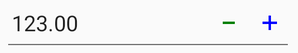
Spin validation
You can customize number increment and decrement mode in spin button interaction in two ways:
- Default
- Tapped
Default
When SpinValidation property is set as Default, the SfNumericUpDown value gets updated on long press until the increment or decrement button is disabled.
<numeric:SfNumericUpDown SpinValidation="Default" />SfNumericUpDown numericUpDown=new SfNumericUpDown();
numericUpDown.SpinValidation = SpinValidation.Default;Tapped
When SpinValidation property is set as Tapped, the SfNumericUpDown value gets updated on the increment or decrement button tap action.
<numeric:SfNumericUpDown SpinValidation="Tapped" />SfNumericUpDown numericUpDown=new SfNumericUpDown();
numericUpDown.SpinValidation = SpinValidation.Tapped;See also
How to change the Spinner button position in SfNumericUpDown
How to hide the increment or decrement button in SfNumericUpDown