Gridlines in Xamarin Diagram (SfDiagram)
20 Jan 20251 minute to read
Gridlines are the pattern of lines drawn behind the diagram elements. It provides a visual guidance when dragging or arranging the node on the diagram surface.
Gridlines visibility
The “ShowGrid” property in PageSettings will show or hide the gridlines. The following code example illustrates how to enable grid visibility.
<diagram:SfDiagram x:Name="diagram" >
<diagram:SfDiagram.PageSettings>
<diagram:PageSettings ShowGrid =“true”/>
</diagram:SfDiagram.PageSettings>
</diagram:SfDiagram>diagram.PageSettings.ShowGrid = true;Customizing gridlines
Grid cell size and gridline color can be modified using the “GridSize” and “GridColor” properties respectively. The following code example illustrates how to customize the grid.
<diagram:SfDiagram x:Name="diagram" >
<diagram:SfDiagram.PageSettings>
<diagram:PageSettings GridColor ="Pink” GridSize =“14”/>
</diagram:SfDiagram.PageSettings>
</diagram:SfDiagram>diagram.PageSettings.GridColor = Color.Pink;
diagram.PageSettings.GridSize = 14;Snapping gridlines
Nodes can be aligned and resized easily using gridlines by enabling the snap to grid. The following code example illustrates how to enable the snap to grid.
<diagram:SfDiagram x:Name="diagram" >
<diagram:SfDiagram.PageSettings>
<diagram:PageSettings SnapToGrid=”true”/>
</diagram:SfDiagram.PageSettings>
</diagram:SfDiagram>diagram.PageSettings.SnapToGrid = true;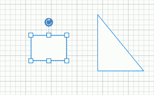
NOTE
You can refer to our Xamarin Diagram feature tour page for its groundbreaking feature representations.You can also explore our Xamarin Diagram example to understand how to present and manipulate data.