Customization in Xamarin Chips
21 Nov 202424 minutes to read
The chip control supports to customize the background color, border color, close button color, and more. The chip control can be customized using the following properties:
ShowCloseButton
The ShowCloseButton property sets the visible state of close button in SfChip.
<ContentPage xmlns="http://xamarin.com/schemas/2014/forms"
             xmlns:x="http://schemas.microsoft.com/winfx/2009/xaml"
             xmlns:local="clr-namespace:ChipCustomization"
             xmlns:buttons="clr-namespace:Syncfusion.XForms.Buttons;assembly=Syncfusion.Buttons.XForms"
             x:Class="ChipCustomization.MainPage">

   <ContentPage.Content>
        <StackLayout Margin="8,8,8,8" >
           <buttons:SfChip  Text="James"
                            WidthRequest="150"
                            HorizontalOptions="Center"
                            VerticalOptions="Center"
                            ShowCloseButton="true" >
           </buttons:SfChip>
        </StackLayout>
    </ContentPage.Content>

</ContentPage>
using System;
using Syncfusion.XForms.Buttons;
using Xamarin.Forms;
namespace ChipCustomization
{
public partial class MainPage : ContentPage
{
public MainPage()
{
InitializeComponent();
StackLayout stackLayout = new StackLayout();
SfChip chip = new SfChip();
chip.Text = "James";
chip.WidthRequest = 150;
chip.HorizontalOptions = LayoutOptions.Center;
chip.VerticalOptions = LayoutOptions.Center;
chip.ShowCloseButton = true;
stackLayout.Children.Add(chip);
this.Content = stackLayout;
}
}
}
NOTE
The default value of
ShowCloseButtonis [false].
ShowSelectionIndicator
The ShowSelectionIndicator property sets the visible state of selection indicator in SfChip.
<ContentPage xmlns="http://xamarin.com/schemas/2014/forms"
             xmlns:x="http://schemas.microsoft.com/winfx/2009/xaml"
             xmlns:local="clr-namespace:ChipCustomization"
             xmlns:buttons="clr-namespace:Syncfusion.XForms.Buttons;assembly=Syncfusion.Buttons.XForms"
             x:Class="ChipCustomization.MainPage">

   <ContentPage.Content>
        <StackLayout Margin="8,8,8,8" >
           <buttons:SfChip  Text="James"
                            WidthRequest="150"
                            HorizontalOptions="Center"
                            VerticalOptions="Center"
                            ShowCloseButton="true"
                            ShowSelectionIndicator="true"
                            >
           </buttons:SfChip>
        </StackLayout>
    </ContentPage.Content>

</ContentPage>
using System;
using Syncfusion.XForms.Buttons;
using Xamarin.Forms;
namespace ChipCustomization
{
public partial class MainPage : ContentPage
{
public MainPage()
{
InitializeComponent();
StackLayout stackLayout = new StackLayout();
SfChip chip = new SfChip();
chip.Text = "James";
chip.WidthRequest = 150;
chip.HorizontalOptions = LayoutOptions.Center;
chip.VerticalOptions = LayoutOptions.Center;
chip.ShowCloseButton = true;
chip.ShowSelectionIndicator = true;
stackLayout.Children.Add(chip);
this.Content = stackLayout;
}
}
}
NOTE
The default value of
ShowSelectionIndicatoris [false].
CloseButtonColor
The CloseButtonColor property customizes the color of the close button in SfChip.
<ContentPage xmlns="http://xamarin.com/schemas/2014/forms"
             xmlns:x="http://schemas.microsoft.com/winfx/2009/xaml"
             xmlns:local="clr-namespace:ChipCustomization"
             xmlns:buttons="clr-namespace:Syncfusion.XForms.Buttons;assembly=Syncfusion.Buttons.XForms"
             x:Class="ChipCustomization.MainPage">

   <ContentPage.Content>
        <StackLayout Margin="8,8,8,8" >
           <buttons:SfChip  Text="James"
                            WidthRequest="150"
                            HorizontalOptions="Center"
                            VerticalOptions="Center"
                            ShowCloseButton="true"
                            CloseButtonColor="White"
                            >
           </buttons:SfChip>
        </StackLayout>
    </ContentPage.Content>

</ContentPage>
using System;
using Syncfusion.XForms.Buttons;
using Xamarin.Forms;
namespace ChipCustomization
{
public partial class MainPage : ContentPage
{
public MainPage()
{
InitializeComponent();
StackLayout stackLayout = new StackLayout();
SfChip chip = new SfChip();
chip.Text = "James";
chip.WidthRequest = 150;
chip.HorizontalOptions = LayoutOptions.Center;
chip.VerticalOptions = LayoutOptions.Center;
chip.ShowCloseButton = true;
chip.CloseButtonColor = Color.White;
stackLayout.Children.Add(chip);
this.Content = stackLayout;
}
}
}
NOTE
The default value of
CloseButtonColoris [Color.FromHex("#6b6b6b")].
SelectionIndicatorColor
The SelectionIndicatorColor property customizes the selection indicator color in SfChip.
<ContentPage xmlns="http://xamarin.com/schemas/2014/forms"
             xmlns:x="http://schemas.microsoft.com/winfx/2009/xaml"
             xmlns:local="clr-namespace:ChipCustomization"
             xmlns:buttons="clr-namespace:Syncfusion.XForms.Buttons;assembly=Syncfusion.Buttons.XForms"
             x:Class="ChipCustomization.MainPage">

   <ContentPage.Content>
        <StackLayout Margin="8,8,8,8" >
           <buttons:SfChip  Text="James"
                            WidthRequest="150"
                            HorizontalOptions="Center"
                            VerticalOptions="Center"
                            ShowCloseButton="true"
                            ShowSelectionIndicator="true"
                            CloseButtonColor = "White"
                            SelectionIndicatorColor = "White"
                            >
           </buttons:SfChip>
        </StackLayout>
    </ContentPage.Content>

</ContentPage>
using System;
using Syncfusion.XForms.Buttons;
using Xamarin.Forms;
namespace ChipCustomization
{
public partial class MainPage : ContentPage
{
public MainPage()
{
InitializeComponent();
StackLayout stackLayout = new StackLayout();
SfChip chip = new SfChip();
chip.Text = "James";
chip.WidthRequest = 150;
chip.HorizontalOptions = LayoutOptions.Center;
chip.VerticalOptions = LayoutOptions.Center;
chip.ShowCloseButton = true;
chip.ShowSelectionIndicator = true;
chip.CloseButtonColor = Color.White;
chip.SelectionIndicatorColor = Color.White;
stackLayout.Children.Add(chip);
this.Content = stackLayout;
}
}
}
NOTE
The default value of
SelectionIndicatorColoris [Color.FromHex("#6b6b6b")].
BackgroundColor
The BackgroundColor property customizes the background color of SfChip.
<ContentPage xmlns="http://xamarin.com/schemas/2014/forms"
             xmlns:x="http://schemas.microsoft.com/winfx/2009/xaml"
             xmlns:local="clr-namespace:ChipCustomization"
             xmlns:buttons="clr-namespace:Syncfusion.XForms.Buttons;assembly=Syncfusion.Buttons.XForms"
             x:Class="ChipCustomization.MainPage">

   <ContentPage.Content>
        <StackLayout Margin="8,8,8,8" >
           <buttons:SfChip  Text="James"
                            WidthRequest="150"
                            HorizontalOptions="Center"
                            VerticalOptions="Center"
                            ShowCloseButton="true"
                            ShowSelectionIndicator="true"
                            CloseButtonColor = "White"
                            SelectionIndicatorColor = "White"
                            BackgroundColor="Aqua"
                            >
           </buttons:SfChip>
        </StackLayout>
    </ContentPage.Content>

</ContentPage>
using System;
using Syncfusion.XForms.Buttons;
using Xamarin.Forms;
namespace ChipCustomization
{
public partial class MainPage : ContentPage
{
public MainPage()
{
InitializeComponent();
StackLayout stackLayout = new StackLayout();
SfChip chip = new SfChip();
chip.Text = "James";
chip.WidthRequest = 150;
chip.HorizontalOptions = LayoutOptions.Center;
chip.VerticalOptions = LayoutOptions.Center;
chip.ShowSelectionIndicator = true;
chip.CloseButtonColor = Color.White;
chip.SelectionIndicatorColor = Color.White;
chip.BackgroundColor = Color.Aqua;
stackLayout.Children.Add(chip);
this.Content = stackLayout;
}
}
}
NOTE
The default value of
BackgroundColoris [Color.Accent].
BorderColor
The BorderColor property customizes the color of border in SfChip.
<ContentPage xmlns="http://xamarin.com/schemas/2014/forms"
             xmlns:x="http://schemas.microsoft.com/winfx/2009/xaml"
             xmlns:local="clr-namespace:ChipCustomization"
             xmlns:buttons="clr-namespace:Syncfusion.XForms.Buttons;assembly=Syncfusion.Buttons.XForms"
             x:Class="ChipCustomization.MainPage">

   <ContentPage.Content>
        <StackLayout Margin="8,8,8,8" >
           <buttons:SfChip  Text="James"
                            WidthRequest="150"
                            HorizontalOptions="Center"
                            VerticalOptions="Center"
                            BorderWidth="4"
                            BorderColor="Black"
                            >
           </buttons:SfChip>
        </StackLayout>
    </ContentPage.Content>

</ContentPage>
using System;
using Syncfusion.XForms.Buttons;
using Xamarin.Forms;
namespace ChipCustomization
{
public partial class MainPage : ContentPage
{
public MainPage()
{
InitializeComponent();
StackLayout stackLayout = new StackLayout();
SfChip chip = new SfChip();
chip.Text = "James";
chip.WidthRequest = 150;
chip.HorizontalOptions = LayoutOptions.Center;
chip.VerticalOptions = LayoutOptions.Center;
chip.BorderWidth = 4;
chip.BorderColor = Color.Black;
stackLayout.Children.Add(chip);
this.Content = stackLayout;
}
}
}
NOTE
The default value of
BorderColoris [Color.Transparent].
BorderWidth
The BorderWidth property customizes the thickness of border in SfChip.
<ContentPage xmlns="http://xamarin.com/schemas/2014/forms"
             xmlns:x="http://schemas.microsoft.com/winfx/2009/xaml"
             xmlns:local="clr-namespace:ChipCustomization"
             xmlns:buttons="clr-namespace:Syncfusion.XForms.Buttons;assembly=Syncfusion.Buttons.XForms"
             x:Class="ChipCustomization.MainPage">

   <ContentPage.Content>
        <StackLayout Margin="8,8,8,8" >
           <buttons:SfChip  Text="James"
                            WidthRequest="150"
                            HorizontalOptions="Center"
                            VerticalOptions="Center"
                            BorderWidth="8"
                            BorderColor="Black"
                            >
           </buttons:SfChip>
        </StackLayout>
    </ContentPage.Content>

</ContentPage>
using System;
using Syncfusion.XForms.Buttons;
using Xamarin.Forms;
namespace ChipCustomization
{
public partial class MainPage : ContentPage
{
public MainPage()
{
InitializeComponent();
StackLayout stackLayout = new StackLayout();
SfChip chip = new SfChip();
chip.Text = "James";
chip.WidthRequest = 150;
chip.HorizontalOptions = LayoutOptions.Center;
chip.VerticalOptions = LayoutOptions.Center;
chip.BorderWidth = 8;
chip.BorderColor = Color.Black;
stackLayout.Children.Add(chip);
this.Content = stackLayout;
}
}
}
NOTE
Default value of BorderWidth
Android : [0d]
iOS : [0d]
UWP : [2d]
BorderThickness
The BorderThickness property is used to customizes the border thickness of the SfChip on four sides.
<ContentPage xmlns="http://xamarin.com/schemas/2014/forms"
             xmlns:x="http://schemas.microsoft.com/winfx/2009/xaml"
             xmlns:local="clr-namespace:ChipCustomization"
             xmlns:buttons="clr-namespace:Syncfusion.XForms.Buttons;assembly=Syncfusion.Buttons.XForms"
             x:Class="ChipCustomization.MainPage">

   <ContentPage.Content>
        <StackLayout Margin="8,8,8,8" >
           <buttons:SfChip  Text="James"
                            WidthRequest="150"
                            HorizontalOptions="Center"
                            VerticalOptions="Center"
                            BorderThickness="0,0,0,5"
                            BorderColor = "Black"
                            CornerRadius = "5"
                            >
           </buttons:SfChip>
        </StackLayout>
    </ContentPage.Content>

</ContentPage>
using System;
using Syncfusion.XForms.Buttons;
using Xamarin.Forms;
namespace ChipCustomization
{
public partial class MainPage : ContentPage
{
public MainPage()
{
InitializeComponent();
StackLayout stackLayout = new StackLayout();
SfChip chip = new SfChip();
chip.Text = "James";
chip.WidthRequest = 150;
chip.HorizontalOptions = LayoutOptions.Center;
chip.VerticalOptions = LayoutOptions.Center;
chip.BorderThickness = new Thickness (0,0,0,5);
chip.CornerRadius = 5;
chip.BorderColor = Color.Black;
stackLayout.Children.Add(chip);
this.Content = stackLayout;
}
}
}
CornerRadius
The CornerRadius property is used to customize the rounded edges in SfChip as demonstrated in the following code sample.
<ContentPage xmlns="http://xamarin.com/schemas/2014/forms"
             xmlns:x="http://schemas.microsoft.com/winfx/2009/xaml"
             xmlns:local="clr-namespace:ChipCustomization"
             xmlns:buttons="clr-namespace:Syncfusion.XForms.Buttons;assembly=Syncfusion.Buttons.XForms"
             x:Class="ChipCustomization.MainPage">

   <ContentPage.Content>
        <StackLayout Margin="8,8,8,8" >
           <buttons:SfChip  Text="James"
                            WidthRequest="150"
                            HorizontalOptions="Center"
                            VerticalOptions="Center"
                            BorderWidth="4"
                            CornerRadius = "4"
                            BorderColor="Black"
                            >
           </buttons:SfChip>
        </StackLayout>
    </ContentPage.Content>

</ContentPage>
using System;
using Syncfusion.XForms.Buttons;
using Xamarin.Forms;
namespace ChipCustomization
{
public partial class MainPage : ContentPage
{
public MainPage()
{
InitializeComponent();
StackLayout stackLayout = new StackLayout();
SfChip chip = new SfChip();
chip.Text = "James";
chip.WidthRequest = 150;
chip.HorizontalOptions = LayoutOptions.Center;
chip.VerticalOptions = LayoutOptions.Center;
chip.BorderWidth = 4;
chip.CornerRadius = 4;
chip.BorderColor = Color.Black;
stackLayout.Children.Add(chip);
this.Content = stackLayout;
}
}
}
NOTE
The default value of
CornerRadiusis [Thickness(0)].
FontAttributes
The FontAttributes property customizes the font style of text in SfChip.
<ContentPage xmlns="http://xamarin.com/schemas/2014/forms"
             xmlns:x="http://schemas.microsoft.com/winfx/2009/xaml"
             xmlns:local="clr-namespace:ChipCustomization"
             xmlns:buttons="clr-namespace:Syncfusion.XForms.Buttons;assembly=Syncfusion.Buttons.XForms"
             x:Class="ChipCustomization.MainPage">

   <ContentPage.Content>
        <StackLayout Margin="8,8,8,8" >
           <buttons:SfChip  Text="James"
                            WidthRequest="150"
                            HorizontalOptions="Center"
                            VerticalOptions="Center"
                            ShowCloseButton="true"
                            ShowSelectionIndicator="true"
                            CloseButtonColor = "White"
                            SelectionIndicatorColor = "White"
                            FontAttributes="Italic" >
           </buttons:SfChip>
        </StackLayout>
    </ContentPage.Content>

</ContentPage>
using System;
using Syncfusion.XForms.Buttons;
using Xamarin.Forms;
namespace ChipCustomization
{
public partial class MainPage : ContentPage
{
public MainPage()
{
InitializeComponent();
StackLayout stackLayout = new StackLayout();
SfChip chip = new SfChip();
chip.Text = "James";
chip.WidthRequest = 150;
chip.HorizontalOptions = LayoutOptions.Center;
chip.VerticalOptions = LayoutOptions.Center;
chip.ShowSelectionIndicator = true;
chip.CloseButtonColor = Color.White;
chip.SelectionIndicatorColor = Color.White;
chip.FontAttributes = FontAttributes.Italic;
stackLayout.Children.Add(chip);
this.Content = stackLayout;
}
}
}
FontFamily
The FontFamily property customizes the font family of text in SfChip.
<ContentPage xmlns="http://xamarin.com/schemas/2014/forms"
             xmlns:x="http://schemas.microsoft.com/winfx/2009/xaml"
             xmlns:local="clr-namespace:ChipCustomization"
             xmlns:buttons="clr-namespace:Syncfusion.XForms.Buttons;assembly=Syncfusion.Buttons.XForms"
             x:Class="ChipCustomization.MainPage">

   <ContentPage.Content>
        <StackLayout Margin="8,8,8,8" >
           <buttons:SfChip  Text="James"
                            WidthRequest="150"
                            HorizontalOptions="Center"
                            VerticalOptions="Center"
                            ShowCloseButton="true"
                            ShowSelectionIndicator="true"
                            CloseButtonColor = "White"
                            SelectionIndicatorColor = "White"
                            FontFamily="Arial"
                            >
           </buttons:SfChip>
        </StackLayout>
    </ContentPage.Content>

</ContentPage>
using System;
using Syncfusion.XForms.Buttons;
using Xamarin.Forms;
namespace ChipCustomization
{
public partial class MainPage : ContentPage
{
public MainPage()
{
InitializeComponent();
StackLayout stackLayout = new StackLayout();
SfChip chip = new SfChip();
chip.Text = "James";
chip.WidthRequest = 150;
chip.HorizontalOptions = LayoutOptions.Center;
chip.VerticalOptions = LayoutOptions.Center;
chip.ShowSelectionIndicator = true;
chip.CloseButtonColor = Color.White;
chip.SelectionIndicatorColor = Color.White;
chip.FontFamily = "Arial";
stackLayout.Children.Add(chip);
this.Content = stackLayout;
}
}
}
FontSize
The FontSize property customizes the size of text in SfChip.
<ContentPage xmlns="http://xamarin.com/schemas/2014/forms"
             xmlns:x="http://schemas.microsoft.com/winfx/2009/xaml"
             xmlns:local="clr-namespace:ChipCustomization"
             xmlns:buttons="clr-namespace:Syncfusion.XForms.Buttons;assembly=Syncfusion.Buttons.XForms"
             x:Class="ChipCustomization.MainPage">

   <ContentPage.Content>
        <StackLayout Margin="8,8,8,8" >
           <buttons:SfChip  Text="James"
                            WidthRequest="150"
                            HorizontalOptions="Center"
                            VerticalOptions="Center"
                            ShowCloseButton="true"
                            ShowSelectionIndicator="true"
                            CloseButtonColor = "White"
                            SelectionIndicatorColor = "White"
                            FontSize = "10"
                            >
           </buttons:SfChip>
        </StackLayout>
    </ContentPage.Content>

</ContentPage>
using System;
using Syncfusion.XForms.Buttons;
using Xamarin.Forms;
namespace ChipCustomization
{
public partial class MainPage : ContentPage
{
public MainPage()
{
InitializeComponent();
StackLayout stackLayout = new StackLayout();
SfChip chip = new SfChip();
chip.Text = "James";
chip.WidthRequest = 150;
chip.HorizontalOptions = LayoutOptions.Center;
chip.VerticalOptions = LayoutOptions.Center;
chip.ShowSelectionIndicator = true;
chip.CloseButtonColor = Color.White;
chip.SelectionIndicatorColor = Color.White;
chip.FontSize = 10;
stackLayout.Children.Add(chip);
this.Content = stackLayout;
}
}
}
NOTE
Default Value of FontSize
Android : [14d]
iOS : [15d]
UWP : [15d]
TextColor
The TextColor property customizes the color of text in SfChip.
<ContentPage xmlns="http://xamarin.com/schemas/2014/forms"
             xmlns:x="http://schemas.microsoft.com/winfx/2009/xaml"
             xmlns:local="clr-namespace:ChipCustomization"
             xmlns:buttons="clr-namespace:Syncfusion.XForms.Buttons;assembly=Syncfusion.Buttons.XForms"
             x:Class="ChipCustomization.MainPage">

   <ContentPage.Content>
        <StackLayout Margin="8,8,8,8" >
           <buttons:SfChip  Text="James"
                            WidthRequest="150"
                            HorizontalOptions="Center"
                            VerticalOptions="Center"
                            ShowCloseButton="true"
                            ShowSelectionIndicator="true"
                            CloseButtonColor = "White"
                            SelectionIndicatorColor = "White"
                            BackgroundColor="Aqua"
                            TextColor="Black"
                            >
           </buttons:SfChip>
        </StackLayout>
    </ContentPage.Content>

</ContentPage>
using System;
using Syncfusion.XForms.Buttons;
using Xamarin.Forms;
namespace ChipCustomization
{
public partial class MainPage : ContentPage
{
public MainPage()
{
InitializeComponent();
StackLayout stackLayout = new StackLayout();
SfChip chip = new SfChip();
chip.Text = "James";
chip.WidthRequest = 150;
chip.HorizontalOptions = LayoutOptions.Center;
chip.VerticalOptions = LayoutOptions.Center;
chip.ShowSelectionIndicator = true;
chip.CloseButtonColor = Color.White;
chip.SelectionIndicatorColor = Color.White;
chip.BackgroundColor = Color.Aqua;
chip.TextColor = Color.Black;
stackLayout.Children.Add(chip);
this.Content = stackLayout;
}
}
}
NOTE
The default value of TextColor is [
Color.White].
TextAlignment
The HorizontalTextAlignment and VerticalTextAlignment properties customize the alignment of text in SfChip
<ContentPage xmlns="http://xamarin.com/schemas/2014/forms"
             xmlns:x="http://schemas.microsoft.com/winfx/2009/xaml"
             xmlns:local="clr-namespace:ChipCustomization"
             xmlns:buttons="clr-namespace:Syncfusion.XForms.Buttons;assembly=Syncfusion.Buttons.XForms"
             x:Class="ChipCustomization.MainPage">

   <ContentPage.Content>
        <StackLayout Margin="8,8,8,8" >
           <buttons:SfChip  Text="James"
                            WidthRequest="150"
                            HorizontalOptions="Center"
                            VerticalOptions="Center"
                            ShowSelectionIndicator="true"
                            SelectionIndicatorColor = "White"
                            BackgroundColor="Aqua"
                            HorizontalTextAlignment="Start"
                            VerticalTextAlignment="Start"
                            TextColor="Black"
                            >
           </buttons:SfChip>
        </StackLayout>
    </ContentPage.Content>

</ContentPage>
using System;
using Syncfusion.XForms.Buttons;
using Xamarin.Forms;
namespace ChipCustomization
{
public partial class MainPage : ContentPage
{
public MainPage()
{
InitializeComponent();
StackLayout stackLayout = new StackLayout();
SfChip chip = new SfChip();
chip.Text = "James";
chip.WidthRequest = 150;
chip.HorizontalOptions = LayoutOptions.Center;
chip.VerticalOptions = LayoutOptions.Center;
chip.ShowSelectionIndicator = true;
chip.SelectionIndicatorColor = Color.White;
chip.BackgroundColor = Color.Aqua;
chip.HorizontalTextAlignment = TextAlignment.Start;
chip.VerticalTextAlignment = TextAlignment.Start;
chip.TextColor = Color.Black;
stackLayout.Children.Add(chip);
this.Content = stackLayout;
}
}
}
NOTE
The default values of
HorizontalTextAlignmentandVerticalTextAlignmentare [TextAlignment.Center].
ShowIcon
You can enable the icon image using the ShowIcon property to know whether any image appears to the SfChip.
<ContentPage xmlns="http://xamarin.com/schemas/2014/forms"
             xmlns:x="http://schemas.microsoft.com/winfx/2009/xaml"
             xmlns:local="clr-namespace:ChipCustomization"
             xmlns:buttons="clr-namespace:Syncfusion.XForms.Buttons;assembly=Syncfusion.Buttons.XForms"
             x:Class="ChipCustomization.MainPage">

   <ContentPage.Content>
        <StackLayout Margin="8,8,8,8" >
           <buttons:SfChip  Text="James"
                            WidthRequest="150"
                            HorizontalOptions="Center"
                            VerticalOptions="Center"
                            BackgroundColor="Aqua"
                            TextColor="Black"
                            ImageSource="ChipUserContact.png"
                            ShowIcon="true"
                            >
           </buttons:SfChip>
        </StackLayout>
    </ContentPage.Content>

</ContentPage>
using System;
using Syncfusion.XForms.Buttons;
using Xamarin.Forms;
namespace ChipCustomization
{
public partial class MainPage : ContentPage
{
public MainPage()
{
InitializeComponent();
StackLayout stackLayout = new StackLayout();
SfChip chip = new SfChip();
chip.Text = "James";
chip.WidthRequest = 150;
chip.HorizontalOptions = LayoutOptions.Center;
chip.VerticalOptions = LayoutOptions.Center;
chip.BackgroundColor = Color.Aqua;
chip.TextColor = Color.Black;
chip.ImageSource = "ChipUserContact.png";
chip.ShowIcon = true;
stackLayout.Children.Add(chip);
this.Content = stackLayout;
}
}
}
NOTE
The default value of ShowIcon is [
false].
Image
The Image property is used to customize the height, width, image source and aspect for the image of SfChip.
<ContentPage xmlns="http://xamarin.com/schemas/2014/forms"
             xmlns:x="http://schemas.microsoft.com/winfx/2009/xaml"
             xmlns:local="clr-namespace:ChipCustomization"
             xmlns:buttons="clr-namespace:Syncfusion.XForms.Buttons;assembly=Syncfusion.Buttons.XForms"
             x:Class="ChipCustomization.MainPage">

   <ContentPage.Content>
        <StackLayout Margin="8,8,8,8" >
           <buttons:SfChip  Text="James"
                            WidthRequest="150"
                            HorizontalOptions="Center"
                            VerticalOptions="Center"
                            ShowIcon="true"
                            >
            <button:SfChip.Image>
  <Image Source="ChipUserContact.png" HeightRequest="50" WidthRequest="50"/>
            </button:SfChip.Image>
           </buttons:SfChip>
        </StackLayout>
    </ContentPage.Content>

</ContentPage>
using System;
using Syncfusion.XForms.Buttons;
using Xamarin.Forms;
namespace ChipCustomization
{
public partial class MainPage : ContentPage
{
public MainPage()
{
InitializeComponent();
StackLayout stackLayout = new StackLayout();
SfChip chip = new SfChip();
chip.Text = "James";
chip.WidthRequest = 150;
chip.HorizontalOptions = LayoutOptions.Center;
chip.VerticalOptions = LayoutOptions.Center;
chip.BackgroundColor = Color.Aqua;
chip.TextColor = Color.Black;
chip.ShowIcon = true;
chip.Image = new Image()
{
source = "ChipUserContact.png",
WidthRequest = 50,
HeightRequest = 50
};
stackLayout.Children.Add(chip);
this.Content = stackLayout;
}
}
}
ImageSource
The ImageSource property customizes the icon image ofSfChip by adding a custom image.
NOTE
Enable the
ShowIconproperty to enable theImageSourceproperty.
<ContentPage xmlns="http://xamarin.com/schemas/2014/forms"
             xmlns:x="http://schemas.microsoft.com/winfx/2009/xaml"
             xmlns:local="clr-namespace:ChipCustomization"
             xmlns:buttons="clr-namespace:Syncfusion.XForms.Buttons;assembly=Syncfusion.Buttons.XForms"
             x:Class="ChipCustomization.MainPage">

   <ContentPage.Content>
        <StackLayout Margin="8,8,8,8" >
           <buttons:SfChip  Text="James"
                            WidthRequest="150"
                            HorizontalOptions="Center"
                            VerticalOptions="Center"
                            BackgroundColor="Aqua"
                            TextColor="Black"
                            ImageSource="ChipUserContact.png"
                            ShowIcon="true"
                            >
           </buttons:SfChip>
        </StackLayout>
    </ContentPage.Content>

</ContentPage>
using System;
using Syncfusion.XForms.Buttons;
using Xamarin.Forms;
namespace ChipCustomization
{
public partial class MainPage : ContentPage
{
public MainPage()
{
InitializeComponent();
StackLayout stackLayout = new StackLayout();
SfChip chip = new SfChip();
chip.Text = "James";
chip.WidthRequest = 150;
chip.HorizontalOptions = LayoutOptions.Center;
chip.VerticalOptions = LayoutOptions.Center;
chip.BackgroundColor = Color.Aqua;
chip.TextColor = Color.Black;
chip.ImageSource = "ChipUserContact.png";
chip.ShowIcon = true;
stackLayout.Children.Add(chip);
this.Content = stackLayout;
}
}
}
ImageWidth
The ImageWidth property customizes the width of icon image in SfChip.
NOTE
Enable the
ShowIconproperty to enable theImageSourceproperty.
<ContentPage xmlns="http://xamarin.com/schemas/2014/forms"
             xmlns:x="http://schemas.microsoft.com/winfx/2009/xaml"
             xmlns:local="clr-namespace:ChipCustomization"
             xmlns:buttons="clr-namespace:Syncfusion.XForms.Buttons;assembly=Syncfusion.Buttons.XForms"
             x:Class="ChipCustomization.MainPage">

   <ContentPage.Content>
        <StackLayout Margin="8,8,8,8" >
           <buttons:SfChip  Text="James"
                            WidthRequest="150"
                            HorizontalOptions="Center"
                            VerticalOptions="Center"
                            BackgroundColor="Aqua"
                            TextColor="Black"
                            ImageSource="ChipUserContact.png"
                            ImageWidth="25"
                            ShowIcon="true"
                            >
           </buttons:SfChip>
        </StackLayout>
    </ContentPage.Content>

</ContentPage>
using System;
using Syncfusion.XForms.Buttons;
using Xamarin.Forms;
namespace ChipCustomization
{
public partial class MainPage : ContentPage
{
public MainPage()
{
InitializeComponent();
StackLayout stackLayout = new StackLayout();
SfChip chip = new SfChip();
chip.Text = "James";
chip.WidthRequest = 150;
chip.HorizontalOptions = LayoutOptions.Center;
chip.VerticalOptions = LayoutOptions.Center;
chip.BackgroundColor = Color.Aqua;
chip.TextColor = Color.Black;
chip.ImageSource = "ChipUserContact.png";
chip.ImageWidth = 25;
chip.ShowIcon = true;
stackLayout.Children.Add(chip);
this.Content = stackLayout;
}
}
}
NOTE
The default value of
ImageWidthis [32].
ImageAlignment
The ImageAlignment property customizes the alignment of icon image in SfChip.
NOTE
Enable the
ShowIconproperty to enable theImageSourceproperty.
<ContentPage xmlns="http://xamarin.com/schemas/2014/forms"
             xmlns:x="http://schemas.microsoft.com/winfx/2009/xaml"
             xmlns:local="clr-namespace:ChipCustomization"
             xmlns:buttons="clr-namespace:Syncfusion.XForms.Buttons;assembly=Syncfusion.Buttons.XForms"
             x:Class="ChipCustomization.MainPage">

   <ContentPage.Content>
        <StackLayout Margin="8,8,8,8" >
           <buttons:SfChip  Text="James"
                            WidthRequest="150"
                            HorizontalOptions="Center"
                            VerticalOptions="Center"
                            BackgroundColor="Aqua"
                            TextColor="Black"
                            ImageSource="ChipUserContact.png"
                            ImageAlignment="End"
                            ImageWidth="25"
                            ShowIcon="true"
                            >
           </buttons:SfChip>
        </StackLayout>
    </ContentPage.Content>

</ContentPage>
using System;
using Syncfusion.XForms.Buttons;
using Xamarin.Forms;
namespace ChipCustomization
{
public partial class MainPage : ContentPage
{
public MainPage()
{
InitializeComponent();
StackLayout stackLayout = new StackLayout();
SfChip chip = new SfChip();
chip.Text = "James";
chip.WidthRequest = 150;
chip.HorizontalOptions = LayoutOptions.Center;
chip.VerticalOptions = LayoutOptions.Center;
chip.BackgroundColor = Color.Aqua;
chip.TextColor = Color.Black;
chip.ImageSource = "ChipUserContact.png";
chip.ImageAlignment = Alignment.End;
chip.ImageWidth = 25;
chip.ShowIcon = true;
stackLayout.Children.Add(chip);
this.Content = stackLayout;
}
}
}
NOTE
The default value of
ImageAlignmentis [Alignment.Start].
Command
The Command property associates a command with an instance of SfChip. This property is most often set with MVVM pattern to bind callbacks back into the ViewModel.
<ContentPage xmlns="http://xamarin.com/schemas/2014/forms"
             xmlns:x="http://schemas.microsoft.com/winfx/2009/xaml"
             xmlns:local="clr-namespace:ChipCustomization"
             xmlns:buttons="clr-namespace:Syncfusion.XForms.Buttons;assembly=Syncfusion.Buttons.XForms"
             x:Class="ChipCustomization.MainPage">

   <ContentPage.BindingContext>
       <local:CommandDemoViewModel />
   </ContentPage.BindingContext>

   <ContentPage.Content>
        <StackLayout Margin="8,8,0,0">
            <buttons:SfChip x:Name="Chip"
                            Text="Chip"
                            HorizontalOptions="Center"
                            VerticalOptions="Center"
                            WidthRequest="150"
                            ShowCloseButton="true"
                            BackgroundColor="{Binding Background}"
                            Command="{Binding ButtonCommand}">


           </buttons:SfChip>
        </StackLayout>
    </ContentPage.Content>

</ContentPage>
// ViewModel class for Command Demo.
public class CommandDemoViewModel : INotifyPropertyChanged
{
private Color _background = Color.Accent;
public Color Background
{
get { return _background; }
set
{
_background = value;
NotifyPropertyChanged();
}
}
private void NotifyPropertyChanged([CallerMemberName] String propertyName = "")
{
PropertyChanged?.Invoke(this, new PropertyChangedEventArgs(propertyName));
}
public event PropertyChangedEventHandler PropertyChanged;
public CommandDemoViewModel()
{
BackgroundColor();
this.Background=Color.Accent;
}
private void BackgroundColor()
{
this.Background = this.Background == Color.DeepSkyBlue ? Color.Accent : Color.DeepSkyBlue;
}
public ICommand ButtonCommand => new Command(BackgroundColor);
}
NOTE
The default value of
Commandis [null].
Customization of SfChipGroup
The chip group supports to customize the chip’s background color, border color, text color, and more. The chip group can be customized using the following properties:
InputView
The InputView property allows to provide a view to the input chip. In this example, the input chip is used to add an employee at run time. To get the employee name as input, an entry is added as InputView.
<ContentPage
xmlns="http://xamarin.com/schemas/2014/forms"
xmlns:buttons="clr-namespace:Syncfusion.XForms.Buttons;assembly=Syncfusion.Buttons.XForms"
xmlns:x="http://schemas.microsoft.com/winfx/2009/xaml"
xmlns:local="clr-namespace:Chips"
x:Class="Chips.GettingStarted">
	<ContentPage.BindingContext>
		<local:ViewModel x:Name="viewModel"/>
	</ContentPage.BindingContext>
	<ContentPage.Content>
	<buttons:SfChipGroup
		x:Name="chipGroup"
		ItemsSource="{Binding Employees}"
		ChipPadding="8,8,0,0"
		DisplayMemberPath="Name">
		<buttons:SfChipGroup.ChipLayout>
				<FlexLayout
				HorizontalOptions="Start"
				VerticalOptions="Center"
				Direction="Row"
				Wrap="Wrap"
				JustifyContent="Start"
				AlignContent="Start"
				AlignItems="Start"/>
		</buttons:SfChipGroup.ChipLayout>
		<buttons:SfChipGroup.InputView>
			<Entry
				Margin="10,10,0,0"
				WidthRequest="110"
				Completed="Entry_Completed"/>
		</buttons:SfChipGroup.InputView>
	</buttons:SfChipGroup>
	</ContentPage.Content>
</ContentPage>
using System;
using Syncfusion.XForms.Buttons;
using Xamarin.Forms;
namespace Chips
{
public partial class GettingStarted: ContentPage
{
public GettingStarted()
{
InitializeComponent();
Grid grid = new Grid();
SfChipGroup chipGroup = new SfChipGroup();
grid.Children.Add(chipGroup);
FlexLayout layout = new FlexLayout()
{
Direction = FlexDirection.Row,
Wrap = FlexWrap.Wrap,
HorizontalOptions = LayoutOptions.Start,
VerticalOptions = LayoutOptions.Center,
AlignContent = FlexAlignContent.Start,
JustifyContent = FlexJustify.Start,
AlignItems = FlexAlignItems.Start,
};
var entry= new Entry { Margin = new Thickness(10, 10, 0, 0), WidthRequest = 110 };
entry.Completed += Entry_Completed;
chipGroup.InputView = entry;
chipGroup.ChipLayout = layout;
this.BindingContext = new ViewModel();
chipGroup.SetBinding(SfChipGroup.ItemsSourceProperty, "Employees");
chipGroup.DisplayMemberPath = "Name";
chipGroup.ChipPadding = new Thickness(8, 8, 0, 0);
this.Content = grid;
}
}
}
NOTE
The
InputViewis visible only in the Input type. The default value ofInputViewis [null].
SelectedChipBackgroundColor
The SelectedChipBackgroundColor property customizes the background color of the selected chip.
<ContentPage xmlns="http://xamarin.com/schemas/2014/forms"
             xmlns:x="http://schemas.microsoft.com/winfx/2009/xaml"
             xmlns:local="clr-namespace:ChipCustomization"
             xmlns:buttons="clr-namespace:Syncfusion.XForms.Buttons;assembly=Syncfusion.Buttons.XForms"
             x:Class="ChipCustomization.MainPage">

 <ContentPage.BindingContext>
        <local:ViewModel/>
    </ContentPage.BindingContext>
    <ContentPage.Content>
        <StackLayout Margin="10,10,10,10">
            <buttons:SfChipGroup
                ItemsSource="{Binding Employees}"
                DisplayMemberPath="Name"
                SelectedChipBackgroundColor="Fuchsia"
                Type="Choice">
            </buttons:SfChipGroup>
        </StackLayout>
    </ContentPage.Content>

</ContentPage>
using System;
using Syncfusion.XForms.Buttons;
using Xamarin.Forms;
namespace ChipCustomization
{
public partial class MainPage : ContentPage
{
public MainPage()
{
InitializeComponent();
StackLayout stack = new StackLayout();
SfChipGroup chipGroup = new SfChipGroup();
stack.Children.Add(chipGroup);
FlexLayout layout = new FlexLayout()
{
Direction = FlexDirection.Row,
Wrap = FlexWrap.Wrap,
HorizontalOptions = LayoutOptions.Start,
VerticalOptions = LayoutOptions.Center,
AlignContent = FlexAlignContent.Start,
JustifyContent = FlexJustify.Start,
AlignItems = FlexAlignItems.Start,
};
chipGroup.ChipLayout = layout;
this.BindingContext = new ViewModel();
chipGroup.SetBinding(SfChipGroup.ItemsSourceProperty, "Employees");
chipGroup.DisplayMemberPath = "Name";
chipGroup.SelectedChipBackgroundColor = Color.Fuchsia;
chipGroup.Type = SfChipsType.Choice;
this.Content = stack;
}
}
}
NOTE
The default value of
SelectedChipBackgroundColoris [Color.Accent].
SelectedChipTextColor
The SelectedChipTextColor property customizes the text color of the selected chip.
<ContentPage xmlns="http://xamarin.com/schemas/2014/forms"
             xmlns:x="http://schemas.microsoft.com/winfx/2009/xaml"
             xmlns:local="clr-namespace:ChipCustomization"
             xmlns:buttons="clr-namespace:Syncfusion.XForms.Buttons;assembly=Syncfusion.Buttons.XForms"
             x:Class="ChipCustomization.MainPage">

 <ContentPage.BindingContext>
        <local:ViewModel/>
    </ContentPage.BindingContext>
    <ContentPage.Content>
        <StackLayout Margin="10,10,10,10">
            <buttons:SfChipGroup
                ItemsSource="{Binding Employees}"
                DisplayMemberPath="Name"
                SelectedChipBackgroundColor="White"
                SelectedChipTextColor="Fuchsia"
                Type="Choice">
            </buttons:SfChipGroup>
        </StackLayout>
    </ContentPage.Content>

</ContentPage>
using System;
using Syncfusion.XForms.Buttons;
using Xamarin.Forms;
namespace ChipCustomization
{
public partial class MainPage : ContentPage
{
public MainPage()
{
InitializeComponent();
StackLayout stack = new StackLayout();
SfChipGroup chipGroup = new SfChipGroup();
stack.Children.Add(chipGroup);
FlexLayout layout = new FlexLayout()
{
Direction = FlexDirection.Row,
Wrap = FlexWrap.Wrap,
HorizontalOptions = LayoutOptions.Start,
VerticalOptions = LayoutOptions.Center,
AlignContent = FlexAlignContent.Start,
JustifyContent = FlexJustify.Start,
AlignItems = FlexAlignItems.Start,
};
chipGroup.ChipLayout = layout;
this.BindingContext = new ViewModel();
chipGroup.SetBinding(SfChipGroup.ItemsSourceProperty, "Employees");
chipGroup.DisplayMemberPath = "Name";
chipGroup.SelectedChipBackgroundColor = Color.White;
chipGroup.SelectedChipTextColor = Color.Fuchsia;
chipGroup.Type = SfChipsType.Choice;
this.Content = stack;
}
}
}
NOTE
The default value of
SelectedChipTextColoris [Color.White].
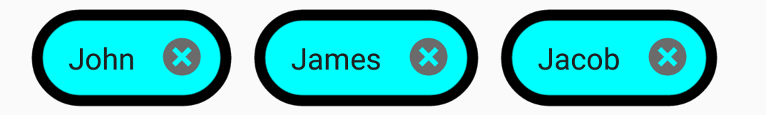
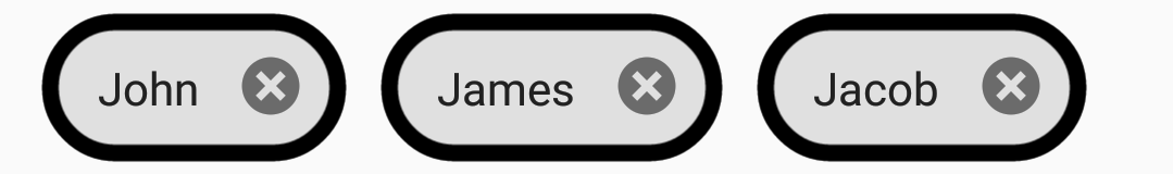
ChipBackgroundColor
The ChipBackgroundColor property customizes the background color of the SfChipGroup.
<ContentPage xmlns="http://xamarin.com/schemas/2014/forms"
             xmlns:x="http://schemas.microsoft.com/winfx/2009/xaml"
             xmlns:local="clr-namespace:ChipCustomization"
             xmlns:buttons="clr-namespace:Syncfusion.XForms.Buttons;assembly=Syncfusion.Buttons.XForms"
             x:Class="ChipCustomization.MainPage">

 <ContentPage.BindingContext>
        <local:ViewModel/>
    </ContentPage.BindingContext>
    <ContentPage.Content>
        <StackLayout Margin="10,10,10,10">
            <buttons:SfChipGroup
                ItemsSource="{Binding Employees}"
                DisplayMemberPath="Name"
                ChipBackgroundColor="Aqua"
                Type="Choice">
            </buttons:SfChipGroup>
        </StackLayout>
    </ContentPage.Content>

</ContentPage>
using System;
using Syncfusion.XForms.Buttons;
using Xamarin.Forms;
namespace ChipCustomization
{
public partial class MainPage : ContentPage
{
public MainPage()
{
InitializeComponent();
StackLayout stack = new StackLayout();
SfChipGroup chipGroup = new SfChipGroup();
stack.Children.Add(chipGroup);
FlexLayout layout = new FlexLayout()
{
Direction = FlexDirection.Row,
Wrap = FlexWrap.Wrap,
HorizontalOptions = LayoutOptions.Start,
VerticalOptions = LayoutOptions.Center,
AlignContent = FlexAlignContent.Start,
JustifyContent = FlexJustify.Start,
AlignItems = FlexAlignItems.Start,
};
chipGroup.ChipLayout = layout;
this.BindingContext = new ViewModel();
chipGroup.SetBinding(SfChipGroup.ItemsSourceProperty, "Employees");
chipGroup.DisplayMemberPath = "Name";
chipGroup.ChipBackgroundColor = Color.Aqua;
chipGroup.Type = SfChipsType.Choice;
this.Content = stack;
}
}
}
NOTE
The default value of
ChipBackgroundColoris [Color.FromHex("#E0E0E0")].
ChipBorderColor
The ChipBorderColor property customizes the border color of the SfChipGroup.
<ContentPage xmlns="http://xamarin.com/schemas/2014/forms"
             xmlns:x="http://schemas.microsoft.com/winfx/2009/xaml"
             xmlns:local="clr-namespace:ChipCustomization"
             xmlns:buttons="clr-namespace:Syncfusion.XForms.Buttons;assembly=Syncfusion.Buttons.XForms"
             x:Class="ChipCustomization.MainPage">

 <ContentPage.BindingContext>
        <local:ViewModel/>
    </ContentPage.BindingContext>
    <ContentPage.Content>
        <StackLayout Margin="10,10,10,10">
            <buttons:SfChipGroup
                ItemsSource="{Binding Employees}"
                DisplayMemberPath="Name"
                ChipBorderWidth="5"
                ChipBorderColor="Black"
                ChipBackgroundColor="Aqua">
            </buttons:SfChipGroup>
        </StackLayout>
    </ContentPage.Content>

</ContentPage>
using System;
using Syncfusion.XForms.Buttons;
using Xamarin.Forms;
namespace ChipCustomization
{
public partial class MainPage : ContentPage
{
public MainPage()
{
InitializeComponent();
StackLayout stack = new StackLayout();
SfChipGroup chipGroup = new SfChipGroup();
stack.Children.Add(chipGroup);
FlexLayout layout = new FlexLayout()
{
Direction = FlexDirection.Row,
Wrap = FlexWrap.Wrap,
HorizontalOptions = LayoutOptions.Start,
VerticalOptions = LayoutOptions.Center,
AlignContent = FlexAlignContent.Start,
JustifyContent = FlexJustify.Start,
AlignItems = FlexAlignItems.Start,
};
chipGroup.ChipLayout = layout;
this.BindingContext = new ViewModel();
chipGroup.SetBinding(SfChipGroup.ItemsSourceProperty, "Employees");
chipGroup.DisplayMemberPath = "Name";
chipGroup.ChipBorderWidth = 5;
chipGroup.ChipBorderColor = Color.Black;
chipGroup.ChipBackgroundColor = Color.Aqua;
this.Content = stack;
}
}
}
NOTE
The default value of
ChipBorderColoris [Color.Transparent].
ChipTextColor
The ChipTextColor property customizes the text color of the SfChipGroup.
<ContentPage xmlns="http://xamarin.com/schemas/2014/forms"
             xmlns:x="http://schemas.microsoft.com/winfx/2009/xaml"
             xmlns:local="clr-namespace:ChipCustomization"
             xmlns:buttons="clr-namespace:Syncfusion.XForms.Buttons;assembly=Syncfusion.Buttons.XForms"
             x:Class="ChipCustomization.MainPage">

 <ContentPage.BindingContext>
        <local:ViewModel/>
    </ContentPage.BindingContext>
    <ContentPage.Content>
        <StackLayout Margin="10,10,10,10">
            <buttons:SfChipGroup
                ItemsSource="{Binding Employees}"
                DisplayMemberPath="Name"
                ChipTextColor="Blue">
            </buttons:SfChipGroup>
            <buttons:SfChipGroup.ChipLayout>
                    <FlexLayout
                        HorizontalOptions="Start"
                        VerticalOptions="Center"
                        Direction="Row"
                        Wrap="Wrap"
                        JustifyContent="Start"
                        AlignContent="Start"
                        AlignItems="Start"/>
                </buttons:SfChipGroup.ChipLayout>
        </StackLayout>
    </ContentPage.Content>

</ContentPage>
using System;
using Syncfusion.XForms.Buttons;
using Xamarin.Forms;
namespace ChipCustomization
{
public partial class MainPage : ContentPage
{
public MainPage()
{
InitializeComponent();
StackLayout stack = new StackLayout();
SfChipGroup chipGroup = new SfChipGroup();
stack.Children.Add(chipGroup);
FlexLayout layout = new FlexLayout()
{
Direction = FlexDirection.Row,
Wrap = FlexWrap.Wrap,
HorizontalOptions = LayoutOptions.Start,
VerticalOptions = LayoutOptions.Center,
AlignContent = FlexAlignContent.Start,
JustifyContent = FlexJustify.Start,
AlignItems = FlexAlignItems.Start,
};
chipGroup.ChipLayout = layout;
this.BindingContext = new ViewModel();
chipGroup.SetBinding(SfChipGroup.ItemsSourceProperty, "Employees");
chipGroup.DisplayMemberPath = "Name";
chipGroup.ChipTextColor = Color.Blue;
this.Content = stack;
}
}
}
NOTE
The default value of
ChipTextColoris [Color.FromHex("#212121")].
ChipTextSize
The ChipTextSize property customizes the text size of the SfChipGroup.
<ContentPage xmlns="http://xamarin.com/schemas/2014/forms"
             xmlns:x="http://schemas.microsoft.com/winfx/2009/xaml"
             xmlns:local="clr-namespace:ChipCustomization"
             xmlns:buttons="clr-namespace:Syncfusion.XForms.Buttons;assembly=Syncfusion.Buttons.XForms"
             x:Class="ChipCustomization.MainPage">

 <ContentPage.BindingContext>
        <local:ViewModel/>
    </ContentPage.BindingContext>
    <ContentPage.Content>
        <StackLayout Margin="8,8,0,0">
            <buttons:SfChipGroup
                ItemsSource="{Binding Employees}"
                DisplayMemberPath="Name"
                ChipTextSize="10">
            </buttons:SfChipGroup>
            <buttons:SfChipGroup.ChipLayout>
                    <FlexLayout
                        HorizontalOptions="Start"
                        VerticalOptions="Center"
                        Direction="Row"
                        Wrap="Wrap"
                        JustifyContent="Start"
                        AlignContent="Start"
                        AlignItems="Start"/>
                </buttons:SfChipGroup.ChipLayout>
        </StackLayout>
    </ContentPage.Content>

</ContentPage>
using System;
using Syncfusion.XForms.Buttons;
using Xamarin.Forms;
namespace ChipCustomization
{
public partial class MainPage : ContentPage
{
public MainPage()
{
InitializeComponent();
StackLayout stack = new StackLayout();
SfChipGroup chipGroup = new SfChipGroup();
stack.Children.Add(chipGroup);
FlexLayout layout = new FlexLayout()
{
Direction = FlexDirection.Row,
Wrap = FlexWrap.Wrap,
HorizontalOptions = LayoutOptions.Start,
VerticalOptions = LayoutOptions.Center,
AlignContent = FlexAlignContent.Start,
JustifyContent = FlexJustify.Start,
AlignItems = FlexAlignItems.Start,
};
chipGroup.ChipLayout = layout;
this.BindingContext = new ViewModel();
chipGroup.SetBinding(SfChipGroup.ItemsSourceProperty, "Employees");
chipGroup.DisplayMemberPath = "Name";
chipGroup.ChipTextSize = 10;
this.Content = stack;
}
}
}
NOTE
The default value of
ChipTextSizeis [14d].
ChipPadding
The ChipPadding property sets spacing between each chip.
<ContentPage xmlns="http://xamarin.com/schemas/2014/forms"
             xmlns:x="http://schemas.microsoft.com/winfx/2009/xaml"
             xmlns:local="clr-namespace:ChipCustomization"
             xmlns:buttons="clr-namespace:Syncfusion.XForms.Buttons;assembly=Syncfusion.Buttons.XForms"
             x:Class="ChipCustomization.MainPage">

 <ContentPage.BindingContext>
        <local:ViewModel/>
    </ContentPage.BindingContext>
    <ContentPage.Content>
        <StackLayout Margin="8,8,0,0">
            <buttons:SfChipGroup
                ItemsSource="{Binding Employees}"
                DisplayMemberPath="Name"
                ChipPadding="8,0,0,0">
            </buttons:SfChipGroup>
            <buttons:SfChipGroup.ChipLayout>
                    <FlexLayout
                        HorizontalOptions="Start"
                        VerticalOptions="Center"
                        Direction="Row"
                        Wrap="Wrap"
                        JustifyContent="Start"
                        AlignContent="Start"
                        AlignItems="Start"/>
                </buttons:SfChipGroup.ChipLayout>
        </StackLayout>
    </ContentPage.Content>

</ContentPage>
using System;
using Syncfusion.XForms.Buttons;
using Xamarin.Forms;
namespace ChipCustomization
{
public partial class MainPage : ContentPage
{
public MainPage()
{
InitializeComponent();
StackLayout stack = new StackLayout();
SfChipGroup chipGroup = new SfChipGroup();
stack.Children.Add(chipGroup);
FlexLayout layout = new FlexLayout()
{
Direction = FlexDirection.Row,
Wrap = FlexWrap.Wrap,
HorizontalOptions = LayoutOptions.Start,
VerticalOptions = LayoutOptions.Center,
AlignContent = FlexAlignContent.Start,
JustifyContent = FlexJustify.Start,
AlignItems = FlexAlignItems.Start,
};
chipGroup.ChipLayout = layout;
this.BindingContext = new ViewModel();
chipGroup.SetBinding(SfChipGroup.ItemsSourceProperty, "Employees");
chipGroup.ChipPadding = new Thickness(8, 8, 0, 0);
chipGroup.DisplayMemberPath = "Name";
this.Content = stack;
}
}
}
NOTE
The default value of
ChipPaddingis [Thickness(5d, 0, 0, 0)].
ChipBorderWidth
The ChipBorderWidth property customizes the border width of the SfChipGroup.
<ContentPage xmlns="http://xamarin.com/schemas/2014/forms"
             xmlns:x="http://schemas.microsoft.com/winfx/2009/xaml"
             xmlns:local="clr-namespace:ChipCustomization"
             xmlns:buttons="clr-namespace:Syncfusion.XForms.Buttons;assembly=Syncfusion.Buttons.XForms"
             x:Class="ChipCustomization.MainPage">

 <ContentPage.BindingContext>
        <local:ViewModel/>
    </ContentPage.BindingContext>
    <ContentPage.Content>
        <StackLayout Margin="8,8,0,0">
            <buttons:SfChipGroup
                ItemsSource="{Binding Employees}"
                ChipBorderWidth="5"
                DisplayMemberPath="Name"
                ChipBorderColor="Black">
            </buttons:SfChipGroup>
            <buttons:SfChipGroup.ChipLayout>
                    <FlexLayout
                        HorizontalOptions="Start"
                        VerticalOptions="Center"
                        Direction="Row"
                        Wrap="Wrap"
                        JustifyContent="Start"
                        AlignContent="Start"
                        AlignItems="Start"/>
                </buttons:SfChipGroup.ChipLayout>
        </StackLayout>
    </ContentPage.Content>

</ContentPage>
using System;
using Syncfusion.XForms.Buttons;
using Xamarin.Forms;
namespace ChipCustomization
{
public partial class MainPage : ContentPage
{
public MainPage()
{
InitializeComponent();
StackLayout stack = new StackLayout();
SfChipGroup chipGroup = new SfChipGroup();
stack.Children.Add(chipGroup);
FlexLayout layout = new FlexLayout()
{
Direction = FlexDirection.Row,
Wrap = FlexWrap.Wrap,
HorizontalOptions = LayoutOptions.Start,
VerticalOptions = LayoutOptions.Center,
AlignContent = FlexAlignContent.Start,
JustifyContent = FlexJustify.Start,
AlignItems = FlexAlignItems.Start,
};
chipGroup.ChipLayout = layout;
this.BindingContext = new ViewModel();
chipGroup.SetBinding(SfChipGroup.ItemsSourceProperty, "Employees");
chipGroup.ChipBorderWidth = 5;
chipGroup.ChipBorderColor = Color.Black;
chipGroup.DisplayMemberPath = "Name";
this.Content = stack;
}
}
}
NOTE
The default value of
ChipBorderWidthis [0d].
ItemHeight
The ItemHeight property customizes the height of the items in the SfChipGroup.
<ContentPage xmlns="http://xamarin.com/schemas/2014/forms"
             xmlns:x="http://schemas.microsoft.com/winfx/2009/xaml"
             xmlns:local="clr-namespace:ChipCustomization"
             xmlns:buttons="clr-namespace:Syncfusion.XForms.Buttons;assembly=Syncfusion.Buttons.XForms"
             x:Class="ChipCustomization.MainPage">

 <ContentPage.BindingContext>
        <local:ViewModel/>
    </ContentPage.BindingContext>
    <ContentPage.Content>
        <StackLayout Margin="8,8,0,0">
            <buttons:SfChipGroup
                ItemsSource="{Binding Employees}"
                ItemHeight="60"
                DisplayMemberPath="Name">
            </buttons:SfChipGroup>
            <buttons:SfChipGroup.ChipLayout>
                    <FlexLayout
                        HorizontalOptions="Start"
                        VerticalOptions="Center"
                        Direction="Row"
                        Wrap="Wrap"
                        JustifyContent="Start"
                        AlignContent="Start"
                        AlignItems="Start"/>
                </buttons:SfChipGroup.ChipLayout>
        </StackLayout>
    </ContentPage.Content>

</ContentPage>
using System;
using Syncfusion.XForms.Buttons;
using Xamarin.Forms;
namespace ChipCustomization
{
public partial class MainPage : ContentPage
{
public MainPage()
{
InitializeComponent();
StackLayout stack = new StackLayout();
SfChipGroup chipGroup = new SfChipGroup();
stack.Children.Add(chipGroup);
FlexLayout layout = new FlexLayout()
{
Direction = FlexDirection.Row,
Wrap = FlexWrap.Wrap,
HorizontalOptions = LayoutOptions.Start,
VerticalOptions = LayoutOptions.Center,
AlignContent = FlexAlignContent.Start,
JustifyContent = FlexJustify.Start,
AlignItems = FlexAlignItems.Start,
};
chipGroup.ChipLayout = layout;
this.BindingContext = new ViewModel();
chipGroup.SetBinding(SfChipGroup.ItemsSourceProperty, "Employees");
chipGroup.ItemHeight = 60;
chipGroup.DisplayMemberPath = "Name";
this.Content = stack;
}
}
}
NOTE
The default value of
ItemHeightis [double.NaN].
ShowIcon
You can enable the icon image using the ShowIcon property to know whether any image appears on the SfChipGroup.
<ContentPage xmlns="http://xamarin.com/schemas/2014/forms"
             xmlns:x="http://schemas.microsoft.com/winfx/2009/xaml"
             xmlns:local="clr-namespace:ChipCustomization"
             xmlns:buttons="clr-namespace:Syncfusion.XForms.Buttons;assembly=Syncfusion.Buttons.XForms"
             x:Class="ChipCustomization.MainPage">

<ContentPage.BindingContext>
        <local:ViewModel x:Name="viewModel"/>
    </ContentPage.BindingContext>
    <ContentPage.Content>
        <Grid>
            <buttons:SfChipGroup
                ItemsSource="{Binding Employees}"
                ChipPadding="8,8,0,0"
                ImageMemberPath="Image"
                ShowIcon="true"
                ChipBackgroundColor="Aqua"
                DisplayMemberPath="Name">
                <buttons:SfChipGroup.ChipLayout>
                    <FlexLayout
                        HorizontalOptions="Start"
                        VerticalOptions="Center"
                        Direction="Row"
                        Wrap="Wrap"
                        JustifyContent="Start"
                        AlignContent="Start"
                        AlignItems="Start"/>
                </buttons:SfChipGroup.ChipLayout>
            </buttons:SfChipGroup>
        </Grid>
    </ContentPage.Content>

</ContentPage>
using System;
using Syncfusion.XForms.Buttons;
using Xamarin.Forms;
namespace ChipCustomization
{
public partial class MainPage : ContentPage
{
public MainPage()
{
InitializeComponent();
StackLayout stack = new StackLayout();
SfChipGroup chipGroup = new SfChipGroup();
stack.Children.Add(chipGroup);
FlexLayout layout = new FlexLayout()
{
Direction = FlexDirection.Row,
Wrap = FlexWrap.Wrap,
HorizontalOptions = LayoutOptions.Start,
VerticalOptions = LayoutOptions.Center,
AlignContent = FlexAlignContent.Start,
JustifyContent = FlexJustify.Start,
AlignItems = FlexAlignItems.Start,
};
chipGroup.ChipLayout = layout;
this.BindingContext = new ViewModel();
chipGroup.SetBinding(SfChipGroup.ItemsSourceProperty, "Employees");
chipGroup.DisplayMemberPath = "Name";
chipGroup.ImageMemberPath = "Image";
chipGroup.ChipImageWidth = 30;
chipGroup.SelectionIndicatorColor = Color.Black;
chipGroup.CloseButtonColor = Color.White;
chipGroup.ChipBackgroundColor = Color.Aqua;
chipGroup.Type = SfChipsType.Input;
chipGroup.ShowIcon = true;
chipGroup.ChipPadding = new Thickness(8, 8, 0, 0);
this.Content = stack;
}
}
public class Person
{
public string Name
{
get;
set;
}
public string Image
{
get;
set;
}
}
public class ViewModel : INotifyPropertyChanged
{
private ObservableCollection<Person> employees;
public ObservableCollection<Person> Employees
{
get
{
return employees;
}
set
{
Employees = value;
OnPropertyChanged("Employees");
}
}
public ViewModel()
{
employees = new ObservableCollection<Person>();
employees.Add(new Person() { Image = "ChipUserContact.png", Name = "John" });
employees.Add(new Person() { Image = "ChipUserContact.png", Name = "James" });
}
public event PropertyChangedEventHandler PropertyChanged;
public void OnPropertyChanged(string property)
{
if (PropertyChanged != null)
{
PropertyChanged(this, new PropertyChangedEventArgs(property));
}
}
}
}
CloseButtonColor
The CloseButtonColor property customizes the color of close button in the SfChipGroup.
<ContentPage xmlns="http://xamarin.com/schemas/2014/forms"
             xmlns:x="http://schemas.microsoft.com/winfx/2009/xaml"
             xmlns:local="clr-namespace:ChipCustomization"
             xmlns:buttons="clr-namespace:Syncfusion.XForms.Buttons;assembly=Syncfusion.Buttons.XForms"
             x:Class="ChipCustomization.MainPage">

<ContentPage.BindingContext>
        <local:ViewModel x:Name="viewModel"/>
    </ContentPage.BindingContext>
    <ContentPage.Content>
        <StackLayout Margin="8,8,0,0">
            <buttons:SfChipGroup
                ItemsSource="{Binding Employees}"
                ImageMemberPath="Image"
                Type="Input"
                ChipImageWidth="30"
                ShowIcon="true"
                CloseButtonColor="White"
                ChipBackgroundColor="Aqua"
                DisplayMemberPath="Name">
                <buttons:SfChipGroup.ChipLayout>
                    <FlexLayout
                        HorizontalOptions="Start"
                        VerticalOptions="Center"
                        Direction="Row"
                        Wrap="Wrap"
                        JustifyContent="Start"
                        AlignContent="Start"
                        AlignItems="Start"/>
                </buttons:SfChipGroup.ChipLayout>
            </buttons:SfChipGroup>
        </StackLayout>
    </ContentPage.Content>

</ContentPage>
using System;
using Syncfusion.XForms.Buttons;
using Xamarin.Forms;
namespace ChipCustomization
{
public partial class MainPage : ContentPage
{
public MainPage()
{
InitializeComponent();
StackLayout stack = new StackLayout();
SfChipGroup chipGroup = new SfChipGroup();
stack.Children.Add(chipGroup);
FlexLayout layout = new FlexLayout()
{
Direction = FlexDirection.Row,
Wrap = FlexWrap.Wrap,
HorizontalOptions = LayoutOptions.Start,
VerticalOptions = LayoutOptions.Center,
AlignContent = FlexAlignContent.Start,
JustifyContent = FlexJustify.Start,
AlignItems = FlexAlignItems.Start,
};
chipGroup.ChipLayout = layout;
this.BindingContext = new ViewModel();
chipGroup.SetBinding(SfChipGroup.ItemsSourceProperty, "Employees");
chipGroup.DisplayMemberPath = "Name";
chipGroup.ImageMemberPath = "Image";
chipGroup.ChipImageWidth = 30;
chipGroup.SelectionIndicatorColor = Color.Black;
chipGroup.CloseButtonColor = Color.White;
chipGroup.ChipBackgroundColor = Color.Aqua;
chipGroup.Type = SfChipsType.Input;
chipGroup.ShowIcon = true;
this.Content = stack;
}
}
}NOTE
The default value of
CloseButtonColoris [Color.Black].
SelectionIndicatorColor
The SelectionIndicatorColor property customizes the selection indicator color of the SfChipGroup.
<ContentPage xmlns="http://xamarin.com/schemas/2014/forms"
             xmlns:x="http://schemas.microsoft.com/winfx/2009/xaml"
             xmlns:local="clr-namespace:ChipCustomization"
             xmlns:buttons="clr-namespace:Syncfusion.XForms.Buttons;assembly=Syncfusion.Buttons.XForms"
             x:Class="ChipCustomization.MainPage">

<ContentPage.BindingContext>
        <local:ViewModel x:Name="viewModel"/>
    </ContentPage.BindingContext>
    <ContentPage.Content>
        <StackLayout Margin="8,8,0,0">
            <buttons:SfChipGroup
                ItemsSource="{Binding Employees}"
                Type="Filter"
                SelectionIndicatorColor="Black"
                CloseButtonColor="White"
                ChipBackgroundColor="Aqua"
                DisplayMemberPath="Name">
                <buttons:SfChipGroup.ChipLayout>
                    <FlexLayout
                        HorizontalOptions="Start"
                        VerticalOptions="Center"
                        Direction="Row"
                        Wrap="Wrap"
                        JustifyContent="Start"
                        AlignContent="Start"
                        AlignItems="Start"/>
                </buttons:SfChipGroup.ChipLayout>
            </buttons:SfChipGroup>
        </StackLayout>
    </ContentPage.Content>

</ContentPage>
using System;
using Syncfusion.XForms.Buttons;
using Xamarin.Forms;
namespace ChipCustomization
{
public partial class MainPage : ContentPage
{
public MainPage()
{
InitializeComponent();
StackLayout stack = new StackLayout();
SfChipGroup chipGroup = new SfChipGroup();
stack.Children.Add(chipGroup);
FlexLayout layout = new FlexLayout()
{
Direction = FlexDirection.Row,
Wrap = FlexWrap.Wrap,
HorizontalOptions = LayoutOptions.Start,
VerticalOptions = LayoutOptions.Center,
AlignContent = FlexAlignContent.Start,
JustifyContent = FlexJustify.Start,
AlignItems = FlexAlignItems.Start,
};
chipGroup.ChipLayout = layout;
this.BindingContext = new ViewModel();
chipGroup.SetBinding(SfChipGroup.ItemsSourceProperty, "Employees");
chipGroup.DisplayMemberPath = "Name";
chipGroup.SelectionIndicatorColor = Color.Black;
chipGroup.CloseButtonColor = Color.White;
chipGroup.ChipBackgroundColor = Color.Aqua;
chipGroup.Type = SfChipsType.Filter;
this.Content = stack;
}
}
}
NOTE
The default value of
SelectionIndicatorColoris [Color.White].
ChipImageWidth
The ChipImageWidth property customizes the width of icon image in the SfChipGroup.
<ContentPage xmlns="http://xamarin.com/schemas/2014/forms"
             xmlns:x="http://schemas.microsoft.com/winfx/2009/xaml"
             xmlns:local="clr-namespace:ChipCustomization"
             xmlns:buttons="clr-namespace:Syncfusion.XForms.Buttons;assembly=Syncfusion.Buttons.XForms"
             x:Class="ChipCustomization.MainPage">

<ContentPage.BindingContext>
        <local:ViewModel x:Name="viewModel"/>
    </ContentPage.BindingContext>
    <ContentPage.Content>
        <StackLayout Margin="8,8,0,0">
            <buttons:SfChipGroup
                ItemsSource="{Binding Employees}"
                ImageMemberPath="Image"
                Type="Choice"
                ChipImageWidth="30"
                ShowIcon="true"
                ChipBackgroundColor="Aqua"
                DisplayMemberPath="Name">
                <buttons:SfChipGroup.ChipLayout>
                    <FlexLayout
                        HorizontalOptions="Start"
                        VerticalOptions="Center"
                        Direction="Row"
                        Wrap="Wrap"
                        JustifyContent="Start"
                        AlignContent="Start"
                        AlignItems="Start"/>
                </buttons:SfChipGroup.ChipLayout>
            </buttons:SfChipGroup>
        </StackLayout>
    </ContentPage.Content>

</ContentPage>
using System;
using System.Collections.Generic;
using System.Collections.ObjectModel;
using System.ComponentModel;
using Syncfusion.XForms.Buttons;
using Xamarin.Forms;
namespace ChipCustomization
{
public partial class MainPage : ContentPage
{
public MainPage()
{
InitializeComponent();
StackLayout stack = new StackLayout();
SfChipGroup chipGroup = new SfChipGroup();
stack.Children.Add(chipGroup);
FlexLayout layout = new FlexLayout()
{
Direction = FlexDirection.Row,
Wrap = FlexWrap.Wrap,
HorizontalOptions = LayoutOptions.Start,
VerticalOptions = LayoutOptions.Center,
AlignContent = FlexAlignContent.Start,
JustifyContent = FlexJustify.Start,
AlignItems = FlexAlignItems.Start,
};
chipGroup.ChipLayout = layout;
this.BindingContext = new ViewModel();
chipGroup.SetBinding(SfChipGroup.ItemsSourceProperty, "Employees");
chipGroup.DisplayMemberPath = "Name";
chipGroup.ImageMemberPath = "Image";
chipGroup.ChipImageWidth = 30;
chipGroup.ChipBackgroundColor = Color.Aqua;
chipGroup.Type = SfChipsType.Choice;
chipGroup.ShowIcon = true;
this.Content = stack;
}
}
// Model Class
public class Person
{
public string Name
{
get;
set;
}
public string Image
{
get;
set;
}
}
//ViewModel Class
public class ViewModel : INotifyPropertyChanged
{
private ObservableCollection<Person> employees;
public ObservableCollection<Person> Employees
{
get
{
return employees;
}
set
{
Employees = value;
OnPropertyChanged("Employees");
}
}
public ViewModel()
{
employees = new ObservableCollection<Person>();
employees.Add(new Person() { Image = "ChipUserContact.png", Name = "John" });
employees.Add(new Person() { Image = "ChipUserContact.png", Name = "James" });
}
public event PropertyChangedEventHandler PropertyChanged;
public void OnPropertyChanged(string property)
{
if (PropertyChanged != null)
{
PropertyChanged(this, new PropertyChangedEventArgs(property));
}
}
}
}
NOTE
The default value of
ChipImageWidthis [26].
See also
How to customize the corner radius of ChipGroup items in Xamarin.Forms
How to remove the indicator icon from Xamarin.Forms chip group (SfChipGroup)
How to restrict chip selection in Xamarin
How to select a multiple chips from the Xamarin ChipGroup [SfChipGroup]
How to display each chip in different colors in the Xamarin.Forms ChipGroup