Trackball in Xamarin Charts (SfChart)
6 Jan 202515 minutes to read
Trackball feature displays the tooltip for the data points that are closer to the point where you touch on the chart area. This feature, especially, can be used instead of data label feature when you cannot show data labels for all data points due to space constraint. To enable this feature, add an instance of ChartTrackballBehavior to the ChartBehaviors collection property of SfChart. Trackball will be activated once you long-press anywhere on the chart area. Once it is activated, it will appear in the UI and move based on your touch movement until you stop touching on the chart.
You can use the following properties to show/hide the line and labels.
-
ShowLabel– Shows/hides trackball label. Default value is true. -
ShowLine– Shows/hides the trackball line. Default value is true.
<chart:SfChart>
...

	<chart:SfChart.ChartBehaviors>

		<chart:ChartTrackballBehavior ShowLabel="True" ShowLine="True"/>

	</chart:SfChart.ChartBehaviors>

</chart:SfChart>
SfChart chart = new SfChart();
...
ChartTrackballBehavior trackballBehavior = new ChartTrackballBehavior();
trackballBehavior.ShowLabel = true;
trackballBehavior.ShowLine = true;
chart.ChartBehaviors.Add(trackballBehavior);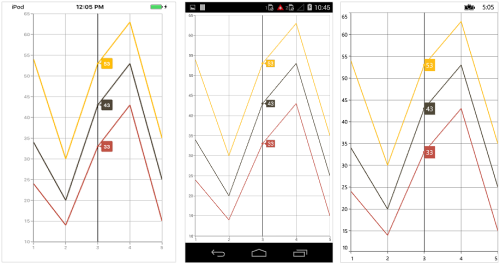
Label Display Mode
TrackballLabelDisplayMode property is used to specify whether to display label for all the data points along the vertical line or display only single label. Following are the two options you can set to this property,
-
FloatAllPoints– Displays label for all the data points along the vertical line. -
NearestPoint– Displays label for single data point that is nearer to the touch contact position. -
GroupAllPoints– Displays label for all the data points grouped and positioned at the top of the chart area.
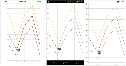
<chart:ChartTrackballBehavior LabelDisplayMode="NearestPoint" ShowLine="False"/>ChartTrackballBehavior trackballBehavior = new ChartTrackballBehavior();
trackballBehavior.ShowLine = false;
trackballBehavior.LabelDisplayMode = TrackballLabelDisplayMode.NearestPoint;In the following screenshot, trackball label is shown for only single data point,
Activation mode
The ActivationMode property is used to restrict the visibility of trackball based on the touch actions. The default value of this property is ChartTrackballActivationMode.LongPress.
The ChartTrackballActivationMode enum contains the following values:
-
LongPress– Activates trackball only when performing the long press action. -
TouchMove– Activates trackball only when performing touch move action. -
None– Hides the visibility of trackball when setting activation mode toNone. It will be activated when calling theShowmethod.
NOTE
The default value of
ActivationModeproperty isChartTrackballActivationMode.LongPressfor Android and iOS platform and default value for MacOS and UWP platform isChartTrackballActivationMode.TouchMove.
Customizing appearance
Customize Trackball Labels
The LabelStyle property provides options to customize the trackball labels.
-
BorderColor– used to change the label border color. -
BackgroundColor– used to change the label background color. -
BorderThickness– used to change label border thickness. -
TextColor– used to change the text color. -
Font– used to change the text size, font family, and font weight. (This is deprecated API. Use FontSize, FontFamily, and FontAttributes properties instead of this.) -
FontFamily- used to change the font family for the trackball label. -
FontAttributes- used to change the font style for the trackball label. -
FontSize- used to change the font size for the trackball label.
<chart:SfChart>
...

	<chart:SfChart.ChartBehaviors>

		<chart:ChartTrackballBehavior>

			<chart:ChartTrackballBehavior.LabelStyle>

				<chart:ChartTrackballLabelStyle BorderColor="Maroon" BackgroundColor="Aqua" BorderThickness="2" TextColor="Red" FontSize="18" FontAttributes="Italic"/>

			</chart:ChartTrackballBehavior.LabelStyle>

		</chart:ChartTrackballBehavior>

	</chart:SfChart.ChartBehaviors>

</chart:SfChart>
SfChart chart = new SfChart();
...
ChartTrackballBehavior trackBallBehavior = new ChartTrackballBehavior();
trackBallBehavior.LabelStyle.BorderColor = Color.Maroon;
trackBallBehavior.LabelStyle.BorderThickness = 2;
trackBallBehavior.LabelStyle.FontSize = 18;
trackBallBehavior.LabelStyle.FontAttributes = FontAttributes.Italic;
trackBallBehavior.LabelStyle.BackgroundColor = Color.Aqua;
trackBallBehavior.LabelStyle.TextColor = Color.Red;
chart.ChartBehaviors.Add(trackballBehavior);Customize Trackball Marker
The MarkerStyle property provides options to customize the trackball markers.
Following properties are used to customize the trackball marker.
-
ShowMarker– used to enable / disable the marker. Default value is true. -
BorderColor– used to change the marker border color. -
Color– used to change the marker background color. -
BorderWidth– used to change the width of the marker border. -
Width– used to change the width of the marker. -
Height– used to change the height of the marker.
<chart:SfChart HorizontalOptions="FillAndExpand" VerticalOptions="FillAndExpand">
...

	<chart:SfChart.ChartBehaviors>

		<chart:ChartTrackballBehavior>

			<chart:ChartTrackballBehavior.MarkerStyle>

				<chart:ChartTrackballMarkerStyle BorderColor="Purple" ShowMarker="True" BorderWidth="1" Width="8" Height="8" Color="Green"/>

			</chart:ChartTrackballBehavior.MarkerStyle>

		</chart:ChartTrackballBehavior>

	</chart:SfChart.ChartBehaviors>

</chart:SfChart>
SfChart chart = new SfChart();
...
ChartTrackballBehavior trackBallBehavior = new ChartTrackballBehavior();
trackBallBehavior.MarkerStyle.BorderWidth = 1;
trackBallBehavior.MarkerStyle.BorderColor = Color.Purple;
trackBallBehavior.MarkerStyle.Width = 8;
trackBallBehavior.MarkerStyle.Height = 8;
trackBallBehavior.MarkerStyle.Color = Color.Green;
trackBallBehavior.MarkerStyle.ShowMarker = true;
chart.ChartBehaviors.Add(trackballBehavior);Customize Trackball Line
The LineStyle property provides options to customize the trackball line.
-
ShowLine– used to enable / disable the line. Default value is true. -
StrokeWidth– used to change the stroke width of the line. -
StrokeColor– used to change the stroke color of the line. -
StrokeDashArray– Specifies the dashes to be applied on the line.
<chart:SfChart HorizontalOptions="FillAndExpand" VerticalOptions="FillAndExpand">
...

	<chart:SfChart.ChartBehaviors>

		<chart:ChartTrackballBehavior>

			<chart:ChartTrackballBehavior.LineStyle>

				<chart:ChartLineStyle StrokeColor="Blue" StrokeWidth="2"/>

			</chart:ChartTrackballBehavior.LineStyle>

		</chart:ChartTrackballBehavior>

	</chart:SfChart.ChartBehaviors>

</chart:SfChart>
SfChart chart = new SfChart();
...
ChartTrackballBehavior trackBallBehavior = new ChartTrackballBehavior();
trackBallBehavior.ShowLine = true;
trackBallBehavior.LineStyle.StrokeWidth = 2;
trackBallBehavior.LineStyle.StrokeColor = Color.Blue;
trackBallBehavior.LineStyle.StrokeDashArray = new double[2] { 2, 3 };
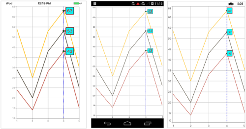
chart.ChartBehaviors.Add(trackballBehavior);Following screenshot illustrates the customization of trackball elements.
Show/hide the trackball label in axis
This feature is used to highlight the respective axis label when the trackball is moving across the axis. ChartAxis.ShowTrackballInfo property is used show/hide the trackball label of the axis. ChartAxis.TrackballLabelStyle property is used to customize its appearance. Default value of ChartAxis.ShowTrackballInfo is False.
<chart:SfChart.PrimaryAxis >

    <chart:CategoryAxis ShowTrackballInfo = "true" />

</chart:SfChart.PrimaryAxis >chart.PrimaryAxis.ShowTrackballInfo = true;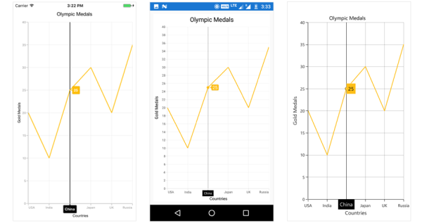
Axis label alignment
The position of trackball’s axis label can be changed using the AxisLabelAlignment property of ChartTrackballAxisLabelStyle. The following options are available in AxisLabelAlignment.
-
Far- The label will be positioned below the tick in vertical axis and right of the tick in horizontal axis. -
Near- The label will be positioned above the tick in vertical axis and left of the tick in horizontal axis. -
Center- The label will be positioned at the center of tick. This is the default value.
The following code snippet and screenshot demonstrate the placement of label at the left to tick line.
<chart:SfChart>
 ...
<chart:CategoryAxis.TrackballLabelStyle>

    <chart:ChartTrackballAxisLabelStyle AxisLabelAlignment="Near"/>

</chart:CategoryAxis.TrackballLabelStyle>
 ...
</chart:SfChart>primaryAxis.TrackballLabelStyle.AxisLabelAlignment = ChartLabelAlignment.Near;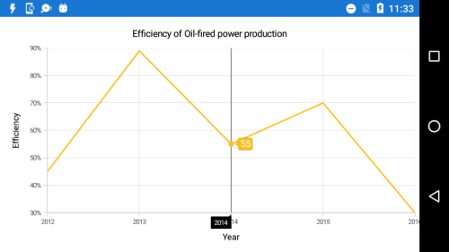
Show/hide the series label
This feature is used to show/hide the trackball label of the series by using CartesianSeries.ShowTrackballInfo property. Default value of CartesianSeries.ShowTrackballInfo property is True.
<chart:SfChart>
...

    <chart:LineSeries ItemsSource ="{Binding Data}" XBindingPath="Year"
    YBindingPath="Value" ShowTrackballInfo = "false" />

</chart:SfChart>
SfChart chart = new SfChart();
...
LineSeries lineSeries = new LineSeries()
{
ItemsSource = Data,
XBindingPath = "Year",
YBindingPath = "Value",
ShowTrackballInfo = false
};
chart.Series.Add(lineSeries);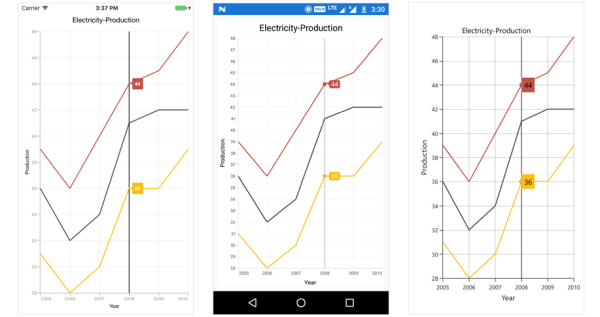
Label Template
You can customize the appearance of the Trackball label with your own template by using TrackballLabelTemplate property of ChartSeries.
<ContentPage.Resources>
    <ResourceDictionary>
       <DataTemplate x:Key="trackballTemplate">
          <StackLayout  Orientation="Horizontal">
             <Label  Text="{Binding Value}" TextColor="White" FontSize ="15" VerticalTextAlignment="Center"/>
             <Image Source ="grain.jpg" WidthRequest="30" HeightRequest="30"/>
          </StackLayout>
       </DataTemplate>
    </ResourceDictionary>
</ContentPage.Resources>

<chart:SfChart.Series>
    <chart:LineSeries TrackballLabelTemplate="{StaticResource trackballTemplate}" ItemsSource="{Binding Data1}" XBindingPath="Name" YBindingPath="Value"/>
    <chart:LineSeries TrackballLabelTemplate="{StaticResource trackballTemplate}" ItemsSource="{Binding Data2}" XBindingPath="Name" YBindingPath="Value"/>
</chart:SfChart.Series>

<chart:SfChart.ChartBehaviors>
    <chart:ChartTrackballBehavior/>
</chart:SfChart.ChartBehaviors>
SfChart chart = new SfChart ();
...
var lineSeries1 = new LineSeries();
lineSeries1.ItemsSource = Data1;
lineSeries1.XBindingPath = "Name";
lineSeries1.YBindingPath = "Value";
var lineSeries2 = new LineSeries();
lineSeries2.ItemsSource = Data2;
lineSeries2.XBindingPath = "Name";
lineSeries2.YBindingPath = "Value";
DataTemplate trackBallTemplate = new DataTemplate(() =>
{
StackLayout stack = new StackLayout();
stack.Orientation = StackOrientation.Horizontal;
Label label = new Label();
label.SetBinding(Label.TextProperty, "Value");
label.FontSize = 15;
label.VerticalTextAlignment = TextAlignment.Center;
label.TextColor = Color.White;
Image image = new Image();
image.Source = "grain.jpg";
image.WidthRequest = 30;
image.HeightRequest = 30;
stack.Children.Add(label);
stack.Children.Add(image);
return stack;
});
lineSeries1.TrackballLabelTemplate = trackBallTemplate;
lineSeries2.TrackballLabelTemplate = trackBallTemplate;
chart.Series.Add(lineSeries1);
chart.Series.Add(lineSeries2);
chart.ChartBehaviors.Add(new ChartTrackballBehavior());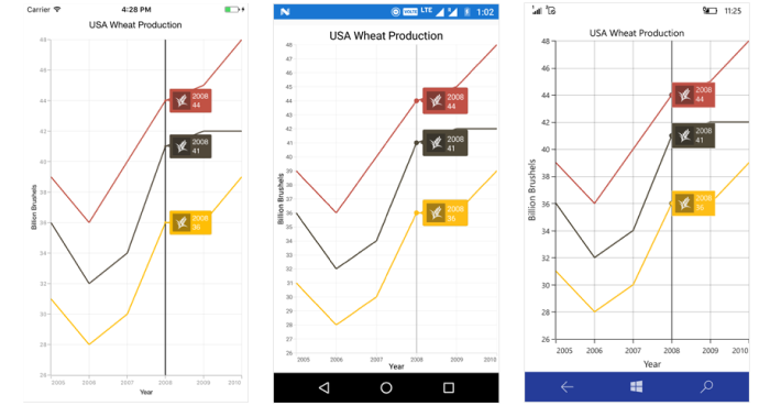
Customize the Axis Label with DataTemplate
Customize the appearance of axis label of trackball using TrackballLabelTemplate property of ChartAxis.
<ContentPage.Resources>
    <ResourceDictionary>
      <DataTemplate x:Key="axisLabelTemplate">
        <Label WidthRequest="50" HeightRequest="20" HorizontalTextAlignment="Center" BackgroundColor="Blue" Text="{Binding }" TextColor="White" FontSize ="15" />
      </DataTemplate>
    </ResourceDictionary>
</ContentPage.Resources>

 <chart:SfChart.PrimaryAxis>
       <chart:CategoryAxis  ShowTrackballInfo="True" TrackballLabelTemplate="{StaticResource axisLabelTemplate}">
        <chart:CategoryAxis.TrackballLabelStyle>
          <chart:ChartTrackballAxisLabelStyle   BackgroundColor="Transparent"/>
        </chart:CategoryAxis.TrackballLabelStyle>
      </chart:CategoryAxis>
</chart:SfChart.PrimaryAxis>

<chart:SfChart.ChartBehaviors>
     <chart:ChartTrackballBehavior />
</chart:SfChart.ChartBehaviors>Chart.PrimaryAxis = new CategoryAxis();
Chart.PrimaryAxis.ShowTrackballInfo = true;
Chart.PrimaryAxis.TrackballLabelStyle.BackgroundColor = Color.Transparent;
DataTemplate axisLabelTemplate = new DataTemplate(() =>
{
Label label = new Label();
label.SetBinding(Label.TextProperty, ".");
label.FontSize = 15;
label.HorizontalTextAlignment = TextAlignment.Center;
label.TextColor = Color.White;
label.BackgroundColor = Color.Blue;
label.WidthRequest = 50;
label.HeightRequest = 20;
return label;
});
Chart.PrimaryAxis.TrackballLabelTemplate = axisLabelTemplate;
Chart.ChartBehaviors.Add(new ChartTrackballBehavior());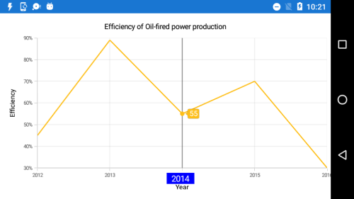
Methods
Show method
The Show method is used to activate the trackball at the specified location.
trackball.Show(pointX, pointY);Hide method
The Hide method is used to hide the trackball programmatically.
trackball.Hide();HitTest method
The HitTest method is used to check whether the point is in trackball or not.
[C#]

trackball.HitTest(pointX, pointY);
Events
TrackballCreated
The TrackballCreated event occurs when the trackball moves from one data point to another. This argument contains object of ChartPointsInfo. The following properties are available in ChartPointInfo class to customize the appearance of trackball label based on condition.
-
Label- Gets or sets the text of trackball label. -
IsVisible- Gets or sets the visibility of trackball. -
Series- Gets the series of the data point in which trackball is activated. -
LabelStyle- Customizes the appearance of trackball label. -
DataPoint- Gets the respective underlying object of the data in which trackball is activated. -
DataPointIndex- Gets the index of the selected data point. -
XPosition- Gets the x-position of trackball label. -
YPosition- Gets the y-position of trackball label. -
BackgroundColor- Gets the default background color of trackball label.
NOTE
You can refer to our Xamarin Charts feature tour page for its groundbreaking feature representations. You can also explore our Xamarin.Forms Charts example to knows various chart types and how to easily configured with built-in support for creating stunning visual effects.
See also
How to add multiple trackballs in Xamarin.Forms Chart
How to activate the trackball on touch in Xamarin.Forms
How to format the trackball labels
How to set the milliseconds label format for axis and trackball label in Xamarin.Forms Chart