Customization in Xamarin Cards
8 Jan 202510 minutes to read
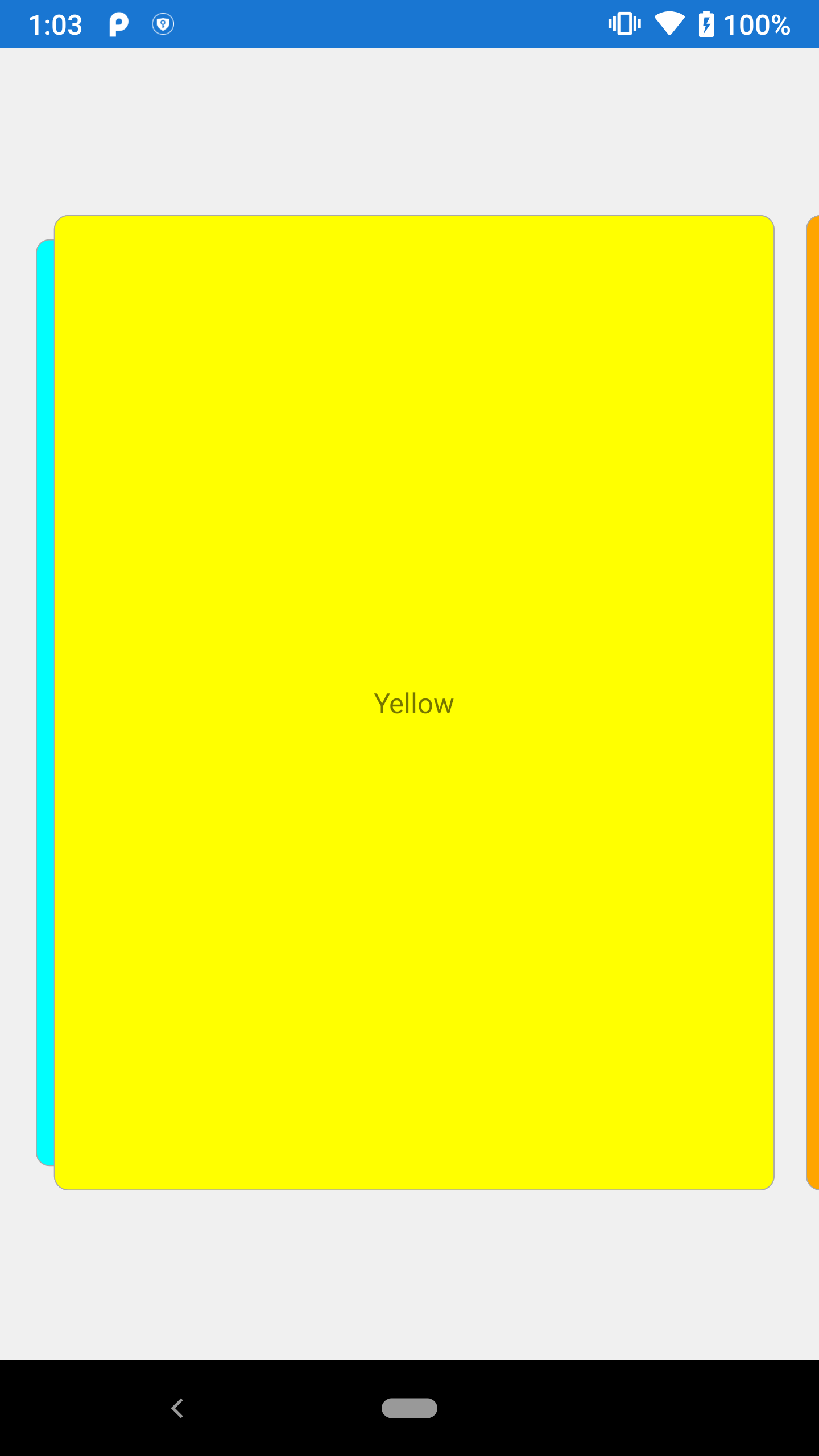
ShowSwipedCard
ShowSwipedCard can be enabled to show the swiped cards at the edge of card layout.
<cards:SfCardLayout ShowSwipedCard="true">
</cards:SfCardLayout>
SfCardLayout cardLayout = new SfCardLayout()
{
ShowSwipedCard = true
};
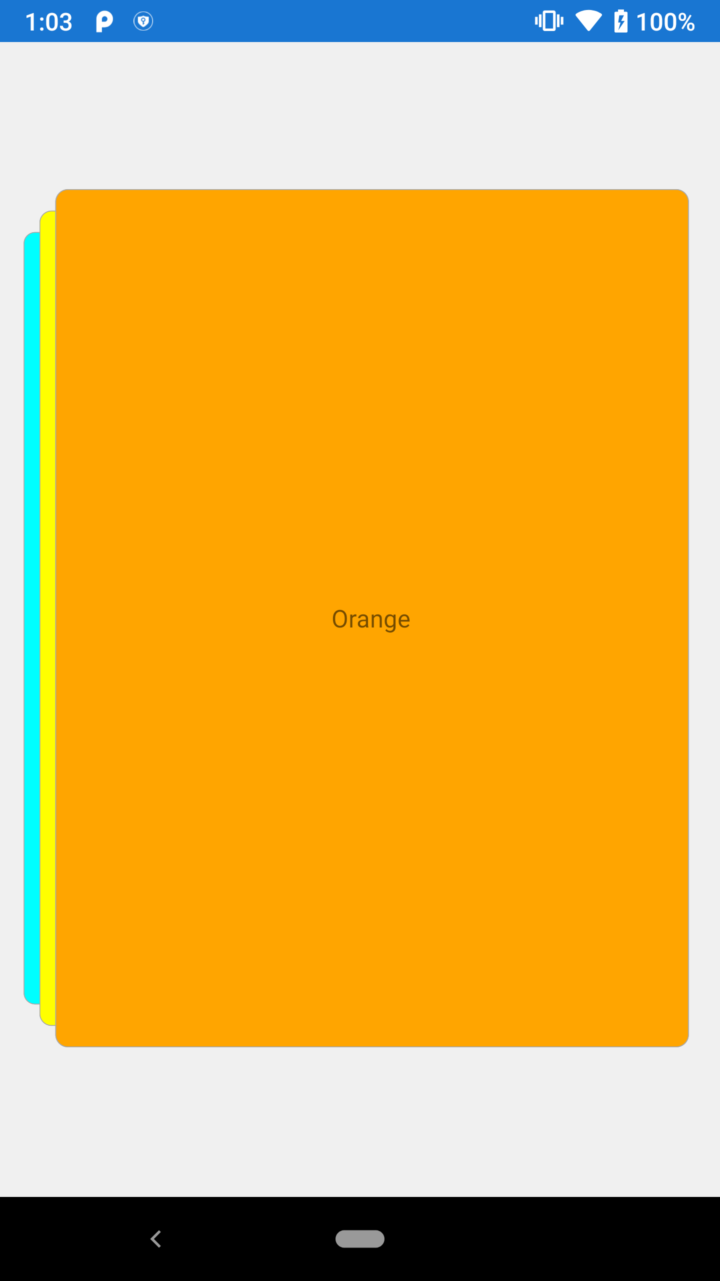
VisibleCardIndex
VisibleCardIndex is used when given index of the card to be displayed in front of the card layout.
<cards:SfCardLayout VisibleCardIndex="1">
</cards:SfCardLayout>
SfCardLayout cardLayout = new SfCardLayout()
{
VisibleCardIndex = 1
};
SwipeDirection
The SwipeDirection property indicates the swiping direction (left or right).
<cards:SfCardLayout SwipeDirection="Right">
</cards:SfCardLayout>
SfCardLayout cardLayout = new SfCardLayout()
{
SwipeDirection = CardSwipeDirection.Right
};
You can find the complete getting started sample from this link.
Customization in CardView
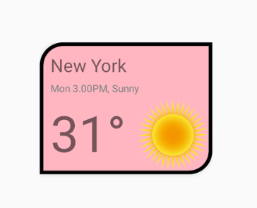
You can customize the border color, thickness, and card corner radius by using the following properties:
BorderColor - Used to customize the card view border color.
BorderWidth - Used to customize the card view border thickness.
CornerRadius - Used to customize the card view corner radius.
<StackLayout  HorizontalOptions="Center" VerticalOptions="Center">
        <cards:SfCardView BorderColor="Black" BorderWidth="5" CornerRadius="30,0,30,0" BackgroundColor="LightPink"  >
            <StackLayout Padding="10, 10, 0, 0" >
             <Label  Text="New York" FontSize="25" />
            <Label Text="Mon 3.00PM, Sunny" TextColor="Gray"/>
            <StackLayout Orientation="Horizontal">
                <Label Text="31°" FontSize="70" Padding="0, 0, 10,0"/>
                <Image  Source="Sun.png" HeightRequest="100" WidthRequest="100"/>
            </StackLayout>
        </StackLayout>
     </cards:SfCardView>
  </StackLayout>
StackLayout mainStack = new StackLayout()
{
HorizontalOptions = LayoutOptions.Center,
VerticalOptions = LayoutOptions.Center,
Children =
{
new SfCardView(){
Content = new StackLayout()
{
Padding = new Thickness(10, 10, 0, 0),
Children =
{
new Label(){Text = "New York" , FontSize = 25},
new Label(){Text = "Mon 3.00PM, Sunny" , TextColor = Color.Gray},
new StackLayout()
{
Orientation = StackOrientation.Horizontal,
Children =
{
new Label(){Text = "31°" , FontSize = 70, Padding = new Thickness(0,0,10,0) },
new Image(){Source = "Sun.png", HeightRequest = 100, WidthRequest = 100}
}
}
}
},
BorderColor = Color.Black,
BorderWidth = 5,
CornerRadius = new Thickness(30, 0, 30, 0),
BackgroundColor = Color.LightPink
}
}
};
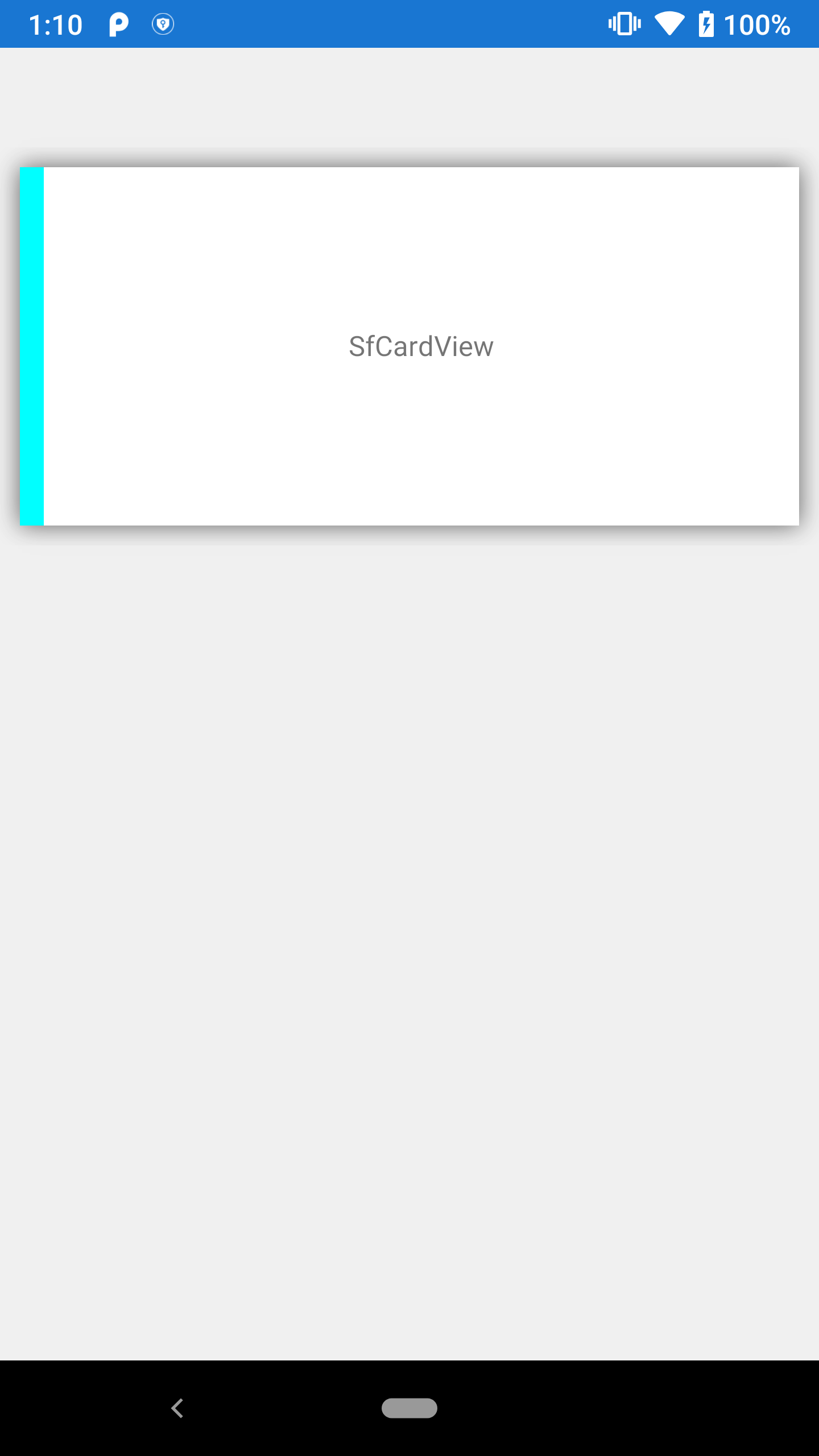
Indicator customization
Indicators are used to indicate the state or level of something.
<cards:SfCardView IndicatorColor="Cyan" HeightRequest="300" IndicatorThickness="12" IndicatorPosition="Left" >
            <Label  Text="SfCardView" VerticalTextAlignment="Center" HorizontalTextAlignment="Center"/>
        </cards:SfCardView>
SfCardView cardView = new SfCardView()
{
Content = new Label()
{
Text = "SfCardView",
HorizontalTextAlignment = TextAlignment.Center,
VerticalTextAlignment = TextAlignment.Center
},
IndicatorThickness = 12,
HeightRequest = 300,
IndicatorPosition = IndicatorPosition.Left,
IndicatorColor = Color.Cyan
};
FadeOutOnSwiping
FadeOutOnSwiping can be enabled when the card view needs to be faded with respect to swiping.
<cards:SfCardView FadeOutOnSwiping="true"/>SfCardView cardView = new SfCardView()
{
FadeOutOnSwiping = true
};NOTE
This property won’t work when adding the SfCardView as a child of SfCardLayout.
Shadow Effect
The CardView control provides shadow effect support. To enable shadow effect, set the HasShadow property to true.
You can customize the color of shadow using the ShadowColor property.
<cards:SfCardView HeightRequest="300" HasShadow="True" ShadowColor="Red">
    <Label  Text="LightGray" BackgroundColor="LightGray"/>
</cards:SfCardView>
SfCardView sfCardView = new SfCardView()
{
Content = new Label() { Text = "LightGray", BackgroundColor = Color.LightGray },
HasShadow = true,
ShadowColor = Color.Red
};NOTE
This property will not work when adding the
SfCardViewas a child ofSfCardLayout.
See also
How to remove cards from card view collection in Xamarin.Forms
How to add multicolored stack of cards in Xamarin.Forms
How to set shadow effect to the cards in Xamarin.Forms
How to add cards to the ListView in Xamarin.Forms
How to set the border color and width of a card within the SfCardLayout
How to reuse the dismissed cards in Xamarin.Forms SfCardView