Customization in Xamarin Avatar View(SfAvatarView)
12 Aug 202222 minutes to read
The SfAvatarView control provides options to customize the color and size. The control can be customized using the following properties:
Colors
Color in the SfAvatarView can be customized by the border color, the default background color, and automatic background color.
Border color
The border color is used for setting color to the border of SfAvatarView using the BorderColor property.
<Grid>
        <sfavatar:SfAvatarView  ContentType="Default"
                                AvatarShape="Circle"
                                AvatarSize="Large"
                                HorizontalOptions="Center"
                                VerticalOptions="Center"
                                ImageSource="ellanaa.png"
                                BorderColor="Red">
        </sfavatar:SfAvatarView>
   </Grid>
Grid mainGrid = new Grid();
SfAvatarView avatarview = new SfAvatarView();
avatarview.ContentType = ContentType.Default;
avatarview.AvatarShape = AvatarShape.Circle;
avatarview.AvatarSize = AvatarSize.Large;
avatarview.VerticalOptions = LayoutOptions.Center;
avatarview.HorizontalOptions = LayoutOptions.Center;
avatarview.ImageSource = "ellanaa.png";
avatarview.BorderColor = Color.Red;
mainGrid.Children.Add(avatarview);
this.Content = mainGrid;
Default background color
The background color for the SfAvatarView control can be set using the AvatarColorMode property. When the AvatarColorMode property is set to default, it displays the background color set in the BackgroundColor property.
<Grid>
        <sfavatar:SfAvatarView ContentType="Initials"
                               AvatarShape="Circle"
                               AvatarSize="Large"
                               HorizontalOptions="Center"
                               VerticalOptions="Center"
                               AvatarName="Alex"
                               BackgroundColor="Bisque"
                               AvatarColorMode="Default"
                               BorderColor="Black">
        </sfavatar:SfAvatarView>
   </Grid>
Grid mainGrid = new Grid();
SfAvatarView avatarview = new SfAvatarView();
avatarview.ContentType = ContentType.Initials;
avatarview.AvatarShape = AvatarShape.Circle;
avatarview.AvatarSize = AvatarSize.Large;
avatarview.VerticalOptions = LayoutOptions.Center;
avatarview.HorizontalOptions = LayoutOptions.Center;
avatarview.AvatarName = "Alex";
avatarview.BorderColor = Color.Black;
avatarview.AvatarColorMode = AvatarColorMode.Default;
avatarview.BackgroundColor = Color.Bisque;
mainGrid.Children.Add(avatarview);
this.Content = mainGrid;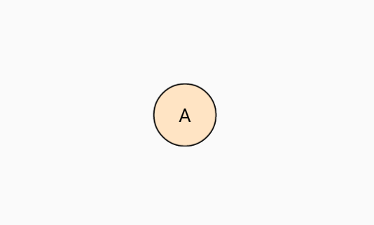
Automatic background color
The SfAvatarView control allows automatic background color while initializing. It contains the following properties:
-
DarkBackground: Shows a dark color for the initials and background color. -
LightBackground: Shows a light color for the initials and background color.
Dark color
The dark background color can be set using DarkBackground in the AvatarColorMode property.
<Grid>
        <sfavatar:SfAvatarView ContentType="Initials"
                               InitialsType="DoubleCharacter"
                               AvatarShape="Circle"
                               AvatarSize="Large"
                               HorizontalOptions="Center"
                               VerticalOptions="Center"
                               AvatarName="Alex"
                               AvatarColorMode="DarkBackground"
                               BorderColor="Black">
        </sfavatar:SfAvatarView>
   </Grid>
Grid mainGrid = new Grid();
SfAvatarView avatarview = new SfAvatarView();
avatarview.VerticalOptions = LayoutOptions.Center;
avatarview.HorizontalOptions = LayoutOptions.Center;
avatarview.AvatarShape = AvatarShape.Circle;
avatarview.AvatarSize = AvatarSize.Large;
avatarview.ContentType = ContentType.Initials;
avatarview.InitialsType = InitialsType.DoubleCharacter;
avatarview.AvatarName = "Alex";
avatarview.BorderColor = Color.Black;
avatarview.AvatarColorMode = AvatarColorMode.DarkBackground;
mainGrid.Children.Add(avatarview);
this.Content = mainGrid;
Light color
The light background color can be set using LightBackground in the AvatarColorMode property.
<Grid>
        <sfavatar:SfAvatarView ContentType="Initials"
                               InitialsType="DoubleCharacter"
                               VerticalOptions="Center"
                               AvatarName="Alex"
                               AvatarShape="Circle"
                               AvatarSize="Large"
                               AvatarColorMode="LightBackground"
                               BorderColor="Black"
                               HorizontalOptions="Center" >
        </sfavatar:SfAvatarView>
   </Grid>
Grid mainGrid = new Grid();
SfAvatarView avatarview = new SfAvatarView();
avatarview.VerticalOptions = LayoutOptions.Center;
avatarview.HorizontalOptions = LayoutOptions.Center;
avatarview.AvatarShape = AvatarShape.Circle;
avatarview.AvatarSize = AvatarSize.Large;
avatarview.ContentType = ContentType.Initials;
avatarview.InitialsType = InitialsType.DoubleCharacter;
avatarview.AvatarName = "Alex";
avatarview.BorderColor = Color.Black;
avatarview.AvatarColorMode = AvatarColorMode.LightBackground;
mainGrid.Children.Add(avatarview);
this.Content = mainGrid;
Gradients
You can also specify a range of colors using BackgroundGradient as demonstrated in the following code example.
xmlns:gradient ="clr-namespace:Syncfusion.XForms.Graphics;assembly=Syncfusion.Core.XForms"
................
        <sfavatar:SfAvatarView ContentType="Initials"
                               AvatarName="Alex"
                               AvatarShape="Circle"
                               AvatarSize="Large"
                               HorizontalOptions="Center"
                               VerticalOptions="Center"
                               InitialsType="DoubleCharacter">
            <sfavatar:SfAvatarView.BackgroundGradient>
                <gradient:SfLinearGradientBrush>
                    <gradient:SfLinearGradientBrush.GradientStops>
                        <gradient:SfGradientStop Color="#2F9BDF" Offset="0"/>
                        <gradient:SfGradientStop Color="#51F1F2" Offset="1"/>
                    </gradient:SfLinearGradientBrush.GradientStops>
                </gradient:SfLinearGradientBrush>
            </sfavatar:SfAvatarView.BackgroundGradient>
        </sfavatar:SfAvatarView>
using Syncfusion.XForms.Graphics;
.......
SfLinearGradientBrush gradientBrush = new SfLinearGradientBrush();
gradientBrush.GradientStops = new GradientStopCollection()
{
new SfGradientStop(){ Color = Color.FromHex("#2F9BDF"), Offset = 0 },
new SfGradientStop(){ Color = Color.FromHex("#51F1F2"), Offset = 1 }
};
Grid mainGrid = new Grid();
SfAvatarView avatarview = new SfAvatarView();
avatarview.VerticalOptions = LayoutOptions.Center;
avatarview.HorizontalOptions = LayoutOptions.Center;
avatarview.AvatarShape = AvatarShape.Circle;
avatarview.AvatarSize = AvatarSize.Large;
avatarview.ContentType = ContentType.Initials;
avatarview.InitialsType = InitialsType.DoubleCharacter;
avatarview.AvatarName = "Alex";
avatarview.BorderColor = Color.Black;
avatarview.BackgroundGradient = gradientBrush;
mainGrid.Children.Add(avatarview);
this.Content = mainGrid;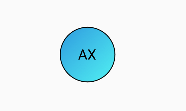
NOTE
Here, the
BackgroundGradientis a type ofSfGradientBrush, so you can applySfLinearGradientBrushon it. ThisSfLinearGradientBrushis available inSyncfusion.Xamarin.Corefromnuget.org. To know more about gradient view, refer to this documentation.
Sizing
In the SfAvatarView control, size of the view can be controlled using width, height, border width, and corner radius.
Width
You can customize the width of the avatar view using the WidthRequest property.
Height
You can customize the height of the avatar view using the HeightRequest property.
Border width
You can customize the thickness of the avatar view using the BorderWidth property.
<Grid>
        <sfavatar:SfAvatarView ContentType="Default"
                               AvatarShape="Circle"
                               AvatarSize="Large"
                               ImageSource="ellanaa.png"
                               BorderColor="Red"
                               VerticalOptions="Center"
                               BorderWidth="4"
                               HorizontalOptions="Center" >
        </sfavatar:SfAvatarView>
   </Grid>
Grid mainGrid = new Grid();
SfAvatarView avatarview = new SfAvatarView();
avatarview.HorizontalOptions = LayoutOptions.Center;
avatarview.VerticalOptions = LayoutOptions.Center;
avatarview.AvatarShape = AvatarShape.Circle;
avatarview.AvatarSize = AvatarSize.Large;
avatarview.BorderWidth = 4;
avatarview.BorderColor = Color.Red,
avatarview.ContentType = ContentType.Default;
avatarview.ImageSource = "ellanaa.png";
mainGrid.Children.Add(avatarview);
this.Content = mainGrid;
Corner radius
You can customize the corner radius of the avatar view using the CornerRadius property.
<Grid>
        <sfavatar:SfAvatarView ContentType="Default"
                               ImageSource="ellanaa.png"
                               HorizontalOptions="Center"
                               VerticalOptions="Center"
                               WidthRequest="60"
                               HeightRequest="60"
                               CornerRadius="20">
        </sfavatar:SfAvatarView>
   </Grid>
Grid mainGrid = new Grid();
SfAvatarView avatarview = new SfAvatarView();
avatarview.HorizontalOptions = LayoutOptions.Center;
avatarview.VerticalOptions = LayoutOptions.Center;
avatarview.WidthRequest = 60;
avatarview.HeightRequest = 60;
avatarview.CornerRadius = 20;
avatarview.ImageSource = "ellanaa.png";
avatarview.ContentType = ContentType.Default;
mainGrid.Children.Add(avatarview);
this.Content = mainGrid;