Placeholder for Xamarin.iOS Kanban (SfKanban)
8 Jan 20252 minutes to read
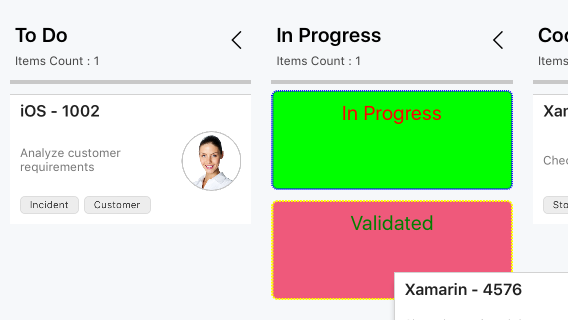
The placeholder is used to denote the new position of a card in the KanbanColumn. It will appear when dragging a card over the column.
Placeholder style
The PlaceholderStyle property is used to customize the placeholder. The following KanbanPlaceholderStyle properties are used to customize its appearance:
-
BackgroundColor- Changes the background color of placeholder. -
StrokeDashes- Used to change the dashes of placeholder. -
StrokeColor- Changes the stroke color of placeholder. -
StrokeWidth- Changes the stroke width of placeholder. -
TextFont- Changes the text size of placeholder. -
TextColor- Changes the text color of placeholder.
The following properties are used to customize the selected category when you have more than one category in a column:
-
SelectedBackgroundColor- Changes the background color of a selected placeholder. -
SelectedStrokeDashes- Used to change the dashes of a selected placeholder. -
SelectedStrokeColor- Changes the stroke color of a selected placeholder. -
SelectedStrokeWidth- Changes the stroke width of a selected placeholder. -
SelectedTextFont- Changes the size of the text in a selected placeholder. -
SelectedTextColor- Changes the color of the text in a selected placeholder.
The following code example describes the above behavior.
KanbanPlaceholderStyle style = new KanbanPlaceholderStyle();
style.BackgroundColor = UIColor.FromRGB(239, 89, 123);
style.StrokeColor = UIColor.Blue;
style.StrokeWidth = 2;
style.TextColor = UIColor.Green;
style.StrokeDashes = new nfloat[] { 1, 1 };
style.TextFont = UIFont.SystemFontOfSize(20);

style.SelectedBackgroundColor = UIColor.FromRGB(0, 255, 0);
style.SelectedStrokeDashes = new nfloat[] { 2, 1 };
style.SelectedStrokeColor = UIColor.Yellow;
style.SelectedStrokeWidth = 2;
style.SelectedTextFont = UIFont.SystemFontOfSize(20);
style.SelectedTextColor = UIColor.Red;

kanban.PlaceholderStyle = style;
The following screenshot illustrates the result of the above code sample.