How can I help you?
WPF Radial Gauge (SfCircularGauge) Overview
16 Mar 20231 minute to read
The circular gauge helps to visualize numeric values on a circular scale. The appearance of the gauge is fully customized to integrate your applications without fault.
Key features
The CircularGauge is composed of several scales. The scales will be an integrated UI part of the circular gauge.
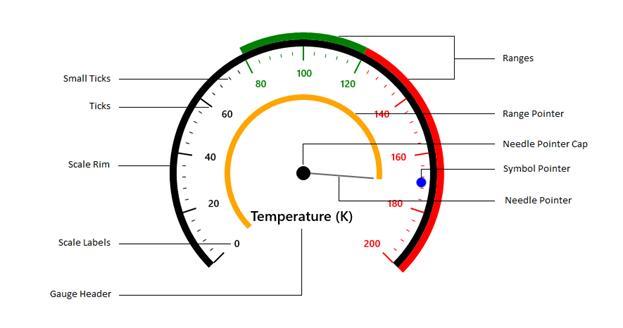
The CircularGauge is a composite UI element with the following subparts:
-
Scales
-
Ranges
-
Pointers
-
Header
The circular gauge control is highly customizable with variety of simple APIs to modify its basic look and feel. You can position the ranges, ticks, labels, and range pointers as needed.
Scales
The Scales contain labels, tick marks, and a rim to customize its basic look and feel. It defines the start angle, sweep direction, sweep angle, overall minimum and maximum values, the frequency of labels, and tick marks.
Ranges
The Ranges are visual elements that depict the start and end values of inner divisions within the scale’s range. Each scale is capable of displaying one or more ranges, and each range can depict different zones or regions of same metrics, such as high, low, and average temperatures.
Pointers
The Pointers are elements that point out the values of the bound property on a scale. A circular scale can contain one or more pointers that can be used to measure different values. Each pointer has the Value property, which informs the current value to users visually.
Header
The Header can be used to set a unique header for the circular gauge. You can add text as the header in the circular gauge.
