DropDownMenuItem in WPF Dropdown Button (DropDownButtonAdv)
Adding Icon to DropDownMenuItem
The DropDownMenuItem control is a basic MenuItem, which forms the actual items of DropDownMenuGroup.
The icon of the DropDownMenuItem can be added as follows:
<shared:DropDownButtonAdv Label="Hello World" x:Name="button" SizeMode="Normal" SmallIcon="employee.png">
<shared:DropDownMenuGroup>
<shared:DropDownMenuItem Header="Menu Item 1">
<shared:DropDownMenuItem.Icon>
<Image Source="Images/Home.png"/>
</shared:DropDownMenuItem.Icon>
</shared:DropDownMenuItem>
<shared:DropDownMenuItem Header="Menu Item 2"/>
<shared:DropDownMenuItem Header="Menu Item 3"/>
</shared:DropDownMenuGroup>
</shared:DropDownButtonAdv>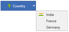
Checkable DropDownMenuItem
The DropDownMenuItem can be checked by setting the IsCheckable property to true.
The feature can be enabled by using the property IsCheckable:
<shared:DropDownButtonAdv Label="Hello World" x:Name="button" SizeMode="Normal" SmallIcon="employee.png">
<shared:DropDownMenuGroup>
<shared:DropDownMenuItem Header="Menu Item 1" IsCheckable="True"/>
<shared:DropDownMenuItem Header="Menu Item 2"/>
<shared:DropDownMenuItem Header="Menu Item 3" IsCheckable="True"/>
</shared:DropDownMenuGroup>
</shared:DropDownButtonAdv>
Was this page helpful?
Yes
No
Thank you for your feedback!
Thank you for your feedback and comments. We will rectify this as soon as possible!
An unknown error has occurred. Please try again.
Help us improve this page