How can I help you?
Response Toolbar in WPF AI AssistView
5 Aug 20256 minutes to read
The SfAIAssistView control includes a Response Toolbar feature, which provides built-in options such as Copy, Regenerate, Like, and Dislike for each chat response. These items provide quick actions to enhance user interactions. In addition to the built-in options, users can personalize the Response Toolbar by adding their own custom toolbar items to suit specific application needs.
ResponseToolbarItem
The ResponseToolbarItem class is used to define and add items in the response toolbar of chat responses for SfAIAssistView. The following properties are available in this class:
- Index: Specifies the internal order or position of the toolbar item.
- IsEnabled: Specifies whether the toolbar item is enabled (interactive) or disabled (non-interactive).
- Tooltip: Sets the tooltip text displayed when the user hovers over the toolbar item.
- Visible: Indicates whether the toolbar item is visible.
- ItemType: Specifies the type of the toolbar item. This is used to distinguish between built-in and custom items.
- ItemTemplate: Allows you to set a custom template for rendering the toolbar item.
<syncfusion:SfAIAssistView x:Name="aiAssistView" CurrentUser="{Binding CurrentUser}"
                               Messages="{Binding Chats}" >
</syncfusion:SfAIAssistView>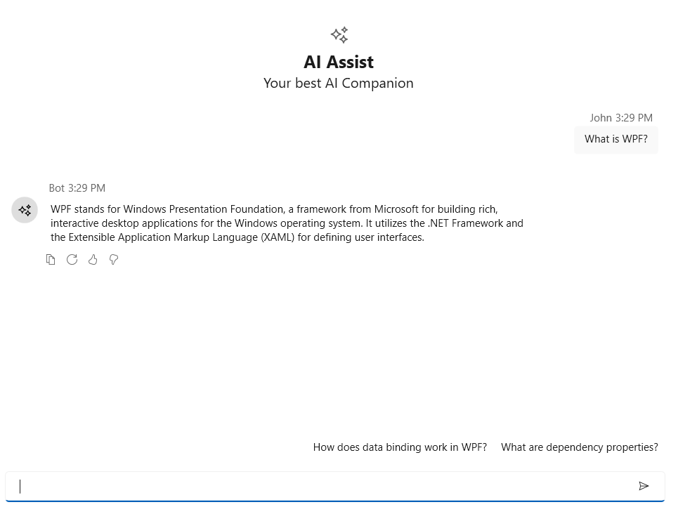
Response toolbar visibility
The IsResponseToolbarVisible property of the SfAIAssistView control determines whether the response toolbar is displayed below each chat items responses. When set to false, the response toolbar is hidden. By default, this property is set to true.
<syncfusion:SfAIAssistView CurrentUser="{Binding CurrentUser}"
                               Messages="{Binding Chats}" IsResponseToolbarVisible="False">
</syncfusion:SfAIAssistView>
SfAIAssistView aiAssistView = new SfAIAssistView();
aiAssistView.IsResponseToolbarVisible = false;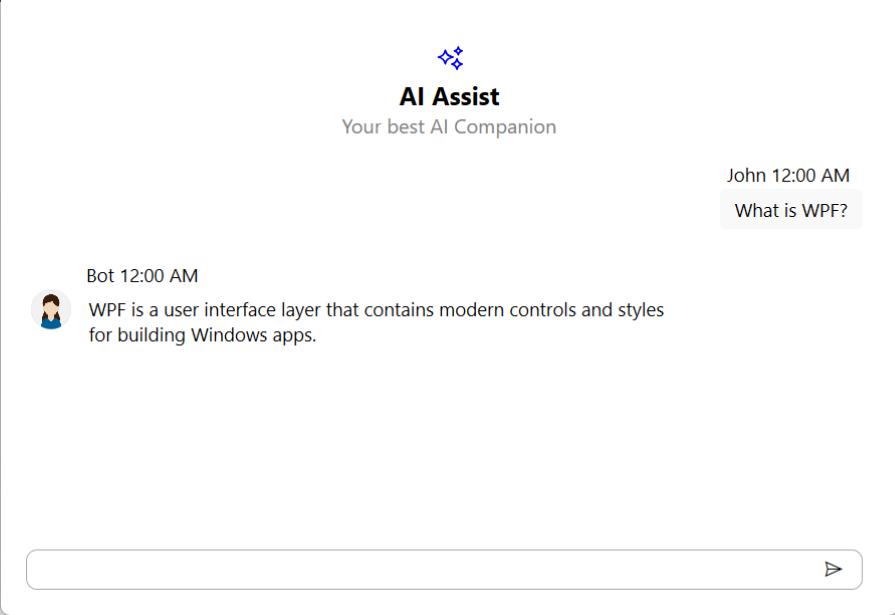
Customization of Response toolbar item using ItemTemplate
The ResponseToolbarItem in SfAIAssistView can be customized using the ItemTemplate property to define a custom appearance and behavior. This allows you to display icons, buttons, text, or even UI elements such as Path, Image, or TextBlock within the toolbar.
<syncfusion:SfAIAssistView x:Name="aiAssistView" CurrentUser="{Binding CurrentUser}"
                            Messages="{Binding Chats}" >
    <syncfusion:SfAIAssistView.ResponseToolbarItems>
        <syncfusion:ResponseToolbarItem ItemType="Custom" Tooltip="Copy">
            <syncfusion:ResponseToolbarItem.ItemTemplate>
                <DataTemplate>
                    <Button ToolTipService.ToolTip="Copy to clipboard"
                            HorizontalAlignment="Left"
                            Padding="5,2"
                            Background="Transparent"
                            BorderThickness="0">
                        <StackPanel Orientation="Horizontal" VerticalAlignment="Center">
                            <Path Width="16" Height="16" Fill="Black"Stretch="Uniform"
                                Data="M3,1 L10,1 C10.55,1 11,1.45 11,2 L11,3 L12,3 C12.55,3 13,3.45 13,4 L13,14 C13,14.55 12.55,15 12,15 L4,15 C3.45,15 3,14.55 3,14 L3,4 C3,3.45 3.45,3 4,3 L5,3 L5,2 C5,1.45 5.45,1 6,1 Z M5,3 L9,3 L9,2 L5,2 Z M4,5 L12,5 L12,14 L4,14 Z"/>
                            <TextBlock Text="Copy" Margin="6,0,0,0" VerticalAlignment="Center"/>
                        </StackPanel>
                    </Button>
                </DataTemplate>
            </syncfusion:ResponseToolbarItem.ItemTemplate>
        </syncfusion:ResponseToolbarItem>
    </syncfusion:SfAIAssistView.ResponseToolbarItems>
</syncfusion:SfAIAssistView>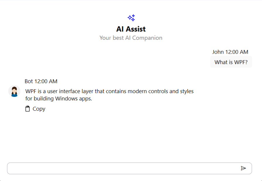
Item clicked event
The ResponseToolbarItemClicked event is triggered whenever a toolbar item in the ResponseToolbarItems collection is clicked by the user. You can handle this event to perform custom actions based on which item was clicked.
<syncfusion:SfAIAssistView x:Name="sfAIAssistView" CurrentUser="{Binding CurrentUser}"
                               Messages="{Binding Chats}" ResponseToolbarItemClicked="AiAssistView_ResponseToolbarItemClicked"/>
SfAIAssistView sfAIAssistView = new SfAIAssistView();
sfAIAssistView.ResponseToolbarItemClicked += AiAssistView_ResponseToolbarItemClicked;
private void AiAssistView_ResponseToolbarItemClicked(object sender, ResponseToolbarItemClickedEventArgs e)
{
// Call your actions based on the toolbar item clicked.
}