How can I help you?
Date Navigations in WinUI Scheduler (SfScheduler)
12 Apr 20227 minutes to read
Range for visible dates
Visible dates can be restricted between certain range of dates, using MaximumDate and MinimumDate properties in SfScheduler. It is applicable in all the scheduler views.
Minimum display date
MinimumDate will restrict date navigations features of backward and also it doesn’t allow to swipe the control using touch gesture beyond the minimum date range. The dates before the minimum date will be disabled in the schedule.
this.Schedule.MinimumDate = new DateTime(2021, 03, 05, 10, 0, 0);Maximum display date
MaximumDate will restrict date navigations features of forward, and also it doesn’t allow to swipe the control using touch gesture beyond the maximum date range. The dates beyond the maximum date will be disabled in the schedule.
this.Schedule.MaximumDate = new DateTime(2021, 05, 05, 10, 0, 0);Programmatic date navigation
Programmatically navigate the dates in scheduler by using the DisplayDate property of SfScheduler.
this.Schedule.DisplayDate = new DateTime(2021, 04, 07, 9, 0, 0);NOTE
Date navigation before the minimum date will be reset to the scheduler minimum date and date navigation beyond the maximum date will be reset to the scheduler maximum date.
Programmatic date selection
Programmatically select the dates in scheduler by using the SelectedDate property of SfScheduler.
this.Schedule.SelectedDate = new DateTime(2021, 04, 07, 10, 0, 0);NOTE
Selection before minimum dates and beyond maximum dates using the
SelectedDateis not possible.
Programmatically change to adjacent dates
By default, the date can be navigated to next and previous views using touch gesture, and by swiping the control from right to left and left to right direction. The view can be also changed programmatically using the Forward and Backward methods available in SfScheduler.
Forward
Use the Forward method of Scheduler for viewing the next immediate visible dates in the scheduler. It will move to the next month if the scheduler view is month, similarly it will move to the next week for week view and the next day for day view.
<scheduler:SfScheduler x:Name="Schedule"
                       ViewType="Week">
</scheduler:SfScheduler>

<Button x:Name="Forward"
        Content="Forward"
        Click="Forward_Click">
</Button>
private void Forward_Click(object sender, RoutedEventArgs e)
{
this.Schedule.Forward();
}Backward
Use the Backward method of Scheduler for viewing the previous immediate visible dates in the scheduler. It will move to the previous month if the scheduler view is month, similarly it will move to the previous week for week view and the previous day for day view.
<scheduler:SfScheduler x:Name="Schedule"
                       ViewType="Week">
</scheduler:SfScheduler>

<Button x:Name="Backward"
        Content="Backward"
        Click="Backward_Click">
</Button>
private void Backward_Click(object sender, RoutedEventArgs e)
{
this.Schedule.Backward();
}Allow view navigation
You can quickly navigate to the respective day or timeline day view by single-clicking on the date in month cell or view header of the following scheduler views such as a week, work week, month, timeline week, timeline work week, and timeline month views by using the AllowViewNavigation property of the scheduler.
<scheduler:SfScheduler  x:Name="Schedule"
                        ViewType="Week"
                        AllowViewNavigation="True">
</scheduler:SfScheduler>this.Schedule.ViewType = SchedulerViewType.Week;
this.Schedule.AllowViewNavigation = true;
NOTE
- The
AllowViewNavigationis not applicable for the day and timeline day views.- If the ShowAgendaView is true in a month view, the month view should navigate to the day view by single-clicking on the agenda date view header, otherwise, the month view should navigate to the day view by single-clicking on the date in a month cell.
Show date picker
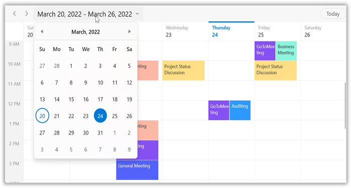
You can enable the date picker for the scheduler by using the ShowDatePickerButton property in the scheduler, which displays the date picker and Today button in the header view. It allows you to quickly navigate to today and different scheduler views.
<syncfusion:SfScheduler x:Name="Schedule"
                        ViewType="Week"
                        ShowDatePickerButton="True">
</syncfusion:SfScheduler>this.Schedule.ViewType = SchedulerViewType.Week;
this.Schedule.ShowDatePickerButton = true;

NOTE
The header
DatePickeruses the calendar for your app’s default language, or you can set the CalendarIdentifier property to a scheduler to use a specific calendar system. If theCalendarIdentifieris not set the scheduler uses the default calendar for the application’s preferred language.
Allowed views
You can quickly navigate to the different scheduler views by using the AllowedViewTypes property in the SfScheduler. The views set to this property will display as a view button in the scheduler header view. This UI will be responsive as showing more icons and will be updated based on the window size change.
<syncfusion:SfScheduler x:Name="Schedule"
                        AllowedViewTypes="Month,Week,WorkWeek,Day,TimelineDay,TimelineWeek,TimelineWorkWeek,TimelineMonth" >
</syncfusion:SfScheduler>this.Schedule.AllowedViewTypes = AllowedSchedulerViewTypes.Week | AllowedSchedulerViewTypes.WorkWeek | AllowedSchedulerViewTypes.Day | AllowedSchedulerViewTypes.Month | AllowedSchedulerViewTypes.TimelineDay | AllowedSchedulerViewTypes.TimelineMonth | AllowedSchedulerViewTypes.TimelineWeek | AllowedSchedulerViewTypes.TimelineWorkWeek;NOTE