ToolStripItem Types in WinForms Context Menu Strip
The following are the ToolStripItems which can be added as menu items to the WinForms Context Menu Strip control.
- MenuItem
- TextBox
- ComboBox
- Separator
MenuItem
Represents a selectable option displayed on a MenuStrip or WinForms Context Menu Strip. The MenuItem supports all the general properties of a ToolStripItem.
NOTE:
Please refer to the Getting Started section for adding a MenuItem to the WinForms Context Menu Strip control.
The below table will explain the properties of menu item,
| Property | Description |
|---|---|
| Checked | Indicates whether the item is in the checked state. This will be displayed only if ContextMenuStripEx.ShowCheckMargin property is set to true . |
| Image |
Sets the image for the menu item. This image will be displayed only when the ContextMenuStripEx.ShowImageMargin is true and DisplayStyle is Image or ImageAndText. |
| CheckedState | Specifies the check state of the item. They can be Checked, Unchecked or Indeterminate. |
| ShowShortcutKeys | Indicates whether a shortcut key should be displayed in the menu item. The user can access the particular menu item using this shortcut key specified in the ShortcutKeys property. |
| ShortcutKeys | The shortcut key to be displayed for a menu item. |
| ShortcutKeyDisplayString | You can modify the ShortcutKey string, that is set by using the ShortcutKeyDisplayString property. |
| AutoToolTip | When set to true, will display the text set in the Text property as the item's tooltip. When set to false, will display the text set in the ToolTipText property. |
| ToolTipText | Sets the text for the tooltip when AutoToolTip is set to false. |
| DropDown |
Specifies the ToolStripDropDown control to be shown when the item is clicked. Use this when the child menu is built and managed outside the designer as a separate ToolStripDropDown instance. |
| DropDownItems |
The collection of child ToolStripItems to be displayed as a submenu when the item is clicked. Use this when you want to define the submenu inline in the same ContextMenuStripEx. |
TextBox
The TextBox control is used for editable text. It is used to get input from the user at runtime.
Add a TextBox through designer
-
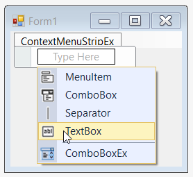
Once the WinForms Context Menu Strip control is added, click Type Here for adding the TextBox. On clicking, it will display different types of ToolStripItems; choose the TextBox option.
-
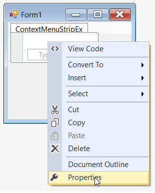
Once the item is added, we can set the text by right-clicking on the particular item in the designer and selecting Properties. Now, in the Properties panel, under Appearance > Text we can set the text.

-
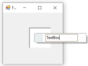
Finally, we have added the TextBox item in the WinForms Context Menu Strip control successfully.
Add a TextBox through code
The below code snippet adds the TextBox in the WinForms Context Menu Strip control.
//Declaration
private Syncfusion.Windows.Forms.Tools.ContextMenuStripEx contextMenuStripEx;
private System.Windows.Forms.ToolStripTextBox toolStripTextBox1;

//Initializing
this.contextMenuStripEx = new Syncfusion.Windows.Forms.Tools.ContextMenuStripEx();
this.toolStripTextBox1 = new System.Windows.Forms.ToolStripTextBox();

//Add a textbox
this.toolStripTextBox1.Text = "TextBox";
this.contextMenuStripEx.Items.Add(this.toolStripTextBox1);
'Declaration
Private contextMenuStripEx As Syncfusion.Windows.Forms.Tools.ContextMenuStripEx
Private toolStripTextBox1 As System.Windows.Forms.ToolStripTextBox
'Initializing
Me.contextMenuStripEx = New Syncfusion.Windows.Forms.Tools.ContextMenuStripEx()
Me.toolStripTextBox1 = New System.Windows.Forms.ToolStripTextBox()
'Add a textbox
Me.toolStripTextBox1.Text = "TextBox"
Me.contextMenuStripEx.Items.Add(Me.toolStripTextBox1)
The below table explains the properties of textbox.
| Property | Description |
|---|---|
| BorderStyle | Sets the border style for the textbox. The styles available are, FixedSingle and Fixed3D (Default). |
| Lines | Let’s you open a String Collection Editor, using which multi-line text can be entered. |
| Text | Specifies the text to be displayed on the item. |
| TextBoxTextAlign | Specifies the alignment of the text inside the textbox. |
| AcceptsReturn | Indicates if return characters are accepted as input. |
| AcceptsTab | Indicates if tab characters are accepted as input. |
| CharacterCasing | Indicates if the characters should be Normal or in Upper Case or in Lower Case. |
| HideSelection | Indicates whether the selection should be hidden when the control loses focus. |
| MaxLength | Maximum number of characters that can be entered into the control. |
| ReadOnly | Indicates whether the text in the textbox is read-only. |
ComboBox
A subset of the hosted control’s properties and events are exposed at the ToolStripComboBox level, but the hosted ComboBox control is fully accessible through the ComboBox property. ToolStripComboBox is optimized for hosting in a ToolStrip.
Add a ComboBox through designer
-
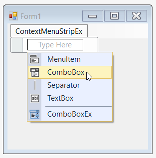
Once the WinForms Context Menu Strip control is added, click Type Here for adding the ComboBox. On clicking, it will display different types of ToolStripItems; choose the ComboBox option.
-
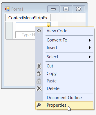
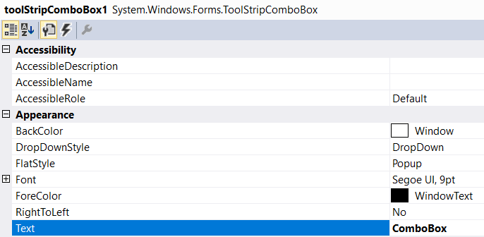
Once the item is added, we can set the text by right-clicking on the particular item in the designer and selecting Properties. Now, in the Properties panel, under Appearance > Text we can set the text.
-
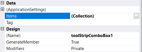
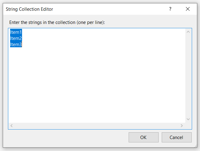
Similarly, we can add items collections in the Properties panel, under Data > Items by using the String Collection Editor.
-
Finally, we have added the ComboBox in the WinForms Context Menu Strip control successfully.
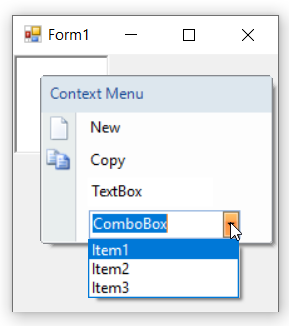
Add a ComboBox through code
The below code snippet adds the ComboBox in the WinForms Context Menu Strip control.
//Declaration
private Syncfusion.Windows.Forms.Tools.ContextMenuStripEx contextMenuStripEx;
private System.Windows.Forms.ToolStripComboBox toolStripComboBox1;

//Initializing
this.contextMenuStripEx = new Syncfusion.Windows.Forms.Tools.ContextMenuStripEx();
this.toolStripComboBox1 = new System.Windows.Forms.ToolStripComboBox();

//Add a combobox
this.toolStripComboBox1.Text = "ComboBox";
this.toolStripComboBox1.Items.AddRange(new object[] { "Item1", "Item2", "Item3" });
this.contextMenuStripEx.Items.Add(this.toolStripComboBox1);
'Declaration
Private contextMenuStripEx As Syncfusion.Windows.Forms.Tools.ContextMenuStripEx
Private toolStripComboBox1 As System.Windows.Forms.ToolStripComboBox
'Initializing
Me.contextMenuStripEx = New Syncfusion.Windows.Forms.Tools.ContextMenuStripEx()
Me.toolStripComboBox1 = New System.Windows.Forms.ToolStripComboBox()
'Add a combobox
Me.toolStripComboBox1.Text = "ComboBox"
Me.toolStripComboBox1.Items.AddRange(New Object() { "Item1", "Item2", "Item3" })
Me.contextMenuStripEx.Items.Add(Me.toolStripComboBox1)
The below table explains the properties of combobox.
| Property | Description |
|---|---|
| FlatStyle | Specifies the style of display of the control. The options are, Flat, Popup, Standard and System. |
| Items | Invokes String Collection Editor which lets you add strings list to be displayed in the combobox. |
| MaxDropDownItems | Sets the maximum number of strings that should be displayed in the dropdown. |
| MaxLength | Specifies the maximum characters that can be entered into the combobox. |
| DropDownHeight | Sets the height for the DropDown. |
| DropDownWidth | Sets the width for the DropDown. |
| IntegralHeight | Indicates whether the combobox should resize to avoid showing partial items. |
| Sorted | Specifies whether the dropdown list should be sorted. |
| AutoCompleteCustomSource | Represents the custom source of string collection for the autocomplete feature, when AutoCompleteSource property is set to CustomSource. |
| AutoCompleteSource | Represents the source of strings used for autocompletion. The sources can be, FileSystem, AllSystemSources (Default), AllUrl, CustomSource, FileSystemDirectories, HistoryList, ListItems, RecentlyUsedList and None. |
| AutoCompleteMode | Indicates text completion behavior of the combo box. The modes are, Suggest - Displays the drop down list associated with the EditControl. This dropdown list is populated with one or more suggested completion strings, Append - Appends the remainder of the most likely candidate string to the existing character, highlighting the appended character, and SuggestAppend - Displays the drop down, also appends the highlighted string. |
Separator
Used for separation of items visually in a form. The ToolStripSeparator is automatically spaced.
Add a Separator through designer
-
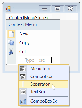
Once the WinForms Context Menu Strip control is added, click Type Here for adding the Separator. On clicking, it will display different types of ToolStripItems, from which choose Separator.
-
The separator is automatically inserted between the surrounding menu items at design time.
Add a Separator through code
The below code snippets adds the Separator in the WinForms Context Menu Strip control.
//Declaration
private Syncfusion.Windows.Forms.Tools.ContextMenuStripEx contextMenuStripEx;
private System.Windows.Forms.ToolStripMenuItem toolStripMenuItem1;
private System.Windows.Forms.ToolStripMenuItem toolStripMenuItem2;
private System.Windows.Forms.ToolStripMenuItem toolStripMenuItem3;
private System.Windows.Forms.ToolStripSeparator toolStripSeparator1;
private System.Windows.Forms.ToolStripMenuItem toolStripMenuItem4;

//Initializing
this.contextMenuStripEx = new Syncfusion.Windows.Forms.Tools.ContextMenuStripEx();
this.toolStripMenuItem1 = new System.Windows.Forms.ToolStripMenuItem();
this.toolStripMenuItem2 = new System.Windows.Forms.ToolStripMenuItem();
this.toolStripMenuItem3 = new System.Windows.Forms.ToolStripMenuItem();
this.toolStripSeparator1 = new System.Windows.Forms.ToolStripSeparator();
this.toolStripMenuItem4 = new System.Windows.Forms.ToolStripMenuItem();

//Add a separator
this.toolStripMenuItem1.Image = System.Drawing.Image.FromFile(@"..\..\..\new.png");
this.toolStripMenuItem2.Image = System.Drawing.Image.FromFile(@"..\..\..\copy.png");
this.toolStripMenuItem3.Image = System.Drawing.Image.FromFile(@"..\..\..\cut.png");
this.toolStripMenuItem4.Image = System.Drawing.Image.FromFile(@"..\..\..\exit.png");
this.toolStripMenuItem1.Text = "New";
this.toolStripMenuItem2.Text = "Copy";
this.toolStripMenuItem3.Text = "Cut";
this.toolStripMenuItem4.Text = "Exit";
this.contextMenuStripEx.Items.AddRange(new System.Windows.Forms.ToolStripItem[] {
    this.toolStripMenuItem1,
    this.toolStripMenuItem2,
    this.toolStripMenuItem3,
    this.toolStripSeparator1,
    this.toolStripMenuItem4});
'Declaration
Private contextMenuStripEx As Syncfusion.Windows.Forms.Tools.ContextMenuStripEx
Private toolStripMenuItem1 As System.Windows.Forms.ToolStripMenuItem
Private toolStripMenuItem2 As System.Windows.Forms.ToolStripMenuItem
Private toolStripMenuItem3 As System.Windows.Forms.ToolStripMenuItem
Private toolStripSeparator1 As System.Windows.Forms.ToolStripSeparator
Private toolStripMenuItem4 As System.Windows.Forms.ToolStripMenuItem
'Initializing
Me.contextMenuStripEx = New Syncfusion.Windows.Forms.Tools.ContextMenuStripEx()
Me.toolStripMenuItem1 = New System.Windows.Forms.ToolStripMenuItem()
Me.toolStripMenuItem2 = New System.Windows.Forms.ToolStripMenuItem()
Me.toolStripMenuItem3 = New System.Windows.Forms.ToolStripMenuItem()
Me.toolStripSeparator1 = New System.Windows.Forms.ToolStripSeparator()
Me.toolStripMenuItem4 = New System.Windows.Forms.ToolStripMenuItem()
'Add a Separator
Me.toolStripMenuItem1.Image = System.Drawing.Image.FromFile("..\..\..\new.png")
Me.toolStripMenuItem2.Image = System.Drawing.Image.FromFile("..\..\..\copy.png")
Me.toolStripMenuItem3.Image = System.Drawing.Image.FromFile("..\..\..\cut.png")
Me.toolStripMenuItem4.Image = System.Drawing.Image.FromFile("..\..\..\exit.png")
Me.toolStripMenuItem1.Text = "New"
Me.toolStripMenuItem2.Text = "Copy"
Me.toolStripMenuItem3.Text = "Cut"
Me.toolStripMenuItem4.Text = "Exit"
Me.contextMenuStripEx.Items.AddRange(New System.Windows.Forms.ToolStripItem() { Me.toolStripMenuItem1, Me.toolStripMenuItem2, Me.toolStripMenuItem3, Me.toolStripSeparator1, Me.toolStripMenuItem4})Finally, we have added a separator in the WinForms Context Menu Strip control successfully.
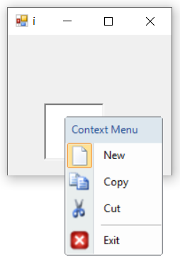
The below table explains the properties of Separator.
| Property | Description |
|---|---|
| BackColor | Sets the back color for the separator. |
| ForeColor | Sets the fore color for the separator. |
| AutoSize | Determines whether the item should automatically size based on its image and text. |
| Visible | Sets the visibility of the separator. |