Getting Started
28 Sep 202324 minutes to read
-
This section encompasses how to configure Circular Gauge. You can provide data to a Circular Gauge and make them to display in a required way.
-
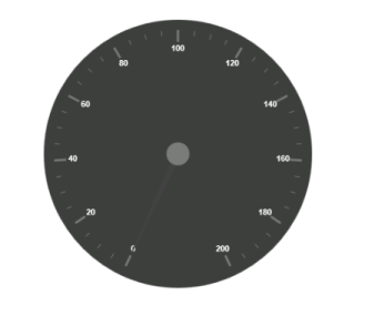
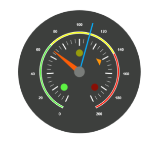
The following screen shot displays a Circular Gauge, which visually represents the functions of an Automobile speedometer with RPM (Rotation per Minute), kph (Kilometer per hour) and it denotes the speed level indicators (Safe, Caution and Danger).
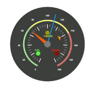
Analog Speedometer
Create a Circular Gauge
You can easily create the Circular Gauge widget by using the following steps.
1.First create a TypeScript project and the references in the app.ts page
For common getting started of TypeScript , you can refer here.
The default type definition file ej.web.all.d.ts needs to include the support for type-checking while initializing any of the Syncfusion widgets.
The important step you need to do is to copy the ej.web.all.d.ts file into your project and then need to refer it in your TypeScript application (app.ts file), so that you will get the intelliSense support and also the compile time type-checking.
You can find the ej.web.all.d.ts file in the following location,
(installed location)\Syncfusion\Essential Studio\24.2.3\JavaScript\assets\typescript
Apart from ej.web.all.d.ts file, it is also necessary to make use of the jquery.d.ts file in your TypeScript application, which can be downloaded from here.
2.Add the following scripts in the HTML page
<!DOCTYPE html>
<html>
<head>
        <link href="http://cdn.syncfusion.com/24.2.3/js/web/bootstrap-theme/ej.web.all.min.css" rel="stylesheet" />
        <script src="https://code.jquery.com/jquery-3.0.0.min.js"></script>
        <script src="http://cdn.syncfusion.com/24.2.3/js/web/ej.web.all.min.js" type="text/javascript"></script>
        <script src="app.js"></script>
</head>
<body>
</body>
</html>
In the above code, ej.web.all.min.js script reference has been added for demonstration purpose. It is not recommended to use this for deployment purpose, as its file size is larger since it contains all the widgets. Instead, you can use [CSG](https://csg.syncfusion.com/ “”) utility to generate a custom script file with the required widgets for deployment purpose.
3.Create a <div> tag.
<html> <body> <div id="CircularGauge"></div> </body> </html>4.Initialize the CircularGauge in ts file by using the ej.CircularGauge method.
/// <reference path="tsfiles/jquery.d.ts" />
/// <reference path="tsfiles/ej.web.all.d.ts" />
module CircularGaugeComponent {
    $(function () {
        var circularGaugeSample = new ej.datavisualization.CircularGauge($("#CircularGauge"));
    });
}
Run the above code example to get a default CircularGauge with default values.

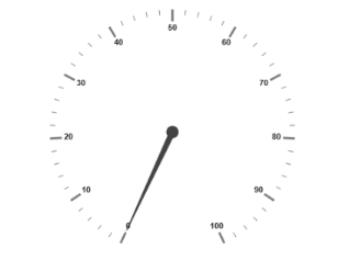
Set Height and Width
Pointers have different height and width so you can set the height and width of the gauge according to your requirements.Set the basic values of the gauge such as height and width of the canvas element values that are to be rendered.
$(function () {
        var circularGaugeSample = new ej.datavisualization.CircularGauge($("#CircularGauge"),{
            width: 500,
            height:500

        });
    });
Run the above code example and you will see the following output.
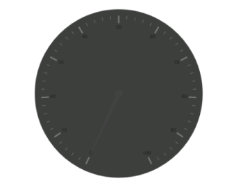
Set Background Color
The speedometer must have some dark color as background so that its value is clearly visible and you can vary the speed of the pointer by setting ReadOnly as false for user interaction.
$(function () {
        var circularGaugeSample = new ej.datavisualization.CircularGauge($("#CircularGauge"),{
            width: 500,
            height: 500,
            backgroundColor: "#3D3F3D",
            readOnly: false,

        });
    });
Run the above code example and you will see the following output.
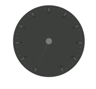
Provide Scale Values
- The pointer cap can be customized with the following options. Cap radius, cap border color, cap background color, pointer cap border width are some of the properties that are customizable.
- The speed limit in the gauge has maximum value of 200 kph. So you can set maximum value for the gauge as 200.
- Major Ticks have the interval value of 20 and minor ticks have the interval value of 5. Show ranges and show indicators are used to display the ranges and indicators in their respective positions.
$(function () {
        var circularGaugeSample = new ej.datavisualization.CircularGauge($("#CircularGauge"),{
           width: 500,
        height: 500,
        backgroundColor: "#3D3F3D",
        readOnly: false,
        scales: [{
            showRanges: true,
            showIndicators: true,
            pointerCap: {
                radius: 15,
                borderWidth: 0,
                backgroundColor: "#797C79",
                borderColor: "#797C79"
            },
            maximum: 200,
            majorIntervalValue: 20,
            minorIntervalValue: 5
              }]
        });
    });
Run the above code example and you will see the following output.
Add Label Customization
To display the value around the scales, labels are used. By customizing the label color it displays as specified.
$(function () {
        var circularGaugeSample = new ej.datavisualization.CircularGauge($("#CircularGauge"),{
        width: 500,
        height: 500,
        backgroundColor: "#3D3F3D",
        readOnly: false,
        scales: [{
            //Add the labels customization code here
            labels: [{
                color: "#ffffff"
            }],

        });
    });
Run the above code example and you will see the following output.
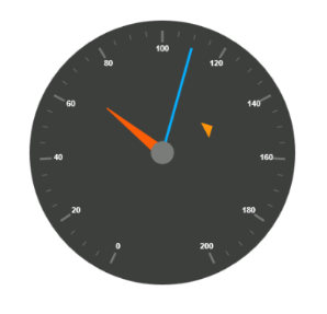
Add Pointers
Here, you have three pointers that denote the kilometer value, rotation per minute value and torque value.The torque value pointer needs not be similar to the other two pointers. You can set torque pointer as marker pointer. And you can set other attributes for pointer such as background color, border color, length, width and distance from scale.
$(function () {
        var circularGaugeSample = new ej.datavisualization.CircularGauge($("#CircularGauge"),{
               width: 500,
        height: 500,
        backgroundColor: "#3D3F3D",
        readOnly: false,
        scales: [{
            //Add the labels customization code here
            //Add the pointers customization code here
            pointers: [{
                value: 140,
                distanceFromScale: 60,
                showBackNeedle: false,
                length: 20,
                type: "marker",
                markerType: "triangle",
                width: 10,
                radius: 10,
                backgroundColor: "#FF940A",
                border: {
                    color: "#FF940A"
                },
            },
            {
                value: 110,
                showBackNeedle: false,
                length: 150,
                width: 2,
                radius: 10,
                needleType: "rectangle",
                backgroundColor: "#05AFFF",
                border: {
                    color: "#05AFFF"
                },
            }, {
                value: 67,
                showBackNeedle: false,
                length: 100,
                width: 15,
                radius: 10,
                backgroundColor: "#FC5D07",
                border: {
                    color: "#FC5D07"
                },
            }],
            //Add the ticks customization code here
            //Add the ranges customization code here
            //Add the indicators customization code here
            //Add the Custom labels customization code here
        }]
        });
    });
Run the above code example and you will see the following output.
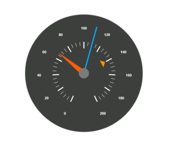
Add Tick Details
- You can set Major ticks with their width and height equal to Minor ticks.
- You can set Color according to your preference for better visibility in dark backgrounds.
- To display and customize the tick value add the following code example.
$(function () {
        var circularGaugeSample = new ej.datavisualization.CircularGauge($("#CircularGauge"),{
       width: 500,
        height: 500,
        backgroundColor: "#3D3F3D",
        readOnly: false,
        scales: [{
            //Add the labels customization code here
            //Add the pointers customization code here
            //Add the ticks customization code here
            ticks: [{
                type: "major",
                distanceFromScale: 70,
                height: 20,
                width: 3,
                color: "#ffffff"
            }, {
                type: "minor",
                height: 12,
                width: 1,
                distanceFromScale: 70,
                color: "#ffffff"
            }]
        });
    });
Run the above code example and you will see the following output.
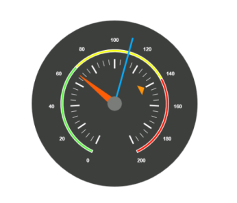
Add Range Values
- Ranges denote the property of the scale value in the speedometer. The color values of the ranges denote speed variation. Set ShowRanges as true for showing the ranges in the Circular Gauge.
- For Low speed, you can mention it as safe zone; for moderate speed, you can call it as caution zone and for high speed, you can mark it as high speed.
- You can customize the range with properties such as start value, end value, start width, end width, background color , border color, etc.,
$(function () {
        var circularGaugeSample = new ej.datavisualization.CircularGauge($("#CircularGauge"),{
         width: 500,
        height: 500,
        backgroundColor: "#3D3F3D",
        readOnly: false,
        scales: [{
                ranges: [{
                distanceFromScale: 30,
                startValue: 0,
                endValue: 70,
                backgroundColor: "#5DF243",
                border: {
                    color: "#FFFFFF"
                },
            }, {
                distanceFromScale: 30,
                startValue: 70,
                endValue: 140,
                backgroundColor: "#F6FF0A",
                border: {
                    color: "#FFFFFF"
                },
            },
            {
                distanceFromScale: 30,
                startValue: 140,
                endValue: 200,
                backgroundColor: "#FF1807",
                border: {
                    color: "#FFFFFF"
                },
            }],

        }]
        });
    });
Run the above code example and you will see the following output.
Add Indicator Details
- Indicators denote whether the pointers values are in their respective zones or not. Positioning the indicator on the respective range value gives you the required changes.
- By using Position property, you can set the location of the indicator. StateRanges defines how the indicator should behave when the pointer is in certain values.
$(function () {
        var circularGaugeSample = new ej.datavisualization.CircularGauge($("#CircularGauge"),{
         width: 500,
        height: 500,
        backgroundColor: "#3D3F3D",
        readOnly: false,
        scales: [{
            indicators: [
            {
                height: 10,
                width: 10,
                type: "circle",
                position: { x: 210, y: 300 },
                stateRanges: [{
                    endValue: 70,
                    startValue: 0,
                    backgroundColor: "#5DF243",
                    borderColor: "#5DF243",
                    text: "",
                    textColor: "#870505"
                }, {
                    endValue: 200,
                    startValue: 70,
                    backgroundColor: "#145608",
                    borderColor: "#145608",
                    text: "",
                    textColor: "#870505"
                }]
            },
            {
                height: 10,
                width: 10,
                type: "circle",
                position: { x: 255, y: 200 },
                stateRanges: [{
                    endValue: 140,
                    startValue: 70,
                    backgroundColor: "#F6FF0A",
                    borderColor: "#F6FF0A",
                    text: "",
                }, {
                    endValue: 70,
                    startValue: 0,
                    backgroundColor: "#969B0C",
                    borderColor: "#969B0C",
                    text: "",
                }, {
                    endValue: 200,
                    startValue: 140,
                    backgroundColor: "#969B0C",
                    borderColor: "#969B0C",
                    text: "",
                }]
            }, {
                height: 10,
                width: 10,
                type: "circle",
                position: { x: 300, y: 300 },
                stateRanges: [{
                    endValue: 140,
                    startValue: 0,
                    backgroundColor: "#890F06",
                    borderColor: "#890F06",
                    text: "",
                },
                {
                    endValue: 200,
                    startValue: 140,
                    backgroundColor: "#FF1807",
                    borderColor: "#FF1807",
                    text: "",
                }]
            }],

        }]
        });
    });
Run the above code example and you will see the following output.
Add Custom Label Details
Custom labels are used to specify the texts that need to be displayed in the gauge. You can customize it through various properties.To display the three range description, custom texts are used here.
$(function () {
        var circularGaugeSample = new ej.datavisualization.CircularGauge($("#CircularGauge"),{
       width: 500,
        height: 500,
        backgroundColor: "#3D3F3D",
        readOnly: false,
        scales: [{
               customLabels: [{
                value: "Safe",
                position: { x: 200, y: 280 },
                color: "#5DF243",
                font:
                {
                    size: "12px",
                    fontFamily: "Arial",
                    fontStyle: "Bold"
                }
            }, {
                value: "Caution",
                position: { x: 253, y: 212 },
                color: "#F6FF0A",
                font:
                {
                    size: "12px",
                    fontFamily: "Arial",
                    fontStyle: "Bold"
                }
            }, {
                value: "Danger",
                position: { x: 290, y: 280 },
                color: "#FF1807",
                font:
                {
                    size: "12px",
                    fontFamily: "Arial",
                    fontStyle: "Bold"
                }
            }]
        }]
        });
    });
Run the above code example and you will see the following output.