About Syncfusion® WPF DateTimePicker Control
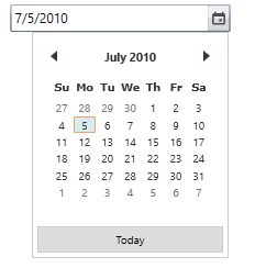
The DateTimeEdit allows you to quickly navigate and select dates using months, years, and decades of calendar. The DateTimeEdit comprises text box and a dropdown with calendar and clock to pick or edit a date with time. It supports data binding, null value, maximum and minimum dates, date validation, watermark, culture and much more. It also provides flexible options for displaying the date-time according to the format required, as well as many customization options to enhance its appearance.
Key features
-
Editing mode - Supports the default text editing and mask mode that helps to restrict the date input to formatted values based on a pre-defined or custom date-time pattern.
-
Date-range support - Supports the maximum and minimum dates in order to prevent users from setting a date or time within a given range.
-
Globalization - Supports different date-time formats and patterns based on cultures.
-
Date validation - Supports date validation when date range constraints are met.
-
Accessibility - Provides touch, keyboard, and mouse support to make applications available to a wide variety of users.
-
Watermark - Supports to display watermark text when a selected date is null.
-
Styles - Provides a rich set of built-in themes and customizes the style of each part of
DateTimeEdit. -
Testing - Provides QTP add-in that contains custom libraries, which helps QTP to recognize
DateTimeEdit.