Agenda view in .NET MAUI Scheduler
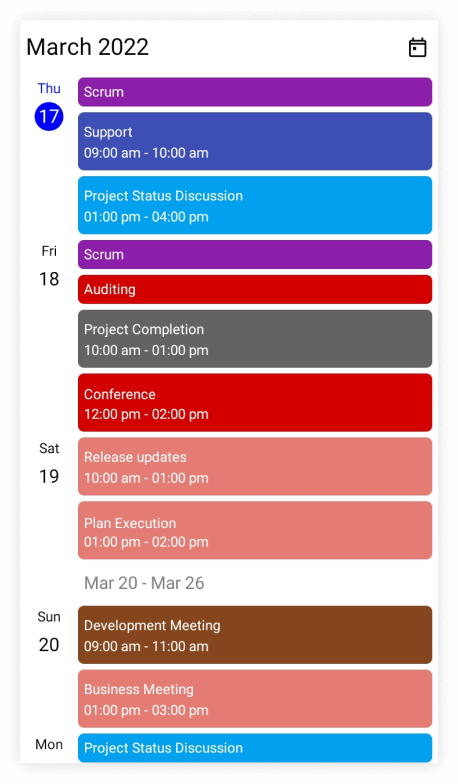
The agenda view displays the events or appointments (normal appointments, all-day appointments, recurring appointments, and span appointments) in chronological order, grouped by date between the minimum and maximum dates and the current date displayed by default. When the AppointmentsSource property of SfScheduler is null, the agenda view will show only the month, week, and date headers for mobile view and responsive UI, and for desktop UI it will display only the date header of display date.
An agenda view displays different UI for mobile and desktop. For mobile, it displays the month header, the week header, and the date header, whereas for desktop, it displays only the date header.
When the desktop view width is less than 600, the scheduler will display the mobile agenda UI on the desktop.
<ContentPage
    . . .
    xmlns:scheduler="clr-namespace:Syncfusion.Maui.Scheduler;assembly=Syncfusion.Maui.Scheduler">
    <scheduler:SfScheduler x:Name="scheduler" View="Agenda" />
</ContentPage>
using Syncfusion.Maui.Scheduler;
using System.Collections.ObjectModel;
. . .
public partial class MainPage : ContentPage
{
public MainPage()
{
InitializeComponent();
this.scheduler.View = SchedulerView.Agenda;
// Creating an instance for the scheduler appointment collection.
var appointments = new ObservableCollection<SchedulerAppointment>();
// Adding scheduler appointment in the scheduler appointment collection.
appointments.Add(new SchedulerAppointment()
{
Subject = "Meeting",
StartTime = DateTime.Now,
EndTime = DateTime.Now.AddHours(1),
Background = Brush.Orange,
});
// Adding scheduler appointment into the AppointmentsSource.
this.scheduler.AppointmentsSource = appointments;
}
}
Layout mode
The layout used to render the agenda view can be specified using the LayoutMode property of the SchedulerAgendaView. The LayoutMode property accepts one of the AgendaViewLayoutMode enumeration values and decides whether the mobile or the desktop agenda layout is rendered.
By default, the LayoutMode is set to Auto, where the Scheduler automatically chooses the mobile or desktop layout based on the available width and the platform.
The available AgendaViewLayoutMode enumeration values are:
- Auto - The agenda view layout is determined automatically based on the available width and the platform.
- Mobile - The agenda view is always rendered using the mobile layout, regardless of the platform, device type, or available width.
- Desktop - The agenda view is always rendered using the desktop layout, regardless of the platform, device type, or available width.
<ContentPage
    . . .
    xmlns:scheduler="clr-namespace:Syncfusion.Maui.Scheduler;assembly=Syncfusion.Maui.Scheduler">
    <scheduler:SfScheduler x:Name="scheduler" View="Agenda">
        <scheduler:SfScheduler.AgendaView>
            <scheduler:SchedulerAgendaView LayoutMode="Mobile"/>
        </scheduler:SfScheduler.AgendaView>
    </scheduler:SfScheduler>
</ContentPage>
using Syncfusion.Maui.Scheduler;
using System.Collections.ObjectModel;
. . .
public partial class MainPage : ContentPage
{
public MainPage()
{
InitializeComponent();
this.scheduler.View = SchedulerView.Agenda;
// Setting the LayoutMode for the agenda view.
this.scheduler.AgendaView.LayoutMode = AgendaViewLayoutMode.Mobile;
// Creating an instance for the scheduler appointment collection.
var appointments = new ObservableCollection<SchedulerAppointment>();
// Adding scheduler appointment in the scheduler appointment collection.
appointments.Add(new SchedulerAppointment()
{
Subject = "Meeting",
StartTime = DateTime.Now,
EndTime = DateTime.Now.AddHours(1),
Background = Brush.Orange,
});
// Adding scheduler appointment into the AppointmentsSource.
this.scheduler.AppointmentsSource = appointments;
}
}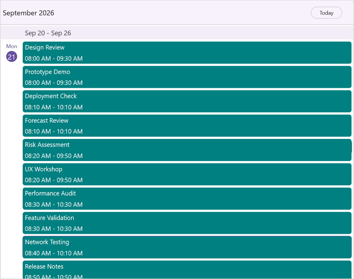
The default value of LayoutMode is Auto. When the desktop view width is less than 600, the Scheduler automatically renders the mobile agenda UI; use Mobile or Desktop to force a specific layout.
Month header appearance customization
The agenda month header view can be customized by using the MonthHeaderSettings property of AgendaView in the SfScheduler.
Customize month header appearance using style
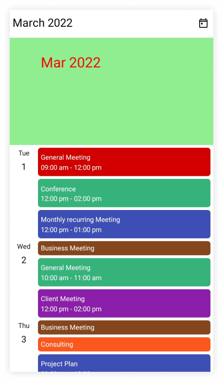
You can style the date format, height, text style, and background color by using the properties such as DateFormat, Height, TextStyle, and Background properties of MonthHeaderSettings.
<ContentPage
    . . .
    xmlns:scheduler="clr-namespace:Syncfusion.Maui.Scheduler;assembly=Syncfusion.Maui.Scheduler">
    <scheduler:SfScheduler x:Name="scheduler" View="Agenda">
        <scheduler:SfScheduler.AgendaView>
            <scheduler:SchedulerAgendaView>
                <scheduler:SchedulerAgendaView.MonthHeaderSettings>
                    <scheduler:SchedulerMonthHeaderSettings DateFormat="MMM yyy"
                                                            Height="200"
                                                            Background="LightGreen" />
                </scheduler:SchedulerAgendaView.MonthHeaderSettings>
            </scheduler:SchedulerAgendaView>
        </scheduler:SfScheduler.AgendaView>
    </scheduler:SfScheduler>
</ContentPage>
using Syncfusion.Maui.Scheduler;
. . .
public partial class MainPage : ContentPage
{
public MainPage()
{
InitializeComponent();
this.scheduler.View = SchedulerView.Agenda;
var textStyle = new SchedulerTextStyle()
{
TextColor = Colors.Red,
FontSize = 25,
};
this.scheduler.AgendaView.MonthHeaderSettings.DateFormat = "MMM yyy";
this.scheduler.AgendaView.MonthHeaderSettings.Height = 200;
this.scheduler.AgendaView.MonthHeaderSettings.TextStyle = textStyle;
this.scheduler.AgendaView.MonthHeaderSettings.Background = Brush.LightGreen;
}
}
Customize month header appearance using DataTemplate
You can customize the month header appearance of scheduler by using the MonthHeaderTemplate property of AgendaView.
<ContentPage
    . . .
    xmlns:scheduler="clr-namespace:Syncfusion.Maui.Scheduler;assembly=Syncfusion.Maui.Scheduler">
    <scheduler:SfScheduler x:Name="scheduler" View="Agenda">
        <scheduler:SfScheduler.AgendaView>
            <scheduler:SchedulerAgendaView>
                <scheduler:SchedulerAgendaView.MonthHeaderTemplate>
                    <DataTemplate>
                        <Grid>
                            <Label x:Name="label" HorizontalOptions="Center" Background="LightGreen" VerticalOptions="Center" TextColor="Black" FontSize="25"  Text="{Binding StringFormat='{0:MMMM yyyy}'}" />
                        </Grid>
                    </DataTemplate>
                </scheduler:SchedulerAgendaView.MonthHeaderTemplate>
            </scheduler:SchedulerAgendaView>
        </scheduler:SfScheduler.AgendaView>
    </scheduler:SfScheduler>

</ContentPage>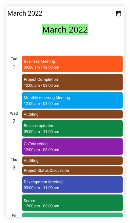
- The default values for
DateFormatandHeightareMMMM yyyyand150,respectively.- For desktop UI, The agenda view displays the appointment only.
Customize month header appearance using DataTemplateSelector
You can customize the month header appearance by using the MonthHeaderTemplate property of AgendaView in the SfScheduler. The DataTemplateSelector can choose a DataTemplate at runtime based on the value of a data-bound to month header by using the MonthHeaderTemplate. It allows you to choose a different data template for each month header, as well as customize the appearance of a particular month header based on certain conditions.
<ContentPage
    . . .
    xmlns:scheduler="clr-namespace:Syncfusion.Maui.Scheduler;assembly=Syncfusion.Maui.Scheduler">
    <Grid>
        <Grid.Resources>
            <DataTemplate x:Key="todayDateTemplate">
                <Grid>
                    <Label x:Name="label" HorizontalOptions="Center" Background="MediumPurple" VerticalOptions="Center" TextColor="Yellow" FontSize="25"  Text="{Binding StringFormat='{0:MMMM yyyy}'}" />
                </Grid>
            </DataTemplate>
            <DataTemplate x:Key="normalDateTemplate">
                <Grid>
                    <Label x:Name="label" HorizontalOptions="Center" Background="MediumPurple" VerticalOptions="Center" TextColor="White" FontSize="25"  Text="{Binding StringFormat='{0:MMMM yyyy}'}" />
                </Grid>
            </DataTemplate>
            <local:AgendaViewTemplateSelector x:Key="agendaViewTemplateSelector" TodayDateTemplate="{StaticResource todayDateTemplate}" NormalDateTemplate="{StaticResource normalDateTemplate}"/>
        </Grid.Resources>
        <scheduler:SfScheduler x:Name="scheduler" View="Agenda" >
            <scheduler:SfScheduler.AgendaView>
                <scheduler:SchedulerAgendaView MonthHeaderTemplate="{StaticResource agendaViewTemplateSelector}" />
            </scheduler:SfScheduler.AgendaView>
        </scheduler:SfScheduler>
    </Grid>

</ContentPage>
using Syncfusion.Maui.Scheduler;
namespace GettingStarted
{
public class AgendaViewTemplateSelector : DataTemplateSelector
{
public AgendaViewTemplateSelector()
{
}
public DataTemplate NormalDateTemplate { get; set; }
public DataTemplate TodayDateTemplate { get; set; }
protected override DataTemplate OnSelectTemplate(object item, BindableObject container)
{
var dateTime = (DateTime)item;
if (dateTime.Month == DateTime.Today.Month)
return TodayDateTemplate;
else
return NormalDateTemplate;
}
}
}using Syncfusion.Maui.Scheduler;
. . .
public partial class MainPage : ContentPage
{
public MainPage()
{
InitializeComponent();
this.scheduler.View = SchedulerView.Agenda;
}
}
- The default value for
DateFormatandHeightareMMMM yyyyand150,respectively.- For desktop UI, The agenda view displays the appointment only.
- When using data template selector, performance issues occur as the conversion template views take time within the framework.
Week header appearance customization
The agenda week header view can be customized by using the WeekHeaderSettings property of AgendaView in the SfScheduler.
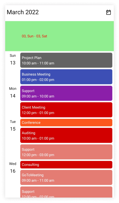
You can style the date format, height, text style, and background color by using the properties such as DateFormat, Height, TextStyle, and Background properties of WeekHeaderSettings.
<ContentPage
    . . .
    xmlns:scheduler="clr-namespace:Syncfusion.Maui.Scheduler;assembly=Syncfusion.Maui.Scheduler">
    <scheduler:SfScheduler x:Name="scheduler" View="Agenda">
        <scheduler:SfScheduler.AgendaView>
            <scheduler:SchedulerAgendaView>
                <scheduler:SchedulerAgendaView.WeekHeaderSettings>
                    <scheduler:SchedulerWeekHeaderSettings DateFormat="MM, ddd"
                                                            Height="100"
                                                            Background="LightGreen" />
                </scheduler:SchedulerAgendaView.WeekHeaderSettings>
            </scheduler:SchedulerAgendaView>
        </scheduler:SfScheduler.AgendaView>
    </scheduler:SfScheduler>

</ContentPage>
using Syncfusion.Maui.Scheduler;
. . .
public partial class MainPage : ContentPage
{
public MainPage()
{
InitializeComponent();
this.scheduler.View = SchedulerView.Agenda;
var textStyle = new SchedulerTextStyle()
{
TextColor = Colors.Red,
FontSize = 12,
};
this.scheduler.AgendaView.WeekHeaderSettings.DateFormat = "MM, ddd";
this.scheduler.AgendaView.WeekHeaderSettings.Height = 100;
this.scheduler.AgendaView.WeekHeaderSettings.TextStyle = textStyle;
this.scheduler.AgendaView.WeekHeaderSettings.Background = Brush.LightGreen;
}
}
- The default value for
DateFormat,andHeightareMMM dd,and30respectively.- For desktop UI, The agenda view displays the appointment only.
Customize week header appearance using DataTemplate
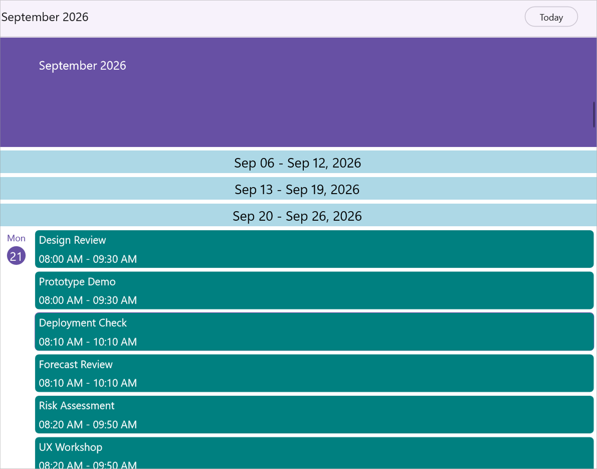
You can fully customize the week header appearance of the scheduler by using the WeekHeaderTemplate property of AgendaView. The BindingContext of the template is the AgendaViewWeekHeaderDetails, which exposes the StartDate and EndDate of the week.
<ContentPage
    . . .
    xmlns:scheduler="clr-namespace:Syncfusion.Maui.Scheduler;assembly=Syncfusion.Maui.Scheduler">

    <scheduler:SfScheduler x:Name="Scheduler" View="Agenda">
        <scheduler:SfScheduler.AgendaView>
            <scheduler:SchedulerAgendaView LayoutMode="Mobile">
                <scheduler:SchedulerAgendaView.WeekHeaderTemplate>
                    <DataTemplate>
                        <Grid BackgroundColor="LightBlue">
                            <Label HorizontalOptions="Center"
                                   VerticalOptions="Center"
                                   FontSize="18"
                                   TextColor="Black">
                                <Label.FormattedText>
                                    <FormattedString>
                                        <Span Text="{Binding StartDate, StringFormat='{0:MMM dd}'}" />
                                        <Span Text=" - " />
                                        <Span Text="{Binding EndDate, StringFormat='{0:MMM dd, yyyy}'}" />
                                    </FormattedString>
                                </Label.FormattedText>
                            </Label>
                        </Grid>
                    </DataTemplate>
                </scheduler:SchedulerAgendaView.WeekHeaderTemplate>
            </scheduler:SchedulerAgendaView>
        </scheduler:SfScheduler.AgendaView>
    </scheduler:SfScheduler>
</ContentPage>
using Syncfusion.Maui.Scheduler;
. . .
public partial class MainPage : ContentPage
{
public MainPage()
{
InitializeComponent();
SfScheduler scheduler = new SfScheduler();
scheduler.View = SchedulerView.Agenda;
scheduler.AgendaView.LayoutMode = AgendaViewLayoutMode.Mobile;
scheduler.AgendaView.WeekHeaderTemplate = new DataTemplate(() =>
{
var startSpan = new Span
{
Text = "{0:MMM dd}",
TextColor = Colors.Black
};
startSpan.SetBinding(Span.TextProperty, new Binding("StartDate", stringFormat: "{0:MMM dd}"));
var separatorSpan = new Span { Text = " - ", TextColor = Colors.Black };
var endSpan = new Span
{
Text = "{0:MMM dd, yyyy}",
TextColor = Colors.Black
};
endSpan.SetBinding(Span.TextProperty, new Binding("EndDate", stringFormat: "{0:MMM dd, yyyy}"));
var formattedString = new FormattedString();
formattedString.Spans.Add(startSpan);
formattedString.Spans.Add(separatorSpan);
formattedString.Spans.Add(endSpan);
var label = new Label
{
FontSize = 18,
HorizontalOptions = LayoutOptions.Center,
VerticalOptions = LayoutOptions.Center,
FormattedText = formattedString
};
var grid = new Grid
{
BackgroundColor = Colors.LightBlue,
Children = { label }
};
return grid;
});
this.Content = scheduler;
}
}
The WeekHeaderTemplate overrides the default
WeekHeaderSettingsrendering for the week header band and is supported only in the Agenda view.
Day header appearance customization
The agenda day header view can be customized by using the DayHeaderSettings property of AgendaView in the SfScheduler.
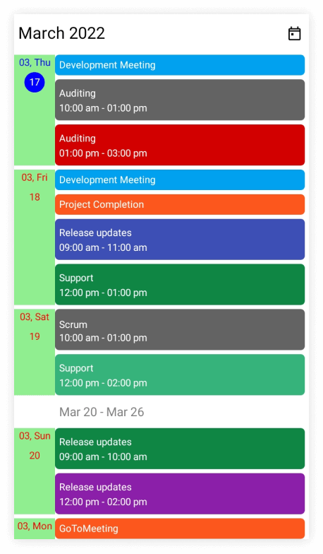
You can style the day format, day text style, date text style, and background color by using the properties such as DayFormat, DayTextStyle, DateTextStyle, and Background properties of DayHeaderSettings.
<ContentPage
    . . .
    xmlns:scheduler="clr-namespace:Syncfusion.Maui.Scheduler;assembly=Syncfusion.Maui.Scheduler">
    <scheduler:SfScheduler x:Name="scheduler" View="Agenda">
        <scheduler:SfScheduler.AgendaView>
            <scheduler:SchedulerAgendaView>
                <scheduler:SchedulerAgendaView.DayHeaderSettings>
                    <scheduler:SchedulerDayHeaderSettings DayFormat="MM, ddd"
                                                            Background="LightGreen" />
                </scheduler:SchedulerAgendaView.DayHeaderSettings>
            </scheduler:SchedulerAgendaView>
        </scheduler:SfScheduler.AgendaView>
    </scheduler:SfScheduler>
</ContentPage>
using Syncfusion.Maui.Scheduler;
. . .
public partial class MainPage : ContentPage
{
public MainPage()
{
InitializeComponent();
this.scheduler.View = SchedulerView.Agenda;
var textStyle = new SchedulerTextStyle()
{
TextColor = Colors.Red,
FontSize = 12,
};
this.scheduler.AgendaView.DayHeaderSettings.DayFormat = "MM, ddd";
this.scheduler.AgendaView.DayHeaderSettings.DayTextStyle = textStyle;
this.scheduler.AgendaView.DayHeaderSettings.DateTextStyle = textStyle;
this.scheduler.AgendaView.DayHeaderSettings.Background = Brush.LightGreen;
}
}
The default value of
DayFormatisMMM, ddd.
Customize day header appearance using DataTemplate
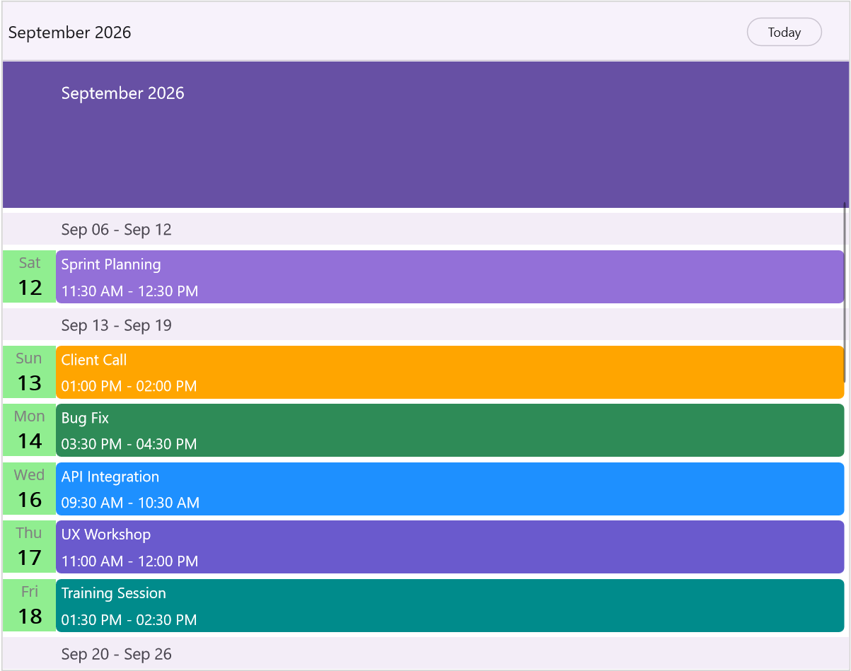
You can fully customize the day header appearance by using the DayHeaderTemplate property of AgendaView. The BindingContext of the template is the DateTime for the corresponding agenda date, which lets you bind directly to date components like the weekday (ddd) and the day number (dd).
<ContentPage
    . . .
    xmlns:scheduler="clr-namespace:Syncfusion.Maui.Scheduler;assembly=Syncfusion.Maui.Scheduler">

    <scheduler:SfScheduler x:Name="Scheduler" View="Agenda">
        <scheduler:SfScheduler.AgendaView>
            <scheduler:SchedulerAgendaView>
                <scheduler:SchedulerAgendaView.DayHeaderTemplate>
                    <DataTemplate>
                        <Grid BackgroundColor="LightGreen">
                            <VerticalStackLayout HorizontalOptions="Center"
                                                  VerticalOptions="Center">
                                <Label FontSize="14"
                                       TextColor="Gray"
                                       HorizontalTextAlignment="Center"
                                       Text="{Binding StringFormat='{0:ddd}'}" />
                                <Label FontSize="20"
                                       FontAttributes="Bold"
                                       TextColor="Black"
                                       HorizontalTextAlignment="Center"
                                       Text="{Binding StringFormat='{0:dd}'}" />
                            </VerticalStackLayout>
                        </Grid>
                    </DataTemplate>
                </scheduler:SchedulerAgendaView.DayHeaderTemplate>
            </scheduler:SchedulerAgendaView>
        </scheduler:SfScheduler.AgendaView>
    </scheduler:SfScheduler>
</ContentPage>
using Syncfusion.Maui.Scheduler;
. . .
public partial class MainPage : ContentPage
{
public MainPage()
{
InitializeComponent();
SfScheduler scheduler = new SfScheduler();
scheduler.View = SchedulerView.Agenda;
scheduler.AgendaView.DayHeaderTemplate = new DataTemplate(() =>
{
var dayLabel = new Label
{
FontSize = 14,
TextColor = Colors.Gray,
HorizontalTextAlignment = TextAlignment.Center
};
dayLabel.SetBinding(Label.TextProperty, new Binding(".", stringFormat: "{0:ddd}"));
var dateLabel = new Label
{
FontSize = 20,
FontAttributes = FontAttributes.Bold,
TextColor = Colors.Black,
HorizontalTextAlignment = TextAlignment.Center
};
dateLabel.SetBinding(Label.TextProperty, new Binding(".", stringFormat: "{0:dd}"));
var stack = new VerticalStackLayout
{
HorizontalOptions = LayoutOptions.Center,
VerticalOptions = LayoutOptions.Center,
Children = { dayLabel, dateLabel }
};
var grid = new Grid
{
BackgroundColor = Colors.LightGreen,
Children = { stack }
};
return grid;
});
this.Content = scheduler;
}
}
The DayHeaderTemplate overrides the default
DayHeaderSettingsrendering for the day header band and is supported only in the mobile layout of the Agenda view.
Appointment text appearance customization
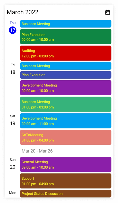
The appointment text style can be customized by using the AppointmentTextStyle property of the SfScheduler.
<ContentPage
    . . .
    xmlns:scheduler="clr-namespace:Syncfusion.Maui.Scheduler;assembly=Syncfusion.Maui.Scheduler">

    <scheduler:SfScheduler x:Name="scheduler" View="Agenda" />

</ContentPage>
using Syncfusion.Maui.Scheduler;
using System.Collections.ObjectModel;
. . .
public partial class MainPage : ContentPage
{
public MainPage()
{
InitializeComponent();
this.scheduler.View = SchedulerView.Agenda;
// Creating an instance for the scheduler appointment collection.
var appointments = new ObservableCollection<SchedulerAppointment>();
// Adding scheduler appointment in the scheduler appointment collection.
appointments.Add(new SchedulerAppointment()
{
Subject = "Meeting",
StartTime = DateTime.Now,
EndTime = DateTime.Now.AddHours(1),
RecurrenceRule = "FREQ=DAILY;INTERVAL=1",
Background = Brush.Orange,
});
// Adding scheduler appointment into the AppointmentsSource.
this.scheduler.AppointmentsSource = appointments;
// Creating the text style for the appointments.
var appointmentTextStyle = new SchedulerTextStyle()
{
TextColor = Colors.White,
FontSize = 12,
};
// Setting the text style for the appointments.
this.scheduler.AppointmentTextStyle = appointmentTextStyle;
}
}
Customize “No Events” Text Appearance
The appearance of the “No events” text in the Agenda view can be customized using the NoEventsTextStyle property of the SfScheduler. This allows modification of font size, color, and other text attributes.
<ContentPage
    . . .
    xmlns:scheduler="clr-namespace:Syncfusion.Maui.Scheduler;assembly=Syncfusion.Maui.Scheduler">

    <scheduler:SfScheduler x:Name="scheduler"
                           View="Agenda"
                           AllowedViews="Day, Agenda">
        <scheduler:SfScheduler.AgendaView>
            <scheduler:SchedulerAgendaView>
                <scheduler:SchedulerAgendaView.NoEventsTextStyle>
                    <scheduler:SchedulerTextStyle TextColor="DarkSlateGrey" FontAttributes="Italic" FontSize="15" />
                </scheduler:SchedulerAgendaView.NoEventsTextStyle>
            </scheduler:SchedulerAgendaView>
        </scheduler:SfScheduler.AgendaView>
    </scheduler:SfScheduler>

</ContentPage>
using Syncfusion.Maui.Scheduler;
. . .
public partial class MainPage : ContentPage
{
public MainPage()
{
InitializeComponent();
// Customizing the No events text style in agenda view
var textStyle = new SchedulerTextStyle()
{
TextColor = Colors.DarkSlateGrey,
FontAttributes = FontAttributes.Italic,
FontSize = 15,
FontAutoScalingEnabled = true
};
// Setting the TextStyle for the NoEvets text.
this.scheduler.AgendaView.NoEventsTextStyle = textStyle;
}
}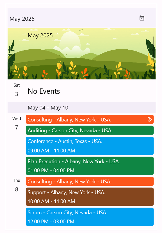
The “No Events” message is displayed when there are no appointments for the current date or for the date specified using the DisplayDate property.
Change the appointment time format
You can customize the appointment time format of the scheduler by using the AppointmentTimeFormat property of AgendaView.
<ContentPage
    . . .
    xmlns:scheduler="clr-namespace:Syncfusion.Maui.Scheduler;assembly=Syncfusion.Maui.Scheduler">
    <scheduler:SfScheduler x:Name="scheduler" View="Agenda">
        <scheduler:SfScheduler.AgendaView>
            <scheduler:SchedulerAgendaView AppointmentTimeFormat="HH:mm:tt" />
        </scheduler:SfScheduler.AgendaView>
    </scheduler:SfScheduler>

</ContentPage>
using Syncfusion.Maui.Scheduler;
. . .
public partial class MainPage : ContentPage
{
public MainPage()
{
InitializeComponent();
SfScheduler scheduler = new SfScheduler();
scheduler.View = SchedulerView.Agenda;
scheduler.AgendaView.AppointmentTimeFormat = "HH:mm:tt";
this.Content = scheduler;
}
}Show or Hide Empty Days
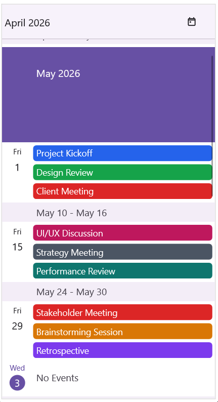
The HideEmptyDays property controls the visibility of days without appointments in the AgendaView. By default, all days are displayed, including those that do not contain any appointments. Setting HideEmptyDays to true hides empty days and displays only dates that contain scheduled appointments, resulting in a more compact agenda view.
<ContentPage
    . . .
    xmlns:scheduler="clr-namespace:Syncfusion.Maui.Scheduler;assembly=Syncfusion.Maui.Scheduler">

    <scheduler:SfScheduler x:Name="scheduler" View="Agenda">
        <scheduler:SfScheduler.AgendaView>
            <scheduler:SchedulerAgendaView HideEmptyDays="True" />
        </scheduler:SfScheduler.AgendaView>
    </scheduler:SfScheduler>

</ContentPage>
using Syncfusion.Maui.Scheduler;
. . .
public partial class MainPage : ContentPage
{
public MainPage()
{
InitializeComponent();
SfScheduler scheduler = new SfScheduler();
scheduler.View = SchedulerView.Agenda;
scheduler.AgendaView.HideEmptyDays = true;
this.Content = scheduler;
}
}
Agenda appointment template
The .NET MAUI Scheduler allows users to customize the visual representation of agenda appointments by defining data templates, enhancing usability within the application. Users can customize the appointment text, icon, image, or view based on their needs and appointment details.
<ContentPage
    . . .
    xmlns:scheduler="clr-namespace:Syncfusion.Maui.Scheduler;assembly=Syncfusion.Maui.Scheduler">

    <Grid>
        <Grid.Resources>
            <DataTemplate x:Key="mainTemplate">
                <Grid Background="Purple" HeightRequest="30">
                    <Label HorizontalTextAlignment="Center" VerticalTextAlignment="Center" TextColor="Black" Text="Client Meeting" />
                </Grid>
            </DataTemplate>
        </Grid.Resources>
        <scheduler:SfScheduler x:Name="DataTemplateScheduler" View="Agenda">
            <scheduler:SfScheduler.AgendaView>
                <scheduler:SchedulerAgendaView AppointmentTemplate="{StaticResource mainTemplate}">
                    <scheduler:SchedulerAgendaView.MonthHeaderTemplate>
                        <DataTemplate>
                            <Grid>
                                <Label x:Name="label"
                                       HorizontalOptions="Center"
                                       Background="MediumPurple"
                                       VerticalOptions="Center"
                                       TextColor="White"
                                       FontSize="25"
                                       Text="{Binding StringFormat='{0:MMMM yyyy}'}" />
                            </Grid>
                        </DataTemplate>
                    </scheduler:SchedulerAgendaView.MonthHeaderTemplate>
                </scheduler:SchedulerAgendaView>
            </scheduler:SfScheduler.AgendaView>
        </scheduler:SfScheduler>
    </Grid>

</ContentPage>
- By default, the SchedulerAppointment is set as the
BindingContextfor AppointmentTemplate for both SchedulerAppointment and custom data object inAppointmentsSource.- The Custom data object can be bound in AppointmentTemplate by using
SchedulerAppointment.DataItem.