Views in .NET MAUI Calendar control
The SfCalendar control has four Calendar views to display. It can be assigned to the control by using the View property. By default, the Month view is initially rendered. The current date will be displayed initially for all the Calendar views.
Month view
The Month view displays the days of the current month, plus a few days from the previous and next month. By default, the current month is displayed and the current date is highlighted in a color that differs from the rest of the dates in the Month view.
<ContentPage
    . . .
    xmlns:calendar="clr-namespace:Syncfusion.Maui.Calendar;assembly=Syncfusion.Maui.Calendar">

    <calendar:SfCalendar x:Name="calendar"
                        View="Month">
    </calendar:SfCalendar>

</ContentPage>
using Syncfusion.Maui.Calendar;
. . .
this.calendar.View = CalendarView.Month;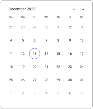
First day of week
The Calendar control is rendered with Sunday as the first day of the week and it allows customization to change the first day of the week using the FirstDayOfWeek property in month view.
The following code explains how to show the Calendar with Monday as the first day of the week.
<ContentPage
    . . .
    xmlns:calendar="clr-namespace:Syncfusion.Maui.Calendar;assembly=Syncfusion.Maui.Calendar">

    <calendar:SfCalendar x:Name="calendar">
        <calendar:SfCalendar.MonthView>
            <calendar:CalendarMonthView FirstDayOfWeek="Monday"/>
        </calendar:SfCalendar.MonthView>
    </calendar:SfCalendar>

</ContentPage>
using Syncfusion.Maui.Calendar;
. . .
this.calendar.MonthView.FirstDayOfWeek = DayOfWeek.Monday;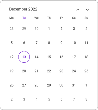
Number of visible weeks
The number of visible weeks in the month view can be customized by using the NumberOfVisibleWeeks property in the Calendar. By default, the Month view displays with the NumberOfVisibleWeeks as 6.
The following code explains how to show the Calendar month view with NumberOfVisibleWeeks as 3.
<ContentPage
    . . .
    xmlns:calendar="clr-namespace:Syncfusion.Maui.Calendar;assembly=Syncfusion.Maui.Calendar">

    <calendar:SfCalendar x:Name="calendar"
                      View="Month">
        <calendar:SfCalendar.MonthView>
            <calendar:CalendarMonthView NumberOfVisibleWeeks = 3/>
        </calendar:SfCalendar.MonthView>
    </calendar:SfCalendar>

</ContentPage>
using Syncfusion.Maui.Calendar;
. . .
this.calendar.MonthView.NumberOfVisibleWeeks = 3;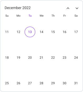
Week number
By setting the ShowWeekNumber property, it displays the week number for the current view dates in the month view. By default, the ShowWeekNumber is set to false. The week numbers will be displayed based on the ISO standard.
<ContentPage
    . . .
    xmlns:calendar="clr-namespace:Syncfusion.Maui.Calendar;assembly=Syncfusion.Maui.Calendar">

    <calendar:SfCalendar x:Name="calendar" View="Month">
        <calendar:SfCalendar.MonthView>
            <calendar:CalendarMonthView ShowWeekNumber="True"/>
        </calendar:SfCalendar.MonthView>
    </calendar:SfCalendar>

</ContentPage>
using Syncfusion.Maui.Calendar;
. . .
this.calendar.MonthView.ShowWeekNumber = true;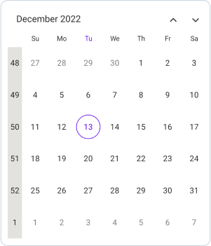
Week number appearance
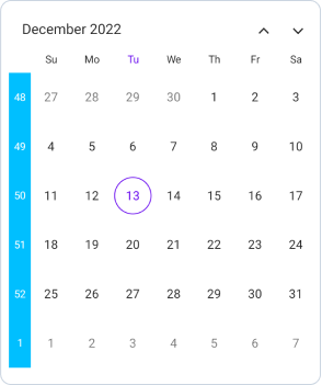
Week number Background and TextStyle can be customized in the month view. Background color can be changed by using the Background property and the textStyle can be changed by using the TextStyle property.
<ContentPage
    . . .
    xmlns:calendar="clr-namespace:Syncfusion.Maui.Calendar;assembly=Syncfusion.Maui.Calendar">

    <calendar:SfCalendar x:Name="calendar"  View="Month">
        <calendar:SfCalendar.MonthView>
            <calendar:CalendarMonthView ShowWeekNumber="True">
                <calendar:CalendarMonthView.WeekNumberStyle>
                    <calendar:CalendarWeekNumberStyle Background="DeepSkyBlue">
                        <calendar:CalendarWeekNumberStyle.TextStyle>
                            <calendar:CalendarTextStyle TextColor="White" FontSize="12" />
                        </calendar:CalendarWeekNumberStyle.TextStyle>
                    </calendar:CalendarWeekNumberStyle>
                </calendar:CalendarMonthView.WeekNumberStyle>
            </calendar:CalendarMonthView>
        </calendar:SfCalendar.MonthView>
    </calendar:SfCalendar>

</ContentPage>
using Syncfusion.Maui.Calendar;
. . .
CalendarTextStyle textStyle = new CalendarTextStyle()
{
TextColor = Colors.Black,
FontSize = 12,
};
this.calendar.MonthView = new CalendarMonthView()
{
ShowWeekNumber = true,
WeekNumberStyle = new CalendarWeekNumberStyle()
{
Background = Colors.DeepSkyBlue,
TextStyle = textStyle,
}
};
Autofit
Autofit dynamically adjusts the month row height based on the number of weeks in the current month. It is available only in the Month view when:
-
ShowTrailingAndLeadingDates is set to
false, and - Mode is Dialog or RelativeDialog.
Autofit is Not applicable when
- NumberOfVisibleWeeks is less than 6.
- PopupHeight is less than or equal to 0.
<ContentPage
    . . .
    xmlns:calendar="clr-namespace:Syncfusion.Maui.Calendar;assembly=Syncfusion.Maui.Calendar">
    <Grid>
        <calendar:SfCalendar x:Name="calendar"
                         Mode="Dialog"
                         ShowTrailingAndLeadingDates="False"/>
        <Button Text="Open Calendar"
            x:Name="calendarButton"
            Clicked="Button_Clicked"
            HorizontalOptions="Center"
            VerticalOptions="Center"
            HeightRequest="50"
            WidthRequest="150">
        </Button>
    </Grid>
</ContentPage>
using Syncfusion.Maui.Calendar;
. . .
private void Button_Clicked(object sender, EventArgs e)
{
this.calendar.IsOpen = true;
}
Year view
The Year view displays the current year’s month. A calendar year is a one-year period that begins on January 1 and ends on December 31. By default, displays the current year’s month and the current month is highlighted by a separate color that is different from the rest of the month color in the Year view. You can easily navigate to the desired month dates from the year view.
<ContentPage
    . . .
    xmlns:calendar="clr-namespace:Syncfusion.Maui.Calendar;assembly=Syncfusion.Maui.Calendar">

    <calendar:SfCalendar x:Name="calendar"
                        View="Year">
    </calendar:SfCalendar>

</ContentPage>
using Syncfusion.Maui.Calendar;
. . .
this.calendar.View = CalendarView.Year;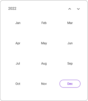
Decade view
The Decade view shows the period of ten years and some years ahead. By default, it displays the current year view, with the current year highlighted in a different color than the other years in the Decade view. From the decade view, you can easily navigate to the desired year in the Year view.
<ContentPage
    . . .
    xmlns:calendar="clr-namespace:Syncfusion.Maui.Calendar;assembly=Syncfusion.Maui.Calendar">

    <calendar:SfCalendar x:Name="calendar"
                        View="Decade">
    </calendar:SfCalendar>

</ContentPage>
using Syncfusion.Maui.Calendar;
. . .
this.calendar.View = CalendarView.Decade;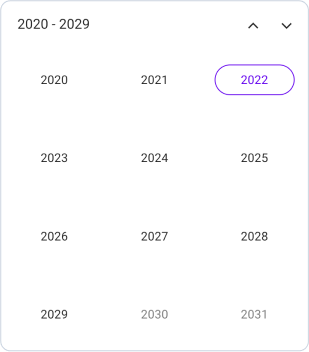
Century view
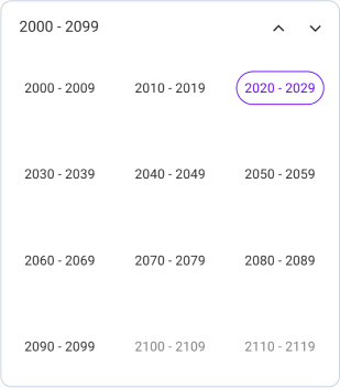
The Century view displays a period of a hundred years and some years ahead. By default, the current range of years is displayed, and the current decade is highlighted in a color that differs from the rest of the years in the Century view. You can easily navigate to the Decade view from the Century view.
<ContentPage
    . . .
    xmlns:calendar="clr-namespace:Syncfusion.Maui.Calendar;assembly=Syncfusion.Maui.Calendar">

    <calendar:SfCalendar x:Name="calendar"
                        View="Century">
    </calendar:SfCalendar>

</ContentPage>
using Syncfusion.Maui.Calendar;
. . .
this.calendar.View = CalendarView.Century;