Resources in JavaScript Scheduler
Resources and grouping let the Scheduler represent appointments for multiple resources. Appointments for each resource appear under the corresponding resource in a column or row layout. The Scheduler supports single- and multi-level resource grouping so you can categorize resources hierarchically. Resources appear as expandable groups in Timeline views or as a vertical hierarchy in calendar views.
You can assign multiple resources to a single appointment by enabling multiple resource selection in the event editor.
Resource data can be provided as a local JSON collection or via a remote service URL (for example, using DataManager).
Resource fields
The default options available within the resources collection are as follows,
| Field name | Type | Description |
|---|---|---|
field |
String | A value that binds to the resource field of event object. |
title |
String | It holds the title of the resource field to be displayed on the event editor window. |
name |
String | A unique resource name used for differentiating various resource objects while grouping. |
allowMultiple |
Boolean | When set to true, the allowMultiple property allows the selection of multiple resource names, thus creating multiple instances of the same appointment for the selected resources. |
dataSource |
Object | Assigns the resource dataSource, where data can be passed either as an array of JavaScript objects, or else can create an instance of DataManager for processing remote data. With remote data assigned to dataSource, check the available adaptors to customize the data processing. |
query |
Query | Defines the external query that will be executed along with data processing. |
idField |
String | Binds the resource ID field name from the resources dataSource. |
expandedField |
String | Binds the expandedField name from the resources dataSource. It usually holds a boolean value that determines whether the resource in Timeline views is in a collapsed or expanded state on initial load. |
textField |
String | Binds the textField name from the resources dataSource. It usually holds the resource names. |
groupIDField |
String | Binds the groupIDField name from the resource dataSource. It usually holds the resource IDs of parent-level resources. |
colorField |
String | Binds the colorField name from the resource dataSource. The color value mapped in this field will be applied to the events of resources. |
startHourField |
String | Binds the startHourField name from the resource dataSource. It allows providing different work start hour for the resources. |
endHourField |
String | Binds the endHourField name from the resource dataSource. It allows providing different work end hour for the resources. |
workDaysField |
String | Binds the workDaysField name from the resources dataSource. It allows providing different working days collection for the resources. |
cssClassField |
String | Binds the custom cssClassField name from the resources dataSource. It maps the CSS class written for specific resources and applies it to the events of those resources. |
Resource data binding
Resource data can be bound to the Scheduler either as a local JSON collection or through a service URL retrieving resource data from remote data services.
Using local JSON data
The following code example demonstrates how to bind local JSON data to the dataSource of the resources collection.
var scheduleObj = new ej.schedule.Schedule({
    width: '100%',
    height: '550px',
    currentView: 'Week',
    views: ['Week', 'Month', 'TimelineWeek', 'TimelineMonth', 'Agenda'],
    selectedDate: new Date(2018, 3, 1),
    group: {
        resources: ['Owners']
    },
    resources: [{
        field: 'OwnerId', title: 'Owner',
        name: 'Owners', allowMultiple: true,
        dataSource: [
            { OwnerText: 'Nancy', Id: 1, OwnerColor: '#ffaa00' },
            { OwnerText: 'Steven', Id: 2, OwnerColor: '#f8a398' },
            { OwnerText: 'Michael', Id: 3, OwnerColor: '#7499e1' }
        ],
        textField: 'OwnerText', idField: 'Id', colorField: 'OwnerColor'
    }],
    eventSettings: { dataSource: resourceData }
});
scheduleObj.appendTo('#Schedule');
<!DOCTYPE html>
<html lang="en">
<head>
<title>Schedule Typescript Control</title>
<meta charset="utf-8">
<meta name="viewport" content="width=device-width, initial-scale=1.0">
<meta name="description" content="Typescript Schedule Control">
<meta name="author" content="Syncfusion">
<link href="index.css" rel="stylesheet">
<link href="https://cdn.syncfusion.com/ej2/35.1.37/bootstrap5.3.css" rel="stylesheet" />
<script src="https://cdn.syncfusion.com/ej2/35.1.37/dist/ej2.min.js" type="text/javascript"></script>
<script src="es5-datasource.js" type="text/javascript"></script>
</head>
<body>
<div id="container">
<div id="Schedule"></div>
</div>
<script>
var ele = document.getElementById('container');
if (ele) {
ele.style.visibility = "visible";
}
</script>
<script src="index.js" type="text/javascript"></script>
</body>
</html>/**
* Schedule datasource spec
*/
var resourceData = [
{
Id: 1,
Subject: 'Workflow Analysis',
StartTime: new Date(2018, 3, 1, 9, 30),
EndTime: new Date(2018, 3, 1, 12, 0),
IsAllDay: false,
OwnerId: 1,
RoomId: 1
}, {
Id: 2,
Subject: 'Requirement planning',
StartTime: new Date(2018, 3, 1, 12, 30),
EndTime: new Date(2018, 3, 1, 14, 45),
IsAllDay: false,
OwnerId: 2,
RoomId: 2
}, {
Id: 3,
Subject: 'Quality Analysis',
StartTime: new Date(2018, 3, 2, 10, 0),
EndTime: new Date(2018, 3, 2, 12, 30),
IsAllDay: false,
OwnerId: 1,
RoomId: 1
}, {
Id: 4,
Subject: 'Resource planning',
StartTime: new Date(2018, 3, 2, 13, 0),
EndTime: new Date(2018, 3, 2, 15, 30),
IsAllDay: false,
OwnerId: 2,
RoomId: 2
}, {
Id: 5,
Subject: 'Timeline estimation',
StartTime: new Date(2018, 3, 3, 9, 0),
EndTime: new Date(2018, 3, 3, 11, 30),
IsAllDay: false,
OwnerId: 1,
RoomId: 1
}, {
Id: 6,
Subject: 'Developers Meeting',
StartTime: new Date(2018, 3, 3, 14, 0),
EndTime: new Date(2018, 3, 3, 16, 45),
IsAllDay: false,
OwnerId: 2,
RoomId: 2
}, {
Id: 7,
Subject: 'Project Review',
StartTime: new Date(2018, 3, 4, 11, 15),
EndTime: new Date(2018, 3, 4, 13, 30),
IsAllDay: false,
OwnerId: 1,
RoomId: 1
}, {
Id: 8,
Subject: 'Manual testing',
StartTime: new Date(2018, 3, 4, 9, 15),
EndTime: new Date(2018, 3, 4, 11, 45),
IsAllDay: false,
OwnerId: 2,
RoomId: 2
}, {
Id: 9,
Subject: 'Project Preview',
StartTime: new Date(2018, 3, 5, 9, 30),
EndTime: new Date(2018, 3, 5, 12, 45),
IsAllDay: false,
OwnerId: 1,
RoomId: 1
}, {
Id: 10,
Subject: 'Cross-browser testing',
StartTime: new Date(2018, 3, 5, 13, 45),
EndTime: new Date(2018, 3, 5, 16, 30),
IsAllDay: false,
OwnerId: 2
}, {
Id: 11,
Subject: 'Bug Automation',
StartTime: new Date(2018, 3, 6, 10, 0),
EndTime: new Date(2018, 3, 6, 12, 15),
IsAllDay: false,
OwnerId: 1,
RoomId: 1
}, {
Id: 12,
Subject: 'Functionality testing',
StartTime: new Date(2018, 3, 6, 9, 0),
EndTime: new Date(2018, 3, 6, 11, 30),
IsAllDay: false,
OwnerId: 2,
RoomId: 2
}, {
Id: 13,
Subject: 'Resolution-based testing',
StartTime: new Date(2018, 3, 7, 13, 0),
EndTime: new Date(2018, 3, 7, 15, 15),
IsAllDay: false,
OwnerId: 1,
RoomId: 1
}, {
Id: 14,
Subject: 'Test report Validation',
StartTime: new Date(2018, 3, 7, 9),
EndTime: new Date(2018, 3, 7, 11),
IsAllDay: false,
OwnerId: 2,
RoomId: 2
}, {
Id: 15,
Subject: 'Test case correction',
StartTime: new Date(2018, 3, 8, 9, 45),
EndTime: new Date(2018, 3, 8, 11, 30),
IsAllDay: false,
OwnerId: 1,
RoomId: 1
}, {
Id: 16,
Subject: 'Run test cases',
StartTime: new Date(2018, 3, 8, 10, 30),
EndTime: new Date(2018, 3, 8, 13, 0),
IsAllDay: false,
OwnerId: 2,
RoomId: 2
}, {
Id: 17,
Subject: 'Quality Analysis',
StartTime: new Date(2018, 3, 9, 12),
EndTime: new Date(2018, 3, 9, 15, 30),
IsAllDay: false,
OwnerId: 1,
RoomId: 1
}, {
Id: 18,
Subject: 'Debugging',
StartTime: new Date(2018, 3, 9, 9, 0),
EndTime: new Date(2018, 3, 9, 11, 15),
IsAllDay: false,
OwnerId: 2,
RoomId: 2
}, {
Id: 19,
Subject: 'Exception handling',
StartTime: new Date(2018, 3, 10, 10, 10),
EndTime: new Date(2018, 3, 10, 13, 30),
IsAllDay: false,
OwnerId: 1,
RoomId: 1
}, {
Id: 20,
Subject: 'Decoding',
StartTime: new Date(2018, 3, 10, 10, 30),
EndTime: new Date(2018, 3, 10, 12, 30),
IsAllDay: false,
OwnerId: 2,
RoomId: 2
}, {
Id: 21,
Subject: 'workflow Analysis',
StartTime: new Date(2018, 3, 11, 9, 30),
EndTime: new Date(2018, 3, 11, 11, 30),
IsAllDay: false,
OwnerId: 3,
RoomId: 1
}, {
Id: 22,
Subject: 'Requirement planning',
StartTime: new Date(2018, 3, 11, 12, 30),
EndTime: new Date(2018, 3, 11, 14, 45),
IsAllDay: false,
OwnerId: 2,
RoomId: 2
}, {
Id: 23,
Subject: 'Quality Analysis',
StartTime: new Date(2018, 3, 12, 10),
EndTime: new Date(2018, 3, 12, 12, 30),
IsAllDay: false,
OwnerId: 3,
RoomId: 1
}, {
Id: 24,
Subject: 'Resource planning',
StartTime: new Date(2018, 3, 12, 13),
EndTime: new Date(2018, 3, 12, 14, 30),
IsAllDay: false,
OwnerId: 2,
RoomId: 2
}, {
Id: 25,
Subject: 'Timeline estimation',
StartTime: new Date(2018, 3, 13, 9),
EndTime: new Date(2018, 3, 13, 11),
IsAllDay: false,
OwnerId: 3,
RoomId: 1
}, {
Id: 26,
Subject: 'Developers Meeting',
StartTime: new Date(2018, 3, 13, 14),
EndTime: new Date(2018, 3, 13, 15, 45),
IsAllDay: false,
OwnerId: 2,
RoomId: 2
}, {
Id: 27,
Subject: 'Project Review',
StartTime: new Date(2018, 3, 14, 11),
EndTime: new Date(2018, 3, 14, 13),
IsAllDay: false,
OwnerId: 1,
RoomId: 1
}, {
Id: 28,
Subject: 'Manual testing',
StartTime: new Date(2018, 3, 14, 9),
EndTime: new Date(2018, 3, 14, 11, 30),
IsAllDay: false,
OwnerId: 2,
RoomId: 2
}, {
Id: 29,
Subject: 'Project Preview',
StartTime: new Date(2018, 3, 15, 9, 30),
EndTime: new Date(2018, 3, 15, 11),
IsAllDay: false,
OwnerId: 3,
RoomId: 1
}, {
Id: 30,
Subject: 'Cross-browser testing',
StartTime: new Date(2018, 3, 15, 14),
EndTime: new Date(2018, 3, 15, 16, 30),
IsAllDay: false,
OwnerId: 2,
RoomId: 2
}, {
Id: 31,
Subject: 'Bug Automation',
StartTime: new Date(2018, 3, 16, 10),
EndTime: new Date(2018, 3, 16, 11),
IsAllDay: false,
OwnerId: 1,
RoomId: 1
}, {
Id: 32,
Subject: 'Functionality testing',
StartTime: new Date(2018, 3, 16, 9),
EndTime: new Date(2018, 3, 16, 11, 30),
IsAllDay: false,
OwnerId: 2,
RoomId: 2
}, {
Id: 33,
Subject: 'Resolution-based testing',
StartTime: new Date(2018, 3, 17, 14),
EndTime: new Date(2018, 3, 17, 15),
IsAllDay: false,
OwnerId: 3,
RoomId: 1
}, {
Id: 34,
Subject: 'Test report Validation',
StartTime: new Date(2018, 3, 17, 9),
EndTime: new Date(2018, 3, 17, 11),
IsAllDay: false,
OwnerId: 2,
RoomId: 2
}, {
Id: 35,
Subject: 'Test case correction',
StartTime: new Date(2018, 3, 18, 10),
EndTime: new Date(2018, 3, 18, 11, 30),
IsAllDay: false,
OwnerId: 1,
RoomId: 1
}, {
Id: 36,
Subject: 'Run test cases',
StartTime: new Date(2018, 3, 18, 10),
EndTime: new Date(2018, 3, 18, 10, 30),
IsAllDay: false,
OwnerId: 2,
RoomId: 2
}, {
Id: 37,
Subject: 'Bug fixing',
StartTime: new Date(2018, 3, 9, 10),
EndTime: new Date(2018, 3, 9, 10, 30),
IsAllDay: false,
OwnerId: 3,
RoomId: 1
}, {
Id: 38,
Subject: 'Debugging',
StartTime: new Date(2018, 3, 19, 9),
EndTime: new Date(2018, 3, 19, 10, 30),
IsAllDay: false,
OwnerId: 2,
RoomId: 2
}, {
Id: 39,
Subject: 'Exception handling',
StartTime: new Date(2018, 3, 20, 10),
EndTime: new Date(2018, 3, 20, 11),
IsAllDay: false,
OwnerId: 1,
RoomId: 1
}, {
Id: 40,
Subject: 'Decoding',
StartTime: new Date(2018, 3, 20, 10, 30),
EndTime: new Date(2018, 3, 20, 12, 30),
IsAllDay: false,
OwnerId: 2,
RoomId: 2
}, {
Id: 41,
Subject: 'workflow Analysis',
StartTime: new Date(2018, 3, 21, 9, 30),
EndTime: new Date(2018, 3, 21, 11, 30),
IsAllDay: false,
OwnerId: 1,RoomId: 1
}, {
Id: 42,
Subject: 'Requirement planning',
StartTime: new Date(2018, 3, 21, 12, 30),
EndTime: new Date(2018, 3, 21, 13, 45),
IsAllDay: false,
OwnerId: 2,
RoomId: 2
}, {
Id: 43,
Subject: 'Quality Analysis',
StartTime: new Date(2018, 3, 22, 10),
EndTime: new Date(2018, 3, 22, 11, 30),
IsAllDay: false,
OwnerId: 1,
RoomId: 1
}, {
Id: 44,
Subject: 'Resource planning',
StartTime: new Date(2018, 3, 22, 13),
EndTime: new Date(2018, 3, 22, 14, 30),
IsAllDay: false,
OwnerId: 2,
RoomId: 2
}, {
Id: 45,
Subject: 'Timeline estimation',
StartTime: new Date(2018, 3, 23, 9),
EndTime: new Date(2018, 3, 23, 10),
IsAllDay: false,
OwnerId: 3,
RoomId: 1
}, {
Id: 46,
Subject: 'Developers Meeting',
StartTime: new Date(2018, 3, 23, 14),
EndTime: new Date(2018, 3, 23, 15, 45),
IsAllDay: false,
OwnerId: 2,
RoomId: 2
}, {
Id: 47,
Subject: 'Project Review',
StartTime: new Date(2018, 3, 24, 11),
EndTime: new Date(2018, 3, 24, 12),
IsAllDay: false,
OwnerId: 1,
RoomId: 1
}, {
Id: 48,
Subject: 'Manual testing',
StartTime: new Date(2018, 3, 24, 9),
EndTime: new Date(2018, 3, 24, 11, 30),
IsAllDay: false,
OwnerId: 2,
RoomId: 2
}, {
Id: 49,
Subject: 'Project Preview',
StartTime: new Date(2018, 3, 25, 9, 30),
EndTime: new Date(2018, 3, 25, 11),
IsAllDay: false,
OwnerId: 3,
RoomId: 1
}, {
Id: 50,
Subject: 'Cross-browser testing',
StartTime: new Date(2018, 3, 25, 14),
EndTime: new Date(2018, 3, 25, 15, 30),
IsAllDay: false,
OwnerId: 2,
RoomId: 2
}, {
Id: 51,
Subject: 'Bug Automation',
StartTime: new Date(2018, 3, 26, 10),
EndTime: new Date(2018, 3, 26, 11),
IsAllDay: false,
OwnerId: 1,
RoomId: 1
}, {
Id: 52,
Subject: 'Functionality testing',
StartTime: new Date(2018, 3, 26, 9),
EndTime: new Date(2018, 3, 26, 11, 30),
IsAllDay: false,
OwnerId: 2,
RoomId: 2
}, {
Id: 53,
Subject: 'Resolution-based testing',
StartTime: new Date(2018, 3, 27, 14),
EndTime: new Date(2018, 3, 27, 15),
IsAllDay: false,
OwnerId: 3,
RoomId: 1
}, {
Id: 54,
Subject: 'Test report Validation',
StartTime: new Date(2018, 3, 27, 9),
EndTime: new Date(2018, 3, 27, 11),
IsAllDay: false,
OwnerId: 2,
RoomId: 2
}, {
Id: 55,
Subject: 'Test case correction',
StartTime: new Date(2018, 3, 28, 10),
EndTime: new Date(2018, 3, 28, 11, 30),
IsAllDay: false,
OwnerId: 1,
RoomId: 1
}, {
Id: 56,
Subject: 'Run test cases',
StartTime: new Date(2018, 3, 28, 10),
EndTime: new Date(2018, 3, 28, 10, 30),
IsAllDay: false,
OwnerId: 2,
RoomId: 2
}, {
Id: 57,
Subject: 'Bug fixing',
StartTime: new Date(2018, 3, 29, 12),
EndTime: new Date(2018, 3, 29, 12, 30),
IsAllDay: false,
OwnerId: 3,
RoomId: 1
}, {
Id: 58,
Subject: 'Debugging',
StartTime: new Date(2018, 3, 29, 9),
EndTime: new Date(2018, 3, 29, 10, 30),
IsAllDay: false,
OwnerId: 2,
RoomId: 2
}, {
Id: 59,
Subject: 'Exception handling',
StartTime: new Date(2018, 3, 30, 10),
EndTime: new Date(2018, 3, 30, 11),
IsAllDay: false,
OwnerId: 1,
RoomId: 1
}, {
Id: 60,
Subject: 'Decoding',
StartTime: new Date(2018, 3, 30, 10, 30),
EndTime: new Date(2018, 3, 30, 12, 30),
IsAllDay: false,
OwnerId: 2,
RoomId: 2
}
];Using remote service URL
The following code example demonstrates how to bind remote data for the resources dataSource.
var resource = new ej.data.DataManager({
    url: 'Home/GetResourceData',
    adaptor: new ej.data.UrlAdaptor,
    crossDomain: true
});

var scheduleObj = new ej.schedule.Schedule({
    width: '100%',
    height: '550px',
    currentView: 'Week',
    views: ['Week', 'Month', 'TimelineWeek', 'TimelineMonth', 'Agenda'],
    selectedDate: new Date(2018, 3, 1),
    group: {
        resources: ['Owners']
    },
    resources: [{
        field: 'OwnerId', title: 'Owner',
        name: 'Owners', allowMultiple: true,
        dataSource: resource,
        textField: 'OwnerText', idField: 'Id', colorField: 'OwnerColor'
    }],
    eventSettings: { dataSource: resourceData }
});
scheduleObj.appendTo('#Schedule');
<!DOCTYPE html>
<html lang="en">
<head>
<title>Schedule Typescript Control</title>
<meta charset="utf-8">
<meta name="viewport" content="width=device-width, initial-scale=1.0">
<meta name="description" content="Typescript Schedule Control">
<meta name="author" content="Syncfusion">
<link href="index.css" rel="stylesheet">
<link href="https://cdn.syncfusion.com/ej2/35.1.37/bootstrap5.3.css" rel="stylesheet" />
<script src="https://cdn.syncfusion.com/ej2/35.1.37/dist/ej2.min.js" type="text/javascript"></script>
<script src="es5-datasource.js" type="text/javascript"></script>
</head>
<body>
<div id="container">
<div id="Schedule"></div>
</div>
<script>
var ele = document.getElementById('container');
if (ele) {
ele.style.visibility = "visible";
}
</script>
<script src="index.js" type="text/javascript"></script>
</body>
</html>/**
* Schedule datasource spec
*/
var resourceData = [
{
Id: 1,
Subject: 'Workflow Analysis',
StartTime: new Date(2018, 3, 1, 9, 30),
EndTime: new Date(2018, 3, 1, 12, 0),
IsAllDay: false,
OwnerId: 1,
RoomId: 1
}, {
Id: 2,
Subject: 'Requirement planning',
StartTime: new Date(2018, 3, 1, 12, 30),
EndTime: new Date(2018, 3, 1, 14, 45),
IsAllDay: false,
OwnerId: 2,
RoomId: 2
}, {
Id: 3,
Subject: 'Quality Analysis',
StartTime: new Date(2018, 3, 2, 10, 0),
EndTime: new Date(2018, 3, 2, 12, 30),
IsAllDay: false,
OwnerId: 1,
RoomId: 1
}, {
Id: 4,
Subject: 'Resource planning',
StartTime: new Date(2018, 3, 2, 13, 0),
EndTime: new Date(2018, 3, 2, 15, 30),
IsAllDay: false,
OwnerId: 2,
RoomId: 2
}, {
Id: 5,
Subject: 'Timeline estimation',
StartTime: new Date(2018, 3, 3, 9, 0),
EndTime: new Date(2018, 3, 3, 11, 30),
IsAllDay: false,
OwnerId: 1,
RoomId: 1
}, {
Id: 6,
Subject: 'Developers Meeting',
StartTime: new Date(2018, 3, 3, 14, 0),
EndTime: new Date(2018, 3, 3, 16, 45),
IsAllDay: false,
OwnerId: 2,
RoomId: 2
}, {
Id: 7,
Subject: 'Project Review',
StartTime: new Date(2018, 3, 4, 11, 15),
EndTime: new Date(2018, 3, 4, 13, 30),
IsAllDay: false,
OwnerId: 1,
RoomId: 1
}, {
Id: 8,
Subject: 'Manual testing',
StartTime: new Date(2018, 3, 4, 9, 15),
EndTime: new Date(2018, 3, 4, 11, 45),
IsAllDay: false,
OwnerId: 2,
RoomId: 2
}, {
Id: 9,
Subject: 'Project Preview',
StartTime: new Date(2018, 3, 5, 9, 30),
EndTime: new Date(2018, 3, 5, 12, 45),
IsAllDay: false,
OwnerId: 1,
RoomId: 1
}, {
Id: 10,
Subject: 'Cross-browser testing',
StartTime: new Date(2018, 3, 5, 13, 45),
EndTime: new Date(2018, 3, 5, 16, 30),
IsAllDay: false,
OwnerId: 2
}, {
Id: 11,
Subject: 'Bug Automation',
StartTime: new Date(2018, 3, 6, 10, 0),
EndTime: new Date(2018, 3, 6, 12, 15),
IsAllDay: false,
OwnerId: 1,
RoomId: 1
}, {
Id: 12,
Subject: 'Functionality testing',
StartTime: new Date(2018, 3, 6, 9, 0),
EndTime: new Date(2018, 3, 6, 11, 30),
IsAllDay: false,
OwnerId: 2,
RoomId: 2
}, {
Id: 13,
Subject: 'Resolution-based testing',
StartTime: new Date(2018, 3, 7, 13, 0),
EndTime: new Date(2018, 3, 7, 15, 15),
IsAllDay: false,
OwnerId: 1,
RoomId: 1
}, {
Id: 14,
Subject: 'Test report Validation',
StartTime: new Date(2018, 3, 7, 9),
EndTime: new Date(2018, 3, 7, 11),
IsAllDay: false,
OwnerId: 2,
RoomId: 2
}, {
Id: 15,
Subject: 'Test case correction',
StartTime: new Date(2018, 3, 8, 9, 45),
EndTime: new Date(2018, 3, 8, 11, 30),
IsAllDay: false,
OwnerId: 1,
RoomId: 1
}, {
Id: 16,
Subject: 'Run test cases',
StartTime: new Date(2018, 3, 8, 10, 30),
EndTime: new Date(2018, 3, 8, 13, 0),
IsAllDay: false,
OwnerId: 2,
RoomId: 2
}, {
Id: 17,
Subject: 'Quality Analysis',
StartTime: new Date(2018, 3, 9, 12),
EndTime: new Date(2018, 3, 9, 15, 30),
IsAllDay: false,
OwnerId: 1,
RoomId: 1
}, {
Id: 18,
Subject: 'Debugging',
StartTime: new Date(2018, 3, 9, 9, 0),
EndTime: new Date(2018, 3, 9, 11, 15),
IsAllDay: false,
OwnerId: 2,
RoomId: 2
}, {
Id: 19,
Subject: 'Exception handling',
StartTime: new Date(2018, 3, 10, 10, 10),
EndTime: new Date(2018, 3, 10, 13, 30),
IsAllDay: false,
OwnerId: 1,
RoomId: 1
}, {
Id: 20,
Subject: 'Decoding',
StartTime: new Date(2018, 3, 10, 10, 30),
EndTime: new Date(2018, 3, 10, 12, 30),
IsAllDay: false,
OwnerId: 2,
RoomId: 2
}, {
Id: 21,
Subject: 'workflow Analysis',
StartTime: new Date(2018, 3, 11, 9, 30),
EndTime: new Date(2018, 3, 11, 11, 30),
IsAllDay: false,
OwnerId: 3,
RoomId: 1
}, {
Id: 22,
Subject: 'Requirement planning',
StartTime: new Date(2018, 3, 11, 12, 30),
EndTime: new Date(2018, 3, 11, 14, 45),
IsAllDay: false,
OwnerId: 2,
RoomId: 2
}, {
Id: 23,
Subject: 'Quality Analysis',
StartTime: new Date(2018, 3, 12, 10),
EndTime: new Date(2018, 3, 12, 12, 30),
IsAllDay: false,
OwnerId: 3,
RoomId: 1
}, {
Id: 24,
Subject: 'Resource planning',
StartTime: new Date(2018, 3, 12, 13),
EndTime: new Date(2018, 3, 12, 14, 30),
IsAllDay: false,
OwnerId: 2,
RoomId: 2
}, {
Id: 25,
Subject: 'Timeline estimation',
StartTime: new Date(2018, 3, 13, 9),
EndTime: new Date(2018, 3, 13, 11),
IsAllDay: false,
OwnerId: 3,
RoomId: 1
}, {
Id: 26,
Subject: 'Developers Meeting',
StartTime: new Date(2018, 3, 13, 14),
EndTime: new Date(2018, 3, 13, 15, 45),
IsAllDay: false,
OwnerId: 2,
RoomId: 2
}, {
Id: 27,
Subject: 'Project Review',
StartTime: new Date(2018, 3, 14, 11),
EndTime: new Date(2018, 3, 14, 13),
IsAllDay: false,
OwnerId: 1,
RoomId: 1
}, {
Id: 28,
Subject: 'Manual testing',
StartTime: new Date(2018, 3, 14, 9),
EndTime: new Date(2018, 3, 14, 11, 30),
IsAllDay: false,
OwnerId: 2,
RoomId: 2
}, {
Id: 29,
Subject: 'Project Preview',
StartTime: new Date(2018, 3, 15, 9, 30),
EndTime: new Date(2018, 3, 15, 11),
IsAllDay: false,
OwnerId: 3,
RoomId: 1
}, {
Id: 30,
Subject: 'Cross-browser testing',
StartTime: new Date(2018, 3, 15, 14),
EndTime: new Date(2018, 3, 15, 16, 30),
IsAllDay: false,
OwnerId: 2,
RoomId: 2
}, {
Id: 31,
Subject: 'Bug Automation',
StartTime: new Date(2018, 3, 16, 10),
EndTime: new Date(2018, 3, 16, 11),
IsAllDay: false,
OwnerId: 1,
RoomId: 1
}, {
Id: 32,
Subject: 'Functionality testing',
StartTime: new Date(2018, 3, 16, 9),
EndTime: new Date(2018, 3, 16, 11, 30),
IsAllDay: false,
OwnerId: 2,
RoomId: 2
}, {
Id: 33,
Subject: 'Resolution-based testing',
StartTime: new Date(2018, 3, 17, 14),
EndTime: new Date(2018, 3, 17, 15),
IsAllDay: false,
OwnerId: 3,
RoomId: 1
}, {
Id: 34,
Subject: 'Test report Validation',
StartTime: new Date(2018, 3, 17, 9),
EndTime: new Date(2018, 3, 17, 11),
IsAllDay: false,
OwnerId: 2,
RoomId: 2
}, {
Id: 35,
Subject: 'Test case correction',
StartTime: new Date(2018, 3, 18, 10),
EndTime: new Date(2018, 3, 18, 11, 30),
IsAllDay: false,
OwnerId: 1,
RoomId: 1
}, {
Id: 36,
Subject: 'Run test cases',
StartTime: new Date(2018, 3, 18, 10),
EndTime: new Date(2018, 3, 18, 10, 30),
IsAllDay: false,
OwnerId: 2,
RoomId: 2
}, {
Id: 37,
Subject: 'Bug fixing',
StartTime: new Date(2018, 3, 9, 10),
EndTime: new Date(2018, 3, 9, 10, 30),
IsAllDay: false,
OwnerId: 3,
RoomId: 1
}, {
Id: 38,
Subject: 'Debugging',
StartTime: new Date(2018, 3, 19, 9),
EndTime: new Date(2018, 3, 19, 10, 30),
IsAllDay: false,
OwnerId: 2,
RoomId: 2
}, {
Id: 39,
Subject: 'Exception handling',
StartTime: new Date(2018, 3, 20, 10),
EndTime: new Date(2018, 3, 20, 11),
IsAllDay: false,
OwnerId: 1,
RoomId: 1
}, {
Id: 40,
Subject: 'Decoding',
StartTime: new Date(2018, 3, 20, 10, 30),
EndTime: new Date(2018, 3, 20, 12, 30),
IsAllDay: false,
OwnerId: 2,
RoomId: 2
}, {
Id: 41,
Subject: 'workflow Analysis',
StartTime: new Date(2018, 3, 21, 9, 30),
EndTime: new Date(2018, 3, 21, 11, 30),
IsAllDay: false,
OwnerId: 1,RoomId: 1
}, {
Id: 42,
Subject: 'Requirement planning',
StartTime: new Date(2018, 3, 21, 12, 30),
EndTime: new Date(2018, 3, 21, 13, 45),
IsAllDay: false,
OwnerId: 2,
RoomId: 2
}, {
Id: 43,
Subject: 'Quality Analysis',
StartTime: new Date(2018, 3, 22, 10),
EndTime: new Date(2018, 3, 22, 11, 30),
IsAllDay: false,
OwnerId: 1,
RoomId: 1
}, {
Id: 44,
Subject: 'Resource planning',
StartTime: new Date(2018, 3, 22, 13),
EndTime: new Date(2018, 3, 22, 14, 30),
IsAllDay: false,
OwnerId: 2,
RoomId: 2
}, {
Id: 45,
Subject: 'Timeline estimation',
StartTime: new Date(2018, 3, 23, 9),
EndTime: new Date(2018, 3, 23, 10),
IsAllDay: false,
OwnerId: 3,
RoomId: 1
}, {
Id: 46,
Subject: 'Developers Meeting',
StartTime: new Date(2018, 3, 23, 14),
EndTime: new Date(2018, 3, 23, 15, 45),
IsAllDay: false,
OwnerId: 2,
RoomId: 2
}, {
Id: 47,
Subject: 'Project Review',
StartTime: new Date(2018, 3, 24, 11),
EndTime: new Date(2018, 3, 24, 12),
IsAllDay: false,
OwnerId: 1,
RoomId: 1
}, {
Id: 48,
Subject: 'Manual testing',
StartTime: new Date(2018, 3, 24, 9),
EndTime: new Date(2018, 3, 24, 11, 30),
IsAllDay: false,
OwnerId: 2,
RoomId: 2
}, {
Id: 49,
Subject: 'Project Preview',
StartTime: new Date(2018, 3, 25, 9, 30),
EndTime: new Date(2018, 3, 25, 11),
IsAllDay: false,
OwnerId: 3,
RoomId: 1
}, {
Id: 50,
Subject: 'Cross-browser testing',
StartTime: new Date(2018, 3, 25, 14),
EndTime: new Date(2018, 3, 25, 15, 30),
IsAllDay: false,
OwnerId: 2,
RoomId: 2
}, {
Id: 51,
Subject: 'Bug Automation',
StartTime: new Date(2018, 3, 26, 10),
EndTime: new Date(2018, 3, 26, 11),
IsAllDay: false,
OwnerId: 1,
RoomId: 1
}, {
Id: 52,
Subject: 'Functionality testing',
StartTime: new Date(2018, 3, 26, 9),
EndTime: new Date(2018, 3, 26, 11, 30),
IsAllDay: false,
OwnerId: 2,
RoomId: 2
}, {
Id: 53,
Subject: 'Resolution-based testing',
StartTime: new Date(2018, 3, 27, 14),
EndTime: new Date(2018, 3, 27, 15),
IsAllDay: false,
OwnerId: 3,
RoomId: 1
}, {
Id: 54,
Subject: 'Test report Validation',
StartTime: new Date(2018, 3, 27, 9),
EndTime: new Date(2018, 3, 27, 11),
IsAllDay: false,
OwnerId: 2,
RoomId: 2
}, {
Id: 55,
Subject: 'Test case correction',
StartTime: new Date(2018, 3, 28, 10),
EndTime: new Date(2018, 3, 28, 11, 30),
IsAllDay: false,
OwnerId: 1,
RoomId: 1
}, {
Id: 56,
Subject: 'Run test cases',
StartTime: new Date(2018, 3, 28, 10),
EndTime: new Date(2018, 3, 28, 10, 30),
IsAllDay: false,
OwnerId: 2,
RoomId: 2
}, {
Id: 57,
Subject: 'Bug fixing',
StartTime: new Date(2018, 3, 29, 12),
EndTime: new Date(2018, 3, 29, 12, 30),
IsAllDay: false,
OwnerId: 3,
RoomId: 1
}, {
Id: 58,
Subject: 'Debugging',
StartTime: new Date(2018, 3, 29, 9),
EndTime: new Date(2018, 3, 29, 10, 30),
IsAllDay: false,
OwnerId: 2,
RoomId: 2
}, {
Id: 59,
Subject: 'Exception handling',
StartTime: new Date(2018, 3, 30, 10),
EndTime: new Date(2018, 3, 30, 11),
IsAllDay: false,
OwnerId: 1,
RoomId: 1
}, {
Id: 60,
Subject: 'Decoding',
StartTime: new Date(2018, 3, 30, 10, 30),
EndTime: new Date(2018, 3, 30, 12, 30),
IsAllDay: false,
OwnerId: 2,
RoomId: 2
}
];The server-side controller code to handle the resource datasource is as follows.
using Microsoft.AspNetCore.Mvc;

namespace Core_DotNet9.Controllers
{
    public class HomeController : Controller
    {
        public IActionResult Index()
        {
            return View();
        }
        public List<Resource> GetResourceData()
        {
            var resources = new List<Resource>
            {
                new Resource { Id = 1, OwnerText = "Alice", OwnerColor = "#1aaa55" },
                new Resource { Id = 2, OwnerText = "Bob", OwnerColor = "#357cd2" },
                new Resource { Id = 3, OwnerText = "Charlie", OwnerColor = "#7fa900" }
            };
            return resources;
        }
        public class Resource
        {
            public int Id { get; set; }
            public string OwnerText { get; set; }
            public string OwnerColor { get; set; }
        }
    }
}
Scheduler with multiple resources
Display the Scheduler in default mode without visually showcasing all resources, while allowing assignment of required resources to appointments through the event editor resource options.
Appointments belonging to different resources display together on the default Scheduler, differentiated by the resource color assigned in the resources collection (indicating which resource the appointment belongs to).
Example: To display the default Scheduler with multiple resource options in the event editor, ignore the group option and simply define the resources property with all its internal options.
var scheduleObj = new ej.schedule.Schedule({
    width: '100%',
    height: '550px',
    currentView: 'Week',
    views: ['Week', 'Month', 'TimelineWeek', 'TimelineMonth', 'Agenda'],
    selectedDate: new Date(2018, 3, 1),
    resources: [{
            field: 'OwnerId', title: 'Owner',
            name: 'Owners', allowMultiple: true,
            dataSource: [
                { OwnerText: 'Nancy', Id: 1, OwnerColor: '#ffaa00' },
                { OwnerText: 'Steven', Id: 2, OwnerColor: '#f8a398' },
                { OwnerText: 'Michael', Id: 3, OwnerColor: '#7499e1' }
            ],
            textField: 'OwnerText', idField: 'Id', colorField: 'OwnerColor'
        }],
    eventSettings: { dataSource: resourceData }
});
scheduleObj.appendTo('#Schedule');
<!DOCTYPE html>
<html lang="en">
<head>
<title>Schedule Typescript Control</title>
<meta charset="utf-8">
<meta name="viewport" content="width=device-width, initial-scale=1.0">
<meta name="description" content="Typescript Schedule Control">
<meta name="author" content="Syncfusion">
<link href="index.css" rel="stylesheet">
<link href="https://cdn.syncfusion.com/ej2/35.1.37/bootstrap5.3.css" rel="stylesheet" />
<script src="https://cdn.syncfusion.com/ej2/35.1.37/dist/ej2.min.js" type="text/javascript"></script>
<script src="es5-datasource.js" type="text/javascript"></script>
</head>
<body>
<div id="container">
<div id="Schedule"></div>
</div>
<script>
var ele = document.getElementById('container');
if (ele) {
ele.style.visibility = "visible";
}
</script>
<script src="index.js" type="text/javascript"></script>
</body>
</html>/**
* Schedule datasource spec
*/
var resourceData = [
{
Id: 1,
Subject: 'Workflow Analysis',
StartTime: new Date(2018, 3, 1, 9, 30),
EndTime: new Date(2018, 3, 1, 12, 0),
IsAllDay: false,
OwnerId: 1,
RoomId: 1
}, {
Id: 2,
Subject: 'Requirement planning',
StartTime: new Date(2018, 3, 1, 12, 30),
EndTime: new Date(2018, 3, 1, 14, 45),
IsAllDay: false,
OwnerId: 2,
RoomId: 2
}, {
Id: 3,
Subject: 'Quality Analysis',
StartTime: new Date(2018, 3, 2, 10, 0),
EndTime: new Date(2018, 3, 2, 12, 30),
IsAllDay: false,
OwnerId: 1,
RoomId: 1
}, {
Id: 4,
Subject: 'Resource planning',
StartTime: new Date(2018, 3, 2, 13, 0),
EndTime: new Date(2018, 3, 2, 15, 30),
IsAllDay: false,
OwnerId: 2,
RoomId: 2
}, {
Id: 5,
Subject: 'Timeline estimation',
StartTime: new Date(2018, 3, 3, 9, 0),
EndTime: new Date(2018, 3, 3, 11, 30),
IsAllDay: false,
OwnerId: 1,
RoomId: 1
}, {
Id: 6,
Subject: 'Developers Meeting',
StartTime: new Date(2018, 3, 3, 14, 0),
EndTime: new Date(2018, 3, 3, 16, 45),
IsAllDay: false,
OwnerId: 2,
RoomId: 2
}, {
Id: 7,
Subject: 'Project Review',
StartTime: new Date(2018, 3, 4, 11, 15),
EndTime: new Date(2018, 3, 4, 13, 30),
IsAllDay: false,
OwnerId: 1,
RoomId: 1
}, {
Id: 8,
Subject: 'Manual testing',
StartTime: new Date(2018, 3, 4, 9, 15),
EndTime: new Date(2018, 3, 4, 11, 45),
IsAllDay: false,
OwnerId: 2,
RoomId: 2
}, {
Id: 9,
Subject: 'Project Preview',
StartTime: new Date(2018, 3, 5, 9, 30),
EndTime: new Date(2018, 3, 5, 12, 45),
IsAllDay: false,
OwnerId: 1,
RoomId: 1
}, {
Id: 10,
Subject: 'Cross-browser testing',
StartTime: new Date(2018, 3, 5, 13, 45),
EndTime: new Date(2018, 3, 5, 16, 30),
IsAllDay: false,
OwnerId: 2
}, {
Id: 11,
Subject: 'Bug Automation',
StartTime: new Date(2018, 3, 6, 10, 0),
EndTime: new Date(2018, 3, 6, 12, 15),
IsAllDay: false,
OwnerId: 1,
RoomId: 1
}, {
Id: 12,
Subject: 'Functionality testing',
StartTime: new Date(2018, 3, 6, 9, 0),
EndTime: new Date(2018, 3, 6, 11, 30),
IsAllDay: false,
OwnerId: 2,
RoomId: 2
}, {
Id: 13,
Subject: 'Resolution-based testing',
StartTime: new Date(2018, 3, 7, 13, 0),
EndTime: new Date(2018, 3, 7, 15, 15),
IsAllDay: false,
OwnerId: 1,
RoomId: 1
}, {
Id: 14,
Subject: 'Test report Validation',
StartTime: new Date(2018, 3, 7, 9),
EndTime: new Date(2018, 3, 7, 11),
IsAllDay: false,
OwnerId: 2,
RoomId: 2
}, {
Id: 15,
Subject: 'Test case correction',
StartTime: new Date(2018, 3, 8, 9, 45),
EndTime: new Date(2018, 3, 8, 11, 30),
IsAllDay: false,
OwnerId: 1,
RoomId: 1
}, {
Id: 16,
Subject: 'Run test cases',
StartTime: new Date(2018, 3, 8, 10, 30),
EndTime: new Date(2018, 3, 8, 13, 0),
IsAllDay: false,
OwnerId: 2,
RoomId: 2
}, {
Id: 17,
Subject: 'Quality Analysis',
StartTime: new Date(2018, 3, 9, 12),
EndTime: new Date(2018, 3, 9, 15, 30),
IsAllDay: false,
OwnerId: 1,
RoomId: 1
}, {
Id: 18,
Subject: 'Debugging',
StartTime: new Date(2018, 3, 9, 9, 0),
EndTime: new Date(2018, 3, 9, 11, 15),
IsAllDay: false,
OwnerId: 2,
RoomId: 2
}, {
Id: 19,
Subject: 'Exception handling',
StartTime: new Date(2018, 3, 10, 10, 10),
EndTime: new Date(2018, 3, 10, 13, 30),
IsAllDay: false,
OwnerId: 1,
RoomId: 1
}, {
Id: 20,
Subject: 'Decoding',
StartTime: new Date(2018, 3, 10, 10, 30),
EndTime: new Date(2018, 3, 10, 12, 30),
IsAllDay: false,
OwnerId: 2,
RoomId: 2
}, {
Id: 21,
Subject: 'workflow Analysis',
StartTime: new Date(2018, 3, 11, 9, 30),
EndTime: new Date(2018, 3, 11, 11, 30),
IsAllDay: false,
OwnerId: 3,
RoomId: 1
}, {
Id: 22,
Subject: 'Requirement planning',
StartTime: new Date(2018, 3, 11, 12, 30),
EndTime: new Date(2018, 3, 11, 14, 45),
IsAllDay: false,
OwnerId: 2,
RoomId: 2
}, {
Id: 23,
Subject: 'Quality Analysis',
StartTime: new Date(2018, 3, 12, 10),
EndTime: new Date(2018, 3, 12, 12, 30),
IsAllDay: false,
OwnerId: 3,
RoomId: 1
}, {
Id: 24,
Subject: 'Resource planning',
StartTime: new Date(2018, 3, 12, 13),
EndTime: new Date(2018, 3, 12, 14, 30),
IsAllDay: false,
OwnerId: 2,
RoomId: 2
}, {
Id: 25,
Subject: 'Timeline estimation',
StartTime: new Date(2018, 3, 13, 9),
EndTime: new Date(2018, 3, 13, 11),
IsAllDay: false,
OwnerId: 3,
RoomId: 1
}, {
Id: 26,
Subject: 'Developers Meeting',
StartTime: new Date(2018, 3, 13, 14),
EndTime: new Date(2018, 3, 13, 15, 45),
IsAllDay: false,
OwnerId: 2,
RoomId: 2
}, {
Id: 27,
Subject: 'Project Review',
StartTime: new Date(2018, 3, 14, 11),
EndTime: new Date(2018, 3, 14, 13),
IsAllDay: false,
OwnerId: 1,
RoomId: 1
}, {
Id: 28,
Subject: 'Manual testing',
StartTime: new Date(2018, 3, 14, 9),
EndTime: new Date(2018, 3, 14, 11, 30),
IsAllDay: false,
OwnerId: 2,
RoomId: 2
}, {
Id: 29,
Subject: 'Project Preview',
StartTime: new Date(2018, 3, 15, 9, 30),
EndTime: new Date(2018, 3, 15, 11),
IsAllDay: false,
OwnerId: 3,
RoomId: 1
}, {
Id: 30,
Subject: 'Cross-browser testing',
StartTime: new Date(2018, 3, 15, 14),
EndTime: new Date(2018, 3, 15, 16, 30),
IsAllDay: false,
OwnerId: 2,
RoomId: 2
}, {
Id: 31,
Subject: 'Bug Automation',
StartTime: new Date(2018, 3, 16, 10),
EndTime: new Date(2018, 3, 16, 11),
IsAllDay: false,
OwnerId: 1,
RoomId: 1
}, {
Id: 32,
Subject: 'Functionality testing',
StartTime: new Date(2018, 3, 16, 9),
EndTime: new Date(2018, 3, 16, 11, 30),
IsAllDay: false,
OwnerId: 2,
RoomId: 2
}, {
Id: 33,
Subject: 'Resolution-based testing',
StartTime: new Date(2018, 3, 17, 14),
EndTime: new Date(2018, 3, 17, 15),
IsAllDay: false,
OwnerId: 3,
RoomId: 1
}, {
Id: 34,
Subject: 'Test report Validation',
StartTime: new Date(2018, 3, 17, 9),
EndTime: new Date(2018, 3, 17, 11),
IsAllDay: false,
OwnerId: 2,
RoomId: 2
}, {
Id: 35,
Subject: 'Test case correction',
StartTime: new Date(2018, 3, 18, 10),
EndTime: new Date(2018, 3, 18, 11, 30),
IsAllDay: false,
OwnerId: 1,
RoomId: 1
}, {
Id: 36,
Subject: 'Run test cases',
StartTime: new Date(2018, 3, 18, 10),
EndTime: new Date(2018, 3, 18, 10, 30),
IsAllDay: false,
OwnerId: 2,
RoomId: 2
}, {
Id: 37,
Subject: 'Bug fixing',
StartTime: new Date(2018, 3, 9, 10),
EndTime: new Date(2018, 3, 9, 10, 30),
IsAllDay: false,
OwnerId: 3,
RoomId: 1
}, {
Id: 38,
Subject: 'Debugging',
StartTime: new Date(2018, 3, 19, 9),
EndTime: new Date(2018, 3, 19, 10, 30),
IsAllDay: false,
OwnerId: 2,
RoomId: 2
}, {
Id: 39,
Subject: 'Exception handling',
StartTime: new Date(2018, 3, 20, 10),
EndTime: new Date(2018, 3, 20, 11),
IsAllDay: false,
OwnerId: 1,
RoomId: 1
}, {
Id: 40,
Subject: 'Decoding',
StartTime: new Date(2018, 3, 20, 10, 30),
EndTime: new Date(2018, 3, 20, 12, 30),
IsAllDay: false,
OwnerId: 2,
RoomId: 2
}, {
Id: 41,
Subject: 'workflow Analysis',
StartTime: new Date(2018, 3, 21, 9, 30),
EndTime: new Date(2018, 3, 21, 11, 30),
IsAllDay: false,
OwnerId: 1,RoomId: 1
}, {
Id: 42,
Subject: 'Requirement planning',
StartTime: new Date(2018, 3, 21, 12, 30),
EndTime: new Date(2018, 3, 21, 13, 45),
IsAllDay: false,
OwnerId: 2,
RoomId: 2
}, {
Id: 43,
Subject: 'Quality Analysis',
StartTime: new Date(2018, 3, 22, 10),
EndTime: new Date(2018, 3, 22, 11, 30),
IsAllDay: false,
OwnerId: 1,
RoomId: 1
}, {
Id: 44,
Subject: 'Resource planning',
StartTime: new Date(2018, 3, 22, 13),
EndTime: new Date(2018, 3, 22, 14, 30),
IsAllDay: false,
OwnerId: 2,
RoomId: 2
}, {
Id: 45,
Subject: 'Timeline estimation',
StartTime: new Date(2018, 3, 23, 9),
EndTime: new Date(2018, 3, 23, 10),
IsAllDay: false,
OwnerId: 3,
RoomId: 1
}, {
Id: 46,
Subject: 'Developers Meeting',
StartTime: new Date(2018, 3, 23, 14),
EndTime: new Date(2018, 3, 23, 15, 45),
IsAllDay: false,
OwnerId: 2,
RoomId: 2
}, {
Id: 47,
Subject: 'Project Review',
StartTime: new Date(2018, 3, 24, 11),
EndTime: new Date(2018, 3, 24, 12),
IsAllDay: false,
OwnerId: 1,
RoomId: 1
}, {
Id: 48,
Subject: 'Manual testing',
StartTime: new Date(2018, 3, 24, 9),
EndTime: new Date(2018, 3, 24, 11, 30),
IsAllDay: false,
OwnerId: 2,
RoomId: 2
}, {
Id: 49,
Subject: 'Project Preview',
StartTime: new Date(2018, 3, 25, 9, 30),
EndTime: new Date(2018, 3, 25, 11),
IsAllDay: false,
OwnerId: 3,
RoomId: 1
}, {
Id: 50,
Subject: 'Cross-browser testing',
StartTime: new Date(2018, 3, 25, 14),
EndTime: new Date(2018, 3, 25, 15, 30),
IsAllDay: false,
OwnerId: 2,
RoomId: 2
}, {
Id: 51,
Subject: 'Bug Automation',
StartTime: new Date(2018, 3, 26, 10),
EndTime: new Date(2018, 3, 26, 11),
IsAllDay: false,
OwnerId: 1,
RoomId: 1
}, {
Id: 52,
Subject: 'Functionality testing',
StartTime: new Date(2018, 3, 26, 9),
EndTime: new Date(2018, 3, 26, 11, 30),
IsAllDay: false,
OwnerId: 2,
RoomId: 2
}, {
Id: 53,
Subject: 'Resolution-based testing',
StartTime: new Date(2018, 3, 27, 14),
EndTime: new Date(2018, 3, 27, 15),
IsAllDay: false,
OwnerId: 3,
RoomId: 1
}, {
Id: 54,
Subject: 'Test report Validation',
StartTime: new Date(2018, 3, 27, 9),
EndTime: new Date(2018, 3, 27, 11),
IsAllDay: false,
OwnerId: 2,
RoomId: 2
}, {
Id: 55,
Subject: 'Test case correction',
StartTime: new Date(2018, 3, 28, 10),
EndTime: new Date(2018, 3, 28, 11, 30),
IsAllDay: false,
OwnerId: 1,
RoomId: 1
}, {
Id: 56,
Subject: 'Run test cases',
StartTime: new Date(2018, 3, 28, 10),
EndTime: new Date(2018, 3, 28, 10, 30),
IsAllDay: false,
OwnerId: 2,
RoomId: 2
}, {
Id: 57,
Subject: 'Bug fixing',
StartTime: new Date(2018, 3, 29, 12),
EndTime: new Date(2018, 3, 29, 12, 30),
IsAllDay: false,
OwnerId: 3,
RoomId: 1
}, {
Id: 58,
Subject: 'Debugging',
StartTime: new Date(2018, 3, 29, 9),
EndTime: new Date(2018, 3, 29, 10, 30),
IsAllDay: false,
OwnerId: 2,
RoomId: 2
}, {
Id: 59,
Subject: 'Exception handling',
StartTime: new Date(2018, 3, 30, 10),
EndTime: new Date(2018, 3, 30, 11),
IsAllDay: false,
OwnerId: 1,
RoomId: 1
}, {
Id: 60,
Subject: 'Decoding',
StartTime: new Date(2018, 3, 30, 10, 30),
EndTime: new Date(2018, 3, 30, 12, 30),
IsAllDay: false,
OwnerId: 2,
RoomId: 2
}
];Setting
allowMultipletotruein the above code example allows selection of multiple resources from the event editor and also creates multiple copies of the same appointment in the Scheduler for each resource while rendering.
Resource grouping
Resource grouping support allows the Scheduler to group resources in a hierarchical structure both as expandable groups (Timeline views) and as vertical hierarchy displaying resources one after the other (Resources view).
The Scheduler supports both single and multiple levels of resource grouping that can be customized in both Timeline and vertical Scheduler views.
Vertical resource view
The following code example displays how multiple resources are grouped and their events are displayed in the default calendar views.
var scheduleObj = new ej.schedule.Schedule({
    width: '100%',
    height: '550px',
    currentView: 'Week',
    views: ['Week', 'Month', 'Agenda'],
    selectedDate: new Date(2018, 3, 4),
    group: {
        byGroupID: false,
        resources: ['Projects', 'Categories']
    },
    resources: [{
        field: 'ProjectId', title: 'Choose Project', name: 'Projects',
        dataSource: [
            { text: 'PROJECT 1', id: 1, color: '#cb6bb2' },
            { text: 'PROJECT 2', id: 2, color: '#56ca85' },
            { text: 'PROJECT 3', id: 3, color: '#df5286' }
        ],
        textField: 'text', idField: 'id', colorField: 'color'
    }, {
        field: 'TaskId', title: 'Category',
        name: 'Categories', allowMultiple: true,
        dataSource: [
            { text: 'Development', id: 1, color: '#df5286' },
            { text: 'Testing', id: 2, color: '#7fa900' }
        ],
        textField: 'text', idField: 'id', colorField: 'color'
    }],
    eventSettings: { dataSource: timelineResourceData }
});
scheduleObj.appendTo('#Schedule');
<!DOCTYPE html>
<html lang="en">
<head>
<title>Schedule Typescript Control</title>
<meta charset="utf-8">
<meta name="viewport" content="width=device-width, initial-scale=1.0">
<meta name="description" content="Typescript Schedule Control">
<meta name="author" content="Syncfusion">
<link href="index.css" rel="stylesheet">
<link href="https://cdn.syncfusion.com/ej2/35.1.37/bootstrap5.3.css" rel="stylesheet" />
<script src="https://cdn.syncfusion.com/ej2/35.1.37/dist/ej2.min.js" type="text/javascript"></script>
<script src="es5-datasource.js" type="text/javascript"></script>
</head>
<body>
<div id="container">
<div id="Schedule"></div>
</div>
<script>
var ele = document.getElementById('container');
if (ele) {
ele.style.visibility = "visible";
}
</script>
<script src="index.js" type="text/javascript"></script>
</body>
</html>/**
* Schedule datasource spec
*/
export var timelineResourceData = [
{
Id: 61,
Subject: 'Decoding',
StartTime: new Date(2018, 3, 4, 9, 30),
EndTime: new Date(2018, 3, 4, 10, 30),
IsAllDay: false,
ProjectId: 2,
TaskId: 2
}, {
Id: 62,
Subject: 'Bug Automation',
StartTime: new Date(2018, 3, 4, 13, 30),
EndTime: new Date(2018, 3, 4, 16, 30),
IsAllDay: false,
ProjectId: 2,
TaskId: 1
}, {
Id: 63,
Subject: 'Functionality testing',
StartTime: new Date(2018, 3, 4, 9),
EndTime: new Date(2018, 3, 4, 10, 30),
IsAllDay: false,
ProjectId: 1,
TaskId: 1
}, {
Id: 64,
Subject: 'Resolution-based testing',
StartTime: new Date(2018, 3, 4, 12),
EndTime: new Date(2018, 3, 4, 13),
IsAllDay: false,
ProjectId: 1,
TaskId: 1
}, {
Id: 65,
Subject: 'Test report Validation',
StartTime: new Date(2018, 3, 4, 15),
EndTime: new Date(2018, 3, 4, 18),
IsAllDay: false,
ProjectId: 1,
TaskId: 1
}, {
Id: 66,
Subject: 'Test case correction',
StartTime: new Date(2018, 3, 4, 14),
EndTime: new Date(2018, 3, 4, 16),
IsAllDay: false,
ProjectId: 1,
TaskId: 2
}, {
Id: 67,
Subject: 'Bug fixing',
StartTime: new Date(2018, 3, 4, 14, 30),
EndTime: new Date(2018, 3, 4, 18, 30),
IsAllDay: false,
ProjectId: 2,
TaskId: 2
}, {
Id: 68,
Subject: 'Run test cases',
StartTime: new Date(2018, 3, 4, 17, 30),
EndTime: new Date(2018, 3, 4, 19, 30),
IsAllDay: false,
ProjectId: 1,
TaskId: 2
}, {
Id: 70,
Subject: 'Bug Automation',
StartTime: new Date(2018, 3, 4, 18, 30),
EndTime: new Date(2018, 3, 4, 20),
IsAllDay: false,
ProjectId: 2,
TaskId: 1
}
];Timeline resource view
The following code example demonstrates how to group the multiple resources on Timeline Scheduler views with their relevant events displayed accordingly under those resources.
var scheduleObj = new ej.schedule.Schedule({
    width: '100%',
    height: '550px',
    currentView: 'TimelineWeek',
    views: ['TimelineWeek', 'TimelineMonth', 'Agenda'],
    selectedDate: new Date(2018, 3, 4),
    group: {
        resources: ['Rooms', 'Owners']
    },
    resources: [{
        field: 'RoomId', title: 'Room',
        name: 'Rooms', allowMultiple: false,
        dataSource: [
            { RoomText: 'ROOM 1', Id: 1, RoomColor: '#cb6bb2' },
            { RoomText: 'ROOM 2', Id: 2, RoomColor: '#56ca85' }
        ],
        textField: 'RoomText', idField: 'Id', colorField: 'RoomColor'
    }, {
        field: 'OwnerId', title: 'Owner',
        name: 'Owners', allowMultiple: true,
        dataSource: [
            { OwnerText: 'Nancy', Id: 1, OwnerGroupId: 1, OwnerColor: '#ffaa00' },
            { OwnerText: 'Steven', Id: 2, OwnerGroupId: 2, OwnerColor: '#f8a398' },
            { OwnerText: 'Michael', Id: 3, OwnerGroupId: 1, OwnerColor: '#7499e1' }
        ],
        textField: 'OwnerText', idField: 'Id', groupIDField: 'OwnerGroupId', colorField: 'OwnerColor'
    }],
    eventSettings: { dataSource: resourceData }
});
scheduleObj.appendTo('#Schedule');
<!DOCTYPE html>
<html lang="en">
<head>
<title>Schedule Typescript Control</title>
<meta charset="utf-8">
<meta name="viewport" content="width=device-width, initial-scale=1.0">
<meta name="description" content="Typescript Schedule Control">
<meta name="author" content="Syncfusion">
<link href="index.css" rel="stylesheet">
<link href="https://cdn.syncfusion.com/ej2/35.1.37/bootstrap5.3.css" rel="stylesheet" />
<script src="https://cdn.syncfusion.com/ej2/35.1.37/dist/ej2.min.js" type="text/javascript"></script>
<script src="es5-datasource.js" type="text/javascript"></script>
</head>
<body>
<div id="container">
<div id="Schedule"></div>
</div>
<script>
var ele = document.getElementById('container');
if (ele) {
ele.style.visibility = "visible";
}
</script>
<script src="index.js" type="text/javascript"></script>
</body>
</html>/**
* Schedule datasource spec
*/
var resourceData = [
{
Id: 1,
Subject: 'Workflow Analysis',
StartTime: new Date(2018, 3, 1, 9, 30),
EndTime: new Date(2018, 3, 1, 12, 0),
IsAllDay: false,
OwnerId: 1,
RoomId: 1
}, {
Id: 2,
Subject: 'Requirement planning',
StartTime: new Date(2018, 3, 1, 12, 30),
EndTime: new Date(2018, 3, 1, 14, 45),
IsAllDay: false,
OwnerId: 2,
RoomId: 2
}, {
Id: 3,
Subject: 'Quality Analysis',
StartTime: new Date(2018, 3, 2, 10, 0),
EndTime: new Date(2018, 3, 2, 12, 30),
IsAllDay: false,
OwnerId: 1,
RoomId: 1
}, {
Id: 4,
Subject: 'Resource planning',
StartTime: new Date(2018, 3, 2, 13, 0),
EndTime: new Date(2018, 3, 2, 15, 30),
IsAllDay: false,
OwnerId: 2,
RoomId: 2
}, {
Id: 5,
Subject: 'Timeline estimation',
StartTime: new Date(2018, 3, 3, 9, 0),
EndTime: new Date(2018, 3, 3, 11, 30),
IsAllDay: false,
OwnerId: 1,
RoomId: 1
}, {
Id: 6,
Subject: 'Developers Meeting',
StartTime: new Date(2018, 3, 3, 14, 0),
EndTime: new Date(2018, 3, 3, 16, 45),
IsAllDay: false,
OwnerId: 2,
RoomId: 2
}, {
Id: 7,
Subject: 'Project Review',
StartTime: new Date(2018, 3, 4, 11, 15),
EndTime: new Date(2018, 3, 4, 13, 30),
IsAllDay: false,
OwnerId: 1,
RoomId: 1
}, {
Id: 8,
Subject: 'Manual testing',
StartTime: new Date(2018, 3, 4, 9, 15),
EndTime: new Date(2018, 3, 4, 11, 45),
IsAllDay: false,
OwnerId: 2,
RoomId: 2
}, {
Id: 9,
Subject: 'Project Preview',
StartTime: new Date(2018, 3, 5, 9, 30),
EndTime: new Date(2018, 3, 5, 12, 45),
IsAllDay: false,
OwnerId: 1,
RoomId: 1
}, {
Id: 10,
Subject: 'Cross-browser testing',
StartTime: new Date(2018, 3, 5, 13, 45),
EndTime: new Date(2018, 3, 5, 16, 30),
IsAllDay: false,
OwnerId: 2
}, {
Id: 11,
Subject: 'Bug Automation',
StartTime: new Date(2018, 3, 6, 10, 0),
EndTime: new Date(2018, 3, 6, 12, 15),
IsAllDay: false,
OwnerId: 1,
RoomId: 1
}, {
Id: 12,
Subject: 'Functionality testing',
StartTime: new Date(2018, 3, 6, 9, 0),
EndTime: new Date(2018, 3, 6, 11, 30),
IsAllDay: false,
OwnerId: 2,
RoomId: 2
}, {
Id: 13,
Subject: 'Resolution-based testing',
StartTime: new Date(2018, 3, 7, 13, 0),
EndTime: new Date(2018, 3, 7, 15, 15),
IsAllDay: false,
OwnerId: 1,
RoomId: 1
}, {
Id: 14,
Subject: 'Test report Validation',
StartTime: new Date(2018, 3, 7, 9),
EndTime: new Date(2018, 3, 7, 11),
IsAllDay: false,
OwnerId: 2,
RoomId: 2
}, {
Id: 15,
Subject: 'Test case correction',
StartTime: new Date(2018, 3, 8, 9, 45),
EndTime: new Date(2018, 3, 8, 11, 30),
IsAllDay: false,
OwnerId: 1,
RoomId: 1
}, {
Id: 16,
Subject: 'Run test cases',
StartTime: new Date(2018, 3, 8, 10, 30),
EndTime: new Date(2018, 3, 8, 13, 0),
IsAllDay: false,
OwnerId: 2,
RoomId: 2
}, {
Id: 17,
Subject: 'Quality Analysis',
StartTime: new Date(2018, 3, 9, 12),
EndTime: new Date(2018, 3, 9, 15, 30),
IsAllDay: false,
OwnerId: 1,
RoomId: 1
}, {
Id: 18,
Subject: 'Debugging',
StartTime: new Date(2018, 3, 9, 9, 0),
EndTime: new Date(2018, 3, 9, 11, 15),
IsAllDay: false,
OwnerId: 2,
RoomId: 2
}, {
Id: 19,
Subject: 'Exception handling',
StartTime: new Date(2018, 3, 10, 10, 10),
EndTime: new Date(2018, 3, 10, 13, 30),
IsAllDay: false,
OwnerId: 1,
RoomId: 1
}, {
Id: 20,
Subject: 'Decoding',
StartTime: new Date(2018, 3, 10, 10, 30),
EndTime: new Date(2018, 3, 10, 12, 30),
IsAllDay: false,
OwnerId: 2,
RoomId: 2
}, {
Id: 21,
Subject: 'workflow Analysis',
StartTime: new Date(2018, 3, 11, 9, 30),
EndTime: new Date(2018, 3, 11, 11, 30),
IsAllDay: false,
OwnerId: 3,
RoomId: 1
}, {
Id: 22,
Subject: 'Requirement planning',
StartTime: new Date(2018, 3, 11, 12, 30),
EndTime: new Date(2018, 3, 11, 14, 45),
IsAllDay: false,
OwnerId: 2,
RoomId: 2
}, {
Id: 23,
Subject: 'Quality Analysis',
StartTime: new Date(2018, 3, 12, 10),
EndTime: new Date(2018, 3, 12, 12, 30),
IsAllDay: false,
OwnerId: 3,
RoomId: 1
}, {
Id: 24,
Subject: 'Resource planning',
StartTime: new Date(2018, 3, 12, 13),
EndTime: new Date(2018, 3, 12, 14, 30),
IsAllDay: false,
OwnerId: 2,
RoomId: 2
}, {
Id: 25,
Subject: 'Timeline estimation',
StartTime: new Date(2018, 3, 13, 9),
EndTime: new Date(2018, 3, 13, 11),
IsAllDay: false,
OwnerId: 3,
RoomId: 1
}, {
Id: 26,
Subject: 'Developers Meeting',
StartTime: new Date(2018, 3, 13, 14),
EndTime: new Date(2018, 3, 13, 15, 45),
IsAllDay: false,
OwnerId: 2,
RoomId: 2
}, {
Id: 27,
Subject: 'Project Review',
StartTime: new Date(2018, 3, 14, 11),
EndTime: new Date(2018, 3, 14, 13),
IsAllDay: false,
OwnerId: 1,
RoomId: 1
}, {
Id: 28,
Subject: 'Manual testing',
StartTime: new Date(2018, 3, 14, 9),
EndTime: new Date(2018, 3, 14, 11, 30),
IsAllDay: false,
OwnerId: 2,
RoomId: 2
}, {
Id: 29,
Subject: 'Project Preview',
StartTime: new Date(2018, 3, 15, 9, 30),
EndTime: new Date(2018, 3, 15, 11),
IsAllDay: false,
OwnerId: 3,
RoomId: 1
}, {
Id: 30,
Subject: 'Cross-browser testing',
StartTime: new Date(2018, 3, 15, 14),
EndTime: new Date(2018, 3, 15, 16, 30),
IsAllDay: false,
OwnerId: 2,
RoomId: 2
}, {
Id: 31,
Subject: 'Bug Automation',
StartTime: new Date(2018, 3, 16, 10),
EndTime: new Date(2018, 3, 16, 11),
IsAllDay: false,
OwnerId: 1,
RoomId: 1
}, {
Id: 32,
Subject: 'Functionality testing',
StartTime: new Date(2018, 3, 16, 9),
EndTime: new Date(2018, 3, 16, 11, 30),
IsAllDay: false,
OwnerId: 2,
RoomId: 2
}, {
Id: 33,
Subject: 'Resolution-based testing',
StartTime: new Date(2018, 3, 17, 14),
EndTime: new Date(2018, 3, 17, 15),
IsAllDay: false,
OwnerId: 3,
RoomId: 1
}, {
Id: 34,
Subject: 'Test report Validation',
StartTime: new Date(2018, 3, 17, 9),
EndTime: new Date(2018, 3, 17, 11),
IsAllDay: false,
OwnerId: 2,
RoomId: 2
}, {
Id: 35,
Subject: 'Test case correction',
StartTime: new Date(2018, 3, 18, 10),
EndTime: new Date(2018, 3, 18, 11, 30),
IsAllDay: false,
OwnerId: 1,
RoomId: 1
}, {
Id: 36,
Subject: 'Run test cases',
StartTime: new Date(2018, 3, 18, 10),
EndTime: new Date(2018, 3, 18, 10, 30),
IsAllDay: false,
OwnerId: 2,
RoomId: 2
}, {
Id: 37,
Subject: 'Bug fixing',
StartTime: new Date(2018, 3, 9, 10),
EndTime: new Date(2018, 3, 9, 10, 30),
IsAllDay: false,
OwnerId: 3,
RoomId: 1
}, {
Id: 38,
Subject: 'Debugging',
StartTime: new Date(2018, 3, 19, 9),
EndTime: new Date(2018, 3, 19, 10, 30),
IsAllDay: false,
OwnerId: 2,
RoomId: 2
}, {
Id: 39,
Subject: 'Exception handling',
StartTime: new Date(2018, 3, 20, 10),
EndTime: new Date(2018, 3, 20, 11),
IsAllDay: false,
OwnerId: 1,
RoomId: 1
}, {
Id: 40,
Subject: 'Decoding',
StartTime: new Date(2018, 3, 20, 10, 30),
EndTime: new Date(2018, 3, 20, 12, 30),
IsAllDay: false,
OwnerId: 2,
RoomId: 2
}, {
Id: 41,
Subject: 'workflow Analysis',
StartTime: new Date(2018, 3, 21, 9, 30),
EndTime: new Date(2018, 3, 21, 11, 30),
IsAllDay: false,
OwnerId: 1,RoomId: 1
}, {
Id: 42,
Subject: 'Requirement planning',
StartTime: new Date(2018, 3, 21, 12, 30),
EndTime: new Date(2018, 3, 21, 13, 45),
IsAllDay: false,
OwnerId: 2,
RoomId: 2
}, {
Id: 43,
Subject: 'Quality Analysis',
StartTime: new Date(2018, 3, 22, 10),
EndTime: new Date(2018, 3, 22, 11, 30),
IsAllDay: false,
OwnerId: 1,
RoomId: 1
}, {
Id: 44,
Subject: 'Resource planning',
StartTime: new Date(2018, 3, 22, 13),
EndTime: new Date(2018, 3, 22, 14, 30),
IsAllDay: false,
OwnerId: 2,
RoomId: 2
}, {
Id: 45,
Subject: 'Timeline estimation',
StartTime: new Date(2018, 3, 23, 9),
EndTime: new Date(2018, 3, 23, 10),
IsAllDay: false,
OwnerId: 3,
RoomId: 1
}, {
Id: 46,
Subject: 'Developers Meeting',
StartTime: new Date(2018, 3, 23, 14),
EndTime: new Date(2018, 3, 23, 15, 45),
IsAllDay: false,
OwnerId: 2,
RoomId: 2
}, {
Id: 47,
Subject: 'Project Review',
StartTime: new Date(2018, 3, 24, 11),
EndTime: new Date(2018, 3, 24, 12),
IsAllDay: false,
OwnerId: 1,
RoomId: 1
}, {
Id: 48,
Subject: 'Manual testing',
StartTime: new Date(2018, 3, 24, 9),
EndTime: new Date(2018, 3, 24, 11, 30),
IsAllDay: false,
OwnerId: 2,
RoomId: 2
}, {
Id: 49,
Subject: 'Project Preview',
StartTime: new Date(2018, 3, 25, 9, 30),
EndTime: new Date(2018, 3, 25, 11),
IsAllDay: false,
OwnerId: 3,
RoomId: 1
}, {
Id: 50,
Subject: 'Cross-browser testing',
StartTime: new Date(2018, 3, 25, 14),
EndTime: new Date(2018, 3, 25, 15, 30),
IsAllDay: false,
OwnerId: 2,
RoomId: 2
}, {
Id: 51,
Subject: 'Bug Automation',
StartTime: new Date(2018, 3, 26, 10),
EndTime: new Date(2018, 3, 26, 11),
IsAllDay: false,
OwnerId: 1,
RoomId: 1
}, {
Id: 52,
Subject: 'Functionality testing',
StartTime: new Date(2018, 3, 26, 9),
EndTime: new Date(2018, 3, 26, 11, 30),
IsAllDay: false,
OwnerId: 2,
RoomId: 2
}, {
Id: 53,
Subject: 'Resolution-based testing',
StartTime: new Date(2018, 3, 27, 14),
EndTime: new Date(2018, 3, 27, 15),
IsAllDay: false,
OwnerId: 3,
RoomId: 1
}, {
Id: 54,
Subject: 'Test report Validation',
StartTime: new Date(2018, 3, 27, 9),
EndTime: new Date(2018, 3, 27, 11),
IsAllDay: false,
OwnerId: 2,
RoomId: 2
}, {
Id: 55,
Subject: 'Test case correction',
StartTime: new Date(2018, 3, 28, 10),
EndTime: new Date(2018, 3, 28, 11, 30),
IsAllDay: false,
OwnerId: 1,
RoomId: 1
}, {
Id: 56,
Subject: 'Run test cases',
StartTime: new Date(2018, 3, 28, 10),
EndTime: new Date(2018, 3, 28, 10, 30),
IsAllDay: false,
OwnerId: 2,
RoomId: 2
}, {
Id: 57,
Subject: 'Bug fixing',
StartTime: new Date(2018, 3, 29, 12),
EndTime: new Date(2018, 3, 29, 12, 30),
IsAllDay: false,
OwnerId: 3,
RoomId: 1
}, {
Id: 58,
Subject: 'Debugging',
StartTime: new Date(2018, 3, 29, 9),
EndTime: new Date(2018, 3, 29, 10, 30),
IsAllDay: false,
OwnerId: 2,
RoomId: 2
}, {
Id: 59,
Subject: 'Exception handling',
StartTime: new Date(2018, 3, 30, 10),
EndTime: new Date(2018, 3, 30, 11),
IsAllDay: false,
OwnerId: 1,
RoomId: 1
}, {
Id: 60,
Subject: 'Decoding',
StartTime: new Date(2018, 3, 30, 10, 30),
EndTime: new Date(2018, 3, 30, 12, 30),
IsAllDay: false,
OwnerId: 2,
RoomId: 2
}
];Grouping single-level resources
This grouping allows the Scheduler to display all resources at a single level simultaneously. The appointments mapped under resources display with colors as per the colorField defined in the resources collection.
Example: To display the Scheduler with single-level resource grouping,
var scheduleObj = new ej.schedule.Schedule({
    width: '100%',
    height: '550px',
    selectedDate: new Date(2018, 3, 1),
    views: ['Week', 'Month', 'TimelineWeek', 'TimelineMonth', 'Agenda'],
    group: {
        resources: ['Owners']
    },
    resources: [{
        field: 'OwnerId', title: 'Owner',
        name: 'Owners', allowMultiple: true,
        dataSource: [
            { OwnerText: 'Nancy', Id: 1, OwnerColor: '#ffaa00' },
            { OwnerText: 'Steven', Id: 2, OwnerColor: '#f8a398' },
            { OwnerText: 'Michael', Id: 3, OwnerColor: '#7499e1' }
        ],
        textField: 'OwnerText', idField: 'Id', colorField: 'OwnerColor'
    }],
    eventSettings: { dataSource: resourceData }
});
scheduleObj.appendTo('#Schedule');
<!DOCTYPE html>
<html lang="en">
<head>
<title>Schedule Typescript Control</title>
<meta charset="utf-8">
<meta name="viewport" content="width=device-width, initial-scale=1.0">
<meta name="description" content="Typescript Schedule Control">
<meta name="author" content="Syncfusion">
<link href="index.css" rel="stylesheet">
<link href="https://cdn.syncfusion.com/ej2/35.1.37/bootstrap5.3.css" rel="stylesheet" />
<script src="https://cdn.syncfusion.com/ej2/35.1.37/dist/ej2.min.js" type="text/javascript"></script>
<script src="es5-datasource.js" type="text/javascript"></script>
</head>
<body>
<div id="container">
<div id="Schedule"></div>
</div>
<script>
var ele = document.getElementById('container');
if (ele) {
ele.style.visibility = "visible";
}
</script>
<script src="index.js" type="text/javascript"></script>
</body>
</html>/**
* Schedule datasource spec
*/
var resourceData = [
{
Id: 1,
Subject: 'Workflow Analysis',
StartTime: new Date(2018, 3, 1, 9, 30),
EndTime: new Date(2018, 3, 1, 12, 0),
IsAllDay: false,
OwnerId: 1,
RoomId: 1
}, {
Id: 2,
Subject: 'Requirement planning',
StartTime: new Date(2018, 3, 1, 12, 30),
EndTime: new Date(2018, 3, 1, 14, 45),
IsAllDay: false,
OwnerId: 2,
RoomId: 2
}, {
Id: 3,
Subject: 'Quality Analysis',
StartTime: new Date(2018, 3, 2, 10, 0),
EndTime: new Date(2018, 3, 2, 12, 30),
IsAllDay: false,
OwnerId: 1,
RoomId: 1
}, {
Id: 4,
Subject: 'Resource planning',
StartTime: new Date(2018, 3, 2, 13, 0),
EndTime: new Date(2018, 3, 2, 15, 30),
IsAllDay: false,
OwnerId: 2,
RoomId: 2
}, {
Id: 5,
Subject: 'Timeline estimation',
StartTime: new Date(2018, 3, 3, 9, 0),
EndTime: new Date(2018, 3, 3, 11, 30),
IsAllDay: false,
OwnerId: 1,
RoomId: 1
}, {
Id: 6,
Subject: 'Developers Meeting',
StartTime: new Date(2018, 3, 3, 14, 0),
EndTime: new Date(2018, 3, 3, 16, 45),
IsAllDay: false,
OwnerId: 2,
RoomId: 2
}, {
Id: 7,
Subject: 'Project Review',
StartTime: new Date(2018, 3, 4, 11, 15),
EndTime: new Date(2018, 3, 4, 13, 30),
IsAllDay: false,
OwnerId: 1,
RoomId: 1
}, {
Id: 8,
Subject: 'Manual testing',
StartTime: new Date(2018, 3, 4, 9, 15),
EndTime: new Date(2018, 3, 4, 11, 45),
IsAllDay: false,
OwnerId: 2,
RoomId: 2
}, {
Id: 9,
Subject: 'Project Preview',
StartTime: new Date(2018, 3, 5, 9, 30),
EndTime: new Date(2018, 3, 5, 12, 45),
IsAllDay: false,
OwnerId: 1,
RoomId: 1
}, {
Id: 10,
Subject: 'Cross-browser testing',
StartTime: new Date(2018, 3, 5, 13, 45),
EndTime: new Date(2018, 3, 5, 16, 30),
IsAllDay: false,
OwnerId: 2
}, {
Id: 11,
Subject: 'Bug Automation',
StartTime: new Date(2018, 3, 6, 10, 0),
EndTime: new Date(2018, 3, 6, 12, 15),
IsAllDay: false,
OwnerId: 1,
RoomId: 1
}, {
Id: 12,
Subject: 'Functionality testing',
StartTime: new Date(2018, 3, 6, 9, 0),
EndTime: new Date(2018, 3, 6, 11, 30),
IsAllDay: false,
OwnerId: 2,
RoomId: 2
}, {
Id: 13,
Subject: 'Resolution-based testing',
StartTime: new Date(2018, 3, 7, 13, 0),
EndTime: new Date(2018, 3, 7, 15, 15),
IsAllDay: false,
OwnerId: 1,
RoomId: 1
}, {
Id: 14,
Subject: 'Test report Validation',
StartTime: new Date(2018, 3, 7, 9),
EndTime: new Date(2018, 3, 7, 11),
IsAllDay: false,
OwnerId: 2,
RoomId: 2
}, {
Id: 15,
Subject: 'Test case correction',
StartTime: new Date(2018, 3, 8, 9, 45),
EndTime: new Date(2018, 3, 8, 11, 30),
IsAllDay: false,
OwnerId: 1,
RoomId: 1
}, {
Id: 16,
Subject: 'Run test cases',
StartTime: new Date(2018, 3, 8, 10, 30),
EndTime: new Date(2018, 3, 8, 13, 0),
IsAllDay: false,
OwnerId: 2,
RoomId: 2
}, {
Id: 17,
Subject: 'Quality Analysis',
StartTime: new Date(2018, 3, 9, 12),
EndTime: new Date(2018, 3, 9, 15, 30),
IsAllDay: false,
OwnerId: 1,
RoomId: 1
}, {
Id: 18,
Subject: 'Debugging',
StartTime: new Date(2018, 3, 9, 9, 0),
EndTime: new Date(2018, 3, 9, 11, 15),
IsAllDay: false,
OwnerId: 2,
RoomId: 2
}, {
Id: 19,
Subject: 'Exception handling',
StartTime: new Date(2018, 3, 10, 10, 10),
EndTime: new Date(2018, 3, 10, 13, 30),
IsAllDay: false,
OwnerId: 1,
RoomId: 1
}, {
Id: 20,
Subject: 'Decoding',
StartTime: new Date(2018, 3, 10, 10, 30),
EndTime: new Date(2018, 3, 10, 12, 30),
IsAllDay: false,
OwnerId: 2,
RoomId: 2
}, {
Id: 21,
Subject: 'workflow Analysis',
StartTime: new Date(2018, 3, 11, 9, 30),
EndTime: new Date(2018, 3, 11, 11, 30),
IsAllDay: false,
OwnerId: 3,
RoomId: 1
}, {
Id: 22,
Subject: 'Requirement planning',
StartTime: new Date(2018, 3, 11, 12, 30),
EndTime: new Date(2018, 3, 11, 14, 45),
IsAllDay: false,
OwnerId: 2,
RoomId: 2
}, {
Id: 23,
Subject: 'Quality Analysis',
StartTime: new Date(2018, 3, 12, 10),
EndTime: new Date(2018, 3, 12, 12, 30),
IsAllDay: false,
OwnerId: 3,
RoomId: 1
}, {
Id: 24,
Subject: 'Resource planning',
StartTime: new Date(2018, 3, 12, 13),
EndTime: new Date(2018, 3, 12, 14, 30),
IsAllDay: false,
OwnerId: 2,
RoomId: 2
}, {
Id: 25,
Subject: 'Timeline estimation',
StartTime: new Date(2018, 3, 13, 9),
EndTime: new Date(2018, 3, 13, 11),
IsAllDay: false,
OwnerId: 3,
RoomId: 1
}, {
Id: 26,
Subject: 'Developers Meeting',
StartTime: new Date(2018, 3, 13, 14),
EndTime: new Date(2018, 3, 13, 15, 45),
IsAllDay: false,
OwnerId: 2,
RoomId: 2
}, {
Id: 27,
Subject: 'Project Review',
StartTime: new Date(2018, 3, 14, 11),
EndTime: new Date(2018, 3, 14, 13),
IsAllDay: false,
OwnerId: 1,
RoomId: 1
}, {
Id: 28,
Subject: 'Manual testing',
StartTime: new Date(2018, 3, 14, 9),
EndTime: new Date(2018, 3, 14, 11, 30),
IsAllDay: false,
OwnerId: 2,
RoomId: 2
}, {
Id: 29,
Subject: 'Project Preview',
StartTime: new Date(2018, 3, 15, 9, 30),
EndTime: new Date(2018, 3, 15, 11),
IsAllDay: false,
OwnerId: 3,
RoomId: 1
}, {
Id: 30,
Subject: 'Cross-browser testing',
StartTime: new Date(2018, 3, 15, 14),
EndTime: new Date(2018, 3, 15, 16, 30),
IsAllDay: false,
OwnerId: 2,
RoomId: 2
}, {
Id: 31,
Subject: 'Bug Automation',
StartTime: new Date(2018, 3, 16, 10),
EndTime: new Date(2018, 3, 16, 11),
IsAllDay: false,
OwnerId: 1,
RoomId: 1
}, {
Id: 32,
Subject: 'Functionality testing',
StartTime: new Date(2018, 3, 16, 9),
EndTime: new Date(2018, 3, 16, 11, 30),
IsAllDay: false,
OwnerId: 2,
RoomId: 2
}, {
Id: 33,
Subject: 'Resolution-based testing',
StartTime: new Date(2018, 3, 17, 14),
EndTime: new Date(2018, 3, 17, 15),
IsAllDay: false,
OwnerId: 3,
RoomId: 1
}, {
Id: 34,
Subject: 'Test report Validation',
StartTime: new Date(2018, 3, 17, 9),
EndTime: new Date(2018, 3, 17, 11),
IsAllDay: false,
OwnerId: 2,
RoomId: 2
}, {
Id: 35,
Subject: 'Test case correction',
StartTime: new Date(2018, 3, 18, 10),
EndTime: new Date(2018, 3, 18, 11, 30),
IsAllDay: false,
OwnerId: 1,
RoomId: 1
}, {
Id: 36,
Subject: 'Run test cases',
StartTime: new Date(2018, 3, 18, 10),
EndTime: new Date(2018, 3, 18, 10, 30),
IsAllDay: false,
OwnerId: 2,
RoomId: 2
}, {
Id: 37,
Subject: 'Bug fixing',
StartTime: new Date(2018, 3, 9, 10),
EndTime: new Date(2018, 3, 9, 10, 30),
IsAllDay: false,
OwnerId: 3,
RoomId: 1
}, {
Id: 38,
Subject: 'Debugging',
StartTime: new Date(2018, 3, 19, 9),
EndTime: new Date(2018, 3, 19, 10, 30),
IsAllDay: false,
OwnerId: 2,
RoomId: 2
}, {
Id: 39,
Subject: 'Exception handling',
StartTime: new Date(2018, 3, 20, 10),
EndTime: new Date(2018, 3, 20, 11),
IsAllDay: false,
OwnerId: 1,
RoomId: 1
}, {
Id: 40,
Subject: 'Decoding',
StartTime: new Date(2018, 3, 20, 10, 30),
EndTime: new Date(2018, 3, 20, 12, 30),
IsAllDay: false,
OwnerId: 2,
RoomId: 2
}, {
Id: 41,
Subject: 'workflow Analysis',
StartTime: new Date(2018, 3, 21, 9, 30),
EndTime: new Date(2018, 3, 21, 11, 30),
IsAllDay: false,
OwnerId: 1,RoomId: 1
}, {
Id: 42,
Subject: 'Requirement planning',
StartTime: new Date(2018, 3, 21, 12, 30),
EndTime: new Date(2018, 3, 21, 13, 45),
IsAllDay: false,
OwnerId: 2,
RoomId: 2
}, {
Id: 43,
Subject: 'Quality Analysis',
StartTime: new Date(2018, 3, 22, 10),
EndTime: new Date(2018, 3, 22, 11, 30),
IsAllDay: false,
OwnerId: 1,
RoomId: 1
}, {
Id: 44,
Subject: 'Resource planning',
StartTime: new Date(2018, 3, 22, 13),
EndTime: new Date(2018, 3, 22, 14, 30),
IsAllDay: false,
OwnerId: 2,
RoomId: 2
}, {
Id: 45,
Subject: 'Timeline estimation',
StartTime: new Date(2018, 3, 23, 9),
EndTime: new Date(2018, 3, 23, 10),
IsAllDay: false,
OwnerId: 3,
RoomId: 1
}, {
Id: 46,
Subject: 'Developers Meeting',
StartTime: new Date(2018, 3, 23, 14),
EndTime: new Date(2018, 3, 23, 15, 45),
IsAllDay: false,
OwnerId: 2,
RoomId: 2
}, {
Id: 47,
Subject: 'Project Review',
StartTime: new Date(2018, 3, 24, 11),
EndTime: new Date(2018, 3, 24, 12),
IsAllDay: false,
OwnerId: 1,
RoomId: 1
}, {
Id: 48,
Subject: 'Manual testing',
StartTime: new Date(2018, 3, 24, 9),
EndTime: new Date(2018, 3, 24, 11, 30),
IsAllDay: false,
OwnerId: 2,
RoomId: 2
}, {
Id: 49,
Subject: 'Project Preview',
StartTime: new Date(2018, 3, 25, 9, 30),
EndTime: new Date(2018, 3, 25, 11),
IsAllDay: false,
OwnerId: 3,
RoomId: 1
}, {
Id: 50,
Subject: 'Cross-browser testing',
StartTime: new Date(2018, 3, 25, 14),
EndTime: new Date(2018, 3, 25, 15, 30),
IsAllDay: false,
OwnerId: 2,
RoomId: 2
}, {
Id: 51,
Subject: 'Bug Automation',
StartTime: new Date(2018, 3, 26, 10),
EndTime: new Date(2018, 3, 26, 11),
IsAllDay: false,
OwnerId: 1,
RoomId: 1
}, {
Id: 52,
Subject: 'Functionality testing',
StartTime: new Date(2018, 3, 26, 9),
EndTime: new Date(2018, 3, 26, 11, 30),
IsAllDay: false,
OwnerId: 2,
RoomId: 2
}, {
Id: 53,
Subject: 'Resolution-based testing',
StartTime: new Date(2018, 3, 27, 14),
EndTime: new Date(2018, 3, 27, 15),
IsAllDay: false,
OwnerId: 3,
RoomId: 1
}, {
Id: 54,
Subject: 'Test report Validation',
StartTime: new Date(2018, 3, 27, 9),
EndTime: new Date(2018, 3, 27, 11),
IsAllDay: false,
OwnerId: 2,
RoomId: 2
}, {
Id: 55,
Subject: 'Test case correction',
StartTime: new Date(2018, 3, 28, 10),
EndTime: new Date(2018, 3, 28, 11, 30),
IsAllDay: false,
OwnerId: 1,
RoomId: 1
}, {
Id: 56,
Subject: 'Run test cases',
StartTime: new Date(2018, 3, 28, 10),
EndTime: new Date(2018, 3, 28, 10, 30),
IsAllDay: false,
OwnerId: 2,
RoomId: 2
}, {
Id: 57,
Subject: 'Bug fixing',
StartTime: new Date(2018, 3, 29, 12),
EndTime: new Date(2018, 3, 29, 12, 30),
IsAllDay: false,
OwnerId: 3,
RoomId: 1
}, {
Id: 58,
Subject: 'Debugging',
StartTime: new Date(2018, 3, 29, 9),
EndTime: new Date(2018, 3, 29, 10, 30),
IsAllDay: false,
OwnerId: 2,
RoomId: 2
}, {
Id: 59,
Subject: 'Exception handling',
StartTime: new Date(2018, 3, 30, 10),
EndTime: new Date(2018, 3, 30, 11),
IsAllDay: false,
OwnerId: 1,
RoomId: 1
}, {
Id: 60,
Subject: 'Decoding',
StartTime: new Date(2018, 3, 30, 10, 30),
EndTime: new Date(2018, 3, 30, 12, 30),
IsAllDay: false,
OwnerId: 2,
RoomId: 2
}
];The
namefield defined in the resources collection namelyOwnerswill be mapped within thegroupproperty, in order to enable the grouping option with those resource levels on the Scheduler.
Grouping multi-level resources
Group the Scheduler resources in multiple levels, by mapping child resources to each parent resource. In the following example, there are 2 levels of resources, where the second level resources are defined with groupID mapping to the first level resource’s ID to establish the parent-child relationship between them.
Example: To display the Scheduler with multiple level resource grouping options,
var scheduleObj = new ej.schedule.Schedule({
    width: '100%',
    height: '550px',
    views: ['Week', 'Month', 'TimelineWeek', 'TimelineMonth', 'Agenda'],
    selectedDate: new Date(2018, 3, 1),
    group: {
        resources: ['Rooms', 'Owners']
    },
    resources: [{
        field: 'RoomId', title: 'Room',
        name: 'Rooms', allowMultiple: false,
        dataSource: [
            { RoomText: 'ROOM 1', Id: 1, RoomGroupId: 1, RoomColor: '#cb6bb2' },
            { RoomText: 'ROOM 2', Id: 2, RoomGroupId: 2, RoomColor: '#56ca85' }
        ],
        textField: 'RoomText', idField: 'Id', groupIDField: 'RoomGroupId', colorField: 'RoomColor'
    },
    {
        field: 'OwnerId', title: 'Owner',
        name: 'Owners', allowMultiple: true,
        dataSource: [
            { OwnerText: 'Nancy', Id: 1, OwnerGroupId: 1, OwnerColor: '#ffaa00' },
            { OwnerText: 'Steven', Id: 2, OwnerGroupId: 2, OwnerColor: '#f8a398' },
            { OwnerText: 'Michael', Id: 3, OwnerGroupId: 1, OwnerColor: '#7499e1' }
        ],
        textField: 'OwnerText', idField: 'Id', groupIDField: 'OwnerGroupId', colorField: 'OwnerColor'
    }],
    eventSettings: { dataSource: resourceData }
});
scheduleObj.appendTo('#Schedule');
<!DOCTYPE html>
<html lang="en">
<head>
<title>Schedule Typescript Control</title>
<meta charset="utf-8">
<meta name="viewport" content="width=device-width, initial-scale=1.0">
<meta name="description" content="Typescript Schedule Control">
<meta name="author" content="Syncfusion">
<link href="index.css" rel="stylesheet">
<link href="https://cdn.syncfusion.com/ej2/35.1.37/bootstrap5.3.css" rel="stylesheet" />
<script src="https://cdn.syncfusion.com/ej2/35.1.37/dist/ej2.min.js" type="text/javascript"></script>
<script src="es5-datasource.js" type="text/javascript"></script>
</head>
<body>
<div id="container">
<div id="Schedule"></div>
</div>
<script>
var ele = document.getElementById('container');
if (ele) {
ele.style.visibility = "visible";
}
</script>
<script src="index.js" type="text/javascript"></script>
</body>
</html>/**
* Schedule datasource spec
*/
var resourceData = [
{
Id: 1,
Subject: 'Workflow Analysis',
StartTime: new Date(2018, 3, 1, 9, 30),
EndTime: new Date(2018, 3, 1, 12, 0),
IsAllDay: false,
OwnerId: 1,
RoomId: 1
}, {
Id: 2,
Subject: 'Requirement planning',
StartTime: new Date(2018, 3, 1, 12, 30),
EndTime: new Date(2018, 3, 1, 14, 45),
IsAllDay: false,
OwnerId: 2,
RoomId: 2
}, {
Id: 3,
Subject: 'Quality Analysis',
StartTime: new Date(2018, 3, 2, 10, 0),
EndTime: new Date(2018, 3, 2, 12, 30),
IsAllDay: false,
OwnerId: 1,
RoomId: 1
}, {
Id: 4,
Subject: 'Resource planning',
StartTime: new Date(2018, 3, 2, 13, 0),
EndTime: new Date(2018, 3, 2, 15, 30),
IsAllDay: false,
OwnerId: 2,
RoomId: 2
}, {
Id: 5,
Subject: 'Timeline estimation',
StartTime: new Date(2018, 3, 3, 9, 0),
EndTime: new Date(2018, 3, 3, 11, 30),
IsAllDay: false,
OwnerId: 1,
RoomId: 1
}, {
Id: 6,
Subject: 'Developers Meeting',
StartTime: new Date(2018, 3, 3, 14, 0),
EndTime: new Date(2018, 3, 3, 16, 45),
IsAllDay: false,
OwnerId: 2,
RoomId: 2
}, {
Id: 7,
Subject: 'Project Review',
StartTime: new Date(2018, 3, 4, 11, 15),
EndTime: new Date(2018, 3, 4, 13, 30),
IsAllDay: false,
OwnerId: 1,
RoomId: 1
}, {
Id: 8,
Subject: 'Manual testing',
StartTime: new Date(2018, 3, 4, 9, 15),
EndTime: new Date(2018, 3, 4, 11, 45),
IsAllDay: false,
OwnerId: 2,
RoomId: 2
}, {
Id: 9,
Subject: 'Project Preview',
StartTime: new Date(2018, 3, 5, 9, 30),
EndTime: new Date(2018, 3, 5, 12, 45),
IsAllDay: false,
OwnerId: 1,
RoomId: 1
}, {
Id: 10,
Subject: 'Cross-browser testing',
StartTime: new Date(2018, 3, 5, 13, 45),
EndTime: new Date(2018, 3, 5, 16, 30),
IsAllDay: false,
OwnerId: 2
}, {
Id: 11,
Subject: 'Bug Automation',
StartTime: new Date(2018, 3, 6, 10, 0),
EndTime: new Date(2018, 3, 6, 12, 15),
IsAllDay: false,
OwnerId: 1,
RoomId: 1
}, {
Id: 12,
Subject: 'Functionality testing',
StartTime: new Date(2018, 3, 6, 9, 0),
EndTime: new Date(2018, 3, 6, 11, 30),
IsAllDay: false,
OwnerId: 2,
RoomId: 2
}, {
Id: 13,
Subject: 'Resolution-based testing',
StartTime: new Date(2018, 3, 7, 13, 0),
EndTime: new Date(2018, 3, 7, 15, 15),
IsAllDay: false,
OwnerId: 1,
RoomId: 1
}, {
Id: 14,
Subject: 'Test report Validation',
StartTime: new Date(2018, 3, 7, 9),
EndTime: new Date(2018, 3, 7, 11),
IsAllDay: false,
OwnerId: 2,
RoomId: 2
}, {
Id: 15,
Subject: 'Test case correction',
StartTime: new Date(2018, 3, 8, 9, 45),
EndTime: new Date(2018, 3, 8, 11, 30),
IsAllDay: false,
OwnerId: 1,
RoomId: 1
}, {
Id: 16,
Subject: 'Run test cases',
StartTime: new Date(2018, 3, 8, 10, 30),
EndTime: new Date(2018, 3, 8, 13, 0),
IsAllDay: false,
OwnerId: 2,
RoomId: 2
}, {
Id: 17,
Subject: 'Quality Analysis',
StartTime: new Date(2018, 3, 9, 12),
EndTime: new Date(2018, 3, 9, 15, 30),
IsAllDay: false,
OwnerId: 1,
RoomId: 1
}, {
Id: 18,
Subject: 'Debugging',
StartTime: new Date(2018, 3, 9, 9, 0),
EndTime: new Date(2018, 3, 9, 11, 15),
IsAllDay: false,
OwnerId: 2,
RoomId: 2
}, {
Id: 19,
Subject: 'Exception handling',
StartTime: new Date(2018, 3, 10, 10, 10),
EndTime: new Date(2018, 3, 10, 13, 30),
IsAllDay: false,
OwnerId: 1,
RoomId: 1
}, {
Id: 20,
Subject: 'Decoding',
StartTime: new Date(2018, 3, 10, 10, 30),
EndTime: new Date(2018, 3, 10, 12, 30),
IsAllDay: false,
OwnerId: 2,
RoomId: 2
}, {
Id: 21,
Subject: 'workflow Analysis',
StartTime: new Date(2018, 3, 11, 9, 30),
EndTime: new Date(2018, 3, 11, 11, 30),
IsAllDay: false,
OwnerId: 3,
RoomId: 1
}, {
Id: 22,
Subject: 'Requirement planning',
StartTime: new Date(2018, 3, 11, 12, 30),
EndTime: new Date(2018, 3, 11, 14, 45),
IsAllDay: false,
OwnerId: 2,
RoomId: 2
}, {
Id: 23,
Subject: 'Quality Analysis',
StartTime: new Date(2018, 3, 12, 10),
EndTime: new Date(2018, 3, 12, 12, 30),
IsAllDay: false,
OwnerId: 3,
RoomId: 1
}, {
Id: 24,
Subject: 'Resource planning',
StartTime: new Date(2018, 3, 12, 13),
EndTime: new Date(2018, 3, 12, 14, 30),
IsAllDay: false,
OwnerId: 2,
RoomId: 2
}, {
Id: 25,
Subject: 'Timeline estimation',
StartTime: new Date(2018, 3, 13, 9),
EndTime: new Date(2018, 3, 13, 11),
IsAllDay: false,
OwnerId: 3,
RoomId: 1
}, {
Id: 26,
Subject: 'Developers Meeting',
StartTime: new Date(2018, 3, 13, 14),
EndTime: new Date(2018, 3, 13, 15, 45),
IsAllDay: false,
OwnerId: 2,
RoomId: 2
}, {
Id: 27,
Subject: 'Project Review',
StartTime: new Date(2018, 3, 14, 11),
EndTime: new Date(2018, 3, 14, 13),
IsAllDay: false,
OwnerId: 1,
RoomId: 1
}, {
Id: 28,
Subject: 'Manual testing',
StartTime: new Date(2018, 3, 14, 9),
EndTime: new Date(2018, 3, 14, 11, 30),
IsAllDay: false,
OwnerId: 2,
RoomId: 2
}, {
Id: 29,
Subject: 'Project Preview',
StartTime: new Date(2018, 3, 15, 9, 30),
EndTime: new Date(2018, 3, 15, 11),
IsAllDay: false,
OwnerId: 3,
RoomId: 1
}, {
Id: 30,
Subject: 'Cross-browser testing',
StartTime: new Date(2018, 3, 15, 14),
EndTime: new Date(2018, 3, 15, 16, 30),
IsAllDay: false,
OwnerId: 2,
RoomId: 2
}, {
Id: 31,
Subject: 'Bug Automation',
StartTime: new Date(2018, 3, 16, 10),
EndTime: new Date(2018, 3, 16, 11),
IsAllDay: false,
OwnerId: 1,
RoomId: 1
}, {
Id: 32,
Subject: 'Functionality testing',
StartTime: new Date(2018, 3, 16, 9),
EndTime: new Date(2018, 3, 16, 11, 30),
IsAllDay: false,
OwnerId: 2,
RoomId: 2
}, {
Id: 33,
Subject: 'Resolution-based testing',
StartTime: new Date(2018, 3, 17, 14),
EndTime: new Date(2018, 3, 17, 15),
IsAllDay: false,
OwnerId: 3,
RoomId: 1
}, {
Id: 34,
Subject: 'Test report Validation',
StartTime: new Date(2018, 3, 17, 9),
EndTime: new Date(2018, 3, 17, 11),
IsAllDay: false,
OwnerId: 2,
RoomId: 2
}, {
Id: 35,
Subject: 'Test case correction',
StartTime: new Date(2018, 3, 18, 10),
EndTime: new Date(2018, 3, 18, 11, 30),
IsAllDay: false,
OwnerId: 1,
RoomId: 1
}, {
Id: 36,
Subject: 'Run test cases',
StartTime: new Date(2018, 3, 18, 10),
EndTime: new Date(2018, 3, 18, 10, 30),
IsAllDay: false,
OwnerId: 2,
RoomId: 2
}, {
Id: 37,
Subject: 'Bug fixing',
StartTime: new Date(2018, 3, 9, 10),
EndTime: new Date(2018, 3, 9, 10, 30),
IsAllDay: false,
OwnerId: 3,
RoomId: 1
}, {
Id: 38,
Subject: 'Debugging',
StartTime: new Date(2018, 3, 19, 9),
EndTime: new Date(2018, 3, 19, 10, 30),
IsAllDay: false,
OwnerId: 2,
RoomId: 2
}, {
Id: 39,
Subject: 'Exception handling',
StartTime: new Date(2018, 3, 20, 10),
EndTime: new Date(2018, 3, 20, 11),
IsAllDay: false,
OwnerId: 1,
RoomId: 1
}, {
Id: 40,
Subject: 'Decoding',
StartTime: new Date(2018, 3, 20, 10, 30),
EndTime: new Date(2018, 3, 20, 12, 30),
IsAllDay: false,
OwnerId: 2,
RoomId: 2
}, {
Id: 41,
Subject: 'workflow Analysis',
StartTime: new Date(2018, 3, 21, 9, 30),
EndTime: new Date(2018, 3, 21, 11, 30),
IsAllDay: false,
OwnerId: 1,RoomId: 1
}, {
Id: 42,
Subject: 'Requirement planning',
StartTime: new Date(2018, 3, 21, 12, 30),
EndTime: new Date(2018, 3, 21, 13, 45),
IsAllDay: false,
OwnerId: 2,
RoomId: 2
}, {
Id: 43,
Subject: 'Quality Analysis',
StartTime: new Date(2018, 3, 22, 10),
EndTime: new Date(2018, 3, 22, 11, 30),
IsAllDay: false,
OwnerId: 1,
RoomId: 1
}, {
Id: 44,
Subject: 'Resource planning',
StartTime: new Date(2018, 3, 22, 13),
EndTime: new Date(2018, 3, 22, 14, 30),
IsAllDay: false,
OwnerId: 2,
RoomId: 2
}, {
Id: 45,
Subject: 'Timeline estimation',
StartTime: new Date(2018, 3, 23, 9),
EndTime: new Date(2018, 3, 23, 10),
IsAllDay: false,
OwnerId: 3,
RoomId: 1
}, {
Id: 46,
Subject: 'Developers Meeting',
StartTime: new Date(2018, 3, 23, 14),
EndTime: new Date(2018, 3, 23, 15, 45),
IsAllDay: false,
OwnerId: 2,
RoomId: 2
}, {
Id: 47,
Subject: 'Project Review',
StartTime: new Date(2018, 3, 24, 11),
EndTime: new Date(2018, 3, 24, 12),
IsAllDay: false,
OwnerId: 1,
RoomId: 1
}, {
Id: 48,
Subject: 'Manual testing',
StartTime: new Date(2018, 3, 24, 9),
EndTime: new Date(2018, 3, 24, 11, 30),
IsAllDay: false,
OwnerId: 2,
RoomId: 2
}, {
Id: 49,
Subject: 'Project Preview',
StartTime: new Date(2018, 3, 25, 9, 30),
EndTime: new Date(2018, 3, 25, 11),
IsAllDay: false,
OwnerId: 3,
RoomId: 1
}, {
Id: 50,
Subject: 'Cross-browser testing',
StartTime: new Date(2018, 3, 25, 14),
EndTime: new Date(2018, 3, 25, 15, 30),
IsAllDay: false,
OwnerId: 2,
RoomId: 2
}, {
Id: 51,
Subject: 'Bug Automation',
StartTime: new Date(2018, 3, 26, 10),
EndTime: new Date(2018, 3, 26, 11),
IsAllDay: false,
OwnerId: 1,
RoomId: 1
}, {
Id: 52,
Subject: 'Functionality testing',
StartTime: new Date(2018, 3, 26, 9),
EndTime: new Date(2018, 3, 26, 11, 30),
IsAllDay: false,
OwnerId: 2,
RoomId: 2
}, {
Id: 53,
Subject: 'Resolution-based testing',
StartTime: new Date(2018, 3, 27, 14),
EndTime: new Date(2018, 3, 27, 15),
IsAllDay: false,
OwnerId: 3,
RoomId: 1
}, {
Id: 54,
Subject: 'Test report Validation',
StartTime: new Date(2018, 3, 27, 9),
EndTime: new Date(2018, 3, 27, 11),
IsAllDay: false,
OwnerId: 2,
RoomId: 2
}, {
Id: 55,
Subject: 'Test case correction',
StartTime: new Date(2018, 3, 28, 10),
EndTime: new Date(2018, 3, 28, 11, 30),
IsAllDay: false,
OwnerId: 1,
RoomId: 1
}, {
Id: 56,
Subject: 'Run test cases',
StartTime: new Date(2018, 3, 28, 10),
EndTime: new Date(2018, 3, 28, 10, 30),
IsAllDay: false,
OwnerId: 2,
RoomId: 2
}, {
Id: 57,
Subject: 'Bug fixing',
StartTime: new Date(2018, 3, 29, 12),
EndTime: new Date(2018, 3, 29, 12, 30),
IsAllDay: false,
OwnerId: 3,
RoomId: 1
}, {
Id: 58,
Subject: 'Debugging',
StartTime: new Date(2018, 3, 29, 9),
EndTime: new Date(2018, 3, 29, 10, 30),
IsAllDay: false,
OwnerId: 2,
RoomId: 2
}, {
Id: 59,
Subject: 'Exception handling',
StartTime: new Date(2018, 3, 30, 10),
EndTime: new Date(2018, 3, 30, 11),
IsAllDay: false,
OwnerId: 1,
RoomId: 1
}, {
Id: 60,
Subject: 'Decoding',
StartTime: new Date(2018, 3, 30, 10, 30),
EndTime: new Date(2018, 3, 30, 12, 30),
IsAllDay: false,
OwnerId: 2,
RoomId: 2
}
];One-to-One grouping
In multi-level grouping, Scheduler usually groups resources on the child level based on the GroupID that maps with the Id field of parent-level resources (as byGroupID set to true by default). There is also option to group all child resource(s) against each of its parent resource(s). To enable this kind of grouping, set false to the byGroupID option within the group property. In the following code example, there are two levels of resources, on which all the 3 resources at the child level is mapped one to one with each resource on the first level.
var scheduleObj = new ej.schedule.Schedule({
    width: '100%',
    height: '550px',
    currentView: 'Week',
    views: ['Week', 'Month', 'TimelineWeek', 'TimelineMonth', 'Agenda'],
    selectedDate: new Date(2018, 3, 1),
    group: {
        byGroupID: false,
        resources: ['Rooms', 'Owners']
    },
    resources: [{
        field: 'RoomId', title: 'Room',
        name: 'Rooms', allowMultiple: false,
        dataSource: [
            { RoomText: 'ROOM 1', Id: 1, RoomColor: '#cb6bb2' },
            { RoomText: 'ROOM 2', Id: 2, RoomColor: '#56ca85' }
        ],
        textField: 'RoomText', idField: 'Id', colorField: 'RoomColor'
    }, {
        field: 'OwnerId', title: 'Owner',
        name: 'Owners', allowMultiple: true,
        dataSource: [
            { OwnerText: 'Nancy', Id: 1, OwnerColor: '#ffaa00' },
            { OwnerText: 'Steven', Id: 2, OwnerColor: '#f8a398' },
            { OwnerText: 'Michael', Id: 3, OwnerColor: '#7499e1' }
        ],
        textField: 'OwnerText', idField: 'Id', colorField: 'OwnerColor'
    }],
    eventSettings: { dataSource: resourceData }
});
scheduleObj.appendTo('#Schedule');
<!DOCTYPE html>
<html lang="en">
<head>
<title>Schedule Typescript Control</title>
<meta charset="utf-8">
<meta name="viewport" content="width=device-width, initial-scale=1.0">
<meta name="description" content="Typescript Schedule Control">
<meta name="author" content="Syncfusion">
<link href="index.css" rel="stylesheet">
<link href="https://cdn.syncfusion.com/ej2/35.1.37/bootstrap5.3.css" rel="stylesheet" />
<script src="https://cdn.syncfusion.com/ej2/35.1.37/dist/ej2.min.js" type="text/javascript"></script>
<script src="es5-datasource.js" type="text/javascript"></script>
</head>
<body>
<div id="container">
<div id="Schedule"></div>
</div>
<script>
var ele = document.getElementById('container');
if (ele) {
ele.style.visibility = "visible";
}
</script>
<script src="index.js" type="text/javascript"></script>
</body>
</html>/**
* Schedule datasource spec
*/
var resourceData = [
{
Id: 1,
Subject: 'Workflow Analysis',
StartTime: new Date(2018, 3, 1, 9, 30),
EndTime: new Date(2018, 3, 1, 12, 0),
IsAllDay: false,
OwnerId: 1,
RoomId: 1
}, {
Id: 2,
Subject: 'Requirement planning',
StartTime: new Date(2018, 3, 1, 12, 30),
EndTime: new Date(2018, 3, 1, 14, 45),
IsAllDay: false,
OwnerId: 2,
RoomId: 2
}, {
Id: 3,
Subject: 'Quality Analysis',
StartTime: new Date(2018, 3, 2, 10, 0),
EndTime: new Date(2018, 3, 2, 12, 30),
IsAllDay: false,
OwnerId: 1,
RoomId: 1
}, {
Id: 4,
Subject: 'Resource planning',
StartTime: new Date(2018, 3, 2, 13, 0),
EndTime: new Date(2018, 3, 2, 15, 30),
IsAllDay: false,
OwnerId: 2,
RoomId: 2
}, {
Id: 5,
Subject: 'Timeline estimation',
StartTime: new Date(2018, 3, 3, 9, 0),
EndTime: new Date(2018, 3, 3, 11, 30),
IsAllDay: false,
OwnerId: 1,
RoomId: 1
}, {
Id: 6,
Subject: 'Developers Meeting',
StartTime: new Date(2018, 3, 3, 14, 0),
EndTime: new Date(2018, 3, 3, 16, 45),
IsAllDay: false,
OwnerId: 2,
RoomId: 2
}, {
Id: 7,
Subject: 'Project Review',
StartTime: new Date(2018, 3, 4, 11, 15),
EndTime: new Date(2018, 3, 4, 13, 30),
IsAllDay: false,
OwnerId: 1,
RoomId: 1
}, {
Id: 8,
Subject: 'Manual testing',
StartTime: new Date(2018, 3, 4, 9, 15),
EndTime: new Date(2018, 3, 4, 11, 45),
IsAllDay: false,
OwnerId: 2,
RoomId: 2
}, {
Id: 9,
Subject: 'Project Preview',
StartTime: new Date(2018, 3, 5, 9, 30),
EndTime: new Date(2018, 3, 5, 12, 45),
IsAllDay: false,
OwnerId: 1,
RoomId: 1
}, {
Id: 10,
Subject: 'Cross-browser testing',
StartTime: new Date(2018, 3, 5, 13, 45),
EndTime: new Date(2018, 3, 5, 16, 30),
IsAllDay: false,
OwnerId: 2
}, {
Id: 11,
Subject: 'Bug Automation',
StartTime: new Date(2018, 3, 6, 10, 0),
EndTime: new Date(2018, 3, 6, 12, 15),
IsAllDay: false,
OwnerId: 1,
RoomId: 1
}, {
Id: 12,
Subject: 'Functionality testing',
StartTime: new Date(2018, 3, 6, 9, 0),
EndTime: new Date(2018, 3, 6, 11, 30),
IsAllDay: false,
OwnerId: 2,
RoomId: 2
}, {
Id: 13,
Subject: 'Resolution-based testing',
StartTime: new Date(2018, 3, 7, 13, 0),
EndTime: new Date(2018, 3, 7, 15, 15),
IsAllDay: false,
OwnerId: 1,
RoomId: 1
}, {
Id: 14,
Subject: 'Test report Validation',
StartTime: new Date(2018, 3, 7, 9),
EndTime: new Date(2018, 3, 7, 11),
IsAllDay: false,
OwnerId: 2,
RoomId: 2
}, {
Id: 15,
Subject: 'Test case correction',
StartTime: new Date(2018, 3, 8, 9, 45),
EndTime: new Date(2018, 3, 8, 11, 30),
IsAllDay: false,
OwnerId: 1,
RoomId: 1
}, {
Id: 16,
Subject: 'Run test cases',
StartTime: new Date(2018, 3, 8, 10, 30),
EndTime: new Date(2018, 3, 8, 13, 0),
IsAllDay: false,
OwnerId: 2,
RoomId: 2
}, {
Id: 17,
Subject: 'Quality Analysis',
StartTime: new Date(2018, 3, 9, 12),
EndTime: new Date(2018, 3, 9, 15, 30),
IsAllDay: false,
OwnerId: 1,
RoomId: 1
}, {
Id: 18,
Subject: 'Debugging',
StartTime: new Date(2018, 3, 9, 9, 0),
EndTime: new Date(2018, 3, 9, 11, 15),
IsAllDay: false,
OwnerId: 2,
RoomId: 2
}, {
Id: 19,
Subject: 'Exception handling',
StartTime: new Date(2018, 3, 10, 10, 10),
EndTime: new Date(2018, 3, 10, 13, 30),
IsAllDay: false,
OwnerId: 1,
RoomId: 1
}, {
Id: 20,
Subject: 'Decoding',
StartTime: new Date(2018, 3, 10, 10, 30),
EndTime: new Date(2018, 3, 10, 12, 30),
IsAllDay: false,
OwnerId: 2,
RoomId: 2
}, {
Id: 21,
Subject: 'workflow Analysis',
StartTime: new Date(2018, 3, 11, 9, 30),
EndTime: new Date(2018, 3, 11, 11, 30),
IsAllDay: false,
OwnerId: 3,
RoomId: 1
}, {
Id: 22,
Subject: 'Requirement planning',
StartTime: new Date(2018, 3, 11, 12, 30),
EndTime: new Date(2018, 3, 11, 14, 45),
IsAllDay: false,
OwnerId: 2,
RoomId: 2
}, {
Id: 23,
Subject: 'Quality Analysis',
StartTime: new Date(2018, 3, 12, 10),
EndTime: new Date(2018, 3, 12, 12, 30),
IsAllDay: false,
OwnerId: 3,
RoomId: 1
}, {
Id: 24,
Subject: 'Resource planning',
StartTime: new Date(2018, 3, 12, 13),
EndTime: new Date(2018, 3, 12, 14, 30),
IsAllDay: false,
OwnerId: 2,
RoomId: 2
}, {
Id: 25,
Subject: 'Timeline estimation',
StartTime: new Date(2018, 3, 13, 9),
EndTime: new Date(2018, 3, 13, 11),
IsAllDay: false,
OwnerId: 3,
RoomId: 1
}, {
Id: 26,
Subject: 'Developers Meeting',
StartTime: new Date(2018, 3, 13, 14),
EndTime: new Date(2018, 3, 13, 15, 45),
IsAllDay: false,
OwnerId: 2,
RoomId: 2
}, {
Id: 27,
Subject: 'Project Review',
StartTime: new Date(2018, 3, 14, 11),
EndTime: new Date(2018, 3, 14, 13),
IsAllDay: false,
OwnerId: 1,
RoomId: 1
}, {
Id: 28,
Subject: 'Manual testing',
StartTime: new Date(2018, 3, 14, 9),
EndTime: new Date(2018, 3, 14, 11, 30),
IsAllDay: false,
OwnerId: 2,
RoomId: 2
}, {
Id: 29,
Subject: 'Project Preview',
StartTime: new Date(2018, 3, 15, 9, 30),
EndTime: new Date(2018, 3, 15, 11),
IsAllDay: false,
OwnerId: 3,
RoomId: 1
}, {
Id: 30,
Subject: 'Cross-browser testing',
StartTime: new Date(2018, 3, 15, 14),
EndTime: new Date(2018, 3, 15, 16, 30),
IsAllDay: false,
OwnerId: 2,
RoomId: 2
}, {
Id: 31,
Subject: 'Bug Automation',
StartTime: new Date(2018, 3, 16, 10),
EndTime: new Date(2018, 3, 16, 11),
IsAllDay: false,
OwnerId: 1,
RoomId: 1
}, {
Id: 32,
Subject: 'Functionality testing',
StartTime: new Date(2018, 3, 16, 9),
EndTime: new Date(2018, 3, 16, 11, 30),
IsAllDay: false,
OwnerId: 2,
RoomId: 2
}, {
Id: 33,
Subject: 'Resolution-based testing',
StartTime: new Date(2018, 3, 17, 14),
EndTime: new Date(2018, 3, 17, 15),
IsAllDay: false,
OwnerId: 3,
RoomId: 1
}, {
Id: 34,
Subject: 'Test report Validation',
StartTime: new Date(2018, 3, 17, 9),
EndTime: new Date(2018, 3, 17, 11),
IsAllDay: false,
OwnerId: 2,
RoomId: 2
}, {
Id: 35,
Subject: 'Test case correction',
StartTime: new Date(2018, 3, 18, 10),
EndTime: new Date(2018, 3, 18, 11, 30),
IsAllDay: false,
OwnerId: 1,
RoomId: 1
}, {
Id: 36,
Subject: 'Run test cases',
StartTime: new Date(2018, 3, 18, 10),
EndTime: new Date(2018, 3, 18, 10, 30),
IsAllDay: false,
OwnerId: 2,
RoomId: 2
}, {
Id: 37,
Subject: 'Bug fixing',
StartTime: new Date(2018, 3, 9, 10),
EndTime: new Date(2018, 3, 9, 10, 30),
IsAllDay: false,
OwnerId: 3,
RoomId: 1
}, {
Id: 38,
Subject: 'Debugging',
StartTime: new Date(2018, 3, 19, 9),
EndTime: new Date(2018, 3, 19, 10, 30),
IsAllDay: false,
OwnerId: 2,
RoomId: 2
}, {
Id: 39,
Subject: 'Exception handling',
StartTime: new Date(2018, 3, 20, 10),
EndTime: new Date(2018, 3, 20, 11),
IsAllDay: false,
OwnerId: 1,
RoomId: 1
}, {
Id: 40,
Subject: 'Decoding',
StartTime: new Date(2018, 3, 20, 10, 30),
EndTime: new Date(2018, 3, 20, 12, 30),
IsAllDay: false,
OwnerId: 2,
RoomId: 2
}, {
Id: 41,
Subject: 'workflow Analysis',
StartTime: new Date(2018, 3, 21, 9, 30),
EndTime: new Date(2018, 3, 21, 11, 30),
IsAllDay: false,
OwnerId: 1,RoomId: 1
}, {
Id: 42,
Subject: 'Requirement planning',
StartTime: new Date(2018, 3, 21, 12, 30),
EndTime: new Date(2018, 3, 21, 13, 45),
IsAllDay: false,
OwnerId: 2,
RoomId: 2
}, {
Id: 43,
Subject: 'Quality Analysis',
StartTime: new Date(2018, 3, 22, 10),
EndTime: new Date(2018, 3, 22, 11, 30),
IsAllDay: false,
OwnerId: 1,
RoomId: 1
}, {
Id: 44,
Subject: 'Resource planning',
StartTime: new Date(2018, 3, 22, 13),
EndTime: new Date(2018, 3, 22, 14, 30),
IsAllDay: false,
OwnerId: 2,
RoomId: 2
}, {
Id: 45,
Subject: 'Timeline estimation',
StartTime: new Date(2018, 3, 23, 9),
EndTime: new Date(2018, 3, 23, 10),
IsAllDay: false,
OwnerId: 3,
RoomId: 1
}, {
Id: 46,
Subject: 'Developers Meeting',
StartTime: new Date(2018, 3, 23, 14),
EndTime: new Date(2018, 3, 23, 15, 45),
IsAllDay: false,
OwnerId: 2,
RoomId: 2
}, {
Id: 47,
Subject: 'Project Review',
StartTime: new Date(2018, 3, 24, 11),
EndTime: new Date(2018, 3, 24, 12),
IsAllDay: false,
OwnerId: 1,
RoomId: 1
}, {
Id: 48,
Subject: 'Manual testing',
StartTime: new Date(2018, 3, 24, 9),
EndTime: new Date(2018, 3, 24, 11, 30),
IsAllDay: false,
OwnerId: 2,
RoomId: 2
}, {
Id: 49,
Subject: 'Project Preview',
StartTime: new Date(2018, 3, 25, 9, 30),
EndTime: new Date(2018, 3, 25, 11),
IsAllDay: false,
OwnerId: 3,
RoomId: 1
}, {
Id: 50,
Subject: 'Cross-browser testing',
StartTime: new Date(2018, 3, 25, 14),
EndTime: new Date(2018, 3, 25, 15, 30),
IsAllDay: false,
OwnerId: 2,
RoomId: 2
}, {
Id: 51,
Subject: 'Bug Automation',
StartTime: new Date(2018, 3, 26, 10),
EndTime: new Date(2018, 3, 26, 11),
IsAllDay: false,
OwnerId: 1,
RoomId: 1
}, {
Id: 52,
Subject: 'Functionality testing',
StartTime: new Date(2018, 3, 26, 9),
EndTime: new Date(2018, 3, 26, 11, 30),
IsAllDay: false,
OwnerId: 2,
RoomId: 2
}, {
Id: 53,
Subject: 'Resolution-based testing',
StartTime: new Date(2018, 3, 27, 14),
EndTime: new Date(2018, 3, 27, 15),
IsAllDay: false,
OwnerId: 3,
RoomId: 1
}, {
Id: 54,
Subject: 'Test report Validation',
StartTime: new Date(2018, 3, 27, 9),
EndTime: new Date(2018, 3, 27, 11),
IsAllDay: false,
OwnerId: 2,
RoomId: 2
}, {
Id: 55,
Subject: 'Test case correction',
StartTime: new Date(2018, 3, 28, 10),
EndTime: new Date(2018, 3, 28, 11, 30),
IsAllDay: false,
OwnerId: 1,
RoomId: 1
}, {
Id: 56,
Subject: 'Run test cases',
StartTime: new Date(2018, 3, 28, 10),
EndTime: new Date(2018, 3, 28, 10, 30),
IsAllDay: false,
OwnerId: 2,
RoomId: 2
}, {
Id: 57,
Subject: 'Bug fixing',
StartTime: new Date(2018, 3, 29, 12),
EndTime: new Date(2018, 3, 29, 12, 30),
IsAllDay: false,
OwnerId: 3,
RoomId: 1
}, {
Id: 58,
Subject: 'Debugging',
StartTime: new Date(2018, 3, 29, 9),
EndTime: new Date(2018, 3, 29, 10, 30),
IsAllDay: false,
OwnerId: 2,
RoomId: 2
}, {
Id: 59,
Subject: 'Exception handling',
StartTime: new Date(2018, 3, 30, 10),
EndTime: new Date(2018, 3, 30, 11),
IsAllDay: false,
OwnerId: 1,
RoomId: 1
}, {
Id: 60,
Subject: 'Decoding',
StartTime: new Date(2018, 3, 30, 10, 30),
EndTime: new Date(2018, 3, 30, 12, 30),
IsAllDay: false,
OwnerId: 2,
RoomId: 2
}
];Grouping resources by date
Group the number of resources under each date, applicable only on Calendar views such as Day, Week, Work Week, Month, Agenda, and Month-Agenda. To enable such grouping, set byDate option to true within the group property.
Example: To display the Scheduler with resources grouped by date,
var scheduleObj = new ej.schedule.Schedule({
    width: '100%',
    height: '550px',
    selectedDate: new Date(2018, 3, 1),
    group: {
        byDate: true,
        resources: ['Owners']
    },
    resources: [{
        field: 'OwnerId', title: 'Owner',
        name: 'Owners', allowMultiple: true,
        dataSource: [
            { text: 'Alice', id: 1, color: '#1aaa55' },
            { text: 'Smith', id: 2, color: '#7fa900' }
        ],
        textField: 'text', idField: 'id', colorField: 'color'
    }],
    views: ['Week', 'Month', 'Agenda'],
    eventSettings: { dataSource: resourceData }
});
scheduleObj.appendTo('#Schedule');
<!DOCTYPE html>
<html lang="en">
<head>
<title>Schedule Typescript Control</title>
<meta charset="utf-8">
<meta name="viewport" content="width=device-width, initial-scale=1.0">
<meta name="description" content="Typescript Schedule Control">
<meta name="author" content="Syncfusion">
<link href="index.css" rel="stylesheet">
<link href="https://cdn.syncfusion.com/ej2/35.1.37/bootstrap5.3.css" rel="stylesheet" />
<script src="https://cdn.syncfusion.com/ej2/35.1.37/dist/ej2.min.js" type="text/javascript"></script>
<script src="es5-datasource.js" type="text/javascript"></script>
</head>
<body>
<div id="container">
<div id="Schedule"></div>
</div>
<script>
var ele = document.getElementById('container');
if (ele) {
ele.style.visibility = "visible";
}
</script>
<script src="index.js" type="text/javascript"></script>
</body>
</html>/**
* Schedule datasource spec
*/
var resourceData = [
{
Id: 1,
Subject: 'Workflow Analysis',
StartTime: new Date(2018, 3, 1, 9, 30),
EndTime: new Date(2018, 3, 1, 12, 0),
IsAllDay: false,
OwnerId: 1,
RoomId: 1
}, {
Id: 2,
Subject: 'Requirement planning',
StartTime: new Date(2018, 3, 1, 12, 30),
EndTime: new Date(2018, 3, 1, 14, 45),
IsAllDay: false,
OwnerId: 2,
RoomId: 2
}, {
Id: 3,
Subject: 'Quality Analysis',
StartTime: new Date(2018, 3, 2, 10, 0),
EndTime: new Date(2018, 3, 2, 12, 30),
IsAllDay: false,
OwnerId: 1,
RoomId: 1
}, {
Id: 4,
Subject: 'Resource planning',
StartTime: new Date(2018, 3, 2, 13, 0),
EndTime: new Date(2018, 3, 2, 15, 30),
IsAllDay: false,
OwnerId: 2,
RoomId: 2
}, {
Id: 5,
Subject: 'Timeline estimation',
StartTime: new Date(2018, 3, 3, 9, 0),
EndTime: new Date(2018, 3, 3, 11, 30),
IsAllDay: false,
OwnerId: 1,
RoomId: 1
}, {
Id: 6,
Subject: 'Developers Meeting',
StartTime: new Date(2018, 3, 3, 14, 0),
EndTime: new Date(2018, 3, 3, 16, 45),
IsAllDay: false,
OwnerId: 2,
RoomId: 2
}, {
Id: 7,
Subject: 'Project Review',
StartTime: new Date(2018, 3, 4, 11, 15),
EndTime: new Date(2018, 3, 4, 13, 30),
IsAllDay: false,
OwnerId: 1,
RoomId: 1
}, {
Id: 8,
Subject: 'Manual testing',
StartTime: new Date(2018, 3, 4, 9, 15),
EndTime: new Date(2018, 3, 4, 11, 45),
IsAllDay: false,
OwnerId: 2,
RoomId: 2
}, {
Id: 9,
Subject: 'Project Preview',
StartTime: new Date(2018, 3, 5, 9, 30),
EndTime: new Date(2018, 3, 5, 12, 45),
IsAllDay: false,
OwnerId: 1,
RoomId: 1
}, {
Id: 10,
Subject: 'Cross-browser testing',
StartTime: new Date(2018, 3, 5, 13, 45),
EndTime: new Date(2018, 3, 5, 16, 30),
IsAllDay: false,
OwnerId: 2
}, {
Id: 11,
Subject: 'Bug Automation',
StartTime: new Date(2018, 3, 6, 10, 0),
EndTime: new Date(2018, 3, 6, 12, 15),
IsAllDay: false,
OwnerId: 1,
RoomId: 1
}, {
Id: 12,
Subject: 'Functionality testing',
StartTime: new Date(2018, 3, 6, 9, 0),
EndTime: new Date(2018, 3, 6, 11, 30),
IsAllDay: false,
OwnerId: 2,
RoomId: 2
}, {
Id: 13,
Subject: 'Resolution-based testing',
StartTime: new Date(2018, 3, 7, 13, 0),
EndTime: new Date(2018, 3, 7, 15, 15),
IsAllDay: false,
OwnerId: 1,
RoomId: 1
}, {
Id: 14,
Subject: 'Test report Validation',
StartTime: new Date(2018, 3, 7, 9),
EndTime: new Date(2018, 3, 7, 11),
IsAllDay: false,
OwnerId: 2,
RoomId: 2
}, {
Id: 15,
Subject: 'Test case correction',
StartTime: new Date(2018, 3, 8, 9, 45),
EndTime: new Date(2018, 3, 8, 11, 30),
IsAllDay: false,
OwnerId: 1,
RoomId: 1
}, {
Id: 16,
Subject: 'Run test cases',
StartTime: new Date(2018, 3, 8, 10, 30),
EndTime: new Date(2018, 3, 8, 13, 0),
IsAllDay: false,
OwnerId: 2,
RoomId: 2
}, {
Id: 17,
Subject: 'Quality Analysis',
StartTime: new Date(2018, 3, 9, 12),
EndTime: new Date(2018, 3, 9, 15, 30),
IsAllDay: false,
OwnerId: 1,
RoomId: 1
}, {
Id: 18,
Subject: 'Debugging',
StartTime: new Date(2018, 3, 9, 9, 0),
EndTime: new Date(2018, 3, 9, 11, 15),
IsAllDay: false,
OwnerId: 2,
RoomId: 2
}, {
Id: 19,
Subject: 'Exception handling',
StartTime: new Date(2018, 3, 10, 10, 10),
EndTime: new Date(2018, 3, 10, 13, 30),
IsAllDay: false,
OwnerId: 1,
RoomId: 1
}, {
Id: 20,
Subject: 'Decoding',
StartTime: new Date(2018, 3, 10, 10, 30),
EndTime: new Date(2018, 3, 10, 12, 30),
IsAllDay: false,
OwnerId: 2,
RoomId: 2
}, {
Id: 21,
Subject: 'workflow Analysis',
StartTime: new Date(2018, 3, 11, 9, 30),
EndTime: new Date(2018, 3, 11, 11, 30),
IsAllDay: false,
OwnerId: 3,
RoomId: 1
}, {
Id: 22,
Subject: 'Requirement planning',
StartTime: new Date(2018, 3, 11, 12, 30),
EndTime: new Date(2018, 3, 11, 14, 45),
IsAllDay: false,
OwnerId: 2,
RoomId: 2
}, {
Id: 23,
Subject: 'Quality Analysis',
StartTime: new Date(2018, 3, 12, 10),
EndTime: new Date(2018, 3, 12, 12, 30),
IsAllDay: false,
OwnerId: 3,
RoomId: 1
}, {
Id: 24,
Subject: 'Resource planning',
StartTime: new Date(2018, 3, 12, 13),
EndTime: new Date(2018, 3, 12, 14, 30),
IsAllDay: false,
OwnerId: 2,
RoomId: 2
}, {
Id: 25,
Subject: 'Timeline estimation',
StartTime: new Date(2018, 3, 13, 9),
EndTime: new Date(2018, 3, 13, 11),
IsAllDay: false,
OwnerId: 3,
RoomId: 1
}, {
Id: 26,
Subject: 'Developers Meeting',
StartTime: new Date(2018, 3, 13, 14),
EndTime: new Date(2018, 3, 13, 15, 45),
IsAllDay: false,
OwnerId: 2,
RoomId: 2
}, {
Id: 27,
Subject: 'Project Review',
StartTime: new Date(2018, 3, 14, 11),
EndTime: new Date(2018, 3, 14, 13),
IsAllDay: false,
OwnerId: 1,
RoomId: 1
}, {
Id: 28,
Subject: 'Manual testing',
StartTime: new Date(2018, 3, 14, 9),
EndTime: new Date(2018, 3, 14, 11, 30),
IsAllDay: false,
OwnerId: 2,
RoomId: 2
}, {
Id: 29,
Subject: 'Project Preview',
StartTime: new Date(2018, 3, 15, 9, 30),
EndTime: new Date(2018, 3, 15, 11),
IsAllDay: false,
OwnerId: 3,
RoomId: 1
}, {
Id: 30,
Subject: 'Cross-browser testing',
StartTime: new Date(2018, 3, 15, 14),
EndTime: new Date(2018, 3, 15, 16, 30),
IsAllDay: false,
OwnerId: 2,
RoomId: 2
}, {
Id: 31,
Subject: 'Bug Automation',
StartTime: new Date(2018, 3, 16, 10),
EndTime: new Date(2018, 3, 16, 11),
IsAllDay: false,
OwnerId: 1,
RoomId: 1
}, {
Id: 32,
Subject: 'Functionality testing',
StartTime: new Date(2018, 3, 16, 9),
EndTime: new Date(2018, 3, 16, 11, 30),
IsAllDay: false,
OwnerId: 2,
RoomId: 2
}, {
Id: 33,
Subject: 'Resolution-based testing',
StartTime: new Date(2018, 3, 17, 14),
EndTime: new Date(2018, 3, 17, 15),
IsAllDay: false,
OwnerId: 3,
RoomId: 1
}, {
Id: 34,
Subject: 'Test report Validation',
StartTime: new Date(2018, 3, 17, 9),
EndTime: new Date(2018, 3, 17, 11),
IsAllDay: false,
OwnerId: 2,
RoomId: 2
}, {
Id: 35,
Subject: 'Test case correction',
StartTime: new Date(2018, 3, 18, 10),
EndTime: new Date(2018, 3, 18, 11, 30),
IsAllDay: false,
OwnerId: 1,
RoomId: 1
}, {
Id: 36,
Subject: 'Run test cases',
StartTime: new Date(2018, 3, 18, 10),
EndTime: new Date(2018, 3, 18, 10, 30),
IsAllDay: false,
OwnerId: 2,
RoomId: 2
}, {
Id: 37,
Subject: 'Bug fixing',
StartTime: new Date(2018, 3, 9, 10),
EndTime: new Date(2018, 3, 9, 10, 30),
IsAllDay: false,
OwnerId: 3,
RoomId: 1
}, {
Id: 38,
Subject: 'Debugging',
StartTime: new Date(2018, 3, 19, 9),
EndTime: new Date(2018, 3, 19, 10, 30),
IsAllDay: false,
OwnerId: 2,
RoomId: 2
}, {
Id: 39,
Subject: 'Exception handling',
StartTime: new Date(2018, 3, 20, 10),
EndTime: new Date(2018, 3, 20, 11),
IsAllDay: false,
OwnerId: 1,
RoomId: 1
}, {
Id: 40,
Subject: 'Decoding',
StartTime: new Date(2018, 3, 20, 10, 30),
EndTime: new Date(2018, 3, 20, 12, 30),
IsAllDay: false,
OwnerId: 2,
RoomId: 2
}, {
Id: 41,
Subject: 'workflow Analysis',
StartTime: new Date(2018, 3, 21, 9, 30),
EndTime: new Date(2018, 3, 21, 11, 30),
IsAllDay: false,
OwnerId: 1,RoomId: 1
}, {
Id: 42,
Subject: 'Requirement planning',
StartTime: new Date(2018, 3, 21, 12, 30),
EndTime: new Date(2018, 3, 21, 13, 45),
IsAllDay: false,
OwnerId: 2,
RoomId: 2
}, {
Id: 43,
Subject: 'Quality Analysis',
StartTime: new Date(2018, 3, 22, 10),
EndTime: new Date(2018, 3, 22, 11, 30),
IsAllDay: false,
OwnerId: 1,
RoomId: 1
}, {
Id: 44,
Subject: 'Resource planning',
StartTime: new Date(2018, 3, 22, 13),
EndTime: new Date(2018, 3, 22, 14, 30),
IsAllDay: false,
OwnerId: 2,
RoomId: 2
}, {
Id: 45,
Subject: 'Timeline estimation',
StartTime: new Date(2018, 3, 23, 9),
EndTime: new Date(2018, 3, 23, 10),
IsAllDay: false,
OwnerId: 3,
RoomId: 1
}, {
Id: 46,
Subject: 'Developers Meeting',
StartTime: new Date(2018, 3, 23, 14),
EndTime: new Date(2018, 3, 23, 15, 45),
IsAllDay: false,
OwnerId: 2,
RoomId: 2
}, {
Id: 47,
Subject: 'Project Review',
StartTime: new Date(2018, 3, 24, 11),
EndTime: new Date(2018, 3, 24, 12),
IsAllDay: false,
OwnerId: 1,
RoomId: 1
}, {
Id: 48,
Subject: 'Manual testing',
StartTime: new Date(2018, 3, 24, 9),
EndTime: new Date(2018, 3, 24, 11, 30),
IsAllDay: false,
OwnerId: 2,
RoomId: 2
}, {
Id: 49,
Subject: 'Project Preview',
StartTime: new Date(2018, 3, 25, 9, 30),
EndTime: new Date(2018, 3, 25, 11),
IsAllDay: false,
OwnerId: 3,
RoomId: 1
}, {
Id: 50,
Subject: 'Cross-browser testing',
StartTime: new Date(2018, 3, 25, 14),
EndTime: new Date(2018, 3, 25, 15, 30),
IsAllDay: false,
OwnerId: 2,
RoomId: 2
}, {
Id: 51,
Subject: 'Bug Automation',
StartTime: new Date(2018, 3, 26, 10),
EndTime: new Date(2018, 3, 26, 11),
IsAllDay: false,
OwnerId: 1,
RoomId: 1
}, {
Id: 52,
Subject: 'Functionality testing',
StartTime: new Date(2018, 3, 26, 9),
EndTime: new Date(2018, 3, 26, 11, 30),
IsAllDay: false,
OwnerId: 2,
RoomId: 2
}, {
Id: 53,
Subject: 'Resolution-based testing',
StartTime: new Date(2018, 3, 27, 14),
EndTime: new Date(2018, 3, 27, 15),
IsAllDay: false,
OwnerId: 3,
RoomId: 1
}, {
Id: 54,
Subject: 'Test report Validation',
StartTime: new Date(2018, 3, 27, 9),
EndTime: new Date(2018, 3, 27, 11),
IsAllDay: false,
OwnerId: 2,
RoomId: 2
}, {
Id: 55,
Subject: 'Test case correction',
StartTime: new Date(2018, 3, 28, 10),
EndTime: new Date(2018, 3, 28, 11, 30),
IsAllDay: false,
OwnerId: 1,
RoomId: 1
}, {
Id: 56,
Subject: 'Run test cases',
StartTime: new Date(2018, 3, 28, 10),
EndTime: new Date(2018, 3, 28, 10, 30),
IsAllDay: false,
OwnerId: 2,
RoomId: 2
}, {
Id: 57,
Subject: 'Bug fixing',
StartTime: new Date(2018, 3, 29, 12),
EndTime: new Date(2018, 3, 29, 12, 30),
IsAllDay: false,
OwnerId: 3,
RoomId: 1
}, {
Id: 58,
Subject: 'Debugging',
StartTime: new Date(2018, 3, 29, 9),
EndTime: new Date(2018, 3, 29, 10, 30),
IsAllDay: false,
OwnerId: 2,
RoomId: 2
}, {
Id: 59,
Subject: 'Exception handling',
StartTime: new Date(2018, 3, 30, 10),
EndTime: new Date(2018, 3, 30, 11),
IsAllDay: false,
OwnerId: 1,
RoomId: 1
}, {
Id: 60,
Subject: 'Decoding',
StartTime: new Date(2018, 3, 30, 10, 30),
EndTime: new Date(2018, 3, 30, 12, 30),
IsAllDay: false,
OwnerId: 2,
RoomId: 2
}
];This grouping by date is not applicable on any Timeline views.
Customizing parent resource cells
In timeline views, work cells of parent resources can be customized by checking the elementType as resourceGroupCells in the event renderCell. In the following code example, background color of work hours has been changed.
var scheduleObj = new ej.schedule.Schedule({
    width: '100%',
    height: '550px',
    currentView: 'TimelineWeek',
    views: ['TimelineDay', 'TimelineWeek', 'TimelineMonth'],
    selectedDate: new Date(2018, 3, 4),
    group: {
        resources: ['Rooms', 'Owners']
    },
    resources: [{
        field: 'RoomId', title: 'Room',
        name: 'Rooms', allowMultiple: false,
        dataSource: [
            { RoomText: 'ROOM 1', Id: 1, RoomColor: '#cb6bb2' },
            { RoomText: 'ROOM 2', Id: 2, RoomColor: '#56ca85' }
            ],
            textField: 'RoomText', idField: 'Id', colorField: 'RoomColor'
        }, {
        field: 'OwnerId', title: 'Owner',
        name: 'Owners', allowMultiple: true,
        dataSource: [
            { OwnerText: 'Nancy', Id: 1, OwnerGroupId: 1, OwnerColor: '#ffaa00' },
            { OwnerText: 'Steven', Id: 2, OwnerGroupId: 2, OwnerColor: '#f8a398' },
            { OwnerText: 'Michael', Id: 3, OwnerGroupId: 1, OwnerColor: '#7499e1' }
        ],
        textField: 'OwnerText', idField: 'Id', groupIDField: 'OwnerGroupId', colorField: 'OwnerColor'
    }],
    eventSettings: { dataSource: resourceData },
    renderCell: function onRenderCell(args) {
      if (args.elementType == 'resourceGroupCells' && args.element.className.indexOf('e-work-hours') > 0) {
        args.element.style.background = "#FAFAE3";
      }
    }
});
scheduleObj.appendTo('#Schedule');
<!DOCTYPE html>
<html lang="en">
<head>
<title>Schedule Typescript Control</title>
<meta charset="utf-8">
<meta name="viewport" content="width=device-width, initial-scale=1.0">
<meta name="description" content="Typescript Schedule Control">
<meta name="author" content="Syncfusion">
<link href="index.css" rel="stylesheet">
<link href="https://cdn.syncfusion.com/ej2/35.1.37/bootstrap5.3.css" rel="stylesheet" />
<script src="https://cdn.syncfusion.com/ej2/35.1.37/dist/ej2.min.js" type="text/javascript"></script>
<script src="es5-datasource.js" type="text/javascript"></script>
</head>
<body>
<div id="container">
<div id="Schedule"></div>
</div>
<script>
var ele = document.getElementById('container');
if (ele) {
ele.style.visibility = "visible";
}
</script>
<script src="index.js" type="text/javascript"></script>
</body>
</html>/**
* Schedule datasource spec
*/
var resourceData = [
{
Id: 1,
Subject: 'Workflow Analysis',
StartTime: new Date(2018, 3, 1, 9, 30),
EndTime: new Date(2018, 3, 1, 12, 0),
IsAllDay: false,
OwnerId: 1,
RoomId: 1
}, {
Id: 2,
Subject: 'Requirement planning',
StartTime: new Date(2018, 3, 1, 12, 30),
EndTime: new Date(2018, 3, 1, 14, 45),
IsAllDay: false,
OwnerId: 2,
RoomId: 2
}, {
Id: 3,
Subject: 'Quality Analysis',
StartTime: new Date(2018, 3, 2, 10, 0),
EndTime: new Date(2018, 3, 2, 12, 30),
IsAllDay: false,
OwnerId: 1,
RoomId: 1
}, {
Id: 4,
Subject: 'Resource planning',
StartTime: new Date(2018, 3, 2, 13, 0),
EndTime: new Date(2018, 3, 2, 15, 30),
IsAllDay: false,
OwnerId: 2,
RoomId: 2
}, {
Id: 5,
Subject: 'Timeline estimation',
StartTime: new Date(2018, 3, 3, 9, 0),
EndTime: new Date(2018, 3, 3, 11, 30),
IsAllDay: false,
OwnerId: 1,
RoomId: 1
}, {
Id: 6,
Subject: 'Developers Meeting',
StartTime: new Date(2018, 3, 3, 14, 0),
EndTime: new Date(2018, 3, 3, 16, 45),
IsAllDay: false,
OwnerId: 2,
RoomId: 2
}, {
Id: 7,
Subject: 'Project Review',
StartTime: new Date(2018, 3, 4, 11, 15),
EndTime: new Date(2018, 3, 4, 13, 30),
IsAllDay: false,
OwnerId: 1,
RoomId: 1
}, {
Id: 8,
Subject: 'Manual testing',
StartTime: new Date(2018, 3, 4, 9, 15),
EndTime: new Date(2018, 3, 4, 11, 45),
IsAllDay: false,
OwnerId: 2,
RoomId: 2
}, {
Id: 9,
Subject: 'Project Preview',
StartTime: new Date(2018, 3, 5, 9, 30),
EndTime: new Date(2018, 3, 5, 12, 45),
IsAllDay: false,
OwnerId: 1,
RoomId: 1
}, {
Id: 10,
Subject: 'Cross-browser testing',
StartTime: new Date(2018, 3, 5, 13, 45),
EndTime: new Date(2018, 3, 5, 16, 30),
IsAllDay: false,
OwnerId: 2
}, {
Id: 11,
Subject: 'Bug Automation',
StartTime: new Date(2018, 3, 6, 10, 0),
EndTime: new Date(2018, 3, 6, 12, 15),
IsAllDay: false,
OwnerId: 1,
RoomId: 1
}, {
Id: 12,
Subject: 'Functionality testing',
StartTime: new Date(2018, 3, 6, 9, 0),
EndTime: new Date(2018, 3, 6, 11, 30),
IsAllDay: false,
OwnerId: 2,
RoomId: 2
}, {
Id: 13,
Subject: 'Resolution-based testing',
StartTime: new Date(2018, 3, 7, 13, 0),
EndTime: new Date(2018, 3, 7, 15, 15),
IsAllDay: false,
OwnerId: 1,
RoomId: 1
}, {
Id: 14,
Subject: 'Test report Validation',
StartTime: new Date(2018, 3, 7, 9),
EndTime: new Date(2018, 3, 7, 11),
IsAllDay: false,
OwnerId: 2,
RoomId: 2
}, {
Id: 15,
Subject: 'Test case correction',
StartTime: new Date(2018, 3, 8, 9, 45),
EndTime: new Date(2018, 3, 8, 11, 30),
IsAllDay: false,
OwnerId: 1,
RoomId: 1
}, {
Id: 16,
Subject: 'Run test cases',
StartTime: new Date(2018, 3, 8, 10, 30),
EndTime: new Date(2018, 3, 8, 13, 0),
IsAllDay: false,
OwnerId: 2,
RoomId: 2
}, {
Id: 17,
Subject: 'Quality Analysis',
StartTime: new Date(2018, 3, 9, 12),
EndTime: new Date(2018, 3, 9, 15, 30),
IsAllDay: false,
OwnerId: 1,
RoomId: 1
}, {
Id: 18,
Subject: 'Debugging',
StartTime: new Date(2018, 3, 9, 9, 0),
EndTime: new Date(2018, 3, 9, 11, 15),
IsAllDay: false,
OwnerId: 2,
RoomId: 2
}, {
Id: 19,
Subject: 'Exception handling',
StartTime: new Date(2018, 3, 10, 10, 10),
EndTime: new Date(2018, 3, 10, 13, 30),
IsAllDay: false,
OwnerId: 1,
RoomId: 1
}, {
Id: 20,
Subject: 'Decoding',
StartTime: new Date(2018, 3, 10, 10, 30),
EndTime: new Date(2018, 3, 10, 12, 30),
IsAllDay: false,
OwnerId: 2,
RoomId: 2
}, {
Id: 21,
Subject: 'workflow Analysis',
StartTime: new Date(2018, 3, 11, 9, 30),
EndTime: new Date(2018, 3, 11, 11, 30),
IsAllDay: false,
OwnerId: 3,
RoomId: 1
}, {
Id: 22,
Subject: 'Requirement planning',
StartTime: new Date(2018, 3, 11, 12, 30),
EndTime: new Date(2018, 3, 11, 14, 45),
IsAllDay: false,
OwnerId: 2,
RoomId: 2
}, {
Id: 23,
Subject: 'Quality Analysis',
StartTime: new Date(2018, 3, 12, 10),
EndTime: new Date(2018, 3, 12, 12, 30),
IsAllDay: false,
OwnerId: 3,
RoomId: 1
}, {
Id: 24,
Subject: 'Resource planning',
StartTime: new Date(2018, 3, 12, 13),
EndTime: new Date(2018, 3, 12, 14, 30),
IsAllDay: false,
OwnerId: 2,
RoomId: 2
}, {
Id: 25,
Subject: 'Timeline estimation',
StartTime: new Date(2018, 3, 13, 9),
EndTime: new Date(2018, 3, 13, 11),
IsAllDay: false,
OwnerId: 3,
RoomId: 1
}, {
Id: 26,
Subject: 'Developers Meeting',
StartTime: new Date(2018, 3, 13, 14),
EndTime: new Date(2018, 3, 13, 15, 45),
IsAllDay: false,
OwnerId: 2,
RoomId: 2
}, {
Id: 27,
Subject: 'Project Review',
StartTime: new Date(2018, 3, 14, 11),
EndTime: new Date(2018, 3, 14, 13),
IsAllDay: false,
OwnerId: 1,
RoomId: 1
}, {
Id: 28,
Subject: 'Manual testing',
StartTime: new Date(2018, 3, 14, 9),
EndTime: new Date(2018, 3, 14, 11, 30),
IsAllDay: false,
OwnerId: 2,
RoomId: 2
}, {
Id: 29,
Subject: 'Project Preview',
StartTime: new Date(2018, 3, 15, 9, 30),
EndTime: new Date(2018, 3, 15, 11),
IsAllDay: false,
OwnerId: 3,
RoomId: 1
}, {
Id: 30,
Subject: 'Cross-browser testing',
StartTime: new Date(2018, 3, 15, 14),
EndTime: new Date(2018, 3, 15, 16, 30),
IsAllDay: false,
OwnerId: 2,
RoomId: 2
}, {
Id: 31,
Subject: 'Bug Automation',
StartTime: new Date(2018, 3, 16, 10),
EndTime: new Date(2018, 3, 16, 11),
IsAllDay: false,
OwnerId: 1,
RoomId: 1
}, {
Id: 32,
Subject: 'Functionality testing',
StartTime: new Date(2018, 3, 16, 9),
EndTime: new Date(2018, 3, 16, 11, 30),
IsAllDay: false,
OwnerId: 2,
RoomId: 2
}, {
Id: 33,
Subject: 'Resolution-based testing',
StartTime: new Date(2018, 3, 17, 14),
EndTime: new Date(2018, 3, 17, 15),
IsAllDay: false,
OwnerId: 3,
RoomId: 1
}, {
Id: 34,
Subject: 'Test report Validation',
StartTime: new Date(2018, 3, 17, 9),
EndTime: new Date(2018, 3, 17, 11),
IsAllDay: false,
OwnerId: 2,
RoomId: 2
}, {
Id: 35,
Subject: 'Test case correction',
StartTime: new Date(2018, 3, 18, 10),
EndTime: new Date(2018, 3, 18, 11, 30),
IsAllDay: false,
OwnerId: 1,
RoomId: 1
}, {
Id: 36,
Subject: 'Run test cases',
StartTime: new Date(2018, 3, 18, 10),
EndTime: new Date(2018, 3, 18, 10, 30),
IsAllDay: false,
OwnerId: 2,
RoomId: 2
}, {
Id: 37,
Subject: 'Bug fixing',
StartTime: new Date(2018, 3, 9, 10),
EndTime: new Date(2018, 3, 9, 10, 30),
IsAllDay: false,
OwnerId: 3,
RoomId: 1
}, {
Id: 38,
Subject: 'Debugging',
StartTime: new Date(2018, 3, 19, 9),
EndTime: new Date(2018, 3, 19, 10, 30),
IsAllDay: false,
OwnerId: 2,
RoomId: 2
}, {
Id: 39,
Subject: 'Exception handling',
StartTime: new Date(2018, 3, 20, 10),
EndTime: new Date(2018, 3, 20, 11),
IsAllDay: false,
OwnerId: 1,
RoomId: 1
}, {
Id: 40,
Subject: 'Decoding',
StartTime: new Date(2018, 3, 20, 10, 30),
EndTime: new Date(2018, 3, 20, 12, 30),
IsAllDay: false,
OwnerId: 2,
RoomId: 2
}, {
Id: 41,
Subject: 'workflow Analysis',
StartTime: new Date(2018, 3, 21, 9, 30),
EndTime: new Date(2018, 3, 21, 11, 30),
IsAllDay: false,
OwnerId: 1,RoomId: 1
}, {
Id: 42,
Subject: 'Requirement planning',
StartTime: new Date(2018, 3, 21, 12, 30),
EndTime: new Date(2018, 3, 21, 13, 45),
IsAllDay: false,
OwnerId: 2,
RoomId: 2
}, {
Id: 43,
Subject: 'Quality Analysis',
StartTime: new Date(2018, 3, 22, 10),
EndTime: new Date(2018, 3, 22, 11, 30),
IsAllDay: false,
OwnerId: 1,
RoomId: 1
}, {
Id: 44,
Subject: 'Resource planning',
StartTime: new Date(2018, 3, 22, 13),
EndTime: new Date(2018, 3, 22, 14, 30),
IsAllDay: false,
OwnerId: 2,
RoomId: 2
}, {
Id: 45,
Subject: 'Timeline estimation',
StartTime: new Date(2018, 3, 23, 9),
EndTime: new Date(2018, 3, 23, 10),
IsAllDay: false,
OwnerId: 3,
RoomId: 1
}, {
Id: 46,
Subject: 'Developers Meeting',
StartTime: new Date(2018, 3, 23, 14),
EndTime: new Date(2018, 3, 23, 15, 45),
IsAllDay: false,
OwnerId: 2,
RoomId: 2
}, {
Id: 47,
Subject: 'Project Review',
StartTime: new Date(2018, 3, 24, 11),
EndTime: new Date(2018, 3, 24, 12),
IsAllDay: false,
OwnerId: 1,
RoomId: 1
}, {
Id: 48,
Subject: 'Manual testing',
StartTime: new Date(2018, 3, 24, 9),
EndTime: new Date(2018, 3, 24, 11, 30),
IsAllDay: false,
OwnerId: 2,
RoomId: 2
}, {
Id: 49,
Subject: 'Project Preview',
StartTime: new Date(2018, 3, 25, 9, 30),
EndTime: new Date(2018, 3, 25, 11),
IsAllDay: false,
OwnerId: 3,
RoomId: 1
}, {
Id: 50,
Subject: 'Cross-browser testing',
StartTime: new Date(2018, 3, 25, 14),
EndTime: new Date(2018, 3, 25, 15, 30),
IsAllDay: false,
OwnerId: 2,
RoomId: 2
}, {
Id: 51,
Subject: 'Bug Automation',
StartTime: new Date(2018, 3, 26, 10),
EndTime: new Date(2018, 3, 26, 11),
IsAllDay: false,
OwnerId: 1,
RoomId: 1
}, {
Id: 52,
Subject: 'Functionality testing',
StartTime: new Date(2018, 3, 26, 9),
EndTime: new Date(2018, 3, 26, 11, 30),
IsAllDay: false,
OwnerId: 2,
RoomId: 2
}, {
Id: 53,
Subject: 'Resolution-based testing',
StartTime: new Date(2018, 3, 27, 14),
EndTime: new Date(2018, 3, 27, 15),
IsAllDay: false,
OwnerId: 3,
RoomId: 1
}, {
Id: 54,
Subject: 'Test report Validation',
StartTime: new Date(2018, 3, 27, 9),
EndTime: new Date(2018, 3, 27, 11),
IsAllDay: false,
OwnerId: 2,
RoomId: 2
}, {
Id: 55,
Subject: 'Test case correction',
StartTime: new Date(2018, 3, 28, 10),
EndTime: new Date(2018, 3, 28, 11, 30),
IsAllDay: false,
OwnerId: 1,
RoomId: 1
}, {
Id: 56,
Subject: 'Run test cases',
StartTime: new Date(2018, 3, 28, 10),
EndTime: new Date(2018, 3, 28, 10, 30),
IsAllDay: false,
OwnerId: 2,
RoomId: 2
}, {
Id: 57,
Subject: 'Bug fixing',
StartTime: new Date(2018, 3, 29, 12),
EndTime: new Date(2018, 3, 29, 12, 30),
IsAllDay: false,
OwnerId: 3,
RoomId: 1
}, {
Id: 58,
Subject: 'Debugging',
StartTime: new Date(2018, 3, 29, 9),
EndTime: new Date(2018, 3, 29, 10, 30),
IsAllDay: false,
OwnerId: 2,
RoomId: 2
}, {
Id: 59,
Subject: 'Exception handling',
StartTime: new Date(2018, 3, 30, 10),
EndTime: new Date(2018, 3, 30, 11),
IsAllDay: false,
OwnerId: 1,
RoomId: 1
}, {
Id: 60,
Subject: 'Decoding',
StartTime: new Date(2018, 3, 30, 10, 30),
EndTime: new Date(2018, 3, 30, 12, 30),
IsAllDay: false,
OwnerId: 2,
RoomId: 2
}
];Working with shared events
Multiple resources can share the same events, thus allowing the CRUD action made on it to reflect on all other shared instances simultaneously. To enable such option, set allowGroupEdit option to true within the group property. With this property enabled, a single appointment object will be maintained within the appointment collection, even if it is shared by more than one resource – whereas the resource fields of such appointment object will be in array which hold the IDs of the multiple resources.
Any actions such as create, edit or delete performed on any shared event instance, will be reflected on all other related instances visible on the UI.
Example: To edit all resource events simultaneously,
var scheduleObj = new ej.schedule.Schedule({
    width: '100%',
    height: '550px',
    selectedDate: new Date(2018, 5, 5),
    views: ['Week', 'Month', 'TimelineWeek', 'TimelineMonth', 'Agenda'],
    currentView: 'Week',
    group: {
        allowGroupEdit: true,
        resources: ['Conferences']
    },
    resources: [{
        field: 'ConferenceId', title: 'Conference',
        name: 'Conferences', allowMultiple: true,
        dataSource: [
            { Text: 'Margaret', Id: 1, Color: '#1aaa55' },
            { Text: 'Robert', Id: 2, Color: '#357cd2' },
            { Text: 'Laura', Id: 3, Color: '#7fa900' }
        ],
            textField: 'Text', idField: 'Id', colorField: 'Color'
    }],
    eventSettings: { dataSource: resourceConferenceData }
});
scheduleObj.appendTo('#Schedule');
<!DOCTYPE html>
<html lang="en">
<head>
<title>Schedule Typescript Control</title>
<meta charset="utf-8">
<meta name="viewport" content="width=device-width, initial-scale=1.0">
<meta name="description" content="Typescript Schedule Control">
<meta name="author" content="Syncfusion">
<link href="index.css" rel="stylesheet">
<link href="https://cdn.syncfusion.com/ej2/35.1.37/bootstrap5.3.css" rel="stylesheet" />
<script src="https://cdn.syncfusion.com/ej2/35.1.37/dist/ej2.min.js" type="text/javascript"></script>
<script src="es5-datasource.js" type="text/javascript"></script>
</head>
<body>
<div id="container">
<div id="Schedule"></div>
</div>
<script>
var ele = document.getElementById('container');
if (ele) {
ele.style.visibility = "visible";
}
</script>
<script src="index.js" type="text/javascript"></script>
</body>
</html>/**
* Schedule datasource spec
*/
var resourceConferenceData = [
{
Id: 1,
Subject: 'Burning Man',
StartTime: new Date(2018, 5, 1, 15, 0),
EndTime: new Date(2018, 5, 1, 17, 0),
ConferenceId: [1, 2, 3]
}, {
Id: 2,
Subject: 'Data-Driven Economy',
StartTime: new Date(2018, 5, 2, 12, 0),
EndTime: new Date(2018, 5, 2, 14, 0),
ConferenceId: [1, 2]
}, {
Id: 3,
Subject: 'Techweek',
StartTime: new Date(2018, 5, 2, 15, 0),
EndTime: new Date(2018, 5, 2, 17, 0),
ConferenceId: [2, 3]
}, {
Id: 4,
Subject: 'Content Marketing World',
StartTime: new Date(2018, 5, 2, 18, 0),
EndTime: new Date(2018, 5, 2, 20, 0),
ConferenceId: [1, 3]
}, {
Id: 5,
Subject: 'B2B Marketing Forum',
StartTime: new Date(2018, 5, 3, 10, 0),
EndTime: new Date(2018, 5, 3, 12, 0),
ConferenceId: [1, 2, 3]
}, {
Id: 6,
Subject: 'Business Innovation Factory',
StartTime: new Date(2018, 5, 3, 13, 0),
EndTime: new Date(2018, 5, 3, 15, 0),
ConferenceId: [1, 2]
}, {
Id: 7,
Subject: 'Grow Conference',
StartTime: new Date(2018, 5, 3, 16, 0),
EndTime: new Date(2018, 5, 3, 18, 0),
ConferenceId: [2, 3]
}, {
Id: 8,
Subject: 'Journalism Interactive',
StartTime: new Date(2018, 5, 3, 19, 0),
EndTime: new Date(2018, 5, 3, 21, 0),
ConferenceId: [1, 3]
}, {
Id: 9,
Subject: 'Blogcademy',
StartTime: new Date(2018, 5, 4, 10, 0),
EndTime: new Date(2018, 5, 4, 11, 30),
ConferenceId: [1, 2, 3]
}, {
Id: 10,
Subject: 'Sustainable Brands',
StartTime: new Date(2018, 5, 4, 13, 0),
EndTime: new Date(2018, 5, 4, 15, 30),
ConferenceId: [1, 2]
}, {
Id: 11,
Subject: 'Fashion Confidential',
StartTime: new Date(2018, 5, 4, 9, 0),
EndTime: new Date(2018, 5, 4, 9, 45),
ConferenceId: [2, 3]
}, {
Id: 12,
Subject: 'Mobile World Conference',
StartTime: new Date(2018, 5, 5, 12, 0),
EndTime: new Date(2018, 5, 5, 14, 0),
ConferenceId: [1, 3]
}, {
Id: 13,
Subject: 'The Human Gathering',
StartTime: new Date(2018, 5, 5, 15, 0),
EndTime: new Date(2018, 5, 5, 17, 0),
ConferenceId: [1, 2, 3]
}, {
Id: 14,
Subject: 'Web Summit',
StartTime: new Date(2018, 5, 5, 18, 0),
EndTime: new Date(2018, 5, 5, 20, 0),
ConferenceId: [1, 2]
}, {
Id: 15,
Subject: 'Funnel Hacking Live',
StartTime: new Date(2018, 5, 6, 12, 0),
EndTime: new Date(2018, 5, 6, 14, 0),
ConferenceId: [1, 3]
}, {
Id: 16,
Subject: 'Data Science Conference',
StartTime: new Date(2018, 5, 6, 15, 0),
EndTime: new Date(2018, 5, 6, 17, 0),
ConferenceId: [2, 3]
}, {
Id: 17,
Subject: 'Powerful Living Experience',
StartTime: new Date(2018, 5, 6, 21, 0),
EndTime: new Date(2018, 5, 6, 23, 30),
ConferenceId: [1, 2, 3]
}, {
Id: 18,
Subject: 'World Domination Summit',
StartTime: new Date(2018, 5, 7, 12, 0),
EndTime: new Date(2018, 5, 7, 14, 0),
ConferenceId: [2, 3]
}, {
Id: 19,
Subject: 'Burning Man',
StartTime: new Date(2018, 5, 7, 15, 0),
EndTime: new Date(2018, 5, 7, 17, 0),
ConferenceId: [1, 3]
}, {
Id: 20,
Subject: 'Data-Driven Economy',
StartTime: new Date(2018, 5, 7, 18, 0),
EndTime: new Date(2018, 5, 7, 20, 0),
ConferenceId: [1, 2]
}, {
Id: 21,
Subject: 'Techweek',
StartTime: new Date(2018, 5, 8, 12, 0),
EndTime: new Date(2018, 5, 8, 14, 0),
ConferenceId: [1, 2, 3]
}, {
Id: 22,
Subject: 'Content Marketing World',
StartTime: new Date(2018, 5, 8, 15, 0),
EndTime: new Date(2018, 5, 8, 17, 0),
ConferenceId: [1, 2, 3]
}, {
Id: 23,
Subject: 'B2B Marketing Forum',
StartTime: new Date(2018, 5, 8, 20, 30),
EndTime: new Date(2018, 5, 8, 21, 30),
ConferenceId: [1, 3]
}, {
Id: 24,
Subject: 'Business Innovation Factory',
StartTime: new Date(2018, 5, 9, 12, 0),
EndTime: new Date(2018, 5, 9, 14, 0),
ConferenceId: [2, 3]
}, {
Id: 25,
Subject: 'Grow Conference',
StartTime: new Date(2018, 5, 9, 15, 0),
EndTime: new Date(2018, 5, 9, 17, 0),
ConferenceId: [1, 2]
}, {
Id: 26,
Subject: 'Journalism Interactive',
StartTime: new Date(2018, 5, 9, 18, 0),
EndTime: new Date(2018, 5, 9, 20, 0),
ConferenceId: [1, 2, 3]
}, {
Id: 27,
Subject: 'Blogcademy',
StartTime: new Date(2018, 5, 10, 12, 0),
EndTime: new Date(2018, 5, 10, 14, 0),
ConferenceId: [1, 3]
}, {
Id: 28,
Subject: 'Sustainable Brands',
StartTime: new Date(2018, 5, 10, 15, 0),
EndTime: new Date(2018, 5, 10, 17, 0),
ConferenceId: [2, 3]
}, {
Id: 29,
Subject: 'Fashion Confidential',
StartTime: new Date(2018, 5, 10, 18, 0),
EndTime: new Date(2018, 5, 10, 20, 0),
ConferenceId: [1, 2]
}, {
Id: 30,
Subject: 'Mobile World Conference',
StartTime: new Date(2018, 5, 11, 12, 0),
EndTime: new Date(2018, 5, 11, 14, 0),
ConferenceId: [1, 2, 3]
}, {
Id: 31,
Subject: 'The Human Gathering',
StartTime: new Date(2018, 5, 11, 15, 0),
EndTime: new Date(2018, 5, 11, 17, 0),
ConferenceId: [1, 2, 3]
}, {
Id: 32,
Subject: 'Web Summit',
StartTime: new Date(2018, 5, 11, 18, 0),
EndTime: new Date(2018, 5, 11, 20, 0),
ConferenceId: [3]
}, {
Id: 33,
Subject: 'Funnel Hacking Live',
StartTime: new Date(2018, 5, 12, 14, 0),
EndTime: new Date(2018, 5, 12, 16, 0),
ConferenceId: [1]
}, {
Id: 34,
Subject: 'Data Science Conference',
StartTime: new Date(2018, 5, 12, 14, 0),
EndTime: new Date(2018, 5, 12, 16, 0),
ConferenceId: [2]
}, {
Id: 35,
Subject: 'Powerful Living Experience',
StartTime: new Date(2018, 5, 12, 18, 0),
EndTime: new Date(2018, 5, 12, 20, 0),
ConferenceId: [1, 2]
}, {
Id: 36,
Subject: 'World Domination Summit',
StartTime: new Date(2018, 5, 12, 18, 0),
EndTime: new Date(2018, 5, 12, 20, 0),
ConferenceId: [3]
}, {
Id: 37,
Subject: 'Burning Man',
StartTime: new Date(2018, 5, 13, 14, 0),
EndTime: new Date(2018, 5, 13, 16, 0),
ConferenceId: [1, 3]
}, {
Id: 38,
Subject: 'Data-Driven Economy',
StartTime: new Date(2018, 5, 13, 14, 0),
EndTime: new Date(2018, 5, 13, 16, 0),
ConferenceId: [1]
}, {
Id: 39,
Subject: 'Techweek',
StartTime: new Date(2018, 5, 13, 18, 0),
EndTime: new Date(2018, 5, 13, 20, 0),
ConferenceId: [2, 3]
}, {
Id: 40,
Subject: 'Content Marketing World',
StartTime: new Date(2018, 5, 13, 18, 0),
EndTime: new Date(2018, 5, 13, 20, 0),
ConferenceId: [1, 2]
}, {
Id: 41,
Subject: 'B2B Marketing Forum',
StartTime: new Date(2018, 5, 14, 14, 0),
EndTime: new Date(2018, 5, 14, 16, 0),
ConferenceId: [1, 2, 3]
}, {
Id: 42,
Subject: 'Business Innovation Factory',
StartTime: new Date(2018, 5, 14, 14, 0),
EndTime: new Date(2018, 5, 14, 16, 0),
ConferenceId: [2, 3]
}, {
Id: 43,
Subject: 'Grow Conference',
StartTime: new Date(2018, 5, 14, 18, 0),
EndTime: new Date(2018, 5, 14, 20, 0),
ConferenceId: [3]
}, {
Id: 44,
Subject: 'Journalism Interactive',
StartTime: new Date(2018, 5, 14, 18, 0),
EndTime: new Date(2018, 5, 14, 20, 0),
ConferenceId: [1, 2, 3]
}, {
Id: 45,
Subject: 'Blogcademy',
StartTime: new Date(2018, 5, 15, 14, 0),
EndTime: new Date(2018, 5, 15, 16, 0),
ConferenceId: [1, 3]
}, {
Id: 46,
Subject: 'Sustainable Brands',
StartTime: new Date(2018, 5, 15, 14, 0),
EndTime: new Date(2018, 5, 15, 16, 0),
ConferenceId: [1, 3]
}, {
Id: 47,
Subject: 'Fashion Confidential',
StartTime: new Date(2018, 5, 15, 18, 0),
EndTime: new Date(2018, 5, 15, 20, 0),
ConferenceId: [1, 2]
}, {
Id: 48,
Subject: 'Mobile World Conference',
StartTime: new Date(2018, 5, 15, 18, 0),
EndTime: new Date(2018, 5, 15, 20, 0),
ConferenceId: [2, 3]
}
];Simple resource header customization
Customize the resource header cells using the built-in template option to change the look and appearance in both vertical and Timeline view modes. All the resource related fields and other information can be accessed within the resourceHeaderTemplate option.
Example: To customize the resource header and display it along with the designation resource field, refer the below code example.
var scheduleObj = new ej.schedule.Schedule({
    width: '100%',
    height: '550px',
    selectedDate: new Date(2018, 3, 1),
    views: ['Week', 'Month', 'Agenda', 'TimelineWeek', 'TimelineMonth'],
    resourceHeaderTemplate: '#resourceTemplate',
    group: {
        resources: ['Doctors']
    },
    resources: [{
        field: 'DoctorId', title: 'Doctor Name', name: 'Doctors',
        dataSource: [
            { text: 'Will Smith', id: 1, color: '#ea7a57', designation: 'Cardioligst' },
            { text: 'Alice', id: 2, color: '#7fa900', designation: 'Neurologist' },
            { text: 'Robson', id: 3, color: '#7fa900', designation: 'Orthopedic Surgeon' }
        ],
        textField: 'text', idField: 'id', colorField: 'color', designationField: 'designation'
    }],
    eventSettings: { dataSource: doctorData }
});
scheduleObj.appendTo('#Schedule');
<!DOCTYPE html>
<html lang="en">
<head>
<title>Schedule Typescript Control</title>
<meta charset="utf-8">
<meta name="viewport" content="width=device-width, initial-scale=1.0">
<meta name="description" content="Typescript Schedule Control">
<meta name="author" content="Syncfusion">
<link href="index.css" rel="stylesheet">
<link href="https://cdn.syncfusion.com/ej2/35.1.37/bootstrap5.3.css" rel="stylesheet" />
<style>
.e-schedule .e-vertical-view .e-resource-cells {
height: 62px;
}
.e-schedule .template-wrap {
display: flex;
text-align: left;
}
.e-schedule .template-wrap .resource-details {
padding-left: 10px;
}
.e-schedule .template-wrap .resource-details .resource-name {
font-size: 16px;
font-weight: 500;
margin-top: 5px;
}
.e-schedule.e-device .template-wrap .resource-details .resource-name {
font-size: inherit;
font-weight: inherit;
}
.e-schedule.e-device .e-resource-tree-popup .e-fullrow {
height: 50px;
}
.e-schedule.e-device .template-wrap .resource-details .resource-designation {
display: none;
}
</style>
<script src="https://cdn.syncfusion.com/ej2/35.1.37/dist/ej2.min.js" type="text/javascript"></script>
<script src="es5-datasource.js" type="text/javascript"></script>
</head>
<body>
<script id="resourceTemplate" type="text/x-template">
<div class='template-wrap'>
<div class="resource-details">
<div class="resource-name">${resourceData.text}</div>
<div class="resource-designation">${resourceData.designation}</div>
</div>
</div>
</script>
<div id="container">
<div id="Schedule"></div>
</div>
<script>
var ele = document.getElementById('container');
if (ele) {
ele.style.visibility = "visible";
}
</script>
<script src="index.js" type="text/javascript"></script>
</body>
</html>/**
* Schedule datasource spec
*/
var doctorData = [
{
Id: 1,
Subject: 'Echocardiogram',
StartTime: new Date(2018, 3, 2, 9, 30),
EndTime: new Date(2018, 3, 2, 11, 30),
IsAllDay: false,
DoctorId: 1
}, {
Id: 2,
Subject: 'Lumbar punctures',
StartTime: new Date(2018, 3, 2, 9, 30),
EndTime: new Date(2018, 3, 2, 10, 45),
IsAllDay: false,
DoctorId: 2
}, {
Id: 3,
Subject: 'Osteoarthritis',
StartTime: new Date(2018, 3, 2, 8),
EndTime: new Date(2018, 3, 2, 10, 30),
IsAllDay: false,
DoctorId: 3
}, {
Id: 4,
Subject: 'Ambulatory ECG',
StartTime: new Date(2018, 3, 3, 12),
EndTime: new Date(2018, 3, 3, 12, 30),
IsAllDay: false,
DoctorId: 1
}, {
Id: 5,
Subject: 'Osteoporosis',
StartTime: new Date(2018, 3, 3, 11),
EndTime: new Date(2018, 3, 3, 11, 50),
IsAllDay: false,
DoctorId: 3
}, {
Id: 6,
Subject: 'Neuromuscular',
StartTime: new Date(2018, 3, 4, 11, 30),
EndTime: new Date(2018, 3, 4, 13, 30),
IsAllDay: false,
DoctorId: 2
}, {
Id: 7,
Subject: 'Rheumatoid arthritis',
StartTime: new Date(2018, 3, 4, 13, 40),
EndTime: new Date(2018, 3, 4, 14, 40),
IsAllDay: false,
DoctorId: 3
}, {
Id: 8,
Subject: 'Cardiac Catheterization',
StartTime: new Date(2018, 3, 5, 11, 30),
EndTime: new Date(2018, 3, 5, 13),
IsAllDay: false,
DoctorId: 1
}, {
Id: 9,
Subject: 'Growth abnormalities',
StartTime: new Date(2018, 3, 5, 14),
EndTime: new Date(2018, 3, 5, 15, 30),
IsAllDay: false,
DoctorId: 3
}, {
Id: 10,
Subject: 'Sleep disorders',
StartTime: new Date(2018, 3, 6, 12),
EndTime: new Date(2018, 3, 6, 14),
IsAllDay: false,
DoctorId: 2
}, {
Id: 11,
Subject: 'Torn ligaments',
StartTime: new Date(2018, 3, 6, 13, 30),
EndTime: new Date(2018, 3, 6, 14, 45),
IsAllDay: false,
DoctorId: 3
}, {
Id: 12,
Subject: 'Coronary angiogram',
StartTime: new Date(2018, 3, 6, 8),
EndTime: new Date(2018, 3, 6, 8, 30),
IsAllDay: false,
DoctorId: 1
}, {
Id: 13,
Subject: 'Blood pressure',
StartTime: new Date(2018, 3, 9, 12),
EndTime: new Date(2018, 3, 9, 12, 30),
IsAllDay: false,
DoctorId: 1
}, {
Id: 14,
Subject: 'Radiculopathy',
StartTime: new Date(2018, 3, 9, 15, 45),
EndTime: new Date(2018, 3, 9, 16, 30),
IsAllDay: false,
DoctorId: 2
}, {
Id: 15,
Subject: 'Sprains and strains',
StartTime: new Date(2018, 3, 9, 14),
EndTime: new Date(2018, 3, 9, 15, 30),
IsAllDay: false,
DoctorId: 3
}, {
Id: 16,
Subject: 'Cardiac stress testing',
StartTime: new Date(2018, 3, 10, 10),
EndTime: new Date(2018, 3, 10, 10, 30),
IsAllDay: false,
DoctorId: 1
}, {
Id: 17,
Subject: 'Tendon injuries',
StartTime: new Date(2018, 3, 10, 14),
EndTime: new Date(2018, 3, 10, 15, 30),
IsAllDay: false,
DoctorId: 3
}, {
Id: 18,
Subject: 'Dementia',
StartTime: new Date(2018, 3, 11, 15),
EndTime: new Date(2018, 3, 11, 17),
IsAllDay: false,
DoctorId: 2
}, {
Id: 19,
Subject: 'Pulled muscles',
StartTime: new Date(2018, 3, 11, 13, 30),
EndTime: new Date(2018, 3, 11, 15, 50),
IsAllDay: false,
DoctorId: 3
}, {
Id: 20,
Subject: 'Coronary angiogram',
StartTime: new Date(2018, 3, 12, 10, 30),
EndTime: new Date(2018, 3, 12, 12, 30),
IsAllDay: false,
DoctorId: 1
}, {
Id: 21,
Subject: 'Back pain',
StartTime: new Date(2018, 3, 12, 10, 30),
EndTime: new Date(2018, 3, 12, 11, 30),
IsAllDay: false,
DoctorId: 3
}, {
Id: 22,
Subject: 'Neuropathy',
StartTime: new Date(2018, 3, 13, 12, 30),
EndTime: new Date(2018, 3, 13, 13, 45),
IsAllDay: false,
DoctorId: 2
}, {
Id: 23,
Subject: 'Ruptured disks',
StartTime: new Date(2018, 3, 13, 13),
EndTime: new Date(2018, 3, 13, 15, 50),
IsAllDay: false,
DoctorId: 3
}, {
Id: 24,
Subject: 'Atherosclerosis',
StartTime: new Date(2018, 3, 13, 10),
EndTime: new Date(2018, 3, 13, 12, 30),
IsAllDay: false,
DoctorId: 1
}, {
Id: 25,
Subject: 'Arthroplasty',
StartTime: new Date(2018, 3, 16, 9),
EndTime: new Date(2018, 3, 16, 10),
IsAllDay: false,
DoctorId: 1
}, {
Id: 26,
Subject: 'Hyperactivity disorder',
StartTime: new Date(2018, 3, 16, 14),
EndTime: new Date(2018, 3, 16, 15, 45),
IsAllDay: false,
DoctorId: 2
}, {
Id: 27,
Subject: 'Muscular dystrophy',
StartTime: new Date(2018, 3, 16, 13, 10),
EndTime: new Date(2018, 3, 16, 15, 20),
IsAllDay: false,
DoctorId: 3
}, {
Id: 28,
Subject: 'Consulting',
StartTime: new Date(2018, 3, 17, 9, 20),
EndTime: new Date(2018, 3, 17, 10, 30),
IsAllDay: false,
DoctorId: 1
}, {
Id: 29,
Subject: 'Hand surgery',
StartTime: new Date(2018, 3, 17, 13, 20),
EndTime: new Date(2018, 3, 17, 15, 22),
IsAllDay: false,
DoctorId: 3
}, {
Id: 30,
Subject: 'Neuromuscular',
StartTime: new Date(2018, 3, 18, 14),
EndTime: new Date(2018, 3, 18, 15, 40),
IsAllDay: false,
DoctorId: 2
}, {
Id: 31,
Subject: 'Spine surgery',
StartTime: new Date(2018, 3, 18, 12, 18),
EndTime: new Date(2018, 3, 18, 14, 23),
IsAllDay: false,
DoctorId: 3
}, {
Id: 32,
Subject: 'Fibrinogen',
StartTime: new Date(2018, 3, 19, 9),
EndTime: new Date(2018, 3, 19, 12, 30),
IsAllDay: false,
DoctorId: 1
}, {
Id: 33,
Subject: 'Bone tumors',
StartTime: new Date(2018, 3, 19, 10, 45),
EndTime: new Date(2018, 3, 19, 12, 20),
IsAllDay: false,
DoctorId: 3
}, {
Id: 34,
Subject: 'Neuromuscular',
StartTime: new Date(2018, 3, 20, 13),
EndTime: new Date(2018, 3, 20, 17),
IsAllDay: false,
DoctorId: 2
}, {
Id: 35,
Subject: 'Osteoporosis',
StartTime: new Date(2018, 3, 20, 11, 45),
EndTime: new Date(2018, 3, 20, 14, 30),
IsAllDay: false,
DoctorId: 3
}, {
Id: 36,
Subject: 'Triglyceride',
StartTime: new Date(2018, 3, 20, 7),
EndTime: new Date(2018, 3, 20, 10, 45),
IsAllDay: false,
DoctorId: 1
}, {
Id: 37,
Subject: 'Fibrinogen',
StartTime: new Date(2018, 3, 23, 8),
EndTime: new Date(2018, 3, 23, 12, 30),
IsAllDay: false,
DoctorId: 1
}, {
Id: 38,
Subject: 'Head trauma',
StartTime: new Date(2018, 3, 23, 12),
EndTime: new Date(2018, 3, 23, 15),
IsAllDay: false,
DoctorId: 2
}, {
Id: 39,
Subject: 'Arthroplasty',
StartTime: new Date(2018, 3, 23, 12, 18),
EndTime: new Date(2018, 3, 23, 13, 22),
IsAllDay: false,
DoctorId: 3
}, {
Id: 40,
Subject: 'Echocardiogram',
StartTime: new Date(2018, 3, 24, 7, 30),
EndTime: new Date(2018, 3, 24, 12, 40),
IsAllDay: false,
DoctorId: 1
}, {
Id: 41,
Subject: 'Skull reconstruction',
StartTime: new Date(2018, 3, 24, 13, 20),
EndTime: new Date(2018, 3, 24, 15, 45),
IsAllDay: false,
DoctorId: 3
}, {
Id: 42,
Subject: 'Dementia',
StartTime: new Date(2018, 3, 25, 12, 30),
EndTime: new Date(2018, 3, 25, 16, 45),
IsAllDay: false,
DoctorId: 2
}, {
Id: 43,
Subject: 'Orthopedic trauma',
StartTime: new Date(2018, 3, 25, 10, 18),
EndTime: new Date(2018, 3, 25, 12, 20),
IsAllDay: false,
DoctorId: 3
}, {
Id: 44,
Subject: 'Blood pressure',
StartTime: new Date(2018, 3, 26, 7, 50),
EndTime: new Date(2018, 3, 26, 12, 30),
IsAllDay: false,
DoctorId: 1
}, {
Id: 45,
Subject: 'Ruptured disks',
StartTime: new Date(2018, 3, 26, 12, 50),
EndTime: new Date(2018, 3, 26, 15, 20),
IsAllDay: false,
DoctorId: 3
}, {
Id: 46,
Subject: 'Head trauma',
StartTime: new Date(2018, 3, 27, 11, 50),
EndTime: new Date(2018, 3, 27, 12, 45),
IsAllDay: false,
DoctorId: 2
}, {
Id: 47,
Subject: 'Cerebral palsy',
StartTime: new Date(2018, 3, 27, 14, 50),
EndTime: new Date(2018, 3, 27, 15, 50),
IsAllDay: false,
DoctorId: 3
}, {
Id: 48,
Subject: 'Consulting',
StartTime: new Date(2018, 3, 27, 9),
EndTime: new Date(2018, 3, 27, 11, 30),
IsAllDay: false,
DoctorId: 1
}, {
Id: 49,
Subject: 'Electrocardiogram',
StartTime: new Date(2018, 3, 30, 9, 30),
EndTime: new Date(2018, 3, 30, 11, 50),
IsAllDay: false,
DoctorId: 1
}, {
Id: 50,
Subject: 'Radiculopathy',
StartTime: new Date(2018, 3, 30, 14),
EndTime: new Date(2018, 3, 30, 15, 30),
IsAllDay: false,
DoctorId: 2
}, {
Id: 51,
Subject: 'Skull reconstruction',
StartTime: new Date(2018, 3, 30, 14),
EndTime: new Date(2018, 3, 30, 16),
IsAllDay: false,
DoctorId: 3
}
];To customize the resource header in compact mode properly, use the class
e-deviceas shown in the code example.
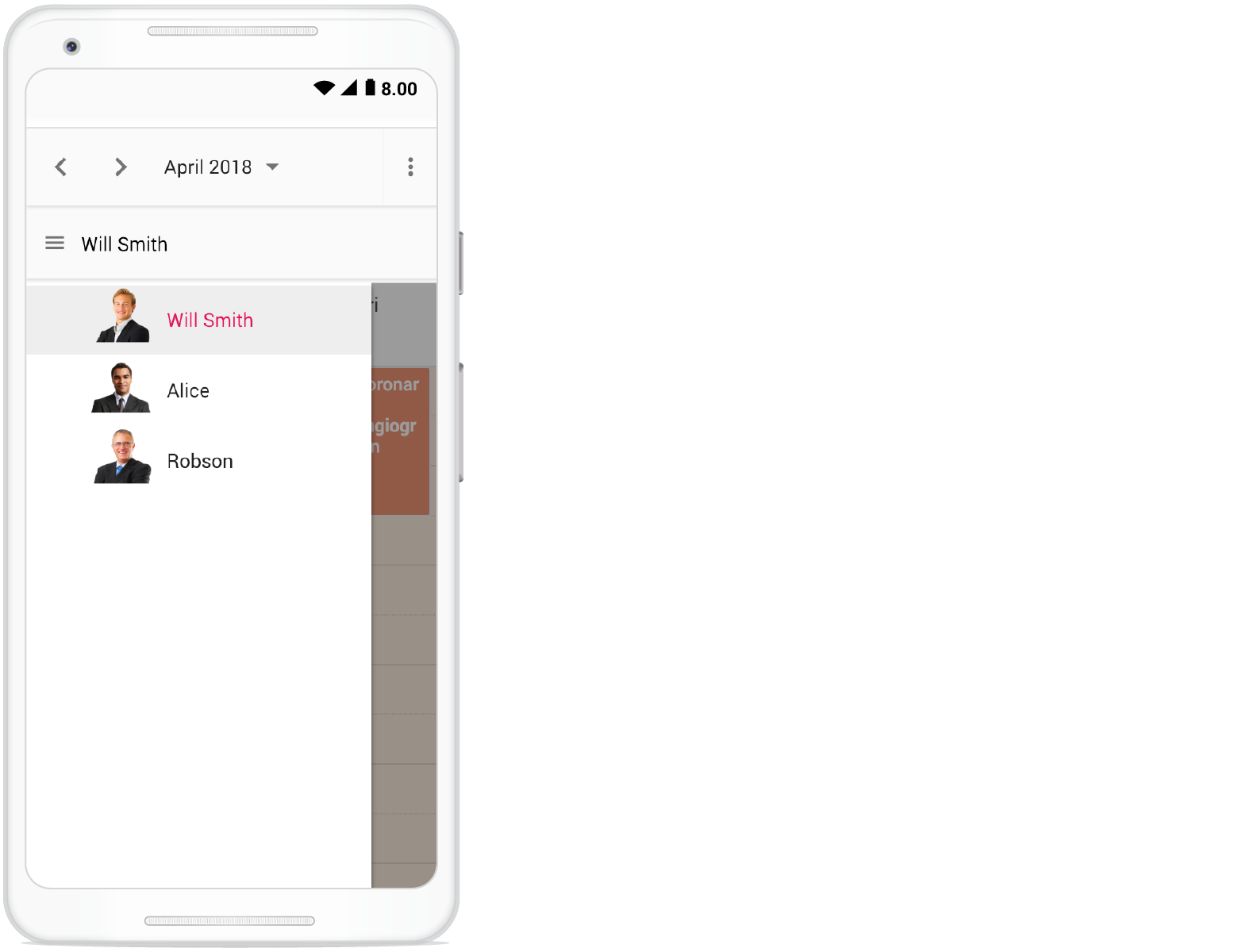
Customizing resource header with multiple columns
Customize the resource headers to display with multiple columns such as Room, Type, and Capacity. The following code example demonstrates how to achieve this and is applicable only on timeline views.
var scheduleObj = new ej.schedule.Schedule({
    width: '100%',
    height: '550px',
    selectedDate: new Date(2018, 7, 1),
    resourceHeaderTemplate: '#resourceTemplate',
    views: ['TimelineWeek', 'TimelineMonth'],
    group: {
        resources: ['MeetingRoom']
    },
    resources: [{
        field: 'RoomId', title: 'Room Type',
        name: 'MeetingRoom', allowMultiple: true,
        dataSource: [
            { text: 'Jammy', id: 1, color: '#ea7a57', capacity: 20, type: 'Conference' },
            { text: 'Tweety', id: 2, color: '#7fa900', capacity: 7, type: 'Cabin' },
            { text: 'Nestle', id: 3, color: '#5978ee', capacity: 5, type: 'Cabin' },
            { text: 'Phoenix', id: 4, color: '#fec200', capacity: 15, type: 'Conference' },
            { text: 'Mission', id: 5, color: '#df5286', capacity: 25, type: 'Conference' },
            { text: 'Hangout', id: 6, color: '#00bdae', capacity: 10, type: 'Cabin' },
            { text: 'Rick Roll', id: 7, color: '#865fcf', capacity: 20, type: 'Conference' },
            { text: 'Rainbow', id: 8, color: '#1aaa55', capacity: 8, type: 'Cabin' },
            { text: 'Swarm', id: 9, color: '#df5286', capacity: 30, type: 'Conference' },
            { text: 'Photogenic', id: 10, color: '#710193', capacity: 25, type: 'Conference' }
        ],
        textField: 'text', idField: 'id', colorField: 'color'
    }],
    renderCell: function (args) {
        if (args.elementType === 'emptyCells' && args.element.classList.contains('e-resource-left-td')) {
            var target = args.element.querySelector('.e-resource-text');
            target.innerHTML = '<div class="name">Rooms</div><div class="type">Type</div><div class="capacity">Capacity</div>';
        }
    },
    eventSettings: { dataSource: roomData }
});
scheduleObj.appendTo('#Schedule');
<!DOCTYPE html>
<html lang="en">
<head>
<title>Schedule Typescript Control</title>
<meta charset="utf-8">
<meta name="viewport" content="width=device-width, initial-scale=1.0">
<meta name="description" content="Typescript Schedule Control">
<meta name="author" content="Syncfusion">
<link href="index.css" rel="stylesheet">
<link href="https://cdn.syncfusion.com/ej2/35.1.37/bootstrap5.3.css" rel="stylesheet" />
<style>
.e-schedule .e-timeline-view .e-resource-left-td,
.e-schedule .e-timeline-month-view .e-resource-left-td {
vertical-align: bottom;
}
.e-schedule.e-device .e-timeline-view .e-resource-left-td,
.e-schedule.e-device .e-timeline-month-view .e-resource-left-td {
width: 75px;
}
.e-schedule .e-timeline-view .e-resource-left-td .e-resource-text,
.e-schedule .e-timeline-month-view .e-resource-left-td .e-resource-text {
display: flex;
font-weight: 500;
padding: 0;
}
.e-schedule .e-timeline-view .e-resource-left-td .e-resource-text>div,
.e-schedule .e-timeline-month-view .e-resource-left-td .e-resource-text>div {
border-right: 1px solid rgba(0, 0, 0, 0.12);
border-top: 1px solid rgba(0, 0, 0, 0.12);
flex: 0 0 33.3%;
font-weight: 500;
height: 36px;
line-height: 34px;
padding-left: 5px;
}
.e-schedule .e-timeline-month-view .e-resource-left-td .e-resource-text>div {
border-top: 0;
}
.e-schedule .e-timeline-view .e-resource-left-td .e-resource-text>div:last-child,
.e-schedule .e-timeline-month-view .e-resource-left-td .e-resource-text>div:last-child {
border-right: 0;
}
.e-schedule .template-wrap {
display: flex;
height: 100%;
text-align: left;
}
.e-schedule .template-wrap>div {
border-right: 1px solid rgba(0, 0, 0, 0.12);
flex: 0 0 33.3%;
font-weight: 500;
line-height: 58px;
overflow: hidden;
padding-left: 5px;
text-overflow: ellipsis;
}
.e-schedule .template-wrap>div:last-child {
border-right: 0;
}
.e-schedule .e-timeline-view .e-resource-cells,
.e-schedule .e-timeline-month-view .e-resource-cells {
padding-left: 0;
}
.e-schedule .e-timeline-view .e-date-header-wrap table col,
.e-schedule .e-timeline-view .e-content-wrap table col {
width: 100px;
}
@media (max-width: 550px) {
.e-schedule .e-timeline-view .e-resource-left-td,
.e-schedule .e-timeline-month-view .e-resource-left-td {
width: 100px;
}
.e-schedule .e-timeline-view .e-resource-left-td .e-resource-text>div,
.e-schedule .e-timeline-month-view .e-resource-left-td .e-resource-text>div,
.e-schedule .template-wrap>div {
flex: 0 0 100%;
}
.e-schedule .template-wrap>div:first-child {
border-right: 0;
}
.e-schedule .e-timeline-view .e-resource-left-td .e-resource-text>div:first-child,
.e-schedule .e-timeline-month-view .e-resource-left-td .e-resource-text>div:first-child {
border-right: 0;
}
.e-schedule .room-type,
.e-schedule .room-capacity {
display: none;
}
}
</style>
<script src="https://cdn.syncfusion.com/ej2/35.1.37/dist/ej2.min.js" type="text/javascript"></script>
<script src="es5-datasource.js" type="text/javascript"></script>
</head>
<body>
<script id="resourceTemplate" type="text/x-template">
<div class='template-wrap'>
<div class="room-name">${resourceData.text}</div>
<div class="room-type">${resourceData.type}</div>
<div class="room-capacity">${resourceData.capacity}</div>
</div>
</script>
<div id="container">
<div id="Schedule"></div>
</div>
<script>
var ele = document.getElementById('container');
if (ele) {
ele.style.visibility = "visible";
}
</script>
<script src="index.js" type="text/javascript"></script>
</body>
</html>/**
* Schedule datasource spec
*/
var roomData = [
{
Id: 1,
Subject: 'Board Meeting',
Description: 'Meeting to discuss business goal of 2018.',
StartTime: new Date(2018, 6, 30, 9, 0),
EndTime: new Date(2018, 6, 30, 11, 0),
RoomId: 1
},
{
Id: 2,
Subject: 'Training session on JSP',
Description: 'Knowledge sharing on JSP topics.',
StartTime: new Date(2018, 6, 30, 15, 0),
EndTime: new Date(2018, 6, 30, 17, 0),
RoomId: 5
},
{
Id: 3,
Subject: 'Sprint Planning with Team members',
Description: 'Planning tasks for sprint.',
StartTime: new Date(2018, 6, 30, 9, 30),
EndTime: new Date(2018, 6, 30, 11, 0),
RoomId: 3
},
{
Id: 4,
Subject: 'Meeting with Client',
Description: 'Customer meeting to discuss features.',
StartTime: new Date(2018, 6, 30, 11, 0),
EndTime: new Date(2018, 6, 30, 13, 0),
RoomId: 4
},
{
Id: 5,
Subject: 'Support Meeting with Managers',
Description: 'Meeting to discuss support plan.',
StartTime: new Date(2018, 6, 30, 16, 0),
EndTime: new Date(2018, 6, 30, 17, 30),
RoomId: 5
},
{
Id: 6, Subject: 'Client Meeting',
Description: 'Meeting to discuss client requirements.',
StartTime: new Date(2018, 6, 30, 10, 30),
EndTime: new Date(2018, 6, 30, 13, 0),
RoomId: 6
},
{
Id: 7,
Subject: 'Appraisal Meeting',
Description: 'Meeting to discuss employee appraisals.',
StartTime: new Date(2018, 6, 30, 15, 0),
EndTime: new Date(2018, 6, 30, 16, 30),
RoomId: 7
},
{
Id: 8,
Subject: 'HR Meeting',
Description: 'Meeting to discuss HR plans.',
StartTime: new Date(2018, 6, 30, 8, 0),
EndTime: new Date(2018, 6, 30, 9, 0),
RoomId: 4
},
{
Id: 9,
Subject: 'Customer Meeting',
Description: 'Meeting to discuss customer reported issues.',
StartTime: new Date(2018, 6, 30, 10, 0),
EndTime: new Date(2018, 6, 30, 12, 0),
RoomId: 8
},
{
Id: 10,
Subject: 'Board Meeting',
Description: 'Meeting to discuss business plans.',
StartTime: new Date(2018, 6, 30, 14, 30),
EndTime: new Date(2018, 6, 30, 17, 0),
RoomId: 9
},
{
Id: 11,
Subject: 'Training session on Vue',
Description: 'Knowledge sharing on Vue concepts.',
StartTime: new Date(2018, 6, 30, 9, 0),
EndTime: new Date(2018, 6, 30, 10, 30),
RoomId: 10
},
{
Id: 12,
Subject: 'Meeting with Team members',
Description: 'Meeting to discuss on work report.',
StartTime: new Date(2018, 6, 30, 11, 30),
EndTime: new Date(2018, 6, 30, 12, 0),
RoomId: 5
},
{
Id: 13,
Subject: 'Meeting with General Manager',
Description: 'Meeting to discuss support plan.',
StartTime: new Date(2018, 6, 30, 14, 0),
EndTime: new Date(2018, 6, 30, 16, 0),
RoomId: 5
},
{
Id: 14,
Subject: 'Board Meeting',
Description: 'Meeting to discuss business goal of 2018.',
StartTime: new Date(2018, 6, 31, 9, 0),
EndTime: new Date(2018, 6, 31, 11, 0),
RoomId: 1
},
{
Id: 15,
Subject: 'Training session on JSP',
Description: 'Knowledge sharing on JSP topics.',
StartTime: new Date(2018, 6, 31, 14, 0),
EndTime: new Date(2018, 6, 31, 17, 0),
RoomId: 6
},
{
Id: 16,
Subject: 'Sprint Planning with Team members',
Description: 'Planning tasks for sprint.',
StartTime: new Date(2018, 6, 31, 9, 30),
EndTime: new Date(2018, 6, 31, 11, 0),
RoomId: 2
},
{
Id: 17,
Subject: 'Meeting with Client',
Description: 'Customer meeting to discuss features.',
StartTime: new Date(2018, 6, 31, 11, 0),
EndTime: new Date(2018, 6, 31, 13, 0),
RoomId: 7
},
{
Id: 18,
Subject: 'Support Meeting with Managers',
Description: 'Meeting to discuss support plan.',
StartTime: new Date(2018, 6, 31, 16, 0),
EndTime: new Date(2018, 6, 31, 17, 30),
RoomId: 2
},
{
Id: 19,
Subject: 'Training session on C#',
Description: 'Training session',
StartTime: new Date(2018, 6, 31, 14, 30),
EndTime: new Date(2018, 6, 31, 16, 0),
RoomId: 9
},
{
Id: 20,
Subject: 'Client Meeting',
Description: 'Meeting to discuss client requirements.',
StartTime: new Date(2018, 6, 31, 10, 30),
EndTime: new Date(2018, 6, 31, 13, 0),
RoomId: 3
},
{
Id: 21,
Subject: 'Appraisal Meeting',
Description: 'Meeting to discuss employee appraisals.',
StartTime: new Date(2018, 6, 31, 15, 0),
EndTime: new Date(2018, 6, 31, 16, 30),
RoomId: 3
},
{
Id: 22,
Subject: 'HR Meeting',
Description: 'Meeting to discuss HR plans.',
StartTime: new Date(2018, 6, 31, 8, 0),
EndTime: new Date(2018, 6, 31, 9, 0),
RoomId: 4
},
{
Id: 23,
Subject: 'Customer Meeting',
Description: 'Meeting to discuss customer reported issues.',
StartTime: new Date(2018, 6, 31, 10, 0),
EndTime: new Date(2018, 6, 31, 12, 0),
RoomId: 4
},
{
Id: 24,
Subject: 'Board Meeting',
Description: 'Meeting to discuss business plans.',
StartTime: new Date(2018, 7, 1, 16, 30),
EndTime: new Date(2018, 7, 1, 18, 0),
RoomId: 10
},
{
Id: 25,
Subject: 'Training session on Vue',
Description: 'Knowledge sharing on Vue concepts.',
StartTime: new Date(2018, 6, 31, 9, 0),
EndTime: new Date(2018, 6, 31, 10, 30),
RoomId: 5
},
{
Id: 26,
Subject: 'Meeting with Team members',
Description: 'Meeting to discuss on work report.',
StartTime: new Date(2018, 6, 31, 11, 30),
EndTime: new Date(2018, 6, 31, 12, 0),
RoomId: 5
},
{
Id: 27,
Subject: 'Meeting with General Manager',
Description: 'Meeting to discuss support plan.',
StartTime: new Date(2018, 6, 31, 14, 0),
EndTime: new Date(2018, 6, 31, 16, 0),
RoomId: 10
},
{
Id: 28,
Subject: 'Board Meeting',
Description: 'Meeting to discuss business goal of 2018.',
StartTime: new Date(2018, 7, 1, 9, 0),
EndTime: new Date(2018, 7, 1, 11, 0),
RoomId: 1
},
{
Id: 29,
Subject: 'Training session on JSP',
Description: 'Knowledge sharing on JSP topics.',
StartTime: new Date(2018, 7, 1, 17, 0),
EndTime: new Date(2018, 7, 1, 20, 0),
RoomId: 6
},
{
Id: 30,
Subject: 'Sprint Planning with Team members',
Description: 'Planning tasks for sprint.',
StartTime: new Date(2018, 7, 1, 10, 30),
EndTime: new Date(2018, 7, 1, 12, 0),
RoomId: 2
},
{
Id: 31,
Subject: 'Meeting with Client',
Description: 'Customer meeting to discuss features.',
StartTime: new Date(2018, 7, 1, 18, 0),
EndTime: new Date(2018, 7, 1, 20, 0),
RoomId: 8
},
{
Id: 32,
Subject: 'Support Meeting with Managers',
Description: 'Meeting to discuss support plan.',
StartTime: new Date(2018, 7, 1, 16, 0),
EndTime: new Date(2018, 7, 1, 17, 30),
RoomId: 7
},
{
Id: 33,
Subject: 'Training session on C#',
Description: 'Training session',
StartTime: new Date(2018, 7, 1, 14, 30),
EndTime: new Date(2018, 7, 1, 16, 0),
RoomId: 2
},
{
Id: 34,
Subject: 'Client Meeting',
Description: 'Meeting to discuss client requirements.',
StartTime: new Date(2018, 7, 1, 10, 30),
EndTime: new Date(2018, 7, 1, 13, 0),
RoomId: 3
},
{
Id: 35,
Subject: 'Appraisal Meeting',
Description: 'Meeting to discuss employee appraisals.',
StartTime: new Date(2018, 7, 1, 15, 0),
EndTime: new Date(2018, 7, 1, 16, 30),
RoomId: 8
},
{
Id: 36,
Subject: 'HR Meeting',
Description: 'Meeting to discuss HR plans.',
StartTime: new Date(2018, 7, 1, 9, 30),
EndTime: new Date(2018, 7, 1, 11, 30),
RoomId: 4
},
{
Id: 37,
Subject: 'Customer Meeting',
Description: 'Meeting to discuss customer reported issues.',
StartTime: new Date(2018, 7, 1, 10, 0),
EndTime: new Date(2018, 7, 1, 12, 0),
RoomId: 9
},
{
Id: 38,
Subject: 'Board Meeting',
Description: 'Meeting to discuss business plans.',
StartTime: new Date(2018, 7, 1, 15, 0),
EndTime: new Date(2018, 7, 1, 17, 0),
RoomId: 4
},
{
Id: 39,
Subject: 'Training session on Vue',
Description: 'Knowledge sharing on Vue concepts.',
StartTime: new Date(2018, 7, 1, 9, 0),
EndTime: new Date(2018, 7, 1, 10, 30),
RoomId: 5
},
{
Id: 40,
Subject: 'Meeting with Team members',
Description: 'Meeting to discuss on work report.',
StartTime: new Date(2018, 7, 1, 11, 30),
EndTime: new Date(2018, 7, 1, 12, 30),
RoomId: 5
},
{
Id: 41,
Subject: 'Meeting with General Manager',
Description: 'Meeting to discuss support plan.',
StartTime: new Date(2018, 7, 1, 14, 0),
EndTime: new Date(2018, 7, 1, 16, 0),
RoomId: 10
},
{
Id: 43,
Subject: 'HR Meeting',
Description: 'Meeting to discuss HR plans.',
StartTime: new Date(2018, 7, 1, 18, 0),
EndTime: new Date(2018, 7, 1, 20, 0),
RoomId: 2
},
{
Id: 44,
Subject: 'HR Meeting',
Description: 'Meeting to discuss HR plans.',
StartTime: new Date(2018, 7, 1, 17, 30),
EndTime: new Date(2018, 7, 1, 20, 0),
RoomId: 1
},
{
Id: 45,
Subject: 'Client Meeting',
Description: 'Meeting to discuss client requirements.',
StartTime: new Date(2018, 7, 1, 16, 30),
EndTime: new Date(2018, 7, 1, 18, 0),
RoomId: 3
},
{
Id: 46,
Subject: 'Board Meeting',
Description: 'Meeting to discuss business plans.',
StartTime: new Date(2018, 7, 1, 18, 30),
EndTime: new Date(2018, 7, 1, 20, 0),
RoomId: 4
},
{
Id: 47,
Subject: 'Board Meeting',
Description: 'Meeting to discuss business plans.',
StartTime: new Date(2018, 7, 1, 15, 30),
EndTime: new Date(2018, 7, 1, 18, 0),
RoomId: 5
},
{
Id: 48,
Subject: 'HR Meeting',
Description: 'Meeting to discuss HR plans.',
StartTime: new Date(2018, 7, 1, 18, 30),
EndTime: new Date(2018, 7, 1, 20, 0),
RoomId: 5
},
{
Id: 49,
Subject: 'HR Meeting',
Description: 'Meeting to discuss HR plans.',
StartTime: new Date(2018, 7, 1, 14, 30),
EndTime: new Date(2018, 7, 1, 16, 0),
RoomId: 6
},
{
Id: 50,
Subject: 'Board Meeting',
Description: 'Meeting to discuss business plans.',
StartTime: new Date(2018, 7, 1, 9, 30),
EndTime: new Date(2018, 7, 1, 12, 0),
RoomId: 6
},
{
Id: 51,
Subject: 'Client Meeting',
Description: 'Meeting to discuss client requirements.',
StartTime: new Date(2018, 7, 1, 10, 30),
EndTime: new Date(2018, 7, 1, 12, 0),
RoomId: 7
},
{
Id: 52,
Subject: 'Appraisal Meeting',
Description: 'Meeting to discuss employee appraisals.',
StartTime: new Date(2018, 7, 1, 18, 0),
EndTime: new Date(2018, 7, 1, 19, 30),
RoomId: 7
},
{
Id: 53,
Subject: 'Support Meeting with Managers',
Description: 'Meeting to discuss support plan.',
StartTime: new Date(2018, 7, 1, 15, 30),
EndTime: new Date(2018, 7, 1, 17, 0),
RoomId: 9
},
{
Id: 54,
Subject: 'Support Meeting with Managers',
Description: 'Meeting to discuss support plan.',
StartTime: new Date(2018, 7, 1, 11, 0),
EndTime: new Date(2018, 7, 1, 12, 30),
RoomId: 8
},
{
Id: 55,
Subject: 'Support Meeting with Managers',
Description: 'Meeting to discuss support plan.',
StartTime: new Date(2018, 7, 1, 11, 0),
EndTime: new Date(2018, 7, 1, 12, 30),
RoomId: 10
}
];Collapse/Expand child resources in timeline views
Expand and collapse resources that have child resources in Timeline views dynamically. By default, resources are in an expanded state with their child resources. We can collapse and expand the child resources in UI by setting the expandedField option as false whereas its default value is true.
var scheduleObj = new ej.schedule.Schedule({
    width: '100%',
    height: '550px',
    currentView: 'TimelineWeek',
    views: ['TimelineWeek', 'TimelineMonth', 'Agenda'],
    selectedDate: new Date(2018, 3, 4),
    group: {
        resources: ['Rooms', 'Owners']
    },
    resources: [{
        field: 'RoomId', title: 'Room',
        name: 'Rooms', allowMultiple: false,
        dataSource: [
            { RoomText: 'ROOM 1', Id: 1, RoomColor: '#cb6bb2', IsExpand: false },
            { RoomText: 'ROOM 2', Id: 2, RoomColor: '#56ca85' }
        ],
        textField: 'RoomText', idField: 'Id', colorField: 'RoomColor', expandedField: 'IsExpand'
    }, {
        field: 'OwnerId', title: 'Owner',
        name: 'Owners', allowMultiple: true,
        dataSource: [
            { OwnerText: 'Nancy', Id: 1, OwnerGroupId: 1, OwnerColor: '#ffaa00' },
            { OwnerText: 'Steven', Id: 2, OwnerGroupId: 2, OwnerColor: '#f8a398' },
            { OwnerText: 'Michael', Id: 3, OwnerGroupId: 1, OwnerColor: '#7499e1' }
        ],
        textField: 'OwnerText', idField: 'Id', groupIDField: 'OwnerGroupId', colorField: 'OwnerColor'
    }],
    eventSettings: { dataSource: resourceData }
});
scheduleObj.appendTo('#Schedule');
<!DOCTYPE html>
<html lang="en">
<head>
<title>Schedule Typescript Control</title>
<meta charset="utf-8">
<meta name="viewport" content="width=device-width, initial-scale=1.0">
<meta name="description" content="Typescript Schedule Control">
<meta name="author" content="Syncfusion">
<link href="index.css" rel="stylesheet">
<link href="https://cdn.syncfusion.com/ej2/35.1.37/bootstrap5.3.css" rel="stylesheet" />
<script src="https://cdn.syncfusion.com/ej2/35.1.37/dist/ej2.min.js" type="text/javascript"></script>
<script src="es5-datasource.js" type="text/javascript"></script>
</head>
<body>
<div id="container">
<div id="Schedule"></div>
</div>
<script>
var ele = document.getElementById('container');
if (ele) {
ele.style.visibility = "visible";
}
</script>
<script src="index.js" type="text/javascript"></script>
</body>
</html>/**
* Schedule datasource spec
*/
var resourceConferenceData = [
{
Id: 1,
Subject: 'Burning Man',
StartTime: new Date(2018, 5, 1, 15, 0),
EndTime: new Date(2018, 5, 1, 17, 0),
ConferenceId: [1, 2, 3]
}, {
Id: 2,
Subject: 'Data-Driven Economy',
StartTime: new Date(2018, 5, 2, 12, 0),
EndTime: new Date(2018, 5, 2, 14, 0),
ConferenceId: [1, 2]
}, {
Id: 3,
Subject: 'Techweek',
StartTime: new Date(2018, 5, 2, 15, 0),
EndTime: new Date(2018, 5, 2, 17, 0),
ConferenceId: [2, 3]
}, {
Id: 4,
Subject: 'Content Marketing World',
StartTime: new Date(2018, 5, 2, 18, 0),
EndTime: new Date(2018, 5, 2, 20, 0),
ConferenceId: [1, 3]
}, {
Id: 5,
Subject: 'B2B Marketing Forum',
StartTime: new Date(2018, 5, 3, 10, 0),
EndTime: new Date(2018, 5, 3, 12, 0),
ConferenceId: [1, 2, 3]
}, {
Id: 6,
Subject: 'Business Innovation Factory',
StartTime: new Date(2018, 5, 3, 13, 0),
EndTime: new Date(2018, 5, 3, 15, 0),
ConferenceId: [1, 2]
}, {
Id: 7,
Subject: 'Grow Conference',
StartTime: new Date(2018, 5, 3, 16, 0),
EndTime: new Date(2018, 5, 3, 18, 0),
ConferenceId: [2, 3]
}, {
Id: 8,
Subject: 'Journalism Interactive',
StartTime: new Date(2018, 5, 3, 19, 0),
EndTime: new Date(2018, 5, 3, 21, 0),
ConferenceId: [1, 3]
}, {
Id: 9,
Subject: 'Blogcademy',
StartTime: new Date(2018, 5, 4, 10, 0),
EndTime: new Date(2018, 5, 4, 11, 30),
ConferenceId: [1, 2, 3]
}, {
Id: 10,
Subject: 'Sustainable Brands',
StartTime: new Date(2018, 5, 4, 13, 0),
EndTime: new Date(2018, 5, 4, 15, 30),
ConferenceId: [1, 2]
}, {
Id: 11,
Subject: 'Fashion Confidential',
StartTime: new Date(2018, 5, 4, 9, 0),
EndTime: new Date(2018, 5, 4, 9, 45),
ConferenceId: [2, 3]
}, {
Id: 12,
Subject: 'Mobile World Conference',
StartTime: new Date(2018, 5, 5, 12, 0),
EndTime: new Date(2018, 5, 5, 14, 0),
ConferenceId: [1, 3]
}, {
Id: 13,
Subject: 'The Human Gathering',
StartTime: new Date(2018, 5, 5, 15, 0),
EndTime: new Date(2018, 5, 5, 17, 0),
ConferenceId: [1, 2, 3]
}, {
Id: 14,
Subject: 'Web Summit',
StartTime: new Date(2018, 5, 5, 18, 0),
EndTime: new Date(2018, 5, 5, 20, 0),
ConferenceId: [1, 2]
}, {
Id: 15,
Subject: 'Funnel Hacking Live',
StartTime: new Date(2018, 5, 6, 12, 0),
EndTime: new Date(2018, 5, 6, 14, 0),
ConferenceId: [1, 3]
}, {
Id: 16,
Subject: 'Data Science Conference',
StartTime: new Date(2018, 5, 6, 15, 0),
EndTime: new Date(2018, 5, 6, 17, 0),
ConferenceId: [2, 3]
}, {
Id: 17,
Subject: 'Powerful Living Experience',
StartTime: new Date(2018, 5, 6, 21, 0),
EndTime: new Date(2018, 5, 6, 23, 30),
ConferenceId: [1, 2, 3]
}, {
Id: 18,
Subject: 'World Domination Summit',
StartTime: new Date(2018, 5, 7, 12, 0),
EndTime: new Date(2018, 5, 7, 14, 0),
ConferenceId: [2, 3]
}, {
Id: 19,
Subject: 'Burning Man',
StartTime: new Date(2018, 5, 7, 15, 0),
EndTime: new Date(2018, 5, 7, 17, 0),
ConferenceId: [1, 3]
}, {
Id: 20,
Subject: 'Data-Driven Economy',
StartTime: new Date(2018, 5, 7, 18, 0),
EndTime: new Date(2018, 5, 7, 20, 0),
ConferenceId: [1, 2]
}, {
Id: 21,
Subject: 'Techweek',
StartTime: new Date(2018, 5, 8, 12, 0),
EndTime: new Date(2018, 5, 8, 14, 0),
ConferenceId: [1, 2, 3]
}, {
Id: 22,
Subject: 'Content Marketing World',
StartTime: new Date(2018, 5, 8, 15, 0),
EndTime: new Date(2018, 5, 8, 17, 0),
ConferenceId: [1, 2, 3]
}, {
Id: 23,
Subject: 'B2B Marketing Forum',
StartTime: new Date(2018, 5, 8, 20, 30),
EndTime: new Date(2018, 5, 8, 21, 30),
ConferenceId: [1, 3]
}, {
Id: 24,
Subject: 'Business Innovation Factory',
StartTime: new Date(2018, 5, 9, 12, 0),
EndTime: new Date(2018, 5, 9, 14, 0),
ConferenceId: [2, 3]
}, {
Id: 25,
Subject: 'Grow Conference',
StartTime: new Date(2018, 5, 9, 15, 0),
EndTime: new Date(2018, 5, 9, 17, 0),
ConferenceId: [1, 2]
}, {
Id: 26,
Subject: 'Journalism Interactive',
StartTime: new Date(2018, 5, 9, 18, 0),
EndTime: new Date(2018, 5, 9, 20, 0),
ConferenceId: [1, 2, 3]
}, {
Id: 27,
Subject: 'Blogcademy',
StartTime: new Date(2018, 5, 10, 12, 0),
EndTime: new Date(2018, 5, 10, 14, 0),
ConferenceId: [1, 3]
}, {
Id: 28,
Subject: 'Sustainable Brands',
StartTime: new Date(2018, 5, 10, 15, 0),
EndTime: new Date(2018, 5, 10, 17, 0),
ConferenceId: [2, 3]
}, {
Id: 29,
Subject: 'Fashion Confidential',
StartTime: new Date(2018, 5, 10, 18, 0),
EndTime: new Date(2018, 5, 10, 20, 0),
ConferenceId: [1, 2]
}, {
Id: 30,
Subject: 'Mobile World Conference',
StartTime: new Date(2018, 5, 11, 12, 0),
EndTime: new Date(2018, 5, 11, 14, 0),
ConferenceId: [1, 2, 3]
}, {
Id: 31,
Subject: 'The Human Gathering',
StartTime: new Date(2018, 5, 11, 15, 0),
EndTime: new Date(2018, 5, 11, 17, 0),
ConferenceId: [1, 2, 3]
}, {
Id: 32,
Subject: 'Web Summit',
StartTime: new Date(2018, 5, 11, 18, 0),
EndTime: new Date(2018, 5, 11, 20, 0),
ConferenceId: [3]
}, {
Id: 33,
Subject: 'Funnel Hacking Live',
StartTime: new Date(2018, 5, 12, 14, 0),
EndTime: new Date(2018, 5, 12, 16, 0),
ConferenceId: [1]
}, {
Id: 34,
Subject: 'Data Science Conference',
StartTime: new Date(2018, 5, 12, 14, 0),
EndTime: new Date(2018, 5, 12, 16, 0),
ConferenceId: [2]
}, {
Id: 35,
Subject: 'Powerful Living Experience',
StartTime: new Date(2018, 5, 12, 18, 0),
EndTime: new Date(2018, 5, 12, 20, 0),
ConferenceId: [1, 2]
}, {
Id: 36,
Subject: 'World Domination Summit',
StartTime: new Date(2018, 5, 12, 18, 0),
EndTime: new Date(2018, 5, 12, 20, 0),
ConferenceId: [3]
}, {
Id: 37,
Subject: 'Burning Man',
StartTime: new Date(2018, 5, 13, 14, 0),
EndTime: new Date(2018, 5, 13, 16, 0),
ConferenceId: [1, 3]
}, {
Id: 38,
Subject: 'Data-Driven Economy',
StartTime: new Date(2018, 5, 13, 14, 0),
EndTime: new Date(2018, 5, 13, 16, 0),
ConferenceId: [1]
}, {
Id: 39,
Subject: 'Techweek',
StartTime: new Date(2018, 5, 13, 18, 0),
EndTime: new Date(2018, 5, 13, 20, 0),
ConferenceId: [2, 3]
}, {
Id: 40,
Subject: 'Content Marketing World',
StartTime: new Date(2018, 5, 13, 18, 0),
EndTime: new Date(2018, 5, 13, 20, 0),
ConferenceId: [1, 2]
}, {
Id: 41,
Subject: 'B2B Marketing Forum',
StartTime: new Date(2018, 5, 14, 14, 0),
EndTime: new Date(2018, 5, 14, 16, 0),
ConferenceId: [1, 2, 3]
}, {
Id: 42,
Subject: 'Business Innovation Factory',
StartTime: new Date(2018, 5, 14, 14, 0),
EndTime: new Date(2018, 5, 14, 16, 0),
ConferenceId: [2, 3]
}, {
Id: 43,
Subject: 'Grow Conference',
StartTime: new Date(2018, 5, 14, 18, 0),
EndTime: new Date(2018, 5, 14, 20, 0),
ConferenceId: [3]
}, {
Id: 44,
Subject: 'Journalism Interactive',
StartTime: new Date(2018, 5, 14, 18, 0),
EndTime: new Date(2018, 5, 14, 20, 0),
ConferenceId: [1, 2, 3]
}, {
Id: 45,
Subject: 'Blogcademy',
StartTime: new Date(2018, 5, 15, 14, 0),
EndTime: new Date(2018, 5, 15, 16, 0),
ConferenceId: [1, 3]
}, {
Id: 46,
Subject: 'Sustainable Brands',
StartTime: new Date(2018, 5, 15, 14, 0),
EndTime: new Date(2018, 5, 15, 16, 0),
ConferenceId: [1, 3]
}, {
Id: 47,
Subject: 'Fashion Confidential',
StartTime: new Date(2018, 5, 15, 18, 0),
EndTime: new Date(2018, 5, 15, 20, 0),
ConferenceId: [1, 2]
}, {
Id: 48,
Subject: 'Mobile World Conference',
StartTime: new Date(2018, 5, 15, 18, 0),
EndTime: new Date(2018, 5, 15, 20, 0),
ConferenceId: [2, 3]
}
];
var timelineResourceData = [
{
Id: 61,
Subject: 'Decoding',
StartTime: new Date(2018, 3, 4, 9, 30),
EndTime: new Date(2018, 3, 4, 10, 30),
IsAllDay: false,
ProjectId: 2,
TaskId: 2
}, {
Id: 62,
Subject: 'Bug Automation',
StartTime: new Date(2018, 3, 4, 13, 30),
EndTime: new Date(2018, 3, 4, 16, 30),
IsAllDay: false,
ProjectId: 2,
TaskId: 1
}, {
Id: 63,
Subject: 'Functionality testing',
StartTime: new Date(2018, 3, 4, 9),
EndTime: new Date(2018, 3, 4, 10, 30),
IsAllDay: false,
ProjectId: 1,
TaskId: 1
}, {
Id: 64,
Subject: 'Resolution-based testing',
StartTime: new Date(2018, 3, 4, 12),
EndTime: new Date(2018, 3, 4, 13),
IsAllDay: false,
ProjectId: 1,
TaskId: 1
}, {
Id: 65,
Subject: 'Test report Validation',
StartTime: new Date(2018, 3, 4, 15),
EndTime: new Date(2018, 3, 4, 18),
IsAllDay: false,
ProjectId: 1,
TaskId: 1
}, {
Id: 66,
Subject: 'Test case correction',
StartTime: new Date(2018, 3, 4, 14),
EndTime: new Date(2018, 3, 4, 16),
IsAllDay: false,
ProjectId: 1,
TaskId: 2
}, {
Id: 67,
Subject: 'Bug fixing',
StartTime: new Date(2018, 3, 4, 14, 30),
EndTime: new Date(2018, 3, 4, 18, 30),
IsAllDay: false,
ProjectId: 2,
TaskId: 2
}, {
Id: 68,
Subject: 'Run test cases',
StartTime: new Date(2018, 3, 4, 17, 30),
EndTime: new Date(2018, 3, 4, 19, 30),
IsAllDay: false,
ProjectId: 1,
TaskId: 2
}, {
Id: 70,
Subject: 'Bug Automation',
StartTime: new Date(2018, 3, 4, 18, 30),
EndTime: new Date(2018, 3, 4, 20),
IsAllDay: false,
ProjectId: 2,
TaskId: 1
}
];
var resourceData = [
{
Id: 1,
Subject: 'Workflow Analysis',
StartTime: new Date(2018, 3, 1, 9, 30),
EndTime: new Date(2018, 3, 1, 12, 0),
IsAllDay: false,
OwnerId: 1,
RoomId: 1
}, {
Id: 2,
Subject: 'Requirement planning',
StartTime: new Date(2018, 3, 1, 12, 30),
EndTime: new Date(2018, 3, 1, 14, 45),
IsAllDay: false,
OwnerId: 2,
RoomId: 2
}, {
Id: 3,
Subject: 'Quality Analysis',
StartTime: new Date(2018, 3, 2, 10, 0),
EndTime: new Date(2018, 3, 2, 12, 30),
IsAllDay: false,
OwnerId: 1,
RoomId: 1
}, {
Id: 4,
Subject: 'Resource planning',
StartTime: new Date(2018, 3, 2, 13, 0),
EndTime: new Date(2018, 3, 2, 15, 30),
IsAllDay: false,
OwnerId: 2,
RoomId: 2
}, {
Id: 5,
Subject: 'Timeline estimation',
StartTime: new Date(2018, 3, 3, 9, 0),
EndTime: new Date(2018, 3, 3, 11, 30),
IsAllDay: false,
OwnerId: 1,
RoomId: 1
}, {
Id: 6,
Subject: 'Developers Meeting',
StartTime: new Date(2018, 3, 3, 14, 0),
EndTime: new Date(2018, 3, 3, 16, 45),
IsAllDay: false,
OwnerId: 2,
RoomId: 2
}, {
Id: 7,
Subject: 'Project Review',
StartTime: new Date(2018, 3, 4, 11, 15),
EndTime: new Date(2018, 3, 4, 13, 30),
IsAllDay: false,
OwnerId: 1,
RoomId: 1
}, {
Id: 8,
Subject: 'Manual testing',
StartTime: new Date(2018, 3, 4, 9, 15),
EndTime: new Date(2018, 3, 4, 11, 45),
IsAllDay: false,
OwnerId: 2,
RoomId: 2
}, {
Id: 9,
Subject: 'Project Preview',
StartTime: new Date(2018, 3, 5, 9, 30),
EndTime: new Date(2018, 3, 5, 12, 45),
IsAllDay: false,
OwnerId: 1,
RoomId: 1
}, {
Id: 10,
Subject: 'Cross-browser testing',
StartTime: new Date(2018, 3, 5, 13, 45),
EndTime: new Date(2018, 3, 5, 16, 30),
IsAllDay: false,
OwnerId: 2
}, {
Id: 11,
Subject: 'Bug Automation',
StartTime: new Date(2018, 3, 6, 10, 0),
EndTime: new Date(2018, 3, 6, 12, 15),
IsAllDay: false,
OwnerId: 1,
RoomId: 1
}, {
Id: 12,
Subject: 'Functionality testing',
StartTime: new Date(2018, 3, 6, 9, 0),
EndTime: new Date(2018, 3, 6, 11, 30),
IsAllDay: false,
OwnerId: 2,
RoomId: 2
}, {
Id: 13,
Subject: 'Resolution-based testing',
StartTime: new Date(2018, 3, 7, 13, 0),
EndTime: new Date(2018, 3, 7, 15, 15),
IsAllDay: false,
OwnerId: 1,
RoomId: 1
}, {
Id: 14,
Subject: 'Test report Validation',
StartTime: new Date(2018, 3, 7, 9),
EndTime: new Date(2018, 3, 7, 11),
IsAllDay: false,
OwnerId: 2,
RoomId: 2
}, {
Id: 15,
Subject: 'Test case correction',
StartTime: new Date(2018, 3, 8, 9, 45),
EndTime: new Date(2018, 3, 8, 11, 30),
IsAllDay: false,
OwnerId: 1,
RoomId: 1
}, {
Id: 16,
Subject: 'Run test cases',
StartTime: new Date(2018, 3, 8, 10, 30),
EndTime: new Date(2018, 3, 8, 13, 0),
IsAllDay: false,
OwnerId: 2,
RoomId: 2
}, {
Id: 17,
Subject: 'Quality Analysis',
StartTime: new Date(2018, 3, 9, 12),
EndTime: new Date(2018, 3, 9, 15, 30),
IsAllDay: false,
OwnerId: 1,
RoomId: 1
}, {
Id: 18,
Subject: 'Debugging',
StartTime: new Date(2018, 3, 9, 9, 0),
EndTime: new Date(2018, 3, 9, 11, 15),
IsAllDay: false,
OwnerId: 2,
RoomId: 2
}, {
Id: 19,
Subject: 'Exception handling',
StartTime: new Date(2018, 3, 10, 10, 10),
EndTime: new Date(2018, 3, 10, 13, 30),
IsAllDay: false,
OwnerId: 1,
RoomId: 1
}, {
Id: 20,
Subject: 'Decoding',
StartTime: new Date(2018, 3, 10, 10, 30),
EndTime: new Date(2018, 3, 10, 12, 30),
IsAllDay: false,
OwnerId: 2,
RoomId: 2
}, {
Id: 21,
Subject: 'workflow Analysis',
StartTime: new Date(2018, 3, 11, 9, 30),
EndTime: new Date(2018, 3, 11, 11, 30),
IsAllDay: false,
OwnerId: 3,
RoomId: 1
}, {
Id: 22,
Subject: 'Requirement planning',
StartTime: new Date(2018, 3, 11, 12, 30),
EndTime: new Date(2018, 3, 11, 14, 45),
IsAllDay: false,
OwnerId: 2,
RoomId: 2
}, {
Id: 23,
Subject: 'Quality Analysis',
StartTime: new Date(2018, 3, 12, 10),
EndTime: new Date(2018, 3, 12, 12, 30),
IsAllDay: false,
OwnerId: 3,
RoomId: 1
}, {
Id: 24,
Subject: 'Resource planning',
StartTime: new Date(2018, 3, 12, 13),
EndTime: new Date(2018, 3, 12, 14, 30),
IsAllDay: false,
OwnerId: 2,
RoomId: 2
}, {
Id: 25,
Subject: 'Timeline estimation',
StartTime: new Date(2018, 3, 13, 9),
EndTime: new Date(2018, 3, 13, 11),
IsAllDay: false,
OwnerId: 3,
RoomId: 1
}, {
Id: 26,
Subject: 'Developers Meeting',
StartTime: new Date(2018, 3, 13, 14),
EndTime: new Date(2018, 3, 13, 15, 45),
IsAllDay: false,
OwnerId: 2,
RoomId: 2
}, {
Id: 27,
Subject: 'Project Review',
StartTime: new Date(2018, 3, 14, 11),
EndTime: new Date(2018, 3, 14, 13),
IsAllDay: false,
OwnerId: 1,
RoomId: 1
}, {
Id: 28,
Subject: 'Manual testing',
StartTime: new Date(2018, 3, 14, 9),
EndTime: new Date(2018, 3, 14, 11, 30),
IsAllDay: false,
OwnerId: 2,
RoomId: 2
}, {
Id: 29,
Subject: 'Project Preview',
StartTime: new Date(2018, 3, 15, 9, 30),
EndTime: new Date(2018, 3, 15, 11),
IsAllDay: false,
OwnerId: 3,
RoomId: 1
}, {
Id: 30,
Subject: 'Cross-browser testing',
StartTime: new Date(2018, 3, 15, 14),
EndTime: new Date(2018, 3, 15, 16, 30),
IsAllDay: false,
OwnerId: 2,
RoomId: 2
}, {
Id: 31,
Subject: 'Bug Automation',
StartTime: new Date(2018, 3, 16, 10),
EndTime: new Date(2018, 3, 16, 11),
IsAllDay: false,
OwnerId: 1,
RoomId: 1
}, {
Id: 32,
Subject: 'Functionality testing',
StartTime: new Date(2018, 3, 16, 9),
EndTime: new Date(2018, 3, 16, 11, 30),
IsAllDay: false,
OwnerId: 2,
RoomId: 2
}, {
Id: 33,
Subject: 'Resolution-based testing',
StartTime: new Date(2018, 3, 17, 14),
EndTime: new Date(2018, 3, 17, 15),
IsAllDay: false,
OwnerId: 3,
RoomId: 1
}, {
Id: 34,
Subject: 'Test report Validation',
StartTime: new Date(2018, 3, 17, 9),
EndTime: new Date(2018, 3, 17, 11),
IsAllDay: false,
OwnerId: 2,
RoomId: 2
}, {
Id: 35,
Subject: 'Test case correction',
StartTime: new Date(2018, 3, 18, 10),
EndTime: new Date(2018, 3, 18, 11, 30),
IsAllDay: false,
OwnerId: 1,
RoomId: 1
}, {
Id: 36,
Subject: 'Run test cases',
StartTime: new Date(2018, 3, 18, 10),
EndTime: new Date(2018, 3, 18, 10, 30),
IsAllDay: false,
OwnerId: 2,
RoomId: 2
}, {
Id: 37,
Subject: 'Bug fixing',
StartTime: new Date(2018, 3, 9, 10),
EndTime: new Date(2018, 3, 9, 10, 30),
IsAllDay: false,
OwnerId: 3,
RoomId: 1
}, {
Id: 38,
Subject: 'Debugging',
StartTime: new Date(2018, 3, 19, 9),
EndTime: new Date(2018, 3, 19, 10, 30),
IsAllDay: false,
OwnerId: 2,
RoomId: 2
}, {
Id: 39,
Subject: 'Exception handling',
StartTime: new Date(2018, 3, 20, 10),
EndTime: new Date(2018, 3, 20, 11),
IsAllDay: false,
OwnerId: 1,
RoomId: 1
}, {
Id: 40,
Subject: 'Decoding',
StartTime: new Date(2018, 3, 20, 10, 30),
EndTime: new Date(2018, 3, 20, 12, 30),
IsAllDay: false,
OwnerId: 2,
RoomId: 2
}, {
Id: 41,
Subject: 'workflow Analysis',
StartTime: new Date(2018, 3, 21, 9, 30),
EndTime: new Date(2018, 3, 21, 11, 30),
IsAllDay: false,
OwnerId: 1,RoomId: 1
}, {
Id: 42,
Subject: 'Requirement planning',
StartTime: new Date(2018, 3, 21, 12, 30),
EndTime: new Date(2018, 3, 21, 13, 45),
IsAllDay: false,
OwnerId: 2,
RoomId: 2
}, {
Id: 43,
Subject: 'Quality Analysis',
StartTime: new Date(2018, 3, 22, 10),
EndTime: new Date(2018, 3, 22, 11, 30),
IsAllDay: false,
OwnerId: 1,
RoomId: 1
}, {
Id: 44,
Subject: 'Resource planning',
StartTime: new Date(2018, 3, 22, 13),
EndTime: new Date(2018, 3, 22, 14, 30),
IsAllDay: false,
OwnerId: 2,
RoomId: 2
}, {
Id: 45,
Subject: 'Timeline estimation',
StartTime: new Date(2018, 3, 23, 9),
EndTime: new Date(2018, 3, 23, 10),
IsAllDay: false,
OwnerId: 3,
RoomId: 1
}, {
Id: 46,
Subject: 'Developers Meeting',
StartTime: new Date(2018, 3, 23, 14),
EndTime: new Date(2018, 3, 23, 15, 45),
IsAllDay: false,
OwnerId: 2,
RoomId: 2
}, {
Id: 47,
Subject: 'Project Review',
StartTime: new Date(2018, 3, 24, 11),
EndTime: new Date(2018, 3, 24, 12),
IsAllDay: false,
OwnerId: 1,
RoomId: 1
}, {
Id: 48,
Subject: 'Manual testing',
StartTime: new Date(2018, 3, 24, 9),
EndTime: new Date(2018, 3, 24, 11, 30),
IsAllDay: false,
OwnerId: 2,
RoomId: 2
}, {
Id: 49,
Subject: 'Project Preview',
StartTime: new Date(2018, 3, 25, 9, 30),
EndTime: new Date(2018, 3, 25, 11),
IsAllDay: false,
OwnerId: 3,
RoomId: 1
}, {
Id: 50,
Subject: 'Cross-browser testing',
StartTime: new Date(2018, 3, 25, 14),
EndTime: new Date(2018, 3, 25, 15, 30),
IsAllDay: false,
OwnerId: 2,
RoomId: 2
}, {
Id: 51,
Subject: 'Bug Automation',
StartTime: new Date(2018, 3, 26, 10),
EndTime: new Date(2018, 3, 26, 11),
IsAllDay: false,
OwnerId: 1,
RoomId: 1
}, {
Id: 52,
Subject: 'Functionality testing',
StartTime: new Date(2018, 3, 26, 9),
EndTime: new Date(2018, 3, 26, 11, 30),
IsAllDay: false,
OwnerId: 2,
RoomId: 2
}, {
Id: 53,
Subject: 'Resolution-based testing',
StartTime: new Date(2018, 3, 27, 14),
EndTime: new Date(2018, 3, 27, 15),
IsAllDay: false,
OwnerId: 3,
RoomId: 1
}, {
Id: 54,
Subject: 'Test report Validation',
StartTime: new Date(2018, 3, 27, 9),
EndTime: new Date(2018, 3, 27, 11),
IsAllDay: false,
OwnerId: 2,
RoomId: 2
}, {
Id: 55,
Subject: 'Test case correction',
StartTime: new Date(2018, 3, 28, 10),
EndTime: new Date(2018, 3, 28, 11, 30),
IsAllDay: false,
OwnerId: 1,
RoomId: 1
}, {
Id: 56,
Subject: 'Run test cases',
StartTime: new Date(2018, 3, 28, 10),
EndTime: new Date(2018, 3, 28, 10, 30),
IsAllDay: false,
OwnerId: 2,
RoomId: 2
}, {
Id: 57,
Subject: 'Bug fixing',
StartTime: new Date(2018, 3, 29, 12),
EndTime: new Date(2018, 3, 29, 12, 30),
IsAllDay: false,
OwnerId: 3,
RoomId: 1
}, {
Id: 58,
Subject: 'Debugging',
StartTime: new Date(2018, 3, 29, 9),
EndTime: new Date(2018, 3, 29, 10, 30),
IsAllDay: false,
OwnerId: 2,
RoomId: 2
}, {
Id: 59,
Subject: 'Exception handling',
StartTime: new Date(2018, 3, 30, 10),
EndTime: new Date(2018, 3, 30, 11),
IsAllDay: false,
OwnerId: 1,
RoomId: 1
}, {
Id: 60,
Subject: 'Decoding',
StartTime: new Date(2018, 3, 30, 10, 30),
EndTime: new Date(2018, 3, 30, 12, 30),
IsAllDay: false,
OwnerId: 2,
RoomId: 2
}
];Displaying tooltip for resource headers
Display tooltips over resource headers showing the resource information. By default, no tooltips are displayed on resource headers. To enable tooltips, assign a customized template design to the headerTooltipTemplate option within the group property.
var scheduleObj = new ej.schedule.Schedule({
  width: '100%',
  height: '550px',
  selectedDate: new Date(2018, 3, 1),
  views: ['Week', 'Month', 'Agenda', 'TimelineWeek', 'TimelineMonth'],
  group: {
    resources: ['Rooms', 'Owners'],
    headerTooltipTemplate: '#tooltipTemplate'
  },
  resources: [{
    field: 'OwnerId', title: 'Owner',
    name: 'Owners', allowMultiple: true,
    dataSource: [
      { OwnerText: 'Nancy', Id: 1, OwnerGroupId: 1, OwnerColor: '#ffaa00' },
      { OwnerText: 'Steven', Id: 2, OwnerGroupId: 2, OwnerColor: '#f8a398' },
      { OwnerText: 'Michael', Id: 3, OwnerGroupId: 1, OwnerColor: '#7499e1' }
    ],
    textField: 'OwnerText', idField: 'Id', groupIDField: 'OwnerGroupId', colorField: 'OwnerColor'
  }
  ],
  eventSettings: { dataSource: resourceData }
});
scheduleObj.appendTo('#Schedule');
<!DOCTYPE html>
<html lang="en">
<head>
<title>Schedule Typescript Control</title>
<meta charset="utf-8">
<meta name="viewport" content="width=device-width, initial-scale=1.0">
<meta name="description" content="Typescript Schedule Control">
<meta name="author" content="Syncfusion">
<link href="index.css" rel="stylesheet">
<link href="https://cdn.syncfusion.com/ej2/35.1.37/bootstrap5.3.css" rel="stylesheet" />
<style>
.e-schedule .e-vertical-view .e-resource-cells {
height: 45px;
}
.e-schedule .e-agenda-view .template-wrap .resource-text {
text-align: center;
}
.e-schedule .template-wrap .resource-text {
font-size: 15px;
padding: 4px 4px 4px;
height: 25px;
text-overflow: ellipsis;
white-space: nowrap;
overflow: hidden;
}
</style>
<script src="https://cdn.syncfusion.com/ej2/35.1.37/dist/ej2.min.js" type="text/javascript"></script>
<script src="es5-datasource.js" type="text/javascript"></script>
</head>
<body>
<script id="tooltipTemplate" type="text/x-template">
<div class='template-wrap'>
<div class="res-text">Name: ${resourceData.OwnerText} </div>
</div>
</script>
<div id="container">
<div id="Schedule"></div>
</div>
<script>
var ele = document.getElementById('container');
if (ele) {
ele.style.visibility = "visible";
}
</script>
<script src="index.js" type="text/javascript"></script>
</body>
</html>/**
* Schedule datasource spec
*/
var resourceData = [
{
Id: 1,
Subject: 'Workflow Analysis',
StartTime: new Date(2018, 3, 1, 9, 30),
EndTime: new Date(2018, 3, 1, 12, 0),
IsAllDay: false,
OwnerId: 1,
RoomId: 1
}, {
Id: 2,
Subject: 'Requirement planning',
StartTime: new Date(2018, 3, 1, 12, 30),
EndTime: new Date(2018, 3, 1, 14, 45),
IsAllDay: false,
OwnerId: 2,
RoomId: 2
}, {
Id: 3,
Subject: 'Quality Analysis',
StartTime: new Date(2018, 3, 2, 10, 0),
EndTime: new Date(2018, 3, 2, 12, 30),
IsAllDay: false,
OwnerId: 1,
RoomId: 1
}, {
Id: 4,
Subject: 'Resource planning',
StartTime: new Date(2018, 3, 2, 13, 0),
EndTime: new Date(2018, 3, 2, 15, 30),
IsAllDay: false,
OwnerId: 2,
RoomId: 2
}, {
Id: 5,
Subject: 'Timeline estimation',
StartTime: new Date(2018, 3, 3, 9, 0),
EndTime: new Date(2018, 3, 3, 11, 30),
IsAllDay: false,
OwnerId: 1,
RoomId: 1
}, {
Id: 6,
Subject: 'Developers Meeting',
StartTime: new Date(2018, 3, 3, 14, 0),
EndTime: new Date(2018, 3, 3, 16, 45),
IsAllDay: false,
OwnerId: 2,
RoomId: 2
}, {
Id: 7,
Subject: 'Project Review',
StartTime: new Date(2018, 3, 4, 11, 15),
EndTime: new Date(2018, 3, 4, 13, 30),
IsAllDay: false,
OwnerId: 1,
RoomId: 1
}, {
Id: 8,
Subject: 'Manual testing',
StartTime: new Date(2018, 3, 4, 9, 15),
EndTime: new Date(2018, 3, 4, 11, 45),
IsAllDay: false,
OwnerId: 2,
RoomId: 2
}, {
Id: 9,
Subject: 'Project Preview',
StartTime: new Date(2018, 3, 5, 9, 30),
EndTime: new Date(2018, 3, 5, 12, 45),
IsAllDay: false,
OwnerId: 1,
RoomId: 1
}, {
Id: 10,
Subject: 'Cross-browser testing',
StartTime: new Date(2018, 3, 5, 13, 45),
EndTime: new Date(2018, 3, 5, 16, 30),
IsAllDay: false,
OwnerId: 2
}, {
Id: 11,
Subject: 'Bug Automation',
StartTime: new Date(2018, 3, 6, 10, 0),
EndTime: new Date(2018, 3, 6, 12, 15),
IsAllDay: false,
OwnerId: 1,
RoomId: 1
}, {
Id: 12,
Subject: 'Functionality testing',
StartTime: new Date(2018, 3, 6, 9, 0),
EndTime: new Date(2018, 3, 6, 11, 30),
IsAllDay: false,
OwnerId: 2,
RoomId: 2
}, {
Id: 13,
Subject: 'Resolution-based testing',
StartTime: new Date(2018, 3, 7, 13, 0),
EndTime: new Date(2018, 3, 7, 15, 15),
IsAllDay: false,
OwnerId: 1,
RoomId: 1
}, {
Id: 14,
Subject: 'Test report Validation',
StartTime: new Date(2018, 3, 7, 9),
EndTime: new Date(2018, 3, 7, 11),
IsAllDay: false,
OwnerId: 2,
RoomId: 2
}, {
Id: 15,
Subject: 'Test case correction',
StartTime: new Date(2018, 3, 8, 9, 45),
EndTime: new Date(2018, 3, 8, 11, 30),
IsAllDay: false,
OwnerId: 1,
RoomId: 1
}, {
Id: 16,
Subject: 'Run test cases',
StartTime: new Date(2018, 3, 8, 10, 30),
EndTime: new Date(2018, 3, 8, 13, 0),
IsAllDay: false,
OwnerId: 2,
RoomId: 2
}, {
Id: 17,
Subject: 'Quality Analysis',
StartTime: new Date(2018, 3, 9, 12),
EndTime: new Date(2018, 3, 9, 15, 30),
IsAllDay: false,
OwnerId: 1,
RoomId: 1
}, {
Id: 18,
Subject: 'Debugging',
StartTime: new Date(2018, 3, 9, 9, 0),
EndTime: new Date(2018, 3, 9, 11, 15),
IsAllDay: false,
OwnerId: 2,
RoomId: 2
}, {
Id: 19,
Subject: 'Exception handling',
StartTime: new Date(2018, 3, 10, 10, 10),
EndTime: new Date(2018, 3, 10, 13, 30),
IsAllDay: false,
OwnerId: 1,
RoomId: 1
}, {
Id: 20,
Subject: 'Decoding',
StartTime: new Date(2018, 3, 10, 10, 30),
EndTime: new Date(2018, 3, 10, 12, 30),
IsAllDay: false,
OwnerId: 2,
RoomId: 2
}, {
Id: 21,
Subject: 'workflow Analysis',
StartTime: new Date(2018, 3, 11, 9, 30),
EndTime: new Date(2018, 3, 11, 11, 30),
IsAllDay: false,
OwnerId: 3,
RoomId: 1
}, {
Id: 22,
Subject: 'Requirement planning',
StartTime: new Date(2018, 3, 11, 12, 30),
EndTime: new Date(2018, 3, 11, 14, 45),
IsAllDay: false,
OwnerId: 2,
RoomId: 2
}, {
Id: 23,
Subject: 'Quality Analysis',
StartTime: new Date(2018, 3, 12, 10),
EndTime: new Date(2018, 3, 12, 12, 30),
IsAllDay: false,
OwnerId: 3,
RoomId: 1
}, {
Id: 24,
Subject: 'Resource planning',
StartTime: new Date(2018, 3, 12, 13),
EndTime: new Date(2018, 3, 12, 14, 30),
IsAllDay: false,
OwnerId: 2,
RoomId: 2
}, {
Id: 25,
Subject: 'Timeline estimation',
StartTime: new Date(2018, 3, 13, 9),
EndTime: new Date(2018, 3, 13, 11),
IsAllDay: false,
OwnerId: 3,
RoomId: 1
}, {
Id: 26,
Subject: 'Developers Meeting',
StartTime: new Date(2018, 3, 13, 14),
EndTime: new Date(2018, 3, 13, 15, 45),
IsAllDay: false,
OwnerId: 2,
RoomId: 2
}, {
Id: 27,
Subject: 'Project Review',
StartTime: new Date(2018, 3, 14, 11),
EndTime: new Date(2018, 3, 14, 13),
IsAllDay: false,
OwnerId: 1,
RoomId: 1
}, {
Id: 28,
Subject: 'Manual testing',
StartTime: new Date(2018, 3, 14, 9),
EndTime: new Date(2018, 3, 14, 11, 30),
IsAllDay: false,
OwnerId: 2,
RoomId: 2
}, {
Id: 29,
Subject: 'Project Preview',
StartTime: new Date(2018, 3, 15, 9, 30),
EndTime: new Date(2018, 3, 15, 11),
IsAllDay: false,
OwnerId: 3,
RoomId: 1
}, {
Id: 30,
Subject: 'Cross-browser testing',
StartTime: new Date(2018, 3, 15, 14),
EndTime: new Date(2018, 3, 15, 16, 30),
IsAllDay: false,
OwnerId: 2,
RoomId: 2
}, {
Id: 31,
Subject: 'Bug Automation',
StartTime: new Date(2018, 3, 16, 10),
EndTime: new Date(2018, 3, 16, 11),
IsAllDay: false,
OwnerId: 1,
RoomId: 1
}, {
Id: 32,
Subject: 'Functionality testing',
StartTime: new Date(2018, 3, 16, 9),
EndTime: new Date(2018, 3, 16, 11, 30),
IsAllDay: false,
OwnerId: 2,
RoomId: 2
}, {
Id: 33,
Subject: 'Resolution-based testing',
StartTime: new Date(2018, 3, 17, 14),
EndTime: new Date(2018, 3, 17, 15),
IsAllDay: false,
OwnerId: 3,
RoomId: 1
}, {
Id: 34,
Subject: 'Test report Validation',
StartTime: new Date(2018, 3, 17, 9),
EndTime: new Date(2018, 3, 17, 11),
IsAllDay: false,
OwnerId: 2,
RoomId: 2
}, {
Id: 35,
Subject: 'Test case correction',
StartTime: new Date(2018, 3, 18, 10),
EndTime: new Date(2018, 3, 18, 11, 30),
IsAllDay: false,
OwnerId: 1,
RoomId: 1
}, {
Id: 36,
Subject: 'Run test cases',
StartTime: new Date(2018, 3, 18, 10),
EndTime: new Date(2018, 3, 18, 10, 30),
IsAllDay: false,
OwnerId: 2,
RoomId: 2
}, {
Id: 37,
Subject: 'Bug fixing',
StartTime: new Date(2018, 3, 9, 10),
EndTime: new Date(2018, 3, 9, 10, 30),
IsAllDay: false,
OwnerId: 3,
RoomId: 1
}, {
Id: 38,
Subject: 'Debugging',
StartTime: new Date(2018, 3, 19, 9),
EndTime: new Date(2018, 3, 19, 10, 30),
IsAllDay: false,
OwnerId: 2,
RoomId: 2
}, {
Id: 39,
Subject: 'Exception handling',
StartTime: new Date(2018, 3, 20, 10),
EndTime: new Date(2018, 3, 20, 11),
IsAllDay: false,
OwnerId: 1,
RoomId: 1
}, {
Id: 40,
Subject: 'Decoding',
StartTime: new Date(2018, 3, 20, 10, 30),
EndTime: new Date(2018, 3, 20, 12, 30),
IsAllDay: false,
OwnerId: 2,
RoomId: 2
}, {
Id: 41,
Subject: 'workflow Analysis',
StartTime: new Date(2018, 3, 21, 9, 30),
EndTime: new Date(2018, 3, 21, 11, 30),
IsAllDay: false,
OwnerId: 1,RoomId: 1
}, {
Id: 42,
Subject: 'Requirement planning',
StartTime: new Date(2018, 3, 21, 12, 30),
EndTime: new Date(2018, 3, 21, 13, 45),
IsAllDay: false,
OwnerId: 2,
RoomId: 2
}, {
Id: 43,
Subject: 'Quality Analysis',
StartTime: new Date(2018, 3, 22, 10),
EndTime: new Date(2018, 3, 22, 11, 30),
IsAllDay: false,
OwnerId: 1,
RoomId: 1
}, {
Id: 44,
Subject: 'Resource planning',
StartTime: new Date(2018, 3, 22, 13),
EndTime: new Date(2018, 3, 22, 14, 30),
IsAllDay: false,
OwnerId: 2,
RoomId: 2
}, {
Id: 45,
Subject: 'Timeline estimation',
StartTime: new Date(2018, 3, 23, 9),
EndTime: new Date(2018, 3, 23, 10),
IsAllDay: false,
OwnerId: 3,
RoomId: 1
}, {
Id: 46,
Subject: 'Developers Meeting',
StartTime: new Date(2018, 3, 23, 14),
EndTime: new Date(2018, 3, 23, 15, 45),
IsAllDay: false,
OwnerId: 2,
RoomId: 2
}, {
Id: 47,
Subject: 'Project Review',
StartTime: new Date(2018, 3, 24, 11),
EndTime: new Date(2018, 3, 24, 12),
IsAllDay: false,
OwnerId: 1,
RoomId: 1
}, {
Id: 48,
Subject: 'Manual testing',
StartTime: new Date(2018, 3, 24, 9),
EndTime: new Date(2018, 3, 24, 11, 30),
IsAllDay: false,
OwnerId: 2,
RoomId: 2
}, {
Id: 49,
Subject: 'Project Preview',
StartTime: new Date(2018, 3, 25, 9, 30),
EndTime: new Date(2018, 3, 25, 11),
IsAllDay: false,
OwnerId: 3,
RoomId: 1
}, {
Id: 50,
Subject: 'Cross-browser testing',
StartTime: new Date(2018, 3, 25, 14),
EndTime: new Date(2018, 3, 25, 15, 30),
IsAllDay: false,
OwnerId: 2,
RoomId: 2
}, {
Id: 51,
Subject: 'Bug Automation',
StartTime: new Date(2018, 3, 26, 10),
EndTime: new Date(2018, 3, 26, 11),
IsAllDay: false,
OwnerId: 1,
RoomId: 1
}, {
Id: 52,
Subject: 'Functionality testing',
StartTime: new Date(2018, 3, 26, 9),
EndTime: new Date(2018, 3, 26, 11, 30),
IsAllDay: false,
OwnerId: 2,
RoomId: 2
}, {
Id: 53,
Subject: 'Resolution-based testing',
StartTime: new Date(2018, 3, 27, 14),
EndTime: new Date(2018, 3, 27, 15),
IsAllDay: false,
OwnerId: 3,
RoomId: 1
}, {
Id: 54,
Subject: 'Test report Validation',
StartTime: new Date(2018, 3, 27, 9),
EndTime: new Date(2018, 3, 27, 11),
IsAllDay: false,
OwnerId: 2,
RoomId: 2
}, {
Id: 55,
Subject: 'Test case correction',
StartTime: new Date(2018, 3, 28, 10),
EndTime: new Date(2018, 3, 28, 11, 30),
IsAllDay: false,
OwnerId: 1,
RoomId: 1
}, {
Id: 56,
Subject: 'Run test cases',
StartTime: new Date(2018, 3, 28, 10),
EndTime: new Date(2018, 3, 28, 10, 30),
IsAllDay: false,
OwnerId: 2,
RoomId: 2
}, {
Id: 57,
Subject: 'Bug fixing',
StartTime: new Date(2018, 3, 29, 12),
EndTime: new Date(2018, 3, 29, 12, 30),
IsAllDay: false,
OwnerId: 3,
RoomId: 1
}, {
Id: 58,
Subject: 'Debugging',
StartTime: new Date(2018, 3, 29, 9),
EndTime: new Date(2018, 3, 29, 10, 30),
IsAllDay: false,
OwnerId: 2,
RoomId: 2
}, {
Id: 59,
Subject: 'Exception handling',
StartTime: new Date(2018, 3, 30, 10),
EndTime: new Date(2018, 3, 30, 11),
IsAllDay: false,
OwnerId: 1,
RoomId: 1
}, {
Id: 60,
Subject: 'Decoding',
StartTime: new Date(2018, 3, 30, 10, 30),
EndTime: new Date(2018, 3, 30, 12, 30),
IsAllDay: false,
OwnerId: 2,
RoomId: 2
}
];Choosing among resource colors for appointments
By default, colors defined on the top level resources collection are applied to events. To apply specific resource colors to events irrespective of top-level parent resource color, define the resourceColorField option within the eventSettings property.
In the following example, colors mentioned in the second level are applied over the events.
var scheduleObj = new ej.schedule.Schedule({
  width: '100%',
  height: '550px',
  views: ['Week', 'Month', 'TimelineWeek', 'TimelineMonth', 'Agenda'],
  selectedDate: new Date(2018, 3, 1),
  group: {
    resources: ['Rooms', 'Owners']
  },
  resources: [{
    field: 'RoomId', title: 'Room',
    name: 'Rooms', allowMultiple: false,
    dataSource: [
      { RoomText: 'ROOM 1', Id: 1, RoomGroupId: 1, RoomColor: '#cb6bb2' },
      { RoomText: 'ROOM 2', Id: 2, RoomGroupId: 2, RoomColor: '#56ca85' }
    ],
    textField: 'RoomText', idField: 'Id', groupIDField: 'RoomGroupId', colorField: 'RoomColor'
  }, {
    field: 'OwnerId', title: 'Owner',
    name: 'Owners', allowMultiple: true,
    dataSource: [
      { OwnerText: 'Nancy', Id: 1, OwnerGroupId: 1, OwnerColor: '#ffaa00' },
      { OwnerText: 'Steven', Id: 2, OwnerGroupId: 2, OwnerColor: '#f8a398' },
      { OwnerText: 'Michael', Id: 3, OwnerGroupId: 1, OwnerColor: '#7499e1' }
    ],
    textField: 'OwnerText', idField: 'Id', groupIDField: 'OwnerGroupId', colorField: 'OwnerColor'
  }],
  eventSettings: { dataSource: resourceData, resourceColorField: 'Rooms' }
});
scheduleObj.appendTo('#Schedule');

new ej.buttons.RadioButton({ value: 'Rooms', name: 'default', label: 'Rooms', checked: true, change: onChange }, '#room');
new ej.buttons.RadioButton({ value: 'Owners', name: 'default', label: 'Owners', checked: false, change: onChange }, '#owner');

function onChange(args) {
  scheduleObj.eventSettings.resourceColorField = args.value;
}
<!DOCTYPE html>
<html lang="en">
<head>
<title>Schedule Typescript Control</title>
<meta charset="utf-8">
<meta name="viewport" content="width=device-width, initial-scale=1.0">
<meta name="description" content="Typescript Schedule Control">
<meta name="author" content="Syncfusion">
<link href="index.css" rel="stylesheet">
<link href="https://cdn.syncfusion.com/ej2/35.1.37/bootstrap5.3.css" rel="stylesheet" />
<script src="https://cdn.syncfusion.com/ej2/35.1.37/dist/ej2.min.js" type="text/javascript"></script>
<script src="es5-datasource.js" type="text/javascript"></script>
</head>
<body>
<div class="col-lg-12 property-section">
<table id="property" title="Use Color of Room / Owner">
<tbody>
<tr>
<td>
<input id="room" class="room" type="radio">
</td>
<td>
<input id="owner" class="owner" type="radio">
</td>
</tr>
</tbody>
</table>
</div>
<div id="container">
<div id="Schedule"></div>
</div>
<style>
#property td {
padding: 0 5px;
}
</style>
<script>
var ele = document.getElementById('container');
if (ele) {
ele.style.visibility = "visible";
}
</script>
<script src="index.js" type="text/javascript"></script>
</body>
</html>/**
* Schedule datasource spec
*/
var resourceData = [
{
Id: 1,
Subject: 'Workflow Analysis',
StartTime: new Date(2018, 3, 1, 9, 30),
EndTime: new Date(2018, 3, 1, 12, 0),
IsAllDay: false,
OwnerId: 1,
RoomId: 1
}, {
Id: 2,
Subject: 'Requirement planning',
StartTime: new Date(2018, 3, 1, 12, 30),
EndTime: new Date(2018, 3, 1, 14, 45),
IsAllDay: false,
OwnerId: 2,
RoomId: 2
}, {
Id: 3,
Subject: 'Quality Analysis',
StartTime: new Date(2018, 3, 2, 10, 0),
EndTime: new Date(2018, 3, 2, 12, 30),
IsAllDay: false,
OwnerId: 1,
RoomId: 1
}, {
Id: 4,
Subject: 'Resource planning',
StartTime: new Date(2018, 3, 2, 13, 0),
EndTime: new Date(2018, 3, 2, 15, 30),
IsAllDay: false,
OwnerId: 2,
RoomId: 2
}, {
Id: 5,
Subject: 'Timeline estimation',
StartTime: new Date(2018, 3, 3, 9, 0),
EndTime: new Date(2018, 3, 3, 11, 30),
IsAllDay: false,
OwnerId: 1,
RoomId: 1
}, {
Id: 6,
Subject: 'Developers Meeting',
StartTime: new Date(2018, 3, 3, 14, 0),
EndTime: new Date(2018, 3, 3, 16, 45),
IsAllDay: false,
OwnerId: 2,
RoomId: 2
}, {
Id: 7,
Subject: 'Project Review',
StartTime: new Date(2018, 3, 4, 11, 15),
EndTime: new Date(2018, 3, 4, 13, 30),
IsAllDay: false,
OwnerId: 1,
RoomId: 1
}, {
Id: 8,
Subject: 'Manual testing',
StartTime: new Date(2018, 3, 4, 9, 15),
EndTime: new Date(2018, 3, 4, 11, 45),
IsAllDay: false,
OwnerId: 2,
RoomId: 2
}, {
Id: 9,
Subject: 'Project Preview',
StartTime: new Date(2018, 3, 5, 9, 30),
EndTime: new Date(2018, 3, 5, 12, 45),
IsAllDay: false,
OwnerId: 1,
RoomId: 1
}, {
Id: 10,
Subject: 'Cross-browser testing',
StartTime: new Date(2018, 3, 5, 13, 45),
EndTime: new Date(2018, 3, 5, 16, 30),
IsAllDay: false,
OwnerId: 2
}, {
Id: 11,
Subject: 'Bug Automation',
StartTime: new Date(2018, 3, 6, 10, 0),
EndTime: new Date(2018, 3, 6, 12, 15),
IsAllDay: false,
OwnerId: 1,
RoomId: 1
}, {
Id: 12,
Subject: 'Functionality testing',
StartTime: new Date(2018, 3, 6, 9, 0),
EndTime: new Date(2018, 3, 6, 11, 30),
IsAllDay: false,
OwnerId: 2,
RoomId: 2
}, {
Id: 13,
Subject: 'Resolution-based testing',
StartTime: new Date(2018, 3, 7, 13, 0),
EndTime: new Date(2018, 3, 7, 15, 15),
IsAllDay: false,
OwnerId: 1,
RoomId: 1
}, {
Id: 14,
Subject: 'Test report Validation',
StartTime: new Date(2018, 3, 7, 9),
EndTime: new Date(2018, 3, 7, 11),
IsAllDay: false,
OwnerId: 2,
RoomId: 2
}, {
Id: 15,
Subject: 'Test case correction',
StartTime: new Date(2018, 3, 8, 9, 45),
EndTime: new Date(2018, 3, 8, 11, 30),
IsAllDay: false,
OwnerId: 1,
RoomId: 1
}, {
Id: 16,
Subject: 'Run test cases',
StartTime: new Date(2018, 3, 8, 10, 30),
EndTime: new Date(2018, 3, 8, 13, 0),
IsAllDay: false,
OwnerId: 2,
RoomId: 2
}, {
Id: 17,
Subject: 'Quality Analysis',
StartTime: new Date(2018, 3, 9, 12),
EndTime: new Date(2018, 3, 9, 15, 30),
IsAllDay: false,
OwnerId: 1,
RoomId: 1
}, {
Id: 18,
Subject: 'Debugging',
StartTime: new Date(2018, 3, 9, 9, 0),
EndTime: new Date(2018, 3, 9, 11, 15),
IsAllDay: false,
OwnerId: 2,
RoomId: 2
}, {
Id: 19,
Subject: 'Exception handling',
StartTime: new Date(2018, 3, 10, 10, 10),
EndTime: new Date(2018, 3, 10, 13, 30),
IsAllDay: false,
OwnerId: 1,
RoomId: 1
}, {
Id: 20,
Subject: 'Decoding',
StartTime: new Date(2018, 3, 10, 10, 30),
EndTime: new Date(2018, 3, 10, 12, 30),
IsAllDay: false,
OwnerId: 2,
RoomId: 2
}, {
Id: 21,
Subject: 'workflow Analysis',
StartTime: new Date(2018, 3, 11, 9, 30),
EndTime: new Date(2018, 3, 11, 11, 30),
IsAllDay: false,
OwnerId: 3,
RoomId: 1
}, {
Id: 22,
Subject: 'Requirement planning',
StartTime: new Date(2018, 3, 11, 12, 30),
EndTime: new Date(2018, 3, 11, 14, 45),
IsAllDay: false,
OwnerId: 2,
RoomId: 2
}, {
Id: 23,
Subject: 'Quality Analysis',
StartTime: new Date(2018, 3, 12, 10),
EndTime: new Date(2018, 3, 12, 12, 30),
IsAllDay: false,
OwnerId: 3,
RoomId: 1
}, {
Id: 24,
Subject: 'Resource planning',
StartTime: new Date(2018, 3, 12, 13),
EndTime: new Date(2018, 3, 12, 14, 30),
IsAllDay: false,
OwnerId: 2,
RoomId: 2
}, {
Id: 25,
Subject: 'Timeline estimation',
StartTime: new Date(2018, 3, 13, 9),
EndTime: new Date(2018, 3, 13, 11),
IsAllDay: false,
OwnerId: 3,
RoomId: 1
}, {
Id: 26,
Subject: 'Developers Meeting',
StartTime: new Date(2018, 3, 13, 14),
EndTime: new Date(2018, 3, 13, 15, 45),
IsAllDay: false,
OwnerId: 2,
RoomId: 2
}, {
Id: 27,
Subject: 'Project Review',
StartTime: new Date(2018, 3, 14, 11),
EndTime: new Date(2018, 3, 14, 13),
IsAllDay: false,
OwnerId: 1,
RoomId: 1
}, {
Id: 28,
Subject: 'Manual testing',
StartTime: new Date(2018, 3, 14, 9),
EndTime: new Date(2018, 3, 14, 11, 30),
IsAllDay: false,
OwnerId: 2,
RoomId: 2
}, {
Id: 29,
Subject: 'Project Preview',
StartTime: new Date(2018, 3, 15, 9, 30),
EndTime: new Date(2018, 3, 15, 11),
IsAllDay: false,
OwnerId: 3,
RoomId: 1
}, {
Id: 30,
Subject: 'Cross-browser testing',
StartTime: new Date(2018, 3, 15, 14),
EndTime: new Date(2018, 3, 15, 16, 30),
IsAllDay: false,
OwnerId: 2,
RoomId: 2
}, {
Id: 31,
Subject: 'Bug Automation',
StartTime: new Date(2018, 3, 16, 10),
EndTime: new Date(2018, 3, 16, 11),
IsAllDay: false,
OwnerId: 1,
RoomId: 1
}, {
Id: 32,
Subject: 'Functionality testing',
StartTime: new Date(2018, 3, 16, 9),
EndTime: new Date(2018, 3, 16, 11, 30),
IsAllDay: false,
OwnerId: 2,
RoomId: 2
}, {
Id: 33,
Subject: 'Resolution-based testing',
StartTime: new Date(2018, 3, 17, 14),
EndTime: new Date(2018, 3, 17, 15),
IsAllDay: false,
OwnerId: 3,
RoomId: 1
}, {
Id: 34,
Subject: 'Test report Validation',
StartTime: new Date(2018, 3, 17, 9),
EndTime: new Date(2018, 3, 17, 11),
IsAllDay: false,
OwnerId: 2,
RoomId: 2
}, {
Id: 35,
Subject: 'Test case correction',
StartTime: new Date(2018, 3, 18, 10),
EndTime: new Date(2018, 3, 18, 11, 30),
IsAllDay: false,
OwnerId: 1,
RoomId: 1
}, {
Id: 36,
Subject: 'Run test cases',
StartTime: new Date(2018, 3, 18, 10),
EndTime: new Date(2018, 3, 18, 10, 30),
IsAllDay: false,
OwnerId: 2,
RoomId: 2
}, {
Id: 37,
Subject: 'Bug fixing',
StartTime: new Date(2018, 3, 9, 10),
EndTime: new Date(2018, 3, 9, 10, 30),
IsAllDay: false,
OwnerId: 3,
RoomId: 1
}, {
Id: 38,
Subject: 'Debugging',
StartTime: new Date(2018, 3, 19, 9),
EndTime: new Date(2018, 3, 19, 10, 30),
IsAllDay: false,
OwnerId: 2,
RoomId: 2
}, {
Id: 39,
Subject: 'Exception handling',
StartTime: new Date(2018, 3, 20, 10),
EndTime: new Date(2018, 3, 20, 11),
IsAllDay: false,
OwnerId: 1,
RoomId: 1
}, {
Id: 40,
Subject: 'Decoding',
StartTime: new Date(2018, 3, 20, 10, 30),
EndTime: new Date(2018, 3, 20, 12, 30),
IsAllDay: false,
OwnerId: 2,
RoomId: 2
}, {
Id: 41,
Subject: 'workflow Analysis',
StartTime: new Date(2018, 3, 21, 9, 30),
EndTime: new Date(2018, 3, 21, 11, 30),
IsAllDay: false,
OwnerId: 1,RoomId: 1
}, {
Id: 42,
Subject: 'Requirement planning',
StartTime: new Date(2018, 3, 21, 12, 30),
EndTime: new Date(2018, 3, 21, 13, 45),
IsAllDay: false,
OwnerId: 2,
RoomId: 2
}, {
Id: 43,
Subject: 'Quality Analysis',
StartTime: new Date(2018, 3, 22, 10),
EndTime: new Date(2018, 3, 22, 11, 30),
IsAllDay: false,
OwnerId: 1,
RoomId: 1
}, {
Id: 44,
Subject: 'Resource planning',
StartTime: new Date(2018, 3, 22, 13),
EndTime: new Date(2018, 3, 22, 14, 30),
IsAllDay: false,
OwnerId: 2,
RoomId: 2
}, {
Id: 45,
Subject: 'Timeline estimation',
StartTime: new Date(2018, 3, 23, 9),
EndTime: new Date(2018, 3, 23, 10),
IsAllDay: false,
OwnerId: 3,
RoomId: 1
}, {
Id: 46,
Subject: 'Developers Meeting',
StartTime: new Date(2018, 3, 23, 14),
EndTime: new Date(2018, 3, 23, 15, 45),
IsAllDay: false,
OwnerId: 2,
RoomId: 2
}, {
Id: 47,
Subject: 'Project Review',
StartTime: new Date(2018, 3, 24, 11),
EndTime: new Date(2018, 3, 24, 12),
IsAllDay: false,
OwnerId: 1,
RoomId: 1
}, {
Id: 48,
Subject: 'Manual testing',
StartTime: new Date(2018, 3, 24, 9),
EndTime: new Date(2018, 3, 24, 11, 30),
IsAllDay: false,
OwnerId: 2,
RoomId: 2
}, {
Id: 49,
Subject: 'Project Preview',
StartTime: new Date(2018, 3, 25, 9, 30),
EndTime: new Date(2018, 3, 25, 11),
IsAllDay: false,
OwnerId: 3,
RoomId: 1
}, {
Id: 50,
Subject: 'Cross-browser testing',
StartTime: new Date(2018, 3, 25, 14),
EndTime: new Date(2018, 3, 25, 15, 30),
IsAllDay: false,
OwnerId: 2,
RoomId: 2
}, {
Id: 51,
Subject: 'Bug Automation',
StartTime: new Date(2018, 3, 26, 10),
EndTime: new Date(2018, 3, 26, 11),
IsAllDay: false,
OwnerId: 1,
RoomId: 1
}, {
Id: 52,
Subject: 'Functionality testing',
StartTime: new Date(2018, 3, 26, 9),
EndTime: new Date(2018, 3, 26, 11, 30),
IsAllDay: false,
OwnerId: 2,
RoomId: 2
}, {
Id: 53,
Subject: 'Resolution-based testing',
StartTime: new Date(2018, 3, 27, 14),
EndTime: new Date(2018, 3, 27, 15),
IsAllDay: false,
OwnerId: 3,
RoomId: 1
}, {
Id: 54,
Subject: 'Test report Validation',
StartTime: new Date(2018, 3, 27, 9),
EndTime: new Date(2018, 3, 27, 11),
IsAllDay: false,
OwnerId: 2,
RoomId: 2
}, {
Id: 55,
Subject: 'Test case correction',
StartTime: new Date(2018, 3, 28, 10),
EndTime: new Date(2018, 3, 28, 11, 30),
IsAllDay: false,
OwnerId: 1,
RoomId: 1
}, {
Id: 56,
Subject: 'Run test cases',
StartTime: new Date(2018, 3, 28, 10),
EndTime: new Date(2018, 3, 28, 10, 30),
IsAllDay: false,
OwnerId: 2,
RoomId: 2
}, {
Id: 57,
Subject: 'Bug fixing',
StartTime: new Date(2018, 3, 29, 12),
EndTime: new Date(2018, 3, 29, 12, 30),
IsAllDay: false,
OwnerId: 3,
RoomId: 1
}, {
Id: 58,
Subject: 'Debugging',
StartTime: new Date(2018, 3, 29, 9),
EndTime: new Date(2018, 3, 29, 10, 30),
IsAllDay: false,
OwnerId: 2,
RoomId: 2
}, {
Id: 59,
Subject: 'Exception handling',
StartTime: new Date(2018, 3, 30, 10),
EndTime: new Date(2018, 3, 30, 11),
IsAllDay: false,
OwnerId: 1,
RoomId: 1
}, {
Id: 60,
Subject: 'Decoding',
StartTime: new Date(2018, 3, 30, 10, 30),
EndTime: new Date(2018, 3, 30, 12, 30),
IsAllDay: false,
OwnerId: 2,
RoomId: 2
}
];
var holidayData = [
{
Id: 401,
Subject: 'Global Family Day',
StartTime: new Date(2018, 0, 1),
EndTime: new Date(2018, 0, 2),
IsAllDay: true,
CalendarId: 4
}, {
Id: 402,
Subject: 'World Braille Day',
StartTime: new Date(2018, 0, 4),
EndTime: new Date(2018, 0, 5),
IsAllDay: true,
CalendarId: 4
}, {
Id: 403,
Subject: 'World Literary Day',
StartTime: new Date(2018, 0, 8),
EndTime: new Date(2018, 0, 9),
IsAllDay: true,
CalendarId: 4
}, {
Id: 404,
Subject: 'International Thank-You Day',
StartTime: new Date(2018, 0, 11),
EndTime: new Date(2018, 0, 12),
IsAllDay: true,
CalendarId: 4
}, {
Id: 405,
Subject: 'World Leprosy Day',
StartTime: new Date(2018, 0, 30),
EndTime: new Date(2018, 0, 31),
IsAllDay: true,
CalendarId: 4
}, {
Id: 406,
Subject: 'Darwin Day',
StartTime: new Date(2018, 1, 12),
EndTime: new Date(2018, 1, 13),
IsAllDay: true,
CalendarId: 4
}, {
Id: 407,
Subject: 'International Mother Language Day',
StartTime: new Date(2018, 1, 21),
EndTime: new Date(2018, 1, 22),
IsAllDay: true,
CalendarId: 4
}, {
Id: 408,
Subject: 'World Thinking Day',
StartTime: new Date(2018, 1, 22),
EndTime: new Date(2018, 1, 23),
IsAllDay: true,
CalendarId: 4
}, {
Id: 409,
Subject: 'International Day of the Seal',
StartTime: new Date(2018, 2, 1),
EndTime: new Date(2018, 2, 2),
IsAllDay: true,
CalendarId: 4
}, {
Id: 410,
Subject: 'International Women’s Day',
StartTime: new Date(2018, 2, 8),
EndTime: new Date(2018, 2, 9),
IsAllDay: true,
CalendarId: 4
}, {
Id: 411,
Subject: 'World Book Day',
StartTime: new Date(2018, 2, 14),
EndTime: new Date(2018, 2, 15),
IsAllDay: true,
CalendarId: 4
}, {
Id: 412,
Subject: 'World Frog Day',
StartTime: new Date(2018, 2, 20),
EndTime: new Date(2018, 2, 21),
IsAllDay: true,
CalendarId: 4
}, {
Id: 413,
Subject: 'World Down Syndrome Day',
StartTime: new Date(2018, 2, 21),
EndTime: new Date(2018, 2, 22),
IsAllDay: true,
CalendarId: 4
}, {
Id: 414,
Subject: 'World Day for Water',
StartTime: new Date(2018, 2, 22),
EndTime: new Date(2018, 2, 23),
IsAllDay: true,
CalendarId: 4
}, {
Id: 415,
Subject: 'World Meteorological Day',
StartTime: new Date(2018, 2, 23),
EndTime: new Date(2018, 2, 24),
IsAllDay: true,
CalendarId: 4
}, {
Id: 416,
Subject: 'International Children’s Book Day',
StartTime: new Date(2018, 3, 2),
EndTime: new Date(2018, 3, 3),
IsAllDay: true,
CalendarId: 4
}, {
Id: 417,
Subject: 'World Health Day',
StartTime: new Date(2018, 3, 7),
EndTime: new Date(2018, 3, 8),
IsAllDay: true,
CalendarId: 4
}, {
Id: 418,
Subject: 'International Special Librarian’s',
StartTime: new Date(2018, 3, 13),
EndTime: new Date(2018, 3, 14),
IsAllDay: true,
CalendarId: 4
}, {
Id: 419,
Subject: 'International Creativity and Innovation Day',
StartTime: new Date(2018, 3, 21),
EndTime: new Date(2018, 3, 22),
IsAllDay: true,
CalendarId: 4
}, {
Id: 420,
Subject: 'Earth Day',
StartTime: new Date(2018, 3, 22),
EndTime: new Date(2018, 3, 23),
IsAllDay: true,
CalendarId: 4
}, {
Id: 421,
Subject: 'World Copyright Day',
StartTime: new Date(2018, 3, 23),
EndTime: new Date(2018, 3, 24),
IsAllDay: true,
CalendarId: 4
}, {
Id: 422,
Subject: 'World Penguin Day',
StartTime: new Date(2018, 3, 25),
EndTime: new Date(2018, 3, 26),
IsAllDay: true,
CalendarId: 4
}, {
Id: 423,
Subject: 'World Press Freedom Day',
StartTime: new Date(2018, 4, 3),
EndTime: new Date(2018, 4, 4),
IsAllDay: true,
CalendarId: 4
}, {
Id: 424,
Subject: 'International Midwives Day',
StartTime: new Date(2018, 4, 5),
EndTime: new Date(2018, 4, 5),
IsAllDay: true,
CalendarId: 4
}, {
Id: 425,
Subject: 'World Red Cross Day',
StartTime: new Date(2018, 4, 8),
EndTime: new Date(2018, 4, 9),
IsAllDay: true,
CalendarId: 4
}, {
Id: 426,
Subject: 'World Lupus Day',
StartTime: new Date(2018, 4, 10),
EndTime: new Date(2018, 4, 11),
IsAllDay: true,
CalendarId: 4
}, {
Id: 427,
Subject: 'International Nurses Day',
StartTime: new Date(2018, 4, 12),
EndTime: new Date(2018, 4, 12),
IsAllDay: true,
CalendarId: 4
}, {
Id: 428,
Subject: 'IEEE Global Engineering Day',
StartTime: new Date(2018, 4, 13),
EndTime: new Date(2018, 4, 14),
IsAllDay: true,
CalendarId: 4
}, {
Id: 429,
Subject: 'International Day of Families',
StartTime: new Date(2018, 4, 15),
EndTime: new Date(2018, 4, 16),
IsAllDay: true,
CalendarId: 4
}, {
Id: 430,
Subject: 'International Museum Day',
StartTime: new Date(2018, 4, 18),
EndTime: new Date(2018, 4, 19),
IsAllDay: true,
CalendarId: 4
}, {
Id: 431,
Subject: 'World Turtle Day',
StartTime: new Date(2018, 4, 23),
EndTime: new Date(2018, 4, 24),
IsAllDay: true,
CalendarId: 4
}, {
Id: 432,
Subject: 'World No-Tobacco Day',
StartTime: new Date(2018, 4, 31),
EndTime: new Date(2018, 5, 1),
IsAllDay: true,
CalendarId: 4
}, {
Id: 433,
Subject: 'World Ocean Day',
StartTime: new Date(2018, 5, 8),
EndTime: new Date(2018, 5, 9),
IsAllDay: true,
CalendarId: 4
}, {
Id: 434,
Subject: 'World Blood Donor Day',
StartTime: new Date(2018, 5, 14),
EndTime: new Date(2018, 5, 15),
IsAllDay: true,
CalendarId: 4
}, {
Id: 435,
Subject: 'World Day to Combat Desertification & Drought',
StartTime: new Date(2018, 5, 17),
EndTime: new Date(2018, 5, 18),
IsAllDay: true,
CalendarId: 4
}, {
Id: 436,
Subject: 'World Refugee Day',
StartTime: new Date(2018, 5, 20),
EndTime: new Date(2018, 5, 21),
IsAllDay: true,
CalendarId: 4
}, {
Id: 437,
Subject: 'International Day Against Drug Abuse & Trafficking',
StartTime: new Date(2018, 5, 26),
EndTime: new Date(2018, 5, 27),
IsAllDay: true,
CalendarId: 4
}
];
var birthdayData = [
{
Id: 301,
Subject: 'Gladys Spellman',
StartTime: new Date(2018, 2, 1),
EndTime: new Date(2018, 2, 2),
IsAllDay: true,
CalendarId: 3
}, {
Id: 302,
Subject: 'Susanna Salter',
StartTime: new Date(2018, 2, 2),
EndTime: new Date(2018, 2, 3),
IsAllDay: true,
CalendarId: 3
}, {
Id: 303,
Subject: 'Dora Marsden',
StartTime: new Date(2018, 2, 5),
EndTime: new Date(2018, 2, 6),
IsAllDay: true,
CalendarId: 3
}, {
Id: 304,
Subject: 'Anne Bonny',
StartTime: new Date(2018, 2, 8),
EndTime: new Date(2018, 2, 9),
IsAllDay: true,
CalendarId: 3
}, {
Id: 305,
Subject: 'Clare Boothe Luce',
StartTime: new Date(2018, 2, 10),
EndTime: new Date(2018, 2, 11),
IsAllDay: true,
CalendarId: 3
}, {
Id: 306,
Subject: 'Ethel Anderson',
StartTime: new Date(2018, 2, 16),
EndTime: new Date(2018, 2, 17),
IsAllDay: true,
CalendarId: 3
}, {
Id: 307,
Subject: 'Louise Otto-Peters',
StartTime: new Date(2018, 2, 26),
EndTime: new Date(2018, 2, 27),
IsAllDay: true,
CalendarId: 3
}, {
Id: 308,
Subject: 'Faith Leech',
StartTime: new Date(2018, 2, 31),
EndTime: new Date(2018, 3, 1),
IsAllDay: true,
CalendarId: 3
}, {
Id: 309,
Subject: 'Wilhelmine Reichard',
StartTime: new Date(2018, 3, 2),
EndTime: new Date(2018, 3, 3),
IsAllDay: true,
CalendarId: 3
}, {
Id: 310,
Subject: 'Janet Rowley',
StartTime: new Date(2018, 3, 5),
EndTime: new Date(2018, 3, 6),
IsAllDay: true,
CalendarId: 3
}, {
Id: 311,
Subject: 'Kathleen Major',
StartTime: new Date(2018, 3, 10),
EndTime: new Date(2018, 3, 11),
IsAllDay: true,
CalendarId: 3
}, {
Id: 312,
Subject: 'Kasturba Gandhi',
StartTime: new Date(2018, 3, 11),
EndTime: new Date(2018, 3, 12),
IsAllDay: true,
CalendarId: 3
}, {
Id: 313,
Subject: 'Elizabeth Huckaby',
StartTime: new Date(2018, 3, 14),
EndTime: new Date(2018, 3, 15),
IsAllDay: true,
CalendarId: 3
}, {
Id: 314,
Subject: 'Helene Hanff',
StartTime: new Date(2018, 3, 15),
EndTime: new Date(2018, 3, 16),
IsAllDay: true,
CalendarId: 3
}, {
Id: 315,
Subject: 'Caresse Crosby',
StartTime: new Date(2018, 3, 20),
EndTime: new Date(2018, 3, 21),
IsAllDay: true,
CalendarId: 3
}, {
Id: 316,
Subject: 'Angela Burdett-Coutts',
StartTime: new Date(2018, 3, 21),
EndTime: new Date(2018, 3, 22),
IsAllDay: true,
CalendarId: 3
}, {
Id: 317,
Subject: 'Pandita Ramabai',
StartTime: new Date(2018, 3, 23),
EndTime: new Date(2018, 3, 24),
IsAllDay: true,
CalendarId: 3
}, {
Id: 318,
Subject: 'Melissa Hayden',
StartTime: new Date(2018, 3, 25),
EndTime: new Date(2018, 3, 26),
IsAllDay: true,
CalendarId: 3
}, {
Id: 319,
Subject: 'Mary Wollstonecraft',
StartTime: new Date(2018, 3, 27),
EndTime: new Date(2018, 3, 28),
IsAllDay: true,
CalendarId: 3
}, {
Id: 320,
Subject: 'Mary Petty',
StartTime: new Date(2018, 3, 29),
EndTime: new Date(2018, 3, 30),
IsAllDay: true,
CalendarId: 3
}, {
Id: 321,
Subject: 'Doris Fisher',
StartTime: new Date(2018, 4, 2),
EndTime: new Date(2018, 4, 3),
IsAllDay: true,
CalendarId: 3
}, {
Id: 322,
Subject: 'Kay Petre',
StartTime: new Date(2018, 4, 10),
EndTime: new Date(2018, 4, 11),
IsAllDay: true,
CalendarId: 3
}, {
Id: 323,
Subject: 'Williamina Fleming',
StartTime: new Date(2018, 4, 15),
EndTime: new Date(2018, 4, 16),
IsAllDay: true,
CalendarId: 3
}, {
Id: 324,
Subject: 'Ondina Valla',
StartTime: new Date(2018, 4, 20),
EndTime: new Date(2018, 4, 21),
IsAllDay: true,
CalendarId: 3
}, {
Id: 325,
Subject: 'Marie Menken',
StartTime: new Date(2018, 4, 25),
EndTime: new Date(2018, 4, 26),
IsAllDay: true,
CalendarId: 3
}
];
var companyData= [
{
Id: 201,
Subject: 'Conference meeting',
StartTime: new Date(2018, 2, 1),
EndTime: new Date(2018, 2, 2),
IsAllDay: true,
CalendarId: 2
}, {
Id: 202,
Subject: 'Product discussion',
StartTime: new Date(2018, 2, 4),
EndTime: new Date(2018, 2, 5),
IsAllDay: true,
CalendarId: 2
}, {
Id: 203,
Subject: 'Companys growth related discussion',
StartTime: new Date(2018, 2, 8),
EndTime: new Date(2018, 2, 9),
IsAllDay: true,
CalendarId: 2
}, {
Id: 204,
Subject: 'Customer issues',
StartTime: new Date(2018, 2, 11),
EndTime: new Date(2018, 2, 12),
IsAllDay: true,
CalendarId: 2
}, {
Id: 205,
Subject: 'Development related chat',
StartTime: new Date(2018, 2, 13),
EndTime: new Date(2018, 2, 14),
IsAllDay: true,
CalendarId: 2
}, {
Id: 206,
Subject: 'Product meeting',
StartTime: new Date(2018, 2, 18),
EndTime: new Date(2018, 2, 19),
IsAllDay: true,
CalendarId: 2
}, {
Id: 207,
Subject: 'General discussion',
StartTime: new Date(2018, 2, 21),
EndTime: new Date(2018, 2, 22),
IsAllDay: true,
CalendarId: 2
}, {
Id: 208,
Subject: 'Hike discussion',
StartTime: new Date(2018, 2, 24),
EndTime: new Date(2018, 2, 25),
IsAllDay: true,
CalendarId: 2
}, {
Id: 209,
Subject: 'Customer meeting',
StartTime: new Date(2018, 2, 28),
EndTime: new Date(2018, 2, 29),
IsAllDay: true,
CalendarId: 2
}, {
Id: 210,
Subject: 'New launch discussion',
StartTime: new Date(2018, 2, 30),
EndTime: new Date(2018, 2, 31),
IsAllDay: true,
CalendarId: 2
}, {
Id: 211,
Subject: 'Conference Meeting',
StartTime: new Date(2018, 3, 1),
EndTime: new Date(2018, 3, 2),
IsAllDay: true,
CalendarId: 2
}, {
Id: 212,
Subject: 'Product Discussion',
StartTime: new Date(2018, 3, 3),
EndTime: new Date(2018, 3, 4),
IsAllDay: true,
CalendarId: 2
}, {
Id: 213,
Subject: 'Companys growth related issues',
StartTime: new Date(2018, 3, 7),
EndTime: new Date(2018, 3, 8),
IsAllDay: true,
CalendarId: 2
}, {
Id: 214,
Subject: 'Customer issues',
StartTime: new Date(2018, 3, 12),
EndTime: new Date(2018, 3, 13),
IsAllDay: true,
CalendarId: 2
}, {
Id: 215,
Subject: 'Development related chat',
StartTime: new Date(2018, 3, 15),
EndTime: new Date(2018, 3, 16),
IsAllDay: true,
CalendarId: 2
}, {
Id: 216,
Subject: 'Product meeting',
StartTime: new Date(2018, 3, 18),
EndTime: new Date(2018, 3, 19),
IsAllDay: true,
CalendarId: 2
}, {
Id: 217,
Subject: 'General discussion',
StartTime: new Date(2018, 3, 21),
EndTime: new Date(2018, 3, 22),
IsAllDay: true,
CalendarId: 2
}, {
Id: 218,
Subject: 'Hike discussion',
StartTime: new Date(2018, 3, 24),
EndTime: new Date(2018, 3, 25),
IsAllDay: true,
CalendarId: 2
}, {
Id: 219,
Subject: 'Customer meeting',
StartTime: new Date(2018, 3, 26),
EndTime: new Date(2018, 3, 27),
IsAllDay: true,
CalendarId: 2
}, {
Id: 220,
Subject: 'New launch discussion',
StartTime: new Date(2018, 3, 29),
EndTime: new Date(2018, 3, 30),
IsAllDay: true,
CalendarId: 2
}, {
Id: 221,
Subject: 'Conference Meeting',
StartTime: new Date(2018, 4, 1),
EndTime: new Date(2018, 4, 2),
IsAllDay: true,
CalendarId: 2
}, {
Id: 222,
Subject: 'Product Discussion',
StartTime: new Date(2018, 4, 3),
EndTime: new Date(2018, 4, 4),
IsAllDay: true,
CalendarId: 2
}, {
Id: 223,
Subject: 'Companys growth related issues',
StartTime: new Date(2018, 4, 9),
EndTime: new Date(2018, 4, 10),
IsAllDay: true,
CalendarId: 2
}, {
Id: 224,
Subject: 'Customer issues',
StartTime: new Date(2018, 4, 13),
EndTime: new Date(2018, 4, 14),
IsAllDay: true,
CalendarId: 2
}, {
Id: 225,
Subject: 'Development related chat',
StartTime: new Date(2018, 4, 15),
EndTime: new Date(2018, 4, 16),
IsAllDay: true,
CalendarId: 2
}, {
Id: 226,
Subject: 'Product meeting',
StartTime: new Date(2018, 4, 18),
EndTime: new Date(2018, 4, 19),
IsAllDay: true,
CalendarId: 2
}, {
Id: 227,
Subject: 'General discussion',
StartTime: new Date(2018, 4, 21),
EndTime: new Date(2018, 4, 22),
IsAllDay: true,
CalendarId: 2
}, {
Id: 228,
Subject: 'Hike discussion',
StartTime: new Date(2018, 4, 24),
EndTime: new Date(2018, 4, 25),
IsAllDay: true,
CalendarId: 2
}, {
Id: 229,
Subject: 'Customer meeting',
StartTime: new Date(2018, 4, 26),
EndTime: new Date(2018, 4, 27),
IsAllDay: true,
CalendarId: 2
}, {
Id: 230,
Subject: 'New launch discussion',
StartTime: new Date(2018, 4, 29),
EndTime: new Date(2018, 4, 30),
IsAllDay: true,
CalendarId: 2
}
];
var personalData = [
{
Id: 101,
Subject: 'Father Birthday',
StartTime: new Date(2018, 2, 1),
EndTime: new Date(2018, 2, 2),
IsAllDay: true,
CalendarId: 1
}, {
Id: 102,
Subject: 'Engagement day',
StartTime: new Date(2018, 2, 4),
EndTime: new Date(2018, 2, 5),
IsAllDay: true,
CalendarId: 1
}, {
Id: 103,
Subject: 'Wedding day',
StartTime: new Date(2018, 2, 8),
EndTime: new Date(2018, 2, 9),
IsAllDay: true,
CalendarId: 1
}, {
Id: 104,
Subject: 'Mother Birthday',
StartTime: new Date(2018, 2, 11),
EndTime: new Date(2018, 2, 12),
IsAllDay: true,
CalendarId: 1
}, {
Id: 105,
Subject: 'Peter`s Wedding Day',
StartTime: new Date(2018, 2, 13),
EndTime: new Date(2018, 2, 14),
IsAllDay: true,
CalendarId: 1
}, {
Id: 106,
Subject: 'Family Trip',
StartTime: new Date(2018, 2, 18),
EndTime: new Date(2018, 2, 19),
IsAllDay: true,
CalendarId: 1
}, {
Id: 107,
Subject: 'Cousin Wedding Ceremony',
StartTime: new Date(2018, 2, 21),
EndTime: new Date(2018, 2, 22),
IsAllDay: true,
CalendarId: 1
}, {
Id: 108,
Subject: 'Family Meetup',
StartTime: new Date(2018, 2, 24),
EndTime: new Date(2018, 2, 25),
IsAllDay: true,
CalendarId: 1
}, {
Id: 109,
Subject: 'Grandfather Birthday',
StartTime: new Date(2018, 2, 28),
EndTime: new Date(2018, 2, 29),
IsAllDay: true,
CalendarId: 1
}, {
Id: 110,
Subject: 'Sister-in-law Wedding Ceremony',
StartTime: new Date(2018, 2, 30),
EndTime: new Date(2018, 2, 31),
IsAllDay: true,
CalendarId: 1
}, {
Id: 111,
Subject: 'Family Meetup',
StartTime: new Date(2018, 3, 1),
EndTime: new Date(2018, 3, 2),
IsAllDay: true,
CalendarId: 1
}, {
Id: 112,
Subject: 'Grandparent Wedding Day',
StartTime: new Date(2018, 3, 3),
EndTime: new Date(2018, 3, 4),
IsAllDay: true,
CalendarId: 1
}, {
Id: 113,
Subject: 'Cousin Wedding Ceremony',
StartTime: new Date(2018, 3, 7),
EndTime: new Date(2018, 3, 8),
IsAllDay: true,
CalendarId: 1
}, {
Id: 114,
Subject: 'Family Vacation Trip',
StartTime: new Date(2018, 3, 12),
EndTime: new Date(2018, 3, 13),
IsAllDay: true,
CalendarId: 1
}, {
Id: 115,
Subject: 'Brother-in-law Birthday',
StartTime: new Date(2018, 3, 15),
EndTime: new Date(2018, 3, 16),
IsAllDay: true,
CalendarId: 1
}, {
Id: 116,
Subject: 'Brother`s Birthday',
StartTime: new Date(2018, 3, 18),
EndTime: new Date(2018, 3, 19),
IsAllDay: true,
CalendarId: 1
}, {
Id: 117,
Subject: 'Sister Wedding Anniversary',
StartTime: new Date(2018, 3, 21),
EndTime: new Date(2018, 3, 22),
IsAllDay: true,
CalendarId: 1
}, {
Id: 118,
Subject: 'Family Vacation Trip',
StartTime: new Date(2018, 3, 24),
EndTime: new Date(2018, 3, 25),
IsAllDay: true,
CalendarId: 1
}, {
Id: 119,
Subject: 'Wedding Anniversary',
StartTime: new Date(2018, 3, 26),
EndTime: new Date(2018, 3, 27),
IsAllDay: true,
CalendarId: 1
}, {
Id: 120,
Subject: 'Month end trip',
StartTime: new Date(2018, 3, 29),
EndTime: new Date(2018, 3, 30),
IsAllDay: true,
CalendarId: 1
}, {
Id: 121,
Subject: 'John Birthday',
StartTime: new Date(2018, 4, 1),
EndTime: new Date(2018, 4, 2),
IsAllDay: true,
CalendarId: 1
}, {
Id: 122,
Subject: 'Vishnu Birthday',
StartTime: new Date(2018, 4, 3),
EndTime: new Date(2018, 4, 4),
IsAllDay: true,
CalendarId: 1
}, {
Id: 123,
Subject: 'Family Trip',
StartTime: new Date(2018, 4, 9),
EndTime: new Date(2018, 4, 10),
IsAllDay: true,
CalendarId: 1
}, {
Id: 124,
Subject: 'Revanth Wedding Anniversary',
StartTime: new Date(2018, 4, 13),
EndTime: new Date(2018, 4, 14),
IsAllDay: true,
CalendarId: 1
}, {
Id: 125,
Subject: 'Family Meetup',
StartTime: new Date(2018, 4, 15),
EndTime: new Date(2018, 4, 16),
IsAllDay: true,
CalendarId: 1
}, {
Id: 126,
Subject: 'Family get-together',
StartTime: new Date(2018, 4, 18),
EndTime: new Date(2018, 4, 19),
IsAllDay: true,
CalendarId: 1
}, {
Id: 127,
Subject: 'Friends Reunion',
StartTime: new Date(2018, 4, 21),
EndTime: new Date(2018, 4, 22),
IsAllDay: true,
CalendarId: 1
}, {
Id: 128,
Subject: 'Rahul Wedding Anniversary Celebration',
StartTime: new Date(2018, 4, 24),
EndTime: new Date(2018, 4, 25),
IsAllDay: true,
CalendarId: 1
}, {
Id: 129,
Subject: 'Vacation Trip with friends',
StartTime: new Date(2018, 4, 26),
EndTime: new Date(2018, 4, 27),
IsAllDay: true,
CalendarId: 1
}, {
Id: 130,
Subject: 'Friends Reunion',
StartTime: new Date(2018, 4, 29),
EndTime: new Date(2018, 4, 30),
IsAllDay: true,
CalendarId: 1
}
];The value of the
resourceColorFieldfield should be mapped with thenamevalue given within theresourcesproperty.
Setting different style to each resource appointments
By default, the appearance of events is the same for all resource events. In case, if you want to apply the different styles to each resource event, you can do this by defining the cssClassField option within the resource property that maps the different cssClass fields from the resource dataSource as shown in the following example.
var scheduleObj = new ej.schedule.Schedule({
  width: '100%',
  height: '550px',
  views: ['Week', 'Month', 'TimelineWeek', 'TimelineMonth', 'Agenda'],
  selectedDate: new Date(2018, 3, 1),
  group: {
    resources: ['Owners']
  },
  resources: [
    {
      field: 'OwnerId', title: 'Owner',
      name: 'Owners', allowMultiple: true,
      dataSource: [
        { OwnerText: 'Nancy', Id: 1, OwnerGroupId: 1, OwnerColor: '#ffaa00', ResourceCssClass: "NancyResource" },
        { OwnerText: 'Steven', Id: 2, OwnerGroupId: 2, OwnerColor: '#f8a398', ResourceCssClass: "StevenResource" },
        { OwnerText: 'Michael', Id: 3, OwnerGroupId: 1, OwnerColor: '#7499e1', ResourceCssClass: "MichaelResource" }
      ],
      textField: 'OwnerText', idField: 'Id', groupIDField: 'OwnerGroupId', colorField: 'OwnerColor', cssClassField: "ResourceCssClass"
    }],
  eventSettings: { dataSource: resourceData, resourceColorField: 'Rooms' }
});
scheduleObj.appendTo('#Schedule');
<!DOCTYPE html>
<html lang="en">
<head>
<title>Schedule Typescript Control</title>
<meta charset="utf-8">
<meta name="viewport" content="width=device-width, initial-scale=1.0">
<meta name="description" content="Typescript Schedule Control">
<meta name="author" content="Syncfusion">
<link href="index.css" rel="stylesheet">
<link href="https://cdn.syncfusion.com/ej2/35.1.37/bootstrap5.3.css" rel="stylesheet" />
<script src="https://cdn.syncfusion.com/ej2/35.1.37/dist/ej2.min.js" type="text/javascript"></script>
<script src="es5-datasource.js" type="text/javascript"></script>
</head>
<body>
<div id="container">
<div id="Schedule"></div>
</div>
<style>
.e-appointment.NancyResource {
border-bottom: 3px solid red !important;
}
.e-appointment.StevenResource {
border-radius: 5px !important;
border-bottom: 3px solid green !important;
}
.e-appointment.MichaelResource {
border: 1px solid black !important;
}
</style>
<script>
var ele = document.getElementById('container');
if (ele) {
ele.style.visibility = "visible";
}
</script>
<script src="index.js" type="text/javascript"></script>
</body>
</html>/**
* Schedule datasource spec
*/
var resourceData = [
{
Id: 1,
Subject: 'Workflow Analysis',
StartTime: new Date(2018, 3, 1, 9, 30),
EndTime: new Date(2018, 3, 1, 12, 0),
IsAllDay: false,
OwnerId: 1,
RoomId: 1
}, {
Id: 2,
Subject: 'Requirement planning',
StartTime: new Date(2018, 3, 1, 12, 30),
EndTime: new Date(2018, 3, 1, 14, 45),
IsAllDay: false,
OwnerId: 2,
RoomId: 2
}, {
Id: 3,
Subject: 'Quality Analysis',
StartTime: new Date(2018, 3, 2, 10, 0),
EndTime: new Date(2018, 3, 2, 12, 30),
IsAllDay: false,
OwnerId: 1,
RoomId: 1
}, {
Id: 4,
Subject: 'Resource planning',
StartTime: new Date(2018, 3, 2, 13, 0),
EndTime: new Date(2018, 3, 2, 15, 30),
IsAllDay: false,
OwnerId: 2,
RoomId: 2
}, {
Id: 5,
Subject: 'Timeline estimation',
StartTime: new Date(2018, 3, 3, 9, 0),
EndTime: new Date(2018, 3, 3, 11, 30),
IsAllDay: false,
OwnerId: 1,
RoomId: 1
}, {
Id: 6,
Subject: 'Developers Meeting',
StartTime: new Date(2018, 3, 3, 14, 0),
EndTime: new Date(2018, 3, 3, 16, 45),
IsAllDay: false,
OwnerId: 2,
RoomId: 2
}, {
Id: 7,
Subject: 'Project Review',
StartTime: new Date(2018, 3, 4, 11, 15),
EndTime: new Date(2018, 3, 4, 13, 30),
IsAllDay: false,
OwnerId: 1,
RoomId: 1
}, {
Id: 8,
Subject: 'Manual testing',
StartTime: new Date(2018, 3, 4, 9, 15),
EndTime: new Date(2018, 3, 4, 11, 45),
IsAllDay: false,
OwnerId: 2,
RoomId: 2
}, {
Id: 9,
Subject: 'Project Preview',
StartTime: new Date(2018, 3, 5, 9, 30),
EndTime: new Date(2018, 3, 5, 12, 45),
IsAllDay: false,
OwnerId: 1,
RoomId: 1
}, {
Id: 10,
Subject: 'Cross-browser testing',
StartTime: new Date(2018, 3, 5, 13, 45),
EndTime: new Date(2018, 3, 5, 16, 30),
IsAllDay: false,
OwnerId: 2
}, {
Id: 11,
Subject: 'Bug Automation',
StartTime: new Date(2018, 3, 6, 10, 0),
EndTime: new Date(2018, 3, 6, 12, 15),
IsAllDay: false,
OwnerId: 1,
RoomId: 1
}, {
Id: 12,
Subject: 'Functionality testing',
StartTime: new Date(2018, 3, 6, 9, 0),
EndTime: new Date(2018, 3, 6, 11, 30),
IsAllDay: false,
OwnerId: 2,
RoomId: 2
}, {
Id: 13,
Subject: 'Resolution-based testing',
StartTime: new Date(2018, 3, 7, 13, 0),
EndTime: new Date(2018, 3, 7, 15, 15),
IsAllDay: false,
OwnerId: 1,
RoomId: 1
}, {
Id: 14,
Subject: 'Test report Validation',
StartTime: new Date(2018, 3, 7, 9),
EndTime: new Date(2018, 3, 7, 11),
IsAllDay: false,
OwnerId: 2,
RoomId: 2
}, {
Id: 15,
Subject: 'Test case correction',
StartTime: new Date(2018, 3, 8, 9, 45),
EndTime: new Date(2018, 3, 8, 11, 30),
IsAllDay: false,
OwnerId: 1,
RoomId: 1
}, {
Id: 16,
Subject: 'Run test cases',
StartTime: new Date(2018, 3, 8, 10, 30),
EndTime: new Date(2018, 3, 8, 13, 0),
IsAllDay: false,
OwnerId: 2,
RoomId: 2
}, {
Id: 17,
Subject: 'Quality Analysis',
StartTime: new Date(2018, 3, 9, 12),
EndTime: new Date(2018, 3, 9, 15, 30),
IsAllDay: false,
OwnerId: 1,
RoomId: 1
}, {
Id: 18,
Subject: 'Debugging',
StartTime: new Date(2018, 3, 9, 9, 0),
EndTime: new Date(2018, 3, 9, 11, 15),
IsAllDay: false,
OwnerId: 2,
RoomId: 2
}, {
Id: 19,
Subject: 'Exception handling',
StartTime: new Date(2018, 3, 10, 10, 10),
EndTime: new Date(2018, 3, 10, 13, 30),
IsAllDay: false,
OwnerId: 1,
RoomId: 1
}, {
Id: 20,
Subject: 'Decoding',
StartTime: new Date(2018, 3, 10, 10, 30),
EndTime: new Date(2018, 3, 10, 12, 30),
IsAllDay: false,
OwnerId: 2,
RoomId: 2
}, {
Id: 21,
Subject: 'workflow Analysis',
StartTime: new Date(2018, 3, 11, 9, 30),
EndTime: new Date(2018, 3, 11, 11, 30),
IsAllDay: false,
OwnerId: 3,
RoomId: 1
}, {
Id: 22,
Subject: 'Requirement planning',
StartTime: new Date(2018, 3, 11, 12, 30),
EndTime: new Date(2018, 3, 11, 14, 45),
IsAllDay: false,
OwnerId: 2,
RoomId: 2
}, {
Id: 23,
Subject: 'Quality Analysis',
StartTime: new Date(2018, 3, 12, 10),
EndTime: new Date(2018, 3, 12, 12, 30),
IsAllDay: false,
OwnerId: 3,
RoomId: 1
}, {
Id: 24,
Subject: 'Resource planning',
StartTime: new Date(2018, 3, 12, 13),
EndTime: new Date(2018, 3, 12, 14, 30),
IsAllDay: false,
OwnerId: 2,
RoomId: 2
}, {
Id: 25,
Subject: 'Timeline estimation',
StartTime: new Date(2018, 3, 13, 9),
EndTime: new Date(2018, 3, 13, 11),
IsAllDay: false,
OwnerId: 3,
RoomId: 1
}, {
Id: 26,
Subject: 'Developers Meeting',
StartTime: new Date(2018, 3, 13, 14),
EndTime: new Date(2018, 3, 13, 15, 45),
IsAllDay: false,
OwnerId: 2,
RoomId: 2
}, {
Id: 27,
Subject: 'Project Review',
StartTime: new Date(2018, 3, 14, 11),
EndTime: new Date(2018, 3, 14, 13),
IsAllDay: false,
OwnerId: 1,
RoomId: 1
}, {
Id: 28,
Subject: 'Manual testing',
StartTime: new Date(2018, 3, 14, 9),
EndTime: new Date(2018, 3, 14, 11, 30),
IsAllDay: false,
OwnerId: 2,
RoomId: 2
}, {
Id: 29,
Subject: 'Project Preview',
StartTime: new Date(2018, 3, 15, 9, 30),
EndTime: new Date(2018, 3, 15, 11),
IsAllDay: false,
OwnerId: 3,
RoomId: 1
}, {
Id: 30,
Subject: 'Cross-browser testing',
StartTime: new Date(2018, 3, 15, 14),
EndTime: new Date(2018, 3, 15, 16, 30),
IsAllDay: false,
OwnerId: 2,
RoomId: 2
}, {
Id: 31,
Subject: 'Bug Automation',
StartTime: new Date(2018, 3, 16, 10),
EndTime: new Date(2018, 3, 16, 11),
IsAllDay: false,
OwnerId: 1,
RoomId: 1
}, {
Id: 32,
Subject: 'Functionality testing',
StartTime: new Date(2018, 3, 16, 9),
EndTime: new Date(2018, 3, 16, 11, 30),
IsAllDay: false,
OwnerId: 2,
RoomId: 2
}, {
Id: 33,
Subject: 'Resolution-based testing',
StartTime: new Date(2018, 3, 17, 14),
EndTime: new Date(2018, 3, 17, 15),
IsAllDay: false,
OwnerId: 3,
RoomId: 1
}, {
Id: 34,
Subject: 'Test report Validation',
StartTime: new Date(2018, 3, 17, 9),
EndTime: new Date(2018, 3, 17, 11),
IsAllDay: false,
OwnerId: 2,
RoomId: 2
}, {
Id: 35,
Subject: 'Test case correction',
StartTime: new Date(2018, 3, 18, 10),
EndTime: new Date(2018, 3, 18, 11, 30),
IsAllDay: false,
OwnerId: 1,
RoomId: 1
}, {
Id: 36,
Subject: 'Run test cases',
StartTime: new Date(2018, 3, 18, 10),
EndTime: new Date(2018, 3, 18, 10, 30),
IsAllDay: false,
OwnerId: 2,
RoomId: 2
}, {
Id: 37,
Subject: 'Bug fixing',
StartTime: new Date(2018, 3, 9, 10),
EndTime: new Date(2018, 3, 9, 10, 30),
IsAllDay: false,
OwnerId: 3,
RoomId: 1
}, {
Id: 38,
Subject: 'Debugging',
StartTime: new Date(2018, 3, 19, 9),
EndTime: new Date(2018, 3, 19, 10, 30),
IsAllDay: false,
OwnerId: 2,
RoomId: 2
}, {
Id: 39,
Subject: 'Exception handling',
StartTime: new Date(2018, 3, 20, 10),
EndTime: new Date(2018, 3, 20, 11),
IsAllDay: false,
OwnerId: 1,
RoomId: 1
}, {
Id: 40,
Subject: 'Decoding',
StartTime: new Date(2018, 3, 20, 10, 30),
EndTime: new Date(2018, 3, 20, 12, 30),
IsAllDay: false,
OwnerId: 2,
RoomId: 2
}, {
Id: 41,
Subject: 'workflow Analysis',
StartTime: new Date(2018, 3, 21, 9, 30),
EndTime: new Date(2018, 3, 21, 11, 30),
IsAllDay: false,
OwnerId: 1,RoomId: 1
}, {
Id: 42,
Subject: 'Requirement planning',
StartTime: new Date(2018, 3, 21, 12, 30),
EndTime: new Date(2018, 3, 21, 13, 45),
IsAllDay: false,
OwnerId: 2,
RoomId: 2
}, {
Id: 43,
Subject: 'Quality Analysis',
StartTime: new Date(2018, 3, 22, 10),
EndTime: new Date(2018, 3, 22, 11, 30),
IsAllDay: false,
OwnerId: 1,
RoomId: 1
}, {
Id: 44,
Subject: 'Resource planning',
StartTime: new Date(2018, 3, 22, 13),
EndTime: new Date(2018, 3, 22, 14, 30),
IsAllDay: false,
OwnerId: 2,
RoomId: 2
}, {
Id: 45,
Subject: 'Timeline estimation',
StartTime: new Date(2018, 3, 23, 9),
EndTime: new Date(2018, 3, 23, 10),
IsAllDay: false,
OwnerId: 3,
RoomId: 1
}, {
Id: 46,
Subject: 'Developers Meeting',
StartTime: new Date(2018, 3, 23, 14),
EndTime: new Date(2018, 3, 23, 15, 45),
IsAllDay: false,
OwnerId: 2,
RoomId: 2
}, {
Id: 47,
Subject: 'Project Review',
StartTime: new Date(2018, 3, 24, 11),
EndTime: new Date(2018, 3, 24, 12),
IsAllDay: false,
OwnerId: 1,
RoomId: 1
}, {
Id: 48,
Subject: 'Manual testing',
StartTime: new Date(2018, 3, 24, 9),
EndTime: new Date(2018, 3, 24, 11, 30),
IsAllDay: false,
OwnerId: 2,
RoomId: 2
}, {
Id: 49,
Subject: 'Project Preview',
StartTime: new Date(2018, 3, 25, 9, 30),
EndTime: new Date(2018, 3, 25, 11),
IsAllDay: false,
OwnerId: 3,
RoomId: 1
}, {
Id: 50,
Subject: 'Cross-browser testing',
StartTime: new Date(2018, 3, 25, 14),
EndTime: new Date(2018, 3, 25, 15, 30),
IsAllDay: false,
OwnerId: 2,
RoomId: 2
}, {
Id: 51,
Subject: 'Bug Automation',
StartTime: new Date(2018, 3, 26, 10),
EndTime: new Date(2018, 3, 26, 11),
IsAllDay: false,
OwnerId: 1,
RoomId: 1
}, {
Id: 52,
Subject: 'Functionality testing',
StartTime: new Date(2018, 3, 26, 9),
EndTime: new Date(2018, 3, 26, 11, 30),
IsAllDay: false,
OwnerId: 2,
RoomId: 2
}, {
Id: 53,
Subject: 'Resolution-based testing',
StartTime: new Date(2018, 3, 27, 14),
EndTime: new Date(2018, 3, 27, 15),
IsAllDay: false,
OwnerId: 3,
RoomId: 1
}, {
Id: 54,
Subject: 'Test report Validation',
StartTime: new Date(2018, 3, 27, 9),
EndTime: new Date(2018, 3, 27, 11),
IsAllDay: false,
OwnerId: 2,
RoomId: 2
}, {
Id: 55,
Subject: 'Test case correction',
StartTime: new Date(2018, 3, 28, 10),
EndTime: new Date(2018, 3, 28, 11, 30),
IsAllDay: false,
OwnerId: 1,
RoomId: 1
}, {
Id: 56,
Subject: 'Run test cases',
StartTime: new Date(2018, 3, 28, 10),
EndTime: new Date(2018, 3, 28, 10, 30),
IsAllDay: false,
OwnerId: 2,
RoomId: 2
}, {
Id: 57,
Subject: 'Bug fixing',
StartTime: new Date(2018, 3, 29, 12),
EndTime: new Date(2018, 3, 29, 12, 30),
IsAllDay: false,
OwnerId: 3,
RoomId: 1
}, {
Id: 58,
Subject: 'Debugging',
StartTime: new Date(2018, 3, 29, 9),
EndTime: new Date(2018, 3, 29, 10, 30),
IsAllDay: false,
OwnerId: 2,
RoomId: 2
}, {
Id: 59,
Subject: 'Exception handling',
StartTime: new Date(2018, 3, 30, 10),
EndTime: new Date(2018, 3, 30, 11),
IsAllDay: false,
OwnerId: 1,
RoomId: 1
}, {
Id: 60,
Subject: 'Decoding',
StartTime: new Date(2018, 3, 30, 10, 30),
EndTime: new Date(2018, 3, 30, 12, 30),
IsAllDay: false,
OwnerId: 2,
RoomId: 2
}
];
var holidayData = [
{
Id: 401,
Subject: 'Global Family Day',
StartTime: new Date(2018, 0, 1),
EndTime: new Date(2018, 0, 2),
IsAllDay: true,
CalendarId: 4
}, {
Id: 402,
Subject: 'World Braille Day',
StartTime: new Date(2018, 0, 4),
EndTime: new Date(2018, 0, 5),
IsAllDay: true,
CalendarId: 4
}, {
Id: 403,
Subject: 'World Literary Day',
StartTime: new Date(2018, 0, 8),
EndTime: new Date(2018, 0, 9),
IsAllDay: true,
CalendarId: 4
}, {
Id: 404,
Subject: 'International Thank-You Day',
StartTime: new Date(2018, 0, 11),
EndTime: new Date(2018, 0, 12),
IsAllDay: true,
CalendarId: 4
}, {
Id: 405,
Subject: 'World Leprosy Day',
StartTime: new Date(2018, 0, 30),
EndTime: new Date(2018, 0, 31),
IsAllDay: true,
CalendarId: 4
}, {
Id: 406,
Subject: 'Darwin Day',
StartTime: new Date(2018, 1, 12),
EndTime: new Date(2018, 1, 13),
IsAllDay: true,
CalendarId: 4
}, {
Id: 407,
Subject: 'International Mother Language Day',
StartTime: new Date(2018, 1, 21),
EndTime: new Date(2018, 1, 22),
IsAllDay: true,
CalendarId: 4
}, {
Id: 408,
Subject: 'World Thinking Day',
StartTime: new Date(2018, 1, 22),
EndTime: new Date(2018, 1, 23),
IsAllDay: true,
CalendarId: 4
}, {
Id: 409,
Subject: 'International Day of the Seal',
StartTime: new Date(2018, 2, 1),
EndTime: new Date(2018, 2, 2),
IsAllDay: true,
CalendarId: 4
}, {
Id: 410,
Subject: 'International Women’s Day',
StartTime: new Date(2018, 2, 8),
EndTime: new Date(2018, 2, 9),
IsAllDay: true,
CalendarId: 4
}, {
Id: 411,
Subject: 'World Book Day',
StartTime: new Date(2018, 2, 14),
EndTime: new Date(2018, 2, 15),
IsAllDay: true,
CalendarId: 4
}, {
Id: 412,
Subject: 'World Frog Day',
StartTime: new Date(2018, 2, 20),
EndTime: new Date(2018, 2, 21),
IsAllDay: true,
CalendarId: 4
}, {
Id: 413,
Subject: 'World Down Syndrome Day',
StartTime: new Date(2018, 2, 21),
EndTime: new Date(2018, 2, 22),
IsAllDay: true,
CalendarId: 4
}, {
Id: 414,
Subject: 'World Day for Water',
StartTime: new Date(2018, 2, 22),
EndTime: new Date(2018, 2, 23),
IsAllDay: true,
CalendarId: 4
}, {
Id: 415,
Subject: 'World Meteorological Day',
StartTime: new Date(2018, 2, 23),
EndTime: new Date(2018, 2, 24),
IsAllDay: true,
CalendarId: 4
}, {
Id: 416,
Subject: 'International Children’s Book Day',
StartTime: new Date(2018, 3, 2),
EndTime: new Date(2018, 3, 3),
IsAllDay: true,
CalendarId: 4
}, {
Id: 417,
Subject: 'World Health Day',
StartTime: new Date(2018, 3, 7),
EndTime: new Date(2018, 3, 8),
IsAllDay: true,
CalendarId: 4
}, {
Id: 418,
Subject: 'International Special Librarian’s',
StartTime: new Date(2018, 3, 13),
EndTime: new Date(2018, 3, 14),
IsAllDay: true,
CalendarId: 4
}, {
Id: 419,
Subject: 'International Creativity and Innovation Day',
StartTime: new Date(2018, 3, 21),
EndTime: new Date(2018, 3, 22),
IsAllDay: true,
CalendarId: 4
}, {
Id: 420,
Subject: 'Earth Day',
StartTime: new Date(2018, 3, 22),
EndTime: new Date(2018, 3, 23),
IsAllDay: true,
CalendarId: 4
}, {
Id: 421,
Subject: 'World Copyright Day',
StartTime: new Date(2018, 3, 23),
EndTime: new Date(2018, 3, 24),
IsAllDay: true,
CalendarId: 4
}, {
Id: 422,
Subject: 'World Penguin Day',
StartTime: new Date(2018, 3, 25),
EndTime: new Date(2018, 3, 26),
IsAllDay: true,
CalendarId: 4
}, {
Id: 423,
Subject: 'World Press Freedom Day',
StartTime: new Date(2018, 4, 3),
EndTime: new Date(2018, 4, 4),
IsAllDay: true,
CalendarId: 4
}, {
Id: 424,
Subject: 'International Midwives Day',
StartTime: new Date(2018, 4, 5),
EndTime: new Date(2018, 4, 5),
IsAllDay: true,
CalendarId: 4
}, {
Id: 425,
Subject: 'World Red Cross Day',
StartTime: new Date(2018, 4, 8),
EndTime: new Date(2018, 4, 9),
IsAllDay: true,
CalendarId: 4
}, {
Id: 426,
Subject: 'World Lupus Day',
StartTime: new Date(2018, 4, 10),
EndTime: new Date(2018, 4, 11),
IsAllDay: true,
CalendarId: 4
}, {
Id: 427,
Subject: 'International Nurses Day',
StartTime: new Date(2018, 4, 12),
EndTime: new Date(2018, 4, 12),
IsAllDay: true,
CalendarId: 4
}, {
Id: 428,
Subject: 'IEEE Global Engineering Day',
StartTime: new Date(2018, 4, 13),
EndTime: new Date(2018, 4, 14),
IsAllDay: true,
CalendarId: 4
}, {
Id: 429,
Subject: 'International Day of Families',
StartTime: new Date(2018, 4, 15),
EndTime: new Date(2018, 4, 16),
IsAllDay: true,
CalendarId: 4
}, {
Id: 430,
Subject: 'International Museum Day',
StartTime: new Date(2018, 4, 18),
EndTime: new Date(2018, 4, 19),
IsAllDay: true,
CalendarId: 4
}, {
Id: 431,
Subject: 'World Turtle Day',
StartTime: new Date(2018, 4, 23),
EndTime: new Date(2018, 4, 24),
IsAllDay: true,
CalendarId: 4
}, {
Id: 432,
Subject: 'World No-Tobacco Day',
StartTime: new Date(2018, 4, 31),
EndTime: new Date(2018, 5, 1),
IsAllDay: true,
CalendarId: 4
}, {
Id: 433,
Subject: 'World Ocean Day',
StartTime: new Date(2018, 5, 8),
EndTime: new Date(2018, 5, 9),
IsAllDay: true,
CalendarId: 4
}, {
Id: 434,
Subject: 'World Blood Donor Day',
StartTime: new Date(2018, 5, 14),
EndTime: new Date(2018, 5, 15),
IsAllDay: true,
CalendarId: 4
}, {
Id: 435,
Subject: 'World Day to Combat Desertification & Drought',
StartTime: new Date(2018, 5, 17),
EndTime: new Date(2018, 5, 18),
IsAllDay: true,
CalendarId: 4
}, {
Id: 436,
Subject: 'World Refugee Day',
StartTime: new Date(2018, 5, 20),
EndTime: new Date(2018, 5, 21),
IsAllDay: true,
CalendarId: 4
}, {
Id: 437,
Subject: 'International Day Against Drug Abuse & Trafficking',
StartTime: new Date(2018, 5, 26),
EndTime: new Date(2018, 5, 27),
IsAllDay: true,
CalendarId: 4
}
];
var birthdayData = [
{
Id: 301,
Subject: 'Gladys Spellman',
StartTime: new Date(2018, 2, 1),
EndTime: new Date(2018, 2, 2),
IsAllDay: true,
CalendarId: 3
}, {
Id: 302,
Subject: 'Susanna Salter',
StartTime: new Date(2018, 2, 2),
EndTime: new Date(2018, 2, 3),
IsAllDay: true,
CalendarId: 3
}, {
Id: 303,
Subject: 'Dora Marsden',
StartTime: new Date(2018, 2, 5),
EndTime: new Date(2018, 2, 6),
IsAllDay: true,
CalendarId: 3
}, {
Id: 304,
Subject: 'Anne Bonny',
StartTime: new Date(2018, 2, 8),
EndTime: new Date(2018, 2, 9),
IsAllDay: true,
CalendarId: 3
}, {
Id: 305,
Subject: 'Clare Boothe Luce',
StartTime: new Date(2018, 2, 10),
EndTime: new Date(2018, 2, 11),
IsAllDay: true,
CalendarId: 3
}, {
Id: 306,
Subject: 'Ethel Anderson',
StartTime: new Date(2018, 2, 16),
EndTime: new Date(2018, 2, 17),
IsAllDay: true,
CalendarId: 3
}, {
Id: 307,
Subject: 'Louise Otto-Peters',
StartTime: new Date(2018, 2, 26),
EndTime: new Date(2018, 2, 27),
IsAllDay: true,
CalendarId: 3
}, {
Id: 308,
Subject: 'Faith Leech',
StartTime: new Date(2018, 2, 31),
EndTime: new Date(2018, 3, 1),
IsAllDay: true,
CalendarId: 3
}, {
Id: 309,
Subject: 'Wilhelmine Reichard',
StartTime: new Date(2018, 3, 2),
EndTime: new Date(2018, 3, 3),
IsAllDay: true,
CalendarId: 3
}, {
Id: 310,
Subject: 'Janet Rowley',
StartTime: new Date(2018, 3, 5),
EndTime: new Date(2018, 3, 6),
IsAllDay: true,
CalendarId: 3
}, {
Id: 311,
Subject: 'Kathleen Major',
StartTime: new Date(2018, 3, 10),
EndTime: new Date(2018, 3, 11),
IsAllDay: true,
CalendarId: 3
}, {
Id: 312,
Subject: 'Kasturba Gandhi',
StartTime: new Date(2018, 3, 11),
EndTime: new Date(2018, 3, 12),
IsAllDay: true,
CalendarId: 3
}, {
Id: 313,
Subject: 'Elizabeth Huckaby',
StartTime: new Date(2018, 3, 14),
EndTime: new Date(2018, 3, 15),
IsAllDay: true,
CalendarId: 3
}, {
Id: 314,
Subject: 'Helene Hanff',
StartTime: new Date(2018, 3, 15),
EndTime: new Date(2018, 3, 16),
IsAllDay: true,
CalendarId: 3
}, {
Id: 315,
Subject: 'Caresse Crosby',
StartTime: new Date(2018, 3, 20),
EndTime: new Date(2018, 3, 21),
IsAllDay: true,
CalendarId: 3
}, {
Id: 316,
Subject: 'Angela Burdett-Coutts',
StartTime: new Date(2018, 3, 21),
EndTime: new Date(2018, 3, 22),
IsAllDay: true,
CalendarId: 3
}, {
Id: 317,
Subject: 'Pandita Ramabai',
StartTime: new Date(2018, 3, 23),
EndTime: new Date(2018, 3, 24),
IsAllDay: true,
CalendarId: 3
}, {
Id: 318,
Subject: 'Melissa Hayden',
StartTime: new Date(2018, 3, 25),
EndTime: new Date(2018, 3, 26),
IsAllDay: true,
CalendarId: 3
}, {
Id: 319,
Subject: 'Mary Wollstonecraft',
StartTime: new Date(2018, 3, 27),
EndTime: new Date(2018, 3, 28),
IsAllDay: true,
CalendarId: 3
}, {
Id: 320,
Subject: 'Mary Petty',
StartTime: new Date(2018, 3, 29),
EndTime: new Date(2018, 3, 30),
IsAllDay: true,
CalendarId: 3
}, {
Id: 321,
Subject: 'Doris Fisher',
StartTime: new Date(2018, 4, 2),
EndTime: new Date(2018, 4, 3),
IsAllDay: true,
CalendarId: 3
}, {
Id: 322,
Subject: 'Kay Petre',
StartTime: new Date(2018, 4, 10),
EndTime: new Date(2018, 4, 11),
IsAllDay: true,
CalendarId: 3
}, {
Id: 323,
Subject: 'Williamina Fleming',
StartTime: new Date(2018, 4, 15),
EndTime: new Date(2018, 4, 16),
IsAllDay: true,
CalendarId: 3
}, {
Id: 324,
Subject: 'Ondina Valla',
StartTime: new Date(2018, 4, 20),
EndTime: new Date(2018, 4, 21),
IsAllDay: true,
CalendarId: 3
}, {
Id: 325,
Subject: 'Marie Menken',
StartTime: new Date(2018, 4, 25),
EndTime: new Date(2018, 4, 26),
IsAllDay: true,
CalendarId: 3
}
];
var companyData= [
{
Id: 201,
Subject: 'Conference meeting',
StartTime: new Date(2018, 2, 1),
EndTime: new Date(2018, 2, 2),
IsAllDay: true,
CalendarId: 2
}, {
Id: 202,
Subject: 'Product discussion',
StartTime: new Date(2018, 2, 4),
EndTime: new Date(2018, 2, 5),
IsAllDay: true,
CalendarId: 2
}, {
Id: 203,
Subject: 'Companys growth related discussion',
StartTime: new Date(2018, 2, 8),
EndTime: new Date(2018, 2, 9),
IsAllDay: true,
CalendarId: 2
}, {
Id: 204,
Subject: 'Customer issues',
StartTime: new Date(2018, 2, 11),
EndTime: new Date(2018, 2, 12),
IsAllDay: true,
CalendarId: 2
}, {
Id: 205,
Subject: 'Development related chat',
StartTime: new Date(2018, 2, 13),
EndTime: new Date(2018, 2, 14),
IsAllDay: true,
CalendarId: 2
}, {
Id: 206,
Subject: 'Product meeting',
StartTime: new Date(2018, 2, 18),
EndTime: new Date(2018, 2, 19),
IsAllDay: true,
CalendarId: 2
}, {
Id: 207,
Subject: 'General discussion',
StartTime: new Date(2018, 2, 21),
EndTime: new Date(2018, 2, 22),
IsAllDay: true,
CalendarId: 2
}, {
Id: 208,
Subject: 'Hike discussion',
StartTime: new Date(2018, 2, 24),
EndTime: new Date(2018, 2, 25),
IsAllDay: true,
CalendarId: 2
}, {
Id: 209,
Subject: 'Customer meeting',
StartTime: new Date(2018, 2, 28),
EndTime: new Date(2018, 2, 29),
IsAllDay: true,
CalendarId: 2
}, {
Id: 210,
Subject: 'New launch discussion',
StartTime: new Date(2018, 2, 30),
EndTime: new Date(2018, 2, 31),
IsAllDay: true,
CalendarId: 2
}, {
Id: 211,
Subject: 'Conference Meeting',
StartTime: new Date(2018, 3, 1),
EndTime: new Date(2018, 3, 2),
IsAllDay: true,
CalendarId: 2
}, {
Id: 212,
Subject: 'Product Discussion',
StartTime: new Date(2018, 3, 3),
EndTime: new Date(2018, 3, 4),
IsAllDay: true,
CalendarId: 2
}, {
Id: 213,
Subject: 'Companys growth related issues',
StartTime: new Date(2018, 3, 7),
EndTime: new Date(2018, 3, 8),
IsAllDay: true,
CalendarId: 2
}, {
Id: 214,
Subject: 'Customer issues',
StartTime: new Date(2018, 3, 12),
EndTime: new Date(2018, 3, 13),
IsAllDay: true,
CalendarId: 2
}, {
Id: 215,
Subject: 'Development related chat',
StartTime: new Date(2018, 3, 15),
EndTime: new Date(2018, 3, 16),
IsAllDay: true,
CalendarId: 2
}, {
Id: 216,
Subject: 'Product meeting',
StartTime: new Date(2018, 3, 18),
EndTime: new Date(2018, 3, 19),
IsAllDay: true,
CalendarId: 2
}, {
Id: 217,
Subject: 'General discussion',
StartTime: new Date(2018, 3, 21),
EndTime: new Date(2018, 3, 22),
IsAllDay: true,
CalendarId: 2
}, {
Id: 218,
Subject: 'Hike discussion',
StartTime: new Date(2018, 3, 24),
EndTime: new Date(2018, 3, 25),
IsAllDay: true,
CalendarId: 2
}, {
Id: 219,
Subject: 'Customer meeting',
StartTime: new Date(2018, 3, 26),
EndTime: new Date(2018, 3, 27),
IsAllDay: true,
CalendarId: 2
}, {
Id: 220,
Subject: 'New launch discussion',
StartTime: new Date(2018, 3, 29),
EndTime: new Date(2018, 3, 30),
IsAllDay: true,
CalendarId: 2
}, {
Id: 221,
Subject: 'Conference Meeting',
StartTime: new Date(2018, 4, 1),
EndTime: new Date(2018, 4, 2),
IsAllDay: true,
CalendarId: 2
}, {
Id: 222,
Subject: 'Product Discussion',
StartTime: new Date(2018, 4, 3),
EndTime: new Date(2018, 4, 4),
IsAllDay: true,
CalendarId: 2
}, {
Id: 223,
Subject: 'Companys growth related issues',
StartTime: new Date(2018, 4, 9),
EndTime: new Date(2018, 4, 10),
IsAllDay: true,
CalendarId: 2
}, {
Id: 224,
Subject: 'Customer issues',
StartTime: new Date(2018, 4, 13),
EndTime: new Date(2018, 4, 14),
IsAllDay: true,
CalendarId: 2
}, {
Id: 225,
Subject: 'Development related chat',
StartTime: new Date(2018, 4, 15),
EndTime: new Date(2018, 4, 16),
IsAllDay: true,
CalendarId: 2
}, {
Id: 226,
Subject: 'Product meeting',
StartTime: new Date(2018, 4, 18),
EndTime: new Date(2018, 4, 19),
IsAllDay: true,
CalendarId: 2
}, {
Id: 227,
Subject: 'General discussion',
StartTime: new Date(2018, 4, 21),
EndTime: new Date(2018, 4, 22),
IsAllDay: true,
CalendarId: 2
}, {
Id: 228,
Subject: 'Hike discussion',
StartTime: new Date(2018, 4, 24),
EndTime: new Date(2018, 4, 25),
IsAllDay: true,
CalendarId: 2
}, {
Id: 229,
Subject: 'Customer meeting',
StartTime: new Date(2018, 4, 26),
EndTime: new Date(2018, 4, 27),
IsAllDay: true,
CalendarId: 2
}, {
Id: 230,
Subject: 'New launch discussion',
StartTime: new Date(2018, 4, 29),
EndTime: new Date(2018, 4, 30),
IsAllDay: true,
CalendarId: 2
}
];
var personalData = [
{
Id: 101,
Subject: 'Father Birthday',
StartTime: new Date(2018, 2, 1),
EndTime: new Date(2018, 2, 2),
IsAllDay: true,
CalendarId: 1
}, {
Id: 102,
Subject: 'Engagement day',
StartTime: new Date(2018, 2, 4),
EndTime: new Date(2018, 2, 5),
IsAllDay: true,
CalendarId: 1
}, {
Id: 103,
Subject: 'Wedding day',
StartTime: new Date(2018, 2, 8),
EndTime: new Date(2018, 2, 9),
IsAllDay: true,
CalendarId: 1
}, {
Id: 104,
Subject: 'Mother Birthday',
StartTime: new Date(2018, 2, 11),
EndTime: new Date(2018, 2, 12),
IsAllDay: true,
CalendarId: 1
}, {
Id: 105,
Subject: 'Peter`s Wedding Day',
StartTime: new Date(2018, 2, 13),
EndTime: new Date(2018, 2, 14),
IsAllDay: true,
CalendarId: 1
}, {
Id: 106,
Subject: 'Family Trip',
StartTime: new Date(2018, 2, 18),
EndTime: new Date(2018, 2, 19),
IsAllDay: true,
CalendarId: 1
}, {
Id: 107,
Subject: 'Cousin Wedding Ceremony',
StartTime: new Date(2018, 2, 21),
EndTime: new Date(2018, 2, 22),
IsAllDay: true,
CalendarId: 1
}, {
Id: 108,
Subject: 'Family Meetup',
StartTime: new Date(2018, 2, 24),
EndTime: new Date(2018, 2, 25),
IsAllDay: true,
CalendarId: 1
}, {
Id: 109,
Subject: 'Grandfather Birthday',
StartTime: new Date(2018, 2, 28),
EndTime: new Date(2018, 2, 29),
IsAllDay: true,
CalendarId: 1
}, {
Id: 110,
Subject: 'Sister-in-law Wedding Ceremony',
StartTime: new Date(2018, 2, 30),
EndTime: new Date(2018, 2, 31),
IsAllDay: true,
CalendarId: 1
}, {
Id: 111,
Subject: 'Family Meetup',
StartTime: new Date(2018, 3, 1),
EndTime: new Date(2018, 3, 2),
IsAllDay: true,
CalendarId: 1
}, {
Id: 112,
Subject: 'Grandparent Wedding Day',
StartTime: new Date(2018, 3, 3),
EndTime: new Date(2018, 3, 4),
IsAllDay: true,
CalendarId: 1
}, {
Id: 113,
Subject: 'Cousin Wedding Ceremony',
StartTime: new Date(2018, 3, 7),
EndTime: new Date(2018, 3, 8),
IsAllDay: true,
CalendarId: 1
}, {
Id: 114,
Subject: 'Family Vacation Trip',
StartTime: new Date(2018, 3, 12),
EndTime: new Date(2018, 3, 13),
IsAllDay: true,
CalendarId: 1
}, {
Id: 115,
Subject: 'Brother-in-law Birthday',
StartTime: new Date(2018, 3, 15),
EndTime: new Date(2018, 3, 16),
IsAllDay: true,
CalendarId: 1
}, {
Id: 116,
Subject: 'Brother`s Birthday',
StartTime: new Date(2018, 3, 18),
EndTime: new Date(2018, 3, 19),
IsAllDay: true,
CalendarId: 1
}, {
Id: 117,
Subject: 'Sister Wedding Anniversary',
StartTime: new Date(2018, 3, 21),
EndTime: new Date(2018, 3, 22),
IsAllDay: true,
CalendarId: 1
}, {
Id: 118,
Subject: 'Family Vacation Trip',
StartTime: new Date(2018, 3, 24),
EndTime: new Date(2018, 3, 25),
IsAllDay: true,
CalendarId: 1
}, {
Id: 119,
Subject: 'Wedding Anniversary',
StartTime: new Date(2018, 3, 26),
EndTime: new Date(2018, 3, 27),
IsAllDay: true,
CalendarId: 1
}, {
Id: 120,
Subject: 'Month end trip',
StartTime: new Date(2018, 3, 29),
EndTime: new Date(2018, 3, 30),
IsAllDay: true,
CalendarId: 1
}, {
Id: 121,
Subject: 'John Birthday',
StartTime: new Date(2018, 4, 1),
EndTime: new Date(2018, 4, 2),
IsAllDay: true,
CalendarId: 1
}, {
Id: 122,
Subject: 'Vishnu Birthday',
StartTime: new Date(2018, 4, 3),
EndTime: new Date(2018, 4, 4),
IsAllDay: true,
CalendarId: 1
}, {
Id: 123,
Subject: 'Family Trip',
StartTime: new Date(2018, 4, 9),
EndTime: new Date(2018, 4, 10),
IsAllDay: true,
CalendarId: 1
}, {
Id: 124,
Subject: 'Revanth Wedding Anniversary',
StartTime: new Date(2018, 4, 13),
EndTime: new Date(2018, 4, 14),
IsAllDay: true,
CalendarId: 1
}, {
Id: 125,
Subject: 'Family Meetup',
StartTime: new Date(2018, 4, 15),
EndTime: new Date(2018, 4, 16),
IsAllDay: true,
CalendarId: 1
}, {
Id: 126,
Subject: 'Family get-together',
StartTime: new Date(2018, 4, 18),
EndTime: new Date(2018, 4, 19),
IsAllDay: true,
CalendarId: 1
}, {
Id: 127,
Subject: 'Friends Reunion',
StartTime: new Date(2018, 4, 21),
EndTime: new Date(2018, 4, 22),
IsAllDay: true,
CalendarId: 1
}, {
Id: 128,
Subject: 'Rahul Wedding Anniversary Celebration',
StartTime: new Date(2018, 4, 24),
EndTime: new Date(2018, 4, 25),
IsAllDay: true,
CalendarId: 1
}, {
Id: 129,
Subject: 'Vacation Trip with friends',
StartTime: new Date(2018, 4, 26),
EndTime: new Date(2018, 4, 27),
IsAllDay: true,
CalendarId: 1
}, {
Id: 130,
Subject: 'Friends Reunion',
StartTime: new Date(2018, 4, 29),
EndTime: new Date(2018, 4, 30),
IsAllDay: true,
CalendarId: 1
}
];Dynamically add and remove resources
Add or remove resources dynamically to and from the Scheduler. In the following example, when the checkboxes are checked and unchecked, the respective resources are added or removed from the Scheduler layout. To add new resource dynamically, use the addResource method, which accepts the resource object, resource name (the level within which to add the resource object), and index (the position where the resource needs to be added) as arguments.
To remove the resources dynamically, use the removeResource method, which accepts the index (position from where the resource should be removed) and resource name (within which level, the resource object presents) as parameters.
var calendarCollections = [
    { CalendarText: 'My Calendar', CalendarId: 1, CalendarColor: '#c43081' },
    { CalendarText: 'Company', CalendarId: 2, CalendarColor: '#ff7f50' },
    { CalendarText: 'Birthday', CalendarId: 3, CalendarColor: '#AF27CD' },
    { CalendarText: 'Holiday', CalendarId: 4, CalendarColor: '#808000' }
];

var scheduleObj = new ej.schedule.Schedule({
    width: '100%',
    height: '550px',
    selectedDate: new Date(2018, 3, 1),
    group: {
        resources: ['Calendars']
    },
    resources: [{
        field: 'CalendarId', title: 'Calendars',
        name: 'Calendars', allowMultiple: true,
        dataSource: [calendarCollections[0]],
        textField: 'CalendarText', idField: 'CalendarId', colorField: 'CalendarColor'
    }],
    views: ['Month', 'TimelineWeek', 'TimelineMonth'],
    eventSettings: { dataSource: generateCalendarData() }
});
scheduleObj.appendTo('#Schedule');

function onChange(args) {
    var value = parseInt((args.event.currentTarget).querySelector('input').getAttribute('value'), 10);
    var resourceData = calendarCollections.filter(function (calendar) { return calendar.CalendarId === value; });
    if (args.checked) {
        scheduleObj.addResource(resourceData[0], 'Calendars', value - 1);
        scheduleObj.dataBind();
    } else {
        scheduleObj.removeResource(value, 'Calendars');
        scheduleObj.dataBind();
    }
}

var check1 = new ej.buttons.CheckBox({ cssClass: 'personal', value: '1', label: 'My Calendar', checked: true, disabled: true, change: onChange }, '#personal');
var check2 = new ej.buttons.CheckBox({ cssClass: 'company', value: '2', label: 'Company', checked: false, change: onChange }, '#company');
var check3 = new ej.buttons.CheckBox({ cssClass: 'birthday', value: '3', label: 'Birthday', checked: false, change: onChange }, '#birthdays');
var check4 = new ej.buttons.CheckBox({ cssClass: 'holiday', value: '4', label: 'Holiday', checked: false, change: onChange }, '#holidays');

function generateCalendarData() {
    var collections = [];
    var dataCollections = [personalData, companyData, birthdayData, holidayData];
    for (var i = 0; i < dataCollections.length; i++) {
        collections = collections.concat(dataCollections[i]);
    }
    return collections;
}
<!DOCTYPE html>
<html lang="en">
<head>
<title>Schedule Typescript Control</title>
<meta charset="utf-8">
<meta name="viewport" content="width=device-width, initial-scale=1.0">
<meta name="description" content="Typescript Schedule Control">
<meta name="author" content="Syncfusion">
<link href="index.css" rel="stylesheet">
<link href="https://cdn.syncfusion.com/ej2/35.1.37/bootstrap5.3.css" rel="stylesheet" />
<script src="https://cdn.syncfusion.com/ej2/35.1.37/dist/ej2.min.js" type="text/javascript"></script>
<script src="es5-datasource.js" type="text/javascript"></script>
</head>
<body>
<div class="col-lg-12 property-section">
<table id="property" title="Show / Hide Resource">
<tbody>
<tr>
<td>
<input id="personal" class="e-resource-calendar e-personal" type="checkbox">
</td>
<td>
<input id="company" class="e-resource-calendar e-company" type="checkbox">
</td>
<td>
<input id="birthdays" class="e-resource-calendar e-birthday" type="checkbox">
</td>
<td>
<input id="holidays" class="e-resource-calendar e-holiday" type="checkbox">
</td>
</tr>
</tbody>
</table>
</div>
<div id="container">
<div id="Schedule"></div>
</div>
<style>
#property td {
padding: 0 5px;
}
.e-schedule .e-timeline-view .e-resource-left-td,
.e-schedule .e-timeline-month-view .e-resource-left-td {
width: 110px;
}
</style>
<script>
var ele = document.getElementById('container');
if (ele) {
ele.style.visibility = "visible";
}
</script>
<script src="index.js" type="text/javascript"></script>
</body>
</html>/**
* Schedule datasource spec
*/
var holidayData = [
{
Id: 401,
Subject: 'Global Family Day',
StartTime: new Date(2018, 0, 1),
EndTime: new Date(2018, 0, 2),
IsAllDay: true,
CalendarId: 4
}, {
Id: 402,
Subject: 'World Braille Day',
StartTime: new Date(2018, 0, 4),
EndTime: new Date(2018, 0, 5),
IsAllDay: true,
CalendarId: 4
}, {
Id: 403,
Subject: 'World Literary Day',
StartTime: new Date(2018, 0, 8),
EndTime: new Date(2018, 0, 9),
IsAllDay: true,
CalendarId: 4
}, {
Id: 404,
Subject: 'International Thank-You Day',
StartTime: new Date(2018, 0, 11),
EndTime: new Date(2018, 0, 12),
IsAllDay: true,
CalendarId: 4
}, {
Id: 405,
Subject: 'World Leprosy Day',
StartTime: new Date(2018, 0, 30),
EndTime: new Date(2018, 0, 31),
IsAllDay: true,
CalendarId: 4
}, {
Id: 406,
Subject: 'Darwin Day',
StartTime: new Date(2018, 1, 12),
EndTime: new Date(2018, 1, 13),
IsAllDay: true,
CalendarId: 4
}, {
Id: 407,
Subject: 'International Mother Language Day',
StartTime: new Date(2018, 1, 21),
EndTime: new Date(2018, 1, 22),
IsAllDay: true,
CalendarId: 4
}, {
Id: 408,
Subject: 'World Thinking Day',
StartTime: new Date(2018, 1, 22),
EndTime: new Date(2018, 1, 23),
IsAllDay: true,
CalendarId: 4
}, {
Id: 409,
Subject: 'International Day of the Seal',
StartTime: new Date(2018, 2, 1),
EndTime: new Date(2018, 2, 2),
IsAllDay: true,
CalendarId: 4
}, {
Id: 410,
Subject: 'International Women’s Day',
StartTime: new Date(2018, 2, 8),
EndTime: new Date(2018, 2, 9),
IsAllDay: true,
CalendarId: 4
}, {
Id: 411,
Subject: 'World Book Day',
StartTime: new Date(2018, 2, 14),
EndTime: new Date(2018, 2, 15),
IsAllDay: true,
CalendarId: 4
}, {
Id: 412,
Subject: 'World Frog Day',
StartTime: new Date(2018, 2, 20),
EndTime: new Date(2018, 2, 21),
IsAllDay: true,
CalendarId: 4
}, {
Id: 413,
Subject: 'World Down Syndrome Day',
StartTime: new Date(2018, 2, 21),
EndTime: new Date(2018, 2, 22),
IsAllDay: true,
CalendarId: 4
}, {
Id: 414,
Subject: 'World Day for Water',
StartTime: new Date(2018, 2, 22),
EndTime: new Date(2018, 2, 23),
IsAllDay: true,
CalendarId: 4
}, {
Id: 415,
Subject: 'World Meteorological Day',
StartTime: new Date(2018, 2, 23),
EndTime: new Date(2018, 2, 24),
IsAllDay: true,
CalendarId: 4
}, {
Id: 416,
Subject: 'International Children’s Book Day',
StartTime: new Date(2018, 3, 2),
EndTime: new Date(2018, 3, 3),
IsAllDay: true,
CalendarId: 4
}, {
Id: 417,
Subject: 'World Health Day',
StartTime: new Date(2018, 3, 7),
EndTime: new Date(2018, 3, 8),
IsAllDay: true,
CalendarId: 4
}, {
Id: 418,
Subject: 'International Special Librarian’s',
StartTime: new Date(2018, 3, 13),
EndTime: new Date(2018, 3, 14),
IsAllDay: true,
CalendarId: 4
}, {
Id: 419,
Subject: 'International Creativity and Innovation Day',
StartTime: new Date(2018, 3, 21),
EndTime: new Date(2018, 3, 22),
IsAllDay: true,
CalendarId: 4
}, {
Id: 420,
Subject: 'Earth Day',
StartTime: new Date(2018, 3, 22),
EndTime: new Date(2018, 3, 23),
IsAllDay: true,
CalendarId: 4
}, {
Id: 421,
Subject: 'World Copyright Day',
StartTime: new Date(2018, 3, 23),
EndTime: new Date(2018, 3, 24),
IsAllDay: true,
CalendarId: 4
}, {
Id: 422,
Subject: 'World Penguin Day',
StartTime: new Date(2018, 3, 25),
EndTime: new Date(2018, 3, 26),
IsAllDay: true,
CalendarId: 4
}, {
Id: 423,
Subject: 'World Press Freedom Day',
StartTime: new Date(2018, 4, 3),
EndTime: new Date(2018, 4, 4),
IsAllDay: true,
CalendarId: 4
}, {
Id: 424,
Subject: 'International Midwives Day',
StartTime: new Date(2018, 4, 5),
EndTime: new Date(2018, 4, 5),
IsAllDay: true,
CalendarId: 4
}, {
Id: 425,
Subject: 'World Red Cross Day',
StartTime: new Date(2018, 4, 8),
EndTime: new Date(2018, 4, 9),
IsAllDay: true,
CalendarId: 4
}, {
Id: 426,
Subject: 'World Lupus Day',
StartTime: new Date(2018, 4, 10),
EndTime: new Date(2018, 4, 11),
IsAllDay: true,
CalendarId: 4
}, {
Id: 427,
Subject: 'International Nurses Day',
StartTime: new Date(2018, 4, 12),
EndTime: new Date(2018, 4, 12),
IsAllDay: true,
CalendarId: 4
}, {
Id: 428,
Subject: 'IEEE Global Engineering Day',
StartTime: new Date(2018, 4, 13),
EndTime: new Date(2018, 4, 14),
IsAllDay: true,
CalendarId: 4
}, {
Id: 429,
Subject: 'International Day of Families',
StartTime: new Date(2018, 4, 15),
EndTime: new Date(2018, 4, 16),
IsAllDay: true,
CalendarId: 4
}, {
Id: 430,
Subject: 'International Museum Day',
StartTime: new Date(2018, 4, 18),
EndTime: new Date(2018, 4, 19),
IsAllDay: true,
CalendarId: 4
}, {
Id: 431,
Subject: 'World Turtle Day',
StartTime: new Date(2018, 4, 23),
EndTime: new Date(2018, 4, 24),
IsAllDay: true,
CalendarId: 4
}, {
Id: 432,
Subject: 'World No-Tobacco Day',
StartTime: new Date(2018, 4, 31),
EndTime: new Date(2018, 5, 1),
IsAllDay: true,
CalendarId: 4
}, {
Id: 433,
Subject: 'World Ocean Day',
StartTime: new Date(2018, 5, 8),
EndTime: new Date(2018, 5, 9),
IsAllDay: true,
CalendarId: 4
}, {
Id: 434,
Subject: 'World Blood Donor Day',
StartTime: new Date(2018, 5, 14),
EndTime: new Date(2018, 5, 15),
IsAllDay: true,
CalendarId: 4
}, {
Id: 435,
Subject: 'World Day to Combat Desertification & Drought',
StartTime: new Date(2018, 5, 17),
EndTime: new Date(2018, 5, 18),
IsAllDay: true,
CalendarId: 4
}, {
Id: 436,
Subject: 'World Refugee Day',
StartTime: new Date(2018, 5, 20),
EndTime: new Date(2018, 5, 21),
IsAllDay: true,
CalendarId: 4
}, {
Id: 437,
Subject: 'International Day Against Drug Abuse & Trafficking',
StartTime: new Date(2018, 5, 26),
EndTime: new Date(2018, 5, 27),
IsAllDay: true,
CalendarId: 4
}
];
var birthdayData = [
{
Id: 301,
Subject: 'Gladys Spellman',
StartTime: new Date(2018, 2, 1),
EndTime: new Date(2018, 2, 2),
IsAllDay: true,
CalendarId: 3
}, {
Id: 302,
Subject: 'Susanna Salter',
StartTime: new Date(2018, 2, 2),
EndTime: new Date(2018, 2, 3),
IsAllDay: true,
CalendarId: 3
}, {
Id: 303,
Subject: 'Dora Marsden',
StartTime: new Date(2018, 2, 5),
EndTime: new Date(2018, 2, 6),
IsAllDay: true,
CalendarId: 3
}, {
Id: 304,
Subject: 'Anne Bonny',
StartTime: new Date(2018, 2, 8),
EndTime: new Date(2018, 2, 9),
IsAllDay: true,
CalendarId: 3
}, {
Id: 305,
Subject: 'Clare Boothe Luce',
StartTime: new Date(2018, 2, 10),
EndTime: new Date(2018, 2, 11),
IsAllDay: true,
CalendarId: 3
}, {
Id: 306,
Subject: 'Ethel Anderson',
StartTime: new Date(2018, 2, 16),
EndTime: new Date(2018, 2, 17),
IsAllDay: true,
CalendarId: 3
}, {
Id: 307,
Subject: 'Louise Otto-Peters',
StartTime: new Date(2018, 2, 26),
EndTime: new Date(2018, 2, 27),
IsAllDay: true,
CalendarId: 3
}, {
Id: 308,
Subject: 'Faith Leech',
StartTime: new Date(2018, 2, 31),
EndTime: new Date(2018, 3, 1),
IsAllDay: true,
CalendarId: 3
}, {
Id: 309,
Subject: 'Wilhelmine Reichard',
StartTime: new Date(2018, 3, 2),
EndTime: new Date(2018, 3, 3),
IsAllDay: true,
CalendarId: 3
}, {
Id: 310,
Subject: 'Janet Rowley',
StartTime: new Date(2018, 3, 5),
EndTime: new Date(2018, 3, 6),
IsAllDay: true,
CalendarId: 3
}, {
Id: 311,
Subject: 'Kathleen Major',
StartTime: new Date(2018, 3, 10),
EndTime: new Date(2018, 3, 11),
IsAllDay: true,
CalendarId: 3
}, {
Id: 312,
Subject: 'Kasturba Gandhi',
StartTime: new Date(2018, 3, 11),
EndTime: new Date(2018, 3, 12),
IsAllDay: true,
CalendarId: 3
}, {
Id: 313,
Subject: 'Elizabeth Huckaby',
StartTime: new Date(2018, 3, 14),
EndTime: new Date(2018, 3, 15),
IsAllDay: true,
CalendarId: 3
}, {
Id: 314,
Subject: 'Helene Hanff',
StartTime: new Date(2018, 3, 15),
EndTime: new Date(2018, 3, 16),
IsAllDay: true,
CalendarId: 3
}, {
Id: 315,
Subject: 'Caresse Crosby',
StartTime: new Date(2018, 3, 20),
EndTime: new Date(2018, 3, 21),
IsAllDay: true,
CalendarId: 3
}, {
Id: 316,
Subject: 'Angela Burdett-Coutts',
StartTime: new Date(2018, 3, 21),
EndTime: new Date(2018, 3, 22),
IsAllDay: true,
CalendarId: 3
}, {
Id: 317,
Subject: 'Pandita Ramabai',
StartTime: new Date(2018, 3, 23),
EndTime: new Date(2018, 3, 24),
IsAllDay: true,
CalendarId: 3
}, {
Id: 318,
Subject: 'Melissa Hayden',
StartTime: new Date(2018, 3, 25),
EndTime: new Date(2018, 3, 26),
IsAllDay: true,
CalendarId: 3
}, {
Id: 319,
Subject: 'Mary Wollstonecraft',
StartTime: new Date(2018, 3, 27),
EndTime: new Date(2018, 3, 28),
IsAllDay: true,
CalendarId: 3
}, {
Id: 320,
Subject: 'Mary Petty',
StartTime: new Date(2018, 3, 29),
EndTime: new Date(2018, 3, 30),
IsAllDay: true,
CalendarId: 3
}, {
Id: 321,
Subject: 'Doris Fisher',
StartTime: new Date(2018, 4, 2),
EndTime: new Date(2018, 4, 3),
IsAllDay: true,
CalendarId: 3
}, {
Id: 322,
Subject: 'Kay Petre',
StartTime: new Date(2018, 4, 10),
EndTime: new Date(2018, 4, 11),
IsAllDay: true,
CalendarId: 3
}, {
Id: 323,
Subject: 'Williamina Fleming',
StartTime: new Date(2018, 4, 15),
EndTime: new Date(2018, 4, 16),
IsAllDay: true,
CalendarId: 3
}, {
Id: 324,
Subject: 'Ondina Valla',
StartTime: new Date(2018, 4, 20),
EndTime: new Date(2018, 4, 21),
IsAllDay: true,
CalendarId: 3
}, {
Id: 325,
Subject: 'Marie Menken',
StartTime: new Date(2018, 4, 25),
EndTime: new Date(2018, 4, 26),
IsAllDay: true,
CalendarId: 3
}
];
var companyData= [
{
Id: 201,
Subject: 'Conference meeting',
StartTime: new Date(2018, 2, 1),
EndTime: new Date(2018, 2, 2),
IsAllDay: true,
CalendarId: 2
}, {
Id: 202,
Subject: 'Product discussion',
StartTime: new Date(2018, 2, 4),
EndTime: new Date(2018, 2, 5),
IsAllDay: true,
CalendarId: 2
}, {
Id: 203,
Subject: 'Companys growth related discussion',
StartTime: new Date(2018, 2, 8),
EndTime: new Date(2018, 2, 9),
IsAllDay: true,
CalendarId: 2
}, {
Id: 204,
Subject: 'Customer issues',
StartTime: new Date(2018, 2, 11),
EndTime: new Date(2018, 2, 12),
IsAllDay: true,
CalendarId: 2
}, {
Id: 205,
Subject: 'Development related chat',
StartTime: new Date(2018, 2, 13),
EndTime: new Date(2018, 2, 14),
IsAllDay: true,
CalendarId: 2
}, {
Id: 206,
Subject: 'Product meeting',
StartTime: new Date(2018, 2, 18),
EndTime: new Date(2018, 2, 19),
IsAllDay: true,
CalendarId: 2
}, {
Id: 207,
Subject: 'General discussion',
StartTime: new Date(2018, 2, 21),
EndTime: new Date(2018, 2, 22),
IsAllDay: true,
CalendarId: 2
}, {
Id: 208,
Subject: 'Hike discussion',
StartTime: new Date(2018, 2, 24),
EndTime: new Date(2018, 2, 25),
IsAllDay: true,
CalendarId: 2
}, {
Id: 209,
Subject: 'Customer meeting',
StartTime: new Date(2018, 2, 28),
EndTime: new Date(2018, 2, 29),
IsAllDay: true,
CalendarId: 2
}, {
Id: 210,
Subject: 'New launch discussion',
StartTime: new Date(2018, 2, 30),
EndTime: new Date(2018, 2, 31),
IsAllDay: true,
CalendarId: 2
}, {
Id: 211,
Subject: 'Conference Meeting',
StartTime: new Date(2018, 3, 1),
EndTime: new Date(2018, 3, 2),
IsAllDay: true,
CalendarId: 2
}, {
Id: 212,
Subject: 'Product Discussion',
StartTime: new Date(2018, 3, 3),
EndTime: new Date(2018, 3, 4),
IsAllDay: true,
CalendarId: 2
}, {
Id: 213,
Subject: 'Companys growth related issues',
StartTime: new Date(2018, 3, 7),
EndTime: new Date(2018, 3, 8),
IsAllDay: true,
CalendarId: 2
}, {
Id: 214,
Subject: 'Customer issues',
StartTime: new Date(2018, 3, 12),
EndTime: new Date(2018, 3, 13),
IsAllDay: true,
CalendarId: 2
}, {
Id: 215,
Subject: 'Development related chat',
StartTime: new Date(2018, 3, 15),
EndTime: new Date(2018, 3, 16),
IsAllDay: true,
CalendarId: 2
}, {
Id: 216,
Subject: 'Product meeting',
StartTime: new Date(2018, 3, 18),
EndTime: new Date(2018, 3, 19),
IsAllDay: true,
CalendarId: 2
}, {
Id: 217,
Subject: 'General discussion',
StartTime: new Date(2018, 3, 21),
EndTime: new Date(2018, 3, 22),
IsAllDay: true,
CalendarId: 2
}, {
Id: 218,
Subject: 'Hike discussion',
StartTime: new Date(2018, 3, 24),
EndTime: new Date(2018, 3, 25),
IsAllDay: true,
CalendarId: 2
}, {
Id: 219,
Subject: 'Customer meeting',
StartTime: new Date(2018, 3, 26),
EndTime: new Date(2018, 3, 27),
IsAllDay: true,
CalendarId: 2
}, {
Id: 220,
Subject: 'New launch discussion',
StartTime: new Date(2018, 3, 29),
EndTime: new Date(2018, 3, 30),
IsAllDay: true,
CalendarId: 2
}, {
Id: 221,
Subject: 'Conference Meeting',
StartTime: new Date(2018, 4, 1),
EndTime: new Date(2018, 4, 2),
IsAllDay: true,
CalendarId: 2
}, {
Id: 222,
Subject: 'Product Discussion',
StartTime: new Date(2018, 4, 3),
EndTime: new Date(2018, 4, 4),
IsAllDay: true,
CalendarId: 2
}, {
Id: 223,
Subject: 'Companys growth related issues',
StartTime: new Date(2018, 4, 9),
EndTime: new Date(2018, 4, 10),
IsAllDay: true,
CalendarId: 2
}, {
Id: 224,
Subject: 'Customer issues',
StartTime: new Date(2018, 4, 13),
EndTime: new Date(2018, 4, 14),
IsAllDay: true,
CalendarId: 2
}, {
Id: 225,
Subject: 'Development related chat',
StartTime: new Date(2018, 4, 15),
EndTime: new Date(2018, 4, 16),
IsAllDay: true,
CalendarId: 2
}, {
Id: 226,
Subject: 'Product meeting',
StartTime: new Date(2018, 4, 18),
EndTime: new Date(2018, 4, 19),
IsAllDay: true,
CalendarId: 2
}, {
Id: 227,
Subject: 'General discussion',
StartTime: new Date(2018, 4, 21),
EndTime: new Date(2018, 4, 22),
IsAllDay: true,
CalendarId: 2
}, {
Id: 228,
Subject: 'Hike discussion',
StartTime: new Date(2018, 4, 24),
EndTime: new Date(2018, 4, 25),
IsAllDay: true,
CalendarId: 2
}, {
Id: 229,
Subject: 'Customer meeting',
StartTime: new Date(2018, 4, 26),
EndTime: new Date(2018, 4, 27),
IsAllDay: true,
CalendarId: 2
}, {
Id: 230,
Subject: 'New launch discussion',
StartTime: new Date(2018, 4, 29),
EndTime: new Date(2018, 4, 30),
IsAllDay: true,
CalendarId: 2
}
];
var personalData = [
{
Id: 101,
Subject: 'Father Birthday',
StartTime: new Date(2018, 2, 1),
EndTime: new Date(2018, 2, 2),
IsAllDay: true,
CalendarId: 1
}, {
Id: 102,
Subject: 'Engagement day',
StartTime: new Date(2018, 2, 4),
EndTime: new Date(2018, 2, 5),
IsAllDay: true,
CalendarId: 1
}, {
Id: 103,
Subject: 'Wedding day',
StartTime: new Date(2018, 2, 8),
EndTime: new Date(2018, 2, 9),
IsAllDay: true,
CalendarId: 1
}, {
Id: 104,
Subject: 'Mother Birthday',
StartTime: new Date(2018, 2, 11),
EndTime: new Date(2018, 2, 12),
IsAllDay: true,
CalendarId: 1
}, {
Id: 105,
Subject: 'Peter`s Wedding Day',
StartTime: new Date(2018, 2, 13),
EndTime: new Date(2018, 2, 14),
IsAllDay: true,
CalendarId: 1
}, {
Id: 106,
Subject: 'Family Trip',
StartTime: new Date(2018, 2, 18),
EndTime: new Date(2018, 2, 19),
IsAllDay: true,
CalendarId: 1
}, {
Id: 107,
Subject: 'Cousin Wedding Ceremony',
StartTime: new Date(2018, 2, 21),
EndTime: new Date(2018, 2, 22),
IsAllDay: true,
CalendarId: 1
}, {
Id: 108,
Subject: 'Family Meetup',
StartTime: new Date(2018, 2, 24),
EndTime: new Date(2018, 2, 25),
IsAllDay: true,
CalendarId: 1
}, {
Id: 109,
Subject: 'Grandfather Birthday',
StartTime: new Date(2018, 2, 28),
EndTime: new Date(2018, 2, 29),
IsAllDay: true,
CalendarId: 1
}, {
Id: 110,
Subject: 'Sister-in-law Wedding Ceremony',
StartTime: new Date(2018, 2, 30),
EndTime: new Date(2018, 2, 31),
IsAllDay: true,
CalendarId: 1
}, {
Id: 111,
Subject: 'Family Meetup',
StartTime: new Date(2018, 3, 1),
EndTime: new Date(2018, 3, 2),
IsAllDay: true,
CalendarId: 1
}, {
Id: 112,
Subject: 'Grandparent Wedding Day',
StartTime: new Date(2018, 3, 3),
EndTime: new Date(2018, 3, 4),
IsAllDay: true,
CalendarId: 1
}, {
Id: 113,
Subject: 'Cousin Wedding Ceremony',
StartTime: new Date(2018, 3, 7),
EndTime: new Date(2018, 3, 8),
IsAllDay: true,
CalendarId: 1
}, {
Id: 114,
Subject: 'Family Vacation Trip',
StartTime: new Date(2018, 3, 12),
EndTime: new Date(2018, 3, 13),
IsAllDay: true,
CalendarId: 1
}, {
Id: 115,
Subject: 'Brother-in-law Birthday',
StartTime: new Date(2018, 3, 15),
EndTime: new Date(2018, 3, 16),
IsAllDay: true,
CalendarId: 1
}, {
Id: 116,
Subject: 'Brother`s Birthday',
StartTime: new Date(2018, 3, 18),
EndTime: new Date(2018, 3, 19),
IsAllDay: true,
CalendarId: 1
}, {
Id: 117,
Subject: 'Sister Wedding Anniversary',
StartTime: new Date(2018, 3, 21),
EndTime: new Date(2018, 3, 22),
IsAllDay: true,
CalendarId: 1
}, {
Id: 118,
Subject: 'Family Vacation Trip',
StartTime: new Date(2018, 3, 24),
EndTime: new Date(2018, 3, 25),
IsAllDay: true,
CalendarId: 1
}, {
Id: 119,
Subject: 'Wedding Anniversary',
StartTime: new Date(2018, 3, 26),
EndTime: new Date(2018, 3, 27),
IsAllDay: true,
CalendarId: 1
}, {
Id: 120,
Subject: 'Month end trip',
StartTime: new Date(2018, 3, 29),
EndTime: new Date(2018, 3, 30),
IsAllDay: true,
CalendarId: 1
}, {
Id: 121,
Subject: 'John Birthday',
StartTime: new Date(2018, 4, 1),
EndTime: new Date(2018, 4, 2),
IsAllDay: true,
CalendarId: 1
}, {
Id: 122,
Subject: 'Vishnu Birthday',
StartTime: new Date(2018, 4, 3),
EndTime: new Date(2018, 4, 4),
IsAllDay: true,
CalendarId: 1
}, {
Id: 123,
Subject: 'Family Trip',
StartTime: new Date(2018, 4, 9),
EndTime: new Date(2018, 4, 10),
IsAllDay: true,
CalendarId: 1
}, {
Id: 124,
Subject: 'Revanth Wedding Anniversary',
StartTime: new Date(2018, 4, 13),
EndTime: new Date(2018, 4, 14),
IsAllDay: true,
CalendarId: 1
}, {
Id: 125,
Subject: 'Family Meetup',
StartTime: new Date(2018, 4, 15),
EndTime: new Date(2018, 4, 16),
IsAllDay: true,
CalendarId: 1
}, {
Id: 126,
Subject: 'Family get-together',
StartTime: new Date(2018, 4, 18),
EndTime: new Date(2018, 4, 19),
IsAllDay: true,
CalendarId: 1
}, {
Id: 127,
Subject: 'Friends Reunion',
StartTime: new Date(2018, 4, 21),
EndTime: new Date(2018, 4, 22),
IsAllDay: true,
CalendarId: 1
}, {
Id: 128,
Subject: 'Rahul Wedding Anniversary Celebration',
StartTime: new Date(2018, 4, 24),
EndTime: new Date(2018, 4, 25),
IsAllDay: true,
CalendarId: 1
}, {
Id: 129,
Subject: 'Vacation Trip with friends',
StartTime: new Date(2018, 4, 26),
EndTime: new Date(2018, 4, 27),
IsAllDay: true,
CalendarId: 1
}, {
Id: 130,
Subject: 'Friends Reunion',
StartTime: new Date(2018, 4, 29),
EndTime: new Date(2018, 4, 30),
IsAllDay: true,
CalendarId: 1
}
];Setting different working days and hours for resources
Each resource in the Scheduler can have different working hours and working days. There are default options available within the resources collection, to customize the default working hours and days of the Scheduler.
- Using the work day field for different work days
- Using the start hour and end hour fields for different work hours
Set different work days
Set different working days for Scheduler resources using the workDaysField property, which maps the working days field from the resource dataSource. This field accepts the collection of day indexes (from 0 to 6) of a week. By default, it is set to [1, 2, 3, 4, 5], In the following example, each resource has been set with different values and therefore each will render only those working days. This option is applicable only on vertical views and is not applicable on timeline views.
var scheduleObj = new ej.schedule.Schedule({
    width: '100%',
    height: '550px',
    selectedDate: new Date(2018, 3, 2),
    views: ['Week', 'WorkWeek', 'Month'],
    currentView: 'WorkWeek',
    group: {
        resources: ['Doctors']
    },
    resources: [{
        field: 'DoctorId', title: 'Doctor Name', name: 'Doctors', allowMultiple: true,
        dataSource: [
            { text: 'Will Smith', id: 1, color: '#ea7a57', workDays: [1, 2, 4, 5], startHour: '08:00', endHour: '15:00' },
            { text: 'Alice', id: 2, color: 'rgb(53, 124, 210)', workDays: [1, 3, 5], startHour: '10:00', endHour: '18:00' },
            { text: 'Robson', id: 3, color: '#7fa900', workDays: [2, 6] }
        ],
        textField: 'text', idField: 'id', colorField: 'color', workDaysField: 'workDays'
    }],
    eventSettings: { dataSource: doctorData }
});
scheduleObj.appendTo('#Schedule');
<!DOCTYPE html>
<html lang="en">
<head>
<title>Schedule Typescript Component</title>
<meta charset="utf-8">
<meta name="viewport" content="width=device-width, initial-scale=1.0">
<meta name="description" content="Typescript Schedule Control">
<meta name="author" content="Syncfusion">
<link href="index.css" rel="stylesheet">
<link href="https://cdn.syncfusion.com/ej2/35.1.37/bootstrap5.3.css" rel="stylesheet" />
<script src="https://cdn.syncfusion.com/ej2/35.1.37/dist/ej2.min.js" type="text/javascript"></script>
<script src="es5-datasource.js" type="text/javascript"></script>
</head>
<body>
<div id="container">
<div id="Schedule"></div>
</div>
<script>
var ele = document.getElementById('container');
if (ele) {
ele.style.visibility = "visible";
}
</script>
<script src="index.js" type="text/javascript"></script>
</body>
</html>/**
* Schedule datasource spec
*/
var resourceData = [
{
Id: 1,
Subject: 'Workflow Analysis',
StartTime: new Date(2018, 3, 1, 9, 30),
EndTime: new Date(2018, 3, 1, 12, 0),
IsAllDay: false,
OwnerId: 1,
RoomId: 1
}, {
Id: 2,
Subject: 'Requirement planning',
StartTime: new Date(2018, 3, 1, 12, 30),
EndTime: new Date(2018, 3, 1, 14, 45),
IsAllDay: false,
OwnerId: 2,
RoomId: 2
}, {
Id: 3,
Subject: 'Quality Analysis',
StartTime: new Date(2018, 3, 2, 10, 0),
EndTime: new Date(2018, 3, 2, 12, 30),
IsAllDay: false,
OwnerId: 1,
RoomId: 1
}, {
Id: 4,
Subject: 'Resource planning',
StartTime: new Date(2018, 3, 2, 13, 0),
EndTime: new Date(2018, 3, 2, 15, 30),
IsAllDay: false,
OwnerId: 2,
RoomId: 2
}, {
Id: 5,
Subject: 'Timeline estimation',
StartTime: new Date(2018, 3, 3, 9, 0),
EndTime: new Date(2018, 3, 3, 11, 30),
IsAllDay: false,
OwnerId: 1,
RoomId: 1
}, {
Id: 6,
Subject: 'Developers Meeting',
StartTime: new Date(2018, 3, 3, 14, 0),
EndTime: new Date(2018, 3, 3, 16, 45),
IsAllDay: false,
OwnerId: 2,
RoomId: 2
}, {
Id: 7,
Subject: 'Project Review',
StartTime: new Date(2018, 3, 4, 11, 15),
EndTime: new Date(2018, 3, 4, 13, 30),
IsAllDay: false,
OwnerId: 1,
RoomId: 1
}, {
Id: 8,
Subject: 'Manual testing',
StartTime: new Date(2018, 3, 4, 9, 15),
EndTime: new Date(2018, 3, 4, 11, 45),
IsAllDay: false,
OwnerId: 2,
RoomId: 2
}, {
Id: 9,
Subject: 'Project Preview',
StartTime: new Date(2018, 3, 5, 9, 30),
EndTime: new Date(2018, 3, 5, 12, 45),
IsAllDay: false,
OwnerId: 1,
RoomId: 1
}, {
Id: 10,
Subject: 'Cross-browser testing',
StartTime: new Date(2018, 3, 5, 13, 45),
EndTime: new Date(2018, 3, 5, 16, 30),
IsAllDay: false,
OwnerId: 2
}, {
Id: 11,
Subject: 'Bug Automation',
StartTime: new Date(2018, 3, 6, 10, 0),
EndTime: new Date(2018, 3, 6, 12, 15),
IsAllDay: false,
OwnerId: 1,
RoomId: 1
}, {
Id: 12,
Subject: 'Functionality testing',
StartTime: new Date(2018, 3, 6, 9, 0),
EndTime: new Date(2018, 3, 6, 11, 30),
IsAllDay: false,
OwnerId: 2,
RoomId: 2
}, {
Id: 13,
Subject: 'Resolution-based testing',
StartTime: new Date(2018, 3, 7, 13, 0),
EndTime: new Date(2018, 3, 7, 15, 15),
IsAllDay: false,
OwnerId: 1,
RoomId: 1
}, {
Id: 14,
Subject: 'Test report Validation',
StartTime: new Date(2018, 3, 7, 9),
EndTime: new Date(2018, 3, 7, 11),
IsAllDay: false,
OwnerId: 2,
RoomId: 2
}, {
Id: 15,
Subject: 'Test case correction',
StartTime: new Date(2018, 3, 8, 9, 45),
EndTime: new Date(2018, 3, 8, 11, 30),
IsAllDay: false,
OwnerId: 1,
RoomId: 1
}, {
Id: 16,
Subject: 'Run test cases',
StartTime: new Date(2018, 3, 8, 10, 30),
EndTime: new Date(2018, 3, 8, 13, 0),
IsAllDay: false,
OwnerId: 2,
RoomId: 2
}, {
Id: 17,
Subject: 'Quality Analysis',
StartTime: new Date(2018, 3, 9, 12),
EndTime: new Date(2018, 3, 9, 15, 30),
IsAllDay: false,
OwnerId: 1,
RoomId: 1
}, {
Id: 18,
Subject: 'Debugging',
StartTime: new Date(2018, 3, 9, 9, 0),
EndTime: new Date(2018, 3, 9, 11, 15),
IsAllDay: false,
OwnerId: 2,
RoomId: 2
}, {
Id: 19,
Subject: 'Exception handling',
StartTime: new Date(2018, 3, 10, 10, 10),
EndTime: new Date(2018, 3, 10, 13, 30),
IsAllDay: false,
OwnerId: 1,
RoomId: 1
}, {
Id: 20,
Subject: 'Decoding',
StartTime: new Date(2018, 3, 10, 10, 30),
EndTime: new Date(2018, 3, 10, 12, 30),
IsAllDay: false,
OwnerId: 2,
RoomId: 2
}, {
Id: 21,
Subject: 'workflow Analysis',
StartTime: new Date(2018, 3, 11, 9, 30),
EndTime: new Date(2018, 3, 11, 11, 30),
IsAllDay: false,
OwnerId: 3,
RoomId: 1
}, {
Id: 22,
Subject: 'Requirement planning',
StartTime: new Date(2018, 3, 11, 12, 30),
EndTime: new Date(2018, 3, 11, 14, 45),
IsAllDay: false,
OwnerId: 2,
RoomId: 2
}, {
Id: 23,
Subject: 'Quality Analysis',
StartTime: new Date(2018, 3, 12, 10),
EndTime: new Date(2018, 3, 12, 12, 30),
IsAllDay: false,
OwnerId: 3,
RoomId: 1
}, {
Id: 24,
Subject: 'Resource planning',
StartTime: new Date(2018, 3, 12, 13),
EndTime: new Date(2018, 3, 12, 14, 30),
IsAllDay: false,
OwnerId: 2,
RoomId: 2
}, {
Id: 25,
Subject: 'Timeline estimation',
StartTime: new Date(2018, 3, 13, 9),
EndTime: new Date(2018, 3, 13, 11),
IsAllDay: false,
OwnerId: 3,
RoomId: 1
}, {
Id: 26,
Subject: 'Developers Meeting',
StartTime: new Date(2018, 3, 13, 14),
EndTime: new Date(2018, 3, 13, 15, 45),
IsAllDay: false,
OwnerId: 2,
RoomId: 2
}, {
Id: 27,
Subject: 'Project Review',
StartTime: new Date(2018, 3, 14, 11),
EndTime: new Date(2018, 3, 14, 13),
IsAllDay: false,
OwnerId: 1,
RoomId: 1
}, {
Id: 28,
Subject: 'Manual testing',
StartTime: new Date(2018, 3, 14, 9),
EndTime: new Date(2018, 3, 14, 11, 30),
IsAllDay: false,
OwnerId: 2,
RoomId: 2
}, {
Id: 29,
Subject: 'Project Preview',
StartTime: new Date(2018, 3, 15, 9, 30),
EndTime: new Date(2018, 3, 15, 11),
IsAllDay: false,
OwnerId: 3,
RoomId: 1
}, {
Id: 30,
Subject: 'Cross-browser testing',
StartTime: new Date(2018, 3, 15, 14),
EndTime: new Date(2018, 3, 15, 16, 30),
IsAllDay: false,
OwnerId: 2,
RoomId: 2
}, {
Id: 31,
Subject: 'Bug Automation',
StartTime: new Date(2018, 3, 16, 10),
EndTime: new Date(2018, 3, 16, 11),
IsAllDay: false,
OwnerId: 1,
RoomId: 1
}, {
Id: 32,
Subject: 'Functionality testing',
StartTime: new Date(2018, 3, 16, 9),
EndTime: new Date(2018, 3, 16, 11, 30),
IsAllDay: false,
OwnerId: 2,
RoomId: 2
}, {
Id: 33,
Subject: 'Resolution-based testing',
StartTime: new Date(2018, 3, 17, 14),
EndTime: new Date(2018, 3, 17, 15),
IsAllDay: false,
OwnerId: 3,
RoomId: 1
}, {
Id: 34,
Subject: 'Test report Validation',
StartTime: new Date(2018, 3, 17, 9),
EndTime: new Date(2018, 3, 17, 11),
IsAllDay: false,
OwnerId: 2,
RoomId: 2
}, {
Id: 35,
Subject: 'Test case correction',
StartTime: new Date(2018, 3, 18, 10),
EndTime: new Date(2018, 3, 18, 11, 30),
IsAllDay: false,
OwnerId: 1,
RoomId: 1
}, {
Id: 36,
Subject: 'Run test cases',
StartTime: new Date(2018, 3, 18, 10),
EndTime: new Date(2018, 3, 18, 10, 30),
IsAllDay: false,
OwnerId: 2,
RoomId: 2
}, {
Id: 37,
Subject: 'Bug fixing',
StartTime: new Date(2018, 3, 9, 10),
EndTime: new Date(2018, 3, 9, 10, 30),
IsAllDay: false,
OwnerId: 3,
RoomId: 1
}, {
Id: 38,
Subject: 'Debugging',
StartTime: new Date(2018, 3, 19, 9),
EndTime: new Date(2018, 3, 19, 10, 30),
IsAllDay: false,
OwnerId: 2,
RoomId: 2
}, {
Id: 39,
Subject: 'Exception handling',
StartTime: new Date(2018, 3, 20, 10),
EndTime: new Date(2018, 3, 20, 11),
IsAllDay: false,
OwnerId: 1,
RoomId: 1
}, {
Id: 40,
Subject: 'Decoding',
StartTime: new Date(2018, 3, 20, 10, 30),
EndTime: new Date(2018, 3, 20, 12, 30),
IsAllDay: false,
OwnerId: 2,
RoomId: 2
}, {
Id: 41,
Subject: 'workflow Analysis',
StartTime: new Date(2018, 3, 21, 9, 30),
EndTime: new Date(2018, 3, 21, 11, 30),
IsAllDay: false,
OwnerId: 1,RoomId: 1
}, {
Id: 42,
Subject: 'Requirement planning',
StartTime: new Date(2018, 3, 21, 12, 30),
EndTime: new Date(2018, 3, 21, 13, 45),
IsAllDay: false,
OwnerId: 2,
RoomId: 2
}, {
Id: 43,
Subject: 'Quality Analysis',
StartTime: new Date(2018, 3, 22, 10),
EndTime: new Date(2018, 3, 22, 11, 30),
IsAllDay: false,
OwnerId: 1,
RoomId: 1
}, {
Id: 44,
Subject: 'Resource planning',
StartTime: new Date(2018, 3, 22, 13),
EndTime: new Date(2018, 3, 22, 14, 30),
IsAllDay: false,
OwnerId: 2,
RoomId: 2
}, {
Id: 45,
Subject: 'Timeline estimation',
StartTime: new Date(2018, 3, 23, 9),
EndTime: new Date(2018, 3, 23, 10),
IsAllDay: false,
OwnerId: 3,
RoomId: 1
}, {
Id: 46,
Subject: 'Developers Meeting',
StartTime: new Date(2018, 3, 23, 14),
EndTime: new Date(2018, 3, 23, 15, 45),
IsAllDay: false,
OwnerId: 2,
RoomId: 2
}, {
Id: 47,
Subject: 'Project Review',
StartTime: new Date(2018, 3, 24, 11),
EndTime: new Date(2018, 3, 24, 12),
IsAllDay: false,
OwnerId: 1,
RoomId: 1
}, {
Id: 48,
Subject: 'Manual testing',
StartTime: new Date(2018, 3, 24, 9),
EndTime: new Date(2018, 3, 24, 11, 30),
IsAllDay: false,
OwnerId: 2,
RoomId: 2
}, {
Id: 49,
Subject: 'Project Preview',
StartTime: new Date(2018, 3, 25, 9, 30),
EndTime: new Date(2018, 3, 25, 11),
IsAllDay: false,
OwnerId: 3,
RoomId: 1
}, {
Id: 50,
Subject: 'Cross-browser testing',
StartTime: new Date(2018, 3, 25, 14),
EndTime: new Date(2018, 3, 25, 15, 30),
IsAllDay: false,
OwnerId: 2,
RoomId: 2
}, {
Id: 51,
Subject: 'Bug Automation',
StartTime: new Date(2018, 3, 26, 10),
EndTime: new Date(2018, 3, 26, 11),
IsAllDay: false,
OwnerId: 1,
RoomId: 1
}, {
Id: 52,
Subject: 'Functionality testing',
StartTime: new Date(2018, 3, 26, 9),
EndTime: new Date(2018, 3, 26, 11, 30),
IsAllDay: false,
OwnerId: 2,
RoomId: 2
}, {
Id: 53,
Subject: 'Resolution-based testing',
StartTime: new Date(2018, 3, 27, 14),
EndTime: new Date(2018, 3, 27, 15),
IsAllDay: false,
OwnerId: 3,
RoomId: 1
}, {
Id: 54,
Subject: 'Test report Validation',
StartTime: new Date(2018, 3, 27, 9),
EndTime: new Date(2018, 3, 27, 11),
IsAllDay: false,
OwnerId: 2,
RoomId: 2
}, {
Id: 55,
Subject: 'Test case correction',
StartTime: new Date(2018, 3, 28, 10),
EndTime: new Date(2018, 3, 28, 11, 30),
IsAllDay: false,
OwnerId: 1,
RoomId: 1
}, {
Id: 56,
Subject: 'Run test cases',
StartTime: new Date(2018, 3, 28, 10),
EndTime: new Date(2018, 3, 28, 10, 30),
IsAllDay: false,
OwnerId: 2,
RoomId: 2
}, {
Id: 57,
Subject: 'Bug fixing',
StartTime: new Date(2018, 3, 29, 12),
EndTime: new Date(2018, 3, 29, 12, 30),
IsAllDay: false,
OwnerId: 3,
RoomId: 1
}, {
Id: 58,
Subject: 'Debugging',
StartTime: new Date(2018, 3, 29, 9),
EndTime: new Date(2018, 3, 29, 10, 30),
IsAllDay: false,
OwnerId: 2,
RoomId: 2
}, {
Id: 59,
Subject: 'Exception handling',
StartTime: new Date(2018, 3, 30, 10),
EndTime: new Date(2018, 3, 30, 11),
IsAllDay: false,
OwnerId: 1,
RoomId: 1
}, {
Id: 60,
Subject: 'Decoding',
StartTime: new Date(2018, 3, 30, 10, 30),
EndTime: new Date(2018, 3, 30, 12, 30),
IsAllDay: false,
OwnerId: 2,
RoomId: 2
}
];
var doctorData = [
{
Id: 1,
Subject: 'Echocardiogram',
StartTime: new Date(2018, 3, 2, 9, 30),
EndTime: new Date(2018, 3, 2, 11, 30),
IsAllDay: false,
DoctorId: 1
}, {
Id: 2,
Subject: 'Lumbar punctures',
StartTime: new Date(2018, 3, 2, 9, 30),
EndTime: new Date(2018, 3, 2, 10, 45),
IsAllDay: false,
DoctorId: 2
}, {
Id: 3,
Subject: 'Osteoarthritis',
StartTime: new Date(2018, 3, 2, 8),
EndTime: new Date(2018, 3, 2, 10, 30),
IsAllDay: false,
DoctorId: 3
}, {
Id: 4,
Subject: 'Ambulatory ECG',
StartTime: new Date(2018, 3, 3, 12),
EndTime: new Date(2018, 3, 3, 12, 30),
IsAllDay: false,
DoctorId: 1
}, {
Id: 5,
Subject: 'Osteoporosis',
StartTime: new Date(2018, 3, 3, 11),
EndTime: new Date(2018, 3, 3, 11, 50),
IsAllDay: false,
DoctorId: 3
}, {
Id: 6,
Subject: 'Neuromuscular',
StartTime: new Date(2018, 3, 4, 11, 30),
EndTime: new Date(2018, 3, 4, 13, 30),
IsAllDay: false,
DoctorId: 2
}, {
Id: 7,
Subject: 'Rheumatoid arthritis',
StartTime: new Date(2018, 3, 4, 13, 40),
EndTime: new Date(2018, 3, 4, 14, 40),
IsAllDay: false,
DoctorId: 3
}, {
Id: 8,
Subject: 'Cardiac Catheterization',
StartTime: new Date(2018, 3, 5, 11, 30),
EndTime: new Date(2018, 3, 5, 13),
IsAllDay: false,
DoctorId: 1
}, {
Id: 9,
Subject: 'Growth abnormalities',
StartTime: new Date(2018, 3, 5, 14),
EndTime: new Date(2018, 3, 5, 15, 30),
IsAllDay: false,
DoctorId: 3
}, {
Id: 10,
Subject: 'Sleep disorders',
StartTime: new Date(2018, 3, 6, 12),
EndTime: new Date(2018, 3, 6, 14),
IsAllDay: false,
DoctorId: 2
}, {
Id: 11,
Subject: 'Torn ligaments',
StartTime: new Date(2018, 3, 6, 13, 30),
EndTime: new Date(2018, 3, 6, 14, 45),
IsAllDay: false,
DoctorId: 3
}, {
Id: 12,
Subject: 'Coronary angiogram',
StartTime: new Date(2018, 3, 6, 8),
EndTime: new Date(2018, 3, 6, 8, 30),
IsAllDay: false,
DoctorId: 1
}, {
Id: 13,
Subject: 'Blood pressure',
StartTime: new Date(2018, 3, 9, 12),
EndTime: new Date(2018, 3, 9, 12, 30),
IsAllDay: false,
DoctorId: 1
}, {
Id: 14,
Subject: 'Radiculopathy',
StartTime: new Date(2018, 3, 9, 15, 45),
EndTime: new Date(2018, 3, 9, 16, 30),
IsAllDay: false,
DoctorId: 2
}, {
Id: 15,
Subject: 'Sprains and strains',
StartTime: new Date(2018, 3, 9, 14),
EndTime: new Date(2018, 3, 9, 15, 30),
IsAllDay: false,
DoctorId: 3
}, {
Id: 16,
Subject: 'Cardiac stress testing',
StartTime: new Date(2018, 3, 10, 10),
EndTime: new Date(2018, 3, 10, 10, 30),
IsAllDay: false,
DoctorId: 1
}, {
Id: 17,
Subject: 'Tendon injuries',
StartTime: new Date(2018, 3, 10, 14),
EndTime: new Date(2018, 3, 10, 15, 30),
IsAllDay: false,
DoctorId: 3
}, {
Id: 18,
Subject: 'Dementia',
StartTime: new Date(2018, 3, 11, 15),
EndTime: new Date(2018, 3, 11, 17),
IsAllDay: false,
DoctorId: 2
}, {
Id: 19,
Subject: 'Pulled muscles',
StartTime: new Date(2018, 3, 11, 13, 30),
EndTime: new Date(2018, 3, 11, 15, 50),
IsAllDay: false,
DoctorId: 3
}, {
Id: 20,
Subject: 'Coronary angiogram',
StartTime: new Date(2018, 3, 12, 10, 30),
EndTime: new Date(2018, 3, 12, 12, 30),
IsAllDay: false,
DoctorId: 1
}, {
Id: 21,
Subject: 'Back pain',
StartTime: new Date(2018, 3, 12, 10, 30),
EndTime: new Date(2018, 3, 12, 11, 30),
IsAllDay: false,
DoctorId: 3
}, {
Id: 22,
Subject: 'Neuropathy',
StartTime: new Date(2018, 3, 13, 12, 30),
EndTime: new Date(2018, 3, 13, 13, 45),
IsAllDay: false,
DoctorId: 2
}, {
Id: 23,
Subject: 'Ruptured disks',
StartTime: new Date(2018, 3, 13, 13),
EndTime: new Date(2018, 3, 13, 15, 50),
IsAllDay: false,
DoctorId: 3
}, {
Id: 24,
Subject: 'Atherosclerosis',
StartTime: new Date(2018, 3, 13, 10),
EndTime: new Date(2018, 3, 13, 12, 30),
IsAllDay: false,
DoctorId: 1
}, {
Id: 25,
Subject: 'Arthroplasty',
StartTime: new Date(2018, 3, 16, 9),
EndTime: new Date(2018, 3, 16, 10),
IsAllDay: false,
DoctorId: 1
}, {
Id: 26,
Subject: 'Hyperactivity disorder',
StartTime: new Date(2018, 3, 16, 14),
EndTime: new Date(2018, 3, 16, 15, 45),
IsAllDay: false,
DoctorId: 2
}, {
Id: 27,
Subject: 'Muscular dystrophy',
StartTime: new Date(2018, 3, 16, 13, 10),
EndTime: new Date(2018, 3, 16, 15, 20),
IsAllDay: false,
DoctorId: 3
}, {
Id: 28,
Subject: 'Consulting',
StartTime: new Date(2018, 3, 17, 9, 20),
EndTime: new Date(2018, 3, 17, 10, 30),
IsAllDay: false,
DoctorId: 1
}, {
Id: 29,
Subject: 'Hand surgery',
StartTime: new Date(2018, 3, 17, 13, 20),
EndTime: new Date(2018, 3, 17, 15, 22),
IsAllDay: false,
DoctorId: 3
}, {
Id: 30,
Subject: 'Neuromuscular',
StartTime: new Date(2018, 3, 18, 14),
EndTime: new Date(2018, 3, 18, 15, 40),
IsAllDay: false,
DoctorId: 2
}, {
Id: 31,
Subject: 'Spine surgery',
StartTime: new Date(2018, 3, 18, 12, 18),
EndTime: new Date(2018, 3, 18, 14, 23),
IsAllDay: false,
DoctorId: 3
}, {
Id: 32,
Subject: 'Fibrinogen',
StartTime: new Date(2018, 3, 19, 9),
EndTime: new Date(2018, 3, 19, 12, 30),
IsAllDay: false,
DoctorId: 1
}, {
Id: 33,
Subject: 'Bone tumors',
StartTime: new Date(2018, 3, 19, 10, 45),
EndTime: new Date(2018, 3, 19, 12, 20),
IsAllDay: false,
DoctorId: 3
}, {
Id: 34,
Subject: 'Neuromuscular',
StartTime: new Date(2018, 3, 20, 13),
EndTime: new Date(2018, 3, 20, 17),
IsAllDay: false,
DoctorId: 2
}, {
Id: 35,
Subject: 'Osteoporosis',
StartTime: new Date(2018, 3, 20, 11, 45),
EndTime: new Date(2018, 3, 20, 14, 30),
IsAllDay: false,
DoctorId: 3
}, {
Id: 36,
Subject: 'Triglyceride',
StartTime: new Date(2018, 3, 20, 7),
EndTime: new Date(2018, 3, 20, 10, 45),
IsAllDay: false,
DoctorId: 1
}, {
Id: 37,
Subject: 'Fibrinogen',
StartTime: new Date(2018, 3, 23, 8),
EndTime: new Date(2018, 3, 23, 12, 30),
IsAllDay: false,
DoctorId: 1
}, {
Id: 38,
Subject: 'Head trauma',
StartTime: new Date(2018, 3, 23, 12),
EndTime: new Date(2018, 3, 23, 15),
IsAllDay: false,
DoctorId: 2
}, {
Id: 39,
Subject: 'Arthroplasty',
StartTime: new Date(2018, 3, 23, 12, 18),
EndTime: new Date(2018, 3, 23, 13, 22),
IsAllDay: false,
DoctorId: 3
}, {
Id: 40,
Subject: 'Echocardiogram',
StartTime: new Date(2018, 3, 24, 7, 30),
EndTime: new Date(2018, 3, 24, 12, 40),
IsAllDay: false,
DoctorId: 1
}, {
Id: 41,
Subject: 'Skull reconstruction',
StartTime: new Date(2018, 3, 24, 13, 20),
EndTime: new Date(2018, 3, 24, 15, 45),
IsAllDay: false,
DoctorId: 3
}, {
Id: 42,
Subject: 'Dementia',
StartTime: new Date(2018, 3, 25, 12, 30),
EndTime: new Date(2018, 3, 25, 16, 45),
IsAllDay: false,
DoctorId: 2
}, {
Id: 43,
Subject: 'Orthopedic trauma',
StartTime: new Date(2018, 3, 25, 10, 18),
EndTime: new Date(2018, 3, 25, 12, 20),
IsAllDay: false,
DoctorId: 3
}, {
Id: 44,
Subject: 'Blood pressure',
StartTime: new Date(2018, 3, 26, 7, 50),
EndTime: new Date(2018, 3, 26, 12, 30),
IsAllDay: false,
DoctorId: 1
}, {
Id: 45,
Subject: 'Ruptured disks',
StartTime: new Date(2018, 3, 26, 12, 50),
EndTime: new Date(2018, 3, 26, 15, 20),
IsAllDay: false,
DoctorId: 3
}, {
Id: 46,
Subject: 'Head trauma',
StartTime: new Date(2018, 3, 27, 11, 50),
EndTime: new Date(2018, 3, 27, 12, 45),
IsAllDay: false,
DoctorId: 2
}, {
Id: 47,
Subject: 'Cerebral palsy',
StartTime: new Date(2018, 3, 27, 14, 50),
EndTime: new Date(2018, 3, 27, 15, 50),
IsAllDay: false,
DoctorId: 3
}, {
Id: 48,
Subject: 'Consulting',
StartTime: new Date(2018, 3, 27, 9),
EndTime: new Date(2018, 3, 27, 11, 30),
IsAllDay: false,
DoctorId: 1
}, {
Id: 49,
Subject: 'Electrocardiogram',
StartTime: new Date(2018, 3, 30, 9, 30),
EndTime: new Date(2018, 3, 30, 11, 50),
IsAllDay: false,
DoctorId: 1
}, {
Id: 50,
Subject: 'Radiculopathy',
StartTime: new Date(2018, 3, 30, 14),
EndTime: new Date(2018, 3, 30, 15, 30),
IsAllDay: false,
DoctorId: 2
}, {
Id: 51,
Subject: 'Skull reconstruction',
StartTime: new Date(2018, 3, 30, 14),
EndTime: new Date(2018, 3, 30, 16),
IsAllDay: false,
DoctorId: 3
}
];Set different work hours
Different working Hours can be set for the resources of Scheduler using the startHourField and endHourField property, which maps the startHourField and endHourField field from the resource dataSource.
-
startHourField- Denotes the start time of the working/business hour in a day. -
endHourField- Denotes the end time limit of the working/business hour in a day.
Working hours indicate the duration of a workday, which is visually highlighted with an active color over the work cells. Each resource in the Scheduler can have its own set of working hours, as depicted in the following example.
var scheduleObj = new ej.schedule.Schedule({
    width: '100%',
    height: '550px',
    selectedDate: new Date(2018, 3, 1),
    views: ['Week', 'Month', 'TimelineWeek', 'TimelineMonth'],
    group: {
        resources: ['Doctors']
    },
    resources: [{
        field: 'DoctorId', title: 'Doctor Name',
        name: 'Doctors', allowMultiple: true,
        dataSource: [
            { text: 'Will Smith', id: 1, color: '#ea7a57', startHour: '08:00', endHour: '15:00' },
            { text: 'Alice', id: 2, color: '#357cd2', startHour: '10:00', endHour: '18:00'},
            { text: 'Robson', id: 3, color: '#7fa900', startHour: '06:00', endHour: '13:00' }
        ],
        textField: 'text', idField: 'id', colorField: 'color', startHourField: 'startHour', endHourField: 'endHour'
    }],
    eventSettings: { dataSource: doctorData }
});
scheduleObj.appendTo('#Schedule');
<!DOCTYPE html>
<html lang="en">
<head>
<title>Schedule Typescript Control</title>
<meta charset="utf-8">
<meta name="viewport" content="width=device-width, initial-scale=1.0">
<meta name="description" content="Typescript Schedule Control">
<meta name="author" content="Syncfusion">
<link href="index.css" rel="stylesheet">
<link href="https://cdn.syncfusion.com/ej2/35.1.37/bootstrap5.3.css" rel="stylesheet" />
<script src="https://cdn.syncfusion.com/ej2/35.1.37/dist/ej2.min.js" type="text/javascript"></script>
<script src="es5-datasource.js" type="text/javascript"></script>
</head>
<body>
<div id="container">
<div id="Schedule"></div>
</div>
<script>
var ele = document.getElementById('container');
if (ele) {
ele.style.visibility = "visible";
}
</script>
<script src="index.js" type="text/javascript"></script>
</body>
</html>/**
* Schedule datasource spec
*/
var resourceData = [
{
Id: 1,
Subject: 'Workflow Analysis',
StartTime: new Date(2018, 3, 1, 9, 30),
EndTime: new Date(2018, 3, 1, 12, 0),
IsAllDay: false,
OwnerId: 1,
RoomId: 1
}, {
Id: 2,
Subject: 'Requirement planning',
StartTime: new Date(2018, 3, 1, 12, 30),
EndTime: new Date(2018, 3, 1, 14, 45),
IsAllDay: false,
OwnerId: 2,
RoomId: 2
}, {
Id: 3,
Subject: 'Quality Analysis',
StartTime: new Date(2018, 3, 2, 10, 0),
EndTime: new Date(2018, 3, 2, 12, 30),
IsAllDay: false,
OwnerId: 1,
RoomId: 1
}, {
Id: 4,
Subject: 'Resource planning',
StartTime: new Date(2018, 3, 2, 13, 0),
EndTime: new Date(2018, 3, 2, 15, 30),
IsAllDay: false,
OwnerId: 2,
RoomId: 2
}, {
Id: 5,
Subject: 'Timeline estimation',
StartTime: new Date(2018, 3, 3, 9, 0),
EndTime: new Date(2018, 3, 3, 11, 30),
IsAllDay: false,
OwnerId: 1,
RoomId: 1
}, {
Id: 6,
Subject: 'Developers Meeting',
StartTime: new Date(2018, 3, 3, 14, 0),
EndTime: new Date(2018, 3, 3, 16, 45),
IsAllDay: false,
OwnerId: 2,
RoomId: 2
}, {
Id: 7,
Subject: 'Project Review',
StartTime: new Date(2018, 3, 4, 11, 15),
EndTime: new Date(2018, 3, 4, 13, 30),
IsAllDay: false,
OwnerId: 1,
RoomId: 1
}, {
Id: 8,
Subject: 'Manual testing',
StartTime: new Date(2018, 3, 4, 9, 15),
EndTime: new Date(2018, 3, 4, 11, 45),
IsAllDay: false,
OwnerId: 2,
RoomId: 2
}, {
Id: 9,
Subject: 'Project Preview',
StartTime: new Date(2018, 3, 5, 9, 30),
EndTime: new Date(2018, 3, 5, 12, 45),
IsAllDay: false,
OwnerId: 1,
RoomId: 1
}, {
Id: 10,
Subject: 'Cross-browser testing',
StartTime: new Date(2018, 3, 5, 13, 45),
EndTime: new Date(2018, 3, 5, 16, 30),
IsAllDay: false,
OwnerId: 2
}, {
Id: 11,
Subject: 'Bug Automation',
StartTime: new Date(2018, 3, 6, 10, 0),
EndTime: new Date(2018, 3, 6, 12, 15),
IsAllDay: false,
OwnerId: 1,
RoomId: 1
}, {
Id: 12,
Subject: 'Functionality testing',
StartTime: new Date(2018, 3, 6, 9, 0),
EndTime: new Date(2018, 3, 6, 11, 30),
IsAllDay: false,
OwnerId: 2,
RoomId: 2
}, {
Id: 13,
Subject: 'Resolution-based testing',
StartTime: new Date(2018, 3, 7, 13, 0),
EndTime: new Date(2018, 3, 7, 15, 15),
IsAllDay: false,
OwnerId: 1,
RoomId: 1
}, {
Id: 14,
Subject: 'Test report Validation',
StartTime: new Date(2018, 3, 7, 9),
EndTime: new Date(2018, 3, 7, 11),
IsAllDay: false,
OwnerId: 2,
RoomId: 2
}, {
Id: 15,
Subject: 'Test case correction',
StartTime: new Date(2018, 3, 8, 9, 45),
EndTime: new Date(2018, 3, 8, 11, 30),
IsAllDay: false,
OwnerId: 1,
RoomId: 1
}, {
Id: 16,
Subject: 'Run test cases',
StartTime: new Date(2018, 3, 8, 10, 30),
EndTime: new Date(2018, 3, 8, 13, 0),
IsAllDay: false,
OwnerId: 2,
RoomId: 2
}, {
Id: 17,
Subject: 'Quality Analysis',
StartTime: new Date(2018, 3, 9, 12),
EndTime: new Date(2018, 3, 9, 15, 30),
IsAllDay: false,
OwnerId: 1,
RoomId: 1
}, {
Id: 18,
Subject: 'Debugging',
StartTime: new Date(2018, 3, 9, 9, 0),
EndTime: new Date(2018, 3, 9, 11, 15),
IsAllDay: false,
OwnerId: 2,
RoomId: 2
}, {
Id: 19,
Subject: 'Exception handling',
StartTime: new Date(2018, 3, 10, 10, 10),
EndTime: new Date(2018, 3, 10, 13, 30),
IsAllDay: false,
OwnerId: 1,
RoomId: 1
}, {
Id: 20,
Subject: 'Decoding',
StartTime: new Date(2018, 3, 10, 10, 30),
EndTime: new Date(2018, 3, 10, 12, 30),
IsAllDay: false,
OwnerId: 2,
RoomId: 2
}, {
Id: 21,
Subject: 'workflow Analysis',
StartTime: new Date(2018, 3, 11, 9, 30),
EndTime: new Date(2018, 3, 11, 11, 30),
IsAllDay: false,
OwnerId: 3,
RoomId: 1
}, {
Id: 22,
Subject: 'Requirement planning',
StartTime: new Date(2018, 3, 11, 12, 30),
EndTime: new Date(2018, 3, 11, 14, 45),
IsAllDay: false,
OwnerId: 2,
RoomId: 2
}, {
Id: 23,
Subject: 'Quality Analysis',
StartTime: new Date(2018, 3, 12, 10),
EndTime: new Date(2018, 3, 12, 12, 30),
IsAllDay: false,
OwnerId: 3,
RoomId: 1
}, {
Id: 24,
Subject: 'Resource planning',
StartTime: new Date(2018, 3, 12, 13),
EndTime: new Date(2018, 3, 12, 14, 30),
IsAllDay: false,
OwnerId: 2,
RoomId: 2
}, {
Id: 25,
Subject: 'Timeline estimation',
StartTime: new Date(2018, 3, 13, 9),
EndTime: new Date(2018, 3, 13, 11),
IsAllDay: false,
OwnerId: 3,
RoomId: 1
}, {
Id: 26,
Subject: 'Developers Meeting',
StartTime: new Date(2018, 3, 13, 14),
EndTime: new Date(2018, 3, 13, 15, 45),
IsAllDay: false,
OwnerId: 2,
RoomId: 2
}, {
Id: 27,
Subject: 'Project Review',
StartTime: new Date(2018, 3, 14, 11),
EndTime: new Date(2018, 3, 14, 13),
IsAllDay: false,
OwnerId: 1,
RoomId: 1
}, {
Id: 28,
Subject: 'Manual testing',
StartTime: new Date(2018, 3, 14, 9),
EndTime: new Date(2018, 3, 14, 11, 30),
IsAllDay: false,
OwnerId: 2,
RoomId: 2
}, {
Id: 29,
Subject: 'Project Preview',
StartTime: new Date(2018, 3, 15, 9, 30),
EndTime: new Date(2018, 3, 15, 11),
IsAllDay: false,
OwnerId: 3,
RoomId: 1
}, {
Id: 30,
Subject: 'Cross-browser testing',
StartTime: new Date(2018, 3, 15, 14),
EndTime: new Date(2018, 3, 15, 16, 30),
IsAllDay: false,
OwnerId: 2,
RoomId: 2
}, {
Id: 31,
Subject: 'Bug Automation',
StartTime: new Date(2018, 3, 16, 10),
EndTime: new Date(2018, 3, 16, 11),
IsAllDay: false,
OwnerId: 1,
RoomId: 1
}, {
Id: 32,
Subject: 'Functionality testing',
StartTime: new Date(2018, 3, 16, 9),
EndTime: new Date(2018, 3, 16, 11, 30),
IsAllDay: false,
OwnerId: 2,
RoomId: 2
}, {
Id: 33,
Subject: 'Resolution-based testing',
StartTime: new Date(2018, 3, 17, 14),
EndTime: new Date(2018, 3, 17, 15),
IsAllDay: false,
OwnerId: 3,
RoomId: 1
}, {
Id: 34,
Subject: 'Test report Validation',
StartTime: new Date(2018, 3, 17, 9),
EndTime: new Date(2018, 3, 17, 11),
IsAllDay: false,
OwnerId: 2,
RoomId: 2
}, {
Id: 35,
Subject: 'Test case correction',
StartTime: new Date(2018, 3, 18, 10),
EndTime: new Date(2018, 3, 18, 11, 30),
IsAllDay: false,
OwnerId: 1,
RoomId: 1
}, {
Id: 36,
Subject: 'Run test cases',
StartTime: new Date(2018, 3, 18, 10),
EndTime: new Date(2018, 3, 18, 10, 30),
IsAllDay: false,
OwnerId: 2,
RoomId: 2
}, {
Id: 37,
Subject: 'Bug fixing',
StartTime: new Date(2018, 3, 9, 10),
EndTime: new Date(2018, 3, 9, 10, 30),
IsAllDay: false,
OwnerId: 3,
RoomId: 1
}, {
Id: 38,
Subject: 'Debugging',
StartTime: new Date(2018, 3, 19, 9),
EndTime: new Date(2018, 3, 19, 10, 30),
IsAllDay: false,
OwnerId: 2,
RoomId: 2
}, {
Id: 39,
Subject: 'Exception handling',
StartTime: new Date(2018, 3, 20, 10),
EndTime: new Date(2018, 3, 20, 11),
IsAllDay: false,
OwnerId: 1,
RoomId: 1
}, {
Id: 40,
Subject: 'Decoding',
StartTime: new Date(2018, 3, 20, 10, 30),
EndTime: new Date(2018, 3, 20, 12, 30),
IsAllDay: false,
OwnerId: 2,
RoomId: 2
}, {
Id: 41,
Subject: 'workflow Analysis',
StartTime: new Date(2018, 3, 21, 9, 30),
EndTime: new Date(2018, 3, 21, 11, 30),
IsAllDay: false,
OwnerId: 1,RoomId: 1
}, {
Id: 42,
Subject: 'Requirement planning',
StartTime: new Date(2018, 3, 21, 12, 30),
EndTime: new Date(2018, 3, 21, 13, 45),
IsAllDay: false,
OwnerId: 2,
RoomId: 2
}, {
Id: 43,
Subject: 'Quality Analysis',
StartTime: new Date(2018, 3, 22, 10),
EndTime: new Date(2018, 3, 22, 11, 30),
IsAllDay: false,
OwnerId: 1,
RoomId: 1
}, {
Id: 44,
Subject: 'Resource planning',
StartTime: new Date(2018, 3, 22, 13),
EndTime: new Date(2018, 3, 22, 14, 30),
IsAllDay: false,
OwnerId: 2,
RoomId: 2
}, {
Id: 45,
Subject: 'Timeline estimation',
StartTime: new Date(2018, 3, 23, 9),
EndTime: new Date(2018, 3, 23, 10),
IsAllDay: false,
OwnerId: 3,
RoomId: 1
}, {
Id: 46,
Subject: 'Developers Meeting',
StartTime: new Date(2018, 3, 23, 14),
EndTime: new Date(2018, 3, 23, 15, 45),
IsAllDay: false,
OwnerId: 2,
RoomId: 2
}, {
Id: 47,
Subject: 'Project Review',
StartTime: new Date(2018, 3, 24, 11),
EndTime: new Date(2018, 3, 24, 12),
IsAllDay: false,
OwnerId: 1,
RoomId: 1
}, {
Id: 48,
Subject: 'Manual testing',
StartTime: new Date(2018, 3, 24, 9),
EndTime: new Date(2018, 3, 24, 11, 30),
IsAllDay: false,
OwnerId: 2,
RoomId: 2
}, {
Id: 49,
Subject: 'Project Preview',
StartTime: new Date(2018, 3, 25, 9, 30),
EndTime: new Date(2018, 3, 25, 11),
IsAllDay: false,
OwnerId: 3,
RoomId: 1
}, {
Id: 50,
Subject: 'Cross-browser testing',
StartTime: new Date(2018, 3, 25, 14),
EndTime: new Date(2018, 3, 25, 15, 30),
IsAllDay: false,
OwnerId: 2,
RoomId: 2
}, {
Id: 51,
Subject: 'Bug Automation',
StartTime: new Date(2018, 3, 26, 10),
EndTime: new Date(2018, 3, 26, 11),
IsAllDay: false,
OwnerId: 1,
RoomId: 1
}, {
Id: 52,
Subject: 'Functionality testing',
StartTime: new Date(2018, 3, 26, 9),
EndTime: new Date(2018, 3, 26, 11, 30),
IsAllDay: false,
OwnerId: 2,
RoomId: 2
}, {
Id: 53,
Subject: 'Resolution-based testing',
StartTime: new Date(2018, 3, 27, 14),
EndTime: new Date(2018, 3, 27, 15),
IsAllDay: false,
OwnerId: 3,
RoomId: 1
}, {
Id: 54,
Subject: 'Test report Validation',
StartTime: new Date(2018, 3, 27, 9),
EndTime: new Date(2018, 3, 27, 11),
IsAllDay: false,
OwnerId: 2,
RoomId: 2
}, {
Id: 55,
Subject: 'Test case correction',
StartTime: new Date(2018, 3, 28, 10),
EndTime: new Date(2018, 3, 28, 11, 30),
IsAllDay: false,
OwnerId: 1,
RoomId: 1
}, {
Id: 56,
Subject: 'Run test cases',
StartTime: new Date(2018, 3, 28, 10),
EndTime: new Date(2018, 3, 28, 10, 30),
IsAllDay: false,
OwnerId: 2,
RoomId: 2
}, {
Id: 57,
Subject: 'Bug fixing',
StartTime: new Date(2018, 3, 29, 12),
EndTime: new Date(2018, 3, 29, 12, 30),
IsAllDay: false,
OwnerId: 3,
RoomId: 1
}, {
Id: 58,
Subject: 'Debugging',
StartTime: new Date(2018, 3, 29, 9),
EndTime: new Date(2018, 3, 29, 10, 30),
IsAllDay: false,
OwnerId: 2,
RoomId: 2
}, {
Id: 59,
Subject: 'Exception handling',
StartTime: new Date(2018, 3, 30, 10),
EndTime: new Date(2018, 3, 30, 11),
IsAllDay: false,
OwnerId: 1,
RoomId: 1
}, {
Id: 60,
Subject: 'Decoding',
StartTime: new Date(2018, 3, 30, 10, 30),
EndTime: new Date(2018, 3, 30, 12, 30),
IsAllDay: false,
OwnerId: 2,
RoomId: 2
}
];
var doctorData = [
{
Id: 1,
Subject: 'Echocardiogram',
StartTime: new Date(2018, 3, 2, 9, 30),
EndTime: new Date(2018, 3, 2, 11, 30),
IsAllDay: false,
DoctorId: 1
}, {
Id: 2,
Subject: 'Lumbar punctures',
StartTime: new Date(2018, 3, 2, 9, 30),
EndTime: new Date(2018, 3, 2, 10, 45),
IsAllDay: false,
DoctorId: 2
}, {
Id: 3,
Subject: 'Osteoarthritis',
StartTime: new Date(2018, 3, 2, 8),
EndTime: new Date(2018, 3, 2, 10, 30),
IsAllDay: false,
DoctorId: 3
}, {
Id: 4,
Subject: 'Ambulatory ECG',
StartTime: new Date(2018, 3, 3, 12),
EndTime: new Date(2018, 3, 3, 12, 30),
IsAllDay: false,
DoctorId: 1
}, {
Id: 5,
Subject: 'Osteoporosis',
StartTime: new Date(2018, 3, 3, 11),
EndTime: new Date(2018, 3, 3, 11, 50),
IsAllDay: false,
DoctorId: 3
}, {
Id: 6,
Subject: 'Neuromuscular',
StartTime: new Date(2018, 3, 4, 11, 30),
EndTime: new Date(2018, 3, 4, 13, 30),
IsAllDay: false,
DoctorId: 2
}, {
Id: 7,
Subject: 'Rheumatoid arthritis',
StartTime: new Date(2018, 3, 4, 13, 40),
EndTime: new Date(2018, 3, 4, 14, 40),
IsAllDay: false,
DoctorId: 3
}, {
Id: 8,
Subject: 'Cardiac Catheterization',
StartTime: new Date(2018, 3, 5, 11, 30),
EndTime: new Date(2018, 3, 5, 13),
IsAllDay: false,
DoctorId: 1
}, {
Id: 9,
Subject: 'Growth abnormalities',
StartTime: new Date(2018, 3, 5, 14),
EndTime: new Date(2018, 3, 5, 15, 30),
IsAllDay: false,
DoctorId: 3
}, {
Id: 10,
Subject: 'Sleep disorders',
StartTime: new Date(2018, 3, 6, 12),
EndTime: new Date(2018, 3, 6, 14),
IsAllDay: false,
DoctorId: 2
}, {
Id: 11,
Subject: 'Torn ligaments',
StartTime: new Date(2018, 3, 6, 13, 30),
EndTime: new Date(2018, 3, 6, 14, 45),
IsAllDay: false,
DoctorId: 3
}, {
Id: 12,
Subject: 'Coronary angiogram',
StartTime: new Date(2018, 3, 6, 8),
EndTime: new Date(2018, 3, 6, 8, 30),
IsAllDay: false,
DoctorId: 1
}, {
Id: 13,
Subject: 'Blood pressure',
StartTime: new Date(2018, 3, 9, 12),
EndTime: new Date(2018, 3, 9, 12, 30),
IsAllDay: false,
DoctorId: 1
}, {
Id: 14,
Subject: 'Radiculopathy',
StartTime: new Date(2018, 3, 9, 15, 45),
EndTime: new Date(2018, 3, 9, 16, 30),
IsAllDay: false,
DoctorId: 2
}, {
Id: 15,
Subject: 'Sprains and strains',
StartTime: new Date(2018, 3, 9, 14),
EndTime: new Date(2018, 3, 9, 15, 30),
IsAllDay: false,
DoctorId: 3
}, {
Id: 16,
Subject: 'Cardiac stress testing',
StartTime: new Date(2018, 3, 10, 10),
EndTime: new Date(2018, 3, 10, 10, 30),
IsAllDay: false,
DoctorId: 1
}, {
Id: 17,
Subject: 'Tendon injuries',
StartTime: new Date(2018, 3, 10, 14),
EndTime: new Date(2018, 3, 10, 15, 30),
IsAllDay: false,
DoctorId: 3
}, {
Id: 18,
Subject: 'Dementia',
StartTime: new Date(2018, 3, 11, 15),
EndTime: new Date(2018, 3, 11, 17),
IsAllDay: false,
DoctorId: 2
}, {
Id: 19,
Subject: 'Pulled muscles',
StartTime: new Date(2018, 3, 11, 13, 30),
EndTime: new Date(2018, 3, 11, 15, 50),
IsAllDay: false,
DoctorId: 3
}, {
Id: 20,
Subject: 'Coronary angiogram',
StartTime: new Date(2018, 3, 12, 10, 30),
EndTime: new Date(2018, 3, 12, 12, 30),
IsAllDay: false,
DoctorId: 1
}, {
Id: 21,
Subject: 'Back pain',
StartTime: new Date(2018, 3, 12, 10, 30),
EndTime: new Date(2018, 3, 12, 11, 30),
IsAllDay: false,
DoctorId: 3
}, {
Id: 22,
Subject: 'Neuropathy',
StartTime: new Date(2018, 3, 13, 12, 30),
EndTime: new Date(2018, 3, 13, 13, 45),
IsAllDay: false,
DoctorId: 2
}, {
Id: 23,
Subject: 'Ruptured disks',
StartTime: new Date(2018, 3, 13, 13),
EndTime: new Date(2018, 3, 13, 15, 50),
IsAllDay: false,
DoctorId: 3
}, {
Id: 24,
Subject: 'Atherosclerosis',
StartTime: new Date(2018, 3, 13, 10),
EndTime: new Date(2018, 3, 13, 12, 30),
IsAllDay: false,
DoctorId: 1
}, {
Id: 25,
Subject: 'Arthroplasty',
StartTime: new Date(2018, 3, 16, 9),
EndTime: new Date(2018, 3, 16, 10),
IsAllDay: false,
DoctorId: 1
}, {
Id: 26,
Subject: 'Hyperactivity disorder',
StartTime: new Date(2018, 3, 16, 14),
EndTime: new Date(2018, 3, 16, 15, 45),
IsAllDay: false,
DoctorId: 2
}, {
Id: 27,
Subject: 'Muscular dystrophy',
StartTime: new Date(2018, 3, 16, 13, 10),
EndTime: new Date(2018, 3, 16, 15, 20),
IsAllDay: false,
DoctorId: 3
}, {
Id: 28,
Subject: 'Consulting',
StartTime: new Date(2018, 3, 17, 9, 20),
EndTime: new Date(2018, 3, 17, 10, 30),
IsAllDay: false,
DoctorId: 1
}, {
Id: 29,
Subject: 'Hand surgery',
StartTime: new Date(2018, 3, 17, 13, 20),
EndTime: new Date(2018, 3, 17, 15, 22),
IsAllDay: false,
DoctorId: 3
}, {
Id: 30,
Subject: 'Neuromuscular',
StartTime: new Date(2018, 3, 18, 14),
EndTime: new Date(2018, 3, 18, 15, 40),
IsAllDay: false,
DoctorId: 2
}, {
Id: 31,
Subject: 'Spine surgery',
StartTime: new Date(2018, 3, 18, 12, 18),
EndTime: new Date(2018, 3, 18, 14, 23),
IsAllDay: false,
DoctorId: 3
}, {
Id: 32,
Subject: 'Fibrinogen',
StartTime: new Date(2018, 3, 19, 9),
EndTime: new Date(2018, 3, 19, 12, 30),
IsAllDay: false,
DoctorId: 1
}, {
Id: 33,
Subject: 'Bone tumors',
StartTime: new Date(2018, 3, 19, 10, 45),
EndTime: new Date(2018, 3, 19, 12, 20),
IsAllDay: false,
DoctorId: 3
}, {
Id: 34,
Subject: 'Neuromuscular',
StartTime: new Date(2018, 3, 20, 13),
EndTime: new Date(2018, 3, 20, 17),
IsAllDay: false,
DoctorId: 2
}, {
Id: 35,
Subject: 'Osteoporosis',
StartTime: new Date(2018, 3, 20, 11, 45),
EndTime: new Date(2018, 3, 20, 14, 30),
IsAllDay: false,
DoctorId: 3
}, {
Id: 36,
Subject: 'Triglyceride',
StartTime: new Date(2018, 3, 20, 7),
EndTime: new Date(2018, 3, 20, 10, 45),
IsAllDay: false,
DoctorId: 1
}, {
Id: 37,
Subject: 'Fibrinogen',
StartTime: new Date(2018, 3, 23, 8),
EndTime: new Date(2018, 3, 23, 12, 30),
IsAllDay: false,
DoctorId: 1
}, {
Id: 38,
Subject: 'Head trauma',
StartTime: new Date(2018, 3, 23, 12),
EndTime: new Date(2018, 3, 23, 15),
IsAllDay: false,
DoctorId: 2
}, {
Id: 39,
Subject: 'Arthroplasty',
StartTime: new Date(2018, 3, 23, 12, 18),
EndTime: new Date(2018, 3, 23, 13, 22),
IsAllDay: false,
DoctorId: 3
}, {
Id: 40,
Subject: 'Echocardiogram',
StartTime: new Date(2018, 3, 24, 7, 30),
EndTime: new Date(2018, 3, 24, 12, 40),
IsAllDay: false,
DoctorId: 1
}, {
Id: 41,
Subject: 'Skull reconstruction',
StartTime: new Date(2018, 3, 24, 13, 20),
EndTime: new Date(2018, 3, 24, 15, 45),
IsAllDay: false,
DoctorId: 3
}, {
Id: 42,
Subject: 'Dementia',
StartTime: new Date(2018, 3, 25, 12, 30),
EndTime: new Date(2018, 3, 25, 16, 45),
IsAllDay: false,
DoctorId: 2
}, {
Id: 43,
Subject: 'Orthopedic trauma',
StartTime: new Date(2018, 3, 25, 10, 18),
EndTime: new Date(2018, 3, 25, 12, 20),
IsAllDay: false,
DoctorId: 3
}, {
Id: 44,
Subject: 'Blood pressure',
StartTime: new Date(2018, 3, 26, 7, 50),
EndTime: new Date(2018, 3, 26, 12, 30),
IsAllDay: false,
DoctorId: 1
}, {
Id: 45,
Subject: 'Ruptured disks',
StartTime: new Date(2018, 3, 26, 12, 50),
EndTime: new Date(2018, 3, 26, 15, 20),
IsAllDay: false,
DoctorId: 3
}, {
Id: 46,
Subject: 'Head trauma',
StartTime: new Date(2018, 3, 27, 11, 50),
EndTime: new Date(2018, 3, 27, 12, 45),
IsAllDay: false,
DoctorId: 2
}, {
Id: 47,
Subject: 'Cerebral palsy',
StartTime: new Date(2018, 3, 27, 14, 50),
EndTime: new Date(2018, 3, 27, 15, 50),
IsAllDay: false,
DoctorId: 3
}, {
Id: 48,
Subject: 'Consulting',
StartTime: new Date(2018, 3, 27, 9),
EndTime: new Date(2018, 3, 27, 11, 30),
IsAllDay: false,
DoctorId: 1
}, {
Id: 49,
Subject: 'Electrocardiogram',
StartTime: new Date(2018, 3, 30, 9, 30),
EndTime: new Date(2018, 3, 30, 11, 50),
IsAllDay: false,
DoctorId: 1
}, {
Id: 50,
Subject: 'Radiculopathy',
StartTime: new Date(2018, 3, 30, 14),
EndTime: new Date(2018, 3, 30, 15, 30),
IsAllDay: false,
DoctorId: 2
}, {
Id: 51,
Subject: 'Skull reconstruction',
StartTime: new Date(2018, 3, 30, 14),
EndTime: new Date(2018, 3, 30, 16),
IsAllDay: false,
DoctorId: 3
}
];In this example, a resource named Will Smith is shown with working hours ranging from 8.00 AM to 3.00 PM, visually illustrated with active colors, whereas the other two resources have different working hours set.
Hide non-working days when grouped by date
In the Scheduler, set custom work days for each resource and group the Scheduler by date to display these work days. By default, the Scheduler shows all days when it is grouped by date, even if they are not included in the custom work days for the resources. However, use the hideNonWorkingDays property to only display the custom work days in the Scheduler.
To use the hideNonWorkingDays property, include it in the configuration options for the Scheduler component. Set the value of hideNonWorkingDays to true to enable this feature.
Example: To display the Scheduler with resources grouped by date for custom working days,
var scheduleObj = new ej.schedule.Schedule({
    width: '100%',
    height: '550px',
    group: {
        byDate: true,
        hideNonWorkingDays: true,
        resources: ['Owners']
    },
    resources: [{
        field: 'OwnerId', title: 'Owner',
        name: 'Owners', allowMultiple: true,
        dataSource: [
            { text: 'Alice', id: 1, color: '#1aaa55', workDays: [1, 2, 3, 4] },
            { text: 'Smith', id: 2, color: '#7fa900', workDays: [2, 3, 5] }
        ],
        textField: 'text', idField: 'id', colorField: 'color', workDaysField: 'workDays'
    }],
});
scheduleObj.appendTo('#Schedule');
<!DOCTYPE html>
<html lang="en">
<head>
<title>Schedule Typescript Control</title>
<meta charset="utf-8">
<meta name="viewport" content="width=device-width, initial-scale=1.0">
<meta name="description" content="Typescript Schedule Control">
<meta name="author" content="Syncfusion">
<link href="index.css" rel="stylesheet">
<link href="https://cdn.syncfusion.com/ej2/35.1.37/bootstrap5.3.css" rel="stylesheet" />
<script src="https://cdn.syncfusion.com/ej2/35.1.37/dist/ej2.min.js" type="text/javascript"></script>
</head>
<body>
<div id="container">
<div id="Schedule"></div>
</div>
<script>
var ele = document.getElementById('container');
if (ele) {
ele.style.visibility = "visible";
}
</script>
<script src="index.js" type="text/javascript"></script>
</body>
</html>The
hideNonWorkingDaysproperty only applies when the Scheduler is groupedbyDate.
Scroll to specific resource
You can manually scroll to a specific resource on the Scheduler using the scrollToResource method as shown in the following code example.
var scheduleObj = new ej.schedule.Schedule({
  width: '100%',
  height: '550px',
  views: ['Week', 'Month', 'TimelineWeek', 'TimelineMonth', 'Agenda'],
  selectedDate: new Date(2018, 3, 1),
  group: {
    resources: ['Owners']
  },
  resources: [
    {
      field: 'OwnerId', title: 'Owner',
      name: 'Owners', allowMultiple: true,
      dataSource: [
        { OwnerText: 'Jammy', Id: 1, OwnerColor: '#ffaa00' },
        { OwnerText: 'Steven', Id: 2, OwnerColor: '#f8a398' },
        { OwnerText: 'Tweety', Id: 3, OwnerColor: '#7499e1' },
        { OwnerText: 'Jammy', Id: 4, OwnerColor: '#ffaa00' },
        { OwnerText: 'Nestle', Id: 5, OwnerGroupId: 2, OwnerColor: '#f8a398' },
        { OwnerText: 'Phoenix', Id: 6, OwnerColor: '#7499e1' },
        { OwnerText: 'Hangout', Id: 7, OwnerColor: '#ffaa00' },
        { OwnerText: 'Rainbow', Id: 8, OwnerGroupId: 2, OwnerColor: '#f8a398' },
        { OwnerText: 'Photogenic', Id: 9, OwnerColor: '#7499e1' }
      ],
      textField: 'OwnerText', idField: 'Id', colorField: 'OwnerColor'
    }],
  eventSettings: { dataSource: resourceData, resourceColorField: 'Rooms' }
});
scheduleObj.appendTo('#Schedule');

var resourceButton = new ej.buttons.Button();
resourceButton.appendTo('#btn1');

resourceButton.element.onclick = function () {
  scheduleObj.scrollToResource(6, 'Owners');
};
<!DOCTYPE html>
<html lang="en">
<head>
<title>Schedule Typescript Control</title>
<meta charset="utf-8">
<meta name="viewport" content="width=device-width, initial-scale=1.0">
<meta name="description" content="Typescript Schedule Control">
<meta name="author" content="Syncfusion">
<link href="index.css" rel="stylesheet">
<link href="https://cdn.syncfusion.com/ej2/35.1.37/bootstrap5.3.css" rel="stylesheet" />
<script src="https://cdn.syncfusion.com/ej2/35.1.37/dist/ej2.min.js" type="text/javascript"></script>
<script src="es5-datasource.js" type="text/javascript"></script>
</head>
<body>
<div class="col-lg-12 property-section">
<button id="btn1"> Click Me to Navigate Phoenix </button>
</div>
<div id="container">
<div id="Schedule"></div>
</div>
<script>
var ele = document.getElementById('container');
if (ele) {
ele.style.visibility = "visible";
}
</script>
<script src="index.js" type="text/javascript"></script>
</body>
</html>/**
* Schedule datasource spec
*/
var resourceData = [
{
Id: 1,
Subject: 'Workflow Analysis',
StartTime: new Date(2018, 3, 1, 9, 30),
EndTime: new Date(2018, 3, 1, 12, 0),
IsAllDay: false,
OwnerId: 1,
RoomId: 1
}, {
Id: 2,
Subject: 'Requirement planning',
StartTime: new Date(2018, 3, 1, 12, 30),
EndTime: new Date(2018, 3, 1, 14, 45),
IsAllDay: false,
OwnerId: 2,
RoomId: 2
}, {
Id: 3,
Subject: 'Quality Analysis',
StartTime: new Date(2018, 3, 2, 10, 0),
EndTime: new Date(2018, 3, 2, 12, 30),
IsAllDay: false,
OwnerId: 1,
RoomId: 1
}, {
Id: 4,
Subject: 'Resource planning',
StartTime: new Date(2018, 3, 2, 13, 0),
EndTime: new Date(2018, 3, 2, 15, 30),
IsAllDay: false,
OwnerId: 2,
RoomId: 2
}, {
Id: 5,
Subject: 'Timeline estimation',
StartTime: new Date(2018, 3, 3, 9, 0),
EndTime: new Date(2018, 3, 3, 11, 30),
IsAllDay: false,
OwnerId: 1,
RoomId: 1
}, {
Id: 6,
Subject: 'Developers Meeting',
StartTime: new Date(2018, 3, 3, 14, 0),
EndTime: new Date(2018, 3, 3, 16, 45),
IsAllDay: false,
OwnerId: 2,
RoomId: 2
}, {
Id: 7,
Subject: 'Project Review',
StartTime: new Date(2018, 3, 4, 11, 15),
EndTime: new Date(2018, 3, 4, 13, 30),
IsAllDay: false,
OwnerId: 1,
RoomId: 1
}, {
Id: 8,
Subject: 'Manual testing',
StartTime: new Date(2018, 3, 4, 9, 15),
EndTime: new Date(2018, 3, 4, 11, 45),
IsAllDay: false,
OwnerId: 2,
RoomId: 2
}, {
Id: 9,
Subject: 'Project Preview',
StartTime: new Date(2018, 3, 5, 9, 30),
EndTime: new Date(2018, 3, 5, 12, 45),
IsAllDay: false,
OwnerId: 1,
RoomId: 1
}, {
Id: 10,
Subject: 'Cross-browser testing',
StartTime: new Date(2018, 3, 5, 13, 45),
EndTime: new Date(2018, 3, 5, 16, 30),
IsAllDay: false,
OwnerId: 2
}, {
Id: 11,
Subject: 'Bug Automation',
StartTime: new Date(2018, 3, 6, 10, 0),
EndTime: new Date(2018, 3, 6, 12, 15),
IsAllDay: false,
OwnerId: 1,
RoomId: 1
}, {
Id: 12,
Subject: 'Functionality testing',
StartTime: new Date(2018, 3, 6, 9, 0),
EndTime: new Date(2018, 3, 6, 11, 30),
IsAllDay: false,
OwnerId: 2,
RoomId: 2
}, {
Id: 13,
Subject: 'Resolution-based testing',
StartTime: new Date(2018, 3, 7, 13, 0),
EndTime: new Date(2018, 3, 7, 15, 15),
IsAllDay: false,
OwnerId: 1,
RoomId: 1
}, {
Id: 14,
Subject: 'Test report Validation',
StartTime: new Date(2018, 3, 7, 9),
EndTime: new Date(2018, 3, 7, 11),
IsAllDay: false,
OwnerId: 2,
RoomId: 2
}, {
Id: 15,
Subject: 'Test case correction',
StartTime: new Date(2018, 3, 8, 9, 45),
EndTime: new Date(2018, 3, 8, 11, 30),
IsAllDay: false,
OwnerId: 1,
RoomId: 1
}, {
Id: 16,
Subject: 'Run test cases',
StartTime: new Date(2018, 3, 8, 10, 30),
EndTime: new Date(2018, 3, 8, 13, 0),
IsAllDay: false,
OwnerId: 2,
RoomId: 2
}, {
Id: 17,
Subject: 'Quality Analysis',
StartTime: new Date(2018, 3, 9, 12),
EndTime: new Date(2018, 3, 9, 15, 30),
IsAllDay: false,
OwnerId: 1,
RoomId: 1
}, {
Id: 18,
Subject: 'Debugging',
StartTime: new Date(2018, 3, 9, 9, 0),
EndTime: new Date(2018, 3, 9, 11, 15),
IsAllDay: false,
OwnerId: 2,
RoomId: 2
}, {
Id: 19,
Subject: 'Exception handling',
StartTime: new Date(2018, 3, 10, 10, 10),
EndTime: new Date(2018, 3, 10, 13, 30),
IsAllDay: false,
OwnerId: 1,
RoomId: 1
}, {
Id: 20,
Subject: 'Decoding',
StartTime: new Date(2018, 3, 10, 10, 30),
EndTime: new Date(2018, 3, 10, 12, 30),
IsAllDay: false,
OwnerId: 2,
RoomId: 2
}, {
Id: 21,
Subject: 'workflow Analysis',
StartTime: new Date(2018, 3, 11, 9, 30),
EndTime: new Date(2018, 3, 11, 11, 30),
IsAllDay: false,
OwnerId: 3,
RoomId: 1
}, {
Id: 22,
Subject: 'Requirement planning',
StartTime: new Date(2018, 3, 11, 12, 30),
EndTime: new Date(2018, 3, 11, 14, 45),
IsAllDay: false,
OwnerId: 2,
RoomId: 2
}, {
Id: 23,
Subject: 'Quality Analysis',
StartTime: new Date(2018, 3, 12, 10),
EndTime: new Date(2018, 3, 12, 12, 30),
IsAllDay: false,
OwnerId: 3,
RoomId: 1
}, {
Id: 24,
Subject: 'Resource planning',
StartTime: new Date(2018, 3, 12, 13),
EndTime: new Date(2018, 3, 12, 14, 30),
IsAllDay: false,
OwnerId: 2,
RoomId: 2
}, {
Id: 25,
Subject: 'Timeline estimation',
StartTime: new Date(2018, 3, 13, 9),
EndTime: new Date(2018, 3, 13, 11),
IsAllDay: false,
OwnerId: 3,
RoomId: 1
}, {
Id: 26,
Subject: 'Developers Meeting',
StartTime: new Date(2018, 3, 13, 14),
EndTime: new Date(2018, 3, 13, 15, 45),
IsAllDay: false,
OwnerId: 2,
RoomId: 2
}, {
Id: 27,
Subject: 'Project Review',
StartTime: new Date(2018, 3, 14, 11),
EndTime: new Date(2018, 3, 14, 13),
IsAllDay: false,
OwnerId: 1,
RoomId: 1
}, {
Id: 28,
Subject: 'Manual testing',
StartTime: new Date(2018, 3, 14, 9),
EndTime: new Date(2018, 3, 14, 11, 30),
IsAllDay: false,
OwnerId: 2,
RoomId: 2
}, {
Id: 29,
Subject: 'Project Preview',
StartTime: new Date(2018, 3, 15, 9, 30),
EndTime: new Date(2018, 3, 15, 11),
IsAllDay: false,
OwnerId: 3,
RoomId: 1
}, {
Id: 30,
Subject: 'Cross-browser testing',
StartTime: new Date(2018, 3, 15, 14),
EndTime: new Date(2018, 3, 15, 16, 30),
IsAllDay: false,
OwnerId: 2,
RoomId: 2
}, {
Id: 31,
Subject: 'Bug Automation',
StartTime: new Date(2018, 3, 16, 10),
EndTime: new Date(2018, 3, 16, 11),
IsAllDay: false,
OwnerId: 1,
RoomId: 1
}, {
Id: 32,
Subject: 'Functionality testing',
StartTime: new Date(2018, 3, 16, 9),
EndTime: new Date(2018, 3, 16, 11, 30),
IsAllDay: false,
OwnerId: 2,
RoomId: 2
}, {
Id: 33,
Subject: 'Resolution-based testing',
StartTime: new Date(2018, 3, 17, 14),
EndTime: new Date(2018, 3, 17, 15),
IsAllDay: false,
OwnerId: 3,
RoomId: 1
}, {
Id: 34,
Subject: 'Test report Validation',
StartTime: new Date(2018, 3, 17, 9),
EndTime: new Date(2018, 3, 17, 11),
IsAllDay: false,
OwnerId: 2,
RoomId: 2
}, {
Id: 35,
Subject: 'Test case correction',
StartTime: new Date(2018, 3, 18, 10),
EndTime: new Date(2018, 3, 18, 11, 30),
IsAllDay: false,
OwnerId: 1,
RoomId: 1
}, {
Id: 36,
Subject: 'Run test cases',
StartTime: new Date(2018, 3, 18, 10),
EndTime: new Date(2018, 3, 18, 10, 30),
IsAllDay: false,
OwnerId: 2,
RoomId: 2
}, {
Id: 37,
Subject: 'Bug fixing',
StartTime: new Date(2018, 3, 9, 10),
EndTime: new Date(2018, 3, 9, 10, 30),
IsAllDay: false,
OwnerId: 3,
RoomId: 1
}, {
Id: 38,
Subject: 'Debugging',
StartTime: new Date(2018, 3, 19, 9),
EndTime: new Date(2018, 3, 19, 10, 30),
IsAllDay: false,
OwnerId: 2,
RoomId: 2
}, {
Id: 39,
Subject: 'Exception handling',
StartTime: new Date(2018, 3, 20, 10),
EndTime: new Date(2018, 3, 20, 11),
IsAllDay: false,
OwnerId: 1,
RoomId: 1
}, {
Id: 40,
Subject: 'Decoding',
StartTime: new Date(2018, 3, 20, 10, 30),
EndTime: new Date(2018, 3, 20, 12, 30),
IsAllDay: false,
OwnerId: 2,
RoomId: 2
}, {
Id: 41,
Subject: 'workflow Analysis',
StartTime: new Date(2018, 3, 21, 9, 30),
EndTime: new Date(2018, 3, 21, 11, 30),
IsAllDay: false,
OwnerId: 1,RoomId: 1
}, {
Id: 42,
Subject: 'Requirement planning',
StartTime: new Date(2018, 3, 21, 12, 30),
EndTime: new Date(2018, 3, 21, 13, 45),
IsAllDay: false,
OwnerId: 2,
RoomId: 2
}, {
Id: 43,
Subject: 'Quality Analysis',
StartTime: new Date(2018, 3, 22, 10),
EndTime: new Date(2018, 3, 22, 11, 30),
IsAllDay: false,
OwnerId: 1,
RoomId: 1
}, {
Id: 44,
Subject: 'Resource planning',
StartTime: new Date(2018, 3, 22, 13),
EndTime: new Date(2018, 3, 22, 14, 30),
IsAllDay: false,
OwnerId: 2,
RoomId: 2
}, {
Id: 45,
Subject: 'Timeline estimation',
StartTime: new Date(2018, 3, 23, 9),
EndTime: new Date(2018, 3, 23, 10),
IsAllDay: false,
OwnerId: 3,
RoomId: 1
}, {
Id: 46,
Subject: 'Developers Meeting',
StartTime: new Date(2018, 3, 23, 14),
EndTime: new Date(2018, 3, 23, 15, 45),
IsAllDay: false,
OwnerId: 2,
RoomId: 2
}, {
Id: 47,
Subject: 'Project Review',
StartTime: new Date(2018, 3, 24, 11),
EndTime: new Date(2018, 3, 24, 12),
IsAllDay: false,
OwnerId: 1,
RoomId: 1
}, {
Id: 48,
Subject: 'Manual testing',
StartTime: new Date(2018, 3, 24, 9),
EndTime: new Date(2018, 3, 24, 11, 30),
IsAllDay: false,
OwnerId: 2,
RoomId: 2
}, {
Id: 49,
Subject: 'Project Preview',
StartTime: new Date(2018, 3, 25, 9, 30),
EndTime: new Date(2018, 3, 25, 11),
IsAllDay: false,
OwnerId: 3,
RoomId: 1
}, {
Id: 50,
Subject: 'Cross-browser testing',
StartTime: new Date(2018, 3, 25, 14),
EndTime: new Date(2018, 3, 25, 15, 30),
IsAllDay: false,
OwnerId: 2,
RoomId: 2
}, {
Id: 51,
Subject: 'Bug Automation',
StartTime: new Date(2018, 3, 26, 10),
EndTime: new Date(2018, 3, 26, 11),
IsAllDay: false,
OwnerId: 1,
RoomId: 1
}, {
Id: 52,
Subject: 'Functionality testing',
StartTime: new Date(2018, 3, 26, 9),
EndTime: new Date(2018, 3, 26, 11, 30),
IsAllDay: false,
OwnerId: 2,
RoomId: 2
}, {
Id: 53,
Subject: 'Resolution-based testing',
StartTime: new Date(2018, 3, 27, 14),
EndTime: new Date(2018, 3, 27, 15),
IsAllDay: false,
OwnerId: 3,
RoomId: 1
}, {
Id: 54,
Subject: 'Test report Validation',
StartTime: new Date(2018, 3, 27, 9),
EndTime: new Date(2018, 3, 27, 11),
IsAllDay: false,
OwnerId: 2,
RoomId: 2
}, {
Id: 55,
Subject: 'Test case correction',
StartTime: new Date(2018, 3, 28, 10),
EndTime: new Date(2018, 3, 28, 11, 30),
IsAllDay: false,
OwnerId: 1,
RoomId: 1
}, {
Id: 56,
Subject: 'Run test cases',
StartTime: new Date(2018, 3, 28, 10),
EndTime: new Date(2018, 3, 28, 10, 30),
IsAllDay: false,
OwnerId: 2,
RoomId: 2
}, {
Id: 57,
Subject: 'Bug fixing',
StartTime: new Date(2018, 3, 29, 12),
EndTime: new Date(2018, 3, 29, 12, 30),
IsAllDay: false,
OwnerId: 3,
RoomId: 1
}, {
Id: 58,
Subject: 'Debugging',
StartTime: new Date(2018, 3, 29, 9),
EndTime: new Date(2018, 3, 29, 10, 30),
IsAllDay: false,
OwnerId: 2,
RoomId: 2
}, {
Id: 59,
Subject: 'Exception handling',
StartTime: new Date(2018, 3, 30, 10),
EndTime: new Date(2018, 3, 30, 11),
IsAllDay: false,
OwnerId: 1,
RoomId: 1
}, {
Id: 60,
Subject: 'Decoding',
StartTime: new Date(2018, 3, 30, 10, 30),
EndTime: new Date(2018, 3, 30, 12, 30),
IsAllDay: false,
OwnerId: 2,
RoomId: 2
}
];
var holidayData = [
{
Id: 401,
Subject: 'Global Family Day',
StartTime: new Date(2018, 0, 1),
EndTime: new Date(2018, 0, 2),
IsAllDay: true,
CalendarId: 4
}, {
Id: 402,
Subject: 'World Braille Day',
StartTime: new Date(2018, 0, 4),
EndTime: new Date(2018, 0, 5),
IsAllDay: true,
CalendarId: 4
}, {
Id: 403,
Subject: 'World Literary Day',
StartTime: new Date(2018, 0, 8),
EndTime: new Date(2018, 0, 9),
IsAllDay: true,
CalendarId: 4
}, {
Id: 404,
Subject: 'International Thank-You Day',
StartTime: new Date(2018, 0, 11),
EndTime: new Date(2018, 0, 12),
IsAllDay: true,
CalendarId: 4
}, {
Id: 405,
Subject: 'World Leprosy Day',
StartTime: new Date(2018, 0, 30),
EndTime: new Date(2018, 0, 31),
IsAllDay: true,
CalendarId: 4
}, {
Id: 406,
Subject: 'Darwin Day',
StartTime: new Date(2018, 1, 12),
EndTime: new Date(2018, 1, 13),
IsAllDay: true,
CalendarId: 4
}, {
Id: 407,
Subject: 'International Mother Language Day',
StartTime: new Date(2018, 1, 21),
EndTime: new Date(2018, 1, 22),
IsAllDay: true,
CalendarId: 4
}, {
Id: 408,
Subject: 'World Thinking Day',
StartTime: new Date(2018, 1, 22),
EndTime: new Date(2018, 1, 23),
IsAllDay: true,
CalendarId: 4
}, {
Id: 409,
Subject: 'International Day of the Seal',
StartTime: new Date(2018, 2, 1),
EndTime: new Date(2018, 2, 2),
IsAllDay: true,
CalendarId: 4
}, {
Id: 410,
Subject: 'International Women’s Day',
StartTime: new Date(2018, 2, 8),
EndTime: new Date(2018, 2, 9),
IsAllDay: true,
CalendarId: 4
}, {
Id: 411,
Subject: 'World Book Day',
StartTime: new Date(2018, 2, 14),
EndTime: new Date(2018, 2, 15),
IsAllDay: true,
CalendarId: 4
}, {
Id: 412,
Subject: 'World Frog Day',
StartTime: new Date(2018, 2, 20),
EndTime: new Date(2018, 2, 21),
IsAllDay: true,
CalendarId: 4
}, {
Id: 413,
Subject: 'World Down Syndrome Day',
StartTime: new Date(2018, 2, 21),
EndTime: new Date(2018, 2, 22),
IsAllDay: true,
CalendarId: 4
}, {
Id: 414,
Subject: 'World Day for Water',
StartTime: new Date(2018, 2, 22),
EndTime: new Date(2018, 2, 23),
IsAllDay: true,
CalendarId: 4
}, {
Id: 415,
Subject: 'World Meteorological Day',
StartTime: new Date(2018, 2, 23),
EndTime: new Date(2018, 2, 24),
IsAllDay: true,
CalendarId: 4
}, {
Id: 416,
Subject: 'International Children’s Book Day',
StartTime: new Date(2018, 3, 2),
EndTime: new Date(2018, 3, 3),
IsAllDay: true,
CalendarId: 4
}, {
Id: 417,
Subject: 'World Health Day',
StartTime: new Date(2018, 3, 7),
EndTime: new Date(2018, 3, 8),
IsAllDay: true,
CalendarId: 4
}, {
Id: 418,
Subject: 'International Special Librarian’s',
StartTime: new Date(2018, 3, 13),
EndTime: new Date(2018, 3, 14),
IsAllDay: true,
CalendarId: 4
}, {
Id: 419,
Subject: 'International Creativity and Innovation Day',
StartTime: new Date(2018, 3, 21),
EndTime: new Date(2018, 3, 22),
IsAllDay: true,
CalendarId: 4
}, {
Id: 420,
Subject: 'Earth Day',
StartTime: new Date(2018, 3, 22),
EndTime: new Date(2018, 3, 23),
IsAllDay: true,
CalendarId: 4
}, {
Id: 421,
Subject: 'World Copyright Day',
StartTime: new Date(2018, 3, 23),
EndTime: new Date(2018, 3, 24),
IsAllDay: true,
CalendarId: 4
}, {
Id: 422,
Subject: 'World Penguin Day',
StartTime: new Date(2018, 3, 25),
EndTime: new Date(2018, 3, 26),
IsAllDay: true,
CalendarId: 4
}, {
Id: 423,
Subject: 'World Press Freedom Day',
StartTime: new Date(2018, 4, 3),
EndTime: new Date(2018, 4, 4),
IsAllDay: true,
CalendarId: 4
}, {
Id: 424,
Subject: 'International Midwives Day',
StartTime: new Date(2018, 4, 5),
EndTime: new Date(2018, 4, 5),
IsAllDay: true,
CalendarId: 4
}, {
Id: 425,
Subject: 'World Red Cross Day',
StartTime: new Date(2018, 4, 8),
EndTime: new Date(2018, 4, 9),
IsAllDay: true,
CalendarId: 4
}, {
Id: 426,
Subject: 'World Lupus Day',
StartTime: new Date(2018, 4, 10),
EndTime: new Date(2018, 4, 11),
IsAllDay: true,
CalendarId: 4
}, {
Id: 427,
Subject: 'International Nurses Day',
StartTime: new Date(2018, 4, 12),
EndTime: new Date(2018, 4, 12),
IsAllDay: true,
CalendarId: 4
}, {
Id: 428,
Subject: 'IEEE Global Engineering Day',
StartTime: new Date(2018, 4, 13),
EndTime: new Date(2018, 4, 14),
IsAllDay: true,
CalendarId: 4
}, {
Id: 429,
Subject: 'International Day of Families',
StartTime: new Date(2018, 4, 15),
EndTime: new Date(2018, 4, 16),
IsAllDay: true,
CalendarId: 4
}, {
Id: 430,
Subject: 'International Museum Day',
StartTime: new Date(2018, 4, 18),
EndTime: new Date(2018, 4, 19),
IsAllDay: true,
CalendarId: 4
}, {
Id: 431,
Subject: 'World Turtle Day',
StartTime: new Date(2018, 4, 23),
EndTime: new Date(2018, 4, 24),
IsAllDay: true,
CalendarId: 4
}, {
Id: 432,
Subject: 'World No-Tobacco Day',
StartTime: new Date(2018, 4, 31),
EndTime: new Date(2018, 5, 1),
IsAllDay: true,
CalendarId: 4
}, {
Id: 433,
Subject: 'World Ocean Day',
StartTime: new Date(2018, 5, 8),
EndTime: new Date(2018, 5, 9),
IsAllDay: true,
CalendarId: 4
}, {
Id: 434,
Subject: 'World Blood Donor Day',
StartTime: new Date(2018, 5, 14),
EndTime: new Date(2018, 5, 15),
IsAllDay: true,
CalendarId: 4
}, {
Id: 435,
Subject: 'World Day to Combat Desertification & Drought',
StartTime: new Date(2018, 5, 17),
EndTime: new Date(2018, 5, 18),
IsAllDay: true,
CalendarId: 4
}, {
Id: 436,
Subject: 'World Refugee Day',
StartTime: new Date(2018, 5, 20),
EndTime: new Date(2018, 5, 21),
IsAllDay: true,
CalendarId: 4
}, {
Id: 437,
Subject: 'International Day Against Drug Abuse & Trafficking',
StartTime: new Date(2018, 5, 26),
EndTime: new Date(2018, 5, 27),
IsAllDay: true,
CalendarId: 4
}
];
var birthdayData = [
{
Id: 301,
Subject: 'Gladys Spellman',
StartTime: new Date(2018, 2, 1),
EndTime: new Date(2018, 2, 2),
IsAllDay: true,
CalendarId: 3
}, {
Id: 302,
Subject: 'Susanna Salter',
StartTime: new Date(2018, 2, 2),
EndTime: new Date(2018, 2, 3),
IsAllDay: true,
CalendarId: 3
}, {
Id: 303,
Subject: 'Dora Marsden',
StartTime: new Date(2018, 2, 5),
EndTime: new Date(2018, 2, 6),
IsAllDay: true,
CalendarId: 3
}, {
Id: 304,
Subject: 'Anne Bonny',
StartTime: new Date(2018, 2, 8),
EndTime: new Date(2018, 2, 9),
IsAllDay: true,
CalendarId: 3
}, {
Id: 305,
Subject: 'Clare Boothe Luce',
StartTime: new Date(2018, 2, 10),
EndTime: new Date(2018, 2, 11),
IsAllDay: true,
CalendarId: 3
}, {
Id: 306,
Subject: 'Ethel Anderson',
StartTime: new Date(2018, 2, 16),
EndTime: new Date(2018, 2, 17),
IsAllDay: true,
CalendarId: 3
}, {
Id: 307,
Subject: 'Louise Otto-Peters',
StartTime: new Date(2018, 2, 26),
EndTime: new Date(2018, 2, 27),
IsAllDay: true,
CalendarId: 3
}, {
Id: 308,
Subject: 'Faith Leech',
StartTime: new Date(2018, 2, 31),
EndTime: new Date(2018, 3, 1),
IsAllDay: true,
CalendarId: 3
}, {
Id: 309,
Subject: 'Wilhelmine Reichard',
StartTime: new Date(2018, 3, 2),
EndTime: new Date(2018, 3, 3),
IsAllDay: true,
CalendarId: 3
}, {
Id: 310,
Subject: 'Janet Rowley',
StartTime: new Date(2018, 3, 5),
EndTime: new Date(2018, 3, 6),
IsAllDay: true,
CalendarId: 3
}, {
Id: 311,
Subject: 'Kathleen Major',
StartTime: new Date(2018, 3, 10),
EndTime: new Date(2018, 3, 11),
IsAllDay: true,
CalendarId: 3
}, {
Id: 312,
Subject: 'Kasturba Gandhi',
StartTime: new Date(2018, 3, 11),
EndTime: new Date(2018, 3, 12),
IsAllDay: true,
CalendarId: 3
}, {
Id: 313,
Subject: 'Elizabeth Huckaby',
StartTime: new Date(2018, 3, 14),
EndTime: new Date(2018, 3, 15),
IsAllDay: true,
CalendarId: 3
}, {
Id: 314,
Subject: 'Helene Hanff',
StartTime: new Date(2018, 3, 15),
EndTime: new Date(2018, 3, 16),
IsAllDay: true,
CalendarId: 3
}, {
Id: 315,
Subject: 'Caresse Crosby',
StartTime: new Date(2018, 3, 20),
EndTime: new Date(2018, 3, 21),
IsAllDay: true,
CalendarId: 3
}, {
Id: 316,
Subject: 'Angela Burdett-Coutts',
StartTime: new Date(2018, 3, 21),
EndTime: new Date(2018, 3, 22),
IsAllDay: true,
CalendarId: 3
}, {
Id: 317,
Subject: 'Pandita Ramabai',
StartTime: new Date(2018, 3, 23),
EndTime: new Date(2018, 3, 24),
IsAllDay: true,
CalendarId: 3
}, {
Id: 318,
Subject: 'Melissa Hayden',
StartTime: new Date(2018, 3, 25),
EndTime: new Date(2018, 3, 26),
IsAllDay: true,
CalendarId: 3
}, {
Id: 319,
Subject: 'Mary Wollstonecraft',
StartTime: new Date(2018, 3, 27),
EndTime: new Date(2018, 3, 28),
IsAllDay: true,
CalendarId: 3
}, {
Id: 320,
Subject: 'Mary Petty',
StartTime: new Date(2018, 3, 29),
EndTime: new Date(2018, 3, 30),
IsAllDay: true,
CalendarId: 3
}, {
Id: 321,
Subject: 'Doris Fisher',
StartTime: new Date(2018, 4, 2),
EndTime: new Date(2018, 4, 3),
IsAllDay: true,
CalendarId: 3
}, {
Id: 322,
Subject: 'Kay Petre',
StartTime: new Date(2018, 4, 10),
EndTime: new Date(2018, 4, 11),
IsAllDay: true,
CalendarId: 3
}, {
Id: 323,
Subject: 'Williamina Fleming',
StartTime: new Date(2018, 4, 15),
EndTime: new Date(2018, 4, 16),
IsAllDay: true,
CalendarId: 3
}, {
Id: 324,
Subject: 'Ondina Valla',
StartTime: new Date(2018, 4, 20),
EndTime: new Date(2018, 4, 21),
IsAllDay: true,
CalendarId: 3
}, {
Id: 325,
Subject: 'Marie Menken',
StartTime: new Date(2018, 4, 25),
EndTime: new Date(2018, 4, 26),
IsAllDay: true,
CalendarId: 3
}
];
var companyData= [
{
Id: 201,
Subject: 'Conference meeting',
StartTime: new Date(2018, 2, 1),
EndTime: new Date(2018, 2, 2),
IsAllDay: true,
CalendarId: 2
}, {
Id: 202,
Subject: 'Product discussion',
StartTime: new Date(2018, 2, 4),
EndTime: new Date(2018, 2, 5),
IsAllDay: true,
CalendarId: 2
}, {
Id: 203,
Subject: 'Companys growth related discussion',
StartTime: new Date(2018, 2, 8),
EndTime: new Date(2018, 2, 9),
IsAllDay: true,
CalendarId: 2
}, {
Id: 204,
Subject: 'Customer issues',
StartTime: new Date(2018, 2, 11),
EndTime: new Date(2018, 2, 12),
IsAllDay: true,
CalendarId: 2
}, {
Id: 205,
Subject: 'Development related chat',
StartTime: new Date(2018, 2, 13),
EndTime: new Date(2018, 2, 14),
IsAllDay: true,
CalendarId: 2
}, {
Id: 206,
Subject: 'Product meeting',
StartTime: new Date(2018, 2, 18),
EndTime: new Date(2018, 2, 19),
IsAllDay: true,
CalendarId: 2
}, {
Id: 207,
Subject: 'General discussion',
StartTime: new Date(2018, 2, 21),
EndTime: new Date(2018, 2, 22),
IsAllDay: true,
CalendarId: 2
}, {
Id: 208,
Subject: 'Hike discussion',
StartTime: new Date(2018, 2, 24),
EndTime: new Date(2018, 2, 25),
IsAllDay: true,
CalendarId: 2
}, {
Id: 209,
Subject: 'Customer meeting',
StartTime: new Date(2018, 2, 28),
EndTime: new Date(2018, 2, 29),
IsAllDay: true,
CalendarId: 2
}, {
Id: 210,
Subject: 'New launch discussion',
StartTime: new Date(2018, 2, 30),
EndTime: new Date(2018, 2, 31),
IsAllDay: true,
CalendarId: 2
}, {
Id: 211,
Subject: 'Conference Meeting',
StartTime: new Date(2018, 3, 1),
EndTime: new Date(2018, 3, 2),
IsAllDay: true,
CalendarId: 2
}, {
Id: 212,
Subject: 'Product Discussion',
StartTime: new Date(2018, 3, 3),
EndTime: new Date(2018, 3, 4),
IsAllDay: true,
CalendarId: 2
}, {
Id: 213,
Subject: 'Companys growth related issues',
StartTime: new Date(2018, 3, 7),
EndTime: new Date(2018, 3, 8),
IsAllDay: true,
CalendarId: 2
}, {
Id: 214,
Subject: 'Customer issues',
StartTime: new Date(2018, 3, 12),
EndTime: new Date(2018, 3, 13),
IsAllDay: true,
CalendarId: 2
}, {
Id: 215,
Subject: 'Development related chat',
StartTime: new Date(2018, 3, 15),
EndTime: new Date(2018, 3, 16),
IsAllDay: true,
CalendarId: 2
}, {
Id: 216,
Subject: 'Product meeting',
StartTime: new Date(2018, 3, 18),
EndTime: new Date(2018, 3, 19),
IsAllDay: true,
CalendarId: 2
}, {
Id: 217,
Subject: 'General discussion',
StartTime: new Date(2018, 3, 21),
EndTime: new Date(2018, 3, 22),
IsAllDay: true,
CalendarId: 2
}, {
Id: 218,
Subject: 'Hike discussion',
StartTime: new Date(2018, 3, 24),
EndTime: new Date(2018, 3, 25),
IsAllDay: true,
CalendarId: 2
}, {
Id: 219,
Subject: 'Customer meeting',
StartTime: new Date(2018, 3, 26),
EndTime: new Date(2018, 3, 27),
IsAllDay: true,
CalendarId: 2
}, {
Id: 220,
Subject: 'New launch discussion',
StartTime: new Date(2018, 3, 29),
EndTime: new Date(2018, 3, 30),
IsAllDay: true,
CalendarId: 2
}, {
Id: 221,
Subject: 'Conference Meeting',
StartTime: new Date(2018, 4, 1),
EndTime: new Date(2018, 4, 2),
IsAllDay: true,
CalendarId: 2
}, {
Id: 222,
Subject: 'Product Discussion',
StartTime: new Date(2018, 4, 3),
EndTime: new Date(2018, 4, 4),
IsAllDay: true,
CalendarId: 2
}, {
Id: 223,
Subject: 'Companys growth related issues',
StartTime: new Date(2018, 4, 9),
EndTime: new Date(2018, 4, 10),
IsAllDay: true,
CalendarId: 2
}, {
Id: 224,
Subject: 'Customer issues',
StartTime: new Date(2018, 4, 13),
EndTime: new Date(2018, 4, 14),
IsAllDay: true,
CalendarId: 2
}, {
Id: 225,
Subject: 'Development related chat',
StartTime: new Date(2018, 4, 15),
EndTime: new Date(2018, 4, 16),
IsAllDay: true,
CalendarId: 2
}, {
Id: 226,
Subject: 'Product meeting',
StartTime: new Date(2018, 4, 18),
EndTime: new Date(2018, 4, 19),
IsAllDay: true,
CalendarId: 2
}, {
Id: 227,
Subject: 'General discussion',
StartTime: new Date(2018, 4, 21),
EndTime: new Date(2018, 4, 22),
IsAllDay: true,
CalendarId: 2
}, {
Id: 228,
Subject: 'Hike discussion',
StartTime: new Date(2018, 4, 24),
EndTime: new Date(2018, 4, 25),
IsAllDay: true,
CalendarId: 2
}, {
Id: 229,
Subject: 'Customer meeting',
StartTime: new Date(2018, 4, 26),
EndTime: new Date(2018, 4, 27),
IsAllDay: true,
CalendarId: 2
}, {
Id: 230,
Subject: 'New launch discussion',
StartTime: new Date(2018, 4, 29),
EndTime: new Date(2018, 4, 30),
IsAllDay: true,
CalendarId: 2
}
];
var personalData = [
{
Id: 101,
Subject: 'Father Birthday',
StartTime: new Date(2018, 2, 1),
EndTime: new Date(2018, 2, 2),
IsAllDay: true,
CalendarId: 1
}, {
Id: 102,
Subject: 'Engagement day',
StartTime: new Date(2018, 2, 4),
EndTime: new Date(2018, 2, 5),
IsAllDay: true,
CalendarId: 1
}, {
Id: 103,
Subject: 'Wedding day',
StartTime: new Date(2018, 2, 8),
EndTime: new Date(2018, 2, 9),
IsAllDay: true,
CalendarId: 1
}, {
Id: 104,
Subject: 'Mother Birthday',
StartTime: new Date(2018, 2, 11),
EndTime: new Date(2018, 2, 12),
IsAllDay: true,
CalendarId: 1
}, {
Id: 105,
Subject: 'Peter`s Wedding Day',
StartTime: new Date(2018, 2, 13),
EndTime: new Date(2018, 2, 14),
IsAllDay: true,
CalendarId: 1
}, {
Id: 106,
Subject: 'Family Trip',
StartTime: new Date(2018, 2, 18),
EndTime: new Date(2018, 2, 19),
IsAllDay: true,
CalendarId: 1
}, {
Id: 107,
Subject: 'Cousin Wedding Ceremony',
StartTime: new Date(2018, 2, 21),
EndTime: new Date(2018, 2, 22),
IsAllDay: true,
CalendarId: 1
}, {
Id: 108,
Subject: 'Family Meetup',
StartTime: new Date(2018, 2, 24),
EndTime: new Date(2018, 2, 25),
IsAllDay: true,
CalendarId: 1
}, {
Id: 109,
Subject: 'Grandfather Birthday',
StartTime: new Date(2018, 2, 28),
EndTime: new Date(2018, 2, 29),
IsAllDay: true,
CalendarId: 1
}, {
Id: 110,
Subject: 'Sister-in-law Wedding Ceremony',
StartTime: new Date(2018, 2, 30),
EndTime: new Date(2018, 2, 31),
IsAllDay: true,
CalendarId: 1
}, {
Id: 111,
Subject: 'Family Meetup',
StartTime: new Date(2018, 3, 1),
EndTime: new Date(2018, 3, 2),
IsAllDay: true,
CalendarId: 1
}, {
Id: 112,
Subject: 'Grandparent Wedding Day',
StartTime: new Date(2018, 3, 3),
EndTime: new Date(2018, 3, 4),
IsAllDay: true,
CalendarId: 1
}, {
Id: 113,
Subject: 'Cousin Wedding Ceremony',
StartTime: new Date(2018, 3, 7),
EndTime: new Date(2018, 3, 8),
IsAllDay: true,
CalendarId: 1
}, {
Id: 114,
Subject: 'Family Vacation Trip',
StartTime: new Date(2018, 3, 12),
EndTime: new Date(2018, 3, 13),
IsAllDay: true,
CalendarId: 1
}, {
Id: 115,
Subject: 'Brother-in-law Birthday',
StartTime: new Date(2018, 3, 15),
EndTime: new Date(2018, 3, 16),
IsAllDay: true,
CalendarId: 1
}, {
Id: 116,
Subject: 'Brother`s Birthday',
StartTime: new Date(2018, 3, 18),
EndTime: new Date(2018, 3, 19),
IsAllDay: true,
CalendarId: 1
}, {
Id: 117,
Subject: 'Sister Wedding Anniversary',
StartTime: new Date(2018, 3, 21),
EndTime: new Date(2018, 3, 22),
IsAllDay: true,
CalendarId: 1
}, {
Id: 118,
Subject: 'Family Vacation Trip',
StartTime: new Date(2018, 3, 24),
EndTime: new Date(2018, 3, 25),
IsAllDay: true,
CalendarId: 1
}, {
Id: 119,
Subject: 'Wedding Anniversary',
StartTime: new Date(2018, 3, 26),
EndTime: new Date(2018, 3, 27),
IsAllDay: true,
CalendarId: 1
}, {
Id: 120,
Subject: 'Month end trip',
StartTime: new Date(2018, 3, 29),
EndTime: new Date(2018, 3, 30),
IsAllDay: true,
CalendarId: 1
}, {
Id: 121,
Subject: 'John Birthday',
StartTime: new Date(2018, 4, 1),
EndTime: new Date(2018, 4, 2),
IsAllDay: true,
CalendarId: 1
}, {
Id: 122,
Subject: 'Vishnu Birthday',
StartTime: new Date(2018, 4, 3),
EndTime: new Date(2018, 4, 4),
IsAllDay: true,
CalendarId: 1
}, {
Id: 123,
Subject: 'Family Trip',
StartTime: new Date(2018, 4, 9),
EndTime: new Date(2018, 4, 10),
IsAllDay: true,
CalendarId: 1
}, {
Id: 124,
Subject: 'Revanth Wedding Anniversary',
StartTime: new Date(2018, 4, 13),
EndTime: new Date(2018, 4, 14),
IsAllDay: true,
CalendarId: 1
}, {
Id: 125,
Subject: 'Family Meetup',
StartTime: new Date(2018, 4, 15),
EndTime: new Date(2018, 4, 16),
IsAllDay: true,
CalendarId: 1
}, {
Id: 126,
Subject: 'Family get-together',
StartTime: new Date(2018, 4, 18),
EndTime: new Date(2018, 4, 19),
IsAllDay: true,
CalendarId: 1
}, {
Id: 127,
Subject: 'Friends Reunion',
StartTime: new Date(2018, 4, 21),
EndTime: new Date(2018, 4, 22),
IsAllDay: true,
CalendarId: 1
}, {
Id: 128,
Subject: 'Rahul Wedding Anniversary Celebration',
StartTime: new Date(2018, 4, 24),
EndTime: new Date(2018, 4, 25),
IsAllDay: true,
CalendarId: 1
}, {
Id: 129,
Subject: 'Vacation Trip with friends',
StartTime: new Date(2018, 4, 26),
EndTime: new Date(2018, 4, 27),
IsAllDay: true,
CalendarId: 1
}, {
Id: 130,
Subject: 'Friends Reunion',
StartTime: new Date(2018, 4, 29),
EndTime: new Date(2018, 4, 30),
IsAllDay: true,
CalendarId: 1
}
];Compact view in mobile
Although the Scheduler views are designed with responsiveness for mobile devices in mind, however when using Scheduler with multiple resources, it is difficult to view all resources and their relevant events at once on mobile devices. Therefore, a new compact mode has been introduced specifically for displaying multiple resources of the Scheduler on mobile devices. By default, this mode is enabled when using Scheduler with multiple resources on mobile devices. To disable this compact mode, set false to the enableCompactView option within the group property. Disabling this option displays the exact desktop mode of Scheduler view on mobile devices.
With this compact view enabled on mobile, only single resource at a time and to switch to other resources, there is a treeview at the left listing out all other available resources - clicking on which will display that particular resource and its related appointments.
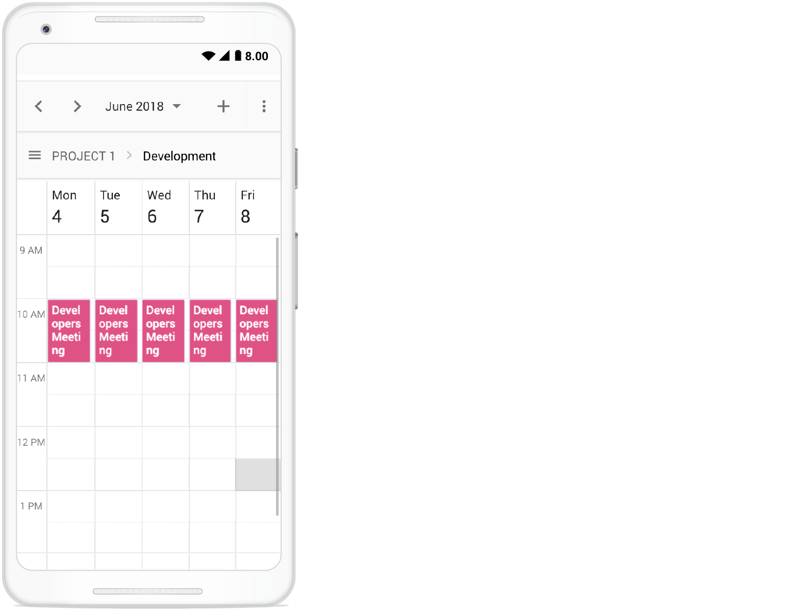
Clicking on the menu icon before the resource text will show the resources available in the Scheduler as following.
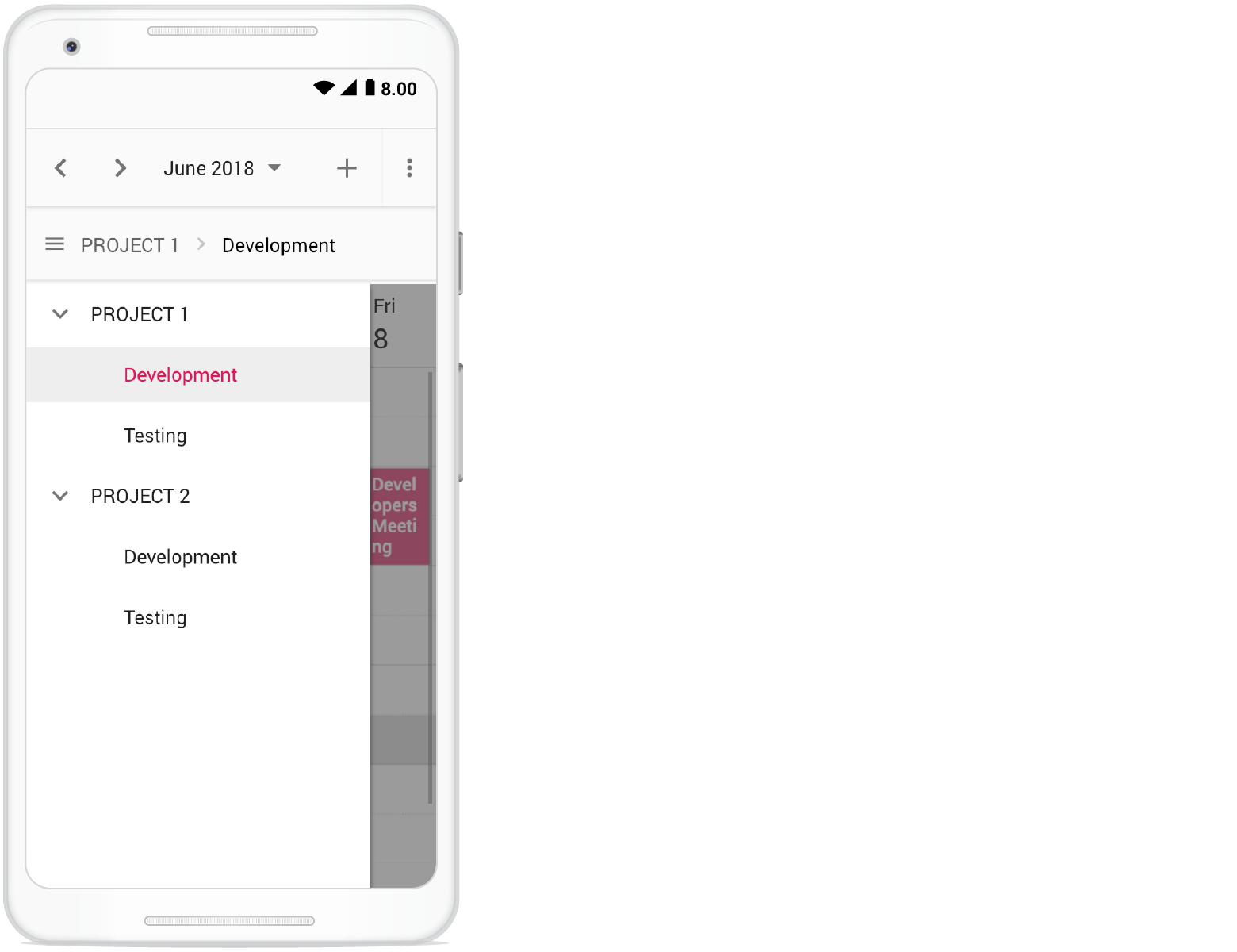
Adaptive UI in desktop
By default, the Scheduler layout adapts automatically on desktop and mobile devices with appropriate UI changes. To display the adaptive Scheduler in desktop mode with adaptive enhancements, set the enableAdaptiveUI property to true. Enabling this option will display the exact mobile mode of the Scheduler view on desktop devices.
Some of the default changes made for compact Scheduler to render in desktop devices are as follows,
- View options displayed in the Navigation drawer.
- Plus icon added to the header for new event creation.
- Today icon added to the header instead of the Today button.
- With Multiple resources – only one resource is shown to enhance the view experience of resource events details clearly. To switch to other resources, there is a TreeView on the left that lists all other available resources. Clicking on a resource displays that particular resource and its related events.
var data = new ej.base.extend([], resourceData.concat(timelineResourceData), null, true);
var projectsData = [
    { text: 'PROJECT 1', id: 1, color: '#cb6bb2' },
    { text: 'PROJECT 2', id: 2, color: '#56ca85' },
    { text: 'PROJECT 3', id: 3, color: '#df5286' }
];
var categoryData = [
    { text: 'Nancy', id: 1, groupId: 1, color: '#df5286' },
    { text: 'Steven', id: 2, groupId: 2, color: '#7fa900' },
    { text: 'Robert', id: 3, groupId: 3, color: '#ea7a57' },
    { text: 'Smith', id: 4, groupId: 1, color: '#5978ee' },
    { text: 'Micheal', id: 5, groupId: 2, color: '#df5286' },
    { text: 'Root', id: 6, groupId: 3, color: '#00bdae' }
];
var scheduleObj = new ej.schedule.Schedule({
    width: '100%',
    height: '650px',
    selectedDate: new Date(2018, 3, 4),
    views: ['Day', 'Week', 'Month'],
    currentView: 'Month',
    enableAdaptiveUI: true,
    resources: [
        {
            field: 'ProjectId', title: 'Choose Project', name: 'Projects',
            dataSource: projectsData,
            textField: 'text', idField: 'id', colorField: 'color'
        }, {
            field: 'TaskId', title: 'Category',
            name: 'Categories', allowMultiple: true,
            dataSource: categoryData,
            textField: 'text', idField: 'id', groupIDField: 'groupId', colorField: 'color'
        }
    ],
    group: {
        resources: ['Projects', 'Categories']
    },
    eventSettings: {
        dataSource: data
    }
});
scheduleObj.appendTo('#Schedule');
<!DOCTYPE html>
<html lang="en">
<head>
<title>Schedule Typescript Control</title>
<meta charset="utf-8">
<meta name="viewport" content="width=device-width, initial-scale=1.0">
<meta name="description" content="Typescript Schedule Control">
<meta name="author" content="Syncfusion">
<link href="index.css" rel="stylesheet">
<link href="https://cdn.syncfusion.com/ej2/35.1.37/bootstrap5.3.css" rel="stylesheet" />
<script src="https://cdn.syncfusion.com/ej2/35.1.37/dist/ej2.min.js" type="text/javascript"></script>
<script src="es5-datasource.js" type="text/javascript"></script>
</head>
<body>
<div id="container">
<div id="Schedule"></div>
</div>
<script>
var ele = document.getElementById('container');
if (ele) {
ele.style.visibility = "visible";
}
</script>
<script src="index.js" type="text/javascript"></script>
</body>
</html>/**
* Schedule datasource spec
*/
var resourceConferenceData = [
{
Id: 1,
Subject: 'Burning Man',
StartTime: new Date(2018, 5, 1, 15, 0),
EndTime: new Date(2018, 5, 1, 17, 0),
ConferenceId: [1, 2, 3]
}, {
Id: 2,
Subject: 'Data-Driven Economy',
StartTime: new Date(2018, 5, 2, 12, 0),
EndTime: new Date(2018, 5, 2, 14, 0),
ConferenceId: [1, 2]
}, {
Id: 3,
Subject: 'Techweek',
StartTime: new Date(2018, 5, 2, 15, 0),
EndTime: new Date(2018, 5, 2, 17, 0),
ConferenceId: [2, 3]
}, {
Id: 4,
Subject: 'Content Marketing World',
StartTime: new Date(2018, 5, 2, 18, 0),
EndTime: new Date(2018, 5, 2, 20, 0),
ConferenceId: [1, 3]
}, {
Id: 5,
Subject: 'B2B Marketing Forum',
StartTime: new Date(2018, 5, 3, 10, 0),
EndTime: new Date(2018, 5, 3, 12, 0),
ConferenceId: [1, 2, 3]
}, {
Id: 6,
Subject: 'Business Innovation Factory',
StartTime: new Date(2018, 5, 3, 13, 0),
EndTime: new Date(2018, 5, 3, 15, 0),
ConferenceId: [1, 2]
}, {
Id: 7,
Subject: 'Grow Conference',
StartTime: new Date(2018, 5, 3, 16, 0),
EndTime: new Date(2018, 5, 3, 18, 0),
ConferenceId: [2, 3]
}, {
Id: 8,
Subject: 'Journalism Interactive',
StartTime: new Date(2018, 5, 3, 19, 0),
EndTime: new Date(2018, 5, 3, 21, 0),
ConferenceId: [1, 3]
}, {
Id: 9,
Subject: 'Blogcademy',
StartTime: new Date(2018, 5, 4, 10, 0),
EndTime: new Date(2018, 5, 4, 11, 30),
ConferenceId: [1, 2, 3]
}, {
Id: 10,
Subject: 'Sustainable Brands',
StartTime: new Date(2018, 5, 4, 13, 0),
EndTime: new Date(2018, 5, 4, 15, 30),
ConferenceId: [1, 2]
}, {
Id: 11,
Subject: 'Fashion Confidential',
StartTime: new Date(2018, 5, 4, 9, 0),
EndTime: new Date(2018, 5, 4, 9, 45),
ConferenceId: [2, 3]
}, {
Id: 12,
Subject: 'Mobile World Conference',
StartTime: new Date(2018, 5, 5, 12, 0),
EndTime: new Date(2018, 5, 5, 14, 0),
ConferenceId: [1, 3]
}, {
Id: 13,
Subject: 'The Human Gathering',
StartTime: new Date(2018, 5, 5, 15, 0),
EndTime: new Date(2018, 5, 5, 17, 0),
ConferenceId: [1, 2, 3]
}, {
Id: 14,
Subject: 'Web Summit',
StartTime: new Date(2018, 5, 5, 18, 0),
EndTime: new Date(2018, 5, 5, 20, 0),
ConferenceId: [1, 2]
}, {
Id: 15,
Subject: 'Funnel Hacking Live',
StartTime: new Date(2018, 5, 6, 12, 0),
EndTime: new Date(2018, 5, 6, 14, 0),
ConferenceId: [1, 3]
}, {
Id: 16,
Subject: 'Data Science Conference',
StartTime: new Date(2018, 5, 6, 15, 0),
EndTime: new Date(2018, 5, 6, 17, 0),
ConferenceId: [2, 3]
}, {
Id: 17,
Subject: 'Powerful Living Experience',
StartTime: new Date(2018, 5, 6, 21, 0),
EndTime: new Date(2018, 5, 6, 23, 30),
ConferenceId: [1, 2, 3]
}, {
Id: 18,
Subject: 'World Domination Summit',
StartTime: new Date(2018, 5, 7, 12, 0),
EndTime: new Date(2018, 5, 7, 14, 0),
ConferenceId: [2, 3]
}, {
Id: 19,
Subject: 'Burning Man',
StartTime: new Date(2018, 5, 7, 15, 0),
EndTime: new Date(2018, 5, 7, 17, 0),
ConferenceId: [1, 3]
}, {
Id: 20,
Subject: 'Data-Driven Economy',
StartTime: new Date(2018, 5, 7, 18, 0),
EndTime: new Date(2018, 5, 7, 20, 0),
ConferenceId: [1, 2]
}, {
Id: 21,
Subject: 'Techweek',
StartTime: new Date(2018, 5, 8, 12, 0),
EndTime: new Date(2018, 5, 8, 14, 0),
ConferenceId: [1, 2, 3]
}, {
Id: 22,
Subject: 'Content Marketing World',
StartTime: new Date(2018, 5, 8, 15, 0),
EndTime: new Date(2018, 5, 8, 17, 0),
ConferenceId: [1, 2, 3]
}, {
Id: 23,
Subject: 'B2B Marketing Forum',
StartTime: new Date(2018, 5, 8, 20, 30),
EndTime: new Date(2018, 5, 8, 21, 30),
ConferenceId: [1, 3]
}, {
Id: 24,
Subject: 'Business Innovation Factory',
StartTime: new Date(2018, 5, 9, 12, 0),
EndTime: new Date(2018, 5, 9, 14, 0),
ConferenceId: [2, 3]
}, {
Id: 25,
Subject: 'Grow Conference',
StartTime: new Date(2018, 5, 9, 15, 0),
EndTime: new Date(2018, 5, 9, 17, 0),
ConferenceId: [1, 2]
}, {
Id: 26,
Subject: 'Journalism Interactive',
StartTime: new Date(2018, 5, 9, 18, 0),
EndTime: new Date(2018, 5, 9, 20, 0),
ConferenceId: [1, 2, 3]
}, {
Id: 27,
Subject: 'Blogcademy',
StartTime: new Date(2018, 5, 10, 12, 0),
EndTime: new Date(2018, 5, 10, 14, 0),
ConferenceId: [1, 3]
}, {
Id: 28,
Subject: 'Sustainable Brands',
StartTime: new Date(2018, 5, 10, 15, 0),
EndTime: new Date(2018, 5, 10, 17, 0),
ConferenceId: [2, 3]
}, {
Id: 29,
Subject: 'Fashion Confidential',
StartTime: new Date(2018, 5, 10, 18, 0),
EndTime: new Date(2018, 5, 10, 20, 0),
ConferenceId: [1, 2]
}, {
Id: 30,
Subject: 'Mobile World Conference',
StartTime: new Date(2018, 5, 11, 12, 0),
EndTime: new Date(2018, 5, 11, 14, 0),
ConferenceId: [1, 2, 3]
}, {
Id: 31,
Subject: 'The Human Gathering',
StartTime: new Date(2018, 5, 11, 15, 0),
EndTime: new Date(2018, 5, 11, 17, 0),
ConferenceId: [1, 2, 3]
}, {
Id: 32,
Subject: 'Web Summit',
StartTime: new Date(2018, 5, 11, 18, 0),
EndTime: new Date(2018, 5, 11, 20, 0),
ConferenceId: [3]
}, {
Id: 33,
Subject: 'Funnel Hacking Live',
StartTime: new Date(2018, 5, 12, 14, 0),
EndTime: new Date(2018, 5, 12, 16, 0),
ConferenceId: [1]
}, {
Id: 34,
Subject: 'Data Science Conference',
StartTime: new Date(2018, 5, 12, 14, 0),
EndTime: new Date(2018, 5, 12, 16, 0),
ConferenceId: [2]
}, {
Id: 35,
Subject: 'Powerful Living Experience',
StartTime: new Date(2018, 5, 12, 18, 0),
EndTime: new Date(2018, 5, 12, 20, 0),
ConferenceId: [1, 2]
}, {
Id: 36,
Subject: 'World Domination Summit',
StartTime: new Date(2018, 5, 12, 18, 0),
EndTime: new Date(2018, 5, 12, 20, 0),
ConferenceId: [3]
}, {
Id: 37,
Subject: 'Burning Man',
StartTime: new Date(2018, 5, 13, 14, 0),
EndTime: new Date(2018, 5, 13, 16, 0),
ConferenceId: [1, 3]
}, {
Id: 38,
Subject: 'Data-Driven Economy',
StartTime: new Date(2018, 5, 13, 14, 0),
EndTime: new Date(2018, 5, 13, 16, 0),
ConferenceId: [1]
}, {
Id: 39,
Subject: 'Techweek',
StartTime: new Date(2018, 5, 13, 18, 0),
EndTime: new Date(2018, 5, 13, 20, 0),
ConferenceId: [2, 3]
}, {
Id: 40,
Subject: 'Content Marketing World',
StartTime: new Date(2018, 5, 13, 18, 0),
EndTime: new Date(2018, 5, 13, 20, 0),
ConferenceId: [1, 2]
}, {
Id: 41,
Subject: 'B2B Marketing Forum',
StartTime: new Date(2018, 5, 14, 14, 0),
EndTime: new Date(2018, 5, 14, 16, 0),
ConferenceId: [1, 2, 3]
}, {
Id: 42,
Subject: 'Business Innovation Factory',
StartTime: new Date(2018, 5, 14, 14, 0),
EndTime: new Date(2018, 5, 14, 16, 0),
ConferenceId: [2, 3]
}, {
Id: 43,
Subject: 'Grow Conference',
StartTime: new Date(2018, 5, 14, 18, 0),
EndTime: new Date(2018, 5, 14, 20, 0),
ConferenceId: [3]
}, {
Id: 44,
Subject: 'Journalism Interactive',
StartTime: new Date(2018, 5, 14, 18, 0),
EndTime: new Date(2018, 5, 14, 20, 0),
ConferenceId: [1, 2, 3]
}, {
Id: 45,
Subject: 'Blogcademy',
StartTime: new Date(2018, 5, 15, 14, 0),
EndTime: new Date(2018, 5, 15, 16, 0),
ConferenceId: [1, 3]
}, {
Id: 46,
Subject: 'Sustainable Brands',
StartTime: new Date(2018, 5, 15, 14, 0),
EndTime: new Date(2018, 5, 15, 16, 0),
ConferenceId: [1, 3]
}, {
Id: 47,
Subject: 'Fashion Confidential',
StartTime: new Date(2018, 5, 15, 18, 0),
EndTime: new Date(2018, 5, 15, 20, 0),
ConferenceId: [1, 2]
}, {
Id: 48,
Subject: 'Mobile World Conference',
StartTime: new Date(2018, 5, 15, 18, 0),
EndTime: new Date(2018, 5, 15, 20, 0),
ConferenceId: [2, 3]
}
];
var timelineResourceData = [
{
Id: 61,
Subject: 'Decoding',
StartTime: new Date(2018, 3, 4, 9, 30),
EndTime: new Date(2018, 3, 4, 10, 30),
IsAllDay: false,
ProjectId: 2,
TaskId: 2
}, {
Id: 62,
Subject: 'Bug Automation',
StartTime: new Date(2018, 3, 4, 13, 30),
EndTime: new Date(2018, 3, 4, 16, 30),
IsAllDay: false,
ProjectId: 2,
TaskId: 1
}, {
Id: 63,
Subject: 'Functionality testing',
StartTime: new Date(2018, 3, 4, 9),
EndTime: new Date(2018, 3, 4, 10, 30),
IsAllDay: false,
ProjectId: 1,
TaskId: 1
}, {
Id: 64,
Subject: 'Resolution-based testing',
StartTime: new Date(2018, 3, 4, 12),
EndTime: new Date(2018, 3, 4, 13),
IsAllDay: false,
ProjectId: 1,
TaskId: 1
}, {
Id: 65,
Subject: 'Test report Validation',
StartTime: new Date(2018, 3, 4, 15),
EndTime: new Date(2018, 3, 4, 18),
IsAllDay: false,
ProjectId: 1,
TaskId: 1
}, {
Id: 66,
Subject: 'Test case correction',
StartTime: new Date(2018, 3, 4, 14),
EndTime: new Date(2018, 3, 4, 16),
IsAllDay: false,
ProjectId: 1,
TaskId: 2
}, {
Id: 67,
Subject: 'Bug fixing',
StartTime: new Date(2018, 3, 4, 14, 30),
EndTime: new Date(2018, 3, 4, 18, 30),
IsAllDay: false,
ProjectId: 2,
TaskId: 2
}, {
Id: 68,
Subject: 'Run test cases',
StartTime: new Date(2018, 3, 4, 17, 30),
EndTime: new Date(2018, 3, 4, 19, 30),
IsAllDay: false,
ProjectId: 1,
TaskId: 2
}, {
Id: 70,
Subject: 'Bug Automation',
StartTime: new Date(2018, 3, 4, 18, 30),
EndTime: new Date(2018, 3, 4, 20),
IsAllDay: false,
ProjectId: 2,
TaskId: 1
}
];
var resourceData = [
{
Id: 1,
Subject: 'Workflow Analysis',
StartTime: new Date(2018, 3, 1, 9, 30),
EndTime: new Date(2018, 3, 1, 12, 0),
IsAllDay: false,
OwnerId: 1,
RoomId: 1
}, {
Id: 2,
Subject: 'Requirement planning',
StartTime: new Date(2018, 3, 1, 12, 30),
EndTime: new Date(2018, 3, 1, 14, 45),
IsAllDay: false,
OwnerId: 2,
RoomId: 2
}, {
Id: 3,
Subject: 'Quality Analysis',
StartTime: new Date(2018, 3, 2, 10, 0),
EndTime: new Date(2018, 3, 2, 12, 30),
IsAllDay: false,
OwnerId: 1,
RoomId: 1
}, {
Id: 4,
Subject: 'Resource planning',
StartTime: new Date(2018, 3, 2, 13, 0),
EndTime: new Date(2018, 3, 2, 15, 30),
IsAllDay: false,
OwnerId: 2,
RoomId: 2
}, {
Id: 5,
Subject: 'Timeline estimation',
StartTime: new Date(2018, 3, 3, 9, 0),
EndTime: new Date(2018, 3, 3, 11, 30),
IsAllDay: false,
OwnerId: 1,
RoomId: 1
}, {
Id: 6,
Subject: 'Developers Meeting',
StartTime: new Date(2018, 3, 3, 14, 0),
EndTime: new Date(2018, 3, 3, 16, 45),
IsAllDay: false,
OwnerId: 2,
RoomId: 2
}, {
Id: 7,
Subject: 'Project Review',
StartTime: new Date(2018, 3, 4, 11, 15),
EndTime: new Date(2018, 3, 4, 13, 30),
IsAllDay: false,
OwnerId: 1,
RoomId: 1
}, {
Id: 8,
Subject: 'Manual testing',
StartTime: new Date(2018, 3, 4, 9, 15),
EndTime: new Date(2018, 3, 4, 11, 45),
IsAllDay: false,
OwnerId: 2,
RoomId: 2
}, {
Id: 9,
Subject: 'Project Preview',
StartTime: new Date(2018, 3, 5, 9, 30),
EndTime: new Date(2018, 3, 5, 12, 45),
IsAllDay: false,
OwnerId: 1,
RoomId: 1
}, {
Id: 10,
Subject: 'Cross-browser testing',
StartTime: new Date(2018, 3, 5, 13, 45),
EndTime: new Date(2018, 3, 5, 16, 30),
IsAllDay: false,
OwnerId: 2
}, {
Id: 11,
Subject: 'Bug Automation',
StartTime: new Date(2018, 3, 6, 10, 0),
EndTime: new Date(2018, 3, 6, 12, 15),
IsAllDay: false,
OwnerId: 1,
RoomId: 1
}, {
Id: 12,
Subject: 'Functionality testing',
StartTime: new Date(2018, 3, 6, 9, 0),
EndTime: new Date(2018, 3, 6, 11, 30),
IsAllDay: false,
OwnerId: 2,
RoomId: 2
}, {
Id: 13,
Subject: 'Resolution-based testing',
StartTime: new Date(2018, 3, 7, 13, 0),
EndTime: new Date(2018, 3, 7, 15, 15),
IsAllDay: false,
OwnerId: 1,
RoomId: 1
}, {
Id: 14,
Subject: 'Test report Validation',
StartTime: new Date(2018, 3, 7, 9),
EndTime: new Date(2018, 3, 7, 11),
IsAllDay: false,
OwnerId: 2,
RoomId: 2
}, {
Id: 15,
Subject: 'Test case correction',
StartTime: new Date(2018, 3, 8, 9, 45),
EndTime: new Date(2018, 3, 8, 11, 30),
IsAllDay: false,
OwnerId: 1,
RoomId: 1
}, {
Id: 16,
Subject: 'Run test cases',
StartTime: new Date(2018, 3, 8, 10, 30),
EndTime: new Date(2018, 3, 8, 13, 0),
IsAllDay: false,
OwnerId: 2,
RoomId: 2
}, {
Id: 17,
Subject: 'Quality Analysis',
StartTime: new Date(2018, 3, 9, 12),
EndTime: new Date(2018, 3, 9, 15, 30),
IsAllDay: false,
OwnerId: 1,
RoomId: 1
}, {
Id: 18,
Subject: 'Debugging',
StartTime: new Date(2018, 3, 9, 9, 0),
EndTime: new Date(2018, 3, 9, 11, 15),
IsAllDay: false,
OwnerId: 2,
RoomId: 2
}, {
Id: 19,
Subject: 'Exception handling',
StartTime: new Date(2018, 3, 10, 10, 10),
EndTime: new Date(2018, 3, 10, 13, 30),
IsAllDay: false,
OwnerId: 1,
RoomId: 1
}, {
Id: 20,
Subject: 'Decoding',
StartTime: new Date(2018, 3, 10, 10, 30),
EndTime: new Date(2018, 3, 10, 12, 30),
IsAllDay: false,
OwnerId: 2,
RoomId: 2
}, {
Id: 21,
Subject: 'workflow Analysis',
StartTime: new Date(2018, 3, 11, 9, 30),
EndTime: new Date(2018, 3, 11, 11, 30),
IsAllDay: false,
OwnerId: 3,
RoomId: 1
}, {
Id: 22,
Subject: 'Requirement planning',
StartTime: new Date(2018, 3, 11, 12, 30),
EndTime: new Date(2018, 3, 11, 14, 45),
IsAllDay: false,
OwnerId: 2,
RoomId: 2
}, {
Id: 23,
Subject: 'Quality Analysis',
StartTime: new Date(2018, 3, 12, 10),
EndTime: new Date(2018, 3, 12, 12, 30),
IsAllDay: false,
OwnerId: 3,
RoomId: 1
}, {
Id: 24,
Subject: 'Resource planning',
StartTime: new Date(2018, 3, 12, 13),
EndTime: new Date(2018, 3, 12, 14, 30),
IsAllDay: false,
OwnerId: 2,
RoomId: 2
}, {
Id: 25,
Subject: 'Timeline estimation',
StartTime: new Date(2018, 3, 13, 9),
EndTime: new Date(2018, 3, 13, 11),
IsAllDay: false,
OwnerId: 3,
RoomId: 1
}, {
Id: 26,
Subject: 'Developers Meeting',
StartTime: new Date(2018, 3, 13, 14),
EndTime: new Date(2018, 3, 13, 15, 45),
IsAllDay: false,
OwnerId: 2,
RoomId: 2
}, {
Id: 27,
Subject: 'Project Review',
StartTime: new Date(2018, 3, 14, 11),
EndTime: new Date(2018, 3, 14, 13),
IsAllDay: false,
OwnerId: 1,
RoomId: 1
}, {
Id: 28,
Subject: 'Manual testing',
StartTime: new Date(2018, 3, 14, 9),
EndTime: new Date(2018, 3, 14, 11, 30),
IsAllDay: false,
OwnerId: 2,
RoomId: 2
}, {
Id: 29,
Subject: 'Project Preview',
StartTime: new Date(2018, 3, 15, 9, 30),
EndTime: new Date(2018, 3, 15, 11),
IsAllDay: false,
OwnerId: 3,
RoomId: 1
}, {
Id: 30,
Subject: 'Cross-browser testing',
StartTime: new Date(2018, 3, 15, 14),
EndTime: new Date(2018, 3, 15, 16, 30),
IsAllDay: false,
OwnerId: 2,
RoomId: 2
}, {
Id: 31,
Subject: 'Bug Automation',
StartTime: new Date(2018, 3, 16, 10),
EndTime: new Date(2018, 3, 16, 11),
IsAllDay: false,
OwnerId: 1,
RoomId: 1
}, {
Id: 32,
Subject: 'Functionality testing',
StartTime: new Date(2018, 3, 16, 9),
EndTime: new Date(2018, 3, 16, 11, 30),
IsAllDay: false,
OwnerId: 2,
RoomId: 2
}, {
Id: 33,
Subject: 'Resolution-based testing',
StartTime: new Date(2018, 3, 17, 14),
EndTime: new Date(2018, 3, 17, 15),
IsAllDay: false,
OwnerId: 3,
RoomId: 1
}, {
Id: 34,
Subject: 'Test report Validation',
StartTime: new Date(2018, 3, 17, 9),
EndTime: new Date(2018, 3, 17, 11),
IsAllDay: false,
OwnerId: 2,
RoomId: 2
}, {
Id: 35,
Subject: 'Test case correction',
StartTime: new Date(2018, 3, 18, 10),
EndTime: new Date(2018, 3, 18, 11, 30),
IsAllDay: false,
OwnerId: 1,
RoomId: 1
}, {
Id: 36,
Subject: 'Run test cases',
StartTime: new Date(2018, 3, 18, 10),
EndTime: new Date(2018, 3, 18, 10, 30),
IsAllDay: false,
OwnerId: 2,
RoomId: 2
}, {
Id: 37,
Subject: 'Bug fixing',
StartTime: new Date(2018, 3, 9, 10),
EndTime: new Date(2018, 3, 9, 10, 30),
IsAllDay: false,
OwnerId: 3,
RoomId: 1
}, {
Id: 38,
Subject: 'Debugging',
StartTime: new Date(2018, 3, 19, 9),
EndTime: new Date(2018, 3, 19, 10, 30),
IsAllDay: false,
OwnerId: 2,
RoomId: 2
}, {
Id: 39,
Subject: 'Exception handling',
StartTime: new Date(2018, 3, 20, 10),
EndTime: new Date(2018, 3, 20, 11),
IsAllDay: false,
OwnerId: 1,
RoomId: 1
}, {
Id: 40,
Subject: 'Decoding',
StartTime: new Date(2018, 3, 20, 10, 30),
EndTime: new Date(2018, 3, 20, 12, 30),
IsAllDay: false,
OwnerId: 2,
RoomId: 2
}, {
Id: 41,
Subject: 'workflow Analysis',
StartTime: new Date(2018, 3, 21, 9, 30),
EndTime: new Date(2018, 3, 21, 11, 30),
IsAllDay: false,
OwnerId: 1,RoomId: 1
}, {
Id: 42,
Subject: 'Requirement planning',
StartTime: new Date(2018, 3, 21, 12, 30),
EndTime: new Date(2018, 3, 21, 13, 45),
IsAllDay: false,
OwnerId: 2,
RoomId: 2
}, {
Id: 43,
Subject: 'Quality Analysis',
StartTime: new Date(2018, 3, 22, 10),
EndTime: new Date(2018, 3, 22, 11, 30),
IsAllDay: false,
OwnerId: 1,
RoomId: 1
}, {
Id: 44,
Subject: 'Resource planning',
StartTime: new Date(2018, 3, 22, 13),
EndTime: new Date(2018, 3, 22, 14, 30),
IsAllDay: false,
OwnerId: 2,
RoomId: 2
}, {
Id: 45,
Subject: 'Timeline estimation',
StartTime: new Date(2018, 3, 23, 9),
EndTime: new Date(2018, 3, 23, 10),
IsAllDay: false,
OwnerId: 3,
RoomId: 1
}, {
Id: 46,
Subject: 'Developers Meeting',
StartTime: new Date(2018, 3, 23, 14),
EndTime: new Date(2018, 3, 23, 15, 45),
IsAllDay: false,
OwnerId: 2,
RoomId: 2
}, {
Id: 47,
Subject: 'Project Review',
StartTime: new Date(2018, 3, 24, 11),
EndTime: new Date(2018, 3, 24, 12),
IsAllDay: false,
OwnerId: 1,
RoomId: 1
}, {
Id: 48,
Subject: 'Manual testing',
StartTime: new Date(2018, 3, 24, 9),
EndTime: new Date(2018, 3, 24, 11, 30),
IsAllDay: false,
OwnerId: 2,
RoomId: 2
}, {
Id: 49,
Subject: 'Project Preview',
StartTime: new Date(2018, 3, 25, 9, 30),
EndTime: new Date(2018, 3, 25, 11),
IsAllDay: false,
OwnerId: 3,
RoomId: 1
}, {
Id: 50,
Subject: 'Cross-browser testing',
StartTime: new Date(2018, 3, 25, 14),
EndTime: new Date(2018, 3, 25, 15, 30),
IsAllDay: false,
OwnerId: 2,
RoomId: 2
}, {
Id: 51,
Subject: 'Bug Automation',
StartTime: new Date(2018, 3, 26, 10),
EndTime: new Date(2018, 3, 26, 11),
IsAllDay: false,
OwnerId: 1,
RoomId: 1
}, {
Id: 52,
Subject: 'Functionality testing',
StartTime: new Date(2018, 3, 26, 9),
EndTime: new Date(2018, 3, 26, 11, 30),
IsAllDay: false,
OwnerId: 2,
RoomId: 2
}, {
Id: 53,
Subject: 'Resolution-based testing',
StartTime: new Date(2018, 3, 27, 14),
EndTime: new Date(2018, 3, 27, 15),
IsAllDay: false,
OwnerId: 3,
RoomId: 1
}, {
Id: 54,
Subject: 'Test report Validation',
StartTime: new Date(2018, 3, 27, 9),
EndTime: new Date(2018, 3, 27, 11),
IsAllDay: false,
OwnerId: 2,
RoomId: 2
}, {
Id: 55,
Subject: 'Test case correction',
StartTime: new Date(2018, 3, 28, 10),
EndTime: new Date(2018, 3, 28, 11, 30),
IsAllDay: false,
OwnerId: 1,
RoomId: 1
}, {
Id: 56,
Subject: 'Run test cases',
StartTime: new Date(2018, 3, 28, 10),
EndTime: new Date(2018, 3, 28, 10, 30),
IsAllDay: false,
OwnerId: 2,
RoomId: 2
}, {
Id: 57,
Subject: 'Bug fixing',
StartTime: new Date(2018, 3, 29, 12),
EndTime: new Date(2018, 3, 29, 12, 30),
IsAllDay: false,
OwnerId: 3,
RoomId: 1
}, {
Id: 58,
Subject: 'Debugging',
StartTime: new Date(2018, 3, 29, 9),
EndTime: new Date(2018, 3, 29, 10, 30),
IsAllDay: false,
OwnerId: 2,
RoomId: 2
}, {
Id: 59,
Subject: 'Exception handling',
StartTime: new Date(2018, 3, 30, 10),
EndTime: new Date(2018, 3, 30, 11),
IsAllDay: false,
OwnerId: 1,
RoomId: 1
}, {
Id: 60,
Subject: 'Decoding',
StartTime: new Date(2018, 3, 30, 10, 30),
EndTime: new Date(2018, 3, 30, 12, 30),
IsAllDay: false,
OwnerId: 2,
RoomId: 2
}
];Refer to the JavaScript Scheduler feature tour page for its groundbreaking feature representations. Also explore the JavaScript Scheduler example to learn how to present and manipulate data.