Views in Angular Scheduler
The Scheduler includes a wide variety of view modes, each with unique configuration options. Available view modes are Day, Week, Work Week, Month, Year, Agenda, Month Agenda, Timeline Day, Timeline Week, Timeline Work Week, Timeline Month, and Timeline Year. By default, the Week view is active.
To navigate between different views and dates, navigation options are available in the Scheduler header bar. The active view is highlighted by default. The date range of the current view is displayed at the left corner of the header bar; clicking this opens a calendar popup for easy date selection.
For guidance on customizing individual views in the Angular Scheduler, watch the following video:
By default, the Scheduler displays calendar views such as day, week, work week, month, and agenda.
Setting a specific view on the Scheduler
The Scheduler displays the Week view by default. To change the active view, set the currentView property to the desired view name. The supported view names are:
- Day
- Week
- WorkWeek
- Month
- Year
- Agenda
- MonthAgenda
- TimelineDay
- TimelineWeek
- TimelineWorkWeek
- TimelineMonth
- TimelineYear
To use these view modes, import and inject the relevant view modules in your application. You can also display only the desired views on the Scheduler. To define and configure specific views, use the views property.
In the following example, the Scheduler displays four views: Week, Month, TimelineWeek, and TimelineMonth. The necessary view modules are imported and injected correctly to render these views.
import { NgModule } from '@angular/core'
import { BrowserModule } from '@angular/platform-browser'
import { ScheduleModule } from '@syncfusion/ej2-angular-schedule'
import { ButtonModule } from '@syncfusion/ej2-angular-buttons'
import { DayService, WorkWeekService, AgendaService, MonthAgendaService} from '@syncfusion/ej2-angular-schedule'


import { Component } from '@angular/core';
import { EventSettingsModel, WeekService, TimelineViewsService, MonthService, TimelineMonthService } from '@syncfusion/ej2-angular-schedule';
import { scheduleData } from './datasource';

@Component({
imports: [

        ScheduleModule,
        ButtonModule
    ],

providers: [DayService,
                WeekService,
                WorkWeekService,
                TimelineViewsService, MonthService, TimelineMonthService,
                AgendaService,
                MonthAgendaService],
standalone: true,
  selector: 'app-root',
  // specifies the template string for the Schedule component
  template: `<ejs-schedule width='100%' height='550px' [selectedDate]="selectedDate" [eventSettings]="eventSettings" >
      <e-views>
        <e-view option='TimelineDay'></e-view>
        <e-view option='Week'></e-view>
        <e-view option='Month'></e-view>
        <e-view option='TimelineMonth'></e-view>
      </e-views>
  </ejs-schedule>`
})
export class AppComponent {
    public selectedDate: Date = new Date(2018, 1, 15);
    public eventSettings: EventSettingsModel = { dataSource: scheduleData };
}
import { bootstrapApplication } from '@angular/platform-browser';
import { AppComponent } from './app.component';
bootstrapApplication(AppComponent).catch((err) => console.error(err));To configure the Scheduler with two views that each have different configurations, refer to the following example. Here, the Week view displays dates in dd-MM-yyyy format, while the Month view hides weekend days and is set to read-only mode.
import { NgModule } from '@angular/core'
import { BrowserModule } from '@angular/platform-browser'
import { ScheduleModule } from '@syncfusion/ej2-angular-schedule'
import { ButtonModule } from '@syncfusion/ej2-angular-buttons'
import { DayService, WeekService, WorkWeekService, MonthService, AgendaService, MonthAgendaService} from '@syncfusion/ej2-angular-schedule'


import { Component } from '@angular/core';
import { EventSettingsModel} from '@syncfusion/ej2-angular-schedule';
import { scheduleData } from './datasource';

@Component({
imports: [

        ScheduleModule,
        ButtonModule
    ],

providers: [DayService,
                WeekService,
                WorkWeekService,
                MonthService,
                AgendaService,
                MonthAgendaService],
standalone: true,
  selector: 'app-root',
  // specifies the template string for the Schedule component
  template: `<ejs-schedule width='100%' height='550px' [selectedDate]="selectedDate" [eventSettings]="eventSettings" >
      <e-views>
        <e-view option='Week' dateFormat='dd-MMM-yyyy'></e-view>
        <e-view option='Month' [showWeekend]="showWeekend" [readonly]="isReadOnly"></e-view>
      </e-views>
    </ejs-schedule>`
})
export class AppComponent {
    public selectedDate: Date = new Date(2018, 1, 15);
    public showWeekend: Boolean = true;
    public isReadOnly: number = 3;
    public eventSettings: EventSettingsModel = { dataSource: scheduleData };
}
import { bootstrapApplication } from '@angular/platform-browser';
import { AppComponent } from './app.component';
bootstrapApplication(AppComponent).catch((err) => console.error(err));View specific configuration
There are scenarios where each view may need different configurations. For such cases, you can define the applicable scheduler properties within the views property for each view option as depicted in the following examples. The fields available for each view option are as follows.
| Property | Type | Description | Applicable views |
|---|---|---|---|
option |
View | It accepts the Scheduler view name, based on which related properties are defined. The view names can be Day, Week, and so on. |
All views. |
isSelected |
Boolean | It acts similarly to the currentView property and defines the active view of the Scheduler. |
All views. |
dateFormat |
Date | By default, Scheduler follows the date format of the assigned culture. When defined for a specific view, only those assigned views follow this date format. | All views. |
readonly |
Boolean | When set to true, prevents CRUD actions on the respective view in which it is defined. |
All views. |
resourceHeaderTemplate |
String | The template option used to customize the resource header cells on the Scheduler. It is applied only to the views in which it is defined. | All views. |
dateHeaderTemplate |
String | The template option used to customize the date header cells and is applied only to the views in which it is defined. | All views. |
eventTemplate |
String | The template option to customize event backgrounds. It is applied to events in the view where it is defined. | All views. |
showWeekend |
Boolean | When set to false, hides weekend days from the views in which it is defined. |
All views. |
group |
GroupModel | Allows setting different resource grouping options on all available Scheduler view modes. | All views. |
cellTemplate |
String | The template option to customize the work cells of the Scheduler and is applied only to the views in which it is defined. | Applicable on all views except Agenda view. |
workDays |
Number[] | It is used to set the working days on Scheduler views. | Applicable on all views except Agenda view. |
displayName |
String | When a particular view is customized with different intervals, this property allows setting a different display name for each view. | Applicable on all views except Agenda and Month Agenda. |
interval |
Number | It allows customizing default Scheduler views with a different set of days, weeks, work weeks, or months on the applicable view type. | Applicable on all views except Agenda and Month Agenda. |
startHour |
String | It is used to specify the start hour from which the Scheduler should be displayed. It accepts a time string in a short skeleton format and hides time earlier than the specified start time. | Applicable on Day, Week, Work Week, Timeline Day, Timeline Week and Timeline Work Week views. |
endHour |
String | It is used to specify the end hour at which the Scheduler ends. It accepts a time string in a short skeleton format. | Applicable on Day, Week, Work Week, Timeline Day, Timeline Week, and Timeline Work Week views. |
timeScale |
TimeScaleModel | Allows setting different timescale configuration on each applicable view mode. | Applicable on Day, Week, Work Week, Timeline Day, Timeline Week, and Timeline Work Week views. |
showWeekNumber |
Boolean | When set to true, shows the week number on the respective weeks. |
Applicable on Day, Week, Work Week, and Month views. |
allowVirtualScrolling |
Boolean | It is used to enable or disable virtual scrolling functionality. | Applicable on Agenda and Timeline views. |
headerRows |
HeaderRowsModel | Allows defining custom header rows on timeline views of the Scheduler to display the year, month, week, date, and hour label as individual rows. | Applicable only on all timeline views. |
Day view
The Day view displays a single day with its appointments. You can extend the Day view to show multiple days by setting the interval property within the views configuration. Any of the above properties can be applied to the day view as needed.
import { NgModule } from '@angular/core'
import { BrowserModule } from '@angular/platform-browser'
import { ScheduleModule } from '@syncfusion/ej2-angular-schedule'
import { ButtonModule } from '@syncfusion/ej2-angular-buttons'
import { DayService, WeekService, WorkWeekService, MonthService, AgendaService, MonthAgendaService} from '@syncfusion/ej2-angular-schedule'


import { Component } from '@angular/core';
import { EventSettingsModel, TimeScaleModel } from '@syncfusion/ej2-angular-schedule';
import { scheduleData } from './datasource';

@Component({
imports: [

        ScheduleModule,
        ButtonModule
    ],

providers: [DayService,
                WeekService,
                WorkWeekService,
                MonthService,
                AgendaService,
                MonthAgendaService],
standalone: true,
  selector: 'app-root',
  // specifies the template string for the Schedule component
  template: `<ejs-schedule width='100%' height='550px' currentView="Day" [selectedDate]="selectedDate" [eventSettings]="eventSettings" >
      <e-views>
        <e-view option='Day' startHour='09:30' endHour='18:00' [timeScale]="timeScaleOptions"></e-view>
      </e-views>
    </ejs-schedule>`
})
export class AppComponent {
    public selectedDate: Date = new Date(2018, 1, 15);
    public timeScaleOptions: TimeScaleModel = { enable: true, slotCount: 5 };
    public eventSettings: EventSettingsModel = { dataSource: scheduleData };
}
import { bootstrapApplication } from '@angular/platform-browser';
import { AppComponent } from './app.component';
bootstrapApplication(AppComponent).catch((err) => console.error(err));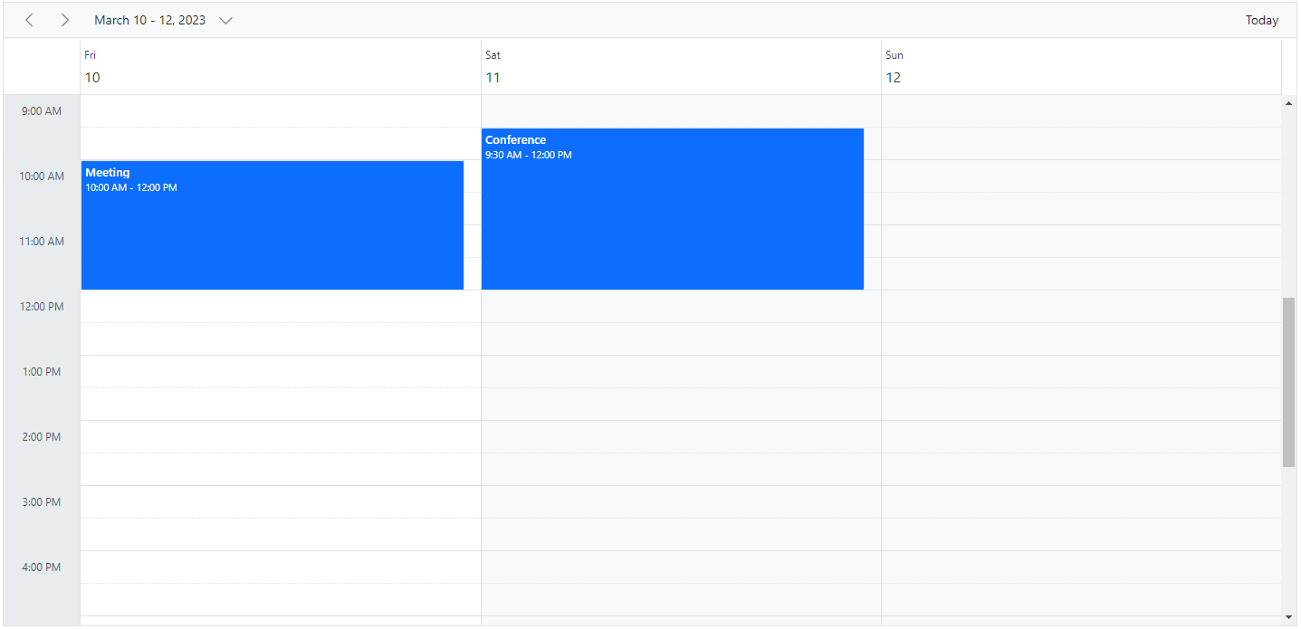
All properties listed above can be used in the Day view except
allowVirtualScrollingandheaderRows.
Week view
The Week view displays a count of 7 days (from Sunday to Saturday) with all its related appointments. The first day of the week can be changed using the firstDayOfWeek which accepts the integer (Sunday=0, Monday=1, Tuesday=2 and so on) value. You can navigate to a particular date in day view from the week view by clicking on the appropriate dates on the date header bar.
import { NgModule } from '@angular/core'
import { BrowserModule } from '@angular/platform-browser'
import { ScheduleModule } from '@syncfusion/ej2-angular-schedule'
import { ButtonModule } from '@syncfusion/ej2-angular-buttons'
import { DayService, WeekService, WorkWeekService, MonthService, AgendaService, MonthAgendaService} from '@syncfusion/ej2-angular-schedule'


import { Component } from '@angular/core';
import { EventSettingsModel, TimeScaleModel } from '@syncfusion/ej2-angular-schedule';
import { scheduleData } from './datasource';

@Component({
imports: [

        ScheduleModule,
        ButtonModule
    ],

providers: [DayService,
                WeekService,
                WorkWeekService,
                MonthService,
                AgendaService,
                MonthAgendaService],
standalone: true,
  selector: 'app-root',
  // specifies the template string for the Schedule component
  template: `<ejs-schedule width='100%' height='550px' currentView="Week" [selectedDate]="selectedDate" [eventSettings]="eventSettings" >
      <e-views>
        <e-view option='Day' [interval]="viewInterval" displayName='2 Days' startHour='09:30' endHour='18:00' [timeScale]="timeScaleOptions"></e-view>
        <e-view option='Week' [interval]="viewInterval" displayName='2 Weeks' [showWeekend]="showWeekend" [isSelected]="isSelected"></e-view>
      </e-views>
    </ejs-schedule>`
})
export class AppComponent {
    public selectedDate: Date = new Date(2018, 1, 15);
    public viewInterval: number= 2;
    public showWeekend: boolean = false;
    public isSelected: boolean = true;
    public timeScaleOptions: TimeScaleModel = { enable: true, slotCount: 5 };
    public eventSettings: EventSettingsModel = { dataSource: scheduleData };
}
import { bootstrapApplication } from '@angular/platform-browser';
import { AppComponent } from './app.component';
bootstrapApplication(AppComponent).catch((err) => console.error(err));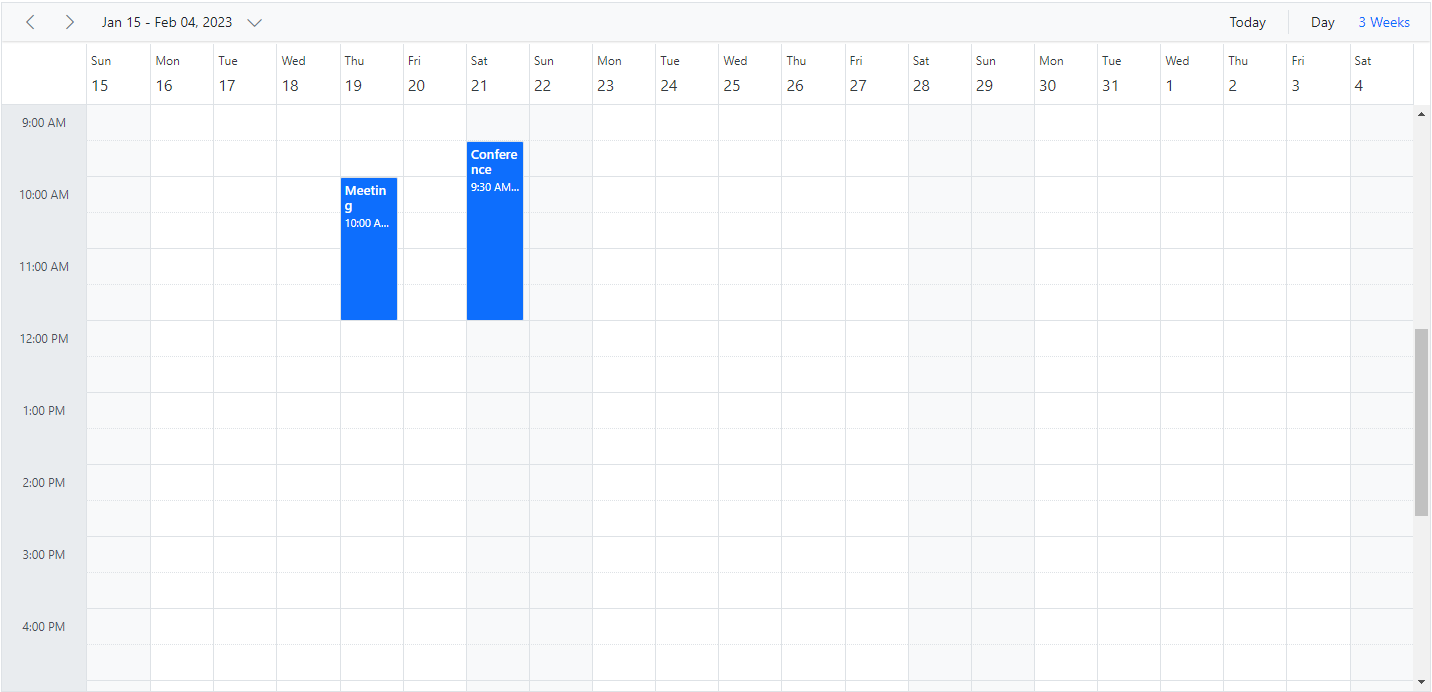
All the above defined properties in the table can be accessed within Week and Work week views except
allowVirtualScrollingandheaderRows.
Work Week view
The Work week view displays only the working days of a week (count of 5 days) and its associated appointments. It is possible to customize the working days on the work week view by using the workDays property which accepts an array of integer values (such as Sunday=0, Monday=1, Tuesday=2 and so on). By default, it displays from Monday to Friday (5 days). You can also navigate to a particular date in the day view from the work week view by clicking on the appropriate dates in the date header bar.
The following code example depicts how to change the working days only on the Work Week view of the Scheduler.
import { NgModule } from '@angular/core'
import { BrowserModule } from '@angular/platform-browser'
import { ScheduleModule } from '@syncfusion/ej2-angular-schedule'
import { ButtonModule } from '@syncfusion/ej2-angular-buttons'
import { DayService, WeekService, WorkWeekService, MonthService, AgendaService, MonthAgendaService} from '@syncfusion/ej2-angular-schedule'


import { Component } from '@angular/core';
import { EventSettingsModel } from '@syncfusion/ej2-angular-schedule';
import { scheduleData } from './datasource';

@Component({
imports: [

        ScheduleModule,
        ButtonModule
    ],

providers: [DayService,
                WeekService,
                WorkWeekService,
                MonthService,
                AgendaService,
                MonthAgendaService],
standalone: true,
  selector: 'app-root',
  // specifies the template string for the Schedule component
  template: `<ejs-schedule width='100%' height='550px' [selectedDate]="selectedDate" [eventSettings]="eventSettings" >
      <e-views>
        <e-view option='WorkWeek' [workDays]="workWeekDays"></e-view>
      </e-views>
    </ejs-schedule>`
})
export class AppComponent {
    public selectedDate: Date = new Date(2018, 1, 15);
    public workWeekDays: number[]= [2, 3, 5];
    public eventSettings: EventSettingsModel = { dataSource: scheduleData };
}
import { bootstrapApplication } from '@angular/platform-browser';
import { AppComponent } from './app.component';
bootstrapApplication(AppComponent).catch((err) => console.error(err));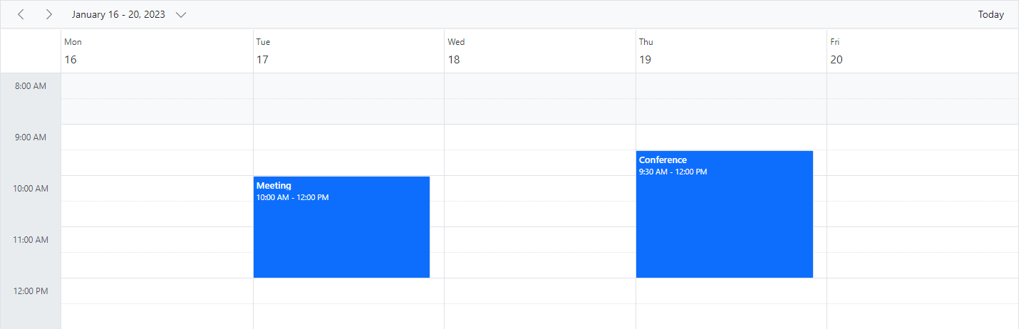
The Week, Work week and Day views can display the all-day row appointments in a separate all-day row with an expand/collapse option to view it.
Month view
The Month view displays all days of the selected month and their appointments. By clicking a date in the month cells, you can navigate to the corresponding Day view.
By default, when you create an appointment through Month view, it is treated as an all-day appointment. You can explicitly change this behavior by unchecking the All-day option in the editor window so that it defaults to a start time of 9:00 AM and an end time of 9:30 AM.
You can also have the + more text indicator on each day cell of a Month view; clicking it allows you to view hidden appointments for that day.
import { NgModule } from '@angular/core'
import { BrowserModule } from '@angular/platform-browser'
import { ScheduleModule } from '@syncfusion/ej2-angular-schedule'
import { ButtonModule } from '@syncfusion/ej2-angular-buttons'
import { DayService, WeekService, WorkWeekService, MonthService, AgendaService, MonthAgendaService} from '@syncfusion/ej2-angular-schedule'


import { Component } from '@angular/core';
import { EventSettingsModel } from '@syncfusion/ej2-angular-schedule';
import { scheduleData } from './datasource';

@Component({
imports: [

        ScheduleModule,
        ButtonModule
    ],

providers: [DayService,
                WeekService,
                WorkWeekService,
                MonthService,
                AgendaService,
                MonthAgendaService],
standalone: true,
  selector: 'app-root',
  // specifies the template string for the Schedule component
  template: `<ejs-schedule width='100%' height='550px' [selectedDate]="selectedDate" [eventSettings]="eventSettings" >
      <e-views>
        <e-view option='Month' [showWeekNumber]="showWeekNumber" [readonly]="isReadOnly"></e-view>
      </e-views>
    </ejs-schedule>`
})
export class AppComponent {
    public selectedDate: Date = new Date(2018, 1, 15);
    public showWeekNumber: boolean = true;
    public isReadOnly: boolean = true;
    public eventSettings: EventSettingsModel = { dataSource: scheduleData };
}
import { bootstrapApplication } from '@angular/platform-browser';
import { AppComponent } from './app.component';
bootstrapApplication(AppComponent).catch((err) => console.error(err));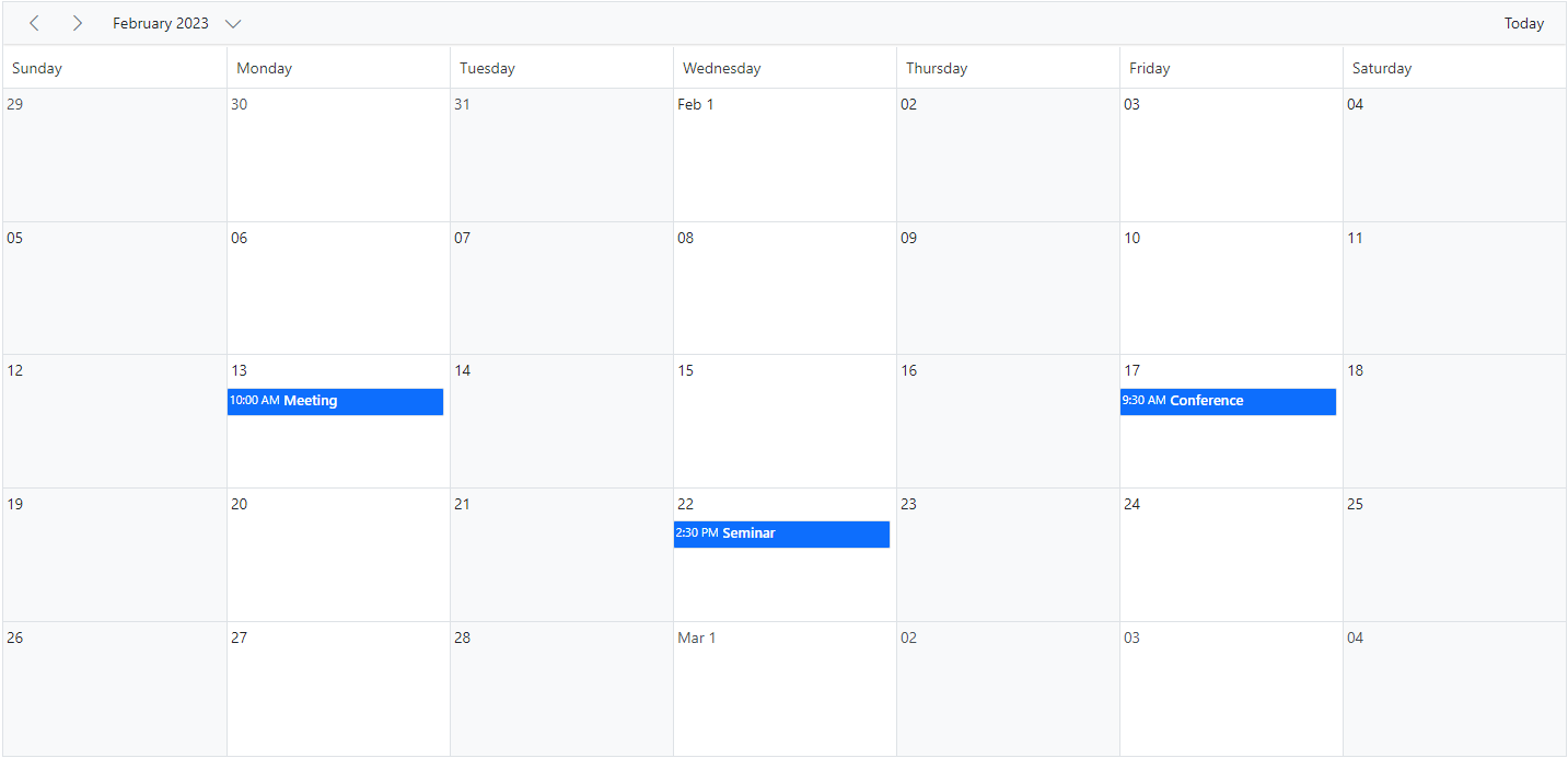
Year view
A Year view displays all the days of a particular year with months and all its related appointments. You can navigate to a particular date in the day view by clicking on the appropriate date text on the year cells.
Year view is available in both the Horizontal and Vertical orientations. You can manage the orientation of year view through views property.
import { NgModule } from '@angular/core'
import { BrowserModule } from '@angular/platform-browser'
import { ScheduleModule } from '@syncfusion/ej2-angular-schedule'
import { ButtonModule } from '@syncfusion/ej2-angular-buttons'
import { DayService, WeekService, WorkWeekService, MonthService, AgendaService, MonthAgendaService} from '@syncfusion/ej2-angular-schedule'


import { Component } from '@angular/core';
import { EventSettingsModel, YearService } from '@syncfusion/ej2-angular-schedule';
import { scheduleData } from './datasource';

@Component({
imports: [

        ScheduleModule,
        ButtonModule
    ],

providers: [DayService,
                WeekService,
                WorkWeekService,
                MonthService,
                AgendaService,
                MonthAgendaService,
                YearService],
standalone: true,
  selector: 'app-root',
  // specifies the template string for the Schedule component
  template: `<ejs-schedule width='100%' height='550px' [selectedDate]="selectedDate" [eventSettings]="eventSettings" >
      <e-views>
        <e-view option='Year' [showWeekNumber]="showWeekNumber" [readonly]="isReadOnly"></e-view>
      </e-views>
    </ejs-schedule>`
})
export class AppComponent {
    public selectedDate: Date = new Date(2018, 1, 15);
    public showWeekNumber: boolean = true;
    public isReadOnly: boolean = true;
    public eventSettings: EventSettingsModel = { dataSource: scheduleData };
}
import { bootstrapApplication } from '@angular/platform-browser';
import { AppComponent } from './app.component';
bootstrapApplication(AppComponent).catch((err) => console.error(err));The year view also has module support. It displays all months of a particular year in a calendar format. In that calendar view, dates containing appointments are highlighted with dots placed under each date. When you click on a date, the event popup is displayed and the events are listed.
Agenda view
The Agenda view lists out the appointments in a grid-like view for the next 7 days by default from the current date. The count of the days can be changed using the API agendaDaysCount. It allows virtual scrolling of dates by enabling the allowVirtualScrolling property. Also, you can enable or disable the display of days on Scheduler that has no appointments by setting true or false to the hideEmptyAgendaDays property.
The following code example depicts how to customize the display of events within Agenda view alone.
import { NgModule } from '@angular/core'
import { BrowserModule } from '@angular/platform-browser'
import { ScheduleModule } from '@syncfusion/ej2-angular-schedule'
import { ButtonModule } from '@syncfusion/ej2-angular-buttons'
import { DayService, WeekService, WorkWeekService, MonthService, MonthAgendaService} from '@syncfusion/ej2-angular-schedule'


import { Component } from '@angular/core';
import { Internationalization } from '@syncfusion/ej2-base';
import { EventSettingsModel, AgendaService } from '@syncfusion/ej2-angular-schedule';
import { scheduleData } from './datasource';

@Component({
imports: [

        ScheduleModule,
        ButtonModule
    ],

providers: [DayService,
                WeekService,
                WorkWeekService,
                MonthService,
                AgendaService,
                MonthAgendaService],
standalone: true,
  selector: 'app-root',
  // specifies the template string for the Schedule component
  template: `<ejs-schedule width='100%' height='550px' [selectedDate]="selectedDate" [eventSettings]="eventSettings" >
      <e-views>
        <e-view option='Agenda' [allowVirtualScrolling]="allowVirtualScroll">
        <ng-template #eventTemplate let-data>
          <div class="template-wrap">
            <div class="subject"></div>
            <div class="time"> - </div>
          </div>
        </ng-template>
        </e-view>
      </e-views>
    </ejs-schedule>`
})
export class AppComponent {
  public selectedDate: Date = new Date(2018, 1, 15);
  public allowVirtualScroll: boolean = true;
  public eventSettings: EventSettingsModel = { dataSource: scheduleData };
  private instance: Internationalization = new Internationalization();
  getTimeString(value: Date): string {
    return this.instance.formatDate(value, { skeleton: 'hm' });
  };
}
import { bootstrapApplication } from '@angular/platform-browser';
import { AppComponent } from './app.component';
bootstrapApplication(AppComponent).catch((err) => console.error(err));
Schedule height must be set in pixels for the Agenda view.
Month Agenda view
The Month Agenda view displays a calendar for the month; clicking on a day shows the appointments for that date below the calendar. Days with appointments are indicated by a circular dot under the date.
The following code example shows how to hide the weekend days on MonthAgenda view as well as the working days list is modified on Month Agenda view alone.
import { NgModule } from '@angular/core'
import { BrowserModule } from '@angular/platform-browser'
import { ScheduleModule } from '@syncfusion/ej2-angular-schedule'
import { ButtonModule } from '@syncfusion/ej2-angular-buttons'
import { DayService, WeekService, WorkWeekService, MonthService, AgendaService} from '@syncfusion/ej2-angular-schedule'


import { Component } from '@angular/core';
import { EventSettingsModel, MonthAgendaService } from '@syncfusion/ej2-angular-schedule';
import { scheduleData } from './datasource';

@Component({
imports: [

        ScheduleModule,
        ButtonModule
    ],

providers: [DayService,
                WeekService,
                WorkWeekService,
                MonthService,
                AgendaService,
                MonthAgendaService],
standalone: true,
  selector: 'app-root',
  // specifies the template string for the Schedule component
  template: `<ejs-schedule width='100%' height='550px' [selectedDate]="selectedDate" [eventSettings]="eventSettings" >
      <e-views>
        <e-view option='MonthAgenda' [showWeekend]="showWeekend" [workDays]="workDays"></e-view>
      </e-views>
    </ejs-schedule>`
})
export class AppComponent {
    public selectedDate: Date = new Date(2018, 1, 14);
    public showWeekend: boolean = false;
    public workDays: number[] = [1, 2, 3];
    public eventSettings: EventSettingsModel = { dataSource: scheduleData };
}
import { bootstrapApplication } from '@angular/platform-browser';
import { AppComponent } from './app.component';
bootstrapApplication(AppComponent).catch((err) => console.error(err));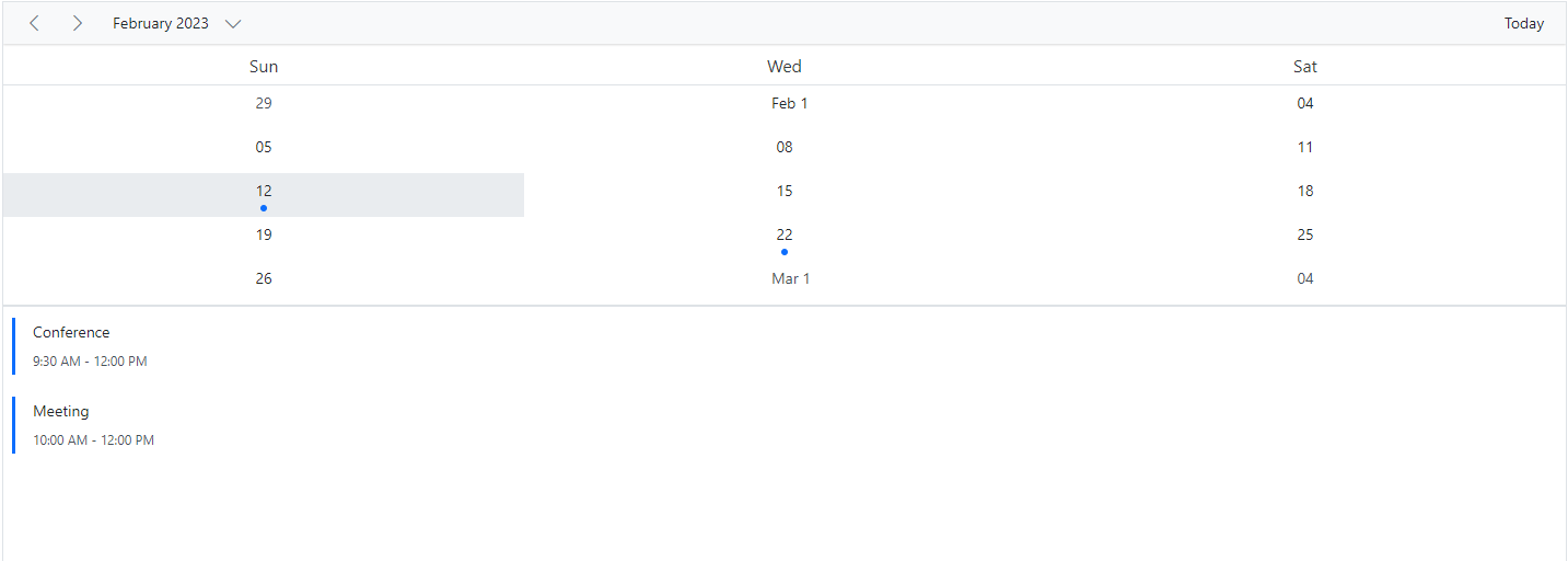
Schedule height must be set in pixels for Month Agenda view.
Timeline views – Day, Week, Work Week
Similar to the day view, it shows a single day with all its appointments where the time slots are displayed horizontally. By default, the cell height adjusts as per the height set to Scheduler. When the number of appointments exceeds the visible area of the cells, the + more text indicator will be displayed at the bottom to denote the presence of few more appointments in that time range.
To use timeline views (Timeline Day, Timeline Week, Timeline Work Week), import and inject the TimelineViews module from the @syncfusion/ej2-angular-schedule package.
import { NgModule } from '@angular/core'
import { BrowserModule } from '@angular/platform-browser'
import { ScheduleModule } from '@syncfusion/ej2-angular-schedule'
import { ButtonModule } from '@syncfusion/ej2-angular-buttons'
import { DayService, WeekService, WorkWeekService, MonthService, AgendaService, MonthAgendaService} from '@syncfusion/ej2-angular-schedule'


import { Component } from '@angular/core';
import { EventSettingsModel, TimelineViewsService } from '@syncfusion/ej2-angular-schedule';
import { scheduleData } from './datasource';

@Component({
imports: [

        ScheduleModule,
        ButtonModule
    ],

providers: [DayService,
                WeekService,
                WorkWeekService,
                MonthService,
                AgendaService,
                MonthAgendaService,
                TimelineViewsService],
standalone: true,
  selector: 'app-root',
  // specifies the template string for the Schedule component
  template: `<ejs-schedule width='100%' height='550px' [selectedDate]="selectedDate" [eventSettings]="eventSettings" >
      <e-views>
        <e-view option='TimelineDay' startHour='10:00' endHour='15:30'></e-view>
      </e-views>
    </ejs-schedule>`
})
export class AppComponent {
    public selectedDate: Date = new Date(2018, 1, 15);
    public eventSettings: EventSettingsModel = { dataSource: scheduleData };
}
import { bootstrapApplication } from '@angular/platform-browser';
import { AppComponent } from './app.component';
bootstrapApplication(AppComponent).catch((err) => console.error(err));Similar to the Week view, the timeline week view shows 7 days with its associated appointments with the time slots displayed horizontally.
import { NgModule } from '@angular/core'
import { BrowserModule } from '@angular/platform-browser'
import { ScheduleModule } from '@syncfusion/ej2-angular-schedule'
import { ButtonModule } from '@syncfusion/ej2-angular-buttons'
import { DayService, WeekService, WorkWeekService, MonthService, AgendaService, MonthAgendaService} from '@syncfusion/ej2-angular-schedule'


import { Component } from '@angular/core';
import { EventSettingsModel, TimelineViewsService, TimeScaleModel } from '@syncfusion/ej2-angular-schedule';
import { scheduleData } from './datasource';

@Component({
imports: [

        ScheduleModule,
        ButtonModule
    ],

providers: [DayService,
                WeekService,
                WorkWeekService,
                MonthService,
                AgendaService,
                MonthAgendaService,
                TimelineViewsService],
standalone: true,
  selector: 'app-root',
  // specifies the template string for the Schedule component
  template: `<ejs-schedule width='100%' height='550px' [selectedDate]="selectedDate" [eventSettings]="eventSettings" >
      <e-views>
        <e-view option='TimelineWeek' timeScale="timeScaleOptions"></e-view>
      </e-views>
    </ejs-schedule>`
})
export class AppComponent {
    public selectedDate: Date = new Date(2018, 1, 15);
    public timeScaleOptions: TimeScaleModel = { enable: false };
    public eventSettings: EventSettingsModel = { dataSource: scheduleData };
}
import { bootstrapApplication } from '@angular/platform-browser';
import { AppComponent } from './app.component';
bootstrapApplication(AppComponent).catch((err) => console.error(err));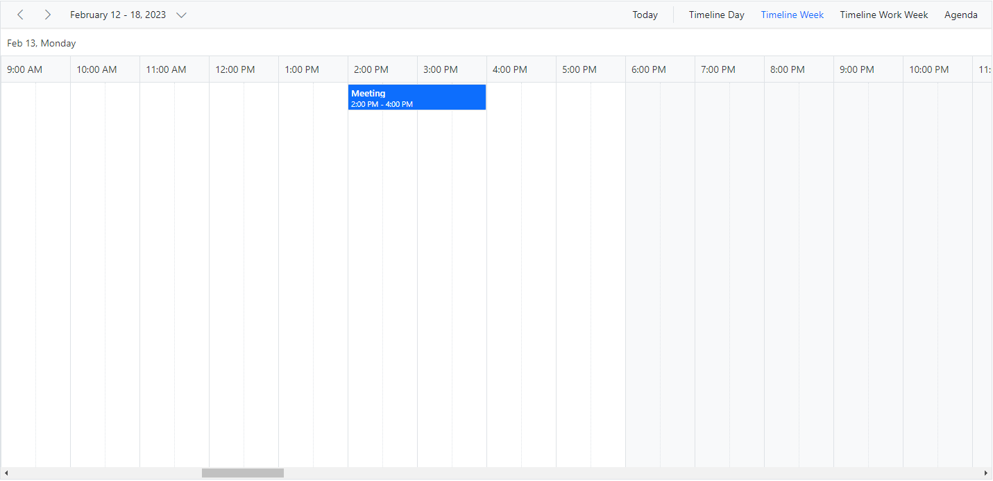
The following code example depicts how to display the timeline work week view on Scheduler:
import { NgModule } from '@angular/core'
import { BrowserModule } from '@angular/platform-browser'
import { ScheduleModule } from '@syncfusion/ej2-angular-schedule'
import { ButtonModule } from '@syncfusion/ej2-angular-buttons'
import { DayService, WeekService, WorkWeekService, MonthService, AgendaService, MonthAgendaService} from '@syncfusion/ej2-angular-schedule'


import { Component } from '@angular/core';
import { EventSettingsModel, TimelineViewsService } from '@syncfusion/ej2-angular-schedule';
import { scheduleData } from './datasource';

@Component({
imports: [

        ScheduleModule,
        ButtonModule
    ],

providers: [DayService,
                WeekService,
                WorkWeekService,
                MonthService,
                AgendaService,
                MonthAgendaService,
                TimelineViewsService],
standalone: true,
  selector: 'app-root',
  // specifies the template string for the Schedule component
  template: `<ejs-schedule width='100%' height='550px' [selectedDate]="selectedDate" [eventSettings]="eventSettings" >
      <e-views>
        <e-view option='TimelineWorkWeek' dateFormat='dd-MMM-yyyy' [interval]="viewInterval" [workDays]="workweekDays"></e-view>
      </e-views>
    </ejs-schedule>`
})
export class AppComponent {
    public selectedDate: Date = new Date(2018, 1, 14);
    public viewInterval: number = 3;
    public workweekDays: number[] = [1, 3, 5];
    public eventSettings: EventSettingsModel = { dataSource: scheduleData };
}
import { bootstrapApplication } from '@angular/platform-browser';
import { AppComponent } from './app.component';
bootstrapApplication(AppComponent).catch((err) => console.error(err));Clicking on dates in the date header bar of Timeline Day, Timeline Week, and Timeline Work Week navigates to the Agenda view.
Timeline Month view
Timeline Month view displays days of the current month and their appointments horizontally. To use Timeline Month view, import and inject the TimelineMonth module from the @syncfusion/ej2-angular-schedule package.
import { NgModule } from '@angular/core'
import { BrowserModule } from '@angular/platform-browser'
import { ScheduleModule } from '@syncfusion/ej2-angular-schedule'
import { ButtonModule } from '@syncfusion/ej2-angular-buttons'
import { DayService, WeekService, WorkWeekService, MonthService, AgendaService, MonthAgendaService} from '@syncfusion/ej2-angular-schedule'


import { Component } from '@angular/core';
import { EventSettingsModel, TimelineMonthService } from '@syncfusion/ej2-angular-schedule';
import { scheduleData } from './datasource';

@Component({
imports: [

        ScheduleModule,
        ButtonModule
    ],

providers: [DayService,
                WeekService,
                WorkWeekService,
                MonthService,
                AgendaService,
                MonthAgendaService,
                TimelineMonthService],
standalone: true,
  selector: 'app-root',
  // specifies the template string for the Schedule component
  template: `<ejs-schedule width='100%' height='550px' [selectedDate]="selectedDate" [eventSettings]="eventSettings" >
      <e-views>
        <e-view option='TimelineMonth' dateFormat='dd-MMM-yyyy' [showWeekend]="showWeekend"></e-view>
      </e-views>
    </ejs-schedule>`
})
export class AppComponent {
    public selectedDate: Date = new Date(2018, 1, 15);
    public showWeekend: boolean = false;
    public eventSettings: EventSettingsModel = { dataSource: scheduleData };
}
import { bootstrapApplication } from '@angular/platform-browser';
import { AppComponent } from './app.component';
bootstrapApplication(AppComponent).catch((err) => console.error(err));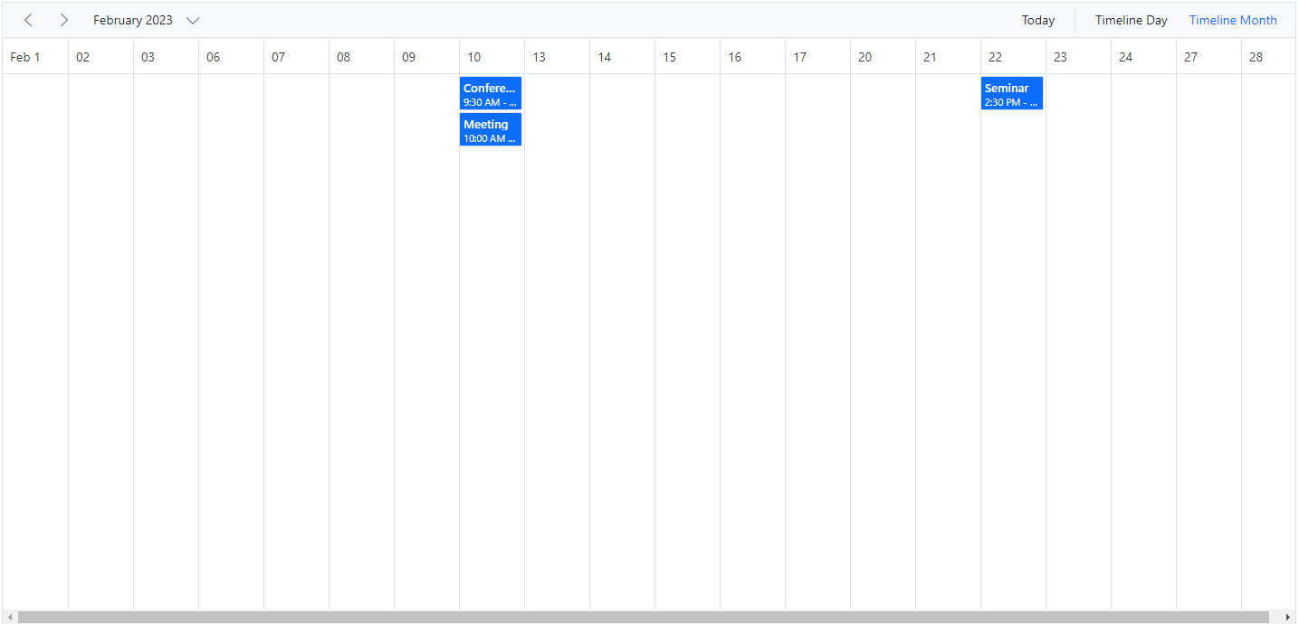
Clicking on the dates in the date header bar of Timeline month will allow you to navigate to the Timeline day view.
Timeline Year view
In Timeline Year view, each row depicts a single resource. In vertical views, each resource is grouped as a column. The resource grouping follows a tree-view hierarchical structure and can contain multiple levels of child resources.
To use the Timeline Year view on Scheduler, import and inject the TimelineYear module from the @syncfusion/ej2-angular-schedule package.
import { NgModule } from '@angular/core'
import { BrowserModule } from '@angular/platform-browser'
import { ScheduleModule } from '@syncfusion/ej2-angular-schedule'
import { ButtonModule } from '@syncfusion/ej2-angular-buttons'
import { DayService, WeekService, WorkWeekService, MonthService, AgendaService, MonthAgendaService} from '@syncfusion/ej2-angular-schedule'


import { Component } from '@angular/core';
import { EventSettingsModel, TimelineYearService } from '@syncfusion/ej2-angular-schedule';
import { scheduleData } from './datasource';

@Component({
imports: [

        ScheduleModule,
        ButtonModule
    ],

providers: [DayService,
                WeekService,
                WorkWeekService,
                MonthService,
                AgendaService,
                MonthAgendaService,
                TimelineYearService],
standalone: true,
  selector: 'app-root',
  // specifies the template string for the Schedule component
  template: `<ejs-schedule width='100%' height='550px' [selectedDate]="selectedDate" [eventSettings]="eventSettings" >
      <e-views>
        <e-view option='TimelineYear' displayName='Horizontal Timeline Year' isSelected=true></e-view>
         <e-view option='TimelineYear' displayName='Vertical Timeline Year'orientation='Vertical'></e-view>
      </e-views>
    </ejs-schedule>`
})
export class AppComponent {
    public selectedDate: Date = new Date(2018, 1, 15);
    public eventSettings: EventSettingsModel = { dataSource: scheduleData };
}
import { bootstrapApplication } from '@angular/platform-browser';
import { AppComponent } from './app.component';
bootstrapApplication(AppComponent).catch((err) => console.error(err));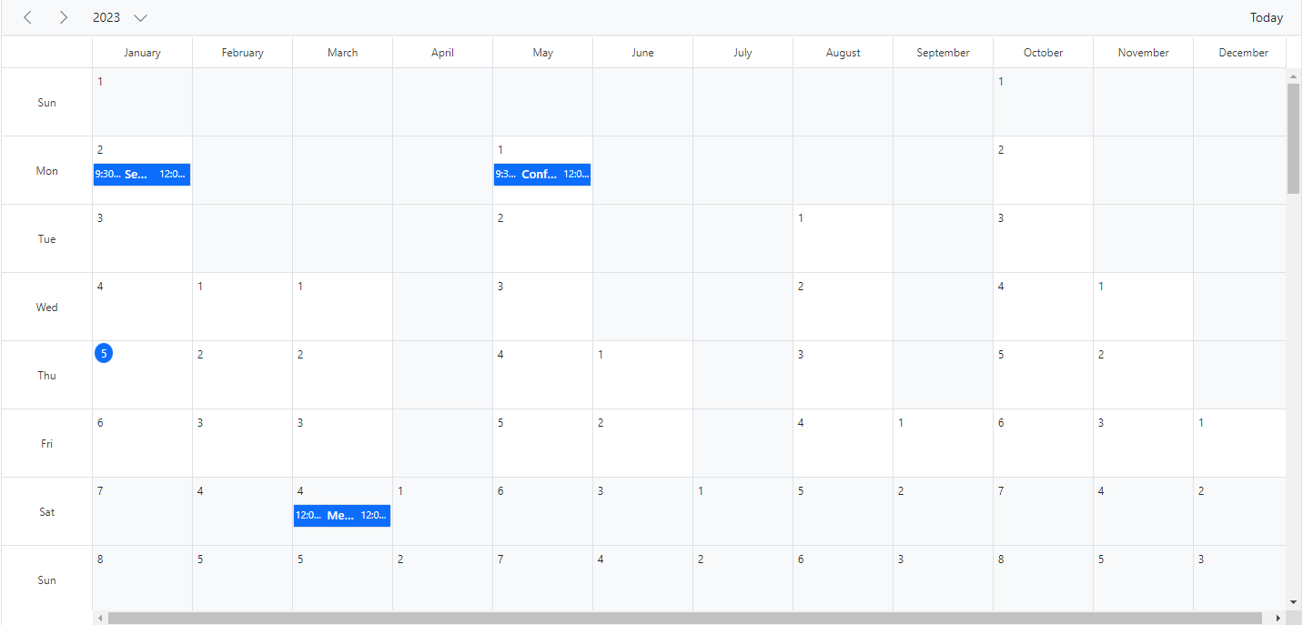
Resource grouping
The following code example depicts how to group the multiple resources on Timeline Year view and its relevant events are displayed accordingly under those resources.
import { NgModule } from '@angular/core'
import { BrowserModule } from '@angular/platform-browser'
import { ScheduleModule } from '@syncfusion/ej2-angular-schedule'
import { ButtonModule } from '@syncfusion/ej2-angular-buttons'
import { DayService, WeekService, WorkWeekService, MonthService, AgendaService, MonthAgendaService} from '@syncfusion/ej2-angular-schedule'


import { Component } from '@angular/core';
import { EventSettingsModel, TimelineYearService, GroupModel } from '@syncfusion/ej2-angular-schedule';
import { resourceData } from './datasource';

@Component({
imports: [

        ScheduleModule,
        ButtonModule
    ],

providers: [DayService,
                WeekService,
                WorkWeekService,
                MonthService,
                AgendaService,
                MonthAgendaService,
                TimelineYearService],
standalone: true,
  selector: 'app-root',
    // specifies the template string for the Schedule component
    template: `
    <ejs-schedule width="100%" height="550px" [selectedDate]="selectedDate" [views]="views"
      [eventSettings]="eventSettings">
      <e-views>
        <e-view option='TimelineYear' displayName='Horizontal Timeline Year' isSelected=true [group]="groupSettings"></e-view>
        <e-view option='TimelineYear' displayName='Vertical Timeline Year' orientation='Vertical' [group]="groupSettings"></e-view>
      </e-views>
      <e-resources>
        <e-resource field="OwnerId" title="Owner" name="Owners"
          [dataSource]="ownerDataSource" [allowMultiple]="allowMultipleOwner"
          textField="OwnerText" idField="Id" colorField="OwnerColor">
        </e-resource>
      </e-resources>
    </ejs-schedule>`
})
export class AppComponent {
    public selectedDate: Date = new Date(2018, 3, 1);
    public views: Array<string> = ['TimelineYear'];
    public eventSettings: EventSettingsModel = {
        dataSource: resourceData
    };
    public groupSettings: GroupModel = { resources: ['Owners'] };
    public allowMultipleOwner: Boolean = true;
    public ownerDataSource: Object[] = [
        { OwnerText: 'Nancy', Id: 1, OwnerColor: '#ffaa00' },
        { OwnerText: 'Steven', Id: 2, OwnerColor: '#f8a398' },
        { OwnerText: 'Michael', Id: 3, OwnerColor: '#7499e1' }
    ];
}
import { bootstrapApplication } from '@angular/platform-browser';
import { AppComponent } from './app.component';
bootstrapApplication(AppComponent).catch((err) => console.error(err));Auto row height
Timeline Year view supports Auto row height. When the feature rowAutoHeight is enabled, the row height gets auto-adjusted based on the number of overlapping events occupied in the same time range. If you disable the Auto row height, you have the + more text indicator on each day cell of a Timeline Year view, clicking on which will allow you to view the hidden appointments of a day.
import { NgModule } from '@angular/core'
import { BrowserModule } from '@angular/platform-browser'
import { ScheduleModule } from '@syncfusion/ej2-angular-schedule'
import { ButtonModule } from '@syncfusion/ej2-angular-buttons'
import { DayService, WeekService, WorkWeekService, MonthService, AgendaService, MonthAgendaService} from '@syncfusion/ej2-angular-schedule'


import { Component } from '@angular/core';
import { EventSettingsModel, TimelineYearService } from '@syncfusion/ej2-angular-schedule';
import { scheduleData } from './datasource';

@Component({
imports: [

        ScheduleModule,
        ButtonModule
    ],

providers: [DayService,
                WeekService,
                WorkWeekService,
                MonthService,
                AgendaService,
                MonthAgendaService,
                TimelineYearService],
standalone: true,
  selector: 'app-root',
  template: `<ejs-schedule width='100%' height='550px' [selectedDate]='selectedDate' [rowAutoHeight]='rowAutoHeight' [eventSettings]='eventSettings'>
  <e-views>
        <e-view option='TimelineYear' displayName='Horizontal Timeline Year' isSelected=true></e-view>
        <e-view option='TimelineYear' displayName='Vertical Timeline Year' orientation='Vertical'></e-view>
  </e-views>
  </ejs-schedule>`
})
export class AppComponent {
  public selectedDate: Date = new Date(2018, 5, 17);
  public rowAutoHeight: boolean = true;
  public eventSettings: EventSettingsModel = { dataSource: scheduleData };
}
import { bootstrapApplication } from '@angular/platform-browser';
import { AppComponent } from './app.component';
bootstrapApplication(AppComponent).catch((err) => console.error(err));Extending view intervals
It is possible to customize the number of days displayed on different Scheduler view modes. For example, a Day view can be extended to display 3 days by setting the interval option to 3 for the Day option within the views property, as depicted in the following code example. Similarly, you can display 2 weeks by setting interval to 2 for the Week option.
You can provide an alternative display name for such customized views on the Scheduler header bar by setting the appropriate displayName property.
import { NgModule } from '@angular/core'
import { BrowserModule } from '@angular/platform-browser'
import { ScheduleModule } from '@syncfusion/ej2-angular-schedule'
import { ButtonModule } from '@syncfusion/ej2-angular-buttons'
import { DayService, WeekService, WorkWeekService, MonthService, AgendaService, MonthAgendaService} from '@syncfusion/ej2-angular-schedule'


import { Component } from '@angular/core';
import { EventSettingsModel } from '@syncfusion/ej2-angular-schedule';
import { scheduleData } from './datasource';

@Component({
imports: [

        ScheduleModule,
        ButtonModule
    ],

providers: [DayService,
                WeekService,
                WorkWeekService,
                MonthService,
                AgendaService,
                MonthAgendaService],
standalone: true,
  selector: 'app-root',
  // specifies the template string for the Schedule component
  template: `<ejs-schedule width='100%' height='550px' currentView="Day" [selectedDate]="selectedDate" [eventSettings]="eventSettings" >
  <e-views>
        <e-view displayName='3 Days' option='Day' [interval]="dayInterval"></e-view>
        <e-view displayName='2 Weeks' option='Week' [isSelected]="isSelected" [interval]="weekInterval"></e-view>
  </e-views> </ejs-schedule>`
})
export class AppComponent {
    public selectedDate: Date = new Date(2018, 1, 15);
    public isSelected: Boolean = true;
    public dayInterval: number = 3;
    public weekInterval: number = 2;
    public eventSettings: EventSettingsModel = { dataSource: scheduleData };
}
import { bootstrapApplication } from '@angular/platform-browser';
import { AppComponent } from './app.component';
bootstrapApplication(AppComponent).catch((err) => console.error(err));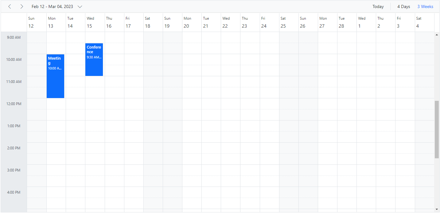
View intervals can be extended in all Scheduler views except Agenda and Month Agenda views.
See Also
You can refer to our Angular Scheduler feature tour page for its groundbreaking feature representations. You can also explore our Angular Scheduler example to knows how to present and manipulate data.