Cell Customization in Angular Scheduler
The Scheduler cells can be customized using a template or the renderCell event.
Setting cell dimensions in all views
The height and width of the Scheduler cells can be customized through the cssClass property, which overrides the default CSS applied to cells.
import { NgModule } from '@angular/core'
import { BrowserModule } from '@angular/platform-browser'
import { ScheduleModule } from '@syncfusion/ej2-angular-schedule'
import { ButtonModule } from '@syncfusion/ej2-angular-buttons'


import { Component, ViewChild, ViewEncapsulation } from '@angular/core';
import { ScheduleComponent, EventSettingsModel, ActionEventArgs, DayService, WeekService, WorkWeekService, MonthService, AgendaService,
    MonthAgendaService } from '@syncfusion/ej2-angular-schedule';
import { scheduleData } from './datasource';

@Component({
imports: [

        ScheduleModule,
        ButtonModule
    ],
standalone: true,
  selector: 'app-root',
  providers: [DayService, WeekService, WorkWeekService, MonthService, AgendaService,
    MonthAgendaService],
  // specifies the template string for the Schedule component
  template: `<ejs-schedule #scheduleObj width='100%' height='550px' cssClass='schedule-cell-dimension' [selectedDate]="selectedDate" [eventSettings]="eventSettings"> </ejs-schedule>`,
  styles: [`
  .schedule-cell-dimension.e-schedule .e-vertical-view .e-date-header-wrap table col,
.schedule-cell-dimension.e-schedule .e-vertical-view .e-content-wrap table col {
    width: 200px;
}

.schedule-cell-dimension.e-schedule .e-vertical-view .e-time-cells-wrap table td,
.schedule-cell-dimension.e-schedule .e-vertical-view .e-work-cells {
    height: 100px;
}

.schedule-cell-dimension.e-schedule .e-month-view .e-work-cells,
.schedule-cell-dimension.e-schedule .e-month-view .e-date-header-wrap table col {
    width: 200px;
}

.schedule-cell-dimension.e-schedule .e-month-view .e-work-cells {
    height: 200px;
}
`],
encapsulation: ViewEncapsulation.None
})
export class AppComponent {
    @ViewChild('scheduleObj', { static: true })
    public scheduleObj?: ScheduleComponent;
    public selectedDate: Date = new Date(2018, 1, 15);
    public eventSettings: EventSettingsModel = { dataSource: scheduleData };
 }
import { bootstrapApplication } from '@angular/platform-browser';
import { AppComponent } from './app.component';
bootstrapApplication(AppComponent).catch((err) => console.error(err));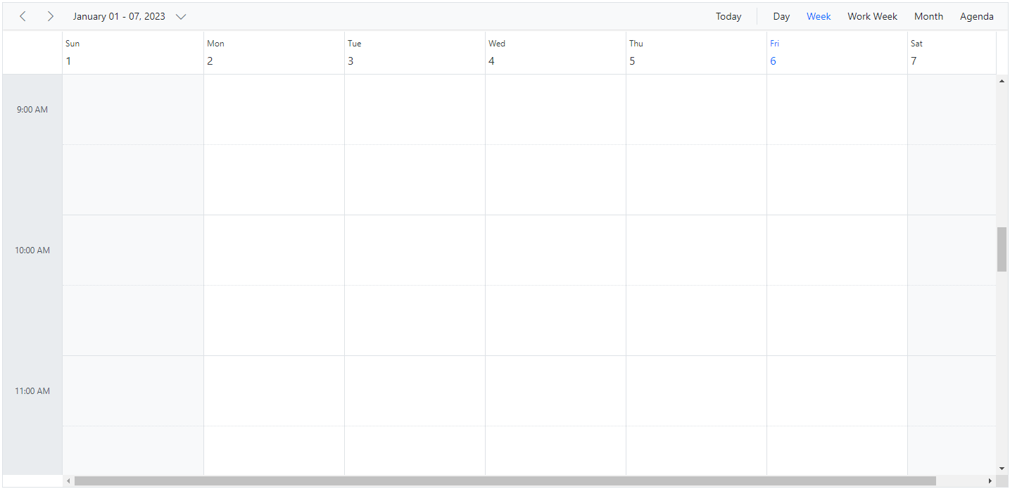
Check for cell availability
You can check whether the given time range slots are available for event creation or already occupied by other events using the isSlotAvailable method. In the following code example, if a specific time slot already contains an appointment, no more appointments can be added to that cell.
Note:
isSlotAvailablechecks appointments only within the current view’s date range. It does not evaluate recurrence occurrences outside that range.
import { NgModule } from '@angular/core'
import { BrowserModule } from '@angular/platform-browser'
import { ScheduleModule } from '@syncfusion/ej2-angular-schedule'
import { ButtonModule } from '@syncfusion/ej2-angular-buttons'


import { Component, ViewChild } from '@angular/core';
import { ScheduleComponent, EventSettingsModel, ActionEventArgs, DayService, WeekService, WorkWeekService, MonthService, EventFieldsMapping, AgendaService, MonthAgendaService } from '@syncfusion/ej2-angular-schedule';
import { scheduleData } from './datasource';

@Component({
imports: [

        ScheduleModule,
        ButtonModule
    ],
standalone: true,
  selector: 'app-root',
  providers: [DayService, WeekService, WorkWeekService, MonthService,AgendaService,
    MonthAgendaService],
  // specifies the template string for the Schedule component
  template: `<ejs-schedule #scheduleObj width='100%' height='550px' [selectedDate]="selectedDate" [eventSettings]="eventSettings" (actionBegin)="onActionBegin($event)" >
   <e-views> <e-view option="Day"></e-view> <e-view option="Week"></e-view> <e-view option="WorkWeek"></e-view> <e-view option="Month"></e-view></e-views> </ejs-schedule>`,
   styles: [`
#container {
  visibility: hidden;
}

#loader {
  color: #008cff;
  height: 40px;
  width: 30%;
  position: absolute;
  top: 45%;
  left: 45%;
}

.templatewrap {
  text-align: center;
  width: 100%;
}

.templatewrap img {
  width: 20px;
  height: 20px;
}

/* csslint ignore:start */
.schedule-cell-dimension.e-schedule .e-vertical-view .e-date-header-wrap table col,
.schedule-cell-dimension.e-schedule .e-vertical-view .e-content-wrap table col {
    width: 200px;
}

.schedule-cell-dimension.e-schedule .e-vertical-view .e-time-cells-wrap table th,
.schedule-cell-dimension.e-schedule .e-vertical-view .e-work-cells {
    height: 100px;
}

.schedule-cell-dimension.e-schedule .e-month-view .e-work-cells,
.schedule-cell-dimension.e-schedule .e-month-view .e-date-header-wrap table col {
    width: 200px;
}

.schedule-cell-dimension.e-schedule .e-month-view .e-work-cells {
    height: 200px;
}
/* csslint ignore:end */
`],
})
export class AppComponent {
  @ViewChild('scheduleObj')
  public scheduleObj?: ScheduleComponent;
  public selectedDate: Date = new Date(2018, 1, 15);
  public eventSettings: EventSettingsModel = { dataSource: scheduleData };
  public onActionBegin(args: ActionEventArgs): void {
    if (args.requestType === 'eventCreate' && (<Object[]>args.data).length > 0) {
    let eventData: { [key: string]: Object } = (<Object[]>args.data)[0] as { [key: string]: Object };
    let eventField: EventFieldsMapping = this.scheduleObj?.eventFields as EventFieldsMapping;
    let startDate: Date = eventData[eventField.startTime||''] as Date;
    let endDate: Date = eventData[eventField.endTime ||''] as Date;
    args.cancel = !this.scheduleObj?.isSlotAvailable(startDate, endDate); }
  }
}
import { bootstrapApplication } from '@angular/platform-browser';
import { AppComponent } from './app.component';
bootstrapApplication(AppComponent).catch((err) => console.error(err));Customizing cells in all views
It is possible to customize the appearance of cells using both template options and the renderCell event in all views.
Using template
The cellTemplate option accepts a template string and is used to customize the cell background with specific images or text for the given date values.
import { NgModule } from '@angular/core'
import { BrowserModule } from '@angular/platform-browser'
import { ScheduleModule } from '@syncfusion/ej2-angular-schedule'
import { ButtonModule } from '@syncfusion/ej2-angular-buttons'


import { Component, ViewEncapsulation } from '@angular/core';
import { View, DayService, WeekService, TimelineViewsService, MonthService, WorkWeekService, AgendaService, MonthAgendaService  } from '@syncfusion/ej2-angular-schedule';

@Component({
imports: [

        ScheduleModule,
        ButtonModule
    ],
standalone: true,
  selector: 'app-root',
  providers: [DayService, WeekService, TimelineViewsService, MonthService, WorkWeekService, AgendaService,
    MonthAgendaService ],
  // specifies the template string for the Schedule component
   template: `<ejs-schedule width='100%' height='550px' [selectedDate]="selectedDate" [(currentView)]="currentView" cssClass="schedule-cell-template">
    <ng-template #cellTemplate let-data>
      <div class="templatewrap" *ngIf="data.type == 'workCells'" [innerHTML]="getWorkCellText(data.date)"></div>
      <div class="templatewrap" *ngIf="data.type == 'monthCells'" [innerHTML]="getMonthCellText(data.date)"></div>
    </ng-template>
  </ejs-schedule>`,
  styles: [`
  .schedule-cell-template.e-schedule .e-month-view .e-work-cells {
    position: relative;
  }
  .templatewrap {
  text-align: center;
  /* In MONTH view the cell template is a SIBLING of event templates. So which is necessary to set the parent position relative and the child position absolute with 100% width */
  position: absolute;
  width: 100%;
}

.templatewrap img {
  width: 20px;
  height: 20px;
}
`],
  encapsulation: ViewEncapsulation.None
})
export class AppComponent {
    public selectedDate: Date = new Date(2017, 11, 16);
    public currentView: View = 'Week';
    getMonthCellText(date: Date): string {
      if (date.getMonth() === 10 && date.getDate() === 23) {
        return '<img src= "https://ej2.syncfusion.com/demos/src/schedule/images/birthday.svg" />';
      } else if (date.getMonth() === 11 && date.getDate() === 9) {
          return '<img src= "https://ej2.syncfusion.com/demos/src/schedule/images/get-together.svg" />';
      } else if (date.getMonth() === 11 && date.getDate() === 13) {
          return '<img src= "https://ej2.syncfusion.com/demos/src/schedule/images/birthday.svg" />';
      } else if (date.getMonth() === 11 && date.getDate() === 22) {
          return '<img src= "https://ej2.syncfusion.com/demos/src/schedule/images/thanksgiving-day.svg" />';
      } else if (date.getMonth() === 11 && date.getDate() === 24) {
          return '<img src="https://ej2.syncfusion.com/demos/src/schedule/images/christmas-eve.svg" />';
      } else if (date.getMonth() === 11 && date.getDate() === 25) {
          return '<img src= "https://ej2.syncfusion.com/demos/src/schedule/images/christmas.svg" />';
      } else if (date.getMonth() === 0 && date.getDate() === 1) {
          return '<img src= "https://ej2.syncfusion.com/demos/src/schedule/images/newyear.svg" />';
      } else if (date.getMonth() === 0 && date.getDate() === 14) {
          return '<img src= "https://ej2.syncfusion.com/demos/src/schedule/images/birthday.svg" />';
      }
      return '';
    }
    getWorkCellText(date: Date): string {
        let weekEnds: number[] = [0, 6];
        if (weekEnds.indexOf(date.getDay()) >= 0) {
            return "<img src='https://ej2.syncfusion.com/demos/src/schedule/images/newyear.svg' />";
        }
        return '';
    }
 }
import { bootstrapApplication } from '@angular/platform-browser';
import { AppComponent } from './app.component';
bootstrapApplication(AppComponent).catch((err) => console.error(err));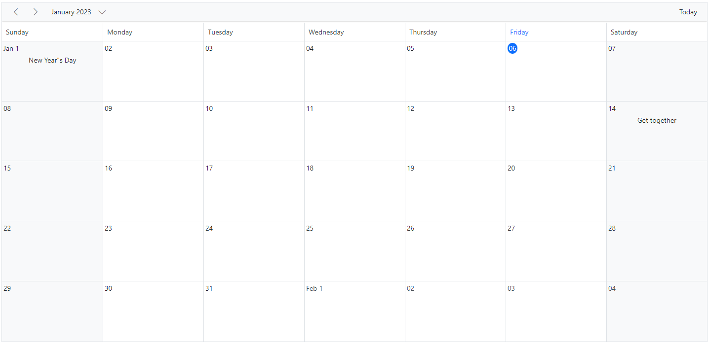
Using renderCell event
An alternative to cellTemplate is the renderCell event, which can also be used to customize cells with images or formatted text.
import { NgModule } from '@angular/core'
import { BrowserModule } from '@angular/platform-browser'
import { ScheduleModule } from '@syncfusion/ej2-angular-schedule'
import { ButtonModule } from '@syncfusion/ej2-angular-buttons'
import { DayService, WeekService, WorkWeekService, MonthService, AgendaService, MonthAgendaService} from '@syncfusion/ej2-angular-schedule'


import { Component, ViewEncapsulation } from '@angular/core';
import { EventSettingsModel, RenderCellEventArgs } from '@syncfusion/ej2-angular-schedule';
import { scheduleData } from './datasource';
import { createElement } from '@syncfusion/ej2-base';

@Component({
imports: [

        ScheduleModule,
        ButtonModule
    ],

providers: [DayService,
                WeekService,
                WorkWeekService,
                MonthService,
                AgendaService,
                MonthAgendaService],
standalone: true,
  selector: 'app-root',
  // specifies the template string for the Schedule component
  template: `<ejs-schedule width='100%' height='550px' currentView='Month' [selectedDate]="selectedDate" [eventSettings]="eventSettings" (renderCell)="onRenderCell($event)">
  <e-views> <e-view option="Day"></e-view> <e-view option="Week"></e-view> <e-view option="Month"></e-view> </e-views> </ejs-schedule>`,
  styleUrls: ['./index.css'],
  encapsulation: ViewEncapsulation.None
})
export class AppComponent {
  public selectedDate: Date = new Date(2018, 1, 14);
  public eventSettings: EventSettingsModel = { dataSource: scheduleData };
  onRenderCell(args: RenderCellEventArgs): void {
    if (args.elementType == 'workCells' || args.elementType == 'monthCells') {
      let weekEnds: number[] = [0, 6];
      if (args.date && weekEnds.indexOf((args.date).getDay()) >= 0) {
        let ele: HTMLElement = createElement('div', {
          innerHTML: "<img src='https://ej2.syncfusion.com/demos/src/schedule/images/newyear.svg' />",
          className: 'templatewrap'
        });
        (args.element).appendChild(ele);
      }
    }
  }
}
import { bootstrapApplication } from '@angular/platform-browser';
import { AppComponent } from './app.component';
bootstrapApplication(AppComponent).catch((err) => console.error(err));You can customize cells such as work cells, month cells, all-day cells, header cells, and resource header cells using the renderCell event by checking the elementType property within the event. You can check elementType against any of the following.
| Element type | Description |
|---|---|
| dateHeader | Triggers on header cell rendering. |
| monthDay | Triggers on header cell in month view rendering. |
| resourceHeader | Triggers on resource header cell rendering. |
| alldayCells | Triggers on all day cell rendering. |
| emptyCells | Triggers on empty cell rendering on header bar. |
| resourceGroupCells | Triggers on rendering of work cells for parent resource. |
| workCells | Triggers on work cell rendering. |
| monthCells | Triggers on month cell rendering. |
| majorSlot | Triggers on major time slot cell rendering. |
| minorSlot | Triggers on minor time slot cell rendering. |
| weekNumberCell | Triggers on cell displaying week number. |
Customizing cell header in month view
The month header of each date cell in month view can be customized using the cellHeaderTemplate option, which accepts a string or HTMLElement. The corresponding date can be accessed within the template.
import { NgModule } from '@angular/core'
import { BrowserModule } from '@angular/platform-browser'
import { ScheduleModule } from '@syncfusion/ej2-angular-schedule'
import { ButtonModule } from '@syncfusion/ej2-angular-buttons'
import { DayService, WeekService, WorkWeekService, MonthService, AgendaService, MonthAgendaService} from '@syncfusion/ej2-angular-schedule'


import { Component, ViewEncapsulation } from '@angular/core';
import { Internationalization } from '@syncfusion/ej2-base';
import { View,  } from '@syncfusion/ej2-angular-schedule';

@Component({
imports: [

        ScheduleModule,
        ButtonModule
    ],

providers: [DayService,
                WeekService,
                WorkWeekService,
                MonthService,
                AgendaService,
                MonthAgendaService],
standalone: true,
  selector: 'app-root',
  // specifies the template string for the Schedule component
   template: `<ejs-schedule width='100%' height='550px' cssClass="schedule-cell-header-template">
    <ng-template #cellHeaderTemplate let-data>
      <div class="date-text"></div>
    </ng-template>
    <e-views>
      <e-view option='Month'></e-view>
    </e-views>
  </ejs-schedule>`,
  encapsulation: ViewEncapsulation.None
})
export class AppComponent {
  public instance: Internationalization = new Internationalization();
  getDateHeaderText: Function = (value: Date) => {
    return this.instance.formatDate(value, { skeleton: "Ed" });
  };
}
import { bootstrapApplication } from '@angular/platform-browser';
import { AppComponent } from './app.component';
bootstrapApplication(AppComponent).catch((err) => console.error(err));Customizing the minimum and maximum date values
Providing the minDate and maxDate properties with date values allows the Scheduler to set the minimum and maximum date range. Dates beyond this range are disabled, and date navigation is blocked beyond the specified range.
import { NgModule } from '@angular/core'
import { BrowserModule } from '@angular/platform-browser'
import { ScheduleModule } from '@syncfusion/ej2-angular-schedule'
import { ButtonModule } from '@syncfusion/ej2-angular-buttons'
import { DayService, WeekService, WorkWeekService, MonthService, AgendaService, MonthAgendaService} from '@syncfusion/ej2-angular-schedule'


import { Component } from '@angular/core';
import { View, EventSettingsModel } from '@syncfusion/ej2-angular-schedule';
import { scheduleData } from './datasource';

@Component({
imports: [

        ScheduleModule,
        ButtonModule
    ],

providers: [DayService,
                WeekService,
                WorkWeekService,
                MonthService,
                AgendaService,
                MonthAgendaService],
standalone: true,
  selector: 'app-root',
  template: `<ejs-schedule width='100%' height='550px' [selectedDate]='selectedDate' [minDate]='minDate' [maxDate]='maxDate' [currentView]='currentView' [eventSettings]='eventSettings'></ejs-schedule>`
})
export class AppComponent {
  public selectedDate: Date = new Date(2018, 1, 17);
  public minDate: Date = new Date(2017, 4, 17);
  public maxDate: Date = new Date(2018, 8, 17);
  public eventSettings: EventSettingsModel = { dataSource: scheduleData };
  public currentView: View = 'Month';
}
import { bootstrapApplication } from '@angular/platform-browser';
import { AppComponent } from './app.component';
bootstrapApplication(AppComponent).catch((err) => console.error(err));By default, the
minDateproperty value is set to new Date(1900, 0, 1), and themaxDateproperty value is set to new Date(2099, 11, 31). Users can also set customminDateandmaxDateproperty values.
Customizing the weekend cells background color
You can customize the background color of weekend cells by using the renderCell event and checking the elementType option within the event.
public onRenderCell(args: RenderCellEventArgs): void {
    if (args.elementType == "workCells") {
      if (args.date) {
        if (args.date.getDay() === 6) {
          (args.element as any).style.background = '#ffdea2';
        }
        if (args.date.getDay() === 0) {
          (args.element as any).style.background = '#ffdea2';
        }
      }
    }
}
You can also change the background color for weekend cells in Month view through the cssClass property, which overrides the default CSS applied to cells.
.schedule-cell-customization.e-schedule .e-month-view .e-work-cells:not(.e-work-days) {
    background-color: #f08080;
}import { NgModule } from '@angular/core'
import { BrowserModule } from '@angular/platform-browser'
import { Component, ViewEncapsulation } from '@angular/core';
import {
EventSettingsModel, View, RenderCellEventArgs, DayService, WeekService, WorkWeekService,
MonthService, AgendaService, ResizeService, DragAndDropService, ScheduleModule
} from '@syncfusion/ej2-angular-schedule';
import { defaultData } from './datasource';
@Component({
imports: [
ScheduleModule
],
standalone: true,
selector: 'app-root',
providers: [DayService, WeekService, WorkWeekService, MonthService, AgendaService, ResizeService, DragAndDropService],
// specifies the template string for the Schedule component
template: `<ejs-schedule width='100%' height='650px' cssClass='schedule-cell-customization' [selectedDate]="selectedDate" [eventSettings]="eventSettings"
[(currentView)]="currentView" (renderCell)="onRenderCell($event)"></ejs-schedule>`,
styles: [
`.schedule-cell-customization.e-schedule .e-month-view .e-work-cells:not(.e-work-days) {
background-color: #f08080;
}`
],
encapsulation: ViewEncapsulation.None
})
export class AppComponent {
public selectedDate: Date = new Date(2021, 1, 15);
public eventSettings: EventSettingsModel = { dataSource: defaultData };
public currentView: View = 'Week';
public onRenderCell(args: RenderCellEventArgs): void {
if (args.elementType == "workCells") {
// To change the color of weekend columns in week view
if (args.date) {
if (args.date.getDay() === 6) {
(args.element as any).style.background = '#ffdea2';
}
if (args.date.getDay() === 0) {
(args.element as any).style.background = '#ffdea2';
}
}
}
}
}import { bootstrapApplication } from '@angular/platform-browser';
import { AppComponent } from './app.component';
bootstrapApplication(AppComponent).catch((err) => console.error(err));How to disable multiple cell and row selection in Schedule
By default, the allowMultiCellSelection property of the Scheduler is set to true. So, the Scheduler allows users to select multiple cells and rows. If users want to disable multiple cell and row selection, they can set this property to false.
You can refer to our Angular Scheduler feature tour page for its feature overview. You can also explore our Angular Scheduler example to learn how to present and manipulate data.