Typography Blocks in Blazor Block Editor Component
18 Nov 20186 minutes to read
Typography blocks are essential for organizing and presenting text-based content. The Block Editor component supports various structural blocks—such as Paragraph, Heading, Collapsible (CollapsibleParagraph and CollapsibleHeading), Divider, Quote, and Callout—to help you format and structure content effectively.
Configure paragraph block
Paragraph blocks are the most common type, used for standard text content. They serve as the default block type and provide basic text formatting options. To render a Paragraph block, set the BlockType property to Paragraph.
BlockType
// Adding paragraph block
    new BlockModel
    {
        BlockType = BlockType.Paragraph,
        Content = {new ContentModel{ContentType = ContentType.Text, Content = "This is a paragraph block example."}}
    }
The below sample demonstrates the configuration of paragraph block in the Block Editor.
@using Syncfusion.Blazor.BlockEditor

<SfBlockEditor Blocks="BlockData"></SfBlockEditor>

@code {
    private List<BlockModel> BlockData = new()
    {
        new BlockModel
        {
            BlockType = BlockType.Paragraph,
            Content = new() {new ContentModel{ContentType = ContentType.Text, Content = "This is a paragraph block example."}}
        }
    };
}
Configure placeholder
You can configure placeholder text for block using the Placeholder property. This text appears when the block is empty. The default placeholder for the paragraph block is Write something or ‘/’ for commands..
BlockType and Properties
// Adding placeholder
    new BlockModel
    {
        BlockType = BlockType.Paragraph,
        Properties = new ParagraphBlockSettings {Placeholder = "Start typing..."}
    }
The below sample demonstrates the configuration of placeholder in the Block Editor for the paragraph block.
@using Syncfusion.Blazor.BlockEditor

<SfBlockEditor Blocks="@BlockData"></SfBlockEditor>

@code {
    private List<BlockModel> BlockData = new()
    {
        new BlockModel
        {
            BlockType = BlockType.Paragraph,
            Content = new() {new ContentModel{ContentType = ContentType.Text, Content = "This is a sample paragraph block."}}
        },
        new BlockModel
        {
            BlockType = BlockType.Paragraph,
            Properties = new ParagraphBlockSettings { Placeholder = "Start typing your notes or press \" /\" for commands..." }
        },
    };
}
Configure heading block
Heading blocks create document titles and section headers. These blocks help structure content hierarchically, making it easier to read and navigate. Render a Heading block by setting the BlockType property to Heading.
Configuring levels
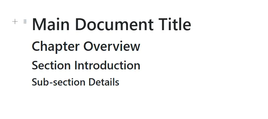
Set the heading level using the Level property, with 1 being the highest level (title) and 4 being the lowest (subsection).
BlockType and Properties
//Adding Heading block
    new BlockModel
    {
        BlockType = BlockType.Heading,
        Properties = new HeadingBlockSettings { Level = 1}
    }
The following sample demonstrates the configuration of a heading block in the Block Editor.
@using Syncfusion.Blazor.BlockEditor

<SfBlockEditor Blocks="@BlockData"></SfBlockEditor>

@code {
    private List<BlockModel> BlockData = new()
    {
        new BlockModel
        {
            BlockType = BlockType.Heading,
            Properties = new HeadingBlockSettings { Level = 1},
            Content = new() {new ContentModel{ContentType = ContentType.Text, Content = "Main Document Title"}}
        },
        new BlockModel
        {
            BlockType = BlockType.Heading,
            Properties = new HeadingBlockSettings { Level = 2},
            Content = new() {new ContentModel{ContentType = ContentType.Text, Content = "Chapter Overview"}}
        },
        new BlockModel
        {
            BlockType = BlockType.Heading,
            Properties = new HeadingBlockSettings { Level = 3},
            Content = new() {new ContentModel{ContentType = ContentType.Text, Content = "Section Introduction"}}
        },
        new BlockModel
        {
            BlockType = BlockType.Heading,
            Properties = new HeadingBlockSettings { Level = 4},
            Content = new() {new ContentModel{ContentType = ContentType.Text, Content = "Sub-section Details"}}
        },
    };
}
Configure placeholder
You can configure placeholder text for block using the Placeholder property. This text appears when the block is empty. The default placeholder for heading block is Heading{level}.
//Adding Placeholder value to blocktype
    new BlockModel
    {
        BlockType = BlockType.Heading,
        Properties = new HeadingBlockSettings { Level = 1, Placeholder = "Heading1" }
    }
Configure divider block
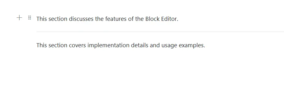
A Divider block inserts a horizontal line to separate content. Render it by setting the BlockType to Divider.
This sample shows how to place a divider between two blocks.
@using Syncfusion.Blazor.BlockEditor

<SfBlockEditor Blocks="@BlockData"></SfBlockEditor>

@code {
    private List<BlockModel> BlockData = new()
    {
        new BlockModel
        {
            BlockType = BlockType.Paragraph,
            Content = new() {new ContentModel{ContentType = ContentType.Text, Content = "This section discusses the features of the Block Editor."}}
        },
        new BlockModel
        {
          BlockType = BlockType.Divider
        },
        new BlockModel
        {
            BlockType = BlockType.Paragraph,
            Content = new() {new ContentModel{ContentType = ContentType.Text, Content = "This section covers implementation details and usage examples."}}
        }
    };
}