Style and Appearance in Blazor Block Editor Component
18 Nov 201810 minutes to read
The Block Editor component provides several properties to customize its visual appearance, allowing control over dimensions, styling, and behavior.
Setting width and height
Specify the width and height for the Block Editor component using the Width and Height properties.
@using Syncfusion.Blazor.BlockEditor

<SfBlockEditor Width="100%" Height="80vh"></SfBlockEditor>

@* Or with specific pixel values *@
<SfBlockEditor Width="800px" Height="500px"></SfBlockEditor>
Setting read-only mode
Use the ReadOnly property to control whether the editor is in read-only mode. When set to true, users cannot edit the content but can still view it. This is useful for displaying finalized documents, creating preview modes, or implementing approval workflows where content should be visible but not editable.
@using Syncfusion.Blazor.BlockEditor

<SfBlockEditor ReadOnly="true"></SfBlockEditor>
Customization using CSS class
Use the CssClass property to customize the appearance of the Block Editor component with custom styles.
@using Syncfusion.Blazor.BlockEditor

<SfBlockEditor Width="600px" Height="400px" CssClass="custom-editor-theme"></SfBlockEditor>
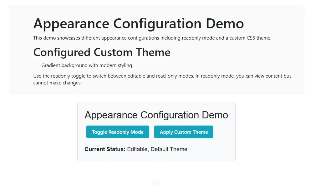
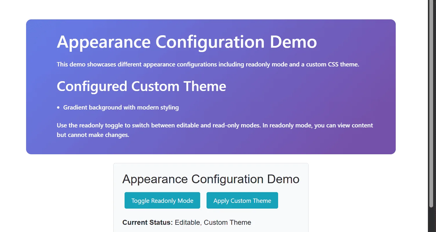
The following example demonstrates the usage of ReadOnly and CssClass properties.
@using Syncfusion.Blazor.BlockEditor
@using Syncfusion.Blazor.Buttons

<div id="container">
    <SfBlockEditor @ref="BlockEditorRef"
                   CssClass="@CssClasses"
                   ReadOnly="@IsReadonly"
                   Blocks="@Blocks"
                   Focus="OnEditorFocus"
                   Blur="OnEditorBlur">
    </SfBlockEditor>

    <div id="controls">
        <h3>Appearance Configuration Demo</h3>
        <div class="button-group">
            <SfButton @onclick="ToggleReadonly">Toggle Readonly Mode</SfButton>
            <SfButton @onclick="ApplyCustomTheme">Apply Custom Theme</SfButton>
        </div>

        <div id="statusText" style="margin-top: 10px;">
            <strong>Current Status: </strong>@StatusMessage
        </div>
    </div>

    <div id="output">@OutputMessage</div>
</div>

@code {
    private SfBlockEditor? BlockEditorRef;
    private bool IsReadonly { get; set; } = false;
    private string CurrentTheme { get; set; } = "default";
    private string StatusMessage { get; set; } = "Editable, Default Theme";
    private string OutputMessage { get; set; } = "";
    private string CssClasses => $"{CurrentTheme} {(IsReadonly ? "readonly-mode" : "")}".Trim();

    private List<BlockModel> Blocks => new List<BlockModel>
    {
        new BlockModel
        {
            BlockType = BlockType.Heading,
            Properties = new HeadingBlockSettings { Level = 1 },
            Content = new List<ContentModel>
            {
                new ContentModel { ContentType = ContentType.Text, Content = "Appearance Configuration Demo" }
            }
        },
        new BlockModel
        {
            BlockType = BlockType.Paragraph,
            Content = new List<ContentModel>
            {
                new ContentModel { ContentType = ContentType.Text, Content = "This demo showcases different appearance configurations including read-only mode and a custom CSS theme." }
            }
        },
        new BlockModel
        {
            BlockType = BlockType.Heading,
            Properties = new HeadingBlockSettings { Level = 2 },
            Content = new List<ContentModel>
            {
                new ContentModel { ContentType = ContentType.Text, Content = "Configured Custom Theme" }
            }
        },
        new BlockModel
        {
            BlockType = BlockType.BulletList,
            Content = new List<ContentModel>
            {
                new ContentModel { ContentType = ContentType.Text, Content = "Gradient background with modern styling" }
            }
        },
        new BlockModel
        {
            BlockType = BlockType.Paragraph,
            Content = new List<ContentModel>
            {
                new ContentModel
                {
                    ContentType = ContentType.Text,
                    Content = "Use the read-only toggle to switch between editable and read-only modes. In read-only mode, content can be viewed but not modified."
                }
            }
        }
    };

    private void ToggleReadonly()
    {
        IsReadonly = !IsReadonly;
        UpdateStatus();
        DisplayOutput($"Read-only mode {(IsReadonly ? "enabled" : "disabled")}. {(IsReadonly ? "Content is now view-only." : "Content is now editable.")}");
    }

    private void ApplyCustomTheme()
    {
        CurrentTheme = "custom-theme";
        UpdateStatus();
        DisplayOutput("Custom theme applied. The editor now features a gradient background with modern styling and hover effects.");
    }

    private void OnEditorFocus()
    {
        DisplayOutput("Editor focused. Content editing is now active.");
    }

    private void OnEditorBlur()
    {
        DisplayOutput("Editor lost focus.");
    }

    protected override void OnInitialized()
    {
        UpdateStatus();
    }

    private void UpdateStatus()
    {
        string mode = IsReadonly ? "Read-Only" : "Editable";
        string theme = CurrentTheme == "default" ? "Default" : "Custom";
        StatusMessage = $"{mode}, {theme} Theme";
    }

    private void DisplayOutput(string msg)
    {
        OutputMessage = msg;
        StateHasChanged();
    }
}

<style>
    #container {
        margin: 50px;
        gap: 20px;
        display: flex;
        flex-direction: column;
        align-items: center;
    }

    #controls {
        margin-bottom: 20px;
        padding: 20px;
        border: 1px solid #ddd;
        border-radius: 5px;
        background-color: #f8f9fa;
    }

    .button-group {
        margin-bottom: 15px;
    }

    .button-group button {
        margin: 5px;
        padding: 8px 16px;
        background-color: #17a2b8;
        color: white;
        border: none;
        border-radius: 4px;
        cursor: pointer;
    }

    .button-group button:hover {
        background-color: #138496;
    }

    .status-info {
        padding: 10px;
        background-color: #d1ecf1;
        border-left: 4px solid #17a2b8;
        border-radius: 4px;
    }

    .status-info p {
        margin: 0;
        color: #0c5460;
    }

    #output {
        margin-top: 15px;
        padding: 10px;
        background-color: #f8f9fa;
        border-radius: 4px;
        min-height: 50px;
        font-family: monospace;
        white-space: pre-wrap;
    }

    /* Custom Theme CSS Class */
    .custom-theme {
        background: linear-gradient(135deg, #667eea 0%, #764ba2 100%);
        border-radius: 12px;
    }

    .custom-theme .e-block {
        border-radius: 8px;
        margin-bottom: 10px;
        backdrop-filter: blur(10px);
    }

    .custom-theme .e-block:hover {
        transform: translateY(-2px);
        transition: all 0.3s ease;
    }

    .custom-theme .e-block-content,
    .custom-theme .e-floating-icon {
        color: #fff;
        font-weight: 500;
    }

    /* Readonly Mode Styling */
    .readonly-mode {
        opacity: 0.8;
        cursor: not-allowed;
    }

    .readonly-mode .e-block-content {
        color: #6c757d;
    }

    .custom-theme.readonly-mode .e-block-content {
        color: #101111;
    }
</style>