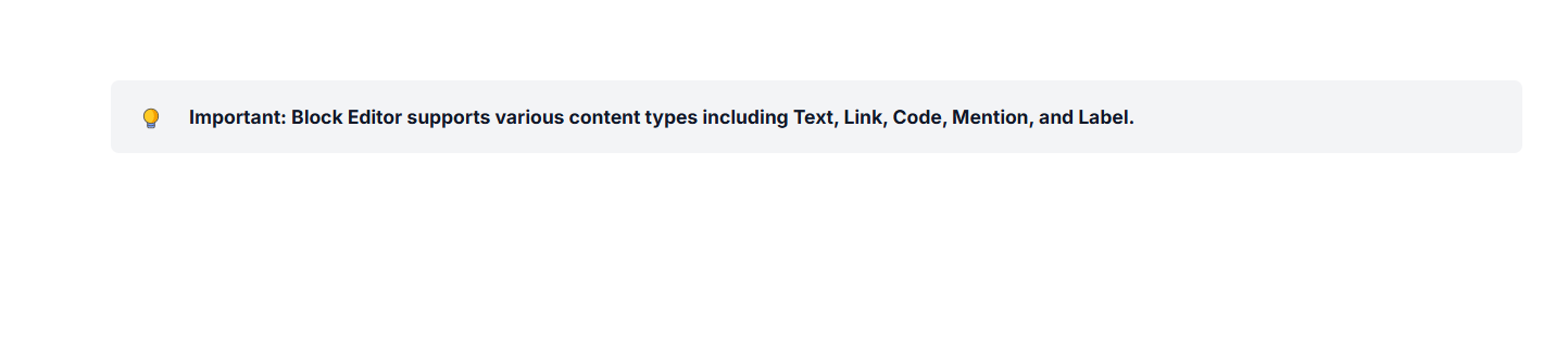
Nested blocks in ASP.NET MVC Block Editor control
18 Nov 201824 minutes to read
Configure children
The Block Editor supports hierarchical content structures through the children property. This property can be achieved through properties property that allows you to create nested blocks, which is applicable only for Callout and Collapsible blocks.
Child blocks can be configured with all the same properties as top-level blocks.
Configure parent id
To establish a clear parent-child relationship, the parentId in the properties of each child block must match the id of its parent block.
This structure is essential for maintaining nested relationships within the editor.
Configure collapsible blocks
You can render Collapsible blocks by setting the blockType property as CollapsibleParagraph or CollapsibleHeading. Collapsible blocks allow users to expand or collapse sections, providing a way to hide or show content as needed.
Configure levels
You can configure the CollapsibleHeading using the property level inside the properties property . The levels can be varied from level: 1 to level: 4.
Configure expanded state
You can control whether a block is expanded or collapsed using the isExpanded in the properties property. By default, this property is set to false, meaning the block will be collapsed initially. This setting is only applicable to Collapsible blocks.
Block type & properties
    // Configuring CollapsibleHeading block
    new BlockModel
    {
        blockType = "CollapsibleHeading",
        properties = new
        {
                level=1,
                isExpanded = true,
                children = new List<BlockModel>(){
                    // your actions
                }
        }
    },
    // Configuring CollapsibleParagraph block
    new BlockModel
    {
        blockType = "CollapsibleParagraph",
        properties = new
        {
                isExpanded = false,
                children = new List<BlockModel>()
                {
                    // your actions
                }
        }
        }
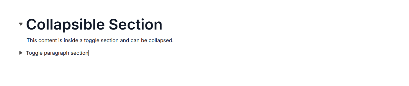
The below sample demonstrates the configuration of CollapsibleParagraph and CollapsibleHeading blocks in the Block Editor.
@using Syncfusion.EJ2.BlockEditor

<div id='blockeditor-container'>
    @Html.EJS().BlockEditor("block-editor").Blocks((List<BlockModel>)ViewBag["BlocksData"]).Render()
</div>

<style>
    #blockeditor-container {
       margin: 20px auto;
    }
</style>
using Syncfusion.EJ2.BlockEditor;
public List<BlockModel> BlocksData { get; set; } = new List<BlockModel>();
public class BlockModel
{
public string id { get; set; }
public string blockType { get; set; }
public object properties { get; set; }
public List<object> content { get; set; }
}
public ActionResult Toggle()
{
BlocksData.Add(new BlockModel
{
blockType = "CollapsibleHeading",
content = new List<object>()
{
new
{
contentType = "Text",
content = "Collapsible Section"
}
},
properties = new
{
level=1,
isExpanded = true,
children = new List<BlockModel>()
{
new BlockModel()
{
blockType = "Paragraph",
content = new List<object>()
{
new
{
contentType = "Text",
content = "This content is inside a toggle section and can be collapsed."
}
}
}
}
}
});
BlocksData.Add(new BlockModel
{
blockType = "CollapsibleParagraph",
content = new List<object>()
{
new
{
contentType = "Text",
content = "Toggle paragraph section"
}
},
properties = new
{
isExpanded = false,
children = new List<BlockModel>()
{
new BlockModel()
{
blockType = "Paragraph",
content = new List<object>()
{
new
{
contentType = "Text",
content = "This content is initially hidden because isExpanded is set to false."
}
}
}
}
}
});
ViewBag.BlocksData = BlocksData;
return View();
}
Configure placeholder
You can configure placeholder text for block using the placeholder in the properties property. This text appears when the block is empty. The default placeholder for collapsible heading and collapsible paragraph is Collapsible Heading{level} and Collapsible Paragraph respectively.
    // Configuring CollapsibleHeading block
    new BlockModel
    {
        blockType = "CollapsibleHeading",
        properties = new
        {
                level=1,
                isExpanded = true,
                placeholder = "collapsible heading"
        }
    },
    // Configuring CollapsibleParagraph block
    new BlockModel
    {
        blockType = "CollapsibleParagraph",
        properties = new
        {
                isExpanded = false,
                placeholder = "collapsible paragraph"
        }
        }
Configure quote block
You can render Quote blocks by setting the blockType property as Quote. Quote blocks are specially styled for quotations or excerpts.
Block type & properties
// Adding Quote block
{
    blockType = "Quote",
    properties = new {
    children = new List<BlockModel>()
    {
        new BlockModel()
        {
                blockType = "Paragraph",
                content = new List<object>(){
                    new{
                        contentType = "Text",
                        content = ""
                    }
                }
        }
    }
    }
}
The below sample demonstrates the configuration of quote block in the Block Editor.
@using Syncfusion.EJ2.BlockEditor

<div id='blockeditor-container'>
    @Html.EJS().BlockEditor("block-editor").Blocks((List<BlockModel>)ViewBag["BlocksData"]).Render()
</div>

<style>
    #blockeditor-container {
       margin: 20px auto;
    }
</style>
using Syncfusion.EJ2.BlockEditor;
public List<BlockModel> BlocksData { get; set; } = new List<BlockModel>();
public class BlockModel
{
public string id { get; set; }
public string blockType { get; set; }
public object properties { get; set; }
public List<object> content { get; set; }
public List<BlockModel> children { get; set; }
}
public ActionResult Quote()
{
BlocksData.Add(new BlockModel
{
blockType = "Quote",
,
properties = new {
children = new List<BlockModel>()
{
new BlockModel()
{
blockType = "Paragraph",
content = new List<object>
{
new
{
contentType = "Text",
content = "The greatest glory in living lies not in never falling, but in rising every time we fall."
}
}
}
}
}
});
ViewBag.BlocksData = BlocksData;
return View();
}
Configure callout block
You can render Callout blocks by setting the blockType property as Callout. They’re useful for notes, warnings, or tips that require special attention.
Block type & properties
// Adding callout block
  {
    blockType = "Callout",
    properties = new {
    children = new List<BlockModel>()
    {
            new BlockModel()
            {
                    blockType = "Paragraph",
                    content = new List<object>(){
                            new{
                                    contentType = "Text",
                                    content = "Important information: This is a callout block used to highlight important content"
                            }
                    }
            }
    }
    }
  }
The below sample demonstrates the configuration of callout block in the Block Editor.
@using Syncfusion.EJ2.BlockEditor

<div id='blockeditor-container'>
    @Html.EJS().BlockEditor("block-editor").Blocks((List<BlockModel>)ViewBag["BlocksData"]).Render()
</div>

<style>
    #blockeditor-container {
       margin: 20px auto;
    }
</style>
using Syncfusion.EJ2.BlockEditor;
public List<BlockModel> BlocksData { get; set; } = new List<BlockModel>();
public class BlockModel
{
public string id { get; set; }
public string blockType { get; set; }
public object properties { get; set; }
public List<object> content { get; set; }
public List<BlockModel> children { get; set; }
}
public ActionResult Callout()
{
BlocksData.Add(new BlockModel() {
blockType = "Callout",
properties = new {
children = new List<BlockModel>()
{
new BlockModel()
{
id = "callout-content-1",
blockType = "Paragraph",
content = new List<object>(){
new{
id = "callout-content-1",
contentType = "Text",
content = "Important information: This is a callout block used to highlight important content."
}
}
}
}
}
});
ViewBag.BlocksData = BlocksData;
return View();
}