Getting Started
11 Jan 20171 minute to read
Using the following steps, you can create a React ToggleButton component. The basic rendering of React ToggleButton can be achieved with default functionality.
Create an ToggleButton
You can create a React application and add necessary scripts and styles with the help of the given React Getting Started Documentation.
Create a JSX file for rendering ToggleButton component using <EJ.ToggleButton> syntax. Add required properties to it in <EJ.ToggleButton> tag element
ReactDOM.render(
        <EJ.ToggleButton>
        </EJ.ToggleButton>,
        document.getElementById('togglebtn')
    );
Define an HTML element for adding ToggleButton in the application and refer the JSX file created.
<div id="togglebtn"></div>
    <script type="text/babel" src="sample.jsx">
This will render an empty ToggleButton component on executing.
Configure Properties
In the JSX, need to declare the ToggleButton properties. Refer to the following code,
ReactDOM.render(
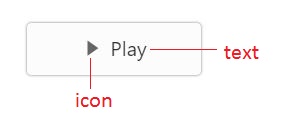
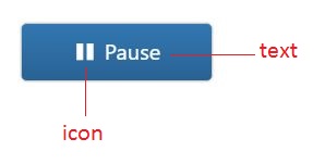
<EJ.ToggleButton id="togglebtn" ejHtmlAttributes= size={ej.ButtonSize.Large} showRoundedCorner={true} contentType={ej.ContentType.TextAndImage} defaultPrefixIcon="e-icon e-mediaplay" activePrefixIcon="e-icon e-mediapause" defaultText="Play" activeText="Pause"></EJ.ToggleButton>,
document.getElementById('togglebtn')
);Run the above code to render the following output,
Note: You can find the ToggleButton properties from the API reference document.