How can I help you?
Getting Started with ReactJS Ribbon
This section explains briefly how to create a Ribbon.
Script & CSS Reference
The Ribbon control has the following list of external JavaScript dependencies.
-
jQuery1.7.1 and later versions
The required ReactJS script dependencies as follows. And you can also refer React to know more about react js.
-
react.min.js- https://cdn.syncfusion.com/js/assets/external/react.min.js -
react-dom.min.js- https://cdn.syncfusion.com/js/assets/external/react-dom.min.js -
ej.web.react.min.js- https://cdn.syncfusion.com/33.1.44/js/common/ej.web.react.min.js
To translate JSX to plain JavaScript, we must use <script type=”text/babel”> and refer the browser.min.js file to perform the transformation in the browser.
To get started, you can use the ej.web.all.min.js file that encapsulates all the ej controls and frameworks in one single file. So the complete boilerplate code is
<!DOCTYPE html>
    <html>
    <head>
    <meta name="viewport" content="width=device-width, initial-scale=1.0">
    <meta name="description" content="Essential Studio for JavaScript">
    <meta name="author" content="Syncfusion">
    <title>Getting Started for Ribbon React JS</title>
    <!-- Essential Studio for JavaScript  theme reference -->
    <link href="http://cdn.syncfusion.com/33.1.44/js/web/flat-azure/ej.web.all.min.css" rel="stylesheet" />
    <!-- Essential Studio for JavaScript  script references -->
    <script src="http://cdn.syncfusion.com/js/assets/external/react.min.js"></script>
    <script src="http://cdn.syncfusion.com/js/assets/external/react-dom.min.js"></script>
    <script src="https://cdnjs.cloudflare.com/ajax/libs/babel-core/5.8.34/browser.min.js"></script>
    <script src="http://cdn.syncfusion.com/js/assets/external/jquery-3.0.0.min.js"></script>
    <script src="http://cdn.syncfusion.com/33.1.44/js/web/ej.web.all.min.js"></script>
    <script src="http://cdn.syncfusion.com/33.1.44/js/common/ej.web.react.min.js"></script>
    <!-- Add your custom scripts here -->
    </head>
    <body>
    </body>
    </html>
NOTE
- In production, we highly recommend you to use our
custom script generatorto create custom script file with required controls and its dependencies only. Also to reduce the file size further please useGZip compressionin your server.- For themes, you can use the
ej.web.all.min.cssCDN link from the code snippet given. To add the themes in your application, please refer tothis link.
NOTE
Ribbon’s sample level icons can be loaded using ej.icons.CSS from the location “/Content/ej/themes/ribbon-css”.
Control Initialization
Control can be initialized in two ways.
- Using jsx Template
- Without using jsx Template
Using jsx Template
By using the jsx template, we can create the html file and jsx file. The .jsx file can be convert to .js file and it can be referred in html page.
Please refer to the code of HTML file.
<div id="ribbon-default"></div>
<script src="app/ribbon/default.js"></script>
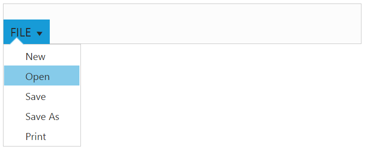
<ul id="ribbonmenu1">
<li><a>FILE</a>
<ul>
<li><a>New</a></li>
<li><a>Open</a></li>
<li><a>Save</a></li>
<li><a>Save As</a></li>
<li><a>Print</a></li>
</ul>
</li>
</ul>Ribbon control can be initialized with the following in HTML document.
ReactDOM.render(
        <EJ.Ribbon width="50%" applicationTab-type="menu" applicationTab-menuItemID="ribbonmenu1">
        </EJ.Ribbon>,
        document.getElementById('ribbon-default')
    );
NOTE
Set the required width to Ribbon, else default parent container or window width will be considered.
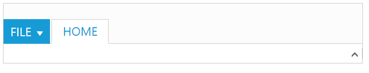
Adding Tabs
Tab is a set of related groups which are combined into single item. For creating tab, id and text properties should be specified.
<div id="ribbon-default"></div>
    <script src="app/ribbon/default.js"></script>
    <ul id="ribbonmenu1">
        <li><a>FILE</a>
            <ul>
                <li><a>New</a></li>
                <li><a>Open</a></li>
                <li><a>Save</a></li>
                <li><a>Save As</a></li>
                <li><a>Print</a></li>
            </ul>
        </li>
    </ul>
Configure the tabs bind value tab in ReactJS view-model as shown in the following code.
ReactDOM.render(
        <EJ.Ribbon width="50%" applicationtab-type="menu" applicationtab-menuitemid="ribbonmenu1">
            <tabs>
                <tab id="home" text="HOME"></tab>
            </tabs>
        </EJ.Ribbon>
        document.getElementById('ribbon-default')
     );
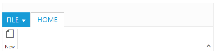
Configuring Groups
List of controls are combined as logical groups into tab. Group alignment type as row/column, Default is row.
Create group item with text specified and add content group to Groups collection with ejButton control settings.
Configure the tabs bind value tab with group and button named as New.
<div id="ribbon-default"></div>
    <script src="app/ribbon/default.js"></script>
    <ul id="ribbonmenu1">
        <li><a>FILE</a>
            <ul>
                <li><a>New</a></li>
                <li><a>Open</a></li>
                <li><a>Save</a></li>
                <li><a>Save As</a></li>
                <li><a>Print</a></li>
            </ul>
        </li>
</ul>ReactDOM.render(
<EJ.Ribbon width="50%" applicationtab-type="menu" applicationtab-menuitemid="ribbonmenu1">
<tabs>
<tab id="home" text="HOME">
<groups>
<group text="New" alignType="rows">
<content>
<content defaults-type="button">
<groups>
<group id="new" text="New" buttonSettings-contentType="imageonly" buttonSettings-prefixIcon="e-icon e-ribbon e-new" >
</group>
</groups>
</content>
</content>
</group>
</groups>
</tab>
</tabs>
</EJ.Ribbon>
document.getElementById('ribbon-default')
);
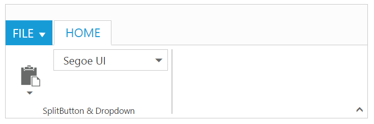
Adding Controls to Group
Syncfusion JavaScript Controls can be added to group’s content with corresponding type specified like button, split button, toggle button, dropdown list, gallery, custom, etc. Default type is button.
Configure the tabs bind value tab with groups, button,split button and dropdown controls.Also the datasource to dropdown control is configured with bind name fontFamily. Please refer to the following code snippets.
var fontFamily = ["Segoe UI", "Arial", "Times New Roman", "Tahoma", "Helvetica"];
     ReactDOM.render(
     <div>
         <ul id="ribbonmenu3">
             <li><a>FILE</a>
                 <ul>
                     <li><a>New</a></li>
                     <li><a>Open</a></li>
                     <li><a>Save</a></li>
                     <li><a>Save As</a></li>
                     <li><a>Print</a></li>
                 </ul>
             </li>
         </ul>
         <ul id="pasteSplit3">
             <li><a>Paste</a></li>
         </ul>
         <EJ.Ribbon width="100%" applicationtab-type="menu" applicationtab-menuitemid="ribbonmenu3">
            <tabs>
                <tab id="home" text="HOME">
                    <groups>
                        <group text="SplitButton & Dropdown" alignType="columns">
                            <content>
                                <content defaults-type="splitbutton" defaults-width={60} defaults-height={70}>
                                    <groups>
                                        <group id="paste" text="Paste" customTooltip-prefixIcon="e-pastetip" splitButtonSettings-contentType="imageonly" splitButtonSettings-prefixIcon="e-icon e-ribbon e-ribbonpaste" splitButtonSettings-targetID="pasteSplit3" splitButtonSettings-buttonMode="dropdown" splitButtonSettings-arrowPosition="bottom" splitButtonSettings-click="executeAction">
                                        </group>
                                    </groups>
                                </content>
                                <content defaults-type="dropdownlist" defaults-height={28}>
                                    <groups>
                                        <group id="fontFamily" dropdownSettings-dataSource={fontFamily} dropdownSettings-text="Segoe UI" dropdownSettings-select="executeAction" dropdownSettings-width={150}>
                                        </group>
                                    </groups>
                                </content>
                            </content>
                        </group>
                    </groups>
                </tab>
            </tabs>
         </EJ.Ribbon>
     </div>
     document.getElementById('ribbon-default')
     );
Without using jsx Template
The Ribbon can be created from a HTML DIV element with the HTML id attribute set to it. Refer to the following code example.
<body>
	  <div id="ribbon-default"></div>
      <ul id="ribbonmenu3">
             <li><a>FILE</a>
                 <ul>
                     <li><a>New</a></li>
                     <li><a>Open</a></li>
                     <li><a>Save</a></li>
                     <li><a>Save As</a></li>
                     <li><a>Print</a></li>
                 </ul>
             </li>
         </ul>
         <ul id="pasteSplit3">
             <li><a>Paste</a></li>
         </ul>
</body>var fontFamily = ["Segoe UI", "Arial", "Times New Roman", "Tahoma", "Helvetica"];
React.createElement(EJ.Ribbon, {width: "100%", allowResizing: true, "applicationTab-type": "menu", "applicationTab-menuItemID": "ribbonmenu3"},
React.createElement("tabs", null,
React.createElement("tab", {id: "home", text: "HOME"},
React.createElement("groups", null,
React.createElement("group", {text: "SplitButton & Dropdown", alignType: "columns"},
React.createElement("content", null,
React.createElement("content", {"defaults-type": "splitbutton", "defaults-width": 60, "defaults-height": 70},
React.createElement("groups", null,
React.createElement("group", {id: "paste", text: "Paste", "customTooltip-prefixIcon": "e-pastetip", "splitButtonSettings-contentType": "imageonly", "splitButtonSettings-prefixIcon": "e-icon e-ribbon e-ribbonpaste", "splitButtonSettings-targetID": "pasteSplit3", "splitButtonSettings-buttonMode": "dropdown", "splitButtonSettings-arrowPosition": "bottom", "splitButtonSettings-click": "executeAction"}
)
)
),
React.createElement("content", {"defaults-type": "dropdownlist", "defaults-height": 28},
React.createElement("groups", null,
React.createElement("group", {id: "fontFamily", "dropdownSettings-dataSource": fontFamily, "dropdownSettings-text": "Segoe UI", "dropdownSettings-select": "executeAction", "dropdownSettings-width": 150})
)
)
)
)
)
)
)
),
document.getElementById('ribbon-default')
);