Getting Started
30 Nov 201612 minutes to read
This section briefly describes how to create a ProgressBar control using Javascript and learn its features.
Essential JavaScript ProgressBar displays a ProgressBar within a web page that allows you to show the progress of an event. Here, you can learn how to customize the progress and color of the ProgressBar in a real-time application to indicate the strength of the password, where the progress changes with respect to the change in length of the password. This helps you to validate the password is typed.
The following screenshot shows the ProgressBar.

Create a ProgressBar
Essential JavaScript ProgressBar widget is created using a simple <div> element. This element provides built-in features that allow you to change the progress, size and text of the control.
You can create a React application and add necessary scripts and styles with the help of the given React Getting Started Documentation.
Create a JSX file for rendering ProgressBar component using <EJ.ProgressBar> syntax. Add required properties to it in <EJ.ProgressBar> tag element
var DefaultProgressbar = React.createClass({
    render: function () {
        return (
            <div id="progressbar_default">
                <div className="imgframe">
                    <span className="txt">Water Purification</span>
                    <EJ.ProgressBar value={45} height="20" text="45 %">
                    </EJ.ProgressBar>
                </div>
            </div>
        );
    }
});

ReactDOM.render(<DefaultProgressbar />, document.getElementById('progressbar-default'));
Define an HTML element for adding ProgressBar in the application and refer the JSX file.
<div id="progressbar-default"></div>
<script src="app/progressbar/default.js">
Add <input> element inside the <body> tag of your file to create a ProgressBar.
<div style="content-container-fluid">
   <div class="row">
      <div class="cols-sample-area">
         <div class="frame">
            <div class="wrap_up">
               <!--Initializing password field*-->
               <label for="startButton">Password</label>
               <input type="password" id="password" style="border-radius:0px"/>
            </div>
            <div class="control">
               <!--initializing ProgressBar control-->
               <div id="progressBar"></div>
            </div>
         </div>
      </div>
   </div>
</div>
It also includes a Password field and through that the progress of the ProgressBar can be controlled
Initialize ProgressBar in script.
var DefaultProgressbar = React.createClass({
 componentDidMount: function () {
 $("#progressbar-default").ejProgressBar({
            height: 20,
            value: 30,  /*Specify the initial value of the progress in percentage*/
            width: 200,
        });
        progresObj = $("#progressbar-default").data("ejProgressBar");
        progresObj.option("text", "weak");
        $(".e-progress").css({ "background-color": "#DE0909", "border-radius":"10px" });
        $(".e-progressbar").css({ "border-radius": "10px", "border": "1px solid black" });
    render: function () {
        return (
        <div id="progressbar_default">
        <div classname="imgframe"></div>
        </div>
        );
    }
});

ReactDOM.render(<defaultprogressbar />, document.getElementById('progressbar-default'));
Here, you can initialize the properties of the ProgressBar such as height, value, width, text that is applied to the control by default.
The following screenshot displays a ProgressBar control.

Include the following code within the <head> tag to change the page layout.
<style type="text/css" class="cssStyles">
/*applying styles */
.frame {
border: 1px solid #BBBCBB;
border-radius: 10px 10px 10px 10px;
padding: 50px 60px;
margin-top: 40px;
width: 400px;
margin-left: 400px;
}
.control {
margin-bottom: 5px;
margin-left: 230px;
}
.wrap_up {
margin-left: 105px;
font-size: 18px;
}
#progressBar {
margin-top: 10px;
}
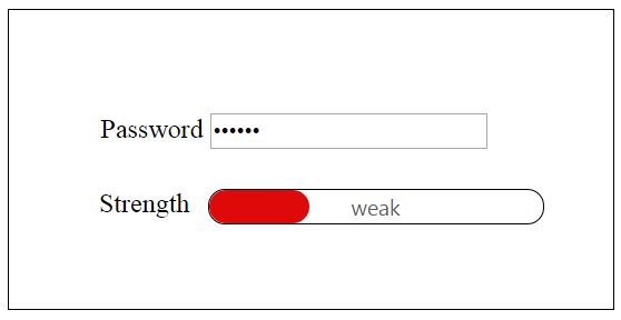
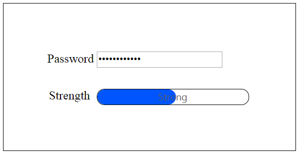
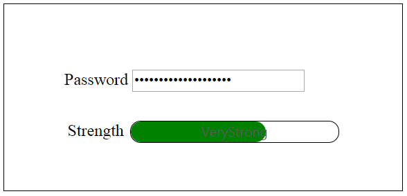
</style>Progress Control using Length of the Password Field
In real-time scenario, the progress of ProgressBar is changed according to the length of text in the password field by binding the change in the properties of control and checking the length of the password field.
Add the following code example inside the <script> tag of your HTML file.
var DefaultProgressbar = React.createClass({
 componentDidMount: function () {
 $("#progressbar-default").ejProgressBar({
            height: 20,
            value: 30,  /*Specify the initial value of the progress in percentage*/
            width: 200,
        });
        progresObj = $("#progressbar-default").data("ejProgressBar");
        progresObj.option("text", "weak");
        $(".e-progress").css({ "background-color": "#DE0909", "border-radius":"10px" });
        $(".e-progressbar").css({ "border-radius": "10px", "border": "1px solid black" });
		var progresObj, buttonObj, k = 10, timer = window.clearInterval(timer), i = 0, obj;
    $(document).keypress(function () {    //To capture the keypress inside the document
        i = $("#password").val().length;
                if (i < 5)
                    weak();
                else if (i == 5 || i < 7)
                    Strong();
                else if (i ==7 ||i>7) {
                    var pwd = $("#password").val();
                    very_strong();
                }
    });
    function Strong() {     //Change the width and text of the progress ... called when the length is greater than 5
        progresObj.option("text", "strong");
        progresObj.option("percentage", k + 50);
        $(".e-progress").css("background-color", "#0055FF");
        $(".e-progressbar").css("color", "#000000");
    }
    function very_strong() {     //Change the width and text of the progress ... called when the length is greater than 7
        progresObj.option("text", "Very strong");
        progresObj.option("percentage", k + 90);
        $(".e-progress").css("background-color", "Green");
        $(".e-progressbar").css("color", "#000000");
    }
    function weak() {     //Change the width and text of the progress... called when the length is less than 5
        progresObj.option("text", "Weak");
        progresObj.option("percentage", k+20 );
        $(".e-progress").css("background-color", "#DE0909");
        $(".e-progressbar").css("border-radius", "10px");
    }
  },
    render: function () {
        return (
        <div id="progressbar_default">
        <div classname="imgframe"></div>
        </div>
        );
    }
});

ReactDOM.render(<defaultprogressbar />, document.getElementById('progressbar-default'));
You can calculate length of the password and call the appropriate function that changes the percentage property of ProgressBar.
- The weak() function changes the text inside the ProgressBar to Weak and percentage to 30, that is invoked when the length of the text is less than 5.
- The strong() function changes the text inside the ProgressBar to Strong and percentage to 60, that is invoked when the length of the text exceeds 5.
- The very_strong() function changes the text inside the ProgressBar to Very Strong and percentage to 100, that is invoked when the length of the text exceeds 7 and the text contains a symbol in it.
You can change themes or appearance of the ProgressBar as required.
The final output is displayed as follows.
You can also bind an event at the start and finish of a ProgressBar by using the start, complete and change properties of the ProgressBar.