Responsive
22 May 20171 minute to read
PivotGrid and PivotTable Field list control supports responsive rendering based on the target device (desktop & tablet) resolution. It supports resolution upto 1024x600. You can enable responsiveness in PivotGrid by setting isResponsive property to true.
On resizing the browser, the PivotTable Field list will get collapse and an icon will appear on the left-hand side of the browser. User can toggle its view and perform UI interaction.
<script type="text/babel">
    //..
    $(function(){
        ReactDOM.render(
        <EJ.PivotGrid id="PivotGrid" isResponsive={true}></EJ.PivotGrid>,
        document.getElementById('PivotGrid1')
        );
    });
</script>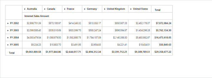
Normal PivotGrid
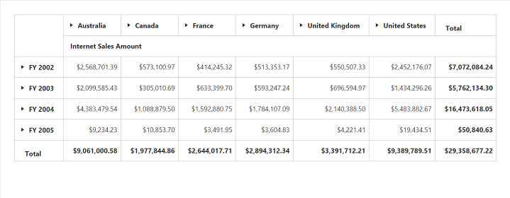
Responsive PivotGrid
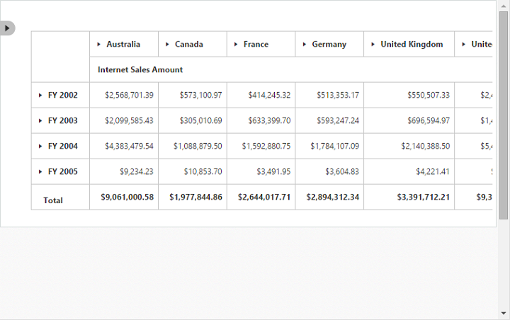
Responsive PivotTable Field List - Collapsed
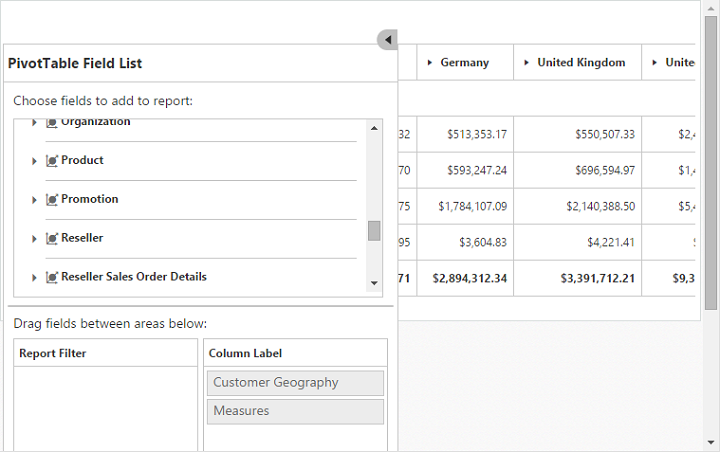
Responsive PivotTable Field List - Expanded