How can I help you?
Getting Started with ReactJS CircularGauge
-
This section encompasses how to configure Circular Gauge. You can provide data to a Circular Gauge and make them to display in a required way.
-
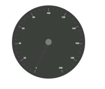
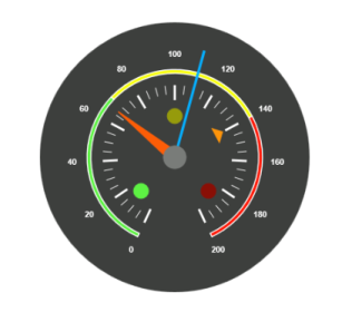
The following screen shot displays a Circular Gauge, which visually represents the functions of an Automobile speedometer with RPM (Rotation per Minute), kph (Kilometer per hour) and it denotes the speed level indicators (Safe, Caution and Danger).
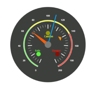
Analog Speedometer
Adding Script Reference
Create an HTML page and add the scripts references in the order mentioned in the following code example.
-
jQuery1.10.2 and later versions
The required ReactJS script dependencies as follows. And you can also refer React to know more about ReactJS.
-
react.min.js- https://cdn.syncfusion.com/js/assets/external/react.min.js -
react-dom.min.js- https://cdn.syncfusion.com/js/assets/external/react-dom.min.js -
ej.web.react.min.js- https://cdn.syncfusion.com/33.1.44/js/common/ej.web.react.min.js
To get started, you can use the ej.web.all.min.js file that encapsulates all the ej controls and frameworks in one single file.
<!DOCTYPE html>
   <html>
     <head>
        <meta name="viewport" content="width=device-width, initial-scale=1.0">
        <meta name="description" content="Essential Studio for React JS">
        <meta name="author" content="Syncfusion">
        <title>Getting Started for Ribbon React JS</title>
        <!-- Essential Studio for JavaScript  theme reference -->
        <link href="http://cdn.syncfusion.com/33.1.44/js/web/flat-azure/ej.web.all.min.css" rel="stylesheet" />
        <!-- Essential Studio for JavaScript  script references -->
        <script src="http://cdn.syncfusion.com/js/assets/external/jquery-3.0.0.min.js"></script>
         <script src="http://cdn.syncfusion.com/js/assets/external/react.min.js"></script>
        <script src="http://cdn.syncfusion.com/js/assets/external/react-dom.min.js"></script>
        <script src="http://cdn.syncfusion.com/33.1.44/js/web/ej.web.all.min.js"></script>
        <script src="http://cdn.syncfusion.com/33.1.44/js/common/ej.web.react.min.js"></script>
        <!-- Add your custom scripts here -->
    </head>
        <body>
        </body>
   </html>
NOTE
- In production, we highly recommend you to use our
custom script generatorto create custom script file with required controls and its dependencies only. Also to reduce the file size further please useGZip compressionin your server.- For themes, you can use the
ej.web.all.min.cssCDN link from the code snippet given. To add the themes in your application, please refer tothis link.
Control Initialization
Control can be initialized in two ways.
- Using jsx Template
- Without using jsx Template
Using jsx Template
By using the jsx template, we can create the HTML file and jsx file. The .jsx file can be convert to .js file and it can be referred in HTML page.
Create your circularGauge
In this tutorial, you will learn how to create a simple circular gauge.
1.Create a <div> tag.
<!DOCTYPE html>
<html>
    <body>
	<div id="circularGauge-default" style="height:99%;"></div>
            <script src="app/circulargauge/default.js"></script>
    </body>
</html>
2.Initialize the CircularGauge by using the EJ.CircularGauge tag.
"use strict";
ReactDOM.render(
    <div className="default">
        <EJ.CircularGauge id="circulargauge1"></EJ.CircularGauge>,
    </div>,
    document.getElementById('circulargauge-default')
    );
Run the above code example to get a default CircularGauge with default values.

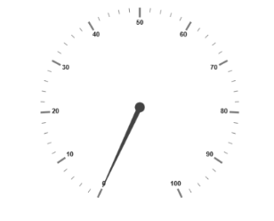
Set Height and Width
Pointers have different height and width so you can set the height and width of the gauge according to your requirements.Set the basic values of the gauge such as height and width of the canvas element values that are to be rendered.
<script type="text/babel">

<!DOCTYPE html>
<html>
    <body>
        <script type="text/babel">
            ReactDOM.render(
                     <div className="default">
                        <EJ.CircularGauge id="circulargauge1" height={500} width={500}></EJ.CircularGauge>,
                     </div>,
                     document.getElementById('circularGauge-default')
                     );
        </script>
    </body>
</html>
Run the above code example and you will see the following output.
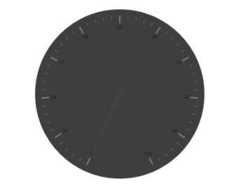
Set Background Color
The speedometer must have some dark color as background so that its value is clearly visible and you can vary the speed of the pointer by setting ReadOnly as False for user interaction.
<script type="text/babel">

<!DOCTYPE html>
<html>
    <body>
        <script type="text/babel">
            ReactDOM.render(
                     <div className="default">
                        <EJ.CircularGauge
                        id="circulargauge1"
                        height={500}
                        width={500}
                        backgroundColor="#3D3F3D"
                        readOnly={false} ></EJ.CircularGauge>,
                     </div>,
                     document.getElementById('circularGauge-default')
                     );
        </script>
    </body>
</html>
Run the above code example and you will see the following output.
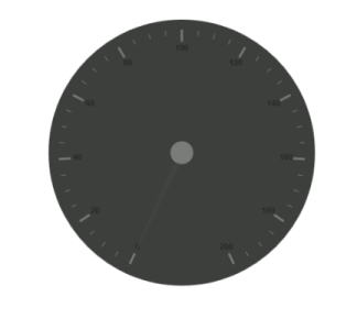
Provide Scale Values
- The pointer cap can be customized with the following options. Cap radius, cap border color, cap background color, pointer cap border width are some of the properties that are customizable.
- The speed limit in the gauge has maximum value of 200 kph. So you can set maximum value for the gauge as 200.
- Major Ticks have the interval value of 20 and minor ticks have the interval value of 5. Show ranges and show indicators are used to display the ranges and indicators in their respective positions.
<script type="text/babel">
var scales = [{
            showRanges: true,
            showIndicators: true,
            pointerCap: {
                radius: 15,
                borderWidth: 0,
                backgroundColor: "#797C79",
                borderColor: "#797C79"
            },
            maximum: 200,
            majorIntervalValue: 20,
            minorIntervalValue: 5

        }];

<!DOCTYPE html>
<html>
    <body>
        <script type="text/babel">
            ReactDOM.render(
                     <div className="default">
                        <EJ.CircularGauge
                        id="circulargauge1"
                        height={500}
                        width={500}
                        backgroundColor="#3D3F3D"
                        readOnly={false}
                        scales={scales} ></EJ.CircularGauge>,
                     </div>,
                     document.getElementById('circularGauge-default')
                     );
        </script>
    </body>
</html>
Run the above code example and you will see the following output.
Add Label Customization
To display the value around the scales, labels are used. By customizing the label color it displays as specified.
<script type="text/babel">

var scales = [{
             //Add the labels customization code here
            labels: [{
                color: "#ffffff"
            }],

        }];

<!DOCTYPE html>
<html>
    <body>
        <script type="text/babel">
            ReactDOM.render(
                     <div className="default">
                        <EJ.CircularGauge
                        id="circulargauge1"
                        height={500}
                        width={500}
                        backgroundColor="#3D3F3D"
                        readOnly={false}
                        scales={scales} ></EJ.CircularGauge>,
                     </div>,
                     document.getElementById('circularGauge-default')
                     );
        </script>
    </body>
</html>
Run the above code example and you will see the following output.
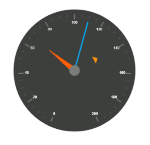
Add Pointers
Here, you have three pointers that denote the kilometer value, rotation per minute value and torque value.The torque value pointer needs not be similar to the other two pointers. You can set torque pointer as marker pointer. And you can set other attributes for pointer such as background color, border color, length, width and distance from scale.
<script type="text/babel">

var scales = [{
              //Add the labels customization code here
            //Add the pointers customization code here
            pointers: [{
                value: 140,
                distanceFromScale: 60,
                showBackNeedle: false,
                length: 20,
                type: "marker",
                markerType: "triangle",
                width: 10,
                radius: 10,
                backgroundColor: "#FF940A",
                border: {
                    color: "#FF940A"
                },
            },
            {
                value: 110,
                showBackNeedle: false,
                length: 150,
                width: 2,
                radius: 10,
                needleType: "rectangle",
                backgroundColor: "#05AFFF",
                border: {
                    color: "#05AFFF"
                },
            }, {
                value: 67,
                showBackNeedle: false,
                length: 100,
                width: 15,
                radius: 10,
                backgroundColor: "#FC5D07",
                border: {
                    color: "#FC5D07"
                },
            }];


<!DOCTYPE html>
<html>
    <body>
        <script type="text/babel">
            ReactDOM.render(
                     <div className="default">
                        <EJ.CircularGauge
                        id="circulargauge1"
                        height={500}
                        width={500}
                        backgroundColor="#3D3F3D"
                        readOnly={false}
                        scales={scales}
                        //Add the ticks customization code here
                        //Add the ranges customization code here
                        //Add the indicators customization code here
                        //Add the Custom labels customization code here ></EJ.CircularGauge>,
                     </div>,
                     document.getElementById('circularGauge-default')
                     );
        </script>
    </body>
</html>
Run the above code example and you will see the following output.
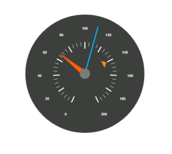
Add Tick Details
- You can set Major ticks with their width and height equal to Minor ticks.
- You can set Color according to your preference for better visibility in dark backgrounds.
- To display and customize the tick value add the following code example.
<script type="text/babel">

var scales = [{
              //Add the labels customization code here
            //Add the pointers customization code here
            //Add the ticks customization code here
            ticks: [{
                type: "major",
                distanceFromScale: 70,
                height: 20,
                width: 3,
                color: "#ffffff"
            }, {
                type: "minor",
                height: 12,
                width: 1,
                distanceFromScale: 70,
                color: "#ffffff"
            }]            }];


<!DOCTYPE html>
<html>
    <body>
        <script type="text/babel">
            ReactDOM.render(
                     <div className="default">
                        <EJ.CircularGauge
                        id="circulargauge1"
                        height={500}
                        width={500}
                        backgroundColor="#3D3F3D"
                        readOnly={false}
                        scales={scales}
                       ></EJ.CircularGauge>,
                     </div>,
                     document.getElementById('circularGauge-default')
                     );
        </script>
    </body>
</html>
Run the above code example and you will see the following output.
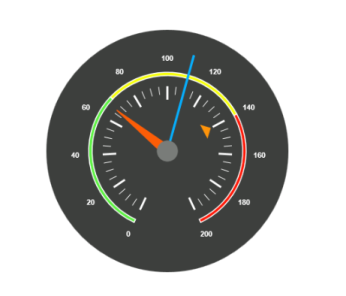
Add Range Values
- Ranges denote the property of the scale value in the speedometer. The color values of the ranges denote speed variation. Set ShowRanges as true for showing the ranges in the Circular Gauge.
- For Low speed, you can mention it as safe zone; for moderate speed, you can call it as caution zone and for high speed, you can mark it as high speed.
- You can customize the range with properties such as start value, end value, start width, end width, background color , border color, etc.,
<script type="text/babel">

var scales = [{
             ranges: [{
                distanceFromScale: 30,
                startValue: 0,
                endValue: 70,
                backgroundColor: "#5DF243",
                border: {
                    color: "#FFFFFF"
                },
            }, {
                distanceFromScale: 30,
                startValue: 70,
                endValue: 140,
                backgroundColor: "#F6FF0A",
                border: {
                    color: "#FFFFFF"
                },
            },
            {
                distanceFromScale: 30,
                startValue: 140,
                endValue: 200,
                backgroundColor: "#FF1807",
                border: {
                    color: "#FFFFFF"
                },
            }]           }];


<!DOCTYPE html>
<html>
    <body>
        <script type="text/babel">
            ReactDOM.render(
                     <div className="default">
                        <EJ.CircularGauge
                        id="circulargauge1"
                        height={500}
                        width={500}
                        backgroundColor="#3D3F3D"
                        readOnly={false}
                        scales={scales}
                       ></EJ.CircularGauge>,
                     </div>,
                     document.getElementById('circularGauge-default')
                     );
        </script>
    </body>
</html>
Run the above code example and you will see the following output.
Add Indicator Details
- Indicators denote whether the pointers values are in their respective zones or not. Positioning the indicator on the respective range value gives you the required changes.
- By using Position property, you can set the location of the indicator. StateRanges defines how the indicator should behave when the pointer is in certain values.
<script type="text/babel">

var scales = [{
            indicators: [
            {
                height: 10,
                width: 10,
                type: "circle",
                position: { x: 210, y: 300 },
                stateRanges: [{
                    endValue: 70,
                    startValue: 0,
                    backgroundColor: "#5DF243",
                    borderColor: "#5DF243",
                    text: "",
                    textColor: "#870505"
                }, {
                    endValue: 200,
                    startValue: 70,
                    backgroundColor: "#145608",
                    borderColor: "#145608",
                    text: "",
                    textColor: "#870505"
                }]
            },
            {
                height: 10,
                width: 10,
                type: "circle",
                position: { x: 255, y: 200 },
                stateRanges: [{
                    endValue: 140,
                    startValue: 70,
                    backgroundColor: "#F6FF0A",
                    borderColor: "#F6FF0A",
                    text: "",
                }, {
                    endValue: 70,
                    startValue: 0,
                    backgroundColor: "#969B0C",
                    borderColor: "#969B0C",
                    text: "",
                }, {
                    endValue: 200,
                    startValue: 140,
                    backgroundColor: "#969B0C",
                    borderColor: "#969B0C",
                    text: "",
                }]
            }, {
                height: 10,
                width: 10,
                type: "circle",
                position: { x: 300, y: 300 },
                stateRanges: [{
                    endValue: 140,
                    startValue: 0,
                    backgroundColor: "#890F06",
                    borderColor: "#890F06",
                    text: "",
                },
                {
                    endValue: 200,
                    startValue: 140,
                    backgroundColor: "#FF1807",
                    borderColor: "#FF1807",
                    text: "",
                }]
            }],         }];


<!DOCTYPE html>
<html>
    <body>
        <script type="text/babel">
            ReactDOM.render(
                     <div className="default">
                        <EJ.CircularGauge
                        id="circulargauge1"
                        height={500}
                        width={500}
                        backgroundColor="#3D3F3D"
                        readOnly={false}
                        scales={scales}
                       ></EJ.CircularGauge>,
                     </div>,
                     document.getElementById('circularGauge-default')
                     );
        </script>
    </body>
</html>
Run the above code example and you will see the following output.
Add Custom Label Details
Custom labels are used to specify the texts that need to be displayed in the gauge. You can customize it through various properties.To display the three range description, custom texts are used here.
<script type="text/babel">

var scales = [{
            customLabels: [{
                value: "Safe",
                position: { x: 200, y: 280 },
                color: "#5DF243",
                font:
                {
                    size: "12px",
                    fontFamily: "Arial",
                    fontStyle: "Bold"
                }
            }, {
                value: "Caution",
                position: { x: 253, y: 212 },
                color: "#F6FF0A",
                font:
                {
                    size: "12px",
                    fontFamily: "Arial",
                    fontStyle: "Bold"
                }
            }, {
                value: "Danger",
                position: { x: 290, y: 280 },
                color: "#FF1807",
                font:
                {
                    size: "12px",
                    fontFamily: "Arial",
                    fontStyle: "Bold"
                }
            }]       }];


<!DOCTYPE html>
<html>
    <body>
        <script type="text/babel">
            ReactDOM.render(
                     <div className="default">
                        <EJ.CircularGauge
                        id="circulargauge1"
                        height={500}
                        width={500}
                        backgroundColor="#3D3F3D"
                        readOnly={false}
                        scales={scales}
                       ></EJ.CircularGauge>,
                     </div>,
                     document.getElementById('circularGauge-default')
                     );
        </script>
    </body>
</html>
Run the above code example and you will see the following output.
Without using jsx Template
The Circular Gauge can be created from a HTML DIV element with the HTML id attribute set to it. Refer to the following code example.
<div id="circularGauge-default"></div><script type="text/babel">
var scale = [{
//Add the labels customization code here
//Add the pointers customization code here
pointers: [{
value: 140,
distanceFromScale: 60,
showBackNeedle: false,
length: 20,
type: "marker",
markerType: "triangle",
width: 10,
radius: 10,
backgroundColor: "#FF940A",
border: {
color: "#FF940A"
},
},
{
value: 110,
showBackNeedle: false,
length: 150,
width: 2,
radius: 10,
needleType: "rectangle",
backgroundColor: "#05AFFF",
border: {
color: "#05AFFF"
},
}, {
value: 67,
showBackNeedle: false,
length: 100,
width: 15,
radius: 10,
backgroundColor: "#FC5D07",
border: {
color: "#FC5D07"
},
}];
ReactDOM.render(
React.createElement(EJ.CircularGauge, {id: "default",
backgroundColor: "#3D3F3D",
scales: scale,
width: 500,
height: 500,
}
),
document.getElementById('circularGauge-default')
);
</script>Run the above code example and you will see the following output.