How can I help you?
Getting Started with ReactJS Chart
This section explains you the steps required to populate the Chart with data, add data labels, tooltips and title to the Chart. This section covers only the minimal features that you need to know to get started with the Chart.
Adding Script Reference
Create an HTML page and add the scripts references in the order mentioned in the following code example.
-
jQuery1.10.2 and later versions
The required ReactJS script dependencies as follows. And you can also refer React to know more about react js.
-
react.min.js- https://cdn.syncfusion.com/js/assets/external/react.min.js -
react-dom.min.js- https://cdn.syncfusion.com/js/assets/external/react-dom.min.js -
ej.web.react.min.js- https://cdn.syncfusion.com/33.1.44/js/common/ej.web.react.min.js
To get started, you can use the ej.web.all.min.js file that encapsulates all the ej controls and frameworks in one single file.
<!DOCTYPE html>
   <html>
     <head>
        <meta name="viewport" content="width=device-width, initial-scale=1.0">
        <meta name="description" content="Essential Studio for React JS">
        <meta name="author" content="Syncfusion">
        <title>Getting Started for Ribbon React JS</title>
        <!-- Essential Studio for JavaScript  theme reference -->
        <link href="http://cdn.syncfusion.com/33.1.44/js/web/flat-azure/ej.web.all.min.css" rel="stylesheet" />
        <!-- Essential Studio for JavaScript  script references -->
        <script src="http://cdn.syncfusion.com/js/assets/external/jquery-3.0.0.min.js"></script>
         <script src="http://cdn.syncfusion.com/js/assets/external/react.min.js"></script>
        <script src="http://cdn.syncfusion.com/js/assets/external/react-dom.min.js"></script>
        <script src="http://cdn.syncfusion.com/33.1.44/js/web/ej.web.all.min.js"></script>
        <script src="http://cdn.syncfusion.com/33.1.44/js/common/ej.web.react.min.js"></script>
        <!-- Add your custom scripts here -->
    </head>
        <body>
        </body>
   </html>
NOTE
- In production, we highly recommend you to use our
custom script generatorto create custom script file with required controls and its dependencies only. Also to reduce the file size further please useGZip compressionin your server.- For themes, you can use the
ej.web.all.min.cssCDN link from the code snippet given. To add the themes in your application, please refer tothis link.
Control Initialization
Control can be initialized in two ways.
- Using jsx Template.
- Without using jsx Template.
Using jsx Template
By using the jsx template, we can create the html file and jsx file. The .jsx file can be convert to .js file and it can be referred in html page.
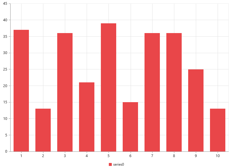
Create your chart
In this tutorial, you will learn how to create a simple chart.The following screen shot displays the output after completing this tutorial.
1.Create a <div> tag.
<!DOCTYPE html>
<html>
    <body>
	<div id="chart-default" style="height:99%;"></div>
            <script src="app/chart/default.js"></script>
    </body>
</html>
2.Initialize the Chart by using the EJ.Chart tag.
"use strict";
ReactDOM.render(
    <div className="default">
        <EJ.Chart id="chart1"></EJ.Chart>,
    </div>,
    document.getElementById('chart-default')
    );
Now, the Chart is rendered with some auto-generated random values and with default Column chart type.
The chart is rendered to the size of its container, by default. You can also customize the chart dimension either by setting the width and height of the container element as in the above code example or by using the Size option of the Chart.
Populate chart with data
Now, this section explains how to plot JSON data to the Chart. First, let us prepare a sample JSON data with each object containing following fields – month and sales.
var chartData = [
      { month: 'Jan', sales: 35 },
      { month: 'Feb', sales: 28 },
      { month: 'Mar', sales: 34 },
      { month: 'Apr', sales: 32 },
      { month: 'May', sales: 40 },
      { month: 'Jun', sales: 32 },
      { month: 'Jul', sales: 35 },
      { month: 'Aug', sales: 55 },
      { month: 'Sep', sales: 38 },
      { month: 'Oct', sales: 30 },
      { month: 'Nov', sales: 25 },
      { month: 'Dec', sales: 32 }];
Add a Series to the Chart using Series option and set the chart type as Line using type option.
<script type="text/babel">

var series= {
                type:'line'
            };
<!DOCTYPE html>
<html>
    <body>
        <script type="text/babel">
            ReactDOM.render(
                     <div className="default">
                        <EJ.Chart id="chart1" series = {series} ></EJ.Chart>,
                     </div>,
                     document.getElementById('chart-default')
                     );
        </script>
    </body>
</html>
You can also add multiple series tags based on your requirement.
Next, map the Month and Sales values in the data source to the Line series by setting XName and YName with the field names respectively, and then set the actual data using DataSource option.
<script type="text/babel">

var series= {
                  dataSource: chartData,
                   xName: "month",
                   yName: "sales",
            };
var size = {height:"400",width:"600"};
<!DOCTYPE html>
<html>
    <body>
        <script type="text/babel">
            ReactDOM.render(
                     <div className="default">
                        <EJ.Chart id="chart1" series={series} ></EJ.Chart>,
                     </div>,
                     document.getElementById('chart-default')
                     );
        </script>
    </body>
</html>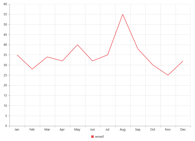
Since the data is related to Sales, format the vertical axis labels by adding ‘$’ as a prefix and ‘K’ as a suffix to each label. This can be achieved by setting the “${value}K” to the labelFormat option of the axis. Here, {value} acts as a placeholder for each axis label, “$” and “K” are the actual prefix and suffix added to each axis label.
The following code example illustrates this,
<script type="text/babel">

var primaryYAxis= {
                   labelFormat: "{value}k"
            };

<!DOCTYPE html>
<html>
    <body>
        <script type="text/babel">
            ReactDOM.render(
                     <div className="default">
                        <EJ.Chart id="chart1" primaryYAxis={primaryYAxis} ></EJ.Chart>,
                     </div>,
                     document.getElementById('chart-default')
                     );
        </script>
    </body>
</html>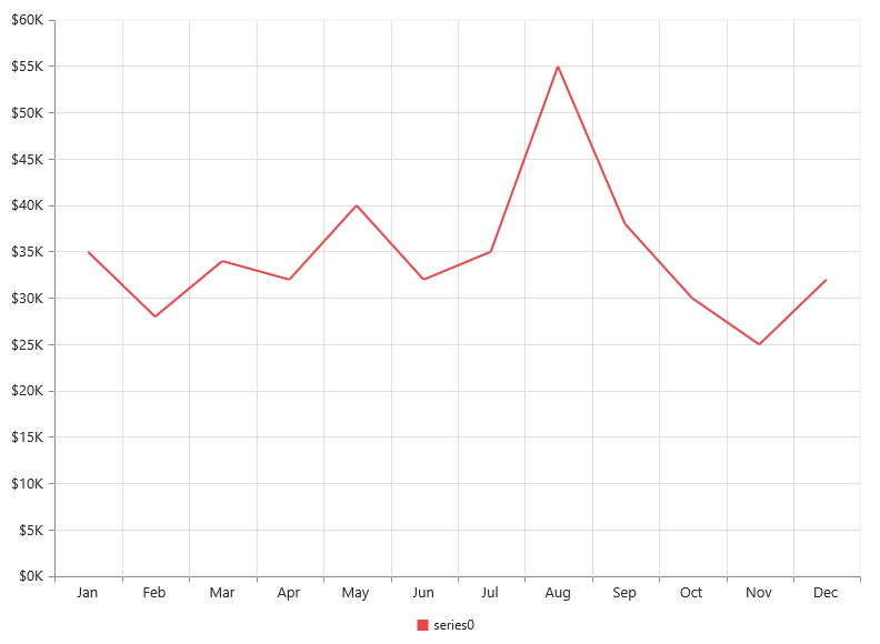
Add Data Labels
You can add data labels to improve the readability of the chart. This can be achieved by enabling the Visible option in the dataLabel option. Now, the data labels are rendered at the top of all the data points.
The following code example illustrates this,
<script type="text/babel">

var series= {
                 marker: {
                         dataLabel: {
                                //Enable data label in the chart
                                visible: true
                   } }
            };

<!DOCTYPE html>
<html>
    <body>
        <script type="text/babel">
            ReactDOM.render(
                     <div className="default">
                        <EJ.Chart id="chart1"  series={series} ></EJ.Chart>,
                     </div>,
                     document.getElementById('chart-default')
                     );
        </script>
    </body>
</html>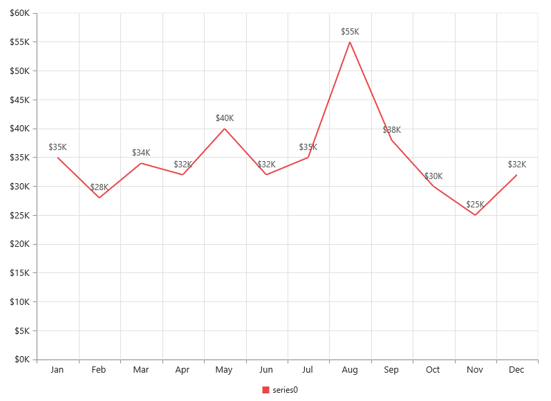
There are situations where the default label content is not sufficient to the user. In this case, you can use the template option to format the label content with some additional information.
<!DOCTYPE html>
<html>
<body>
      <div id="dataLabelTemplate" style="display:none; padding:3px;background-color:#B9C5C9; opacity:0.8;">
         <div id="point">#point.x#:$#point.y#K</div>
      </div>
</body>
</html>
The above HTML template is used as a template for each data label. Here, “point.x” and “point.y” are the placeholder text used to display the corresponding data point’s x & y value.
The following code example shows how to set the id of the above template to dataLabel template option,
var series= {
                 marker: {
                         dataLabel: {

                                visible: true,
                                 //Set the id of HTML template to the chart series
                                  template: "dataLabelTemplate"
                   } }
            };

<!DOCTYPE html>
<html>
    <body>
        <script type="text/babel">
            ReactDOM.render(
                     <div className="default">
                        <EJ.Chart id="chart1"  series={series} ></EJ.Chart>,
                     </div>,
                     document.getElementById('chart-default')
                     );
        </script>
    </body>
</html>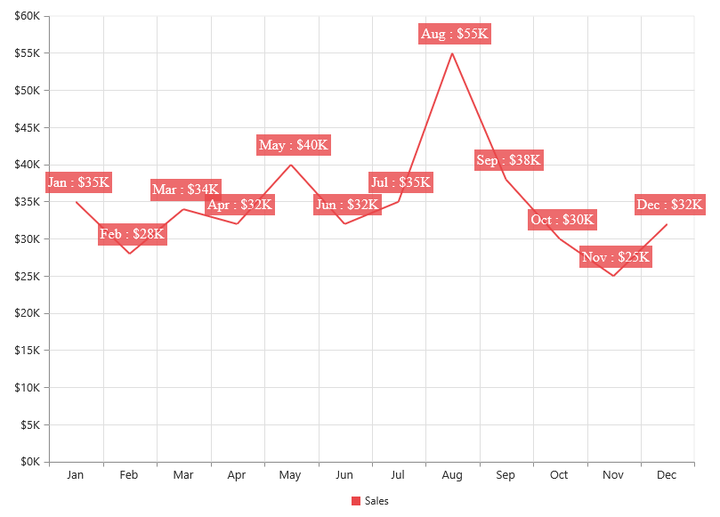
Enable Legend
You can enable or disable the legend by using the Visible option in the legend option. It is enabled in the chart, by default.
var series= {
               //Add series name  to display on the legend item
                 name:"Sales"
            };

 var legend = {
              //Enable chart legend
                visible: true
 };

<!DOCTYPE html>
<html>
    <body>
        <script type="text/babel">
            ReactDOM.render(
                     <div className="default">
                        <EJ.Chart id="chart1"  series={series} legend={legend} ></EJ.Chart>,
                     </div>,
                     document.getElementById('chart-default')
                     );
        </script>
    </body>
</html>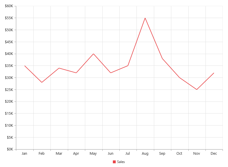
Enable Tooltip
The Tooltip is useful when you cannot display information by using the dataLabel due to the space constraints. You can enable tooltip by using the Visible option of the tooltip option in the specific series.
The following code example illustrates this,
var series= {
                //Enable tooltip in chart area
                   tooltip: {visible: true}
            };

<!DOCTYPE html>
<html>
    <body>
        <script type="text/babel">
            ReactDOM.render(
                     <div className="default">
                        <EJ.Chart id="chart1"  series={series} ></EJ.Chart>,
                     </div>,
                     document.getElementById('chart-default')
                     );
        </script>
    </body>
</html>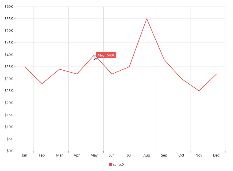
Add Chart Title
You need to add a title to the chart to provide quick information to the user about the data being plotted in the chart. You can add it by using the text option of the title option.
var title= {
	           //Add chart title
               text: 'Sales Analysis'

            };

<!DOCTYPE html>
<html>
    <body>
        <script type="text/babel">
            ReactDOM.render(
                     <div className="default">
                        <EJ.Chart id="chart1"  title={title} ></EJ.Chart>,
                     </div>,
                     document.getElementById('chart-default')
                     );
        </script>
    </body>
</html>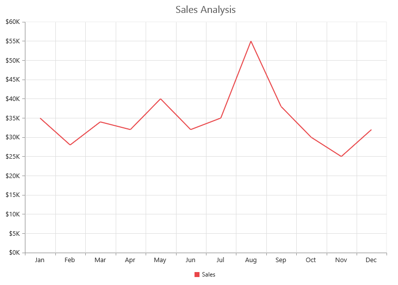
Without using jsx Template
The Chart can be created from a HTML DIV element with the HTML id attribute set to it. Refer to the following code example.
<div id="chart-default" style="height:99%;"></div>var chartData = [
{ month: 'Jan', sales: 35 },
{ month: 'Feb', sales: 28 },
{ month: 'Mar', sales: 34 },
{ month: 'Apr', sales: 32 },
{ month: 'May', sales: 40 },
{ month: 'Jun', sales: 32 },
{ month: 'Jul', sales: 35 },
{ month: 'Aug', sales: 55 },
{ month: 'Sep', sales: 38 },
{ month: 'Oct', sales: 30 },
{ month: 'Nov', sales: 25 },
{ month: 'Dec', sales: 32 }];
var series= [{
dataSource: chartData,
xName: "month",
yName: "sales",
type:"line"
}];
var size = {height:"400",width:"600"};
ReactDOM.render(
React.createElement(EJ.Chart, {id: "default_chart0",
series:series,
size:size
}
),
document.getElementById('chart-default')
);
</script>Now the line chart is rendered