How can I help you?
Applying Themes in MAUI Controls
18 Mar 20267 minutes to read
Syncfusion® themes allow you to apply colors across all the Syncfusion® controls, providing a uniform look and feel to your applications. This section covers the following topics:
- Applying light and dark themes
- Overriding the default theme
- Creating your own theme
Applying light and dark themes
By default, Syncfusion® offers support for both light and dark themes through the inclusion of the SyncfusionThemeResourceDictionary.
To apply themes to your application, merge the SyncfusionThemeResourceDictionary item.
Theme resource dictionary
This resource dictionary includes keys and their corresponding color codes for all Syncfusion® controls. Additionally, it contains the VisualTheme property where we can declare the following four theme color values:
- MaterialLight
- MaterialDark
- CupertinoLight
- CupertinoDark
Automatic merging
When using multiple Syncfusion® controls in an application, to make the process easier for merging the control style dictionaries of the controls, the SyncfusionThemeResourceDictionary class has been provided for automatic merging.
Using Material Dark theme
<Application xmlns:base="clr-namespace:SampleBrowser.Maui.Base;assembly=SampleBrowser.Maui.Base"
             xmlns:syncTheme="clr-namespace:Syncfusion.Maui.Themes;assembly=Syncfusion.Maui.Core"
             x:Class="SampleBrowser.Maui.App"
             ...>
<Application.Resources>
        <ResourceDictionary>
            <ResourceDictionary.MergedDictionaries>
                <!-- Theme resource dictionary -->
                <syncTheme:SyncfusionThemeResourceDictionary VisualTheme="MaterialDark"/>
            </ResourceDictionary.MergedDictionaries>
        </ResourceDictionary>
</Application.Resources>

....

</Application>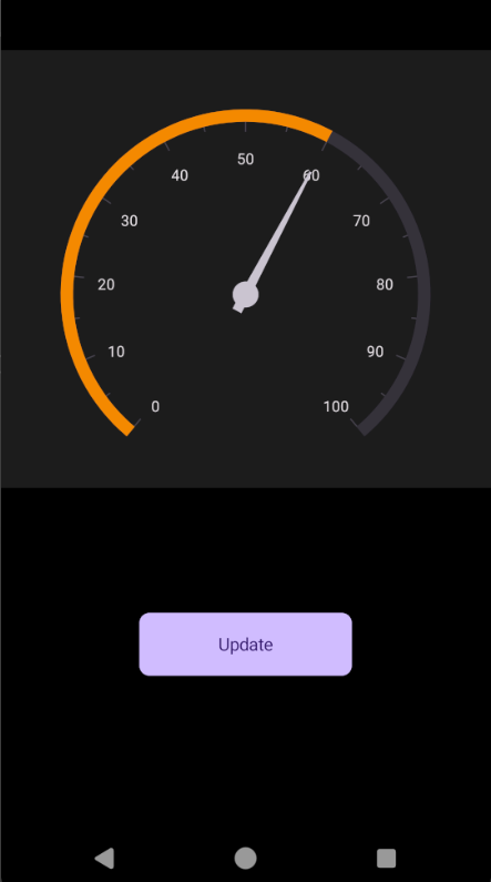
Using Cupertino Dark theme
<Application xmlns:base="clr-namespace:SampleBrowser.Maui.Base;assembly=SampleBrowser.Maui.Base"
             xmlns:syncTheme="clr-namespace:Syncfusion.Maui.Themes;assembly=Syncfusion.Maui.Core"
             x:Class="SampleBrowser.Maui.App"
             ...>
<Application.Resources>
        <ResourceDictionary>
            <ResourceDictionary.MergedDictionaries>
                <!-- Theme resource dictionary -->
                <syncTheme:SyncfusionThemeResourceDictionary VisualTheme="CupertinoDark"/>
            </ResourceDictionary.MergedDictionaries>
        </ResourceDictionary>
</Application.Resources>

....

</Application>
Overriding the default theme
The theme resource dictionary contains a set of keys mapped to styles in control style dictionaries. The default appearance of themes can be customized by overriding the key values.
The following section explains how to override the control specific keys.
Overriding the control specific keys
In addition to the primary keys, the theme resource dictionary also contains the keys that are specific to each controls; these keys can also be overridden. You can find the keys and the UI elements to which they are mapped to all the controls in this documentation.
<Application xmlns:syncTheme="clr-namespace:Syncfusion.Maui.Themes;assembly=Syncfusion.Maui.Core"
             ...>
<Application.Resources>
    <ResourceDictionary>
        <ResourceDictionary.MergedDictionaries>
            <syncTheme:SyncfusionThemeResourceDictionary VisualTheme="MaterialDark"/>
            <ResourceDictionary>
                <Color x:Key="SfRadialGaugeNeedlePointerNeedleFillColor">LimeGreen</Color>
                <Color x:Key="SfRadialGaugeNeedlePointerKnobFillColor">LimeGreen</Color>
                <Color x:Key="SfRadialGaugeNeedlePointerTailFillColor">Black</Color>
                <Color x:Key="SfRadialGaugeAxisLineFillColor">Green</Color>
                <Color x:Key="SfRadialGaugeRangePointerFillColor">LimeGreen</Color>
            </ResourceDictionary>
        </ResourceDictionary.MergedDictionaries>
    </ResourceDictionary>
</Application.Resources>

....

</Application>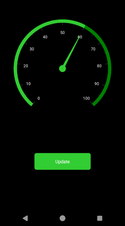
Creating your own theme
You can also create your own theme as an alternative approach to the above methods. To create your own theme, first, you need to merge the resource, whose key name should be “ControlName” + “Theme” based on the controls. For example, the SfChartTheme and SfTextInputLayoutTheme. You can find this key for each control in this documentation. After merging this resource, you need to merge the required color resources based on the UI elements that need to be customized. You can find the keys and the UI elements to which they are mapped to all the controls in this documentation.
Using this approach, you can create your own theme for all the controls or specific controls you need.
Customize MaterialDark theme
<Application xmlns:syncTheme="clr-namespace:Syncfusion.Maui.Themes;assembly=Syncfusion.Maui.Core"
             ...>
 <Application.Resources>
    <ResourceDictionary>
        <ResourceDictionary.MergedDictionaries>
            <syncTheme:SyncfusionThemeResourceDictionary VisualTheme="MaterialDark"/>
            <ResourceDictionary>
                <x:String x:Key="SfRadialGaugeTheme">CommonTheme</x:String>
                <Color x:Key="SfRadialGaugeNeedlePointerNeedleFillColor">LimeGreen</Color>
                <Color x:Key="SfRadialGaugeNeedlePointerKnobFillColor">LimeGreen</Color>
                <Color x:Key="SfRadialGaugeNeedlePointerTailFillColor">Black</Color>
                <Color x:Key="SfRadialGaugeAxisLineFillColor">Green</Color>
                <Color x:Key="SfRadialGaugeRangePointerFillColor">LimeGreen</Color>
            </ResourceDictionary>
        </ResourceDictionary.MergedDictionaries>
    </ResourceDictionary>
</Application.Resources>

....

</Application>
Customize CupertinoDark theme
<Application xmlns:syncTheme="clr-namespace:Syncfusion.Maui.Themes;assembly=Syncfusion.Maui.Core"
             ...>
 <Application.Resources>
    <ResourceDictionary>
        <ResourceDictionary.MergedDictionaries>
            <syncTheme:SyncfusionThemeResourceDictionary VisualTheme="CupertinoDark"/>
            <ResourceDictionary>
                <x:String x:Key="SfRadialGaugeTheme">CommonTheme</x:String>
                <Color x:Key="SfRadialGaugeNeedlePointerNeedleFillColor">LimeGreen</Color>
                <Color x:Key="SfRadialGaugeNeedlePointerKnobFillColor">LimeGreen</Color>
                <Color x:Key="SfRadialGaugeNeedlePointerTailFillColor">Black</Color>
                <Color x:Key="SfRadialGaugeAxisLineFillColor">Green</Color>
                <Color x:Key="SfRadialGaugeRangePointerFillColor">LimeGreen</Color>
            </ResourceDictionary>
        </ResourceDictionary.MergedDictionaries>
    </ResourceDictionary>
</Application.Resources>

....

</Application>
NOTE
- When Liquid Glass Effect is applied to controls, the UI adapts to the Liquid Glass design layered over the selected theme (
CupertinoorMaterial).- The Liquid Glass Effect feature is available only in
.NET 10.and is supported onmacOS 26 or higherandiOS 26 or higher