Item Border Customization in .NET MAUI ListView (SfListView)
16 Jul 202610 minutes to read
This section explains how to customize item borders in the .NET MAUI ListView (SfListView) using the built-in APIs.
Enable Item Border
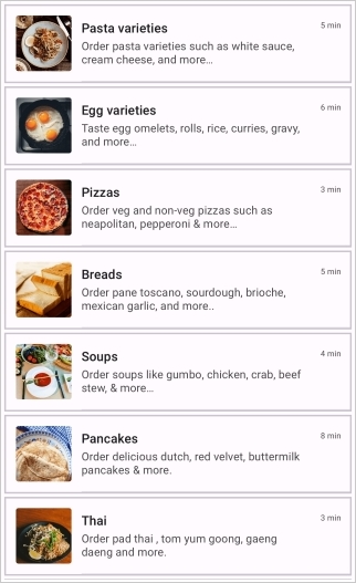
The SfListView allows applying borders to each item by setting the ShowItemBorder property to true. By default, item borders are not displayed. You can customize the color, thickness, margin, and corner radius of the borders using the respective APIs.
| Property |
Description |
|
ShowItemBorder
|
Enables or disables the visibility of item borders. (Default: false)
|
|
ItemBorderColor
|
Sets the color of the item border.
</tr>
|
|
ItemBorderThickness
|
Defines the border thickness for each side of the item (per-side double values).
</tr>
|
|
ItemBorderMargin
|
Sets the margin around the border within the item.
</tr>
|
|
ItemBorderRadius
|
Sets the corner radius of the item border.
</tr>
</tbody>
</table>
N> `ItemBorderRadius` is applicable only when `ItemBorderThickness` has uniform values on all sides.
<syncfusion:SfListView x:Name="listView"
                       ShowItemBorder="True"
                       ItemsSource="{Binding BookInfo}">
    <syncfusion:SfListView.ItemTemplate>
        <DataTemplate>
            <StackLayout Padding="5">
                <Label Text="{Binding BookName}" FontAttributes="Bold" />
                <Label Text="{Binding BookDescription}" />
            </StackLayout>
        </DataTemplate>
    </syncfusion:SfListView.ItemTemplate>
</syncfusion:SfListView>
listView.ShowItemBorder = true;
## Border Customization
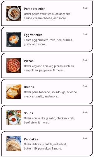
After enabling the item border, you can customize its appearance using the following properties:
- [ItemBorderColor](https://help.syncfusion.com/cr/maui/Syncfusion.Maui.ListView.SfListView.html#Syncfusion_Maui_ListView_SfListView_ItemBorderColorProperty): Sets the border color.
- [ItemBorderThickness](https://help.syncfusion.com/cr/maui/Syncfusion.Maui.ListView.SfListView.html#Syncfusion_Maui_ListView_SfListView_ItemBorderThicknessProperty): Specifies the thickness of the border.
- [ItemBorderMargin](https://help.syncfusion.com/cr/maui/Syncfusion.Maui.ListView.SfListView.html#Syncfusion_Maui_ListView_SfListView_ItemBorderMarginProperty): Adds margin around the border.
- [ItemBorderRadius](https://help.syncfusion.com/cr/maui/Syncfusion.Maui.ListView.SfListView.html#Syncfusion_Maui_ListView_SfListView_ItemBorderRadiusProperty): Sets the corner radius of the border.
<syncfusion:SfListView x:Name="listView"
                       ItemSize="60"
                       ShowItemBorder="True"
                       ItemBorderColor="Black"
                       ItemBorderThickness="2"
                       ItemBorderMargin="5,2,5,2"
                       ItemBorderRadius="20,0,0,20"
                       ItemsSource="{Binding BookInfo}">
    <syncfusion:SfListView.ItemTemplate>
        <DataTemplate>
            <StackLayout Padding="5">
                <Label Text="{Binding BookName}" FontAttributes="Bold" />
                <Label Text="{Binding BookDescription}" />
            </StackLayout>
        </DataTemplate>
    </syncfusion:SfListView.ItemTemplate>
</syncfusion:SfListView>
listView.ShowItemBorder = true;
listView.ItemBorderColor = Colors.Black;
listView.ItemBorderThickness = new Thickness(2);
listView.ItemBorderMargin = new Thickness(5, 2, 5, 2);
listView.ItemBorderRadius = new CornerRadius(20,0,0,20);
## Limitations
- Item borders are not supported when [SfListView.ItemsLayout](https://help.syncfusion.com/cr/maui/Syncfusion.Maui.ListView.SfListView.html#Syncfusion_Maui_ListView_SfListView_ItemsLayout) is set to [GridLayout](https://help.syncfusion.com/cr/maui/Syncfusion.Maui.ListView.GridLayout.html).
- [ItemBorderRadius](https://help.syncfusion.com/cr/maui/Syncfusion.Maui.ListView.SfListView.html#Syncfusion_Maui_ListView_SfListView_ItemBorderRadiusProperty) is applicable only when [ItemBorderThickness](https://help.syncfusion.com/cr/maui/Syncfusion.Maui.ListView.SfListView.html#Syncfusion_Maui_ListView_SfListView_ItemBorderThicknessProperty) has uniform values on all sides.
## See Also
- [Syncfusion .NET MAUI ListView Item Size Customization](https://help.syncfusion.com/maui/listview/item-size-customization)
## Group Header Border Customization in .NET MAUI ListView (SfListView)
This section explains how to customize group header borders in the `.NET MAUI ListView` (SfListView) using the built-in APIs.
## Enable Group Header Border
The [SfListView](https://help.syncfusion.com/cr/maui/Syncfusion.Maui.ListView.html) allows applying borders to each group header by setting the `ShowGroupHeaderBorder` property to `true`. By default, group header borders are not displayed. You can customize the color, thickness, margin, and corner radius of the borders using the respective APIs.
N> `GroupHeaderBorderRadius` is applicable only when `GroupHeaderBorderThickness` has uniform values on all sides.
### XAML Example
<syncfusion:SfListView x:Name="listView"
                       GroupHeaderSize="50"
                       ShowGroupHeaderBorder="True"
                       AllowGroupExpandCollapse="True"
                       ItemsSource="{Binding BookInfo}"
                       GroupKeySelector="{Binding Category}">
    <syncfusion:SfListView.ItemTemplate>
        <DataTemplate>
            <StackLayout Padding="5">
                <Label Text="{Binding BookName}" FontAttributes="Bold" />
                <Label Text="{Binding BookDescription}" />
            </StackLayout>
        </DataTemplate>
    </syncfusion:SfListView.ItemTemplate>
</syncfusion:SfListView>
listView.ShowGroupHeaderBorder = true;

## Border Customization
After enabling the group header border, you can customize its appearance using the following properties:
- `GroupHeaderBorderColor`: Sets the border color.
- `GroupHeaderBorderThickness`: Specifies the thickness of the border.
- `GroupHeaderBorderMargin`: Adds margin around the border.
- `GroupHeaderBorderRadius`: Sets the corner radius of the border.
<syncfusion:SfListView x:Name="listView"
                       GroupHeaderSize="60"
                       ShowGroupHeaderBorder="True"
                       GroupHeaderBorderColor="Black"
                       GroupHeaderBorderThickness="2"
                       GroupHeaderBorderMargin="5,2,5,2"
                       GroupHeaderBorderRadius="20,0,0,20"
                       ItemsSource="{Binding BookInfo}">
    <syncfusion:SfListView.ItemTemplate>
        <DataTemplate>
            <StackLayout Padding="5">
                <Label Text="{Binding BookName}" FontAttributes="Bold" />
                <Label Text="{Binding BookDescription}" />
            </StackLayout>
        </DataTemplate>
    </syncfusion:SfListView.ItemTemplate>
</syncfusion:SfListView>
listView.ShowGroupHeaderBorder = true;
listView.GroupHeaderBorderColor = Colors.Black;
listView.GroupHeaderBorderThickness = new Thickness(2);
listView.GroupHeaderBorderMargin = new Thickness(2);
listView.GroupHeaderBorderRadius = new CornerRadius(20,0,0,20);

## Limitations
- Group header borders are rendered on top of the group header template content and do not interfere with touch interactions.
- `GroupHeaderBorderRadius` is applicable only when `GroupHeaderBorderThickness` has uniform values on all sides.
- Group header borders are only supported with grouped data sources (when `GroupKeySelector` is set).
## See Also
- [Grouping in .NET MAUI ListView](https://help.syncfusion.com/maui/listview/grouping)
|