How can I help you?
Date Time picker mode in .NET MAUI Date Time Picker (SfDateTimePicker)
30 Jun 20257 minutes to read
The date time picker mode is specified in the picker property enumeration, which is used to display the date time picker based on the modes. It offers three modes: Default, Dialog, and RelativeDialog. The default picker mode in the SfDateTimePicker is Default.
Dialog mode
The dialog mode is used to display the date time picker in a popup by setting the Mode property to Dialog in SfDateTimePicker.
<picker:SfDateTimePicker x:Name="picker"
                         Mode="Dialog">
</picker:SfDateTimePicker>
SfDateTimePicker picker = new SfDateTimePicker();
picker.Mode = PickerMode.Dialog;
this.Content = picker;The Date Time picker can be opened programmatically by setting the IsOpen property to true of SfDateTimePicker. By default, the IsOpen property is false.
Note: This property automatically changes to false when you close the dialog by clicking outside of it.
<Grid>
<picker:SfDateTimePicker x:Name="picker"
Mode="Dialog">
</picker:SfDateTimePicker>
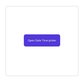
<Button Text="Open Date Time picker"
x:Name="pickerButton"
Clicked="Button_Clicked"
HorizontalOptions="Center"
VerticalOptions="Center"
HeightRequest="50"
WidthRequest="150">
</Button>
</Grid>private void Button_Clicked(object sender, EventArgs e)
{
this.picker.IsOpen = true;
}
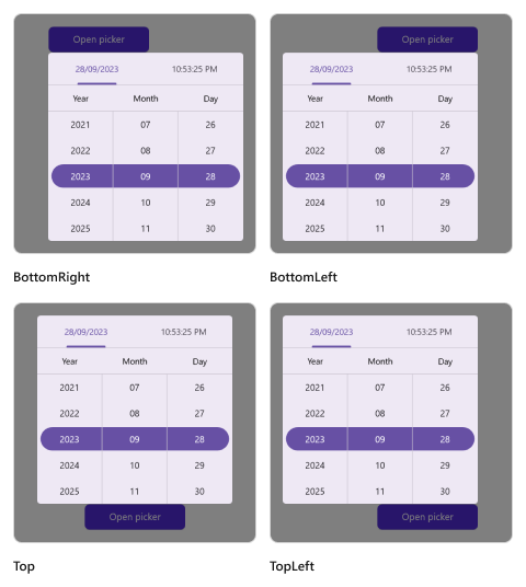
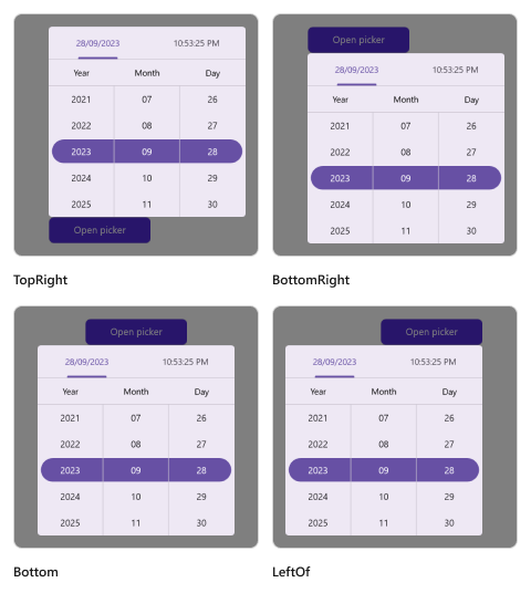
Relative dialog mode
The relative dialog mode is used to display the date time picker in a pop-up by setting the Mode property to RelativeDialog. It is used to align the picker in a specific position. You can set the position by setting the RelativePosition property in the SfDateTimePicker.
Relative position
The relative position is specified in the picker property enumeration, which is used to align the picker in a specific position. It provides eight positions such as AlignTop, AlignToLeftOf, AlignToRightOf, AlignBottom, AlignTopLeft, AlignTopRight, AlignBottomLeft, and AlignBottomRight. The default relative position is AlignTop in the SfDateTimePicker.
The Date Time picker can be opened programmatically by setting the IsOpen property to true of SfDateTimePicker. By default, the IsOpen property is false.
Note: This property is automatically changed to false when you close the dialog by clicking outside of the dialog.
<Grid>
    <picker:SfDateTimePicker x:Name="picker"
                             Mode="RelativeDialog"
                             RelativePosition="AlignTopLeft">
    </picker:SfDateTimePicker>
    <Button Text="Open Date Time picker"
            x:Name="pickerButton"
            Clicked="Button_Clicked"
            HorizontalOptions="Center"
            VerticalOptions="Center"
            HeightRequest="50"
            WidthRequest="150">
    </Button>
</Grid>
private void Button_Clicked(object sender, EventArgs e)
{
this.picker.IsOpen = true;
}Relative view
The RelativeView is specified in the picker’s property enumeration and is used to display the picker dialog relative to a view by setting setting the Mode property to RelativeDialog. You can set the position by setting the RelativePosition property in the SfDateTimePicker.
NOTE
It is only applicable in
RelativeDialogmode. Ifno relative viewis specified, the picker base will be set as thedefaultrelative view.
<Grid>
    <picker:SfDateTimePicker x:Name="picker"
                             Mode="RelativeDialog"
                             RelativePosition="AlignTopLeft"
                             RelativeView = "{x:Reference pickerButton}">
    </picker:SfDateTimePicker>
    <Button Text="Open Date Time picker"
            x:Name="pickerButton"
            Clicked="Button_Clicked"
            HorizontalOptions="Center"
            VerticalOptions="Center"
            HeightRequest="50"
            WidthRequest="150">
    </Button>
</Grid>
private void Button_Clicked(object sender, EventArgs e)
{
this.picker.IsOpen = true;
this.picker.RelativeView = pickerButton;
}
Custom Popup Size
SfDateTimePicker allows the display of the Popup to render at any desired size by setting the PopupWidth and PopupHeight properties.
<picker:SfDateTimePicker x:Name="picker"
                         Mode="Dialog"
                         PopupWidth="300"
PopupHeight="400"/>this.picker.PopupWidth = 300;
this.picker.PopupHeight = 400;