Accessibility in .NET MAUI Date Time Picker (SfDateTimePicker)
21 Jul 20261 minute to read
The .NET MAUI Date Time Picker allows users to interact with the Header, Column Header, Footer, and Picker Items.
Header Layout
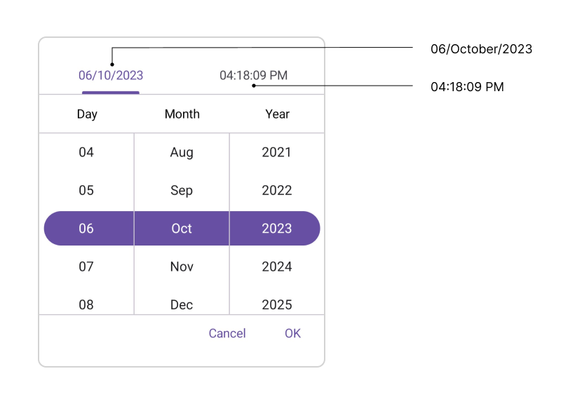
The header supports localization through the DateFormat and TimeFormat properties of the DateTimePickerHeaderView. For example, with DateFormat="dd_MMM_yyyy" and TimeFormat="h_mm_ss_tt":
| Format | Accessibility |
|---|---|
| Date Format | 1/January/2026 |
| Time Format | 10:15:30 AM (or) PM |
Column Header Layout
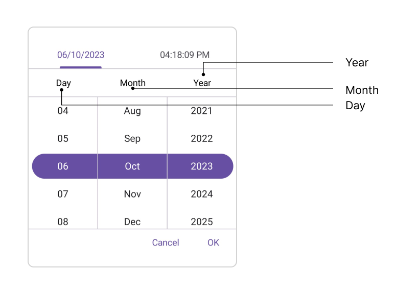
The column header supports localization through the configurable text properties. It contains DayHeaderText, MonthHeaderText, YearHeaderText, HourHeaderText, MinuteHeaderText, SecondHeaderText, and MeridiemHeaderText properties in the DateTimePickerColumnHeaderView. The default value of DayHeaderText is “Day”, MonthHeaderText is “Month”, YearHeaderText is “Year”, HourHeaderText is “Hour”, MinuteHeaderText is “Minute”, SecondHeaderText is “Second”, and MeridiemHeaderText is “string.Empty”.
Footer Layout
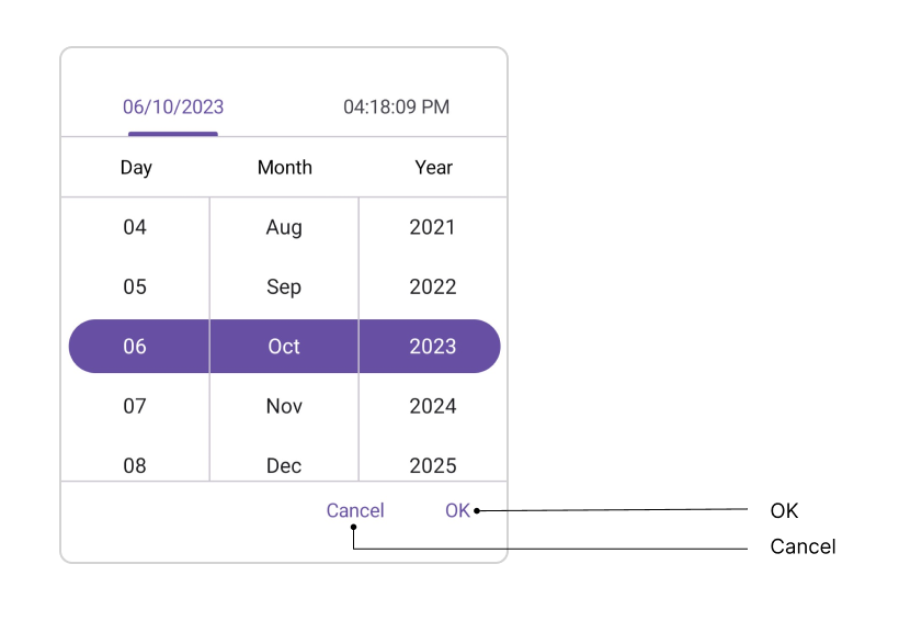
The validation buttons (OK and Cancel) support localization through their text properties. The Default value of the OkButtonText property is “OK”, and CancelButtonText is “Cancel”.
Picker Items
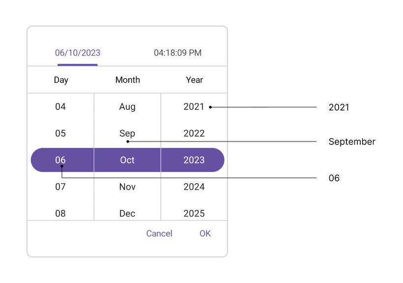
The SfDateTimePicker control has interact with the item source in picker items. The item source contains based on the Date Format and Time Format. For example,
| Format | Example |
|---|---|
| d, M, h, H | 1 |
| dd, MM, hh, HH, mm, ss | 01 |
| MMM | January |
| yyyy | 2023 |
| tt | AM/PM |
Keyboard
SfDateTimePicker supports selection using keyboard interactions.
| Key | Description |
|---|---|
| Tab | Focus the picker. |
| Enter | Opens the selected picker. |
| DownArrow | Select the next item in the currently focused column. |
| UpArrow | Select the previous item in the currently focused column. |
| RightArrow/Tab | Move focus to the column on the right. |
| LeftArrow/Shift+Tab | Move focus to the column on the left. |
| Esc/Enter | Exit and commit selection. |