About Syncfusion® .NET MAUI Date Picker Control
Syncfusion® .NET MAUI Date Picker control allows you to select a date and visualize its items inside a popup or a drop-down UI element. The Date Picker also enables you to set date ranges and formats and customize its dialog appearance by configuring its header, footer, and more.
Business use cases
- Booking and reservation applications that require date selection with validation and range restrictions.
- Form-based applications that need user-friendly date input for registration, scheduling, or data entry.
- Business applications that use date-based filtering and reporting workflows.
- Mobile and desktop apps that require consistent and customizable date selection UI across platforms.
Key features
-
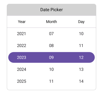
Header view support allows displaying and customizing header text to provide context in the date picker dialog.
-
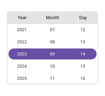
Column header view support allows showing predefined or custom column headers for better readability of date elements.
-
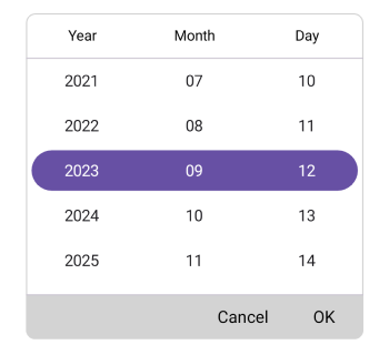
Footer view support provides OK and Cancel buttons with customizable text and appearance.
-
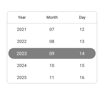
Selection view support allows displaying the currently selected date in a dedicated customizable section.
-
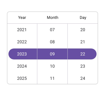
Date format support allows representing selected dates using predefined string formats.
-
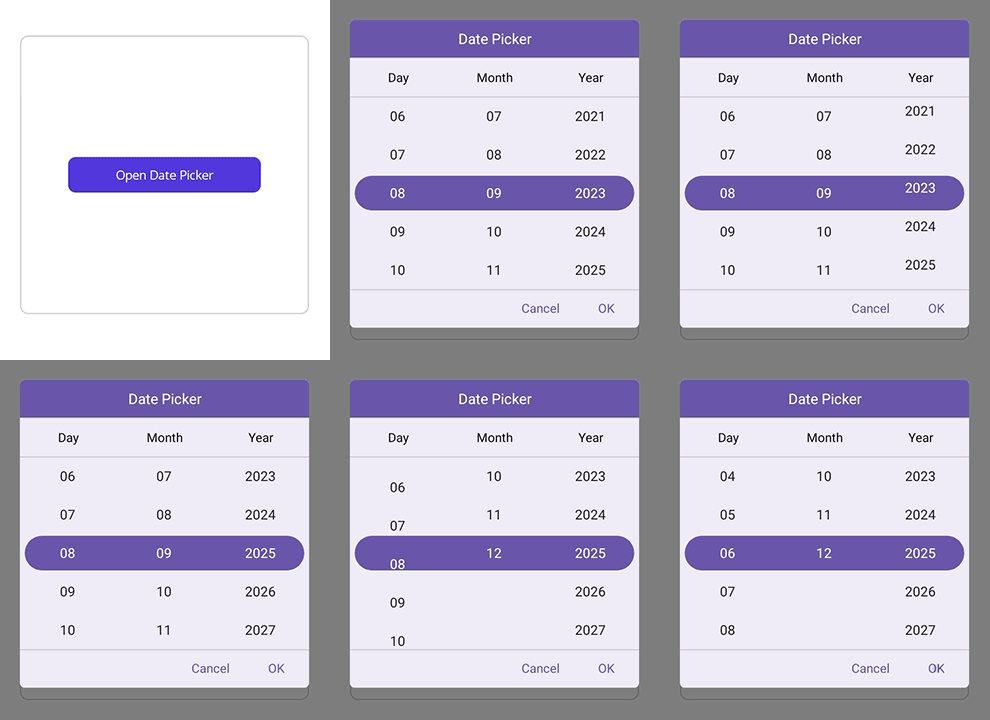
Picker mode options allow displaying the picker in popup or dialog mode with flexible positioning.
-
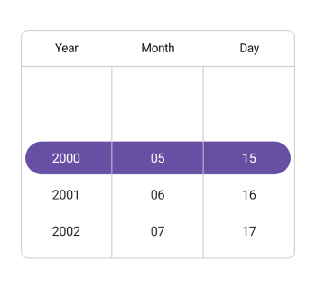
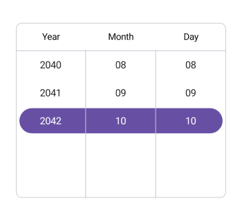
Date restriction support allows limiting selection within minimum and maximum date ranges.
-
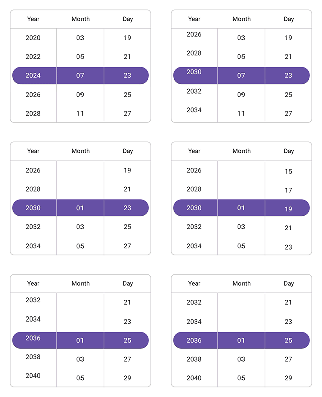
Interval support allows configuring values for days, months, and years using defined intervals.
-
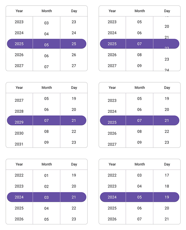
User interaction support allows selecting dates through intuitive tap and scroll gestures.
Globalization
The following table summarizes the globalization support available in this control.
 Full Support
| Control | Localization | RTL | Time zone | Screen reader | Keyboard navigation |
|---|---|---|---|---|---|
| DatePicker | |
|
|
|
|
Related controls
- Date Time Picker for selecting both date and time values.
- Calendar for navigating and selecting dates using full calendar views.
- DataForm for integrating date picker inputs within forms.
See Also
- Getting Started shows a step‑by‑step guide to begin using the Date Picker control.
- Formatting explains how to configure how date values are displayed.
- Customization helps modify appearance and interaction behavior.
- UI Kit provides interactive demos and ready‑made UI examples.