Liquid Glass Effect in .NET MAUI Date Picker (SfDatePicker)
21 Jul 20266 minutes to read
The Liquid Glass Effect introduces a modern, translucent design with adaptive color tinting and light refraction, creating a sleek, glass like user experience that remains clear and accessible. This section explains how to enable and customize the effect in the Syncfusion® .NET MAUI Date Picker (SfDatePicker) control.
Apply liquid glass effect
Follow these steps to enable and configure the Liquid Glass Effect in the Date Picker control:
Step 1: Wrap the control inside glass effect view
To apply the Liquid Glass Effect to Syncfusion® .NET MAUI Date Picker control, wrap the control inside the SfGlassEffectView class.
For more details, refer to the Liquid Glass Getting Started documentation.
Step 2: Enable the liquid glass effect on Date Picker
Set the EnableLiquidGlassEffect property to true in the SfDatePicker control to apply the Liquid Glass Effect. When enabled, the effect is also applied to its dependent controls and responds to touch and gestures, providing a smooth and engaging user experience.
Step 3: Customize the background
To achieve a glass like background in the Date Picker, set the Background property to Transparent. The background will then be applied as a tinted color, ensuring a consistent glass effect across the controls.
The following code snippet demonstrates how to apply the Liquid Glass Effect to the SfDatePicker control:
<ContentPage
    xmlns="http://schemas.microsoft.com/dotnet/2021/maui"
    xmlns:x="http://schemas.microsoft.com/winfx/2009/xaml"
    xmlns:picker="clr-namespace:Syncfusion.Maui.Picker;assembly=Syncfusion.Maui.Picker"
    xmlns:core="clr-namespace:Syncfusion.Maui.Core;assembly=Syncfusion.Maui.Core"
    x:Class="LiquidGlassDatePickerPage">
    <Grid>
        <Grid.Background>
            <LinearGradientBrush StartPoint="0,0"
                                 EndPoint="0,1">
                <GradientStop Color="#0F4C75"
                              Offset="0.0"/>
                <GradientStop Color="#3282B8"
                              Offset="0.5"/>
                <GradientStop Color="#1B262C"
                              Offset="1.0"/>
            </LinearGradientBrush>
        </Grid.Background>
        <Grid>
            <core:SfGlassEffectView
                EffectType="Regular"
                CornerRadius="20"
                WidthRequest="350"
                HeightRequest="350">
                <picker:SfDatePicker x:Name="datepicker"
                                     EnableLiquidGlassEffect="True"
                                     Background="Transparent">
                    <picker:SfDatePicker.ColumnHeaderView>
                        <picker:DatePickerColumnHeaderView Background="Transparent"/>
                    </picker:SfDatePicker.ColumnHeaderView>
                </picker:SfDatePicker>
            </core:SfGlassEffectView>
        </Grid>
    </Grid>
</ContentPage>
using Microsoft.Maui.Controls;
using Syncfusion.Maui.Core;
using Syncfusion.Maui.Picker;
// Outer grid with gradient background
var mainGrid = new Grid()
{
Background = new LinearGradientBrush()
{
StartPoint = new Point(0, 0),
EndPoint = new Point(0, 1),
GradientStops =
{
new GradientStop { Color = Color.FromArgb("#0F4C75"), Offset = 0.0f },
new GradientStop { Color = Color.FromArgb("#3282B8"), Offset = 0.5f },
new GradientStop { Color = Color.FromArgb("#1B262C"), Offset = 1.0f }
}
}
};
// Inner grid container
var innerGrid = new Grid();
var glassView = new SfGlassEffectView()
{
CornerRadius = 20,
EffectType = LiquidGlassEffectType.Regular,
WidthRequest = 350,
HeightRequest = 350,
Background = Colors.Transparent
};
var datePicker = new SfDatePicker()
{
EnableLiquidGlassEffect = true,
Background = Colors.Transparent,
WidthRequest = 350,
HeightRequest = 350,
ColumnHeaderView = new DatePickerColumnHeaderView()
{
Background = Colors.Transparent,
}
};
glassView.Content = datePicker;
innerGrid.Children.Add(glassView);
mainGrid.Children.Add(innerGrid);
this.Content = mainGrid;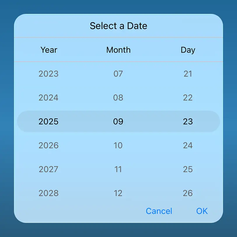
NOTE
- Supported on
macOS 26 or higherandiOS 26 or higher.- This feature is available only in
.NET 10.