How can I help you?
Accessibility in .NET MAUI Date Picker (SfDatePicker)
7 Jan 20251 minute to read
The .NET MAUI Date Picker control has interact with the Header, Column Header, Footer, and Picker Items.
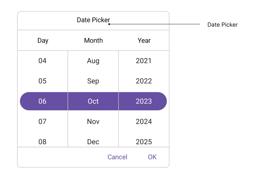
Header Layout
The SfDatePicker control has interact Header Text with localization of header layout.
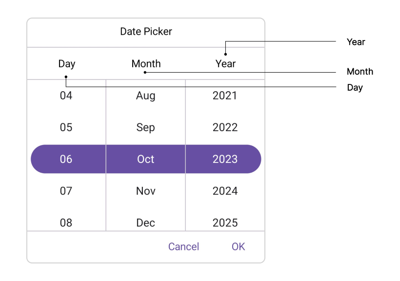
Column Header Layout
The SfDatePicker control has interact column header text with localization of column header layout. It contains DayHeaderText, MonthHeaderText, and YearHeaderText properties of the DatePickerColumnHeaderView. The default value of the DayHeaderText property is “Day”, MonthHeaderText is “Month”, and YearHeaderText is “Year”.
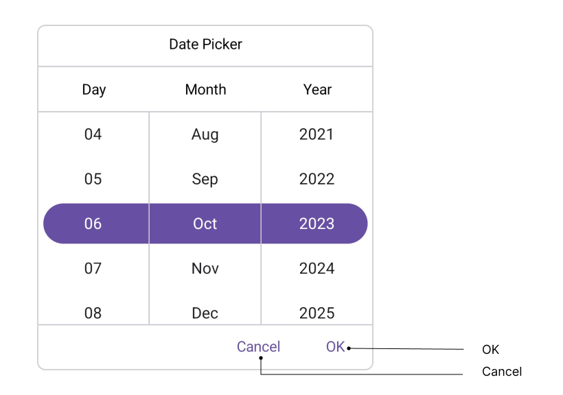
Footer Layout
The SfDatePicker control has interact validation buttons (OK and Cancel) with localization of footer layout. The Default value of the OkButtonText property is “OK”, and CancelButtonText is “Cancel”.
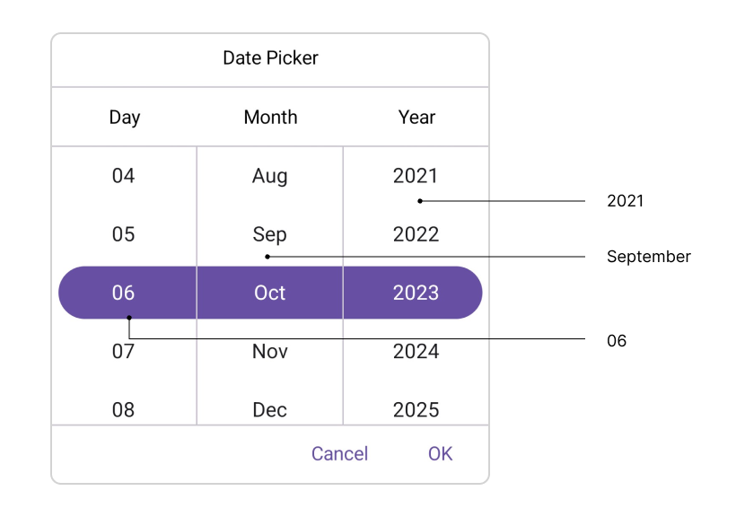
Picker Items
The SfDatePicker control has interact with the item source in picker items. The item source contains based on the Date Format. For example,
| Format | Example |
|---|---|
| d, M | 1 |
| dd, MM | 01 |
| MMM | January |
| yyyy | 2023 |
Keyboard
SfDatePicker supports selection using keyboard interactions.
| Key | Description |
|---|---|
| Tab | Focus the picker. |
| Enter | Opens the selected picker. |
| DownArrow | Selects an item from the currently expanded list by moving downwards. |
| UpArrow | Selects an item from the currently expanded list by moving upwards. |
| RightArrow/Tab | Navigates through the selected item in the right direction. |
| LeftArrow/Shift+Tab | Navigates through the selected item in the left direction. |
| Esc/Enter | Exit and commit selection. |