How can I help you?
Record Template View in Maui DataGrid (SfDataGrid)
5 Mar 202623 minutes to read
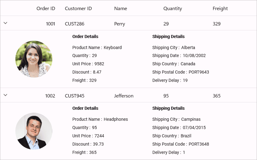
The SfDataGrid provides support to represent additional information of a row using TemplateViewDefinition that can be defined in datagrid. It allows you to load any controls to TemplateViewDefinition.RowTemplate in order to display the additional information of a row. You can expand or collapse the row template view by using an expander in a row or programmatically.
Defining row template
Template view can be generated for the master row by using the RowTemplate defined in the TemplateViewDefinition.
Follow the below steps to define the row template,
- Create
TemplateViewDefinition. - Define data template for the
TemplateViewDefinition.RowTemplateproperty. - Then add
TemplateViewDefinitionto the SfDataGrid.DetailsViewDefinition.
You can bind the row data using the Data.PropertyName (where Data is the underlying object bound).
<syncfusion:SfDataGrid x:Name="dataGrid"
                       ItemsSource="{Binding Employees}">
    <syncfusion:SfDataGrid.DetailsViewDefinition>
        <syncfusion:TemplateViewDefinition  x:Name="Template"
                                            HeightMode="Auto">
            <syncfusion:TemplateViewDefinition.RowTemplate>
                <DataTemplate>
                    <Label Text="{Binding Data.Name}" />
                </DataTemplate>
            </syncfusion:TemplateViewDefinition.RowTemplate>
        </syncfusion:TemplateViewDefinition>
    </syncfusion:SfDataGrid.DetailsViewDefinition>
</syncfusion:SfDataGrid>
Defining RowTemplateSelector
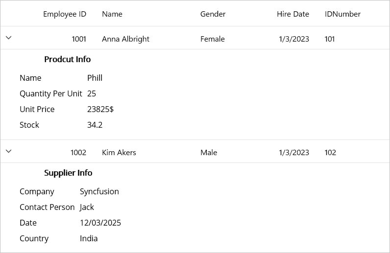
TemplateViewDefinition provides support to choose different DataTemplate based on underlying data object using TemplateViewDefinition.RowTemplate property.
<ContentPage.Resources>
    <DataTemplate x:Key="ProductInfo">
        <Grid BackgroundColor="AliceBlue">
            <Grid.RowDefinitions>
                <RowDefinition Height="Auto" />
                <RowDefinition Height="Auto" />
            </Grid.RowDefinitions>
            <Label Grid.Row="0"
                   HorizontalOptions="Center"
                   Margin="5"
                   Text="Prodcut Info"
                   FontAttributes="Bold" />
            <Grid Grid.Row="1"
                  HorizontalOptions="Center"
                  VerticalOptions="Center">
                <Grid.ColumnDefinitions>
                    <ColumnDefinition Width="*" />
                    <ColumnDefinition Width="*" />
                </Grid.ColumnDefinitions>
                <Grid.RowDefinitions>
                    <RowDefinition Height="Auto" />
                    <RowDefinition Height="Auto" />
                    <RowDefinition Height="Auto" />
                    <RowDefinition Height="Auto" />
                </Grid.RowDefinitions>
                <Label Grid.Row="0"
                       Margin="5"
                       Grid.Column="0"
                       HorizontalOptions="Center"
                       Text="Name" />
                <Label Grid.Row="0"
                       Grid.Column="1"
                       Margin="5"
                       HorizontalOptions="Center"
                       Text="Phill" />
                <Label Grid.Row="1"
                       Margin="5"
                       Grid.Column="0"
                       HorizontalOptions="Center"
                       Text="Quantity Per Unit" />
                <Label Grid.Row="1"
                       Margin="5"
                       Grid.Column="1"
                       HorizontalOptions="Center"
                       Text="25" />
                <Label Grid.Row="2"
                       Margin="5"
                       Grid.Column="0"
                       HorizontalOptions="Center"
                       Text="Unit Price" />
                <Label Grid.Row="2"
                       Margin="5"
                       Grid.Column="1"
                       HorizontalOptions="Center"
                       Text="23825$" />
                <Label Grid.Row="3"
                       Margin="5"
                       Grid.Column="0"
                       HorizontalOptions="Center"
                       Text="Stock" />
                <Label Grid.Row="3"
                       Margin="5"
                       Grid.Column="1"
                       HorizontalOptions="Center"
                       Text="34.2" />
            </Grid>
        </Grid>
    </DataTemplate>
    <DataTemplate x:Key="SupplierInfo">
        <Grid BackgroundColor="AliceBlue">
            <Grid.RowDefinitions>
                <RowDefinition Height="Auto" />
                <RowDefinition Height="Auto" />
            </Grid.RowDefinitions>
            <Label Grid.Row="0"
                   Margin="5"
                   HorizontalOptions="Center"
                   Text="Supplier Info"
                   FontAttributes="Bold" />
            <Grid Grid.Row="1"
                  HorizontalOptions="Center">
                <Grid.ColumnDefinitions>
                    <ColumnDefinition Width="*" />
                    <ColumnDefinition Width="*" />
                </Grid.ColumnDefinitions>
                <Grid.RowDefinitions>
                    <RowDefinition Height="Auto" />
                    <RowDefinition Height="Auto" />
                    <RowDefinition Height="Auto" />
                    <RowDefinition Height="Auto" />
                </Grid.RowDefinitions>
                <Label Grid.Row="0"
                       Margin="5"
                       Grid.Column="0"
                       HorizontalOptions="Center"
                       Text="Company" />
                <Label Grid.Row="0"
                       Grid.Column="1"
                       Margin="5"
                       HorizontalOptions="Center"
                       Text="Syncfusion" />
                <Label Grid.Row="1"
                       Margin="5"
                       Grid.Column="0"
                       HorizontalOptions="Center"
                       Text="Contact Person" />
                <Label Grid.Row="1"
                       Grid.Column="1"
                       Margin="5"
                       HorizontalOptions="Center"
                       Text="Jack" />
                <Label Grid.Row="2"
                       Margin="5"
                       Grid.Column="0"
                       HorizontalOptions="Center"
                       Text="Date" />
                <Label Grid.Row="2"
                       Margin="5"
                       Grid.Column="1"
                       HorizontalOptions="Center"
                       Text="12/03/2025" />
                <Label Grid.Row="3"
                       Margin="5"
                       Grid.Column="0"
                       HorizontalOptions="Center"
                       Text="Country" />
                <Label Grid.Row="3"
                       Margin="5"
                       Grid.Column="1"
                       HorizontalOptions="Center"
                       Text="India" />
            </Grid>
        </Grid>
    </DataTemplate>
     <selector:DetailsViewTemplateSelector x:Key="EditTemplateSelector"
                                       ProductTemplate="{StaticResource ProductInfo}"
                                       SupplierTemplate="{StaticResource SupplierInfo}" />
</ContentPage.Resources>
<syncfusion:SfDataGrid x:Name="dataGrid"
                       DataGridLoaded="dataGrid_DataGridLoaded"
                       ItemsSource="{Binding Employees}">
    <syncfusion:SfDataGrid.DetailsViewDefinition>
        <syncfusion:TemplateViewDefinition  x:Name="Template"
                                            RowTemplate="{StaticResource EditTemplateSelector}"
                                            HeightMode="Auto" />
    </syncfusion:SfDataGrid.DetailsViewDefinition>
</syncfusion:SfDataGrid>
public class DetailsViewTemplateSelector : DataTemplateSelector
{
public DataTemplate ProductTemplate { get; set; }
public DataTemplate SupplierTemplate { get; set; }
protected override DataTemplate OnSelectTemplate(object item, BindableObject container)
{
var employeeID = ((item as RecordEntry)?.Data as Employee)?.EmployeeID ?? 0;
return (employeeID % 2 == 0) ? SupplierTemplate : ProductTemplate;
}
}
Height customization
Height mode
You can customize height of the row that contains RowTemplate by using the TemplateViewDefinition.HeightMode property. The height modes are as follows.
| Height mode | Definition |
|---|---|
Auto
|
Arranges template for the actual size as the RowTemplate is measured. |
Fixed
|
Arranges template for the specified height in . |
ViewportHeight
|
Arranges template for the ViewPortHeight when the RowTemplate actual height is greater thanViewPortHeight.
|
Populating record template view using events
You can set the RowTemplate on-demand when expanding the record by using the DataGridDetailsViewExpandingEventArgs.RowTemplate property in SfDataGrid.DetailsViewExpanding event handler.
<syncfusion:SfDataGrid Name="dataGrid"
                       DetailsViewExpanding="dataGrid_DetailsViewExpanding"
                       ItemsSource="{Binding Employees}">
    <datagrid:SfDataGrid.DetailsViewDefinition>
        <datagrid:TemplateViewDefinition  RowTemplate="{StaticResource DetailViewTemplate}"/>
    </datagrid:SfDataGrid.DetailsViewDefinition>
</Syncfusion.SfDataGrid>
private void dataGrid_DetailsViewExpanding(object sender, DataGridDetailsViewExpandingEventArgs e)
{
e.RowTemplate = GetDataTemplate();
}
public DataTemplate GetDataTemplate()
{
return new DataTemplate(() =>
{
var label = new Label();
label.SetBinding(Label.TextProperty, "Data.ShipCity");
return label;
});
}Expanding and collapsing row template programmatically
The SfDataGrid allows you to expand or collapse the RowTemplate programmatically in different ways.
Expand or collapse all the row template
You can expand or collapse all the RowTemplate by using the ExpandAllDetailsView and CollapseAllDetailsView methods.
this.dataGrid.ExpandAllDetailsView();
this.dataGrid.CollapseAllDetailsView();
Expand or collapse row template based on record index
You can expand or collapse the RowTemplate based on the record index by using the ExpandDetailsViewAt and CollapseDetailsViewAt methods.
this.dataGrid.ExpandDetailsViewAt(1);
this.dataGrid.CollapseDetailsViewAt(1);
Handling events
DetailsViewExpanding
The DetailsViewExpanding event is raised when the RowTemplate is being expanded by using an expander.
this.dataGrid.DetailsViewExpanding += dataGrid_DetailsViewExpanding;

void dataGrid_DetailsViewExpanding(object sender, DataGridDetailsViewExpandingEventArgs e)
{
}
DetailsViewExpanded
The DetailsViewExpanded event is raised when the RowTemplate is expanded by using an expander.
this.dataGrid.DetailsViewExpanded += dataGrid_DetailsViewExpanded;

void dataGrid_DetailsViewExpanded(object sender, DataGridDetailsViewExpandedEventArgs e)
{
}
DetailsViewCollapsing
The DetailsViewCollapsing event is raised when the RowTemplate is being collapsed by using an expander.
this.dataGrid.DetailsViewCollapsing += dataGrid_DetailsViewCollapsing;

void dataGrid_DetailsViewCollapsing(object sender, DataGridDetailsViewCollapsingEventArgs e)
{
}
DetailsViewCollapsed
The DetailsViewCollapsed event is raised when the RowTemplate is collapsed by using an expander.
this.dataGrid.DetailsViewCollapsed += dataGrid_DetailsViewCollapsed;

void dataGrid_DetailsViewCollapsed(object sender, DataGridDetailsViewCollapsedEventArgs e)
{
}
Cancel expanding or collapsing operations through events
You can cancel the expanding operation when expanding the RowTemplate by using the DataGridDetailsViewExpandingEventArgs.Cancel property in the DetailsViewExpanding event handler.
this.dataGrid.DetailsViewExpanding += dataGrid_DetailsViewExpanding;

void dataGrid_DetailsViewExpanding(object sender, DataGridDetailsViewExpandingEventArgs e)
{
     if ((e.Record as Employee).EmployeeID == 1002)
     e.Cancel = true;
}
Similarly, the collapsing operation can also be canceled through the DataGridDetailsViewCollapsingEventArgs.Cancel property in DetailsViewCollapsing event handler.
this.dataGrid.DetailsViewCollapsing += dataGrid_DetailsViewCollapsing;

void dataGrid_DetailsViewCollapsing(object sender, DataGridDetailsViewCollapsingEventArgs e)
{
     if ((e.Record as Employee).EmployeeID == 1002)
     e.Cancel = true;
}
Limitations
Limitations are:
- Does not support both
DetailsViewTemplateandDetailsViewDataGridat same level. - Does not support more than one
DetailsViewTemplatein same level.