Data Validation in MAUI DataGrid (SfDataGrid)
17 Oct 202524 minutes to read
.NET MAUI DataGrid allows you to validate the data and display hints in case of validation is not passed. In case of invalid data, error icon is displayed at the top right corner of DataGridCell. When mouse over the error icon, error information will be displayed in error tip.
Built-in Validation
Built-in validations through IDataErrorInfo and INotifyDataErrorInfo, can be enabled by setting SfDataGrid.ValidationMode or DataGridColumn.ValidationMode properties.
DataGridColumn.ValidationMode takes priority than SfDataGrid.ValidationMode.
- DataGridValidationMode.InEdit - display error icon & tips and also doesn’t allow the users to commit the invalid data by not allowing users to edit other cells.
- DataGridValidationMode.InView - displays error icons and tips alone.
- DataGridValidationMode.None - disables built-in validation support.
Built-in validation using IDataErrorInfo / INotifyDataErrorInfo
.NET MAUI DataGrid (SfDataGrid) provides support to validate the data based on IDataErrorInfo / INotifyDataErrorInfo.
Using IDataErrorInfo
You can validate the data by inheriting the IDataErrorInfo interface in model class.
public class OrderInfo : IDataErrorInfo
{
    private string shipCountry;

    public string ShipCountry
    {
        get { return shipCountry; }
        set { shipCountry = value; }
    }

    [Display(AutoGenerateField = false)]
    public string Error
    {
        get
        {
            return string.Empty;
        }
    }

    public string this[string columnName]
    {
        get
        {

            if (!columnName.Equals("ShipCountry"))
                return string.Empty;

            if (this.ShipCountry == "Canada" || this.ShipCountry == "Belgium")
                return "Delivery not available for " + this.ShipCountry;

            return string.Empty;
        }
    }
}
Enable built-in validation support by setting SfDataGrid.ValidationMode or DataGridColumn.ValidationMode property to InEdit or InView.
<syncfusion:SfDataGrid x:Name = "dataGrid"
                       ItemsSource = "{Binding OrderInfoCollection}"
                       SelectionMode = "Single"
                       NavigationMode = "Cell"
                       AllowEditing = "True"
ValidationMode = "InView"/>this.dataGrid.ValidationMode = DataGridValidationMode.InView;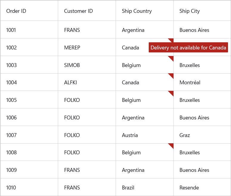
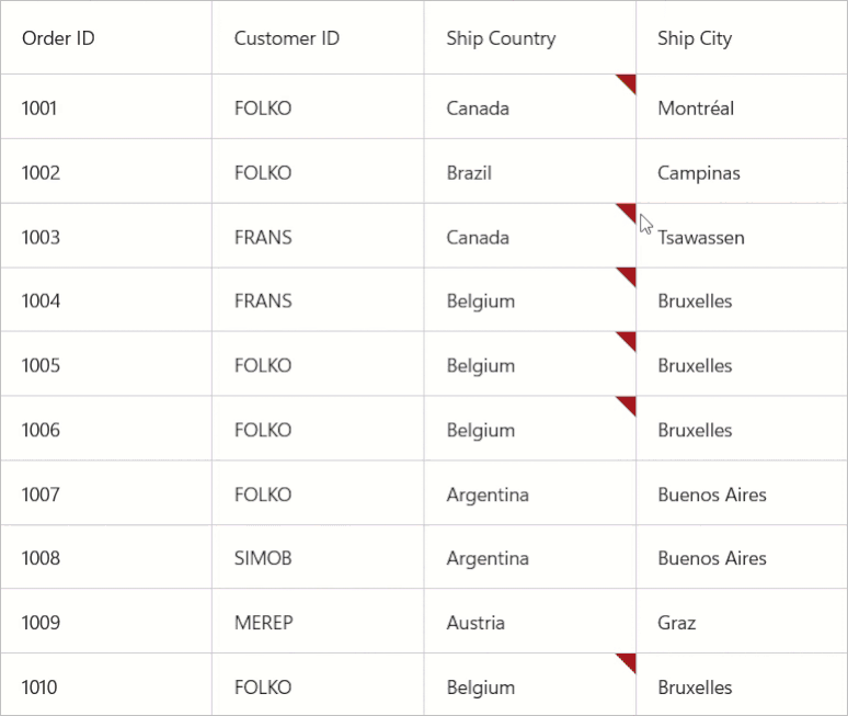
Using INotifyDataErrorInfo
The data can be validated by inheriting the INotifyDataErrorInfo interface in model class.
public class OrderInfo : INotifyDataErrorInfo
{
    private List<string> errors = new List<string>();

    private string shipCountry;

    public string ShipCountry
    {
        get { return shipCountry; }
        set { shipCountry = value; }
    }

    public System.Collections.IEnumerable GetErrors(string propertyName)
    {

        if (!propertyName.Equals("ShipCity"))
            return null;

        if (this.ShipCity.Contains("Graz") || this.ShipCity.Contains("Montréal"))
            errors.Add("Delivery not available for " + this.ShipCity);
        return errors;
    }

    [Display(AutoGenerateField = false)]

    public bool HasErrors
    {
        get
        {
            return false;
        }
    }

    public event EventHandler<DataErrorsChangedEventArgs> ErrorsChanged;
}
Enable built-in validation support by setting SfDataGrid.ValidationMode or DataGridColumn.ValidationMode property to InEdit or InView.
<syncfusion:SfDataGrid x:Name = "dataGrid"
                       ItemsSource = "{Binding OrderInfoCollection}"
                       SelectionMode = "Single"
                       NavigationMode = "Cell"
                       AllowEditing = "True"
                       ValidationMode = "InView"/>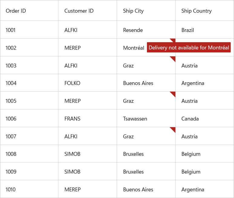
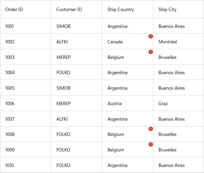
Cell Validation
A cell can be validated using CellValidating event when the cell is edited. CellValidating event occurs when the edited cells tries to commit the data or lose the focus. DataGrid will not allow user to edit other cells if validation failed.
DataGridCellValidatingEventArgs provides information to CellValidating event for validating the cell. DataGridCellValidatingEventArgs.OriginalSource returns the DataGrid fired this event for DetailsView.
DataGridCellValidatingEventArgs.NewValue returns the edited value and you can set the validation status using DataGridCellValidatingEventArgs.IsValid property.
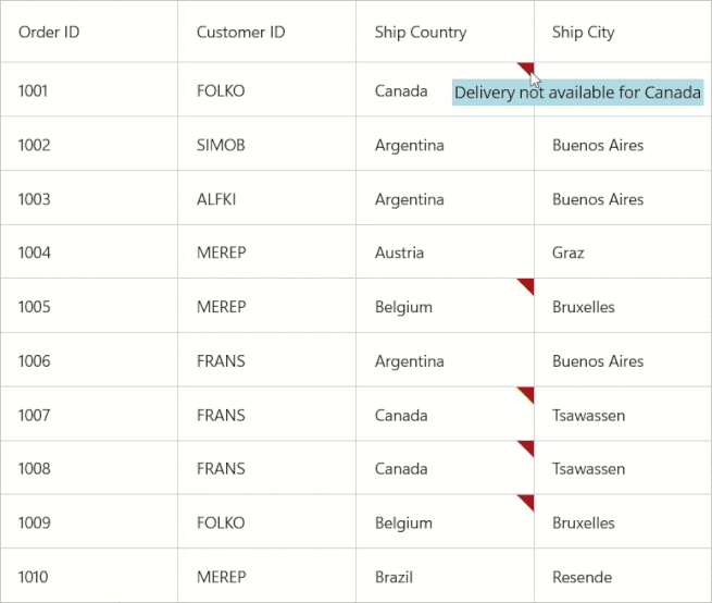
this.dataGrid.CellValidating += dataGrid_CellValidating;

private void dataGrid_CellValidating(object sender, DataGridCellValidatingEventArgs args)
{
    if (args.NewValue.ToString().Equals("Brazil"))
    {
        args.IsValid = false;
        args.ErrorMessage = "Brazil cannot be passed";
    }
}
SfDataGrid.CellValidated event triggered when the cell has finished validating with valid data.
this.dataGrid.CellValidated += dataGrid_CellValidated;

private void dataGrid_CellValidated(object sender, DataGridCellValidatedEventArgs args)
{

}
Row Validation
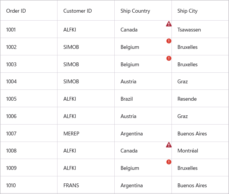
A Row can be validated using RowValidating event when the cell is edited. The RowValidating event occurs when the edited cells tries to commit the row data or lose the focus. DataGrid will not allow user to edit other rows if validation failed.
DataGridRowValidatingEventArgs provides information to RowValidating event for validating row. DataGridRowValidatingEventArgs.OriginalSource returns the DataGrid fired this event for DetailsView.
DataGridRowValidatingEventArgs.RowData returns the edited value and you can set the validation status using DataGridRowValidatingEventArgs.IsValid property.
this.dataGrid.RowValidating += dataGrid_RowValidating;

void dataGrid_RowValidating(object sender, DataGridRowValidatingEventArgs args)
{
    var data = args.RowData.GetType().GetProperty("ShipCountry").GetValue(args.RowData);

    if (data != null && data.ToString().Equals("Austria"))
    {
        args.IsValid = false;
        args.ErrorMessages.Add("ShipCountry", "Austria cannot be passed");
    }
}
SfDataGrid.RowValidated event triggered when the row has finished validating with valid row data.
this.dataGrid.RowValidated += dataGrid_RowValidated;

private void dataGrid_RowValidated(object sender, DataGridRowValidatedEventArgs args)
{

}
Error Icon Customization
Change Error Icon Color
The default error icon color can be customized by setting the DataGridStyle.ErrorIconColor property.
<syncfusion:SfDataGrid x:Name = "dataGrid"
                       ItemsSource = "{Binding OrderInfoCollection}"
                       SelectionMode = "Single"
                       NavigationMode = "Cell"
                       AllowEditing = "True"
                       ValidationMod = "InView">
        <syncfusion:SfDataGrid.DefaultStyle>
                <syncfusion:DataGridStyle ErrorIconColor = "Orange" />
        </syncfusion:SfDataGrid.DefaultStyle>
</syncfusion:SfDataGrid>
Load Error Icon through Template
The SfDataGrid uses an icon to indicate if a cell has error. You can personalize the error icon by using the SfDataGrid.ErrorIconTemplate property.
<syncfusion:SfDataGrid x:Name = "dataGrid"
                       ItemsSource = "{Binding OrderInfoCollection}"
                       SelectionMode = "Single"
                       NavigationMode = "Cell"
                       AllowEditing = "True"
                       ValidationMode = "InView">
        <syncfusion:SfDataGrid.ErrorIconTemplate>
                <DataTemplate>
                    <Image Source = "error_icon.png"/>
                </DataTemplate>
        </syncfusion:SfDataGrid.ErrorIconTemplate>
</syncfusion:SfDataGrid>this.dataGrid.ValidationMode = DataGridValidationMode.InView;
this.dataGrid.ErrorIconTemplate = new DataTemplate(() =>
{
var image = new Image()
{
Source = "error_icon.png",
};
return image;
});
Load Error Icon through Template Selector
When choosing a ErrorIconTemplate as a DataTemplateSelector, you have the option to supply distinct templates for different invalid values.
<ContentPage.Resources>
    <ResourceDictionary>
        <DataTemplate x:Key = "BelgiumTemplate">
            <Image Source = "error_icon.png"/>
        </DataTemplate>
    <DataTemplate x:Key = "CanadaTemplate">
            <Image Source = "error_triangle.png"/>
        </DataTemplate>
    </ResourceDictionary>
</ContentPage.Resources>

<syncfusion:SfDataGrid x:Name = "dataGrid"
                       ItemsSource = "{Binding OrderInfoCollection}"
                       SelectionMode = "Single"
                       NavigationMode = "Cell"
                       AllowEditing = "True"
                       ValidationMode = "InView">
        <syncfusion:SfDataGrid.ErrorIconTemplate>
                <local:ErrorIconTemplateSelector BelgiumTemplate = "{StaticResource BelgiumTemplate}" CanadaTemplate = "{StaticResource CanadaTemplate}" />
        </syncfusion:SfDataGrid.ErrorIconTemplate>
</syncfusion:SfDataGrid>
public class ErrorIconTemplateSelector: DataTemplateSelector
{
public DataTemplate BelgiumTemplate { get; set; }
public DataTemplate CanadaTemplate { get; set; }
protected override DataTemplate OnSelectTemplate(object item, BindableObject container)
{
if (item is Orders order)
{
if (order.ShipCountry == "Belgium")
{
return BelgiumTemplate;
}
else
{
return CanadaTemplate;
}
}
return CanadaTemplate;
}
}
Error Tip Customization
Change Error Tip Background and Text Color
The background of the error tip can be changed by setting DataGridStyle.ErrorTipBackground property. The error tip text color can be changed by setting DataGridStyle.ErrorTipTextColor property.
<syncfusion:SfDataGrid x:Name = "dataGrid"
                       ItemsSource = "{Binding OrderInfoCollection}"
                       SelectionMode = "Single"
                       NavigationMode = "Cell"
                       AllowEditing = "True"
                       ValidationMode = "InView">
        <syncfusion:SfDataGrid.DefaultStyle>
                <syncfusion:DataGridStyle ErrortipBackground = "LightBlue" ErrorTipTextColor = "Black"/>
        </syncfusion:SfDataGrid.DefaultStyle>
</syncfusion:SfDataGrid>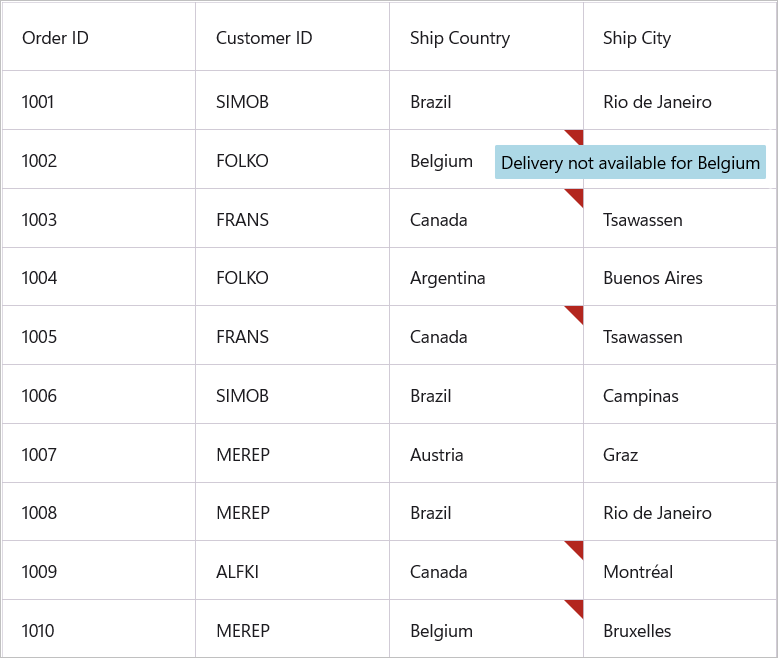
Load Error Tip through Template
The SfDataGrid uses a tool tip to showcase an error message if a cell has error. You can personalize the error tip by using the SfDataGrid.ErrorTipTemplate property.
<syncfusion:SfDataGrid x:Name = "dataGrid"
                       ItemsSource = "{Binding OrderInfoCollection}"
                       SelectionMode = "Single"
                       NavigationMode = "Cell"
                       AllowEditing = "True"
                       ValidationMode = "InView">
        <syncfusion:SfDataGrid.ErrorTipTemplate>
                <DataTemplate>
                    <Label Text = "Delivery not available" Background = "Orange" TextColor = "Black" Padding = "2"/>
                </DataTemplate>
        </syncfusion:SfDataGrid.ErrorTipTemplate>
</syncfusion:SfDataGrid>this.dataGrid.ValidationMode = DataGridValidationMode.InView;
this.dataGrid.ErrorTipTemplate = new DataTemplate(() =>
{
var label = new Label()
{
Text = "Delivery Not available",
Background = Colors.Orange,
TextColor = Colors.Black
};
return label;
});
Load Error Tip through Template Selector
When choosing a ErrorTipTemplate as a DataTemplateSelector, you have the option to supply distinct templates for different invalid values.
<ContentPage.Resources>
    <ResourceDictionary>
        <DataTemplate x:Key = "BelgiumTemplate">
            <Label Text = "Delivery not available for Belgium" Background = "Orange" TextColor = "Black" Padding = "2"/>
        </DataTemplate>
    <DataTemplate x:Key = "CanadaTemplate">
            <Label Text = "Delivery not available for Canada" Background = "LightBlue" TextColor = "Black" Padding = "2"/>
        </DataTemplate>
    </ResourceDictionary>
</ContentPage.Resources>

<syncfusion:SfDataGrid x:Name = "dataGrid"
                       ItemsSource = "{Binding OrderInfoCollection}"
                       SelectionMode = "Single"
                       NavigationMode = "Cell"
                       AllowEditing = "True"
                       ValidationMode = "InView">
        <syncfusion:SfDataGrid.ErrorTipTemplate>
                <local:ErrorTipTemplateSelector BelgiumTemplate = "{StaticResource BelgiumTemplate}" CanadaTemplate = "{StaticResource CanadaTemplate}" />
        </syncfusion:SfDataGrid.ErrorTipTemplate>
</syncfusion:SfDataGrid>
public class ErrorTipTemplateSelector: DataTemplateSelector
{
public DataTemplate BelgiumTemplate { get; set; }
public DataTemplate CanadaTemplate { get; set; }
protected override DataTemplate OnSelectTemplate(object item, BindableObject container)
{
if (item is Orders order)
{
if (order.ShipCountry == "Belgium")
{
return BelgiumTemplate;
}
else
{
return CanadaTemplate;
}
}
return CanadaTemplate;
}
}
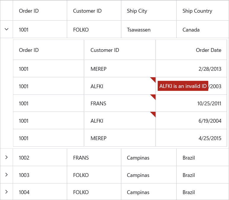
Data Validation with Master-Details View
The data bound based on IDataErrorInfo or INotifyDataErrorInfo can be validated by setting ValidationMode property of DataGridViewDefinition.DataGrid.
<syncfuion:SfDataGrid x:Name = "dataGrid"
                      ItemsSource = "{Binding OrderList}"
                      SelectionMode = "Single"
                      NavigationMode = "Cell"
                      GridLinesVisibility = "Both">
        <syncfuion:SfDataGrid.DetailsViewDefinition>
                <syncfuion:DataGridViewDefinition RelationalColumn = "OrdersList">
                        <syncfuion:DataGridViewDefinition.DataGrid>
                                <syncfuion:SfDataGrid  x:Name = "FirstLevelNestedGrid"
                                                       ValidationMode = "InView"
                                                       AllowEditing = "True"
                                                       GridLinesVisibility = "Both"/>
                        </syncfuion:DataGridViewDefinition.DataGrid>
                </syncfuion:DataGridViewDefinition>
        </syncfuion:SfDataGrid.DetailsViewDefinition>
</syncfuion:SfDataGrid>
When the relation is auto-generated, the data can be validated by setting ValidationMode property to AutoGeneratingRelations.DataGridViewDefinition.DataGrid in AutoGeneratingRelations event handler.
dataGrid.AutoGenerateRelations = true;

dataGrid.AutoGeneratingRelations += dataGrid_AutoGeneratingRelations;

void dataGrid_AutoGeneratingRelations(object sender, AutoGeneratingRelationsArgs e)
{
    e.DataGridViewDefinition.DataGrid.ValidationMode = DataGridValidationMode.InView;
}
Custom validation through events
Master-Details View support to validate the cells and rows using CellValidating and RowValidating events.
Cell Validation
The cells can be validated using CellValidating event of ViewDefinition.DataGrid when the cell is edited. CellValidating event occurs when the edited cells tries to commit the data or lose the focus.
<syncfuion:SfDataGrid x:Name = "dataGrid"
                      ItemsSource = "{Binding OrderList}"
                      SelectionMode = "Single"
                      NavigationMode = "Cell"
                      GridLinesVisibility = "Both">
        <syncfuion:SfDataGrid.DetailsViewDefinition>
                <syncfuion:DataGridViewDefinition RelationalColumn = "OrdersList">
                        <syncfuion:DataGridViewDefinition.DataGrid>
                                <syncfuion:SfDataGrid  x:Name = "FirstLevelNestedGrid"
                                                       AllowEditing = "True"
                                                       ValidationMode = "InView"
                                                       GridLinesVisibility = "Both"/>
                        </syncfuion:DataGridViewDefinition.DataGrid>
                </syncfuion:DataGridViewDefinition>
        </syncfuion:SfDataGrid.DetailsViewDefinition>
</syncfuion:SfDataGrid>this.FirstLevelNestedGrid.CellValidating += FirstLevelNestedGrid_CellValidating;
private void FirstLevelNestedGrid_CellValidating(object sender, DataGridCellValidatingEventArgs args)
{
if (args.NewValue.ToString().Equals("SIMOB"))
{
args.IsValid = false;
args.ErrorMessage = "SIMOB cannot be passed";
}
}CellValidated event of ViewDefinition.DataGrid triggered when the cell has finished validating with valid data.
this.FirstLevelNestedGrid.CellValidated += FirstLevelNestedGrid_CellValidated;

private void FirstLevelNestedGrid_CellValidated(object sender, DataGridCellValidatedEventArgs args)
{

}
When the relation is auto-generated, you can wire the CellValidating and CellValidated events for AutoGeneratingRelations.DataGridViewDefinition.DataGrid in AutoGeneratingRelations event handler.
dataGrid.AutoGenerateRelations = true;
dataGrid.AutoGeneratingRelations += dataGrid_AutoGeneratingRelations;

private void dataGrid_AutoGeneratingRelations(object sender, AutoGeneratingRelationsArgs e)
{
    e.DataGridViewDefinition.DataGrid.CellValidating += FirstLevelNestedGrid_CurrentCellValidating;
    e.DataGridViewDefinition.DataGrid.CellValidated += FirstLevelNestedGrid_CurrentCellValidated;
}
Row Validation
The row can be validated using RowValidating event of ViewDefinition.DataGrid when the cell is edited.
The RowValidating event occurs when edited cells tries to commit the row data or lose the focus.
<syncfuion:SfDataGrid x:Name = "dataGrid"
                      ItemsSource = "{Binding OrderList}"
                      SelectionMode = "Single"
                      NavigationMode = "Cell"
                      GridLinesVisibility = "Both">
        <syncfuion:SfDataGrid.DetailsViewDefinition>
                <syncfuion:DataGridViewDefinition RelationalColumn = "OrdersList">
                        <syncfuion:DataGridViewDefinition.DataGrid>
                                <syncfuion:SfDataGrid  x:Name = "FirstLevelNestedGrid"
                                                       AllowEditing = "True"
                                                       ValidationMode = "InView"
                                                       GridLinesVisibility = "Both"/>
                        </syncfuion:DataGridViewDefinition.DataGrid>
                </syncfuion:DataGridViewDefinition>
        </syncfuion:SfDataGrid.DetailsViewDefinition>
</syncfuion:SfDataGrid>this.FirstLevelNestedGrid.RowValidating += FirstLevelNestedGrid_RowValidating;
private void FirstLevelNestedGrid_RowValidating(object sender, DataGridRowValidatingEventArgs args)
{
var data = args.RowData.GetType().GetProperty("CustomerID").GetValue(args.RowData);
if (data.ToString().Equals("MEREP"))
{
args.IsValid = false;
args.ErrorMessages.Add("CustomerID", "MEREP cannot be passed");
}
}RowValidated of ViewDefinition.DataGrid event triggered when the row has finished validating with valid row data.
this.FirstLevelNestedGrid.RowValidated += FirstLevelNestedGrid_RowValidated;

private void FirstLevelNestedGrid_RowValidated(object sender, DataGridRowValidatedEventArgs args)
{

}
When the relation is auto-generated, you can wire the RowValidating and RowValidated events for AutoGeneratingRelations.DataGridViewDefinition.DataGrid in AutoGeneratingRelations event handler.
dataGrid.AutoGenerateRelations = true;
dataGrid.AutoGeneratingRelations += dataGrid_AutoGeneratingRelations;

private void dataGrid_AutoGeneratingRelations(object sender, AutoGeneratingRelationsArgs e)
{
    e.DataGridViewDefinition.DataGrid.RowValidating += FirstLevelNestedGrid_RowValidating;
    e.DataGridViewDefinition.DataGrid.RowValidated += FirstLevelNestedGrid_RowValidated;
}
Limitations
- Non editable columns will not support custom validation.