How can I help you?
Context Menu in .NET MAUI DataGrid (SfDataGrid)
11 May 202624 minutes to read
Overview
The SfDataGrid control allows you to display a customizable context menu when a user performs a secondary click (right-click on Windows and Mac Catalyst) or a long-press gesture (on Android and iOS) on different parts of the DataGrid.
Types of Context Menus
You can define context menus for the following elements:
- Header: Context menu for column headers.
- Record (Row): Context menu for data rows.
- Group Caption: Context menu for group caption rows.
- Group Summary: Context menu for group summary rows.
- Table Summary: Context menu for table summary rows.
Each context menu type provides specific options tailored to the DataGrid element it is associated with.
Customize Header Context Menu
The header context menu is displayed when the user invokes the context menu on a column header.You can customize the menu items by adding MenuItem objects to the SfDataGrid.HeaderContextMenu collection.
<syncfusion:SfDataGrid x:Name="dataGrid"
ItemsSource="{Binding Orders}">
<syncfusion:SfDataGrid.HeaderContextMenu>
<syncfusion:MenuItemCollection>
<syncfusion:MenuItem Text="Sort Ascending">
<syncfusion:MenuItem.Icon>
<Label Text=""
FontFamily="MaterialAssets"
HorizontalTextAlignment="Center"
VerticalTextAlignment="Center"/>
</syncfusion:MenuItem.Icon>
</syncfusion:MenuItem>
<syncfusion:MenuItem Text="Sort Descending">
<syncfusion:MenuItem.Icon>
<Label Text=""
FontFamily="MaterialAssets"
HorizontalTextAlignment="Center"
VerticalTextAlignment="Center"/>
</syncfusion:MenuItem.Icon>
</syncfusion:MenuItem>
<syncfusion:MenuItem Text="Clear Sorting">
<syncfusion:MenuItem.Icon>
<Label Text=""
FontFamily="MaterialAssets"
HorizontalTextAlignment="Center"
VerticalTextAlignment="Center"/>
</syncfusion:MenuItem.Icon>
</syncfusion:MenuItem>
<syncfusion:MenuItem Text="Search">
<syncfusion:MenuItem.Icon>
<Label Text=""
FontFamily="MaterialAssets"
HorizontalTextAlignment="Center"
VerticalTextAlignment="Center"/>
</syncfusion:MenuItem.Icon>
</syncfusion:MenuItem>
</syncfusion:MenuItemCollection>
</syncfusion:SfDataGrid.HeaderContextMenu>
</syncfusion:SfDataGrid>SfDataGrid dataGrid = new SfDataGrid();
OrderInfoViewModel orderInfoViewModel = new OrderInfoViewModel();
dataGrid.ItemsSource = orderInfoViewModel.Orders;
// Create Header Context Menu
var headerContextMenu = new Syncfusion.Maui.DataGrid.MenuItemCollection
{
new Syncfusion.Maui.DataGrid.MenuItem
{
Text = "Sort Ascending",
Icon = new Label
{
Text = "\ue791",
FontFamily = "MaterialAssets",
HorizontalTextAlignment = TextAlignment.Center,
VerticalTextAlignment = TextAlignment.Center
}
},
new Syncfusion.Maui.DataGrid.MenuItem
{
Text = "Sort Descending",
Icon = new Label
{
Text = "\ue792",
FontFamily = "MaterialAssets",
HorizontalTextAlignment = TextAlignment.Center,
VerticalTextAlignment = TextAlignment.Center
}
},
new Syncfusion.Maui.DataGrid.MenuItem
{
Text = "Clear Sorting",
Icon = new Label
{
Text = "\ue70e",
FontFamily = "MaterialAssets",
HorizontalTextAlignment = TextAlignment.Center,
VerticalTextAlignment = TextAlignment.Center
}
},
new Syncfusion.Maui.DataGrid.MenuItem
{
Text = "Search",
Icon = new Label
{
Text = "\ue715",
FontFamily = "MaterialAssets",
HorizontalTextAlignment = TextAlignment.Center,
VerticalTextAlignment = TextAlignment.Center
}
}
};
dataGrid.HeaderContextMenu = headerContextMenu;
this.Content = dataGrid;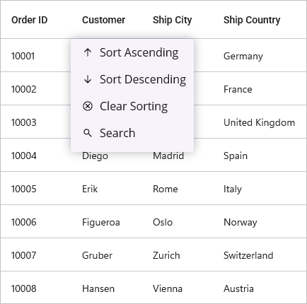
Header Context Menu with Commands
When binding a menu item using a Command, you can access the command parameter as HeaderContextInfo. This object provides contextual information such as the DataGrid instance, the Column clicked, and its RowIndex and ColumnIndex.
<ContentPage.BindingContext>
<local:OrderInfoViewModel x:Name="viewmodel"/>
</ContentPage.BindingContext>
<syncfusion:SfDataGrid x:Name="dataGrid"
ItemsSource="{Binding Orders}">
<syncfusion:SfDataGrid.HeaderContextMenu>
<syncfusion:MenuItemCollection>
<syncfusion:MenuItem Text="Sort Ascending"
BindingContext="{x:Reference viewmodel}"
Command="{Binding SortAscendingCommand}">
<syncfusion:MenuItem.Icon>
<Label Text=""
FontFamily="MaterialAssets"
HorizontalTextAlignment="Center"
VerticalTextAlignment="Center"/>
</syncfusion:MenuItem.Icon>
</syncfusion:MenuItem>
</syncfusion:MenuItemCollection>
</syncfusion:SfDataGrid.HeaderContextMenu>
</syncfusion:SfDataGrid>// ViewModel for the DataGrid
public class OrderInfoViewModel
{
// Command to sort the column in ascending order
public ICommand SortAscendingCommand { get; set; }
// Constructor
public OrderInfoViewModel()
{
// Initialize the command with the method to execute when the command is invoked
SortAscendingCommand = new Command<object>(SortAscending);
}
// Method to sort the column in ascending order
private void SortAscending(object obj)
{
if (obj is HeaderContextInfo context && context.Column != null)
{
context.DataGrid.SortColumnDescriptions.Clear();
context.DataGrid.SortColumnDescriptions.Add(
new SortColumnDescription
{
ColumnName = context.Column.MappingName,
SortDirection = System.ComponentModel.ListSortDirection.Ascending
});
}
}
// Logic to generate predefined data for the DataGrid, as needed
}Customize Record Context Menu
The record context menu is displayed when the user invokes the context menu on a data row. You can customize the menu items by adding MenuItem objects to the SfDataGrid.RecordContextMenu collection.
<syncfusion:SfDataGrid x:Name="dataGrid"
ItemsSource="{Binding Orders}">
<syncfusion:SfDataGrid.RecordContextMenu>
<syncfusion:MenuItemCollection>
<syncfusion:MenuItem Text="Copy">
<syncfusion:MenuItem.Icon>
<Label Text=""
FontFamily="MaterialAssets"
HorizontalTextAlignment="Center"
VerticalTextAlignment="Center"/>
</syncfusion:MenuItem.Icon>
</syncfusion:MenuItem>
<syncfusion:MenuItem Text="Paste">
<syncfusion:MenuItem.Icon>
<Label Text=""
FontFamily="MaterialAssets"
HorizontalTextAlignment="Center"
VerticalTextAlignment="Center"/>
</syncfusion:MenuItem.Icon>
</syncfusion:MenuItem>
<syncfusion:MenuItem Text="Cut">
<syncfusion:MenuItem.Icon>
<Label Text=""
FontFamily="MaterialAssets"
HorizontalTextAlignment="Center"
VerticalTextAlignment="Center"/>
</syncfusion:MenuItem.Icon>
</syncfusion:MenuItem>
<syncfusion:MenuItem Text="Delete">
<syncfusion:MenuItem.Icon>
<Label Text=""
FontFamily="MaterialAssets"
HorizontalTextAlignment="Center"
VerticalTextAlignment="Center"/>
</syncfusion:MenuItem.Icon>
</syncfusion:MenuItem>
</syncfusion:MenuItemCollection>
</syncfusion:SfDataGrid.RecordContextMenu>
</syncfusion:SfDataGrid>SfDataGrid dataGrid = new SfDataGrid();
OrderInfoViewModel orderInfoViewModel = new OrderInfoViewModel();
dataGrid.ItemsSource = orderInfoViewModel.Orders;
// Define the context menu for records
var recordContextMenu = new Syncfusion.Maui.DataGrid.MenuItemCollection
{
new Syncfusion.Maui.DataGrid.MenuItem
{
Text = "Copy",
Icon = new Label
{
Text = "\ue7a0",
FontFamily = "MaterialAssets",
HorizontalTextAlignment = TextAlignment.Center,
VerticalTextAlignment = TextAlignment.Center
}
},
new Syncfusion.Maui.DataGrid.MenuItem
{
Text = "Paste",
Icon = new Label
{
Text = "\ue797",
FontFamily = "MaterialAssets",
HorizontalTextAlignment = TextAlignment.Center,
VerticalTextAlignment = TextAlignment.Center
}
},
new Syncfusion.Maui.DataGrid.MenuItem
{
Text = "Cut",
Icon = new Label
{
Text = "\ue710",
FontFamily = "MaterialAssets",
HorizontalTextAlignment = TextAlignment.Center,
VerticalTextAlignment = TextAlignment.Center
}
},
new Syncfusion.Maui.DataGrid.MenuItem
{
Text = "Delete",
Icon = new Label
{
Text = "\ue70f",
FontFamily = "MaterialAssets",
HorizontalTextAlignment = TextAlignment.Center,
VerticalTextAlignment = TextAlignment.Center
}
}
};
dataGrid.RecordContextMenu = recordContextMenu;
this.Content = dataGrid;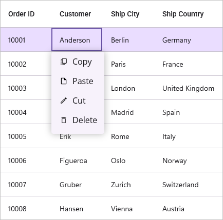
Record Context Menu with Commands
When binding a menu item using a Command, you can access the command parameter as RowContextMenuInfo. This object contains the RowData of the corresponding row, along with the DataGrid instance and the RowIndex.
<ContentPage.BindingContext>
<local:OrderInfoViewModel x:Name="viewmodel"/>
</ContentPage.BindingContext>
<syncfusion:SfDataGrid x:Name="dataGrid"
ItemsSource="{Binding Orders}"
SelectionUnit="Row"
SelectionMode="Single"
AllowEditing="True">
<syncfusion:SfDataGrid.RecordContextMenu>
<syncfusion:MenuItemCollection>
<syncfusion:MenuItem Text="Copy"
BindingContext="{x:Reference viewmodel}"
Command="{x:Binding CopyContentCommand}">
<syncfusion:MenuItem.Icon>
<Label Text=""
FontFamily="MaterialAssets"
HorizontalTextAlignment="Center"
VerticalTextAlignment="Center"/>
</syncfusion:MenuItem.Icon>
</syncfusion:MenuItem>
</syncfusion:MenuItemCollection>
</syncfusion:SfDataGrid.RecordContextMenu>
</syncfusion:SfDataGrid>// ViewModel for the DataGrid
public class OrderInfoViewModel
{
// command to copy the content of the cell
public ICommand CopyContentCommand { get; set; }
// Constructor
public OrderInfoViewModel()
{
// Initialize the command with the method to execute when the command is invoked
CopyContentCommand = new Command<object>(CopyCellContent);
}
// Method to copy the content of the cell when the command is executed
private void CopyCellContent(object obj)
{
if (obj is RowContextMenuInfo context && context.RowIndex >= 0)
{
context.DataGrid?.CopyPasteController.Copy();
}
}
// Logic to generate predefined data for the DataGrid, as needed
}Customize Group Caption Context Menu
The group caption context menu is displayed when the user invokes the context menu on a group caption row. You can customize the menu items by adding MenuItem objects to the SfDataGrid.GroupCaptionContextMenu collection.
<syncfusion:SfDataGrid x:Name="dataGrid"
ItemsSource="{Binding Orders}"
AllowGroupExpandCollapse="True">
<!-- Grouping the data based on the Country column. -->
<syncfusion:SfDataGrid.GroupColumnDescriptions>
<syncfusion:GroupColumnDescription ColumnName="Country"/>
</syncfusion:SfDataGrid.GroupColumnDescriptions>
<!-- Context menu for group caption. -->
<syncfusion:SfDataGrid.GroupCaptionContextMenu>
<syncfusion:MenuItemCollection>
<syncfusion:MenuItem Text="Expand All">
<syncfusion:MenuItem.Icon>
<Label Text=""
FontFamily="MaterialAssets"
HorizontalTextAlignment="Center"
VerticalTextAlignment="Center"/>
</syncfusion:MenuItem.Icon>
</syncfusion:MenuItem>
<syncfusion:MenuItem Text="Collapse All">
<syncfusion:MenuItem.Icon>
<Label Text=""
FontFamily="MaterialAssets"
HorizontalTextAlignment="Center"
VerticalTextAlignment="Center"/>
</syncfusion:MenuItem.Icon>
</syncfusion:MenuItem>
</syncfusion:MenuItemCollection>
</syncfusion:SfDataGrid.GroupCaptionContextMenu>
</syncfusion:SfDataGrid>SfDataGrid dataGrid = new SfDataGrid();
OrderInfoViewModel orderInfoViewModel = new OrderInfoViewModel();
dataGrid.ItemsSource = orderInfoViewModel.Orders;
dataGrid.AllowGroupExpandCollapse = true;
// Grouping the DataGrid based on the Country column
dataGrid.GroupColumnDescriptions.Add(new GroupColumnDescription()
{
ColumnName = "Country",
});
// Define the context menu for group captions
var groupCaptionContextMenu = new Syncfusion.Maui.DataGrid.MenuItemCollection
{
new Syncfusion.Maui.DataGrid.MenuItem
{
Text = "Expand All",
Icon = new Label
{
Text = "\ue705",
FontFamily = "MaterialAssets",
HorizontalTextAlignment = TextAlignment.Center,
VerticalTextAlignment = TextAlignment.Center
}
},
new Syncfusion.Maui.DataGrid.MenuItem
{
Text = "Collapse All",
Icon = new Label
{
Text = "\ue708",
FontFamily = "MaterialAssets",
HorizontalTextAlignment = TextAlignment.Center,
VerticalTextAlignment = TextAlignment.Center
}
}
};
dataGrid.GroupCaptionContextMenu = groupCaptionContextMenu;
this.Content = dataGrid;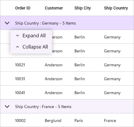
Group Caption Context Menu with Commands
When binding a menu item using a Command, you can access the command parameter as GroupCaptionContextInfo. This object provides access to the DataGrid instance, the Group object, and the RowIndex of the clicked group caption.
<ContentPage.BindingContext>
<local:OrderInfoViewModel x:Name="viewmodel"/>
</ContentPage.BindingContext>
<syncfusion:SfDataGrid x:Name="dataGrid"
ItemsSource="{Binding Orders}"
AllowGroupExpandCollapse="True"
AutoExpandGroups="False">
<!-- Grouping the data based on the Country column. -->
<syncfusion:SfDataGrid.GroupColumnDescriptions>
<syncfusion:GroupColumnDescription ColumnName="Country"/>
</syncfusion:SfDataGrid.GroupColumnDescriptions>
<!-- Context menu for group caption. -->
<syncfusion:SfDataGrid.GroupCaptionContextMenu>
<syncfusion:MenuItemCollection>
<syncfusion:MenuItem Text="Expand this Group"
Command="{x:Binding ExpandAllCommand}"
BindingContext="{x:Reference viewmodel}">
<syncfusion:MenuItem.Icon>
<Label Text=""
FontFamily="MaterialAssets"
HorizontalTextAlignment="Center"
VerticalTextAlignment="Center"/>
</syncfusion:MenuItem.Icon>
</syncfusion:MenuItem>
</syncfusion:MenuItemCollection>
</syncfusion:SfDataGrid.GroupCaptionContextMenu>
</syncfusion:SfDataGrid>// ViewModel for the DataGrid
public class OrderInfoViewModel
{
// command to expand all groups in the DataGrid
public ICommand ExpandAllCommand { get; set; }
// Constructor
public OrderInfoViewModel()
{
// Initialize the command with the method to execute when the command is invoked
ExpandAllCommand = new Command<object>(ExpandAll);
}
// Method to expand all groups in the DataGrid when the command is executed
private void ExpandAll(object obj)
{
if (obj is GroupCaptionContextInfo groupInfo && groupInfo.DataGrid != null && groupInfo.Group != null)
{
groupInfo.DataGrid.ExpandGroup(groupInfo.Group);
}
}
// Logic to generate predefined data for the DataGrid, as needed
}Customize Group Summary Context Menu
The group summary context menu is displayed when the user invokes the context menu on a group summary row. You can customize the menu items by adding MenuItem objects to the SfDataGrid.GroupSummaryContextMenu collection.
<syncfusion:SfDataGrid x:Name="dataGrid"
ItemsSource="{Binding Orders}"
AllowGroupExpandCollapse="True">
<!-- Grouping the data based on the Country column. -->
<syncfusion:SfDataGrid.GroupColumnDescriptions>
<syncfusion:GroupColumnDescription ColumnName="Country"/>
</syncfusion:SfDataGrid.GroupColumnDescriptions>
<!-- Context menu for group caption. -->
<syncfusion:SfDataGrid.GroupSummaryRows>
<syncfusion:DataGridSummaryRow ShowSummaryInRow="True"
Title="Total Orders: {Orders}">
<syncfusion:DataGridSummaryRow.SummaryColumns>
<syncfusion:DataGridSummaryColumn Name="Orders"
MappingName="OrderID"
Format="{}{Count}"
SummaryType="CountAggregate">
</syncfusion:DataGridSummaryColumn>
</syncfusion:DataGridSummaryRow.SummaryColumns>
</syncfusion:DataGridSummaryRow>
</syncfusion:SfDataGrid.GroupSummaryRows>
<!-- Context menu for group summary. -->
<syncfusion:SfDataGrid.GroupSummaryContextMenu>
<syncfusion:MenuItemCollection>
<syncfusion:MenuItem Text="Clear Summary">
<syncfusion:MenuItem.Icon>
<Label Text=""
FontFamily="MaterialAssets"
HorizontalTextAlignment="Center"
VerticalTextAlignment="Center"/>
</syncfusion:MenuItem.Icon>
</syncfusion:MenuItem>
</syncfusion:MenuItemCollection>
</syncfusion:SfDataGrid.GroupSummaryContextMenu>
</syncfusion:SfDataGrid>SfDataGrid dataGrid = new SfDataGrid();
OrderInfoViewModel orderInfoViewModel = new OrderInfoViewModel();
dataGrid.ItemsSource = orderInfoViewModel.Orders;
dataGrid.AllowGroupExpandCollapse = true;
// Grouping the DataGrid based on the Country column
dataGrid.GroupColumnDescriptions.Add(new GroupColumnDescription()
{
ColumnName = "Country",
});
dataGrid.GroupSummaryRows.Add(new DataGridSummaryRow()
{
ShowSummaryInRow = true,
Title = "Total Orders: {Orders}",
SummaryColumns = new ObservableCollection<ISummaryColumn>()
{
new DataGridSummaryColumn()
{
Name="Orders",
MappingName="OrderID",
Format="{Count}",
SummaryType=SummaryType.CountAggregate
}
}
});
// Define the context menu for group captions
var groupSummaryContextMenu = new Syncfusion.Maui.DataGrid.MenuItemCollection
{
new Syncfusion.Maui.DataGrid.MenuItem
{
Text = "Clear Summary",
Icon = new Label
{
Text = "\ue70b",
FontFamily = "MaterialAssets",
HorizontalTextAlignment = TextAlignment.Center,
VerticalTextAlignment = TextAlignment.Center
}
}
};
dataGrid.GroupSummaryContextMenu = groupSummaryContextMenu;
this.Content = dataGrid;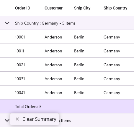
Group Summary Context Menu with Commands
When binding a menu item using a Command, you can access the command parameter as GroupSummaryContextInfo. This object includes the DataGrid instance, the SummaryRow, the Group object, and the RowIndex.
<ContentPage.BindingContext>
<local:OrderInfoViewModel x:Name="viewmodel"/>
</ContentPage.BindingContext>
<syncfusion:SfDataGrid x:Name="dataGrid"
ItemsSource="{Binding Orders}"
AllowGroupExpandCollapse="True">
<!-- Grouping the data based on the Country column. -->
<syncfusion:SfDataGrid.GroupColumnDescriptions>
<syncfusion:GroupColumnDescription ColumnName="Country"/>
</syncfusion:SfDataGrid.GroupColumnDescriptions>
<!-- Context menu for group caption. -->
<syncfusion:SfDataGrid.GroupSummaryRows>
<syncfusion:DataGridSummaryRow ShowSummaryInRow="True"
Title="Total Orders: {Orders}">
<syncfusion:DataGridSummaryRow.SummaryColumns>
<syncfusion:DataGridSummaryColumn Name="Orders"
MappingName="OrderID"
Format="{}{Count}"
SummaryType="CountAggregate">
</syncfusion:DataGridSummaryColumn>
</syncfusion:DataGridSummaryRow.SummaryColumns>
</syncfusion:DataGridSummaryRow>
</syncfusion:SfDataGrid.GroupSummaryRows>
<!-- Context menu for group summary. -->
<syncfusion:SfDataGrid.GroupSummaryContextMenu>
<syncfusion:MenuItemCollection>
<syncfusion:MenuItem Text="Clear Summary"
BindingContext="{x:Reference viewmodel}"
Command="{x:Binding ClearGroupSummaryCommand}">
<syncfusion:MenuItem.Icon>
<Label Text=""
FontFamily="MaterialAssets"
HorizontalTextAlignment="Center"
VerticalTextAlignment="Center"/>
</syncfusion:MenuItem.Icon>
</syncfusion:MenuItem>
</syncfusion:MenuItemCollection>
</syncfusion:SfDataGrid.GroupSummaryContextMenu>
</syncfusion:SfDataGrid>// ViewModel for the DataGrid
public class OrderInfoViewModel
{
// command to clear group summary rows
public ICommand ClearGroupSummaryCommand { get; set; }
// Constructor
public OrderInfoViewModel()
{
// Initialize the command with the method to execute when the command is invoked
ClearGroupSummaryCommand = new Command<object>(ClearSummary);
}
// Method to clear group summary rows in the DataGrid
private void ClearSummary(object obj)
{
if (obj is GroupSummaryContextInfo summaryContextInfo)
{
if (summaryContextInfo.DataGrid?.GroupSummaryRows.Count > 0)
summaryContextInfo.DataGrid.GroupSummaryRows.Clear();
}
}
// Logic to generate predefined data for the DataGrid, as needed
}Customize Table Summary Context Menu
The table summary context menu is displayed when the user invokes the context menu on a table summary row. You can customize the menu items by adding MenuItem objects to the SfDataGrid.TableSummaryContextMenu collection.
<syncfusion:SfDataGrid x:Name="dataGrid"
ItemsSource="{Binding Orders}"
AllowGroupExpandCollapse="True">
<!-- Grouping the data based on the Country column. -->
<syncfusion:SfDataGrid.GroupColumnDescriptions>
<syncfusion:GroupColumnDescription ColumnName="Country"/>
</syncfusion:SfDataGrid.GroupColumnDescriptions>
<!-- Table Summary row to display the total number of orders. -->
<syncfusion:SfDataGrid.TableSummaryRows>
<syncfusion:DataGridTableSummaryRow Title="Total Orders : {Orders}"
Position="Top"
ShowSummaryInRow="True">
<syncfusion:DataGridTableSummaryRow.SummaryColumns>
<syncfusion:DataGridSummaryColumn Name="Orders"
Format="{}{Count}"
MappingName="OrderID"
SummaryType="CountAggregate"/>
</syncfusion:DataGridTableSummaryRow.SummaryColumns>
</syncfusion:DataGridTableSummaryRow>
</syncfusion:SfDataGrid.TableSummaryRows>
<!-- Context menu for table summary. -->
<syncfusion:SfDataGrid.TableSummaryContextMenu>
<syncfusion:MenuItemCollection>
<syncfusion:MenuItem Text="Count">
<syncfusion:MenuItem.Icon>
<Label Text=""
FontFamily="MaterialAssets"
HorizontalTextAlignment="Center"
VerticalTextAlignment="Center"/>
</syncfusion:MenuItem.Icon>
</syncfusion:MenuItem>
<syncfusion:MenuItem Text="Minimum">
<syncfusion:MenuItem.Icon>
<Label Text=""
FontFamily="MaterialAssets"
HorizontalTextAlignment="Center"
VerticalTextAlignment="Center"/>
</syncfusion:MenuItem.Icon>
</syncfusion:MenuItem>
<syncfusion:MenuItem Text="Maximum">
<syncfusion:MenuItem.Icon>
<Label Text=""
FontFamily="MaterialAssets"
HorizontalTextAlignment="Center"
VerticalTextAlignment="Center"/>
</syncfusion:MenuItem.Icon>
</syncfusion:MenuItem>
<syncfusion:MenuItem Text="Sum">
<syncfusion:MenuItem.Icon>
<Label Text=""
FontFamily="MaterialAssets"
HorizontalTextAlignment="Center"
VerticalTextAlignment="Center"/>
</syncfusion:MenuItem.Icon>
</syncfusion:MenuItem>
<syncfusion:MenuItem Text="Average">
<syncfusion:MenuItem.Icon>
<Label Text=""
FontFamily="MaterialAssets"
HorizontalTextAlignment="Center"
VerticalTextAlignment="Center"/>
</syncfusion:MenuItem.Icon>
</syncfusion:MenuItem>
</syncfusion:MenuItemCollection>
</syncfusion:SfDataGrid.TableSummaryContextMenu>
</syncfusion:SfDataGrid>SfDataGrid dataGrid = new SfDataGrid();
OrderInfoViewModel orderInfoViewModel = new OrderInfoViewModel();
dataGrid.ItemsSource = orderInfoViewModel.Orders;
dataGrid.AllowGroupExpandCollapse = true;
// Grouping the DataGrid based on the Country column
dataGrid.GroupColumnDescriptions.Add(new GroupColumnDescription()
{
ColumnName = "Country",
});
// Table summary row to display the total number of orders
DataGridTableSummaryRow tableSummaryRow = new DataGridTableSummaryRow();
tableSummaryRow.Title = "Total Orders : {Orders}";
tableSummaryRow.ShowSummaryInRow = true;
tableSummaryRow.Position = SummaryRowPosition.Top;
tableSummaryRow.SummaryColumns.Add(new DataGridSummaryColumn()
{
Name = "Orders",
MappingName = "Orders",
Format = "{Count}",
SummaryType = SummaryType.CountAggregate
});
dataGrid.TableSummaryRows.Add(tableSummaryRow);
// Define the context menu for Table summary row
var tableSummaryContextMenu = new Syncfusion.Maui.DataGrid.MenuItemCollection
{
new Syncfusion.Maui.DataGrid.MenuItem
{
Text = "Count",
Icon = new Label
{
Text = "\ue793",
FontFamily = "MaterialAssets",
HorizontalTextAlignment = TextAlignment.Center,
VerticalTextAlignment = TextAlignment.Center
}
},
new Syncfusion.Maui.DataGrid.MenuItem
{
Text = "Minimum",
Icon = new Label
{
Text = "\ue701",
FontFamily = "MaterialAssets",
HorizontalTextAlignment = TextAlignment.Center,
VerticalTextAlignment = TextAlignment.Center
}
},
new Syncfusion.Maui.DataGrid.MenuItem
{
Text = "Maximum",
Icon = new Label
{
Text = "\ue702",
FontFamily = "MaterialAssets",
HorizontalTextAlignment = TextAlignment.Center,
VerticalTextAlignment = TextAlignment.Center
}
},
new Syncfusion.Maui.DataGrid.MenuItem
{
Text = "Sum",
Icon = new Label
{
Text = "\ue70d",
FontFamily = "MaterialAssets",
HorizontalTextAlignment = TextAlignment.Center,
VerticalTextAlignment = TextAlignment.Center
}
},
new Syncfusion.Maui.DataGrid.MenuItem
{
Text = "Average",
Icon = new Label
{
Text = "\ue710",
FontFamily = "MaterialAssets",
HorizontalTextAlignment = TextAlignment.Center,
VerticalTextAlignment = TextAlignment.Center
}
},
};
dataGrid.TableSummaryContextMenu = tableSummaryContextMenu;
this.Content = dataGrid;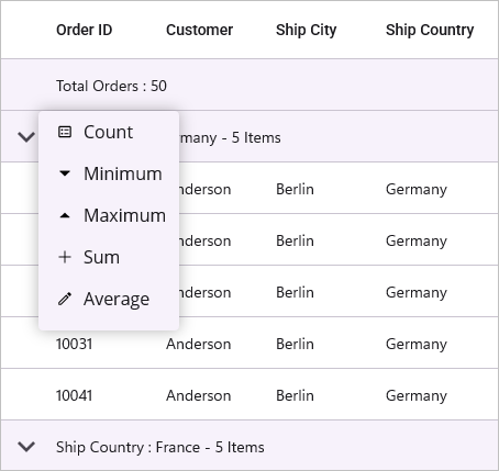
Table Summary Context Menu with Commands
When binding a menu item using a Command, you can access the command parameter as TableSummaryContextInfo. This object provides the DataGrid instance, the relevant Column, the SummaryRow, and the RowIndex.
<ContentPage.BindingContext>
<local:OrderInfoViewModel x:Name="viewmodel"/>
</ContentPage.BindingContext>
<syncfusion:SfDataGrid x:Name="dataGrid"
ItemsSource="{Binding Orders}"
AllowGroupExpandCollapse="True">
<!-- Grouping the data based on the Country column. -->
<syncfusion:SfDataGrid.GroupColumnDescriptions>
<syncfusion:GroupColumnDescription ColumnName="Country"/>
</syncfusion:SfDataGrid.GroupColumnDescriptions>
<!-- Table Summary row to display the total number of orders. -->
<syncfusion:SfDataGrid.TableSummaryRows>
<syncfusion:DataGridTableSummaryRow Title="Total Orders : {Orders}"
Position="Top"
ShowSummaryInRow="True">
<syncfusion:DataGridTableSummaryRow.SummaryColumns>
<syncfusion:DataGridSummaryColumn Name="Orders"
Format="{}{Count}"
MappingName="OrderID"
SummaryType="CountAggregate"/>
</syncfusion:DataGridTableSummaryRow.SummaryColumns>
</syncfusion:DataGridTableSummaryRow>
</syncfusion:SfDataGrid.TableSummaryRows>
<!-- Context menu for table summary. -->
<syncfusion:SfDataGrid.TableSummaryContextMenu>
<syncfusion:MenuItemCollection>
<syncfusion:MenuItem Text="Count"
BindingContext="{x:Reference viewmodel}"
Command="{x:Binding AddCountSummaryCommand}">
<syncfusion:MenuItem.Icon>
<Label Text=""
FontFamily="MaterialAssets"
HorizontalTextAlignment="Center"
VerticalTextAlignment="Center"/>
</syncfusion:MenuItem.Icon>
</syncfusion:MenuItem>
</syncfusion:MenuItemCollection>
</syncfusion:SfDataGrid.TableSummaryContextMenu>
</syncfusion:SfDataGrid>// ViewModel for the DataGrid
public class OrderInfoViewModel
{
// command to add count summary to the DataGrid
public ICommand AddCountSummaryCommand { get; set; }
// Constructor
public OrderInfoViewModel()
{
// Initialize the command with the method to execute when the command is invoked
AddCountSummaryCommand = new Command<object>(AddCountSummary);
}
// Method to add count summary to the DataGrid when the command is executed
private void AddCountSummary(object obj)
{
if (obj is TableSummaryContextInfo context && context.DataGrid != null && context.Column != null)
{
var row = new DataGridTableSummaryRow
{
ShowSummaryInRow = false,
Position = SummaryRowPosition.Bottom,
SummaryColumns = new ObservableCollection<ISummaryColumn>
{
new DataGridSummaryColumn
{
Name = "Count",
MappingName = context.Column.MappingName,
SummaryType = SummaryType.CountAggregate,
Format = "Count: {Count}"
}
}
};
context.DataGrid.TableSummaryRows.Clear();
context.DataGrid.TableSummaryRows.Add(row);
}
}
// Logic to generate predefined data for the DataGrid, as needed
}Events
The DataGrid exposes events to customize and react to the context menu life cycle.
ContextMenuOpening
The ContextMenuOpening event occurs before the context menu is displayed, allowing you to customize its content or cancel its display. The event handler receives ContextMenuOpeningEventArgs with the following properties:
-
Cancel: Set to
trueto cancel the display of the context menu. -
Column: Represents the column for which the context menu is opening. This property will be
nullif the context menu is not opened for a column header. -
MenuItems: Provides access to the collection of
MenuItemobjects that will be displayed in the context menu. You can add, remove, or modify these items to customize the menu.
ContextMenuOpened
The ContextMenuOpened event occurs immediately after the context menu has been displayed. The event handler receives ContextMenuOpenedEventArgs with the following properties:
-
Column: Represents the column that triggered the context menu. This property will be
nullif the context menu was not opened for a column header. -
MenuItems: Provides access to the collection of
MenuItemobjects that are currently displayed in the context menu.
ContextMenuItemClicked
The ContextMenuItemClicked event occurs when a menu item within the context menu is clicked. The event handler receives ContextMenuItemClickedEventArgs with the following property:
-
MenuItem: Represents the
MenuItemobject that was clicked by the user.
ContextMenuClosing
The ContextMenuClosing event occurs before the context menu is closed, allowing you to prevent its closure. The event handler receives ContextMenuClosingEventArgs with the following properties:
-
Cancel: Set to
trueto keep the context menu open and prevent its closure. -
Column: Represents the column for which the context menu is closing. This property will be
nullif the context menu is not associated with a column header. -
MenuItems: Provides access to the collection of
MenuItemobjects that are currently displayed in the context menu.
ContextMenuClosed
The ContextMenuClosed event occurs after the context menu has been closed. The event handler receives ContextMenuClosedEventArgs with the following properties:
-
Column: Represents the column that was associated with the closed context menu. This property will be
nullif the context menu was not opened for a column header. -
MenuItems: Provides access to the collection of
MenuItemobjects that were displayed in the closed context menu.