About Syncfusion® .NET MAUI Color Picker Control
18 Nov 20185 minutes to read
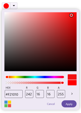
The .NET MAUI Color Picker is a UI component that enables users to select a color from various color palettes or a spectrum. It is particularly useful in design, drawing, or customization scenarios within .NET MAUI applications.
Business use cases
- Design and drawing applications that require accurate color selection and customization tools.
- Theme configuration systems that allow users to personalize application appearance using color settings.
- Data visualization tools that require color selection for charts, indicators, and UI elements.
- Form-based applications that allow users to choose colors for preferences or customization settings.
Key features
- Multiple color selection modes allow switching between Palette and Spectrum modes based on user preference.
- Custom color support allows adding or removing user-defined colors for flexibility in selection.
- Manual color input allows entering color values using RGB, HSV, and HEX formats for precise control.
- Opacity control allows adjusting the transparency level of the selected color.
- Recent colors panel allows accessing previously selected colors for quick reuse.
- Theme adaptation support allows aligning the control with application or system themes for consistent UI appearance.
- No color option allows clearing the selected color using a dedicated option.
- Interaction control allows enabling or disabling user interaction programmatically.
- Inline mode support allows embedding the color picker directly within the UI layout without requiring a popup.
Globalization
The following table summarizes the globalization support available in this control.
 Full Support
 Partial Support
 Not Applicable
| Control | Localization | RTL | Time zone | Screen reader | Keyboard navigation |
|---|---|---|---|---|---|
| Color Picker | |
|
|
|
|
Related controls
- Button for applying selected colors to interactive UI elements.
- Slider for adjusting color values with precise range-based input.
- Text Input Layout for entering or displaying color codes alongside labels and validation.
See Also
- Getting Started shows a step‑by‑step guide to begin using the Color Picker control.
- Modes explains palette and spectrum selection modes.
- Customization helps customize appearance and behavior of the control.
- UI Kit provides interactive demos and ready‑made UI examples.
Resources
Feature Tour
Get a quick overview of key features and capabilities to kick start your journey.
Explore Features
Tutorial Videos
Watch step‑by‑step video guides to quickly understand concepts and implementation.
Watch now
Knowledge Base
Find practical solutions, troubleshooting tips and how‑to guides for common scenarios.
Search KB's