Customization in .NET MAUI Color Picker (SfColorPicker)
3 Jul 202615 minutes to read
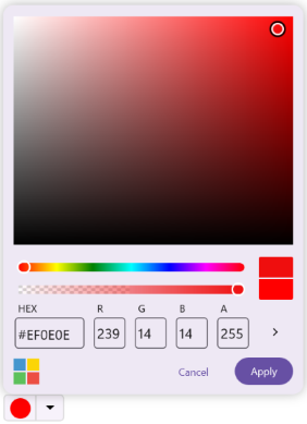
Selected color
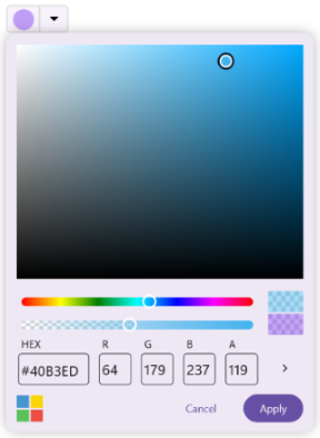
The SelectedColor property of the Color Picker is used to display a default color during initial load. You can also select a color value in the UI using built-in elements like the color spectrum, sliders, palette, or HEX input.
<inputs:SfColorPicker SelectedColor="DodgerBlue"/>SfColorPicker colorPicker = new SfColorPicker()
{
SelectedColor = Colors.DodgerBlue
};
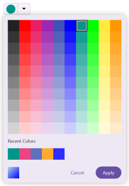
Show recent colors
You can display the recently selected colors in the Color Picker when in Palette mode by enabling the ShowRecentColors property. By default, it is set to True.
<inputs:SfColorPicker ShowRecentColors="True"/>SfColorPicker colorPicker = new SfColorPicker()
{
ShowRecentColors = true
};
ClearRecentColors
You can clear all colors shown in the Recent Colors section of the Color Picker by calling the ClearRecentColors method. This method removes all previously selected colors and resets the Recent Colors list.
SfColorPicker colorPicker = new SfColorPicker();

// Clear all recent colors
colorPicker.ClearRecentColors();
Show input area
You can show or hide the input area of the Color Picker by adjusting the ShowInputArea property. By default, it is set to True.
<inputs:SfColorPicker ShowInputArea="False"/>SfColorPicker colorPicker = new SfColorPicker()
{
ShowInputArea = false
};
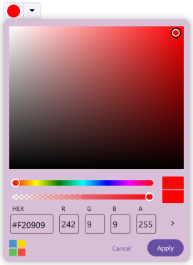
Alpha slider
The alpha slider is used to control the transparency of the selected color. You can show or hide the alpha slider by adjusting the ShowAlphaSlider property. By default, it is set to True.
<inputs:SfColorPicker ShowAlphaSlider="True"/>SfColorPicker colorPicker = new SfColorPicker()
{
ShowAlphaSlider = true
};
Action buttons
You can render the Color Picker without the Apply and Cancel buttons for a seamless color selection experience. When the control buttons are hidden, the selected color is applied instantly, and the Color Picker popup closes automatically upon selection. To enable this, simply set the IsActionButtonsVisible property to False.
<inputs:SfColorPicker IsActionButtonsVisible="False"/>SfColorPicker colorPicker = new SfColorPicker()
{
IsActionButtonsVisible = false
};
Customize action buttons
You can customize the background color for the action buttons by specifying a suitable color for the ApplyButtonBackground and CancelButtonBackground properties.
<inputs:SfColorPicker ApplyButtonBackground="Navy"
                      CancelButtonBackground="LightGrey">
</inputs:SfColorPicker>
SfColorPicker colorPicker = new SfColorPicker()
{
ApplyButtonBackground = Colors.Navy,
CancelButtonBackground = Colors.LightGrey
};
Also you can customize the text appearance of the action buttons by defining a suitable label style for the ApplyButtonLabelStyle and CancelButtonLabelStyle properties.
<inputs:SfColorPicker>
    <inputs:SfColorPicker.ApplyButtonLabelStyle>
        <inputs:LabelStyle
            FontSize="16"
            TextColor="White"
            FontAttributes="Bold" />
    </inputs:SfColorPicker.ApplyButtonLabelStyle>
    <inputs:SfColorPicker.CancelButtonLabelStyle>
        <inputs:LabelStyle
            FontSize="14"
            TextColor="Gray"
            FontAttributes="None" />
    </inputs:SfColorPicker.CancelButtonLabelStyle>
</inputs:SfColorPicker>
SfColorPicker colorPicker = new SfColorPicker();
// Set Apply button label style
colorPicker.ApplyButtonLabelStyle = new LabelStyle
{
FontSize = 16,
TextColor = Colors.White,
FontAttributes = FontAttributes.Bold
};
// Set Cancel button label style
colorPicker.CancelButtonLabelStyle = new LabelStyle
{
FontSize = 14,
TextColor = Colors.Gray,
FontAttributes = FontAttributes.None
};Customize Recent Colors and Spectrum Input View Label Style
You can customize the text appearance of the recent colors label and the labels displayed in the spectrum input view by defining suitable label styles for the [RecentColorsLabelStyle]
(https://help.syncfusion.com/cr/maui/Syncfusion.Maui.Inputs.SfColorPicker.html#Syncfusion_Maui_Inputs_SfColorPicker_RecentColorsLabelStyle) and [SpectrumInputViewLabelStyle]
(https://help.syncfusion.com/cr/maui/Syncfusion.Maui.Inputs.SfColorPicker.html#Syncfusion_Maui_Inputs_SfColorPicker_SpectrumInputViewLabelStyle) properties.
-
RecentColorsLabelStyleapplies to the “Recent Colors” text displayed above the recent color palette. -
SpectrumInputViewLabelStyleapplies to the label texts displayed in the spectrum input view, such as HEX, R, G, B, H, S, V, and A modify labels.
<syncfusion:SfColorPicker>
    <!-- Recent colors label style -->
    <syncfusion:SfColorPicker.RecentColorsLabelStyle>
        <syncfusion:LabelStyle
            FontSize="14"
            TextColor="DarkGray"
            FontAttributes="Italic" />
    </syncfusion:SfColorPicker.RecentColorsLabelStyle>
    <!-- Spectrum input view label style (HEX, RGBA labels) -->
    <syncfusion:SfColorPicker.SpectrumInputViewLabelStyle>
        <syncfusion:LabelStyle
            FontSize="14"
            TextColor="Black"
            FontFamily="Arial" />
    </syncfusion:SfColorPicker.SpectrumInputViewLabelStyle>
</syncfusion:SfColorPicker>
SfColorPicker colorPicker = new SfColorPicker();
// Set recent colors label style
colorPicker.RecentColorsLabelStyle = new LabelStyle
{
FontSize = 14,
TextColor = Colors.DarkGray,
FontAttributes = FontAttributes.Italic
};
// Set spectrum input view label style (HEX, RGBA, HSV labels)
colorPicker.SpectrumInputViewLabelStyle = new LabelStyle
{
FontSize = 14,
TextColor = Colors.Black,
FontFamily = "Arial"
};No color option
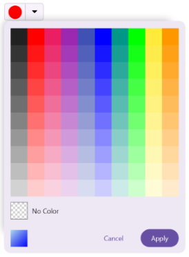
The ShowNoColor property determines whether the No Color option is displayed in the Color Picker UI. This option allows users to clear their selection from the palette, effectively choosing no color. By default, this property is set to False.
<inputs:SfColorPicker ShowNoColor="True"/>SfColorPicker colorPicker = new SfColorPicker()
{
ShowNoColor = true
};
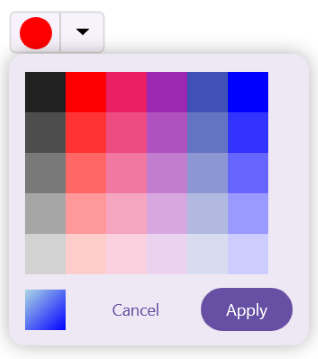
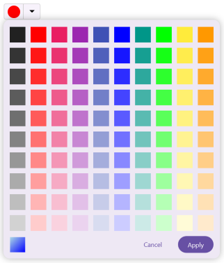
Palette count
The PaletteColumnCount and PaletteRowCount properties define the number of columns and rows displayed in the palette grid. By default, both are set to 10.
<inputs:SfColorPicker PaletteColumnCount="6" PaletteRowCount="5"/>SfColorPicker colorPicker = new SfColorPicker()
{
PaletteColumnCount = 6,
PaletteRowCount = 5
};
Palette spacing
The PaletteColumnSpacing property defines the horizontal spacing between columns, while the PaletteRowSpacing property defines the vertical spacing between rows in Palette mode. By default, both properties are set to 0, meaning the swatches are placed directly next to each other without any spacing.
<inputs:SfColorPicker PaletteColumnSpacing="10"
                      PaletteRowSpacing="10"/>
SfColorPicker colorPicker = new SfColorPicker()
{
PaletteColumnSpacing = 10,
PaletteRowSpacing = 10
};
Palette cell customization
PaletteCellCornerRadius
You can customize the Corner Radius of individual palette cells by adjusting the PaletteCellCornerRadius property.
<syncfusion:SfColorPicker PaletteCellCornerRadius="15, 12, 15, 7" />SfColorPicker colorPicker = new SfColorPicker()
{
PaletteCellCornerRadius = new CornerRadius(15, 12, 15, 7)
};PaletteCellShape
You can define the shape of the color palette cells using the PaletteCellShape property.
<syncfusion:SfColorPicker PaletteCellShape="Circle" />SfColorPicker colorPicker = new SfColorPicker()
{
PaletteCellShape = PaletteCellShape.Circle
};PaletteCellSize
You can control the width and height of each color cell in the palette by setting the PaletteCellSize property.
<syncfusion:SfColorPicker PaletteCellSize="40" />SfColorPicker colorPicker = new SfColorPicker()
{
PaletteCellSize = 40
};PaletteColors
You can define a custom collection of Colors displayed in the palette view by using the PaletteColors property.
SfColorPicker colorPicker = new SfColorPicker();

 // Set custom palette colors
colorPicker.ColorMode = ColorPickerMode.Palette;
colorPicker.PaletteColumnCount = 7;
colorPicker.PaletteRowCount = 3;
colorPicker.PaletteColors = new List<Color>
{
    Colors.Red,
    Colors.Green,
    Colors.Blue,
    Colors.Yellow,
    Colors.Purple,
    Colors.Orange
};

// Add a color to the existing palette
colorPicker.PaletteColors.Add(Colors.Pink);
Selection indicator customization
SelectionIndicatorRadius
You can customize the corner radius of the selection indicator by setting the SelectionIndicatorRadius property.
<syncfusion:SfColorPicker SelectionIndicatorRadius="6" />SfColorPicker colorPicker = new SfColorPicker()
{
SelectionIndicatorRadius = 6
};SelectionIndicatorStroke
You can specify the stroke color of the selection indicator using the SelectionIndicatorStroke property.
<syncfusion:SfColorPicker SelectionIndicatorStroke="White" />SfColorPicker colorPicker = new SfColorPicker()
{
SelectionIndicatorStroke = Colors.White
};SelectionIndicatorStrokeThickness
You can modify the thickness of the selection outline by adjusting the SelectionIndicatorStrokeThickness property.
<syncfusion:SfColorPicker SelectionIndicatorStrokeThickness="2" />SfColorPicker colorPicker = new SfColorPicker()
{
SelectionIndicatorStrokeThickness = 2
};Slider thumb customization
The Slider thumb represents the Hue and Alpha Sliders in the Color Picker. You can customize its appearance using the following properties.
SliderThumbFill
You can customize the fill brush of the Slider thumb by setting the SliderThumbFill property.
<syncfusion:SfColorPicker SliderThumbFill="Blue" />SfColorPicker colorPicker = new SfColorPicker()
{
SliderThumbFill = new SolidColorBrush(Colors.Blue)
};SliderThumbRadius
You can control the size and roundness of the Slider thumb by adjusting the SliderThumbRadius property.
<syncfusion:SfColorPicker SliderThumbRadius="12" />SfColorPicker colorPicker = new SfColorPicker()
{
SliderThumbRadius = 12
};SliderThumbStroke
You can customize the stroke color of the Slider thumb by adjusting the SliderThumbStroke property.
<syncfusion:SfColorPicker SliderThumbStroke="Black" />SfColorPicker colorPicker = new SfColorPicker()
{
SliderThumbStroke = Colors.Black
};SliderThumbStrokeThickness
You can control the thickness of the Slider thumb’s outline by adjusting the SliderThumbStrokeThickness property.
<syncfusion:SfColorPicker SliderThumbStrokeThickness="3" />SfColorPicker colorPicker = new SfColorPicker()
{
SliderThumbStrokeThickness = 3
};Popup customization
IsOpen
The IsOpen property in the Color Picker control allows you to programmatically open the popup by setting it to True. By default, this property is set to False.
<inputs:SfColorPicker x:Name="colorPicker" IsOpen="True"/>SfColorPicker colorPicker = new SfColorPicker()
{
IsOpen = true
};Popup background
The PopupBackground property specifies the background color of the popup panel in the Color Picker control.
<inputs:SfColorPicker x:Name="colorPicker" PopupBackground="Thistle"/>SfColorPicker colorPicker = new SfColorPicker()
{
PopupBackground = Colors.Thistle
};
Popup relative position
The PopupRelativePosition property specifies the placement of the popup in the Color Picker control. It supports the following eight positioning options:
- AlignBottom
- AlignBottomLeft
- AlignBottomRight
- AlignToLeftOf
- AlignTop
- AlignTopLeft
- AlignTopRight
- AlignTopRightOf
The default position is AlignBottom.
<inputs:SfColorPicker x:Name="colorPicker" PopupRelativePosition="AlignTop"/>SfColorPicker colorPicker = new SfColorPicker()
{
PopupRelativePosition = PopupRelativePosition.AlignTop
};