Customization in .NET MAUI Chips
10 Jun 202624 minutes to read
The .NET MAUI Chips control supports to customize the background color, border color, close button color, and more. The chip control can be customized using the following properties:
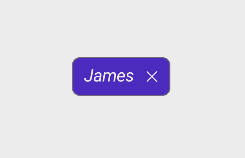
ShowCloseButton
The ShowCloseButton property sets the visible state of close button in SfChip.
<chip:SfChip Text="James"
            ShowCloseButton="true" >
</chip:SfChip>
SfChip chip = new SfChip()
{
Text = "James",
ShowCloseButton = true,
};
NOTE
The default value of ShowCloseButton is [
false].
ShowSelectionIndicator
The ShowSelectionIndicator property sets the visible state of selection indicator in SfChip.
<chip:SfChip Text="James"
            ShowSelectionIndicator="true">
</chip:SfChip>
SfChip chip = new SfChip()
{
Text = "James",
ShowSelectionIndicator = true,
};
NOTE
The default value of ShowSelectionIndicator is [
false].
CloseButtonColor
The CloseButtonColor property customizes the color of the close button in SfChip.
<chip:SfChip Text="James"
            ShowCloseButton="true"
            CloseButtonColor="Red">
</chip:SfChip>
SfChip chip = new SfChip()
{
Text = "James",
ShowCloseButton = true,
CloseButtonColor = Colors.Red,
};
NOTE
The Default value of CloseButtonColor is [
Color.FromArgb("#49454E")].
SelectionIndicatorColor
The SelectionIndicatorColor property customizes the selection indicator color in SfChip.
<chip:SfChip Text="James"
            ShowSelectionIndicator="true"
            SelectionIndicatorColor = "Yellow">
</chip:SfChip>
SfChip chip = new SfChip()
{
Text = "James",
ShowSelectionIndicator = true,
SelectionIndicatorColor = Colors.Yellow
};
NOTE
The default value of SelectionIndicatorColor is [
Color.FromRgb(30, 25, 43)].
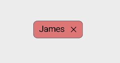
Background Color
The Background property customizes the background color of SfChip.
<chip:SfChip Text="James"
            Background="LightCoral" >
</chip:SfChip>
SfChip chip = new SfChip()
{
Text = "James",
Background = Colors.LightCoral
};
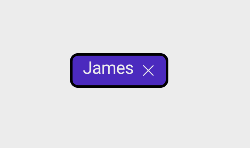
Stroke
The Stroke property customizes the color of border in SfChip.
<chip:SfChip Text="James"
            Stroke="Black" >
</chip:SfChip>
SfChip chip = new SfChip()
{
Text="James",
Stroke = Colors.Black
};
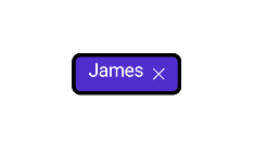
StrokeThickness
The StrokeThickness property is used to customizes the border thickness of the SfChip on four sides.
<chip:SfChip Text="James"
            StrokeThickness="7"
            Stroke = "Black" >
</chip:SfChip>
SfChip chip = new SfChip()
{
Text="James",
StrokeThickness = 7,
Stroke = Colors.Black
};
CornerRadius
The CornerRadius property is used to customize the rounded edges in SfChip as demonstrated in the following code sample.
<chip:SfChip Text="James"
            CornerRadius = "25"
            Stroke="Black" >
</chip:SfChip>
SfChip chip = new SfChip()
{
Text="James",
CornerRadius = 25,
Stroke = Colors.Black
};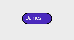
NOTE
The default value of CornerRadius is [
Thickness(8)].
FontAttributes
The FontAttributes property customizes the font style of text in SfChip.
<chip:SfChip Text="James"
            FontAttributes="Italic" >
</chip:SfChip>
SfChip chip = new SfChip()
{
Text="James",
FontAttributes = FontAttributes.Italic
};
FontFamily
The FontFamily property customizes the font family of text in SfChip.
<chip:SfChip Text="James"
            FontFamily="times new roman" >
</chip:SfChip>
SfChip chip = new SfChip()
{
Text="James",
FontFamily = "times new roman"
};
FontSize
The FontSize property customizes the size of text in SfChip.
<chip:SfChip Text="James"
            FontSize = "15" >
</chip:SfChip>
SfChip chip = new SfChip()
{
Text = "James",
FontSize = 15
};
NOTE
Default Value of FontSize is [
14d]
TextColor
The TextColor property customizes the color of text in SfChip.
<chip:SfChip Text="James"
            TextColor="Red" >
</chip:SfChip>
SfChip chip = new SfChip()
{
Text = "James",
TextColor = Colors.Red
};
NOTE
The default value of TextColor is [
Color.FromArgb("#1C1B1F")].
TextAlignment
The HorizontalTextAlignment and VerticalTextAlignment properties customize the alignment of text in SfChip.
<chip:SfChip Text="James"
            ShowCloseButton="True"
            HorizontalTextAlignment="Start"
            VerticalTextAlignment="Center" >
</chip:SfChip>
SfChip chip = new SfChip()
{
Text = "James",
ShowCloseButton = true,
HorizontalTextAlignment = TextAlignment.Start,
VerticalTextAlignment = TextAlignment.Center
};
NOTE
The default values of HorizontalTextAlignment and VerticalTextAlignment are [
TextAlignment.Center].
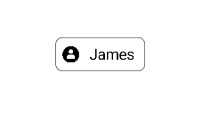
ShowIcon
You can enable the icon image using the ShowIcon property to know whether any image appears to the SfChip.
<chip:SfChip Text="James"
            ImageSource="ChipUserContact.png"
            ShowIcon="true" >
</chip:SfChip>
SfChip chip = new SfChip()
{
Text = "James",
ImageSource = "ChipUserContact.png",
ShowIcon = true
};
NOTE
The default value of ShowIcon is [
false].
BackgroundImageSource
The BackgroundImageSource property is used to customize the aspect for the image of SfChip.
<chip:SfChip BackgroundImageSource="lion.png">
</chip:SfChip>
SfChip chip = new SfChip();
chip.BackgroundImageSource="lion.png";
ImageSource
The ImageSource property customizes the icon image of SfChip by adding a custom image.
<chip:SfChip Text="James"
            ImageSource="ChipUserContact.png"
            ShowIcon="true" >
</chip:SfChip>
SfChip chip = new SfChip()
{
Text = "James",
ImageSource = "ChipUserContact.png",
ShowIcon = true
};
NOTE
Enable the [
ShowIcon] property to enable the [ImageSource] property.
ImageSize
The ImageSize property customizes the width and height of icon image in SfChip.
<chip:SfChip Text="James"
            ImageSource="ChipUserContact.png"
            ImageSize="30"
            ShowIcon="true">
</chip:SfChip>
SfChip chip = new SfChip()
{
Text = "James",
ImageSource = "ChipUserContact.png",
ImageSize = 30,
ShowIcon = true
};
NOTE
The default value of ImageSize is [
18d].
ImageAlignment
The ImageAlignment property customizes the alignment of icon image in SfChip.
<chip:SfChip Text="James"
            ImageSource="ChipUserContact.png"
            ImageAlignment="End"
            ShowIcon="true" >
</chip:SfChip>
SfChip chip = new SfChip()
{
Text = "James",
ImageSource = "ChipUserContact.png",
ImageAlignment = Alignment.End,
ShowIcon = true
};
NOTE
The default value of ImageAlignment is [
Alignment.Start].
Command
The Command property associates a command with an instance of SfChip. This property is most often set with MVVM pattern to bind callbacks back into the ViewModel.
<ContentPage.BindingContext>
    <local:CommandDemoViewModel />
</ContentPage.BindingContext>

<chip:SfChip x:Name="Chip" Text="James"
            WidthRequest="120"
            Background="{Binding Background}"
            Command="{Binding ButtonCommand}">
</chip:SfChip>
// ViewModel class for Command Demo.
public class CommandDemoViewModel : INotifyPropertyChanged
{
private Color _background = Colors.Violet;
public Color Background
{
get { return _background; }
set { _background = value; NotifyPropertyChanged(); }
}
private void NotifyPropertyChanged([CallerMemberName] String propertyName = "")
{
PropertyChanged?.Invoke(this, new PropertyChangedEventArgs(propertyName));
}
public event PropertyChangedEventHandler PropertyChanged;
public CommandDemoViewModel()
{
BackgroundColor();
this.Background = Colors.Violet;
}
private void BackgroundColor()
{
this.Background = this.Background == Colors.DeepSkyBlue ? Colors.Violet : Colors.DeepSkyBlue;
}
public ICommand ButtonCommand => new Command(BackgroundColor);
}
NOTE
The default value of Command is [
null].
Customization of SfChipGroup
The chip group supports to customize the chip’s background color, border color, text color, and more. The chip group can be customized using the following properties:
InputView
The InputView property allows to provide a view to the input chip. In this example, the input chip is used to add an employee at run time. To get the employee name as input, an entry is added as InputView.
<chip:SfChipGroup
    x:Name="chipGroup"
    ItemsSource="{Binding Employees}"
    ChipPadding="8,8,0,0"
    ChipType="Input"
    DisplayMemberPath="Name">
    <chip:SfChipGroup.InputView>
        <Entry x:Name="entry"
            Placeholder="Enter Name"
            Margin="10,10,0,0"
            WidthRequest="110"/>
    </chip:SfChipGroup.InputView>
</chip:SfChipGroup>this.BindingContext = new ViewModel();
Entry entry = new Entry
{
Margin = new Thickness(10, 10, 0, 0),
WidthRequest = 110
};
SfChipGroup chipGroup = new SfChipGroup
{
InputView = entry,
DisplayMemberPath = "Name",
ChipPadding = new Thickness(8, 8, 0, 0),
ChipType = SfChipsType.Input
};
chipGroup.SetBinding(SfChipGroup.ItemsSourceProperty, new Binding("Employees"));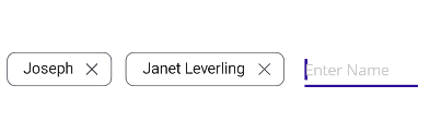
NOTE
The InputView is visible only in the Input type. The default value of InputView is [
null].
ChipBackground
The ChipBackground property customizes the background color of the SfChipGroup.
<chip:SfChipGroup ItemsSource="{Binding Employees}"
    DisplayMemberPath="Name"
    ChipTextColor="White"
    CloseButtonColor="White"
    ChipBackground="#512dcd">
</chip:SfChipGroup>
SfChipGroup chipGroup = new SfChipGroup
{
DisplayMemberPath = "Name",
ChipBackground = Color.FromHex("#512dcd"),
ChipTextColor = Colors.White,
CloseButtonColor = Colors.White
};
chipGroup.SetBinding(SfChipGroup.ItemsSourceProperty, new Binding("Employees"));
NOTE
The default value of ChipBackground is [
Colors.Transparent].
The ChipBackground property customizes the background color of the selected chip.
So, Add visual states to enable selected chip background color also set the ChipType to Choice or Filter.
<chip:SfChipGroup x:Name="sfChipGroup"
    ItemsSource="{Binding Employees}"
    DisplayMemberPath="Name"
    ChipType="Choice">
    <VisualStateManager.VisualStateGroups>
        <VisualStateGroup x:Name="CommonStates">
            <VisualState x:Name="Normal">
                <VisualState.Setters>
                    <Setter Property="ChipBackground" Value="white" />
                </VisualState.Setters>
            </VisualState>
            <VisualState x:Name="Selected">
                <VisualState.Setters>
                    <Setter Property="ChipBackground" Value="#502cd5" />
                    </VisualState.Setters>
            </VisualState>
        </VisualStateGroup>
    </VisualStateManager.VisualStateGroups>
</chip:SfChipGroup>
SfChipGroup chipGroup = new SfChipGroup();
chipGroup.SetBinding(SfChipGroup.ItemsSourceProperty, "Employees");
chipGroup.DisplayMemberPath = "Name";
chipGroup.ChipType = SfChipsType.Choice;
VisualStateGroupList visualStateGroupList = new VisualStateGroupList();
VisualState normalState = new VisualState() { Name="Normal"};
VisualStateGroup commonStateGroup = new VisualStateGroup();
if (chipGroup.ChipType == SfChipsType.Choice)
{
normalState.Setters.Add(new Setter { Property = SfChipGroup.ChipBackgroundProperty, Value = Colors.White });
}
VisualState selectedState = new VisualState
{
Name = "Selected"
};
selectedState.Setters.Add(new Setter { Property = SfChipGroup.ChipBackgroundProperty, Value = Colors.Violet });
commonStateGroup.States.Add(normalState);
commonStateGroup.States.Add(selectedState);
visualStateGroupList.Add(commonStateGroup);
VisualStateManager.SetVisualStateGroups(chipGroup, visualStateGroupList);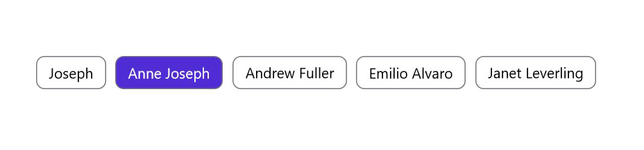
SelectedChipBackground
The SelectedChipBackground property customizes the background color of the selected chips.
<chip:SfChipGroup ItemsSource="{Binding Employees}"
                DisplayMemberPath="Name"
                ChipTextColor="White"
                ChipBackground="#512dcd"
                ChipType="Filter"
                SelectedChipBackground="#E8DEF8"/>
SfChipGroup chipGroup = new SfChipGroup()
{
DisplayMemberPath = "Name",
ChipBackground = Color.FromHex("#512dcd"),
ChipTextColor = Colors.White,
ChipType = SfChipsType.Filter,
SelectedChipBackground = Color.FromHex("#E8DEF8")
};
chipGroup.SetBinding(SfChipGroup.ItemsSourceProperty, "Employees");
ChipTextColor
The ChipTextColor property customizes the text color of the SfChipGroup.
<chip:SfChipGroup
    ItemsSource="{Binding Employees}"
    DisplayMemberPath="Name"
    ChipTextColor="Red">
</chip:SfChipGroup>
SfChipGroup chipGroup = new SfChipGroup()
{
DisplayMemberPath = "Name",
ChipTextColor = Colors.Red
};
chipGroup.SetBinding(SfChipGroup.ItemsSourceProperty, "Employees");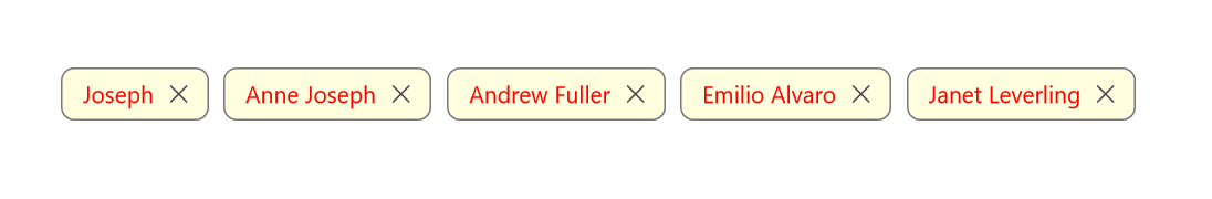
NOTE
The default value of ChipTextColor is [
Color.FromArgb("#1C1B1F")].
The ChipTextColor property customizes the text color of the selected chip.
So, Add visual states to enable selected chip text color also set the ChipType to Choice or Filter.
<chip:SfChipGroup x:Name="sfChipGroup"
    ItemsSource="{Binding Employees}"
    DisplayMemberPath="Name"
    ChipBackground="White"
    ChipTextColor="Green"
    ChipType="Choice">
<VisualStateManager.VisualStateGroups>
        <VisualStateGroup x:Name="CommonStates">
            <VisualState x:Name="Normal">
                <VisualState.Setters>
                    <Setter Property="ChipTextColor" Value="Black" />
                </VisualState.Setters>
            </VisualState>
            <VisualState x:Name="Selected">
                <VisualState.Setters>
                    <Setter Property="ChipTextColor" Value="Green" />
                    </VisualState.Setters>
            </VisualState>
        </VisualStateGroup>
    </VisualStateManager.VisualStateGroups>
</chip:SfChipGroup>
SfChipGroup chipGroup = new SfChipGroup()
{
DisplayMemberPath = "Name",
ChipBackground = Colors.White,
ChipTextColor= Colors.Green,
ChipType = SfChipsType.Choice,
};
chipGroup.SetBinding(SfChipGroup.ItemsSourceProperty, "Employees");
VisualStateGroupList visualStateGroupList = new VisualStateGroupList();
VisualState normalState = new VisualState() { Name="Normal"};
VisualStateGroup commonStateGroup = new VisualStateGroup();
if (chipGroup.ChipType == SfChipsType.Choice)
{
normalState.Setters.Add(new Setter { Property = SfChipGroup.ChipTextColorProperty, Value = Colors.Black });
}
VisualState selectedState = new VisualState
{
Name = "Selected"
};
selectedState.Setters.Add(new Setter { Property = SfChipGroup.ChipTextColorProperty, Value = Colors.Green });
commonStateGroup.States.Add(normalState);
commonStateGroup.States.Add(selectedState);
visualStateGroupList.Add(commonStateGroup);
VisualStateManager.SetVisualStateGroups(chipGroup, visualStateGroupList);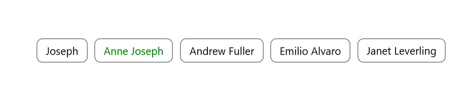
NOTE
The default value of SelectedChipTextColor is [
Color.White].
SelectedChipTextColor
The SelectedChipTextColor property customizes the text color of the selected chips.
<chip:SfChipGroup ItemsSource="{Binding Employees}"
                DisplayMemberPath="Name"
                ChipBackground="LightGray"
                ChipType="Filter"
                SelectionIndicatorColor="White"
                SelectedChipBackground="#512dcd"
                SelectedChipTextColor="White"/>
SfChipGroup chipGroup = new SfChipGroup()
{
DisplayMemberPath = "Name",
ChipBackground = Colors.LightGray,
ChipType = SfChipsType.Filter,
SelectionIndicatorColor = Colors.White,
SelectedChipBackground = Color.FromHex("#512dcd"),
SelectedChipTextColor = Colors.White,
};
chipGroup.SetBinding(SfChipGroup.ItemsSourceProperty, "Employees");
ChipStroke
The ChipStroke property customizes the border color of the SfChipGroup.
<chip:SfChipGroup
    ItemsSource="{Binding Employees}"
    DisplayMemberPath="Name"
    ChipStroke="Red"
    ChipBackground="LightYellow">
</chip:SfChipGroup>
SfChipGroup chipGroup = new SfChipGroup()
{
DisplayMemberPath = "Name",
ChipStroke = Colors.Red,
ChipBackground = Colors.LightYellow
};
chipGroup.SetBinding(SfChipGroup.ItemsSourceProperty, "Employees");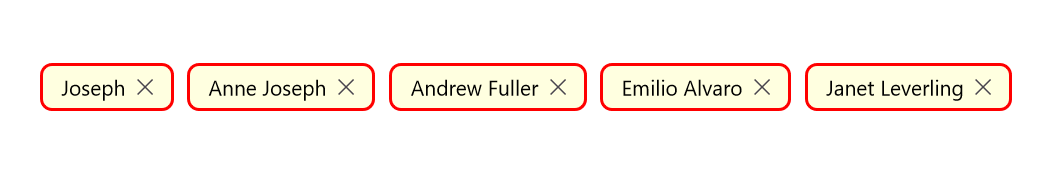
NOTE
The default value of ChipBorderColor is [
Color.FromArgb("#79747E")].
ChipTextSize
The ChipTextSize property customizes the text size of the SfChipGroup.
<chip:SfChipGroup
    ItemsSource="{Binding Employees}"
    DisplayMemberPath="Name"
    ChipTextSize="10">
</chip:SfChipGroup>
SfChipGroup chipGroup = new SfChipGroup()
{
DisplayMemberPath = "Name",
ChipTextSize = 10
};
chipGroup.SetBinding(SfChipGroup.ItemsSourceProperty, "Employees");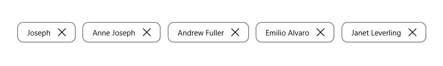
NOTE
The default value of ChipTextSize is [
14d].
ChipFontAttribute
The ChipFontAttribute property customizes the font style of text in SfChipGroup.
<chip:SfChipGroup
    ItemsSource="{Binding Employees}"
    DisplayMemberPath="Name"
    ChipFontAttributes="Bold"
    ChipType="Choice">
</chip:SfChipGroup>
SfChipGroup chipGroup = new SfChipGroup()
{
DisplayMemberPath = "Name",
ChipType = SfChipsType.Choice,
ChipFontAttributes = FontAttributes.Bold
};
chipGroup.SetBinding(SfChipGroup.ItemsSourceProperty, "Employees");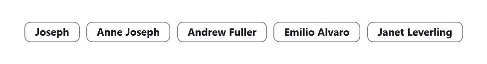
NOTE
The default value of ChipFontAttribute is [
FontAttributes.None].
ChipFontFamily
The [ChipFontFamily] property customizes the font family of text in SfChipGroup.
<chip:SfChipGroup
    ItemsSource="{Binding Employees}"
    DisplayMemberPath="Name"
    ChipFontFamily="OpenSans-Semibold">
</chip:SfChipGroup>
SfChipGroup chipGroup = new SfChipGroup()
{
DisplayMemberPath = "Name",
ChipFontFamily = "OpenSans-Semibold"
};
chipGroup.SetBinding(SfChipGroup.ItemsSourceProperty, "Employees");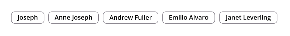
NOTE
The default value of ChipFontFamily is [
string.Empty].
ChipPadding
The ChipPadding property sets spacing between each chip.
<chip:SfChipGroup
    ItemsSource="{Binding Employees}"
    DisplayMemberPath="Name"
    ChipPadding="8,0,0,0">
</chip:SfChipGroup>
SfChipGroup chipGroup = new SfChipGroup()
{
ChipPadding = new Thickness(8, 0, 0, 0),
DisplayMemberPath = "Name"
};
chipGroup.SetBinding(SfChipGroup.ItemsSourceProperty, "Employees");
NOTE
The default value of ChipPadding is [
Thickness(5d, 0, 0, 0)].
ChipStrokeThickness
The ChipStrokeThickness property customizes the border width of the SfChipGroup.
<chip:SfChipGroup
    ItemsSource="{Binding Employees}"
    ChipStrokeThickness="7"
    DisplayMemberPath="Name"
    ChipStroke="Red">
</chip:SfChipGroup>
SfChipGroup chipGroup = new SfChipGroup()
{
ChipStrokeThickness = 7,
DisplayMemberPath = "Name",
ChipStroke = Colors.Red,
};
chipGroup.SetBinding(SfChipGroup.ItemsSourceProperty, "Employees");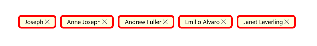
NOTE
The default value of ChipStrokeThickness is [
2d].
ChipLayout
The chips control creates chip for each object and arranges chips in a StackLayout with horizontal orientation. Any layout can be used to arrange the chips in the chips control.In the following example, the FlexLayout has been used.
<ContentPage.Content>
	<Grid>
		<chip:SfChipGroup DisplayMemberPath="Name">
			<chip:SfChipGroup.ChipLayout>
				<FlexLayout
					HorizontalOptions="Start"
					VerticalOptions="Center" />
			</chip:SfChipGroup.ChipLayout>
		</chip:SfChipGroup>
	</Grid>
</ContentPage.Content>
using Syncfusion.Maui.Core;
Grid grid = new Grid();
SfChipGroup chipGroup = new SfChipGroup();
chipGroup.DispalyMemberpath="Name",
grid.Children.Add(chipGroup);
FlexLayout layout = new FlexLayout()
{
HorizontalOptions = LayoutOptions.Start,
VerticalOptions = LayoutOptions.Center,
};
chipGroup.ChipLayout = layout;
this.Content = grid;ItemHeight
The ItemHeight property customizes the height of the items in the SfChipGroup.
<chip:SfChipGroup
    ItemsSource="{Binding Employees}"
    ItemHeight="60"
    DisplayMemberPath="Name">
</chip:SfChipGroup>
SfChipGroup chipGroup = new SfChipGroup()
{
ItemHeight = 60,
DisplayMemberPath = "Name",
};
chipGroup.SetBinding(SfChipGroup.ItemsSourceProperty, "Employees");
NOTE
The default value of ItemHeight is [
double.NaN].
ShowIcon
You can enable the icon image using the ShowIcon property to know whether any image appears on the SfChipGroup.
<chip:SfChipGroup
    ItemsSource="{Binding Employees}"
    ChipPadding="8,8,0,0"
    ImageMemberPath="Image"
    ChipImageSize="30"
    ShowIcon="true"
    DisplayMemberPath="Name">
</chip:SfChipGroup>
SfChipGroup chipGroup = new SfChipGroup()
{
DisplayMemberPath = "Name",
ImageMemberPath = "Image",
ChipImageSize = 30,
ShowIcon = true,
ChipPadding = new Thickness(8, 8, 0, 0)
};
chipGroup.SetBinding(SfChipGroup.ItemsSourceProperty, "Employees");
[Model]
public class Person
{
public string Name
{
get;
set;
}
public string Image
{
get;
set;
}
}
[ViewModel]
public class ViewModel : INotifyPropertyChanged
{
private ObservableCollection<Person> employees;
public ObservableCollection<Person> Employees
{
get { return employees; }
set { Employees = value; OnPropertyChanged("Employees"); }
}
public ViewModel()
{
employees = new ObservableCollection<Person>();
employees.Add(new Person() { Image = "jhon.png", Name = "John" });
employees.Add(new Person() { Image = "james.png", Name = "James" });
employees.Add(new Person() { Image = "alexandar.png", Name = "Alexandar" });
employees.Add(new Person() { Image = "liam.png", Name = "Liam" });
}
public event PropertyChangedEventHandler PropertyChanged;
public void OnPropertyChanged(string property)
{
if (PropertyChanged != null)
{
PropertyChanged(this, new PropertyChangedEventArgs(property));
}
}
}
CloseButtonColor
The CloseButtonColor property customizes the color of close button in the SfChipGroup.
<chip:SfChipGroup
    ItemsSource="{Binding Employees}"
    CloseButtonColor="Red"
    ChipBackground = "LightYellow"
    DisplayMemberPath="Name">
</chip:SfChipGroup>
SfChipGroup chipGroup = new SfChipGroup()
{
DisplayMemberPath = "Name",
CloseButtonColor = Colors.Red
};
chipGroup.SetBinding(SfChipGroup.ItemsSourceProperty, "Employees");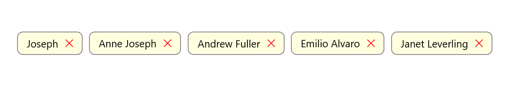
NOTE
The default value of CloseButtonColor is [
Color.FromArgb("#49454E")].
SelectionIndicatorColor
The SelectionIndicatorColor property customizes the selection indicator color of the SfChipGroup.
<chip:SfChipGroup x:Name="sfChipGroup"
                ItemsSource="{Binding Employees}"
                SelectionIndicatorColor="White"
                DisplayMemberPath="Name">
</chip:SfChipGroup>
SfChipGroup chipGroup = new SfChipGroup()
{
DisplayMemberPath = "Name",
SelectionIndicatorColor = Colors.White
};
chipGroup.SetBinding(SfChipGroup.ItemsSourceProperty, "Employees");
NOTE
The default value of SelectionIndicatorColor is [
Color.FromRgb(30, 25, 43)].
ChipImageSize
The ChipImageSize property customizes the width of icon image in the SfChipGroup.
<chip:SfChipGroup
    ItemsSource="{Binding Employees}"
    ImageMemberPath="Image"
    ChipImageSize="50"
    ShowIcon="true"
    DisplayMemberPath="Name">
</chip:SfChipGroup>
SfChipGroup chipGroup = new SfChipGroup()
{
DisplayMemberPath = "Name",
ImageMemberPath = "Image",
ChipImageSize = 50,
ShowIcon = true
};
chipGroup.SetBinding(SfChipGroup.ItemsSourceProperty, "Employees");
NOTE
The default value of ChipImageSize is [
18d].
IsSelected
The IsSelected property in the SfChip is used to indicate whether a chip has been selected in choice and filter types.